
Search results for "Proper tables" in Home Design Ideas
 Proper Paint & Paper
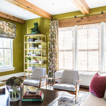
Iantha Carley Interiors was commissioned to design the family room of the Eighth Annual D.C. Design House benefiting the Children’s National Health System. Proper Paint & Paper was brought in to support the execution of room. From the abundant space, we crafted a family-friendly setting, incorporating a gorgeous walnut coffee table (with storage underneath for games or books) and lots of comfortable seating in indoor and outdoor fabrics to accommodate a soccer team or movie-viewing party.
 Proper Paint & Paper
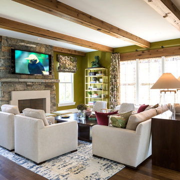
Iantha Carley Interiors was commissioned to design the family room of the Eighth Annual D.C. Design House benefiting the Children’s National Health System. Proper Paint & Paper was brought in to support the execution of room. From the abundant space, we crafted a family-friendly setting, incorporating a gorgeous walnut coffee table (with storage underneath for games or books) and lots of comfortable seating in indoor and outdoor fabrics to accommodate a soccer team or movie-viewing party.
 Proper Paint & Paper
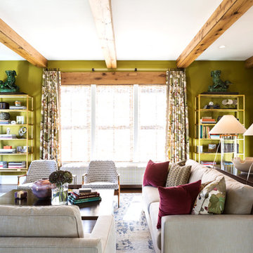
Iantha Carley Interiors was commissioned to design the family room of the Eighth Annual D.C. Design House benefiting the Children’s National Health System. Proper Paint & Paper was brought in to support the execution of room. From the abundant space, we crafted a family-friendly setting, incorporating a gorgeous walnut coffee table (with storage underneath for games or books) and lots of comfortable seating in indoor and outdoor fabrics to accommodate a soccer team or movie-viewing party.
Find the right local pro for your project
 Proper Paint & Paper
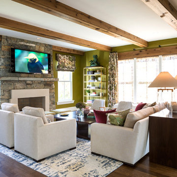
Iantha Carley Interiors was commissioned to design the family room of the Eighth Annual D.C. Design House benefiting the Children’s National Health System. Proper Paint & Paper was brought in to support the execution of room. From the abundant space, we crafted a family-friendly setting, incorporating a gorgeous walnut coffee table (with storage underneath for games or books) and lots of comfortable seating in indoor and outdoor fabrics to accommodate a soccer team or movie-viewing party.
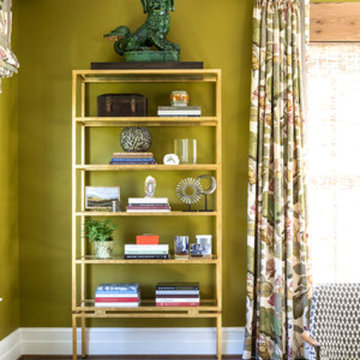 Proper Paint & Paper
Iantha Carley Interiors was commissioned to design the family room of the Eighth Annual D.C. Design House benefiting the Children’s National Health System. Proper Paint & Paper was brought in to support the execution of room. From the abundant space, we crafted a family-friendly setting, incorporating a gorgeous walnut coffee table (with storage underneath for games or books) and lots of comfortable seating in indoor and outdoor fabrics to accommodate a soccer team or movie-viewing party.
 TKS Design Group
Download our free ebook, Creating the Ideal Kitchen. DOWNLOAD NOW
Lakefront property in the northwest suburbs of Chicago is hard to come by, so when we were hired by this young family with exactly that, we were immediately inspired by not just the unusually large footprint of this 1950’s colonial revival but also the lovely views of the manmade lake it was sited on. The large 5-bedroom home was solidly stuck in the 1980’s, but we saw tons of potential. We started out by updating the existing staircase with a fresh coat of paint and adding new herringbone slate to the entry hall.
The powder room off the entryway also got a refresh - new flooring, new cabinets and fixtures. We ran the new slate right through into this space for some consistency. A fun wallpaper and shiplap trim add a welcoming feel and set the tone for the home.
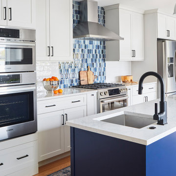
Next, we tackled the kitchen. Located away from the rest of the first floor, the kitchen felt a little isolated, so we immediately began planning for how to better connect it to the rest of the first floor. We landed on removing the wall between the kitchen and dining room and designed a modified galley style space with separate cooking and clean up zones. The cooking zone consists of the refrigerator, prep sink and cooktop, along with a nice long run of prep space at the island. The cleanup side of the kitchen consists of the main sink and dishwasher. Both areas are situated so that the user can view the lake during prep work and cleanup!
One of the home’s main puzzles was how to incorporate the mudroom and area in front of the patio doors at the back of the house. We already had a breakfast table area, so the space by the patio doors was a bit of a no man’s land. We decided to separate the kitchen proper from what became the new mudroom with a large set of barn doors. That way you can quickly hide any mudroom messes but have easy access to the light coming in through the patio doors as well as the outdoor grilling station. We also love the impact the barn doors add to the overall space.
The homeowners’ first words to us were “it’s time to ditch the brown,” so we did! We chose a lovely blue pallet that reflects the home’s location on the lake which is also vibrant yet easy on the eye. Countertops are white quartz, and the natural oak floor works well with the other honey accents. The breakfast table was given a refresh with new chairs, chandelier and window treatments that frame the gorgeous views of the lake out the back.
We coordinated the slate mudroom flooring with that used in the home’s main entrance for a consistent feel. The storage area consists of open and closed storage to allow for some clutter control as needed.
Next on our “to do” list was revamping the dated brown bar area in the neighboring dining room. We eliminated the clutter by adding some closed cabinets and did some easy updates to help the space feel more current. One snag we ran into here was the discovery of a beam above the existing open shelving that had to be modified with a smaller structural beam to allow for our new design to work. This was an unexpected surprise, but in the end we think it was well worth it!
We kept the colors here a bit more muted to blend with the homeowner’s existing furnishings. Open shelving and polished nickel hardware add some simple detail to the new entertainment zone which also looks out onto the lake!
Next we tackled the upstairs starting with the homeowner’s son’s bath. The bath originally had both a tub shower and a separate shower, so we decided to swap out the shower for a new laundry area. This freed up some space downstairs in what used to be the mudroom/laundry room and is much more convenient for daily laundry needs.
We continued the blue palette here with navy cabinetry and the navy tile in the shower. Porcelain floor tile and chrome fixtures keep maintenance to a minimum while matte black mirrors and lighting add some depth the design. A low maintenance runner adds some warmth underfoot and ties the whole space together.
We added a pocket door to the bathroom to minimize interference with the door swings. The left door of the laundry closet is on a 180 degree hinge to allow for easy full access to the machines. Next we tackled the master bath which is an en suite arrangement. The original was typical of the 1980’s with the vanity outside of the bathroom, situated near the master closet. And the brown theme continued here with multiple shades of brown.
Our first move was to segment off the bath and the closet from the master bedroom. We created a short hall from the bedroom to the bathroom with his and hers walk-in closets on the left and right as well as a separate toilet closet outside of the main bathroom for privacy and flexibility.
The original bathroom had a giant soaking tub with steps (dangerous!) as well as a small shower that did not work well for our homeowner who is 6’3”. With other bathtubs in the home, they decided to eliminate the tub and create an oversized shower which takes up the space where the old tub was located. The double vanity is on the opposite wall and a bench is located under the window for morning conversations and a place to set a couple of towels.
The pallet in here is light and airy with a mix of blond wood, creamy porcelain and marble tile, and brass accents. A simple roman shade adds some texture and it’s top-down mechanism allows for light and privacy.
This large whole house remodel gave our homeowners not only the ability to maximize the potential of their home but also created a lovely new frame from which to view their fabulous lake views.
Designed by: Susan Klimala, CKD, CBD
Photography by: Michael Kaskel
For more information on kitchen and bath design ideas go to: www.kitchenstudio-ge.com
 ODS Architecture
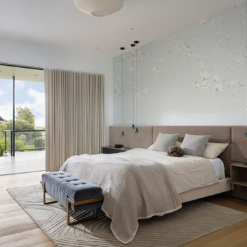
A 6,000 square foot 2-story new home complex in Milpitas was designed to facilitate the owners’ large business parties and gatherings, to have rooms for the kids to come back to upstairs, and a ground floor master suite with a huge walk-in closet. Several separate structures make up the dwelling: The main house, 3-car garage with carport for overflow parking, and a separate entertainment and recreation building separated by a courtyard from the main house.
The business activities include gatherings in the hundreds of people, so parking was maximized and guests can flow in through a separate gate to party in the courtyard and recreation building. Inside this structure is a wet bar, billiard room, workout gym and home theater. The main house ground floor has formal and informal living rooms, open kitchen and master suite with views and expansive windows in every direction. The house is sited on the crestline of a hill with views of the San Francisco Bay and private golf course below. The indoor-outdoor aspect of the house is further accentuated with outside living and dining areas.
High ceilings and expansive glass walls dissolve the sense of enclosure taking advantage of the site’s openness and privacy. The owner’s suite is downstairs in anticipation of aging-in-place, and upstairs there are three bedrooms and four bathrooms plus a sitting area lounge and casual TV loft area.
The house sits on one acre at the top of a low hill range overlooking Milpitas. The city was very cognizant of the importance of keeping a low profile at this crestline and required extensive story poles and photo evidence of the proper height and siting so as not to be seen from certain selected vantage points.
GENERAL CONTRACTOR: JCD Builders Inc.
LANDSCAPE DESIGN: Morf Chang Landscape Architecture / ODS Architecture
PHOTOGRAPHS: Paul Dyer Photography

 TKS Design Group
Download our free ebook, Creating the Ideal Kitchen. DOWNLOAD NOW
This client was referred to us from a past client. They are a busy 2-career household with young children and enjoy entertaining friends and family in their home. They have a beautiful open concept home but unfortunately the kitchen was not fitting for the rest of the home. They were not quite sure what to do with the space. We talked about trying to refresh it or do more of a minor remodel, but in the end they decided a full gut would get them to where they wanted to be.
One problem was there was no place for guests to hang out other than the large and awkward banquette area. The brick wall and tiled hood area were feeling a bit dated and tired. The space was just not functional for their lifestyle. There was no prep space near the cooktop and no landing area for items coming out of the ovens or refrigerator, plus a big dead zone in the center of the room.
Banquettes, like the one they previously had in the space, are great for small spaces, but when they get really large like this one, it makes getting in and out of the seating area awkward and uncomfortable. Plus, there was room for a large table, so we eliminated the awkward built in.
We started by removing the faux brick wall between the kitchen and back entry. We relocated the entry to the garage over a couple feet in order to get every last inch out of the new kitchen. We also made the decision to close up the primary window that faced the pretty ho hum brick wall of the neighbor’s house. There was plenty of light coming in from the seating area, so we just didn’t feel the window was adding much to the room.
Construction went smoothy. There was a bit of rework with electrical, flooring and HVAC, but in the end, we think it was well worth it.
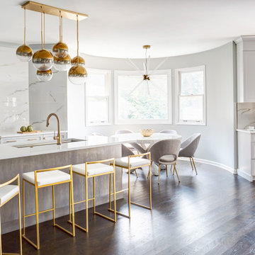
The clients really wanted a sleek contemporary look, and we originally had planned for a full height slab backsplash, but due to it’s size, it was a budget buster. Instead, we got creative and settled on large format porcelain tiles that have a similar feel but were a fraction of the cost. We made sure the wall was plumb and level so that the fit and finish would mimic that of slab material.
The final space was quite a change. A large prep sink sits directly across from the new pro-style range with plenty additional prep space on the large island. The refrigerator and ovens now have miles of landing space, and a nice tight work triangle makes cooking a breeze.
Since we wanted a more contemporary feel, not many wall cabinets were included. Instead, we outfitted some of the drawers for dish storage with a peg system. Two large pantries flanking the refrigerator hold baking supplies and small appliances. Large drawers by the cooktop hold pots and pans, and an appliance garage tucked away to the left of the range hides away miscellaneous items. The large island also houses a microwave drawer and tons of storage, most of which is drawers offering maximum convenience.
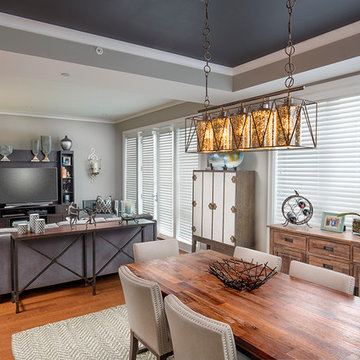
The island now seats 5-6 people comfortably along with the new table in the seating area which can seat up to 8. Entertaining will be a breeze in this space. With such a clean backdrop, we knew we would need some drama with the lighting, so we chose two sets of staggered pendants, which we adjusted for the right visual balance above the island.
We also included a small coffee station to the right of the main kitchen, which helps keep the coffee clutter out of the kitchen proper. Two tones of complimentary gray are featured in this kitchen. The perimeter is a light gray that reads almost white. The island is a gray stain that adds some depth and interest with the visible wood texture. The countertops are clean white quartz, and the hardware, barstools and light fixtures add warm brass tones. I see lots of cooking and entertaining with family and friends in the near future in this bright and airy new space.
Designed by: Susan Klimala, CKD, CBD
Photography by: Michael Kaskel
For more information on kitchen and bath design ideas go to: www.kitchenstudio-ge.com

 shorelarkbythesea.com
Deck cleats: Blue Water Marine; hot water bottle: Shoppers Drug Mart
©David Green
Example of a small classic master bedroom design in Other with white walls
Example of a small classic master bedroom design in Other with white walls
 Heller & Associates
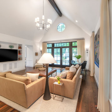
A black painted wood beam supports the dramatically vaulted ceiling of a Bloomfield Hills living room completed in 2018. A double set of French doors with transoms and circular window above admit natural light into the space and provide a complete architectural window grouping. A large yet unimposing chandelier teams up with recessed lighting, a pair of striking torchiere sconces, and lamp lighting to provide additional illumination. A side wall features built-in custom bookcases perfectly encasing the television and providing storage for books and personal items. The television was placed at an optimal height to continue the horizontal sight lines of millwork in the archways symmetrically flanking the bookcase. Fabric doors on the lower cabinets provide textural interest as well as proper ventilation for left, right and center channel surround sound speakers. A lighted, recessed niche in the wall behind the sitting area provides a custom spot for a sculptural rustic bench. A fourth wall accommodates an outsized modern art canvas full of color and movement. Stained pine flooring is topped by a large square rug to ground the sitting area. A table and chairs by the corner windows make use of light and space to create a family friendly multi-use living room. The design keeps kitchen clutter out of sight while connecting the space and creating outstanding flow and ergonomics. The room, along with the archway off the foyer, is positioned to allow a view through toward the pool and rear yard.
 Unique Home Solutions Inc.
Adding furniture and accessories to a vacant property makes an incredible difference to the potential purchaser's perspective when they walk through the door for the first time. If you would like a consultation, give us a call at 514-222-5553.
We work with investors, home owners, realtors and house 'flippers'. Unique home Solutions Inc. has been in business since 2006 helping owners improve the look of their properties.
 User
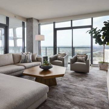
UserModern, minimalist living room that utilizes a brown wood coffee table to break up the neutrals
Living room - mid-sized modern open concept medium tone wood floor and brown floor living room idea in Austin with white walls and a wall-mounted tv
Living room - mid-sized modern open concept medium tone wood floor and brown floor living room idea in Austin with white walls and a wall-mounted tv

Sponsored
Sunbury, OH

J.Holderby - Renovations
Franklin County's Leading General Contractors - 2X Best of Houzz!
 Jones Design Group LLC
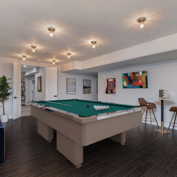
Large trendy dark wood floor and brown floor basement game room photo in Indianapolis with white walls
 Dawn D. Totty Interior DESIGNS
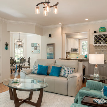
A brighter space and comfort was this clients request!
I believe it sure is brighter and the addition of the two custom reupholstered chairs and reclining leather sofa is the pinnacle of comfort. Custom designed reversible pillows insure the custom, one of a kind design (by Dawn D Totty). The medium colored new hardwoods, light furnishings, brighter wall color and light fixtures and reflective glass tables & table lamp bring this once drab space to life!! The now properly sized furnishings also make this living room much more spacious and functional. Living room design by-
Dawn D Totty Designs
@ddtotty on instagram
 Sandra Hambley
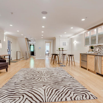
With a listing price of just under $4 million, this gorgeous row home located near the Convention Center in Washington DC required a very specific look to attract the proper buyer.
The home has been completely remodeled in a modern style with bamboo flooring and bamboo kitchen cabinetry so the furnishings and decor needed to be complimentary. Typically, transitional furnishings are used in staging across the board, however, for this property we wanted an urban loft, industrial look with heavy elements of reclaimed wood to create a city, hotel luxe style. As with all DC properties, this one is long and narrow but is completely open concept on each level, so continuity in color and design selections was critical.
The row home had several open areas that needed a defined purpose such as a reception area, which includes a full bar service area, pub tables, stools and several comfortable seating areas for additional entertaining. It also boasts an in law suite with kitchen and living quarters as well as 3 outdoor spaces, which are highly sought after in the District.
 J. A. Yancey & Associates Inc.
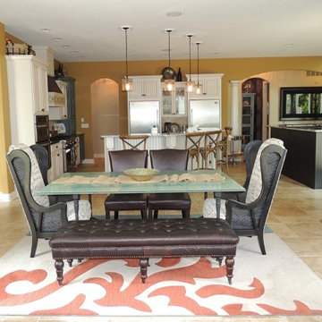
A large casual dining area in an open-concept kitchen is perfect for entertaining.
Eclectic dining room photo in Indianapolis
Eclectic dining room photo in Indianapolis

Sponsored
Columbus, OH

Wannemacher Interiors
Customized Award-Winning Interior Design Solutions in Franklin Cnty OH
 Drury Design
THE SETUP
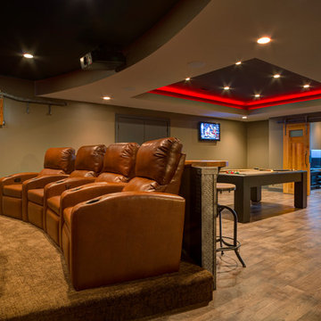
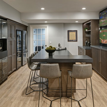
When we first encountered this basement for a family with three boys, we saw a space with untapped potential. Though previously remodeled, it lacked a cohesive design strategy. The expansive area housed various entertainment pieces (a shuffleboard table, air hockey, foosball, etc.) scattered haphazardly throughout the space.
While the basement included a workout room and a rudimentary kitchen area, it lacked a dedicated game room or proper bar. Excessive storage closets along the back wall consumed valuable real estate that could be repurposed for more engaging uses.
In essence, the basement was spacious but disjointed—functional for family use but falling short as an entertainment hub. It didn’t align with the sophistication of the rest of the home. Our clients envisioned a transformation: a fresh, organized space that would not only serve their family’s needs but also shine as an inviting arena for entertaining friends and hosting gatherings – especially sports-focused gatherings!
Design Objectives:
Reimagine the basement layout, creating distinct zones for varied activities.
Expand the workout area to accommodate new equipment, including a Smith machine.
Implement a multi-screen setup inspired by high-end sports bars, allowing guests to follow multiple games while socializing.
Enhance existing features while developing new areas:
Optimize a workout space for all equipment needs
Establish a dedicated children’s space with guest room capabilities
Create an integrated bar and entertainment area
Retain and incorporate the existing projector setup
Design Challenges:
Navigate layout constraints in the new workout room due to fixed utility areas.
Carve out a distinct space for kids within the open plan.
Revitalize an underutilized section of the basement.
Elevate the existing big screen area with purposeful design elements.
Develop a full-fledged bar area while maintaining kitchen functions applicable for hangout snacking.
Work around immovable structural elements (soffits, load-bearing support columns)
THE RENEWED SPACE
Design Solutions:
Install a stylish barn door for the utility area of the new workout space, improving aesthetics and accessibility.
Repurpose the former workout room into a dedicated game room for kids, utilizing couches with pull-out beds so the area can double as overflow guest accommodations.
Transform the unused area into a vibrant pub-style area for card and table games.
Enhance the big screen area with elegant wainscoting and ambient theatre-style lighting.
Design a multi-functional wet bar area featuring varied seating, prep areas, and a microwave.
Base the bar sink area width off the soffit above it.
In the big screen area, use the soffit to inform the width of a wainscoting section.
For the immovable support columns, dress one up to match the wainscoting of the nearby big screen wall. Hide the other one in a new wall.
Final Thoughts:
The reimagined basement has exceeded our clients’ expectations, evolving into the ultimate entertainment hub. With seven strategically placed screens, it’s perfect for gatherings focused on major sporting events and casual gatherings, as well. The space strikes a balance between adult sophistication and family-friendly functionality, featuring distinct zones for various activities.
The new design not only maximizes functionality for modern, multi-screen entertainment but also elevates the aesthetic appeal. It integrates flawlessly with the rest of the home’s transitional style while allowing each basement section to maintain its unique character. The result is a versatile space that caters to both intimate family time and large-scale entertaining.
 Nar Design Group
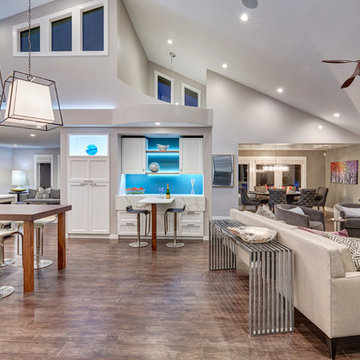
This home remodel is a celebration of curves and light. Starting from humble beginnings as a basic builder ranch style house, the design challenge was maximizing natural light throughout and providing the unique contemporary style the client’s craved.
The Entry offers a spectacular first impression and sets the tone with a large skylight and an illuminated curved wall covered in a wavy pattern Porcelanosa tile.
The chic entertaining kitchen was designed to celebrate a public lifestyle and plenty of entertaining. Celebrating height with a robust amount of interior architectural details, this dynamic kitchen still gives one that cozy feeling of home sweet home. The large “L” shaped island accommodates 7 for seating. Large pendants over the kitchen table and sink provide additional task lighting and whimsy. The Dekton “puzzle” countertop connection was designed to aid the transition between the two color countertops and is one of the homeowner’s favorite details. The built-in bistro table provides additional seating and flows easily into the Living Room.
A curved wall in the Living Room showcases a contemporary linear fireplace and tv which is tucked away in a niche. Placing the fireplace and furniture arrangement at an angle allowed for more natural walkway areas that communicated with the exterior doors and the kitchen working areas.
The dining room’s open plan is perfect for small groups and expands easily for larger events. Raising the ceiling created visual interest and bringing the pop of teal from the Kitchen cabinets ties the space together. A built-in buffet provides ample storage and display.
The Sitting Room (also called the Piano room for its previous life as such) is adjacent to the Kitchen and allows for easy conversation between chef and guests. It captures the homeowner’s chic sense of style and joie de vivre.
 TKS Design Group
Download our free ebook, Creating the Ideal Kitchen. DOWNLOAD NOW
Lakefront property in the northwest suburbs of Chicago is hard to come by, so when we were hired by this young family with exactly that, we were immediately inspired by not just the unusually large footprint of this 1950’s colonial revival but also the lovely views of the manmade lake it was sited on. The large 5-bedroom home was solidly stuck in the 1980’s, but we saw tons of potential. We started out by updating the existing staircase with a fresh coat of paint and adding new herringbone slate to the entry hall.
The powder room off the entryway also got a refresh - new flooring, new cabinets and fixtures. We ran the new slate right through into this space for some consistency. A fun wallpaper and shiplap trim add a welcoming feel and set the tone for the home.
Next, we tackled the kitchen. Located away from the rest of the first floor, the kitchen felt a little isolated, so we immediately began planning for how to better connect it to the rest of the first floor. We landed on removing the wall between the kitchen and dining room and designed a modified galley style space with separate cooking and clean up zones. The cooking zone consists of the refrigerator, prep sink and cooktop, along with a nice long run of prep space at the island. The cleanup side of the kitchen consists of the main sink and dishwasher. Both areas are situated so that the user can view the lake during prep work and cleanup!
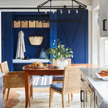
One of the home’s main puzzles was how to incorporate the mudroom and area in front of the patio doors at the back of the house. We already had a breakfast table area, so the space by the patio doors was a bit of a no man’s land. We decided to separate the kitchen proper from what became the new mudroom with a large set of barn doors. That way you can quickly hide any mudroom messes but have easy access to the light coming in through the patio doors as well as the outdoor grilling station. We also love the impact the barn doors add to the overall space.
The homeowners’ first words to us were “it’s time to ditch the brown,” so we did! We chose a lovely blue pallet that reflects the home’s location on the lake which is also vibrant yet easy on the eye. Countertops are white quartz, and the natural oak floor works well with the other honey accents. The breakfast table was given a refresh with new chairs, chandelier and window treatments that frame the gorgeous views of the lake out the back.
We coordinated the slate mudroom flooring with that used in the home’s main entrance for a consistent feel. The storage area consists of open and closed storage to allow for some clutter control as needed.
Next on our “to do” list was revamping the dated brown bar area in the neighboring dining room. We eliminated the clutter by adding some closed cabinets and did some easy updates to help the space feel more current. One snag we ran into here was the discovery of a beam above the existing open shelving that had to be modified with a smaller structural beam to allow for our new design to work. This was an unexpected surprise, but in the end we think it was well worth it!
We kept the colors here a bit more muted to blend with the homeowner’s existing furnishings. Open shelving and polished nickel hardware add some simple detail to the new entertainment zone which also looks out onto the lake!
Next we tackled the upstairs starting with the homeowner’s son’s bath. The bath originally had both a tub shower and a separate shower, so we decided to swap out the shower for a new laundry area. This freed up some space downstairs in what used to be the mudroom/laundry room and is much more convenient for daily laundry needs.
We continued the blue palette here with navy cabinetry and the navy tile in the shower. Porcelain floor tile and chrome fixtures keep maintenance to a minimum while matte black mirrors and lighting add some depth the design. A low maintenance runner adds some warmth underfoot and ties the whole space together.
We added a pocket door to the bathroom to minimize interference with the door swings. The left door of the laundry closet is on a 180 degree hinge to allow for easy full access to the machines. Next we tackled the master bath which is an en suite arrangement. The original was typical of the 1980’s with the vanity outside of the bathroom, situated near the master closet. And the brown theme continued here with multiple shades of brown.
Our first move was to segment off the bath and the closet from the master bedroom. We created a short hall from the bedroom to the bathroom with his and hers walk-in closets on the left and right as well as a separate toilet closet outside of the main bathroom for privacy and flexibility.
The original bathroom had a giant soaking tub with steps (dangerous!) as well as a small shower that did not work well for our homeowner who is 6’3”. With other bathtubs in the home, they decided to eliminate the tub and create an oversized shower which takes up the space where the old tub was located. The double vanity is on the opposite wall and a bench is located under the window for morning conversations and a place to set a couple of towels.
The pallet in here is light and airy with a mix of blond wood, creamy porcelain and marble tile, and brass accents. A simple roman shade adds some texture and it’s top-down mechanism allows for light and privacy.
This large whole house remodel gave our homeowners not only the ability to maximize the potential of their home but also created a lovely new frame from which to view their fabulous lake views.
Designed by: Susan Klimala, CKD, CBD
Photography by: Michael Kaskel
For more information on kitchen and bath design ideas go to: www.kitchenstudio-ge.com
25