
Search results for "Proper tables" in Home Design Ideas
 TKS Design Group
Download our free ebook, Creating the Ideal Kitchen. DOWNLOAD NOW
Lakefront property in the northwest suburbs of Chicago is hard to come by, so when we were hired by this young family with exactly that, we were immediately inspired by not just the unusually large footprint of this 1950’s colonial revival but also the lovely views of the manmade lake it was sited on. The large 5-bedroom home was solidly stuck in the 1980’s, but we saw tons of potential. We started out by updating the existing staircase with a fresh coat of paint and adding new herringbone slate to the entry hall.
The powder room off the entryway also got a refresh - new flooring, new cabinets and fixtures. We ran the new slate right through into this space for some consistency. A fun wallpaper and shiplap trim add a welcoming feel and set the tone for the home.
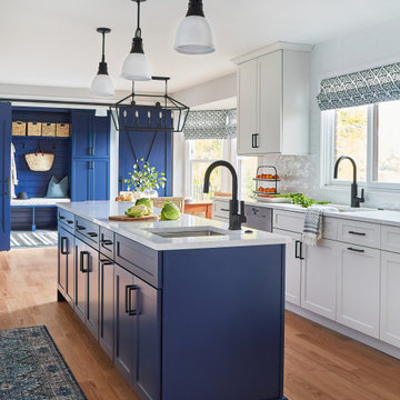
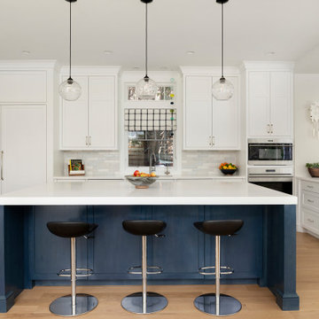
Next, we tackled the kitchen. Located away from the rest of the first floor, the kitchen felt a little isolated, so we immediately began planning for how to better connect it to the rest of the first floor. We landed on removing the wall between the kitchen and dining room and designed a modified galley style space with separate cooking and clean up zones. The cooking zone consists of the refrigerator, prep sink and cooktop, along with a nice long run of prep space at the island. The cleanup side of the kitchen consists of the main sink and dishwasher. Both areas are situated so that the user can view the lake during prep work and cleanup!
One of the home’s main puzzles was how to incorporate the mudroom and area in front of the patio doors at the back of the house. We already had a breakfast table area, so the space by the patio doors was a bit of a no man’s land. We decided to separate the kitchen proper from what became the new mudroom with a large set of barn doors. That way you can quickly hide any mudroom messes but have easy access to the light coming in through the patio doors as well as the outdoor grilling station. We also love the impact the barn doors add to the overall space.
The homeowners’ first words to us were “it’s time to ditch the brown,” so we did! We chose a lovely blue pallet that reflects the home’s location on the lake which is also vibrant yet easy on the eye. Countertops are white quartz, and the natural oak floor works well with the other honey accents. The breakfast table was given a refresh with new chairs, chandelier and window treatments that frame the gorgeous views of the lake out the back.
We coordinated the slate mudroom flooring with that used in the home’s main entrance for a consistent feel. The storage area consists of open and closed storage to allow for some clutter control as needed.
Next on our “to do” list was revamping the dated brown bar area in the neighboring dining room. We eliminated the clutter by adding some closed cabinets and did some easy updates to help the space feel more current. One snag we ran into here was the discovery of a beam above the existing open shelving that had to be modified with a smaller structural beam to allow for our new design to work. This was an unexpected surprise, but in the end we think it was well worth it!
We kept the colors here a bit more muted to blend with the homeowner’s existing furnishings. Open shelving and polished nickel hardware add some simple detail to the new entertainment zone which also looks out onto the lake!
Next we tackled the upstairs starting with the homeowner’s son’s bath. The bath originally had both a tub shower and a separate shower, so we decided to swap out the shower for a new laundry area. This freed up some space downstairs in what used to be the mudroom/laundry room and is much more convenient for daily laundry needs.
We continued the blue palette here with navy cabinetry and the navy tile in the shower. Porcelain floor tile and chrome fixtures keep maintenance to a minimum while matte black mirrors and lighting add some depth the design. A low maintenance runner adds some warmth underfoot and ties the whole space together.
We added a pocket door to the bathroom to minimize interference with the door swings. The left door of the laundry closet is on a 180 degree hinge to allow for easy full access to the machines. Next we tackled the master bath which is an en suite arrangement. The original was typical of the 1980’s with the vanity outside of the bathroom, situated near the master closet. And the brown theme continued here with multiple shades of brown.
Our first move was to segment off the bath and the closet from the master bedroom. We created a short hall from the bedroom to the bathroom with his and hers walk-in closets on the left and right as well as a separate toilet closet outside of the main bathroom for privacy and flexibility.
The original bathroom had a giant soaking tub with steps (dangerous!) as well as a small shower that did not work well for our homeowner who is 6’3”. With other bathtubs in the home, they decided to eliminate the tub and create an oversized shower which takes up the space where the old tub was located. The double vanity is on the opposite wall and a bench is located under the window for morning conversations and a place to set a couple of towels.
The pallet in here is light and airy with a mix of blond wood, creamy porcelain and marble tile, and brass accents. A simple roman shade adds some texture and it’s top-down mechanism allows for light and privacy.
This large whole house remodel gave our homeowners not only the ability to maximize the potential of their home but also created a lovely new frame from which to view their fabulous lake views.
Designed by: Susan Klimala, CKD, CBD
Photography by: Michael Kaskel
For more information on kitchen and bath design ideas go to: www.kitchenstudio-ge.com
 Sandra Hambley
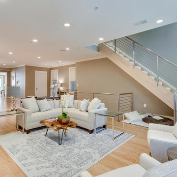
With a listing price of just under $4 million, this gorgeous row home located near the Convention Center in Washington DC required a very specific look to attract the proper buyer.
The home has been completely remodeled in a modern style with bamboo flooring and bamboo kitchen cabinetry so the furnishings and decor needed to be complimentary. Typically, transitional furnishings are used in staging across the board, however, for this property we wanted an urban loft, industrial look with heavy elements of reclaimed wood to create a city, hotel luxe style. As with all DC properties, this one is long and narrow but is completely open concept on each level, so continuity in color and design selections was critical.
The row home had several open areas that needed a defined purpose such as a reception area, which includes a full bar service area, pub tables, stools and several comfortable seating areas for additional entertaining. It also boasts an in law suite with kitchen and living quarters as well as 3 outdoor spaces, which are highly sought after in the District.
 TKS Design Group
Download our free ebook, Creating the Ideal Kitchen. DOWNLOAD NOW
Lakefront property in the northwest suburbs of Chicago is hard to come by, so when we were hired by this young family with exactly that, we were immediately inspired by not just the unusually large footprint of this 1950’s colonial revival but also the lovely views of the manmade lake it was sited on. The large 5-bedroom home was solidly stuck in the 1980’s, but we saw tons of potential. We started out by updating the existing staircase with a fresh coat of paint and adding new herringbone slate to the entry hall.
The powder room off the entryway also got a refresh - new flooring, new cabinets and fixtures. We ran the new slate right through into this space for some consistency. A fun wallpaper and shiplap trim add a welcoming feel and set the tone for the home.
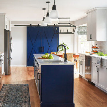
Next, we tackled the kitchen. Located away from the rest of the first floor, the kitchen felt a little isolated, so we immediately began planning for how to better connect it to the rest of the first floor. We landed on removing the wall between the kitchen and dining room and designed a modified galley style space with separate cooking and clean up zones. The cooking zone consists of the refrigerator, prep sink and cooktop, along with a nice long run of prep space at the island. The cleanup side of the kitchen consists of the main sink and dishwasher. Both areas are situated so that the user can view the lake during prep work and cleanup!
One of the home’s main puzzles was how to incorporate the mudroom and area in front of the patio doors at the back of the house. We already had a breakfast table area, so the space by the patio doors was a bit of a no man’s land. We decided to separate the kitchen proper from what became the new mudroom with a large set of barn doors. That way you can quickly hide any mudroom messes but have easy access to the light coming in through the patio doors as well as the outdoor grilling station. We also love the impact the barn doors add to the overall space.
The homeowners’ first words to us were “it’s time to ditch the brown,” so we did! We chose a lovely blue pallet that reflects the home’s location on the lake which is also vibrant yet easy on the eye. Countertops are white quartz, and the natural oak floor works well with the other honey accents. The breakfast table was given a refresh with new chairs, chandelier and window treatments that frame the gorgeous views of the lake out the back.
We coordinated the slate mudroom flooring with that used in the home’s main entrance for a consistent feel. The storage area consists of open and closed storage to allow for some clutter control as needed.
Next on our “to do” list was revamping the dated brown bar area in the neighboring dining room. We eliminated the clutter by adding some closed cabinets and did some easy updates to help the space feel more current. One snag we ran into here was the discovery of a beam above the existing open shelving that had to be modified with a smaller structural beam to allow for our new design to work. This was an unexpected surprise, but in the end we think it was well worth it!
We kept the colors here a bit more muted to blend with the homeowner’s existing furnishings. Open shelving and polished nickel hardware add some simple detail to the new entertainment zone which also looks out onto the lake!
Next we tackled the upstairs starting with the homeowner’s son’s bath. The bath originally had both a tub shower and a separate shower, so we decided to swap out the shower for a new laundry area. This freed up some space downstairs in what used to be the mudroom/laundry room and is much more convenient for daily laundry needs.
We continued the blue palette here with navy cabinetry and the navy tile in the shower. Porcelain floor tile and chrome fixtures keep maintenance to a minimum while matte black mirrors and lighting add some depth the design. A low maintenance runner adds some warmth underfoot and ties the whole space together.
We added a pocket door to the bathroom to minimize interference with the door swings. The left door of the laundry closet is on a 180 degree hinge to allow for easy full access to the machines. Next we tackled the master bath which is an en suite arrangement. The original was typical of the 1980’s with the vanity outside of the bathroom, situated near the master closet. And the brown theme continued here with multiple shades of brown.
Our first move was to segment off the bath and the closet from the master bedroom. We created a short hall from the bedroom to the bathroom with his and hers walk-in closets on the left and right as well as a separate toilet closet outside of the main bathroom for privacy and flexibility.
The original bathroom had a giant soaking tub with steps (dangerous!) as well as a small shower that did not work well for our homeowner who is 6’3”. With other bathtubs in the home, they decided to eliminate the tub and create an oversized shower which takes up the space where the old tub was located. The double vanity is on the opposite wall and a bench is located under the window for morning conversations and a place to set a couple of towels.
The pallet in here is light and airy with a mix of blond wood, creamy porcelain and marble tile, and brass accents. A simple roman shade adds some texture and it’s top-down mechanism allows for light and privacy.
This large whole house remodel gave our homeowners not only the ability to maximize the potential of their home but also created a lovely new frame from which to view their fabulous lake views.
Designed by: Susan Klimala, CKD, CBD
Photography by: Michael Kaskel
For more information on kitchen and bath design ideas go to: www.kitchenstudio-ge.com
Find the right local pro for your project
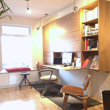
Small minimalist built-in desk light wood floor and beige floor study room photo in Toronto with white walls

 Pool Environments, Inc.
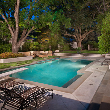
Originally designed by one of the most notable landscape architects in town, this once impressive project had faltered in recent years. The pool and spa still functioned well, and the client wanted to keep it intact. In addition, they wanted to keep as much of the existing landscaping as possible. The surrounding decks, walls, and steps were fair game. At first glance, one might think that our changes were simple material changes. Upon closer inspection, however, one can see the subtle, yet transformative changes that come together to update this classic pool in a tasteful, timeless manner, and improve the flow and usability of the deck areas, while softening the feel of the massive hardscape.
The subtle changes begin as soon as you walk out the back door of the house. The existing decking had a lot of what we call “tweeners”; areas that are overly generous walkways, yet not large enough to house furniture. The awkwardly small bluestone patio was expanded to accommodate a generous seating area, by pushing the step-down closer to the pool. Our talented stone mason carefully married the new bluestone into the existing, resulting in an imperceptible difference between the two. As you descend the new bluestone steps to the pool level, your bare feet will be thankful for the new smooth-finished limestone colored concrete, with a hand cut pattern carefully etched into its surface. The old red brick decking was so hot that the owners could not walk around the pool in bare feet. The brick coping was also replaced with an eased edge Pennsylvania Premier Stone which matches the new step treads throughout the project. Between the house and the pool, a large raised planter was reconfigured, giving additional space to the pool deck for a shaded lounge chair area.
Across the pool, a bank of rather tall painted brick retaining walls were cut down, shortened, and moved. This lessened the visual impact of the walls, which were rather overwhelming in the space, as well as opening up a new seating area, nestled under the arms of the massive pecan at the back of the property. Rather than continuing solid decking around the entire pool, the area near these walls has been transformed to large stone stepper pads set in a sea of beautiful St. Augustine lawn. This creates a visually softened area that is still suited to setting tables and chairs when the guest list calls for additional seating.
The spa area is quite possibly the most dramatic change on this project. Yet more raised planter walls divided this area into awkward spaces, unsuited to proper furniture placement. The planters were removed, new stone decks, once again expertly married into the existing, opening the area to house a large dining table and new built in bbq area. The spa itself was re-imagined with the bluestone coping, and painted brick veneer. The most impressive addition though is the new handmade glazed tiles that surround the existing cast stone water feature. This water feature was almost unnoticeable against the painted brick wall, but now the dramatic arch and pop of color draw the eye to this quaint little corner of the property.
 Randy Angell Designs
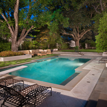
The subtle changes begin as soon as you walk out the back door of the house. The existing decking had a lot of what we call "tweeners"; areas that are overly generous walkways, yet not large enough to house furniture. The awkwardly small bluestone patio was expanded to accommodate a generous seating area. This was done by pushing the step-down closer to the pool.
Our talented stone mason carefully married the new bluestone into the existing portion of the patio, resulting in an imperceptible difference between the two.
As you descend the new bluestone steps to the pool level, your bare feet will be thankful for the new smooth-finished, limestone-colored concrete, with a hand cut pattern carefully etched into it's surface.
The old red brick decking was so hot that the owners could not walk around the pool with their bare feet. The brick coping was also replaced with an eased edge, Pennsylvania Premier Stone which matches the new step treads throughout the project.
Between the house and the pool, a large raised planter was reconfigured, giving additional space to the pool deck for a shaded lounge chair area. Across the pool, a bank of rather tall painted brick retaining walls were cut down, shortened and moved. This lessened the visual impact of the walls (which were overwhelming in the space) and also opened up a new seating area, nestled under the arms of the massive Pecan tree at the back of the property.
Rather than continuing solid decking around the entire pool, the area near these walls has been transformed to large stone stepper pads set in a sea of beautiful St. Augustine lawn. This creates a visually softened area that is still suited to setting tables and chairs when the guest list calls for additional seating.
The spa area is possibly the most dramatic change on this project. Yet more raised planter walls divided this area into awkward spaces, unsuited for proper furniture placement. The planters were removed, new stone decks added, and once again expertly married into the existing decks, opening the area to house a large dining table and a newly built-in BBQ area.
The spa itself was re-imagined with the bluestone coping and painted brick veneer. The most impressive addition though is the new handmade glazed tiles that surround the existing cast stone water feature. This water feature was almost unnoticeable against the painted brick wall, but now the dramatic arch and pop of color draw the eye to this quaint little corner of the property.
Originally designed by one of the most notable landscape architects in town, this once impressive project had faltered in recent years. The pool and spa still functioned well, and the client wanted to keep it intact. In addition, they wanted to keep as much of the existing landscape as possible. But, the surrounding decks, walls and steps were fair game.
At first glance, one might think that our changes were simple material changes. However, upon closer inspection, one can see the subtle-yet-transformative changes that came together to update this classic pool in a tasteful, timeless manner, as well as to improve the flow and usability of the deck areas, while softening the feel of this massive hardscape.
Sponsored
Sunbury, OH

J.Holderby - Renovations
Franklin County's Leading General Contractors - 2X Best of Houzz!
 Sandra Hambley
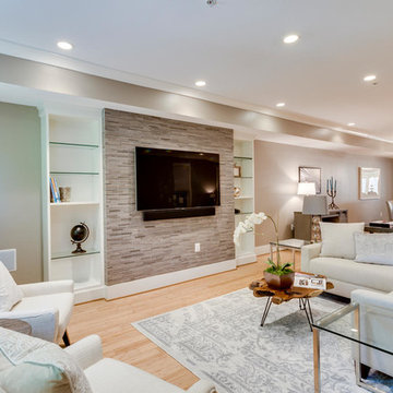
With a listing price of just under $4 million, this gorgeous row home located near the Convention Center in Washington DC required a very specific look to attract the proper buyer.
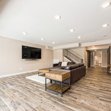
The home has been completely remodeled in a modern style with bamboo flooring and bamboo kitchen cabinetry so the furnishings and decor needed to be complimentary. Typically, transitional furnishings are used in staging across the board, however, for this property we wanted an urban loft, industrial look with heavy elements of reclaimed wood to create a city, hotel luxe style. As with all DC properties, this one is long and narrow but is completely open concept on each level, so continuity in color and design selections was critical.
The row home had several open areas that needed a defined purpose such as a reception area, which includes a full bar service area, pub tables, stools and several comfortable seating areas for additional entertaining. It also boasts an in law suite with kitchen and living quarters as well as 3 outdoor spaces, which are highly sought after in the District.
 Sandra Hambley
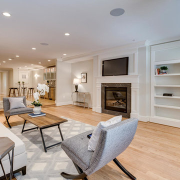
With a listing price of just under $4 million, this gorgeous row home located near the Convention Center in Washington DC required a very specific look to attract the proper buyer.
The home has been completely remodeled in a modern style with bamboo flooring and bamboo kitchen cabinetry so the furnishings and decor needed to be complimentary. Typically, transitional furnishings are used in staging across the board, however, for this property we wanted an urban loft, industrial look with heavy elements of reclaimed wood to create a city, hotel luxe style. As with all DC properties, this one is long and narrow but is completely open concept on each level, so continuity in color and design selections was critical.
The row home had several open areas that needed a defined purpose such as a reception area, which includes a full bar service area, pub tables, stools and several comfortable seating areas for additional entertaining. It also boasts an in law suite with kitchen and living quarters as well as 3 outdoor spaces, which are highly sought after in the District.
 Sandra Hambley
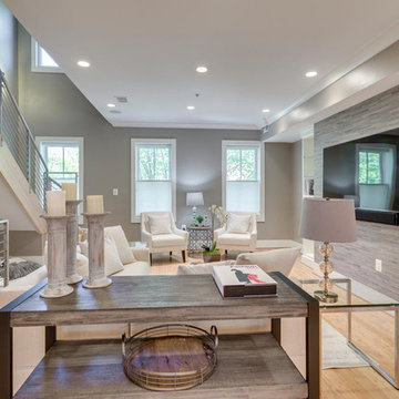
With a listing price of just under $4 million, this gorgeous row home located near the Convention Center in Washington DC required a very specific look to attract the proper buyer.
The home has been completely remodeled in a modern style with bamboo flooring and bamboo kitchen cabinetry so the furnishings and decor needed to be complimentary. Typically, transitional furnishings are used in staging across the board, however, for this property we wanted an urban loft, industrial look with heavy elements of reclaimed wood to create a city, hotel luxe style. As with all DC properties, this one is long and narrow but is completely open concept on each level, so continuity in color and design selections was critical.
The row home had several open areas that needed a defined purpose such as a reception area, which includes a full bar service area, pub tables, stools and several comfortable seating areas for additional entertaining. It also boasts an in law suite with kitchen and living quarters as well as 3 outdoor spaces, which are highly sought after in the District.
 M Atelier
If there is one big mistake that homeowners make when carrying out the decoration tasks of their interior design project, that would be over-accessorising. Indeed, experts in interior design in Singapore agree that there are styles where “more is more,” and there are also those where “less is more.”
While as a homeowner you may choose either of these two style directions, you should first think about the different aspects of interior design and make sure that your style choice fits with these elements. Not doing so may not only result to a poorly executed renovation, but a home that you will find uncomfortable to live in.
So how do you avoid the tendency of over-accessorising? You may want to follow these pieces of advice coming from professionals in interior design in Singapore:
Mistake #1: Using the same fabric on almost all surfaces.
It is common practice among most homeowners to use almost the same fabric on all table surfaces, and sometimes even on sofa covers and drapes. Indeed, this can be cost effective, but it does not contribute to the development of the home’s overall design.
This is because there are fabrics are created to meet specific purposes. For example, lace is often used as table runners, as they give more definition and style to these specific furniture pieces. However, they do not do your windows any favours when used as curtains.
Opaque and heavy fabrics are often intended for curtains and drapes for rooms that require more privacy; in contrast, sheer and fabric materials are more suited for living room windows as they allow natural light and ventilation to move around the house.
Mistake #2: Placing more accents than you actually need.
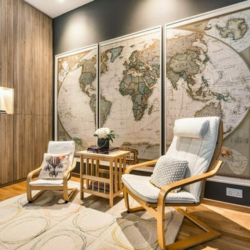
Another mistake which homeowners are prone to make when decorating their home is placing more accents than needed. There are homes you can see side tables that are overpopulated with picture frames, trinkets, and fancy souvenirs that do not have any connection to each other. Sometimes, you can find numerous throw pillows occupying almost the entire sofa, to the point that all the seats are already occupied.
These are classic examples of “fear of empty spaces,” which is prevalent in most Asian societies, and even in some Western countries. But while it is common practice to occupy empty spaces, you may also want to think about what to do with the space first.
Instead of piling up all your memorabilia in the side tables of your bedroom or living room, why not use a tiered stand so that they can be presented in an organised manner? You may also want to choose a designated area for your trinkets, such as a wall or an unoccupied corner in your room.
Mistake #3: Overdoing the lighting fixtures.
Some homeowners want to imitate the homes of the celebrities they see on TV, and apart from following the same colour schemes and choice of furniture, they also choose to add more lights in their rooms than necessary.
Well, you should understand that the purpose of lighting fixtures is to illuminate the rooms of the house, but this doesn’t mean that you have to brighten up your home all the time. You may want to use lamps that spread the light across the room, rather than several smaller bulbs. The latter only lights up specific parts of the room, and when all these bulbs are lit simultaneously, they only spike up your electric bill.
It would be better to choose lighting fixtures according to your need and the function of the room. Doing so not only illuminates your home properly, but also creates an ambiance that gives you the comfort you are looking for in a dwelling space.
 Architecture Stones
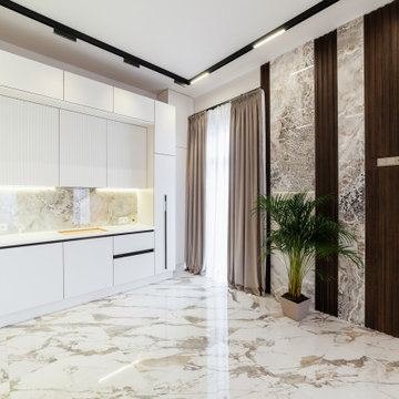
How to clean marble countertops? Marble is very beautiful and can turn an average kitchen or bathroom into a masterpiece, but it is very capricious - it stains even if a marble sealer was used properly. Make sure you wipe your kitchen countertops immediately every time after using it. If you are considering stone countertops like quartz countertops, granite countertops, porcelain countertops, quartzite countertops along with marble countertops, check out our competitive prices and large selection of stones at our Architecture Stones shop. For our customers in the DC Metro Area we do countertop installation, make stone products on site in our warehouse, and if one wants to buy a natural stone shelf, a stone slab, a stone sink, a shower bench, kitchen shelves, a stone table top, order a fire place mantel or a fireplace tile, a kitchen backsplash, stone tile, a vanity top - we will be happy to serve your needs.
 Grandeur Hills Group,Inc.
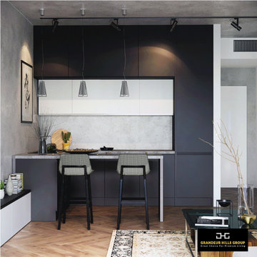
The kitchen is traditionally divided into several functional areas, one of which is a stylish large rectangular dining table with numerous chairs around it.
The dining table with the chairs are located in the form of an island in the center of the room and are highlighted with a special color, materials, as well as the light emitted by several large pendant lamps right above the dining table.
You can improve the interior design of your kitchen too. The Grandeur Hills Group design studio is always happy to help you do it properly.


 Gallotti&Radice
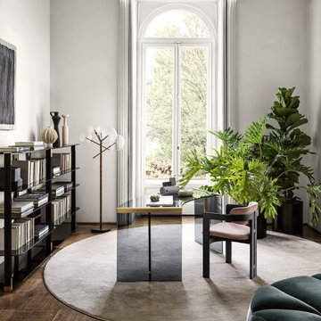
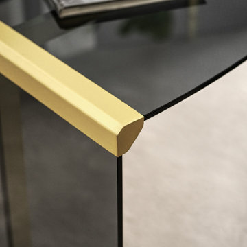
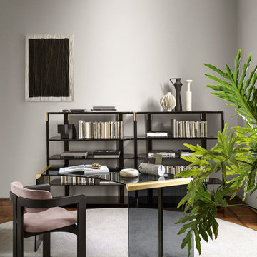
Desk in transparent tempered glass. Bright stainless steel metal parts. Satin stainless steel, bright or satin brass or embossed white or black lacquered metal parts, on request. For a proper cable management, a hole on the top can be arranged upon request. Minimum distancefrom the edge: 10cm.
 Gallotti&Radice
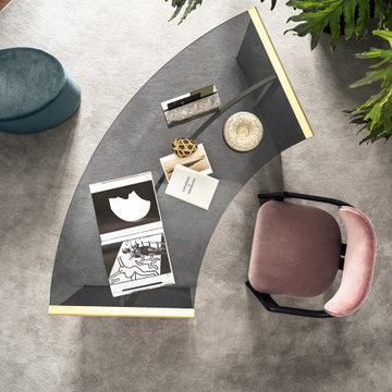
Desk in transparent tempered glass. Bright stainless steel metal parts. Satin stainless steel, bright or satin brass or embossed white or black lacquered metal parts, on request. For a proper cable management, a hole on the top can be arranged upon request. Minimum distancefrom the edge: 10cm.
 Gallotti&Radice
Desk in transparent tempered glass. Bright stainless steel metal parts. Satin stainless steel, bright or satin brass or embossed white or black lacquered metal parts, on request. For a proper cable management, a hole on the top can be arranged upon request. Minimum distancefrom the edge: 10cm.
 Gallotti&Radice
Desk in transparent tempered glass. Bright stainless steel metal parts. Satin stainless steel, bright or satin brass or embossed white or black lacquered metal parts, on request. For a proper cable management, a hole on the top can be arranged upon request. Minimum distancefrom the edge: 10cm.
 Design Studio West
Committing to a kosher kitchen is quite a daunting undertaking and when you are also taking on a complete remodel, it can be overwhelming. It does not, however, have to be insurmountable. There are many resources to help guide you through the experience. Check out the internet and magazines to guide you. Once you have done the initial research, contact your Rabi with questions and for clarification on a kosher kitchen. Kosher requirements can vary differently between Orthodox, Conservatism, Ultra Orthodox and Reform Judaism. Your Rabi most likely will have a list of rules and guidelines. Also, hire a professional kitchen designer. They will not only be able to design the needs of a kosher kitchen but also make it personal to your needs and beautiful too.
If the space and the budget allow, two distinct kitchens within one space is a possibility. A kosher kitchen requires stringent separation of meat and dairy items. Depending on the sect of Judaism you practice ------
Storage:
The Storage areas need space for two sets of dishes, pots and pans, flatware, cups and utensils. You can combine the storage areas as long as there is a separation and that you do not mix service ware. A good recommendation is to color code your plates, flatware, table linen, pots. For example, red plates, gold-colored flatware, copper pots for meat items while dairy items have white plates, stainless flatware, stainless pots. You may want to label each area so when you have your new sister-in-law help in the kitchen; everything stays in the correct place.
Appliances:
When selecting appliances look for the STAR-K logo. This will help you determine to what extent an appliance is Kosher. Some ovens will have Sabbath modes where they will turn on automatically at a predetermined time. Once the oven is open, the oven turns off. Some refrigerators also have Sabbath modes where the ice maker turns off on the Sabbath and back on the following day. One refrigerator is usually sufficient provided all foods stay on the proper container in the proper section of the refrigerator. Having an immaculately clean refrigerator is a must if this is the case. You do not want spills from one food source contaminating food from the other. If you decide on two refrigerators, one can be full size while the other is smaller. A good kitchen designer can help assess your family’s needs to determine which is best for you.
Dishwashers cannot be Kosher in most cases. You either need two dishwashers, separate compartment dishwashers as in dishwasher drawers or wash by hand. Look at Fisher Pikel or Kitchen Aid for dishwasher drawers. Each drawer is on separate controls. You can dedicate the top drawer for dairy while the bottom drawer is for meat service ware.
If you have space and decide to have two dishwashers, you can get two 24” wide dishwashers. Another option is to have one full size dishwasher and supplement it with a small 18” wide dishwasher. Miele makes an 18” wide dishwasher that is super quiet and cleans dishes very well. You may also opt for a single dishwasher drawer in addition to a full sized dishwasher.
A single Microwave oven can be used for milk and meat provided that a complete cover is used around the food. You will also need separate plastic plate’s places on the bottom or glass turn table. Keeping the unit clean is very important.
Counter tops:
Counter tops may or may not be able to be koshered depending on your sect. Simply having sets of trivets for dairy, meat and pareve (not meat or dairy) will provide adequate separation of foods.
Sinks:
If you can’t have two separate sinks, include three separate tubs to be places in the sink. Color code the tubs for meat, dairy and pareve. If you have one sink or a single divided sink, you will need to be cautious about splashing, to keep the meat and dairy particulates apart. You will also need space for separate dish cloths or sponges and dish towels. Again, color coding is extremely helpful and highly suggested.
Must Haves:
~Storage space for two sets of dishes, flatware, pans bowls
~Color Code and label where appropriate
~Separate burners dedicate for either meat or dairy
~Separate clean up areas
~Clean environment to avoid contamination between meat and dairy
~A space that functions for how you cook
~A space that reflects you
Design and remodel by Design Studio West
Brady Architectural Photography
 TKS Design Group
Download our free ebook, Creating the Ideal Kitchen. DOWNLOAD NOW
This client was referred to us from a past client. They are a busy 2-career household with young children and enjoy entertaining friends and family in their home. They have a beautiful open concept home but unfortunately the kitchen was not fitting for the rest of the home. They were not quite sure what to do with the space. We talked about trying to refresh it or do more of a minor remodel, but in the end they decided a full gut would get them to where they wanted to be.
One problem was there was no place for guests to hang out other than the large and awkward banquette area. The brick wall and tiled hood area were feeling a bit dated and tired. The space was just not functional for their lifestyle. There was no prep space near the cooktop and no landing area for items coming out of the ovens or refrigerator, plus a big dead zone in the center of the room.
Banquettes, like the one they previously had in the space, are great for small spaces, but when they get really large like this one, it makes getting in and out of the seating area awkward and uncomfortable. Plus, there was room for a large table, so we eliminated the awkward built in.
We started by removing the faux brick wall between the kitchen and back entry. We relocated the entry to the garage over a couple feet in order to get every last inch out of the new kitchen. We also made the decision to close up the primary window that faced the pretty ho hum brick wall of the neighbor’s house. There was plenty of light coming in from the seating area, so we just didn’t feel the window was adding much to the room.
Construction went smoothy. There was a bit of rework with electrical, flooring and HVAC, but in the end, we think it was well worth it.
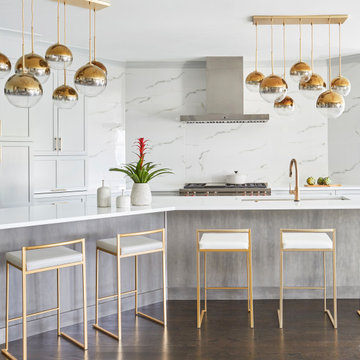
The clients really wanted a sleek contemporary look, and we originally had planned for a full height slab backsplash, but due to it’s size, it was a budget buster. Instead, we got creative and settled on large format porcelain tiles that have a similar feel but were a fraction of the cost. We made sure the wall was plumb and level so that the fit and finish would mimic that of slab material.
The final space was quite a change. A large prep sink sits directly across from the new pro-style range with plenty additional prep space on the large island. The refrigerator and ovens now have miles of landing space, and a nice tight work triangle makes cooking a breeze.
Since we wanted a more contemporary feel, not many wall cabinets were included. Instead, we outfitted some of the drawers for dish storage with a peg system. Two large pantries flanking the refrigerator hold baking supplies and small appliances. Large drawers by the cooktop hold pots and pans, and an appliance garage tucked away to the left of the range hides away miscellaneous items. The large island also houses a microwave drawer and tons of storage, most of which is drawers offering maximum convenience.
The island now seats 5-6 people comfortably along with the new table in the seating area which can seat up to 8. Entertaining will be a breeze in this space. With such a clean backdrop, we knew we would need some drama with the lighting, so we chose two sets of staggered pendants, which we adjusted for the right visual balance above the island.
We also included a small coffee station to the right of the main kitchen, which helps keep the coffee clutter out of the kitchen proper. Two tones of complimentary gray are featured in this kitchen. The perimeter is a light gray that reads almost white. The island is a gray stain that adds some depth and interest with the visible wood texture. The countertops are clean white quartz, and the hardware, barstools and light fixtures add warm brass tones. I see lots of cooking and entertaining with family and friends in the near future in this bright and airy new space.
Designed by: Susan Klimala, CKD, CBD
Photography by: Michael Kaskel
For more information on kitchen and bath design ideas go to: www.kitchenstudio-ge.com
 Grandeur Hills Group,Inc.
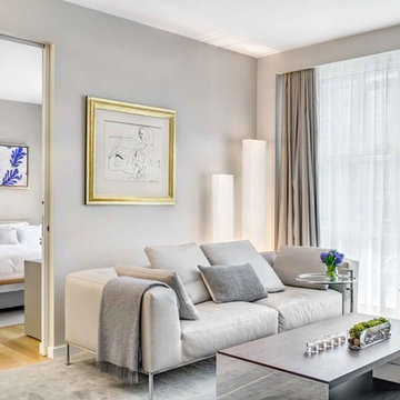
The entire interior of this beautiful living room is decorated in gray tones that create a warm, welcoming, and cozy atmosphere inside the room. Expressive decorative elements - living indoor plants, flowers, paintings, books, vases, curtains, and figurines - stand out against the background of the gray interior.
An elegant glass coffee table in the center of the living room, around which all the furniture pieces are concentrated, is the essence of the idea of our professional interior designers.
Make your living room stand out as well! The Grandeur Hills Group design studio is always ready to help you elevate your living room interior design properly!
23