
Search results for "Proportionate" in Home Design Ideas
 KALLISTA
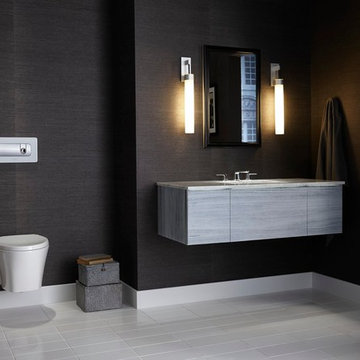
From Greek meaning “to float,” Pléo is a design that lifts elegant, modern form up off of the floor. Featuring a stylized, hourglass shaped bowl and a softly rounded actuator plate framed in smoky white glass, the Pléo wall-mounted toilet is a model of clean design. The dual-flush actuator buttons are intuitive to the touch with firm actuation. The bowl shape smoothly conforms to the wall in a straightforward approach and is proportionately scaled to fit any surrounding.
Pléo on KALLISTA.com | http://bit.ly/1jXw1li
 N C R
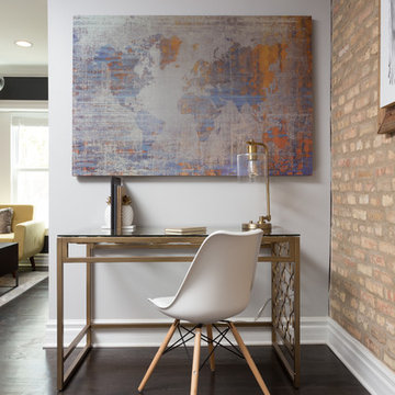
N C RUpon entering this studio oasis, one is met with an elegant but compact office area. This design made the most sense proportionately and functionally, as the desk is sleek and doesn’t take up too much space but offers somewhere (tucked out of view) to rest papers, keys, and other smaller items we tend to leave around.
Designed by Chi Renovation & Design who serve Chicago and it's surrounding suburbs, with an emphasis on the North Side and North Shore. You'll find their work from the Loop through Lincoln Park, Skokie, Wilmette, and all the way up to Lake Forest.
 Buchanan Construction
J. Weiland, Professional Photographer.
Paul Jackson, Aerial Photography.
Alice Dodson, Architect.
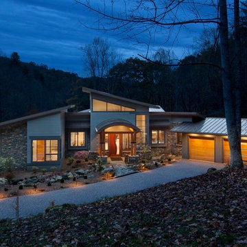
This Contemporary Mountain Home sits atop 50 plus acres in the Beautiful Mountains of Hot Springs, NC. Eye catching beauty and designs tribute local Architect, Alice Dodson and Team. Sloping roof lines intrigue and maximize natural light. This home rises high above the normal energy efficient standards with Geothermal Heating & Cooling System, Radiant Floor Heating, Kolbe Windows and Foam Insulation. Creative Owners put there heart & souls into the unique features. Exterior textured stone, smooth gray stucco around the glass blocks, smooth artisan siding with mitered corners and attractive landscaping collectively compliment. Cedar Wood Ceilings, Tile Floors, Exquisite Lighting, Modern Linear Fireplace and Sleek Clean Lines throughout please the intellect and senses.
Find the right local pro for your project
 Chris Hargis, CKD
Eat-in kitchen - mid-sized transitional galley ceramic tile eat-in kitchen idea with shaker cabinets, white cabinets, quartz countertops, beige backsplash, glass tile backsplash, stainless steel appliances and an island
 Castle Building & Remodeling
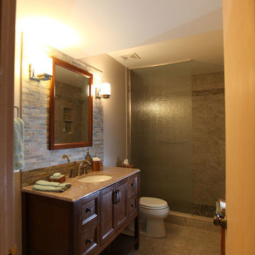
The basement bathroom of this 1975 split level needed some updating. The homeowner had found a few inspiration photos and a great natural stole tile that she wanted to use in the bathroom. we used the color variation of the stone to select the rest of the materials for the space. the existing bathroom had a small fiberglass shower and a linen cabinet at the back. we tore all of the of that out and installed a new larger tiled shower with a custom niche, grey pebble floor tile and rain textured glass panel. The toilet and vanity remained in the same location, but we shrunk the size of the vanity to make it more proportionate to the room. the new vanity was installed with a granite top, a natural stone tiled backsplash that continued to the ceiling, a coordinating mirror and square brushed nickel sconces.
 User
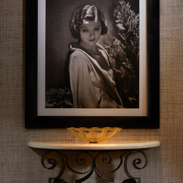
UserApproaching this project, I was faced with the challenge of an extensive collection within one home. The interior spatial architecture was proportionately large, but the rooms were filled with furnishings to fill the spaces; this resulted in a cluttered environment. My vision was to edit to the best and get rid of the rest.
 N C R
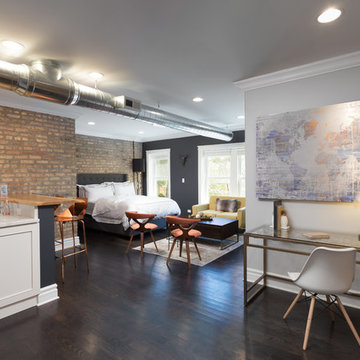
N C RUpon entering this studio oasis, one is met with an elegant but compact office area. This design made the most sense proportionately and functionally, as the desk is sleek and doesn’t take up too much space but offers somewhere (tucked out of view) to rest papers, keys, and other smaller items we tend to leave around.
Designed by Chi Renovation & Design who serve Chicago and it's surrounding suburbs, with an emphasis on the North Side and North Shore. You'll find their work from the Loop through Lincoln Park, Skokie, Wilmette, and all the way up to Lake Forest.
 Vision Design
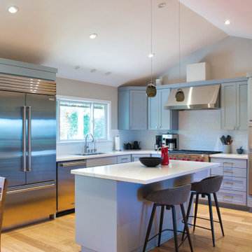
1960s enclosed kitchen with peninsula turned into an open kitchen to enjoy the beautiful views of the East Bay hills. We used gray cabinets and a full cathedral ceiling rather than a single-plane cathedral to modernize this kitchen and make it more proportionate to humans.
 Metropolis Drafting and Construction Inc
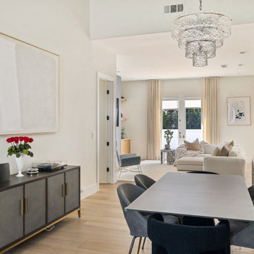
When our client bought this house, it was stuck in limbo between the traditional interior and a 90's modern structure.
The direction we took was a combination of calm beige color scheme with clean lines and smooth surfaces.
The continuation of the same materials throughout the house finally bonded all the different spaces into a singular home.
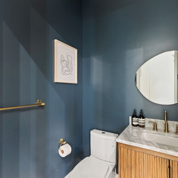
The two guest bathrooms were made with Cloe zellige style tiles and custom floating vanities made from white oak.
The same oak was used also for the built-in TV wall as floating shelves and base cabinets with a large, tiled center piece for the recessed TV and the electric fireplace.
The kitchen also received some of the white oak love in the form of the Island and the recessed cooking area.
The biggest issue with the kitchen space was the lack of proportions between the width and its length vs. the extreme height of the vaulted ceiling.
The solution I came up with was a secondary line of wall cabinets to be the same depth as the full height units to create a wrap around and make the space more proportionate.
Continuing to the master bathroom, here we have a true walk-in master bath suite, no door needed with this size of space.
All the walls received porcelain semi slab treatment. (72x36 porcelain tile) a lot of work went into selecting the correct tile pieces to give it the effect of a single slab installation but without the added cost.
All fixtures are by Kohler with their fantastic modern gold finish.
The result was a perfect flow of calm beige colors and warmth of natural wood throughout.
 Metropolis Drafting and Construction Inc
When our client bought this house, it was stuck in limbo between the traditional interior and a 90's modern structure.
The direction we took was a combination of calm beige color scheme with clean lines and smooth surfaces.
The continuation of the same materials throughout the house finally bonded all the different spaces into a singular home.
The two guest bathrooms were made with Cloe zellige style tiles and custom floating vanities made from white oak.
The same oak was used also for the built-in TV wall as floating shelves and base cabinets with a large, tiled center piece for the recessed TV and the electric fireplace.
The kitchen also received some of the white oak love in the form of the Island and the recessed cooking area.
The biggest issue with the kitchen space was the lack of proportions between the width and its length vs. the extreme height of the vaulted ceiling.
The solution I came up with was a secondary line of wall cabinets to be the same depth as the full height units to create a wrap around and make the space more proportionate.
Continuing to the master bathroom, here we have a true walk-in master bath suite, no door needed with this size of space.
All the walls received porcelain semi slab treatment. (72x36 porcelain tile) a lot of work went into selecting the correct tile pieces to give it the effect of a single slab installation but without the added cost.
All fixtures are by Kohler with their fantastic modern gold finish.
The result was a perfect flow of calm beige colors and warmth of natural wood throughout.
 Metropolis Drafting and Construction Inc
When our client bought this house, it was stuck in limbo between the traditional interior and a 90's modern structure.
The direction we took was a combination of calm beige color scheme with clean lines and smooth surfaces.
The continuation of the same materials throughout the house finally bonded all the different spaces into a singular home.
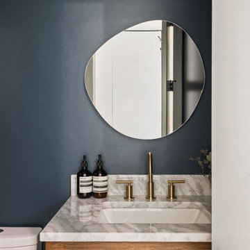
The two guest bathrooms were made with Cloe zellige style tiles and custom floating vanities made from white oak.
The same oak was used also for the built-in TV wall as floating shelves and base cabinets with a large, tiled center piece for the recessed TV and the electric fireplace.
The kitchen also received some of the white oak love in the form of the Island and the recessed cooking area.
The biggest issue with the kitchen space was the lack of proportions between the width and its length vs. the extreme height of the vaulted ceiling.
The solution I came up with was a secondary line of wall cabinets to be the same depth as the full height units to create a wrap around and make the space more proportionate.
Continuing to the master bathroom, here we have a true walk-in master bath suite, no door needed with this size of space.
All the walls received porcelain semi slab treatment. (72x36 porcelain tile) a lot of work went into selecting the correct tile pieces to give it the effect of a single slab installation but without the added cost.
All fixtures are by Kohler with their fantastic modern gold finish.
The result was a perfect flow of calm beige colors and warmth of natural wood throughout.
 TFLarkin, Inc
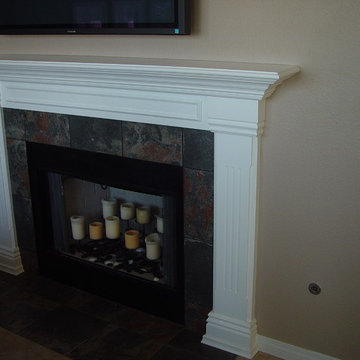
Mantle tops that support large posts or columns will stick out further from the wall. But the legs should stay proportionate in size.
Living room - traditional living room idea in San Diego
Living room - traditional living room idea in San Diego
 Badin Lake Builders
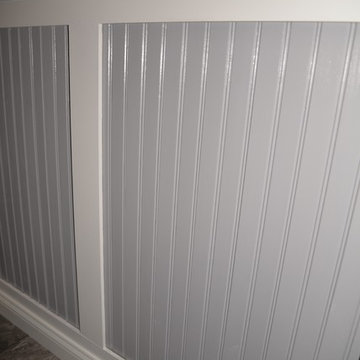
Example of a small classic gray tile and porcelain tile home design design with a pedestal sink, a two-piece toilet and gray walls
 Vision Design
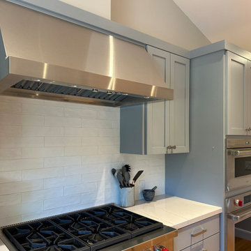
1960s enclosed kitchen with peninsula turned into an open kitchen to enjoy the beautiful views of the East Bay hills. We used gray cabinets and a full cathedral ceiling rather than a single-plane cathedral to modernize this kitchen and make it more proportionate to humans.
 Metropolis Drafting and Construction Inc
When our client bought this house, it was stuck in limbo between the traditional interior and a 90's modern structure.
The direction we took was a combination of calm beige color scheme with clean lines and smooth surfaces.
The continuation of the same materials throughout the house finally bonded all the different spaces into a singular home.
The two guest bathrooms were made with Cloe zellige style tiles and custom floating vanities made from white oak.
The same oak was used also for the built-in TV wall as floating shelves and base cabinets with a large, tiled center piece for the recessed TV and the electric fireplace.
The kitchen also received some of the white oak love in the form of the Island and the recessed cooking area.
The biggest issue with the kitchen space was the lack of proportions between the width and its length vs. the extreme height of the vaulted ceiling.
The solution I came up with was a secondary line of wall cabinets to be the same depth as the full height units to create a wrap around and make the space more proportionate.
Continuing to the master bathroom, here we have a true walk-in master bath suite, no door needed with this size of space.
All the walls received porcelain semi slab treatment. (72x36 porcelain tile) a lot of work went into selecting the correct tile pieces to give it the effect of a single slab installation but without the added cost.
All fixtures are by Kohler with their fantastic modern gold finish.
The result was a perfect flow of calm beige colors and warmth of natural wood throughout.
 TFLarkin, Inc
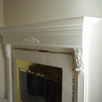
Mantle tops that support large posts or columns will stick out further from the wall. But the legs should stay proportionate in size.
Elegant living room photo in San Diego
Elegant living room photo in San Diego
 Vision Design
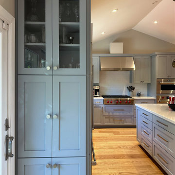
1960s enclosed kitchen with peninsula turned into an open kitchen to enjoy the beautiful views of the East Bay hills. We used gray cabinets and a full cathedral ceiling rather than a single-plane cathedral to modernize this kitchen and make it more proportionate to humans.
 Pravin Bakrania
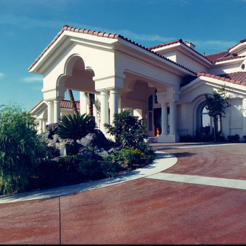
Pair of columns are proportionate to the mass of port-cochere.
Mediterranean exterior home idea in Las Vegas
Mediterranean exterior home idea in Las Vegas

 NJ Architecture Design Studio
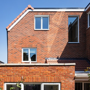
The rear elevation of the Seymour Road loft conversion shows the hip-to-gable extension and newly added dormer windows. Careful brickwork matching and proportionate detailing ensure the new addition integrates seamlessly with the existing home, while modern rooflights maximise natural light within the new en-suite bedrooms.
15