
Search results for "Public appearances" in Home Design Ideas
 Hugh Jefferson Randolph Architects
Casey Dunn
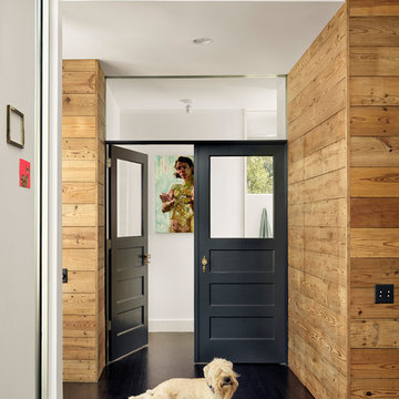
Inspiration for a contemporary dark wood floor and black floor hallway remodel in Austin
Inspiration for a contemporary dark wood floor and black floor hallway remodel in Austin
 Monogram Decor
Photo by Adza
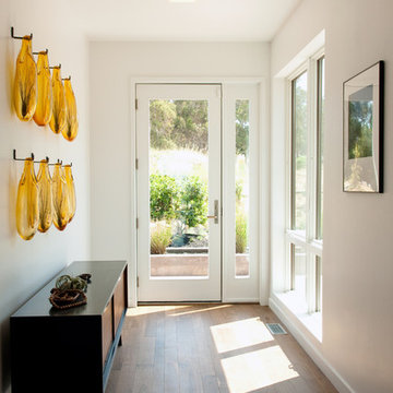
Entryway - small contemporary medium tone wood floor entryway idea in San Francisco with white walls and a white front door
Entryway - small contemporary medium tone wood floor entryway idea in San Francisco with white walls and a white front door
 Brooks + Scarpa Architects
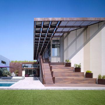
The Yin-Yang House is a net-zero energy single-family home in a quiet Venice, CA neighborhood. The design objective was to create a space for a large and growing family with several children, which would create a calm, relaxed and organized environment that emphasizes public family space. The home also serves as a place to entertain, and a welcoming space for teenagers as they seek social space with friends.
The home is organized around a series of courtyards and other outdoor spaces that integrate with the interior of the house. Facing the street the house appears to be solid. However, behind the steel entry door is a courtyard, which reveals the indoor-outdoor nature of the house behind the solid exterior. From the entry courtyard, the entire space to the rear garden wall can be seen; the first clue of the home’s spatial connection between inside and out. These spaces are designed for entertainment, and the 40 foot sliding glass door to the living room enhances the harmonic relationship of the main room, allowing the owners to host many guests without the feeling of being overburdened.
The tensions of the house’s exterior are subtly underscored by a 12-inch steel band that hews close to, but sometimes rises above or falls below the floor line of the second floor – a continuous loop moving inside and out like a pen that is never lifted from the page, but reinforces the intent to spatially weave together the indoors with the outside as a single space.
Scale manipulation also plays a formal role in the design of the structure. From the rear, the house appears to be a single-story volume. The large master bedroom window and the outdoor steps are scaled to support this illusion. It is only when the steps are animated with people that one realizes the true scale of the house is two stories.
The kitchen is the heart of the house, with an open working area that allows the owner, an accomplished chef, to converse with friends while cooking. Bedrooms are intentionally designed to be very small and simple; allowing for larger public spaces, emphasizing the family over individual domains. The breakfast room looks across an outdoor courtyard to the guest room/kids playroom, establishing a visual connection while defining the separation of uses. The children can play outdoors while under adult supervision from the dining area or the office, or do homework in the office while adults occupy the adjacent outdoor or indoor space.
Many of the materials used, including the bamboo interior, composite stone and tile countertops and bathroom finishes are recycled, and reinforce the environmental DNA of the house, which also has a green roof. Blown-in cellulose insulation, radiant heating and a host of other sustainable features aids in the performance of the building’s heating and cooling.
The active systems in the home include a 12 KW solar photovoltaic panel system, the largest such residential system available on the market. The solar panels also provide shade from the sun, preventing the house from becoming overheated. The owners have been in the home for over nine months and have yet to receive a power bill.
Find the right local pro for your project
 J Taylor Designs
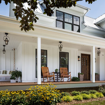
Inspiration for a mid-sized cottage white two-story wood exterior home remodel in Nashville
 ZeroEnergy Design
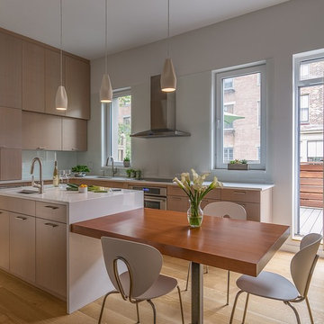
This renovated brick rowhome in Boston’s South End offers a modern aesthetic within a historic structure, creative use of space, exceptional thermal comfort, a reduced carbon footprint, and a passive stream of income.
DESIGN PRIORITIES. The goals for the project were clear - design the primary unit to accommodate the family’s modern lifestyle, rework the layout to create a desirable rental unit, improve thermal comfort and introduce a modern aesthetic. We designed the street-level entry as a shared entrance for both the primary and rental unit. The family uses it as their everyday entrance - we planned for bike storage and an open mudroom with bench and shoe storage to facilitate the change from shoes to slippers or bare feet as they enter their home. On the main level, we expanded the kitchen into the dining room to create an eat-in space with generous counter space and storage, as well as a comfortable connection to the living space. The second floor serves as master suite for the couple - a bedroom with a walk-in-closet and ensuite bathroom, and an adjacent study, with refinished original pumpkin pine floors. The upper floor, aside from a guest bedroom, is the child's domain with interconnected spaces for sleeping, work and play. In the play space, which can be separated from the work space with new translucent sliding doors, we incorporated recreational features inspired by adventurous and competitive television shows, at their son’s request.
MODERN MEETS TRADITIONAL. We left the historic front facade of the building largely unchanged - the security bars were removed from the windows and the single pane windows were replaced with higher performing historic replicas. We designed the interior and rear facade with a vision of warm modernism, weaving in the notable period features. Each element was either restored or reinterpreted to blend with the modern aesthetic. The detailed ceiling in the living space, for example, has a new matte monochromatic finish, and the wood stairs are covered in a dark grey floor paint, whereas the mahogany doors were simply refinished. New wide plank wood flooring with a neutral finish, floor-to-ceiling casework, and bold splashes of color in wall paint and tile, and oversized high-performance windows (on the rear facade) round out the modern aesthetic.
RENTAL INCOME. The existing rowhome was zoned for a 2-family dwelling but included an undesirable, single-floor studio apartment at the garden level with low ceiling heights and questionable emergency egress. In order to increase the quality and quantity of space in the rental unit, we reimagined it as a two-floor, 1 or 2 bedroom, 2 bathroom apartment with a modern aesthetic, increased ceiling height on the lowest level and provided an in-unit washer/dryer. The apartment was listed with Jackie O'Connor Real Estate and rented immediately, providing the owners with a source of passive income.
ENCLOSURE WITH BENEFITS. The homeowners sought a minimal carbon footprint, enabled by their urban location and lifestyle decisions, paired with the benefits of a high-performance home. The extent of the renovation allowed us to implement a deep energy retrofit (DER) to address air tightness, insulation, and high-performance windows. The historic front facade is insulated from the interior, while the rear facade is insulated on the exterior. Together with these building enclosure improvements, we designed an HVAC system comprised of continuous fresh air ventilation, and an efficient, all-electric heating and cooling system to decouple the house from natural gas. This strategy provides optimal thermal comfort and indoor air quality, improved acoustic isolation from street noise and neighbors, as well as a further reduced carbon footprint. We also took measures to prepare the roof for future solar panels, for when the South End neighborhood’s aging electrical infrastructure is upgraded to allow them.
URBAN LIVING. The desirable neighborhood location allows the both the homeowners and tenant to walk, bike, and use public transportation to access the city, while each charging their respective plug-in electric cars behind the building to travel greater distances.
OVERALL. The understated rowhouse is now ready for another century of urban living, offering the owners comfort and convenience as they live life as an expression of their values.
Photography: Eric Roth Photo
 KBG Design
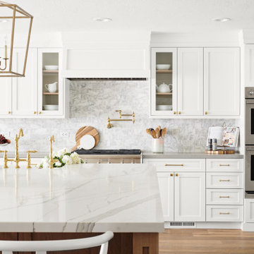
Kitchen - large scandinavian l-shaped light wood floor and beige floor kitchen idea in San Francisco with a farmhouse sink, white cabinets, white backsplash, stainless steel appliances, an island, recessed-panel cabinets, quartzite countertops, marble backsplash and white countertops
 Bruns Architecture
Tricia Shay Photography
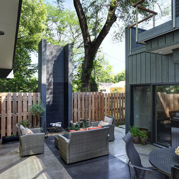
Example of a large trendy courtyard concrete patio design in Milwaukee with no cover
Example of a large trendy courtyard concrete patio design in Milwaukee with no cover
 Bruns Architecture
Tricia Shay Photography
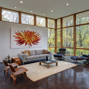
Living room - large contemporary formal and open concept concrete floor and brown floor living room idea in Milwaukee with white walls
Living room - large contemporary formal and open concept concrete floor and brown floor living room idea in Milwaukee with white walls
 Harwick Homes
Giovanni Photography
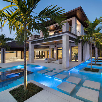
Pool - tropical backyard stamped concrete and custom-shaped pool idea in Miami
Pool - tropical backyard stamped concrete and custom-shaped pool idea in Miami

 Choate + Hertlein Architects
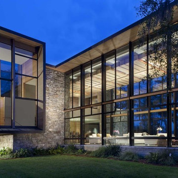
The house first appears sphinx-like and mostly solid with a weathered wood form atop stone walls that extend through the site to define exterior spaces. Proceeding into the house, the public spaces become transparent, with the exception of a solid fireplace wall to the east.
Phillip Spears Photographer
 Himsben Design Studio, LLC
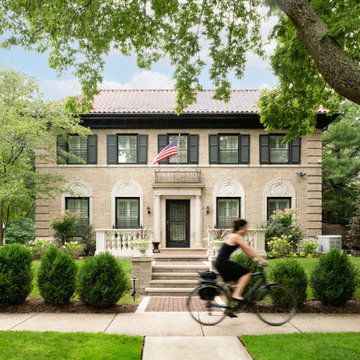
Our client acquired this historic home full of charm and details, but the architecture was hidden by an overgrown landscape that had a variety of styles, lacking cohesion. Our team worked with the client, the village, and the historical review committee to develop a new landscape design that highlighted the unique architectural features of the home.
The design intent was to create a new landscape that looked as though it had always been there. We reduced an oversized circle driveway, added clay brick paver walkways, and built a new terrace with balustrades in front of the home to evoke the original architectural drawings from the home’s design from the 1920s. The design also re-connected the face of the home to the public walkway, creating a more welcoming entry that had been abandoned sometime in the 1950s. Layers of color, textures, and seasonal interest create a foundation of plantings to anchor the home’s stately appearance.
 OLSON LEWIS + Architects
Contractor: David Clough
Photographer: Dan Gair/Blind Dog Photo, Inc.
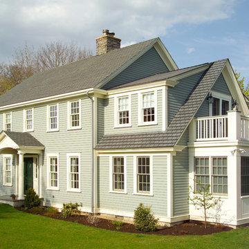
This period home straddles two centuries and dual roles. As the home for the headmaster of an independent high school, it is also considered a school asset as a facility for visitors. Formal details define the public rooms that accommodate school functions. A ground-floor guest suite hosts campus visitors. The catering-quality kitchen, like a hinge, connects the intimate living quarters to formal spaces. The heart of their family sanctuary is the great room just beyond the kitchen. The headmaster holds occasional student classes in his living room, connecting students to this campus legacy. He and his wife can see the front door of the main building from his upstairs window. Boundaries between public and private life are sensitively articulated throughout.
 Mosher Dolan, Inc.
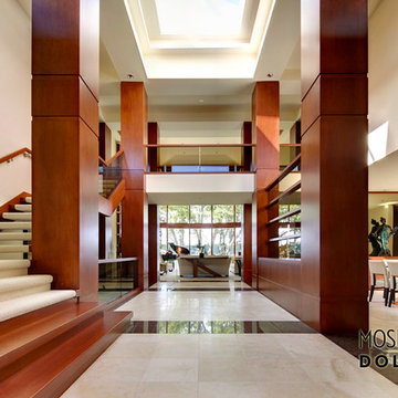
This brilliant, open entry hall leaves you breathless with its heavy, solid wooden accents and its light and open ceiling.
Example of a huge trendy marble floor entry hall design in Detroit with white walls
Example of a huge trendy marble floor entry hall design in Detroit with white walls
 Dynia Architects
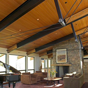
This mountain vacation residence places the living and sleeping space for a family of three on the main level with guest bedrooms, recreation rooms, and garage below. The sloped site allows approach and entry on the main level, achieving the appearance of a one-story house. The scheme is an L-shaped, open-plan building containing primary living space covered with a shed roof. This configuration forms a “courtyard” facing southeast, which contains the main entry. Intersected with the shed roof component the mudroom, bedroom, and master closet and bath are contained in “cabins” of stone with arced roofs. The roof support at the northwest corner has been eliminated to allow a sliding glass system which, when open, voids the corner of the family room. This allows the living space to extend onto an elevated concrete terrace overlooking the view.
The result is a living environment that distinguishes public from private uses with form and space, provides outdoor areas of contrasting characteristics in a place of sharp seasonal contrast, and creates an image that blends with the landscape.

 Pollination Press LLC
Prairie Phlox / Phlox pilosa
This is an example of a landscaping in Minneapolis.
This is an example of a landscaping in Minneapolis.
 Black + Vernooy Architects
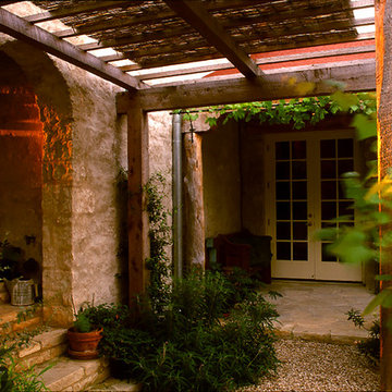
Inspired by the owners' travels in the Mediterranean region yet rooted firmly in Texas soil, this single family residence is designed to provide a secluded, comfortable environment for observing nature, relaxing, entertaining, living, and working. The oddly shaped site determined a house that is removed from the street, resulting in a long drive through a wooded area that leads to the gently sloping house site. The house is designed around a large, central public living area. The basic "H" shaped plan reaches out to define the entry court as well as the rear yard area. The building can only be seen in small vignettes as one moves around and through it, and is finally understood from inside the main room. The public space is central to the plan, where rooms overlay and flow through and into one another. Private rooms are tucked away in more remote parts of the site. The guest bedrooms are located at a slightly lower level, and a remote study, reached by a ship's ladder, overlooks the main living area and enjoys its own roof terrace. The central part of the house is designed as a solid, strong, "original" building to which other wings are added as if built over time. The client desired that the house appear to be of no discernible style or period, and seem older rather than newer.
Built By: Dalgleish Construction Co.
Photography By: Paul Bardagjy
 William Prull
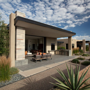
This gorgeous home, situated in the Commonwealth subdivision of the Galisteo Basin Preserve, was designed to accommodate the beautiful but sometimes harsh weather of the Basin. Built around an inner courtyard, buffered to the somewhat inclement conditions, it allows for seasonal year around enjoyment. The floor to ceiling windows, European Reynaers Aluminum, were imported from Ireland, and appear as glassy walls that disappear into pocketing doors ensuring magnificent wraparound views.
The grand entrance, encased with an oversized custom steel and brass entry door, with glass side panel and transom, open up to soaring illuminated recessed lit ceilings. Porcelain tile floors seamlessly transition between interior/exterior. An impressive 3-sided Ortal fireplace provides warmth and coziness encapsulating the entire great room. The excellence of the materials and exclusive nature of the finishes are expressed in a tailored and sophisticated manner.
The 4,332 heated per square foot home is designed with two Master Suite wings that spin off the main great room. The state-of-the-art kitchen is sleek and spacious with an expansive island comprised of Elegant Brown granite countertops, luxury modern Italian Poliform custom cabinets and high-end Gaggenau appliances. The home has a highly efficient engineered heating/cooling system with heat radiant floors and Unico air conditioning.
A detached guest casita/art studio sits adjacent to the main house, on a lushly landscaped protected courtyard. The exterior landscaping is organically integrated into the natural terrain, incorporating a bocce ball court, walking labyrinth, sculpture and water features.
AWARDS
2016 AIA Santa Fe Design Excellence: Citation Award- Single Family Home
PUBLICATIONS
Santa Fe New Mexican – HOME/Santa Fe Real Estate Guide– January 2017 – A Courtyard Centered Gem in the Galisteo Basin
Western Art & Architecture Magazine – February/March 2016 – Finding Home
TESTIMONIAL
After researching several builders in Santa Fe and then interviewing the ones of interest, we decided on Will Prull as he seemed to instantly connect to what we wanted and how to achieve it. He was also highly recommended by our architect. Our Project Manager was excellent and helped us make decisions that creep up between the plans and the actual building. Our house won the AIA award in 2016 for Santa Fe. When choosing your builder, the most important thing is that your Project Manager understands your direction and has your best interests at heart. Our's did!
ARCHITECT
Hoopes + Associates Architects, , Santa Fe, NM
INTERIORS
Paul Rau Interiors, Santa Fe, NM
LANDSCAPE ARCHITECT
Sequis + Associates Landscape Architecture, Santa Fe, NM
 Susan Yeley Homes
This gem of a house was built in the 1950s, when its neighborhood undoubtedly felt remote. The university footprint has expanded in the 70 years since, however, and today this home sits on prime real estate—easy biking and reasonable walking distance to campus.
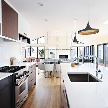
When it went up for sale in 2017, it was largely unaltered. Our clients purchased it to renovate and resell, and while we all knew we'd need to add square footage to make it profitable, we also wanted to respect the neighborhood and the house’s own history. Swedes have a word that means “just the right amount”: lagom. It is a guiding philosophy for us at SYH, and especially applied in this renovation. Part of the soul of this house was about living in just the right amount of space. Super sizing wasn’t a thing in 1950s America. So, the solution emerged: keep the original rectangle, but add an L off the back.
With no owner to design with and for, SYH created a layout to appeal to the masses. All public spaces are the back of the home--the new addition that extends into the property’s expansive backyard. A den and four smallish bedrooms are atypically located in the front of the house, in the original 1500 square feet. Lagom is behind that choice: conserve space in the rooms where you spend most of your time with your eyes shut. Put money and square footage toward the spaces in which you mostly have your eyes open.
In the studio, we started calling this project the Mullet Ranch—business up front, party in the back. The front has a sleek but quiet effect, mimicking its original low-profile architecture street-side. It’s very Hoosier of us to keep appearances modest, we think. But get around to the back, and surprise! lofted ceilings and walls of windows. Gorgeous.
 Dibello Architects, PLLC
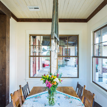
The 3,400 SF, 3 – bedroom, 3 ½ bath main house feels larger than it is because we pulled the kids’ bedroom wing and master suite wing out from the public spaces and connected all three with a TV Den.
Convenient ranch house features include a porte cochere at the side entrance to the mud room, a utility/sewing room near the kitchen, and covered porches that wrap two sides of the pool terrace.
We designed a separate icehouse to showcase the owner’s unique collection of Texas memorabilia. The building includes a guest suite and a comfortable porch overlooking the pool.
The main house and icehouse utilize reclaimed wood siding, brick, stone, tie, tin, and timbers alongside appropriate new materials to add a feeling of age.
3