
Search results for "Purchase properties" in Home Design Ideas

 StudioLAB
Nestled at the end of a long flag lot driveway in Amagansett, NY, a young couple purchased the property with intentions to construct a second home for their growing family. A home that would not only be comfortable for the immediate family but also serve and grow on busy summer weekends to accommodate extended family, friends, children and guests. The tight lot along with the sizable program culminated in the building envelope being pushed to every limit, restriction and regulation one could imagine. The resulting architecture possesses a traditional Hamptons cottage exterior juxtaposed with modern elements that help break up the single mass. Centered on the entry façade is a large double story window that shrouds the floating switchback staircase on the interior. A bluestone patio wraps three sides of the home, which, in the rear, leads to a small in ground pool with a frameless glass railing. In the interior, custom white washed white oak floors run throughout the home as well as on the floating central staircase. For a more modern style of living, the open living, kitchen and dining area serve as one large entertaining space. In an area surrounded by sprawling Mcmansions, this tightly knit home functions more similar to that of a large NYC apartment by serving the perfect balance between maximized form with the right amount of function given the strict parameters. Large glass sliders open the living and dining rooms to the backyard patio and pool creating harmony between the indoor and outdoor spaces. Shaker style cabinets in the kitchen pair with a more contemporary staircase softened by the warmer wood tones of the vertical slats that surround it.

 Amy Martin Landscape Design
Location: Cohasset, MA, USA
When my clients purchased this historic house, they saw that this garden held great potential, even though the property had been somewhat neglected. They wanted the new landscape to evoke the feeling of an Olde Maine house that time had forgotten. Sitting on the front veranda in the shade of the treasured Horse Chestnut and Maple trees that flank each side of the house, we explored the possibilities together.
The front yard sloped a bit too much for comfort, so we determined that building a stone wall in the middle would create a terrace, making both parts of the lawn more usable. Visions of parties and children's weddings came to mind. We put a set of elegant arching steps in the middle, leading down to the sunken garden.
Large, mature Rhododendrons were planted at the base of the Horse Chestnut and Maple trees just off the front veranda. Boxwoods undulate beneath the trees with Vinca as a ground cover.
Ticonderoga stone was used for the walls and steps, which was the closest match to the existing stone foundation. The exquisite masonry by Doug Brooks Masonry makes this staircase as elegant as a tiered wedding cake.
The front veranda is furnished with comfortable pieces and simple ferns, where they sit in the shade, watching sunsets on the harbor.

 Deslaurier Custom Cabinets
Cory Residence
Decidedly Scandinavian influence, and minimalist details make this sleek kitchen shine.
When the owners purchased this property, it was dramatically different from the new layout.
All very closed off – with only small openings between each room, making the space feel dark and small. Walls were removed, and the kitchen was moved from the original dining location to create a better a relationship from room to room. This enabled a large wrap around peninsula that transitions into a bar with wine cooler and use as a dining server. Ample seating for casual eating flanks the living room side of the peninsula, with simple post details. The overall result has dramatically improved the look and function of the space which can accommodate several helpers at one time.
The Warm grey cabinetry and walnut accented hood and floating shelves a moody, masculine palate and adds feeling of warmth to the space, while the white upper cabinets provide the needed lightness to balance it all off. Blending the combination of shaker styled upper cabinetry provides just enough detail to the design. The thermofoil dark grey slab door base cabinetry adds the right touch of modern, and ensures ease of clean up of base cabinetry for a busy household. The hexagonal tile backsplash carried up to the ceiling draws the eye upward giving the illusion of more height in the space, and adds texture and added warmth. Accessories such as the spice pull out cabinetry which flank each side of the range providing easy access storage for need at hand items.
Find the right local pro for your project
 Deslaurier Custom Cabinets
Cory Residence
Decidedly Scandinavian influence, and minimalist details make this sleek kitchen shine.
When the owners purchased this property, it was dramatically different from the new layout.
All very closed off – with only small openings between each room, making the space feel dark and small. Walls were removed, and the kitchen was moved from the original dining location to create a better a relationship from room to room. This enabled a large wrap around peninsula that transitions into a bar with wine cooler and use as a dining server. Ample seating for casual eating flanks the living room side of the peninsula, with simple post details. The overall result has dramatically improved the look and function of the space which can accommodate several helpers at one time.
The Warm grey cabinetry and walnut accented hood and floating shelves a moody, masculine palate and adds feeling of warmth to the space, while the white upper cabinets provide the needed lightness to balance it all off. Blending the combination of shaker styled upper cabinetry provides just enough detail to the design. The thermofoil dark grey slab door base cabinetry adds the right touch of modern, and ensures ease of clean up of base cabinetry for a busy household. The hexagonal tile backsplash carried up to the ceiling draws the eye upward giving the illusion of more height in the space, and adds texture and added warmth. Accessories such as the spice pull out cabinetry which flank each side of the range providing easy access storage for need at hand items.

 Regan Baker Design Inc.
Intentional. Elevated. Artisanal.
With three children under the age of 5, our clients were starting to feel the confines of their Pacific Heights home when the expansive 1902 Italianate across the street went on the market. After learning the home had been recently remodeled, they jumped at the chance to purchase a move-in ready property. We worked with them to infuse the already refined, elegant living areas with subtle edginess and handcrafted details, and also helped them reimagine unused space to delight their little ones.
Elevated furnishings on the main floor complement the home’s existing high ceilings, modern brass bannisters and extensive walnut cabinetry. In the living room, sumptuous emerald upholstery on a velvet side chair balances the deep wood tones of the existing baby grand. Minimally and intentionally accessorized, the room feels formal but still retains a sharp edge—on the walls moody portraiture gets irreverent with a bold paint stroke, and on the the etagere, jagged crystals and metallic sculpture feel rugged and unapologetic. Throughout the main floor handcrafted, textured notes are everywhere—a nubby jute rug underlies inviting sofas in the family room and a half-moon mirror in the living room mixes geometric lines with flax-colored fringe.
On the home’s lower level, we repurposed an unused wine cellar into a well-stocked craft room, with a custom chalkboard, art-display area and thoughtful storage. In the adjoining space, we installed a custom climbing wall and filled the balance of the room with low sofas, plush area rugs, poufs and storage baskets, creating the perfect space for active play or a quiet reading session. The bold colors and playful attitudes apparent in these spaces are echoed upstairs in each of the children’s imaginative bedrooms.
Architect + Developer: McMahon Architects + Studio, Photographer: Suzanna Scott Photography

 Michael Nash Design, Build & Homes
Built in the 1950s, this rambler housed a dark, cramped galley kitchen only 6’ x 20’. A later addition added more space, but wasn’t optimally designed. So, when they purchased the property, the new owners did so with the intent of gutting and remodeling the first floor.
The goal of the renovation was to create a functional, dedicated kitchen and dining room space while keeping many of the home’s historic touches. The first step was to remove the bearing wall between kitchen and living room and install a structural beam to create a seamless connection between the two spaces.
A large center island was designed to be the focal point of the space, complete with a new farm sink and room to serve four or more people. A professional range with a stylish wooden hood was installed and custom cabinets wrap around the entire kitchen to provide plenty of storage.
Meanwhile, a custom-built hutch was installed in the dining room area, as was a butler’s pantry, to add more flair to the project. A timeless tile backsplash was installed to spruce up the soft color granite top which was carefully selected to harmonize with cabinet and floor color schemes.
The lighting was revamped and redesigned for entire space, including a couple of hanging pendants over the island. Wide plank distressed hardwood flooring was installed all over the kitchen and dining room to maintain the integrity of historic look.
With all new appliances, linen-stained maple cabinetry and distressed wood Island, old world hickory floor and more, this project moved from its dysfunctional status to fun and funky.

 Jarrett Design
This remodel was a dated 1980s Cape Cod style home that desperately needed updating with the kitchen starting as the foundation for the rest of the home. The owners purchased the property in 2013 with the intent of replacing the existing kitchen installed in 2000, as well as updating most surfaces throughout the home. The space while moderately sized, felt cramped due to the L-shaped design and eat-in island that disrupted traffic flow from the mudroom, dining room and sliding doors to the patio. The owners knew they wanted to bring the light from the southern facing front of the home to the dark cave-like feeling of the kitchen. This was remedied by knocking down the wall between the existing dining room (now a lounge area), widening the entrance to the family room and creating a pathway to the existing formal living room (now the dining room). Also to create better traffic flow into the kitchen, the existing mudroom door was moved to the opposite side of the wall.
A large work island with cooktop, oven and convection/microwave was designed for efficiency and maintaining clean site lines. The work triangle allows for quick and easy meal prep and clean-up for the busy family. Space at the end of the kitchen was perfectly suited for a large kitchen table with views of the back yard, easy conversation with the cook at the island or those hanging in the newly appointed lounge area. The new doorway between the kitchen and dining room showcases the 10ft floor to ceiling bay window, allows more light to flood into the space and creates easy access between the two rooms for family gatherings. Given the home owners relocated to the area for job reasons and are not sure how long they will be in this home, we helped them achieve a balance of a design and finishes that they not only love, but would be appealing to many if another move was in their near future.
Matt Villano Photography
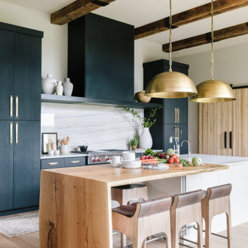

 Michael Nash Design, Build & Homes
Built in the 1950s, this rambler housed a dark, cramped galley kitchen only 6’ x 20’. A later addition added more space, but wasn’t optimally designed. So, when they purchased the property, the new owners did so with the intent of gutting and remodeling the first floor.
The goal of the renovation was to create a functional, dedicated kitchen and dining room space while keeping many of the home’s historic touches. The first step was to remove the bearing wall between kitchen and living room and install a structural beam to create a seamless connection between the two spaces.
A large center island was designed to be the focal point of the space, complete with a new farm sink and room to serve four or more people. A professional range with a stylish wooden hood was installed and custom cabinets wrap around the entire kitchen to provide plenty of storage.
Meanwhile, a custom-built hutch was installed in the dining room area, as was a butler’s pantry, to add more flair to the project. A timeless tile backsplash was installed to spruce up the soft color granite top which was carefully selected to harmonize with cabinet and floor color schemes.
The lighting was revamped and redesigned for entire space, including a couple of hanging pendants over the island. Wide plank distressed hardwood flooring was installed all over the kitchen and dining room to maintain the integrity of historic look.
With all new appliances, linen-stained maple cabinetry and distressed wood Island, old world hickory floor and more, this project moved from its dysfunctional status to fun and funky.

 Braswell Design+Build
This client sought to update their recently purchased home in Alexandria. A gourmet kitchen that complemented the size of the home and property was a top priority. They wanted more light-filled and connected living spaces for their growing family. Updating the finishes throughout the home was also a necessity.
Design challenges included an existing utility space that occupied a large portion of the kitchen footprint, making the kitchen cramped and narrow. In addition, the foyer was dark, confined and uninviting as a result of its organization and enclosed nature of the main stair.
To overcome the challenges, we relocated the utilities, creating a more usable footprint for the kitchen. The aging furnace was replaced with a high efficiency furnace located in a newly insulated and conditioned crawl space. A new hot water heater was placed in the finished attic, and the electrical panel was also relocated. Then, we designed a portion of the kitchen to mask the need for dropped structural headers: the refrigerator, freezer and pantry were placed under the area that necessitated a drop bulkhead, creating a sleek built-in area for the appliances.
Once the utilities were moved, the kitchen could be opened up to a large family room and designed with a much-improved layout. Two new four-panel exterior doors replaced small doors at the family room to connect the main living space with the beautiful yard. In addition, white bead board was added to the family room ceiling, creating more visual continuity with the adjacent white kitchen.
To transform the foyer into a grand and welcoming entry, a small amount of space was taken from a large second floor bedroom, and the entire second floor structure was supported with a series of flush beams to allow the stair to be opened and expose the rail. New glass doors to the den, relocated at an angle from the main stair provide the foyer with more natural light and a wider, more inviting path to the kitchen.
In the master suite, the bedroom and bathroom entry doors were relocated to improve the room’s layout and offer more bathroom privacy and space for a walk-in closet. A room forgotten by the previous owner was turned into a family mudroom with built-ins and wainscoting to keep the family organized in style.
Photography by Greg Hadley
 Amy Martin Landscape Design
Location: Cohasset, MA, USA
When my clients purchased this historic house, they saw that this garden held great potential, even though the property had been somewhat neglected. They wanted the new landscape to evoke the feeling of an Olde Maine house that time had forgotten. Sitting on the front veranda in the shade of the treasured Horse Chestnut and Maple trees that flank each side of the house, we explored the possibilities together.
The front yard sloped a bit too much for comfort, so we determined that building a stone wall in the middle would create a terrace, making both parts of the lawn more usable. Visions of parties and children's weddings came to mind. We put a set of elegant arching steps in the middle, leading down to the sunken garden.
Large, mature Rhododendrons were planted at the base of the Horse Chestnut and Maple trees just off the front veranda. Boxwoods undulate beneath the trees with Vinca as a ground cover.
Ticonderoga stone was used for the walls and steps, which was the closest match to the existing stone foundation. The exquisite masonry by Doug Brooks Masonry makes this staircase as elegant as a tiered wedding cake.
The side entrance has a courtyard feeling, as its outlined with stone walls and accented with containers set on pea stone.
 StudioLAB
Nestled at the end of a long flag lot driveway in Amagansett, NY, a young couple purchased the property with intentions to construct a second home for their growing family. A home that would not only be comfortable for the immediate family but also serve and grow on busy summer weekends to accommodate extended family, friends, children and guests. The tight lot along with the sizable program culminated in the building envelope being pushed to every limit, restriction and regulation one could imagine. The resulting architecture possesses a traditional Hamptons cottage exterior juxtaposed with modern elements that help break up the single mass. Centered on the entry façade is a large double story window that shrouds the floating switchback staircase on the interior. A bluestone patio wraps three sides of the home, which, in the rear, leads to a small in ground pool with a frameless glass railing. In the interior, custom white washed white oak floors run throughout the home as well as on the floating central staircase. For a more modern style of living, the open living, kitchen and dining area serve as one large entertaining space. In an area surrounded by sprawling Mcmansions, this tightly knit home functions more similar to that of a large NYC apartment by serving the perfect balance between maximized form with the right amount of function given the strict parameters. Large glass sliders open the living and dining rooms to the backyard patio and pool creating harmony between the indoor and outdoor spaces. Shaker style cabinets in the kitchen pair with a more contemporary staircase softened by the warmer wood tones of the vertical slats that surround it.

 AoDK Inc.
A couple wanted a weekend retreat without spending a majority of their getaway in an automobile. Therefore, a lot was purchased along the Rocky River with the vision of creating a nearby escape less than five miles away from their home. This 1,300 sf 24’ x 24’ dwelling is divided into a four square quadrant with the goal to create a variety of interior and exterior experiences while maintaining a rather small footprint.
Typically, when going on a weekend retreat one has the drive time to decompress. However, without this, the goal was to create a procession from the car to the house to signify such change of context. This concept was achieved through the use of a wood slatted screen wall which must be passed through. After winding around a collection of poured concrete steps and walls one comes to a wood plank bridge and crosses over a Japanese garden leaving all the stresses of the daily world behind.
The house is structured around a nine column steel frame grid, which reinforces the impression one gets of the four quadrants. The two rear quadrants intentionally house enclosed program space but once passed through, the floor plan completely opens to long views down to the mouth of the river into Lake Erie.
On the second floor the four square grid is stacked with one quadrant removed for the two story living area on the first floor to capture heightened views down the river. In a move to create complete separation there is a one quadrant roof top office with surrounding roof top garden space. The rooftop office is accessed through a unique approach by exiting onto a steel grated staircase which wraps up the exterior facade of the house. This experience provides an additional retreat within their weekend getaway, and serves as the apex of the house where one can completely enjoy the views of Lake Erie disappearing over the horizon.
Visually the house extends into the riverside site, but the four quadrant axis also physically extends creating a series of experiences out on the property. The Northeast kitchen quadrant extends out to become an exterior kitchen & dining space. The two-story Northwest living room quadrant extends out to a series of wrap around steps and lounge seating. A fire pit sits in this quadrant as well farther out in the lawn. A fruit and vegetable garden sits out in the Southwest quadrant in near proximity to the shed, and the entry sequence is contained within the Southeast quadrant extension. Internally and externally the whole house is organized in a simple and concise way and achieves the ultimate goal of creating many different experiences within a rationally sized footprint.
Photo: Sergiu Stoian
 Regan Baker Design Inc.
Intentional. Elevated. Artisanal.
With three children under the age of 5, our clients were starting to feel the confines of their Pacific Heights home when the expansive 1902 Italianate across the street went on the market. After learning the home had been recently remodeled, they jumped at the chance to purchase a move-in ready property. We worked with them to infuse the already refined, elegant living areas with subtle edginess and handcrafted details, and also helped them reimagine unused space to delight their little ones.
Elevated furnishings on the main floor complement the home’s existing high ceilings, modern brass bannisters and extensive walnut cabinetry. In the living room, sumptuous emerald upholstery on a velvet side chair balances the deep wood tones of the existing baby grand. Minimally and intentionally accessorized, the room feels formal but still retains a sharp edge—on the walls moody portraiture gets irreverent with a bold paint stroke, and on the the etagere, jagged crystals and metallic sculpture feel rugged and unapologetic. Throughout the main floor handcrafted, textured notes are everywhere—a nubby jute rug underlies inviting sofas in the family room and a half-moon mirror in the living room mixes geometric lines with flax-colored fringe.
On the home’s lower level, we repurposed an unused wine cellar into a well-stocked craft room, with a custom chalkboard, art-display area and thoughtful storage. In the adjoining space, we installed a custom climbing wall and filled the balance of the room with low sofas, plush area rugs, poufs and storage baskets, creating the perfect space for active play or a quiet reading session. The bold colors and playful attitudes apparent in these spaces are echoed upstairs in each of the children’s imaginative bedrooms.
Architect + Developer: McMahon Architects + Studio, Photographer: Suzanna Scott Photography

Sponsored
Sunbury, OH

J.Holderby - Renovations
Franklin County's Leading General Contractors - 2X Best of Houzz!

 ODS Architecture
Atherton has many large substantial homes - our clients purchased an existing home on a one acre flag-shaped lot and asked us to design a new dream home for them. The result is a new 7,000 square foot four-building complex consisting of the main house, six-car garage with two car lifts, pool house with a full one bedroom residence inside, and a separate home office /work out gym studio building. A fifty-foot swimming pool was also created with fully landscaped yards.
Given the rectangular shape of the lot, it was decided to angle the house to incoming visitors slightly so as to more dramatically present itself. The house became a classic u-shaped home but Feng Shui design principals were employed directing the placement of the pool house to better contain the energy flow on the site. The main house entry door is then aligned with a special Japanese red maple at the end of a long visual axis at the rear of the site. These angles and alignments set up everything else about the house design and layout, and views from various rooms allow you to see into virtually every space tracking movements of others in the home.
The residence is simply divided into two wings of public use, kitchen and family room, and the other wing of bedrooms, connected by the living and dining great room. Function drove the exterior form of windows and solid walls with a line of clerestory windows which bring light into the middle of the large home. Extensive sun shadow studies with 3D tree modeling led to the unorthodox placement of the pool to the north of the home, but tree shadow tracking showed this to be the sunniest area during the entire year.
Sustainable measures included a full 7.1kW solar photovoltaic array technically making the house off the grid, and arranged so that no panels are visible from the property. A large 16,000 gallon rainwater catchment system consisting of tanks buried below grade was installed. The home is California GreenPoint rated and also features sealed roof soffits and a sealed crawlspace without the usual venting. A whole house computer automation system with server room was installed as well. Heating and cooling utilize hot water radiant heated concrete and wood floors supplemented by heat pump generated heating and cooling.
A compound of buildings created to form balanced relationships between each other, this home is about circulation, light and a balance of form and function.
Photo by John Sutton Photography.
 ODS Architecture
Atherton has many large substantial homes - our clients purchased an existing home on a one acre flag-shaped lot and asked us to design a new dream home for them. The result is a new 7,000 square foot four-building complex consisting of the main house, six-car garage with two car lifts, pool house with a full one bedroom residence inside, and a separate home office /work out gym studio building. A fifty-foot swimming pool was also created with fully landscaped yards.
Given the rectangular shape of the lot, it was decided to angle the house to incoming visitors slightly so as to more dramatically present itself. The house became a classic u-shaped home but Feng Shui design principals were employed directing the placement of the pool house to better contain the energy flow on the site. The main house entry door is then aligned with a special Japanese red maple at the end of a long visual axis at the rear of the site. These angles and alignments set up everything else about the house design and layout, and views from various rooms allow you to see into virtually every space tracking movements of others in the home.
The residence is simply divided into two wings of public use, kitchen and family room, and the other wing of bedrooms, connected by the living and dining great room. Function drove the exterior form of windows and solid walls with a line of clerestory windows which bring light into the middle of the large home. Extensive sun shadow studies with 3D tree modeling led to the unorthodox placement of the pool to the north of the home, but tree shadow tracking showed this to be the sunniest area during the entire year.
Sustainable measures included a full 7.1kW solar photovoltaic array technically making the house off the grid, and arranged so that no panels are visible from the property. A large 16,000 gallon rainwater catchment system consisting of tanks buried below grade was installed. The home is California GreenPoint rated and also features sealed roof soffits and a sealed crawlspace without the usual venting. A whole house computer automation system with server room was installed as well. Heating and cooling utilize hot water radiant heated concrete and wood floors supplemented by heat pump generated heating and cooling.
A compound of buildings created to form balanced relationships between each other, this home is about circulation, light and a balance of form and function.
Photo by John Sutton Photography.

 Zelaya Properties LLC
We used: Custom cherry cabinetry in Arts & Crafts Shaker style by Kabinart in Boulder and Espresso stains. Liberty Hardware Venetian bronze 1-1/2" cabinet knobs. KitchenAid Architect II Series 22 CF counter-depth French door refrigerator. KitchenAid Architect Series II 27" convection single wall oven. KitchenAid 36" 6-burner dual fuel freestanding commercial-style range. KitchenAid Architect II Series 24" dishwasher. Sharp Insight Pro Series 24" built-in microwave drawer (Model #KB6524PS). Crystorama Solaris 12" wide pendant lights in English bronze. Granite countertops in Brown Fantasy. 3"x6" polished marble backsplash.
Paint colors:
Walls: Glidden Silver Cloud 30YY 63/024
Ceilings/Trims/Doors: Glidden Swan White GLC23
Robert B. Narod Photography
 StudioLAB
Nestled at the end of a long flag lot driveway in Amagansett, NY, a young couple purchased the property with intentions to construct a second home for their growing family. A home that would not only be comfortable for the immediate family but also serve and grow on busy summer weekends to accommodate extended family, friends, children and guests. The tight lot along with the sizable program culminated in the building envelope being pushed to every limit, restriction and regulation one could imagine. The resulting architecture possesses a traditional Hamptons cottage exterior juxtaposed with modern elements that help break up the single mass. Centered on the entry façade is a large double story window that shrouds the floating switchback staircase on the interior. A bluestone patio wraps three sides of the home, which, in the rear, leads to a small in ground pool with a frameless glass railing. In the interior, custom white washed white oak floors run throughout the home as well as on the floating central staircase. For a more modern style of living, the open living, kitchen and dining area serve as one large entertaining space. In an area surrounded by sprawling Mcmansions, this tightly knit home functions more similar to that of a large NYC apartment by serving the perfect balance between maximized form with the right amount of function given the strict parameters. Large glass sliders open the living and dining rooms to the backyard patio and pool creating harmony between the indoor and outdoor spaces. Shaker style cabinets in the kitchen pair with a more contemporary staircase softened by the warmer wood tones of the vertical slats that surround it.
Sponsored
Delaware, OH

Buckeye Basements, Inc.
Central Ohio's Basement Finishing ExpertsBest Of Houzz '13-'21
 Jarrett Design
This remodel was a dated 1980s Cape Cod style home that desperately needed updating with the kitchen starting as the foundation for the rest of the home. The owners purchased the property in 2013 with the intent of replacing the existing kitchen installed in 2000, as well as updating most surfaces throughout the home. The space while moderately sized, felt cramped due to the L-shaped design and eat-in island that disrupted traffic flow from the mudroom, dining room and sliding doors to the patio. The owners knew they wanted to bring the light from the southern facing front of the home to the dark cave-like feeling of the kitchen. This was remedied by knocking down the wall between the existing dining room (now a lounge area), widening the entrance to the family room and creating a pathway to the existing formal living room (now the dining room). Also to create better traffic flow into the kitchen, the existing mudroom door was moved to the opposite side of the wall.
A large work island with cooktop, oven and convection/microwave was designed for efficiency and maintaining clean site lines. The work triangle allows for quick and easy meal prep and clean-up for the busy family. Space at the end of the kitchen was perfectly suited for a large kitchen table with views of the back yard, easy conversation with the cook at the island or those hanging in the newly appointed lounge area. The new doorway between the kitchen and dining room showcases the 10ft floor to ceiling bay window, allows more light to flood into the space and creates easy access between the two rooms for family gatherings. Given the home owners relocated to the area for job reasons and are not sure how long they will be in this home, we helped them achieve a balance of a design and finishes that they not only love, but would be appealing to many if another move was in their near future.
Matt Villano Photography
 Jarrett Design
This remodel was a dated 1980s Cape Cod style home that desperately needed updating with the kitchen starting as the foundation for the rest of the home. The owners purchased the property in 2013 with the intent of replacing the existing kitchen installed in 2000, as well as updating most surfaces throughout the home. The space while moderately sized, felt cramped due to the L-shaped design and eat-in island that disrupted traffic flow from the mudroom, dining room and sliding doors to the patio. The owners knew they wanted to bring the light from the southern facing front of the home to the dark cave-like feeling of the kitchen. This was remedied by knocking down the wall between the existing dining room (now a lounge area), widening the entrance to the family room and creating a pathway to the existing formal living room (now the dining room). Also to create better traffic flow into the kitchen, the existing mudroom door was moved to the opposite side of the wall.
A large work island with cooktop, oven and convection/microwave was designed for efficiency and maintaining clean site lines. The work triangle allows for quick and easy meal prep and clean-up for the busy family. Space at the end of the kitchen was perfectly suited for a large kitchen table with views of the back yard, easy conversation with the cook at the island or those hanging in the newly appointed lounge area. The new doorway between the kitchen and dining room showcases the 10ft floor to ceiling bay window, allows more light to flood into the space and creates easy access between the two rooms for family gatherings. Given the home owners relocated to the area for job reasons and are not sure how long they will be in this home, we helped them achieve a balance of a design and finishes that they not only love, but would be appealing to many if another move was in their near future.
Matt Villano Photography
 Regan Baker Design Inc.
Intentional. Elevated. Artisanal.
With three children under the age of 5, our clients were starting to feel the confines of their Pacific Heights home when the expansive 1902 Italianate across the street went on the market. After learning the home had been recently remodeled, they jumped at the chance to purchase a move-in ready property. We worked with them to infuse the already refined, elegant living areas with subtle edginess and handcrafted details, and also helped them reimagine unused space to delight their little ones.
Elevated furnishings on the main floor complement the home’s existing high ceilings, modern brass bannisters and extensive walnut cabinetry. In the living room, sumptuous emerald upholstery on a velvet side chair balances the deep wood tones of the existing baby grand. Minimally and intentionally accessorized, the room feels formal but still retains a sharp edge—on the walls moody portraiture gets irreverent with a bold paint stroke, and on the the etagere, jagged crystals and metallic sculpture feel rugged and unapologetic. Throughout the main floor handcrafted, textured notes are everywhere—a nubby jute rug underlies inviting sofas in the family room and a half-moon mirror in the living room mixes geometric lines with flax-colored fringe.
On the home’s lower level, we repurposed an unused wine cellar into a well-stocked craft room, with a custom chalkboard, art-display area and thoughtful storage. In the adjoining space, we installed a custom climbing wall and filled the balance of the room with low sofas, plush area rugs, poufs and storage baskets, creating the perfect space for active play or a quiet reading session. The bold colors and playful attitudes apparent in these spaces are echoed upstairs in each of the children’s imaginative bedrooms.
Architect + Developer: McMahon Architects + Studio, Photographer: Suzanna Scott Photography
67