
Search results for "Purchase properties" in Home Design Ideas

 Regan Baker Design Inc.
Intentional. Elevated. Artisanal.
With three children under the age of 5, our clients were starting to feel the confines of their Pacific Heights home when the expansive 1902 Italianate across the street went on the market. After learning the home had been recently remodeled, they jumped at the chance to purchase a move-in ready property. We worked with them to infuse the already refined, elegant living areas with subtle edginess and handcrafted details, and also helped them reimagine unused space to delight their little ones.
Elevated furnishings on the main floor complement the home’s existing high ceilings, modern brass bannisters and extensive walnut cabinetry. In the living room, sumptuous emerald upholstery on a velvet side chair balances the deep wood tones of the existing baby grand. Minimally and intentionally accessorized, the room feels formal but still retains a sharp edge—on the walls moody portraiture gets irreverent with a bold paint stroke, and on the the etagere, jagged crystals and metallic sculpture feel rugged and unapologetic. Throughout the main floor handcrafted, textured notes are everywhere—a nubby jute rug underlies inviting sofas in the family room and a half-moon mirror in the living room mixes geometric lines with flax-colored fringe.
On the home’s lower level, we repurposed an unused wine cellar into a well-stocked craft room, with a custom chalkboard, art-display area and thoughtful storage. In the adjoining space, we installed a custom climbing wall and filled the balance of the room with low sofas, plush area rugs, poufs and storage baskets, creating the perfect space for active play or a quiet reading session. The bold colors and playful attitudes apparent in these spaces are echoed upstairs in each of the children’s imaginative bedrooms.
Architect + Developer: McMahon Architects + Studio, Photographer: Suzanna Scott Photography
 Regan Baker Design Inc.
Intentional. Elevated. Artisanal.
With three children under the age of 5, our clients were starting to feel the confines of their Pacific Heights home when the expansive 1902 Italianate across the street went on the market. After learning the home had been recently remodeled, they jumped at the chance to purchase a move-in ready property. We worked with them to infuse the already refined, elegant living areas with subtle edginess and handcrafted details, and also helped them reimagine unused space to delight their little ones.
Elevated furnishings on the main floor complement the home’s existing high ceilings, modern brass bannisters and extensive walnut cabinetry. In the living room, sumptuous emerald upholstery on a velvet side chair balances the deep wood tones of the existing baby grand. Minimally and intentionally accessorized, the room feels formal but still retains a sharp edge—on the walls moody portraiture gets irreverent with a bold paint stroke, and on the the etagere, jagged crystals and metallic sculpture feel rugged and unapologetic. Throughout the main floor handcrafted, textured notes are everywhere—a nubby jute rug underlies inviting sofas in the family room and a half-moon mirror in the living room mixes geometric lines with flax-colored fringe.
On the home’s lower level, we repurposed an unused wine cellar into a well-stocked craft room, with a custom chalkboard, art-display area and thoughtful storage. In the adjoining space, we installed a custom climbing wall and filled the balance of the room with low sofas, plush area rugs, poufs and storage baskets, creating the perfect space for active play or a quiet reading session. The bold colors and playful attitudes apparent in these spaces are echoed upstairs in each of the children’s imaginative bedrooms.
Architect + Developer: McMahon Architects + Studio, Photographer: Suzanna Scott Photography

 Advance Design Studio, Ltd.
This 1930's Barrington Hills farmhouse was in need of some TLC when it was purchased by this southern family of five who planned to make it their new home. The renovation taken on by Advance Design Studio's designer Scott Christensen and master carpenter Justin Davis included a custom porch, custom built in cabinetry in the living room and children's bedrooms, 2 children's on-suite baths, a guest powder room, a fabulous new master bath with custom closet and makeup area, a new upstairs laundry room, a workout basement, a mud room, new flooring and custom wainscot stairs with planked walls and ceilings throughout the home.
The home's original mechanicals were in dire need of updating, so HVAC, plumbing and electrical were all replaced with newer materials and equipment. A dramatic change to the exterior took place with the addition of a quaint standing seam metal roofed farmhouse porch perfect for sipping lemonade on a lazy hot summer day.
In addition to the changes to the home, a guest house on the property underwent a major transformation as well. Newly outfitted with updated gas and electric, a new stacking washer/dryer space was created along with an updated bath complete with a glass enclosed shower, something the bath did not previously have. A beautiful kitchenette with ample cabinetry space, refrigeration and a sink was transformed as well to provide all the comforts of home for guests visiting at the classic cottage retreat.
The biggest design challenge was to keep in line with the charm the old home possessed, all the while giving the family all the convenience and efficiency of modern functioning amenities. One of the most interesting uses of material was the porcelain "wood-looking" tile used in all the baths and most of the home's common areas. All the efficiency of porcelain tile, with the nostalgic look and feel of worn and weathered hardwood floors. The home’s casual entry has an 8" rustic antique barn wood look porcelain tile in a rich brown to create a warm and welcoming first impression.
Painted distressed cabinetry in muted shades of gray/green was used in the powder room to bring out the rustic feel of the space which was accentuated with wood planked walls and ceilings. Fresh white painted shaker cabinetry was used throughout the rest of the rooms, accentuated by bright chrome fixtures and muted pastel tones to create a calm and relaxing feeling throughout the home.
Custom cabinetry was designed and built by Advance Design specifically for a large 70” TV in the living room, for each of the children’s bedroom’s built in storage, custom closets, and book shelves, and for a mudroom fit with custom niches for each family member by name.
The ample master bath was fitted with double vanity areas in white. A generous shower with a bench features classic white subway tiles and light blue/green glass accents, as well as a large free standing soaking tub nestled under a window with double sconces to dim while relaxing in a luxurious bath. A custom classic white bookcase for plush towels greets you as you enter the sanctuary bath.
Joe Nowak
Find the right local pro for your project
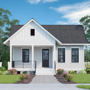
 Real Estate Renderings
3D Real Estate Renderings
If you are looking for High-Quality Real Estate Rendering Services at a Lowest and Unbeatable Price, then we are here to assist you. We provide Photo-realistic and Professional 3D Real Estate Renderings at an insanely low price. This lowest pricing is only possible, because of our operations technical team set-up in India, large volume and bulk orders, and matured-efficient operations delivery process. At this price, we do offer high-quality real estate 3D renderings, using the most advanced Real Estate 3D Rendering Software i.e. 3DsMax (for 3D modeling) and V-ray (for 3D rendering). This software combination makes the best possible photo-realistic rendering images.3D Renderings are a very powerful marketing tool. Customers do not want to see your property in 2D, they want to SEE IT! There is nothing more effective than seeing a 3D Rendering of your property. With today’s technology you can give your customers the ability to look at your home from any angle and even close up. This will eliminate the guessing game for buyers and help them make that all important decision to purchase.
Our photo-realistic 3D renderings are unmatched in quality. We can give you an incredible virtual tour of your property that will have interested buyers, brokers and real estate agents wanting to see more. Our 3D renderings come with unlimited revisions, so you can tweak and make changes until you’re satisfied.
Our team of professional, highly-trained 3D Renderersspecialize in turning your ideas and design concepts into photo-realistic images that look virtually the same as a photograph. We specialize in custom designs and will work with you until you are 100% satisfied with your rendering. No project is too large or too small!
We provide realistic, visual marketing solutions in order to give you the edge in today’s competitive housing market. We produce stunning 3D virtual tours and 3D rendered animations (Movies). Our marketing packages are unmatched in quality, creativity and affordability. Whether you are a realtor who wants to sell your client’s property or an investor looking for outstanding 3D renderings for your next project, we have a solution for you!
3D Real Estate Renderings are undeniably the most effective way to sell a property and they are our specialty. We’ll take your property from drab to fab by creating a beautiful, custom 3D real estate renderingthat will get you the highest price possible. Our designers will polish your home to perfection, bringing out its best features through lighting and camera angles, in order to create the most compelling visual presentation of your listing or product.
Professional Out-of-the-Box 3D Real Estate Renderings for your REDFIN ZILLOW, and other real estate website. We take the guesswork out of selling your home by creating online showings that will make buyers feel like they have already toured your home in person. Our 3D renderings are customized to fit the style of a specific location, such as the architecture or neighborhood of a property. This customization gives our virtual tours an authentic look that is unparalleled among other competitors’ presentations.
Other Services:
Real Estate Rendering Services
Real Estate Rendering Company
Real Estate Rendering Companies
Digital Real Estate Renderings
3D Real Estate Renderings
Real Estate 3D Rendering
High-Quality Real Estate Renderings
Real Estate Renderings

 PPG PROLUXE Wood Finishes
A beautiful blend of traditional and contemporary styles. Finished with PPG® PROLUXE™ Cetol® Log & Siding in Natural.
Large traditional brown three-story wood house exterior idea with a hip roof and a shingle roof
Large traditional brown three-story wood house exterior idea with a hip roof and a shingle roof

 Picus Woodwrights
While we are not home inspectors, we are sometimes asked by clients who are considering buying an antique home to offer our thoughts and opinions on individual properties before they purchase them. Such was the case with Bryan and Erin in Smithfield, Rhode Island. When they called, they had already looked at the early nineteenth-century center chimney colonial on the hilltop and they were interested in looking again. Much of the house was original and, as is often the case in two-hundred-year-old buildings, long of tooth and ready for a new family to move in.
Erin and Bryan decided to be that family and we were thrilled to work with them to make the house their own. That started with performing a full structural evaluation of the existing house and determining what repairs they needed to consider. We also designed a single-storey shed style addition that would house a new kitchen and bathroom.
As with many projects undertaken on old buildings, it is wise to approach the work with a master plan in mind. We understand and share the hard truth that owning an antique property is often a financial burden and the decision to do so an expression of passion for… something different. Working with Bryan and Erin, we developed a master plan that established outlines for the work to happen over time.
They started with extensive structural repairs in the basement and portions of the exterior walls. We also added a new foundation for the addition and decided to reframe the flooring system through the original house out through the addition. This spared us the task of rebuilding the original collapsing foundation along that wall. We created a kitchen with an open floorplan but used reclaimed hard pine flooring through the addition to match the original floors elsewhere. We also reproduced any original millwork from elsewhere in the house for the added space.
Erin and Bryan aren’t farmers but they could be. Even before they moved in, they planted gardens and as our work wound down, they sent us home with vegetables daily.

 ODS Architecture
Atherton has many large substantial homes - our clients purchased an existing home on a one acre flag-shaped lot and asked us to design a new dream home for them. The result is a new 7,000 square foot four-building complex consisting of the main house, six-car garage with two car lifts, pool house with a full one bedroom residence inside, and a separate home office /work out gym studio building. A fifty-foot swimming pool was also created with fully landscaped yards.
Given the rectangular shape of the lot, it was decided to angle the house to incoming visitors slightly so as to more dramatically present itself. The house became a classic u-shaped home but Feng Shui design principals were employed directing the placement of the pool house to better contain the energy flow on the site. The main house entry door is then aligned with a special Japanese red maple at the end of a long visual axis at the rear of the site. These angles and alignments set up everything else about the house design and layout, and views from various rooms allow you to see into virtually every space tracking movements of others in the home.
The residence is simply divided into two wings of public use, kitchen and family room, and the other wing of bedrooms, connected by the living and dining great room. Function drove the exterior form of windows and solid walls with a line of clerestory windows which bring light into the middle of the large home. Extensive sun shadow studies with 3D tree modeling led to the unorthodox placement of the pool to the north of the home, but tree shadow tracking showed this to be the sunniest area during the entire year.
Sustainable measures included a full 7.1kW solar photovoltaic array technically making the house off the grid, and arranged so that no panels are visible from the property. A large 16,000 gallon rainwater catchment system consisting of tanks buried below grade was installed. The home is California GreenPoint rated and also features sealed roof soffits and a sealed crawlspace without the usual venting. A whole house computer automation system with server room was installed as well. Heating and cooling utilize hot water radiant heated concrete and wood floors supplemented by heat pump generated heating and cooling.
A compound of buildings created to form balanced relationships between each other, this home is about circulation, light and a balance of form and function.
Photo by John Sutton Photography.
Sponsored
Delaware, OH

Buckeye Basements, Inc.
Central Ohio's Basement Finishing ExpertsBest Of Houzz '13-'21
 Regan Baker Design Inc.
Intentional. Elevated. Artisanal.
With three children under the age of 5, our clients were starting to feel the confines of their Pacific Heights home when the expansive 1902 Italianate across the street went on the market. After learning the home had been recently remodeled, they jumped at the chance to purchase a move-in ready property. We worked with them to infuse the already refined, elegant living areas with subtle edginess and handcrafted details, and also helped them reimagine unused space to delight their little ones.
Elevated furnishings on the main floor complement the home’s existing high ceilings, modern brass bannisters and extensive walnut cabinetry. In the living room, sumptuous emerald upholstery on a velvet side chair balances the deep wood tones of the existing baby grand. Minimally and intentionally accessorized, the room feels formal but still retains a sharp edge—on the walls moody portraiture gets irreverent with a bold paint stroke, and on the the etagere, jagged crystals and metallic sculpture feel rugged and unapologetic. Throughout the main floor handcrafted, textured notes are everywhere—a nubby jute rug underlies inviting sofas in the family room and a half-moon mirror in the living room mixes geometric lines with flax-colored fringe.
On the home’s lower level, we repurposed an unused wine cellar into a well-stocked craft room, with a custom chalkboard, art-display area and thoughtful storage. In the adjoining space, we installed a custom climbing wall and filled the balance of the room with low sofas, plush area rugs, poufs and storage baskets, creating the perfect space for active play or a quiet reading session. The bold colors and playful attitudes apparent in these spaces are echoed upstairs in each of the children’s imaginative bedrooms.
Architect + Developer: McMahon Architects + Studio, Photographer: Suzanna Scott Photography
 Picus Woodwrights
While we are not home inspectors, we are sometimes asked by clients who are considering buying an antique home to offer our thoughts and opinions on individual properties before they purchase them. Such was the case with Bryan and Erin in Smithfield, Rhode Island. When they called, they had already looked at the early nineteenth-century center chimney colonial on the hilltop and they were interested in looking again. Much of the house was original and, as is often the case in two-hundred-year-old buildings, long of tooth and ready for a new family to move in.
Erin and Bryan decided to be that family and we were thrilled to work with them to make the house their own. That started with performing a full structural evaluation of the existing house and determining what repairs they needed to consider. We also designed a single-storey shed style addition that would house a new kitchen and bathroom.
As with many projects undertaken on old buildings, it is wise to approach the work with a master plan in mind. We understand and share the hard truth that owning an antique property is often a financial burden and the decision to do so an expression of passion for… something different. Working with Bryan and Erin, we developed a master plan that established outlines for the work to happen over time.
They started with extensive structural repairs in the basement and portions of the exterior walls. We also added a new foundation for the addition and decided to reframe the flooring system through the original house out through the addition. This spared us the task of rebuilding the original collapsing foundation along that wall. We created a kitchen with an open floorplan but used reclaimed hard pine flooring through the addition to match the original floors elsewhere. We also reproduced any original millwork from elsewhere in the house for the added space.
Erin and Bryan aren’t farmers but they could be. Even before they moved in, they planted gardens and as our work wound down, they sent us home with vegetables daily.
 Picus Woodwrights
While we are not home inspectors, we are sometimes asked by clients who are considering buying an antique home to offer our thoughts and opinions on individual properties before they purchase them. Such was the case with Bryan and Erin in Smithfield, Rhode Island. When they called, they had already looked at the early nineteenth-century center chimney colonial on the hilltop and they were interested in looking again. Much of the house was original and, as is often the case in two-hundred-year-old buildings, long of tooth and ready for a new family to move in.
Erin and Bryan decided to be that family and we were thrilled to work with them to make the house their own. That started with performing a full structural evaluation of the existing house and determining what repairs they needed to consider. We also designed a single-storey shed style addition that would house a new kitchen and bathroom.
As with many projects undertaken on old buildings, it is wise to approach the work with a master plan in mind. We understand and share the hard truth that owning an antique property is often a financial burden and the decision to do so an expression of passion for… something different. Working with Bryan and Erin, we developed a master plan that established outlines for the work to happen over time.
They started with extensive structural repairs in the basement and portions of the exterior walls. We also added a new foundation for the addition and decided to reframe the flooring system through the original house out through the addition. This spared us the task of rebuilding the original collapsing foundation along that wall. We created a kitchen with an open floorplan but used reclaimed hard pine flooring through the addition to match the original floors elsewhere. We also reproduced any original millwork from elsewhere in the house for the added space.
Erin and Bryan aren’t farmers but they could be. Even before they moved in, they planted gardens and as our work wound down, they sent us home with vegetables daily.

 Amy Martin Landscape Design
Location: Cohasset, MA, USA
When my clients purchased this historic house, they saw that this garden held great potential, even though the property had been somewhat neglected. They wanted the new landscape to evoke the feeling of an Olde Maine house that time had forgotten. Sitting on the front veranda in the shade of the treasured Horse Chestnut and Maple trees that flank each side of the house, we explored the possibilities together.
The front yard sloped a bit too much for comfort, so we determined that building a stone wall in the middle would create a terrace, making both parts of the lawn more usable. Visions of parties and children's weddings came to mind. We put a set of elegant arching steps in the middle, leading down to the sunken garden.
Large, mature Rhododendrons were planted at the base of the Horse Chestnut and Maple trees just off the front veranda. Boxwoods undulate beneath the trees with Vinca as a ground cover.
Ticonderoga stone was used for the walls and steps, which was the closest match to the existing stone foundation. The exquisite masonry by Doug Brooks Masonry makes this staircase as elegant as a tiered wedding cake.

 StudioLAB
Nestled at the end of a long flag lot driveway in Amagansett, NY, a young couple purchased the property with intentions to construct a second home for their growing family. A home that would not only be comfortable for the immediate family but also serve and grow on busy summer weekends to accommodate extended family, friends, children and guests. The tight lot along with the sizable program culminated in the building envelope being pushed to every limit, restriction and regulation one could imagine. The resulting architecture possesses a traditional Hamptons cottage exterior juxtaposed with modern elements that help break up the single mass. Centered on the entry façade is a large double story window that shrouds the floating switchback staircase on the interior. A bluestone patio wraps three sides of the home, which, in the rear, leads to a small in ground pool with a frameless glass railing. In the interior, custom white washed white oak floors run throughout the home as well as on the floating central staircase. For a more modern style of living, the open living, kitchen and dining area serve as one large entertaining space. In an area surrounded by sprawling Mcmansions, this tightly knit home functions more similar to that of a large NYC apartment by serving the perfect balance between maximized form with the right amount of function given the strict parameters. Large glass sliders open the living and dining rooms to the backyard patio and pool creating harmony between the indoor and outdoor spaces. Shaker style cabinets in the kitchen pair with a more contemporary staircase softened by the warmer wood tones of the vertical slats that surround it.

 Jarrett Design
This remodel was a dated 1980s Cape Cod style home that desperately needed updating with the kitchen starting as the foundation for the rest of the home. The owners purchased the property in 2013 with the intent of replacing the existing kitchen installed in 2000, as well as updating most surfaces throughout the home. The space while moderately sized, felt cramped due to the L-shaped design and eat-in island that disrupted traffic flow from the mudroom, dining room and sliding doors to the patio. The owners knew they wanted to bring the light from the southern facing front of the home to the dark cave-like feeling of the kitchen. This was remedied by knocking down the wall between the existing dining room (now a lounge area), widening the entrance to the family room and creating a pathway to the existing formal living room (now the dining room). Also to create better traffic flow into the kitchen, the existing mudroom door was moved to the opposite side of the wall.
A large work island with cooktop, oven and convection/microwave was designed for efficiency and maintaining clean site lines. The work triangle allows for quick and easy meal prep and clean-up for the busy family. Space at the end of the kitchen was perfectly suited for a large kitchen table with views of the back yard, easy conversation with the cook at the island or those hanging in the newly appointed lounge area. The new doorway between the kitchen and dining room showcases the 10ft floor to ceiling bay window, allows more light to flood into the space and creates easy access between the two rooms for family gatherings. Given the home owners relocated to the area for job reasons and are not sure how long they will be in this home, we helped them achieve a balance of a design and finishes that they not only love, but would be appealing to many if another move was in their near future.
Matt Villano Photography

Sponsored
Sunbury, OH

J.Holderby - Renovations
Franklin County's Leading General Contractors - 2X Best of Houzz!

 Michael Nash Design, Build & Homes
Built in the 1950s, this rambler housed a dark, cramped galley kitchen only 6’ x 20’. A later addition added more space, but wasn’t optimally designed. So, when they purchased the property, the new owners did so with the intent of gutting and remodeling the first floor.
The goal of the renovation was to create a functional, dedicated kitchen and dining room space while keeping many of the home’s historic touches. The first step was to remove the bearing wall between kitchen and living room and install a structural beam to create a seamless connection between the two spaces.
A large center island was designed to be the focal point of the space, complete with a new farm sink and room to serve four or more people. A professional range with a stylish wooden hood was installed and custom cabinets wrap around the entire kitchen to provide plenty of storage.
Meanwhile, a custom-built hutch was installed in the dining room area, as was a butler’s pantry, to add more flair to the project. A timeless tile backsplash was installed to spruce up the soft color granite top which was carefully selected to harmonize with cabinet and floor color schemes.
The lighting was revamped and redesigned for entire space, including a couple of hanging pendants over the island. Wide plank distressed hardwood flooring was installed all over the kitchen and dining room to maintain the integrity of historic look.
With all new appliances, linen-stained maple cabinetry and distressed wood Island, old world hickory floor and more, this project moved from its dysfunctional status to fun and funky.
 User
Our Style
I.D My Designs seeks to identify the interior design needs that fit perfectly with each client looking to give their residence or commercial properties an upscale design.
Whether it be your newly purchased home, renovations, expanding business and all other design needs, we work hard to design a space fit for your lifestyle.
We devise a plan from the ground up with innovative effortless designs that I.D with you!
Our Approach
How do we I.D your style? During the consultation stage, we collect the necessary data from you to put in motion the developing stages of your designs. From the 3D rendering, material board presentations, around the clock communication keeping you in the loop during every stage until the completion of your interior design project.
Why I.D My Designs?
Why to choose I.D? We work for you, develop for you, and design looks just for you bringing your vision to life, which identifies with who you are and what you desire your space to feel and look like. We are here to create your style with professional design elements bringing each look cohesively together.
I.D My Designs is more than an interior design firm, but one who takes on each project with careful evaluation and pride in your home and business as our own.
Call or book online free consultation.
 Advance Design Studio, Ltd.
This 1930's Barrington Hills farmhouse was in need of some TLC when it was purchased by this southern family of five who planned to make it their new home. The renovation taken on by Advance Design Studio's designer Scott Christensen and master carpenter Justin Davis included a custom porch, custom built in cabinetry in the living room and children's bedrooms, 2 children's on-suite baths, a guest powder room, a fabulous new master bath with custom closet and makeup area, a new upstairs laundry room, a workout basement, a mud room, new flooring and custom wainscot stairs with planked walls and ceilings throughout the home.
The home's original mechanicals were in dire need of updating, so HVAC, plumbing and electrical were all replaced with newer materials and equipment. A dramatic change to the exterior took place with the addition of a quaint standing seam metal roofed farmhouse porch perfect for sipping lemonade on a lazy hot summer day.
In addition to the changes to the home, a guest house on the property underwent a major transformation as well. Newly outfitted with updated gas and electric, a new stacking washer/dryer space was created along with an updated bath complete with a glass enclosed shower, something the bath did not previously have. A beautiful kitchenette with ample cabinetry space, refrigeration and a sink was transformed as well to provide all the comforts of home for guests visiting at the classic cottage retreat.
The biggest design challenge was to keep in line with the charm the old home possessed, all the while giving the family all the convenience and efficiency of modern functioning amenities. One of the most interesting uses of material was the porcelain "wood-looking" tile used in all the baths and most of the home's common areas. All the efficiency of porcelain tile, with the nostalgic look and feel of worn and weathered hardwood floors. The home’s casual entry has an 8" rustic antique barn wood look porcelain tile in a rich brown to create a warm and welcoming first impression.
Painted distressed cabinetry in muted shades of gray/green was used in the powder room to bring out the rustic feel of the space which was accentuated with wood planked walls and ceilings. Fresh white painted shaker cabinetry was used throughout the rest of the rooms, accentuated by bright chrome fixtures and muted pastel tones to create a calm and relaxing feeling throughout the home.
Custom cabinetry was designed and built by Advance Design specifically for a large 70” TV in the living room, for each of the children’s bedroom’s built in storage, custom closets, and book shelves, and for a mudroom fit with custom niches for each family member by name.
The ample master bath was fitted with double vanity areas in white. A generous shower with a bench features classic white subway tiles and light blue/green glass accents, as well as a large free standing soaking tub nestled under a window with double sconces to dim while relaxing in a luxurious bath. A custom classic white bookcase for plush towels greets you as you enter the sanctuary bath.
Joe Nowak
 Klopf Architecture
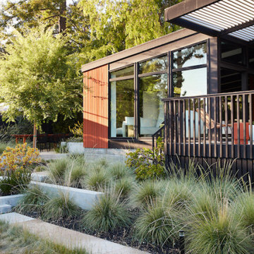
The Roger Lee designed house from 1962 was purchased by the current homeowners in almost original condition, as the previous owners elected to defer most maintenance projects over the years. The clients were able to see beyond the dated materials and finishes, single-paned glass and uninsulated walls and they approached Klopf Architecture to help them expand and update the entire home, one the family could settle into and enjoy for years to come. It was important that the new designs were aligned with Lee's original intent not only because of the client's appreciation for mid-century modern architecture, but also because the house was deemed historical. The Stanford Real Estate Office requires a stringent design review which safeguards the integrity of the community, which Klopf Architecture was happy to oblige going into their updated designs.
As with many original mid-century modern homes, the house was scaled to the 1960s lifestyle where rooms were smaller and openings to views were limited and tightly framed. The original conditions defined the direction the family of four would take in updating the house and making it comfortable for their modern lifestyle. Klopf designed a full gut remodel and major addition to bring the house into the 21st century and provide the living area needed for the client's family. The newly expanded house added just about 1,100 sf to create an airy, comfortable and family friendly house, taking full advantage of the beautiful southwestern views that extend out to the hills beyond. The enclosed garage created an additional 240 sf of covered space for long-term storage.
A cracked swimming pool created an eyesore taking up a majority of the backyard landscape, so it was one of the first elements to go during the transformation. Working with Outer Space Landscape Architects, the family asked for a mix of relaxing outdoor patio spaces that eventually blend into the native landscaping, extending their views outward toward the natural greenery of the trees beyond their property. Filling in the old pool was a smart way to expand the living spaces outward. The orientation of the house was designed to enjoy the views, but the original architecture provided the first homeowners with mere glimpses of the landscape outside.
Klopf was able to broaden those views, continuing and extending on the original architecture to take full advantage of the unobstructed natural views across the rear facade of the house. Small horizontal openings in the primary bedroom and office were replaced with much taller windows that now follow the angled roof line upward, extending across almost all of the facade. We worked with Western Windows, whose designs included an oblique-shaped, operable casement that allowed our design to rise with the slope. A new corner office added to the primary suite, offers a bright and functional work-from-home solution that looks out at the distant views and added natural light from the expanded window configuration that now wraps around the corner.
The existing lower level was designed by Lee as a utilitarian space, serving as a wet pool room with a drain in the center of the floor, bathroom, laundry and storage areas. Without the need for a pool room, Klopf was able to convert the area into a much more comfortable and functional living space with a new family room and guest suite. The new spaces enjoy easy access to a new outdoor patio through floor to ceiling, full-width glass sliders.
Continuing along the rear facade, a previously exposed deck extending from the living room and hallway provided access to the backyard through a single set of stairs leading toward the side of the house which made sense when the pool was in place. The new deck was re-envisioned as an extension of the main living room and now serves as a second outdoor living room. A new slatted pergola above provides the homeowners welcome relief from the hot afternoon sun. A second set of stairs now creates a better connection to the redesigned lower level. Klopf was able to reconfigure the spaces, extending the living room outward toward the views, where the family now claims it as the heart of the home, spending a large majority of their time outdoors.
Back inside, the original wood-burning Malm fireplace was beautifully restored and a gas burner installed to comply with California's strict air standards. It now rests in front of a wall of Heath accent tiles where a dated red brick wall used to stand. A new taller window brings more light and views into the refreshed interior living room. The original glass doors opposite the fireplace were replaced by larger sliders that when fully opened, create a seamless transition to the new outdoor living area so the two spaces feel like one connected space. The original utilitarian kitchen was needlessly tucked into the far back corner and closed-off, out of sight from the living room, so the clients asked Klopf to open it up and expand the kitchen forward so it felt more connected. Today the much larger kitchen is connected to the living area where a short wall with a cutout offers a visual glimpse into the kitchen and a handy pass-through counter for serving guests. A new breakfast nook was also added to create another spot where the family can gather for casual meals. Just outside, a new built-in outdoor grill and prep area extends the kitchen outside and connects to a new outdoor dining spot nestled amongst the trees, taking advantage of the views out back.
Klopf was able to expand the other two bedrooms, add a new laundry room and half-bath and convert the carport to an enclosed garage to add more storage areas which was lost when the pool house was converted to the family and guest room.
To maintain a historical connection to the original designs, the exterior siding was repeated on all exterior walls, a full-height stained glass window at the front entryway restored, and an interior slatted screen element repeated outside at the exterior entry courtyard and over the new outdoor living room to create a shade trellis. The new house stands proudly and shines against it's new landscaping features, while respecting and expanding on the original intent of Roger Lee's designs epitomizing the comforts of indoor-outdoor living in Northern California.
Completion year: 2020
Klopf Architecture project team: John Klopf, Klara Kevane, Noel Andrade
Contractor: ORB Construction, Brendan O'Reilly
Structural engineer: Sezen and Moon
Landscape architect: Outer space
Furnishings and decoration: Urbanism Designs
Photographer: Mariko Reed
Sponsored
Sunbury, OH
J.Holderby - Renovations
Franklin County's Leading General Contractors - 2X Best of Houzz!
 Michael Nash Design, Build & Homes
Built in the 1950s, this rambler housed a dark, cramped galley kitchen only 6’ x 20’. A later addition added more space, but wasn’t optimally designed. So, when they purchased the property, the new owners did so with the intent of gutting and remodeling the first floor.
The goal of the renovation was to create a functional, dedicated kitchen and dining room space while keeping many of the home’s historic touches. The first step was to remove the bearing wall between kitchen and living room and install a structural beam to create a seamless connection between the two spaces.
A large center island was designed to be the focal point of the space, complete with a new farm sink and room to serve four or more people. A professional range with a stylish wooden hood was installed and custom cabinets wrap around the entire kitchen to provide plenty of storage.
Meanwhile, a custom-built hutch was installed in the dining room area, as was a butler’s pantry, to add more flair to the project. A timeless tile backsplash was installed to spruce up the soft color granite top which was carefully selected to harmonize with cabinet and floor color schemes.
The lighting was revamped and redesigned for entire space, including a couple of hanging pendants over the island. Wide plank distressed hardwood flooring was installed all over the kitchen and dining room to maintain the integrity of historic look.
With all new appliances, linen-stained maple cabinetry and distressed wood Island, old world hickory floor and more, this project moved from its dysfunctional status to fun and funky.
 Regan Baker Design Inc.
Intentional. Elevated. Artisanal.
With three children under the age of 5, our clients were starting to feel the confines of their Pacific Heights home when the expansive 1902 Italianate across the street went on the market. After learning the home had been recently remodeled, they jumped at the chance to purchase a move-in ready property. We worked with them to infuse the already refined, elegant living areas with subtle edginess and handcrafted details, and also helped them reimagine unused space to delight their little ones.
Elevated furnishings on the main floor complement the home’s existing high ceilings, modern brass bannisters and extensive walnut cabinetry. In the living room, sumptuous emerald upholstery on a velvet side chair balances the deep wood tones of the existing baby grand. Minimally and intentionally accessorized, the room feels formal but still retains a sharp edge—on the walls moody portraiture gets irreverent with a bold paint stroke, and on the the etagere, jagged crystals and metallic sculpture feel rugged and unapologetic. Throughout the main floor handcrafted, textured notes are everywhere—a nubby jute rug underlies inviting sofas in the family room and a half-moon mirror in the living room mixes geometric lines with flax-colored fringe.
On the home’s lower level, we repurposed an unused wine cellar into a well-stocked craft room, with a custom chalkboard, art-display area and thoughtful storage. In the adjoining space, we installed a custom climbing wall and filled the balance of the room with low sofas, plush area rugs, poufs and storage baskets, creating the perfect space for active play or a quiet reading session. The bold colors and playful attitudes apparent in these spaces are echoed upstairs in each of the children’s imaginative bedrooms.
Architect + Developer: McMahon Architects + Studio, Photographer: Suzanna Scott Photography
 Jarrett Design
This remodel was a dated 1980s Cape Cod style home that desperately needed updating with the kitchen starting as the foundation for the rest of the home. The owners purchased the property in 2013 with the intent of replacing the existing kitchen installed in 2000, as well as updating most surfaces throughout the home. The space while moderately sized, felt cramped due to the L-shaped design and eat-in island that disrupted traffic flow from the mudroom, dining room and sliding doors to the patio. The owners knew they wanted to bring the light from the southern facing front of the home to the dark cave-like feeling of the kitchen. This was remedied by knocking down the wall between the existing dining room (now a lounge area), widening the entrance to the family room and creating a pathway to the existing formal living room (now the dining room). Also to create better traffic flow into the kitchen, the existing mudroom door was moved to the opposite side of the wall.
A large work island with cooktop, oven and convection/microwave was designed for efficiency and maintaining clean site lines. The work triangle allows for quick and easy meal prep and clean-up for the busy family. Space at the end of the kitchen was perfectly suited for a large kitchen table with views of the back yard, easy conversation with the cook at the island or those hanging in the newly appointed lounge area. The new doorway between the kitchen and dining room showcases the 10ft floor to ceiling bay window, allows more light to flood into the space and creates easy access between the two rooms for family gatherings. Given the home owners relocated to the area for job reasons and are not sure how long they will be in this home, we helped them achieve a balance of a design and finishes that they not only love, but would be appealing to many if another move was in their near future.
Matt Villano Photography
66