
Search results for "Purchase properties" in Home Design Ideas

 KINGDOM WOODWORKS
Collaboration with Canonbury Homes and Frank Neely Design Associates.
Inspiration for a timeless open concept kitchen remodel in Atlanta with beaded inset cabinets and two islands
Inspiration for a timeless open concept kitchen remodel in Atlanta with beaded inset cabinets and two islands
 Advance Design Studio, Ltd.
This 1930's Barrington Hills farmhouse was in need of some TLC when it was purchased by this southern family of five who planned to make it their new home. The renovation taken on by Advance Design Studio's designer Scott Christensen and master carpenter Justin Davis included a custom porch, custom built in cabinetry in the living room and children's bedrooms, 2 children's on-suite baths, a guest powder room, a fabulous new master bath with custom closet and makeup area, a new upstairs laundry room, a workout basement, a mud room, new flooring and custom wainscot stairs with planked walls and ceilings throughout the home.
The home's original mechanicals were in dire need of updating, so HVAC, plumbing and electrical were all replaced with newer materials and equipment. A dramatic change to the exterior took place with the addition of a quaint standing seam metal roofed farmhouse porch perfect for sipping lemonade on a lazy hot summer day.
In addition to the changes to the home, a guest house on the property underwent a major transformation as well. Newly outfitted with updated gas and electric, a new stacking washer/dryer space was created along with an updated bath complete with a glass enclosed shower, something the bath did not previously have. A beautiful kitchenette with ample cabinetry space, refrigeration and a sink was transformed as well to provide all the comforts of home for guests visiting at the classic cottage retreat.
The biggest design challenge was to keep in line with the charm the old home possessed, all the while giving the family all the convenience and efficiency of modern functioning amenities. One of the most interesting uses of material was the porcelain "wood-looking" tile used in all the baths and most of the home's common areas. All the efficiency of porcelain tile, with the nostalgic look and feel of worn and weathered hardwood floors. The home’s casual entry has an 8" rustic antique barn wood look porcelain tile in a rich brown to create a warm and welcoming first impression.
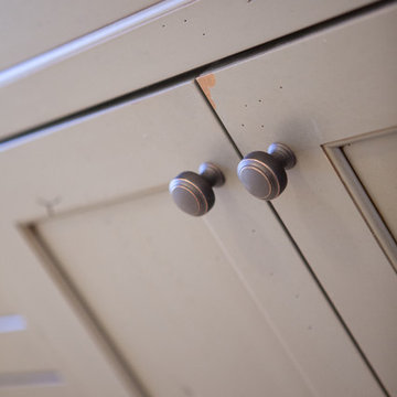
Painted distressed cabinetry in muted shades of gray/green was used in the powder room to bring out the rustic feel of the space which was accentuated with wood planked walls and ceilings. Fresh white painted shaker cabinetry was used throughout the rest of the rooms, accentuated by bright chrome fixtures and muted pastel tones to create a calm and relaxing feeling throughout the home.
Custom cabinetry was designed and built by Advance Design specifically for a large 70” TV in the living room, for each of the children’s bedroom’s built in storage, custom closets, and book shelves, and for a mudroom fit with custom niches for each family member by name.
The ample master bath was fitted with double vanity areas in white. A generous shower with a bench features classic white subway tiles and light blue/green glass accents, as well as a large free standing soaking tub nestled under a window with double sconces to dim while relaxing in a luxurious bath. A custom classic white bookcase for plush towels greets you as you enter the sanctuary bath.

 Ernest M. Ferizi
German Embassy in Pristina - Kosovo, contracted the architecture office “Ferizi + Ferizi Architects” to plan and implement an Annex Office building for their purposes. As detached part of this building is designed the waiting area, as alone standing structure.
This Office Building is constructed by assembling of Eight used office containers that were delivered on trucks and set up after only a few hours on the basis of the LEGO principle, according to the planning on strip foundations.
By removing the flexible exterior wall panels, a large room of 115 m² was created, with the counter wall as a room partition between two office spaces, each with seven workstations as well as three counters for agents on one side and a room for visitors on the other side.
With this system, room solutions can be easily implemented in all dimensions.
The container, seen as a geometric shape, is a simple, octagonal, solid box.
The standardized perfection of its dimensions is striking: 2.44 meters wide, 2.59 meters high and 6.06 meters or 12.19 meters long.
Since its introduction in 1956 by the American transport entrepreneur Malcom McLean, the container has become a standardized transport module worldwide, whether on ships, trucks or construction sites.
The shipping containers have additionally revolutionized the transport industry, pushed the globalization noticeably, and thus directly or indirectly influenced all our lives.
But after only a few years, when the first overseas containers wore out, many engineers recognized the positive properties of used shipping containers for building houses, especially since they are robust, flexible, multifunctional and second-hand relatively inexpensive to purchase. The time has long passed by to treat containers exclusively as transport objects.
As a "measure of all things", containers can hardly be ignored in construction.
Their use is no longer limited to temporary use since school containers, information containers, office containers or entire residential buildings are now part of our everyday life in the construction industry.
However, current examples of the container architecture prove that even the most demanding solutions for container building are feasible. For their specific aesthetic and spatial qualities, containers also serve as design parameters for the development of new forms of architecture and urbanity.
The office building as an extension of the visa section, characterized by modern materials and contemporary aesthetics has been designed and built mainly as a low-energy building.
Extensive insulation to achieve a comfortable and sustainable constant temperature in the interior, high window quality and low energy consumption make the building energy-efficient.
The sophisticated lighting technology, networks, heating systems and air-conditioning systems are also components of this equipment.
It creates an overall harmonic picture and guarantees the highest standard in sustainable construction, taking into consideration the fact that environmentally friendly recycling and reutilization have become an increasingly important issue in our society.
West and East side of the wooden facade is compact and has few openings, while the southern facade is completely open with lot of glass. Its spatial openness ensures a transparent, friendly work environment, which allows a lot of light into the space.
This openness allows an uninterrupted, pleasant and close-to-nature view from interior spaces into the beautiful garden. During the installation of sophisticated light sources in the garden, emphasis was not only put on functionality and security, but also on the beauty of the garden shown through the illumination in the evening.
Large, horizontal white “brisole” serve as external sun protection systems, mounted on the canopies of the entrance areas of the modular construction and the enclosure, adeptly cast shade on these areas and at the same time shape the entire architectural language.
While on one hand, the two quadratic ledges suspended in the air, are docked with steel stairs and match the wooden façade, lead the staff to their office space, the artful modern interior, on the other hand, perfectly unites the functionality, innovative technology, culture and positive effects on the employees' efficiency and wellbeing.
A lot of white, interjected by warm wooden and colored accents, determines the ambience.
In the case of the lighting solution, the mainly linear ceiling lighting is used as the overlapping design element both for the offices of the visa section as well as for the counters and the waiting area for the visitors.
They underline the puristic design in order to create a pleasant light for a desired general illumination and ensure optimal light conditions without causing disturbing reflections on the computer screens.
In addition, precisely positioned pendant luminaires are installed at the workstations, which ensure pleasant room brightness.
In the entrance area, the harmonic and uniform lighting effect from the ground highlights the integration of photography and architecture.
Photographs of landscapes, people, places, expressing unforgettable, impressive moments and memories have been lovingly engraved on 8 x 8cm square oak blocks.
The idea of an effective, impressive environment that stimulates and inspires the work was the premiss on which the whole design concept was based. Consequently, the modular construction was no longer viewed through its history of utilization and scars, but rather as a structure of work ambiance, art and elegance.
FERIZI + FERIZI Architects
Photo: Arben Llapashtica
Find the right local pro for your project

 SKP Design
Located in a wooded setting which backs up to a golf course, The Woods is a vacation condo community in Canadian Lakes, Michigan. The owners asked us to create a comfortable modern design that would appeal to golfers and also families visiting relatives in the area. This complete renovation brought the design from 80's basic to rustic transitional. Colors and design elements echo the natural area surrounding the property.
SKP Design was involved in multiple aspects of this project. Our services included:
space planning for kitchen and both bathrooms
selecting finishes for walls, floors, trim, cabinets and countertops
reviewing construction details and electrical plans
specification of plumbing fixtures, appliances and accent lighting
furniture layout, specification and purchasing
fireplace design and stone selection
reviewing branding and signage ideas
In the great room, wrought iron accents are featured in a new staircase handrail system. Other metal accents are found in the new chandelier, barstools and the legs of the live edge coffee table. An open area under the staircase was enclosed with recessed shelving which gives a focal point to the dinette area. Recessed built-in cabinets near the fireplace store TV technology and accessories. The original tiled hearth was replaced by poured concrete with stone accents.
A queen sleeper sofa from Edgecomb provides additional sleeping. Fabrics and upholstery throughout the condo were selected for durability and cleanability.
Basic white laminate kitchen cabinets were replaced with beautiful dark stained wood. Floor tile is a wood-look porcelain from Daltile called Saddle Brook. Countertops in the kitchen and bathrooms are solid surface Corian Quartz (formerly called DuPont Zodiaq). Broadloom carpet is from Durkan. The first floor bedroom is Mona Vista pattern from Modesto Collection; all other carpet is Inviting Spaces pattern from Timeless Compositions. Walls are painted with Sherwin Williams 7647 Crushed Ice.
The main floor bedroom has a custom headboard mounted on a feature wall with plaid wallcovering. A freestanding vanity with undermount sink was added to the alcove area, creating space for a larger walk-in tiled shower with custom bench. On both levels, backlit mirrors highlight the sink areas. The upstairs bath has a blue tile feature wall and vessel sink.
A fiberglass bathtub surround was removed and replaced by a custom tiled shower. Vinyl wallcovering from D.L. Couch provides a focal point behind the king headboard in the loft bedroom. A twin sleeper chair adds an extra bed.
 SKP Design
Located in a wooded setting which backs up to a golf course, The Woods is a vacation condo community in Canadian Lakes, Michigan. The owners asked us to create a comfortable modern design that would appeal to golfers and also families visiting relatives in the area. This complete renovation brought the design from 80's basic to rustic transitional. Colors and design elements echo the natural area surrounding the property.
SKP Design was involved in multiple aspects of this project. Our services included:
space planning for kitchen and both bathrooms
selecting finishes for walls, floors, trim, cabinets and countertops
reviewing construction details and electrical plans
specification of plumbing fixtures, appliances and accent lighting
furniture layout, specification and purchasing
fireplace design and stone selection
reviewing branding and signage ideas
In the great room, wrought iron accents are featured in a new staircase handrail system. Other metal accents are found in the new chandelier, barstools and the legs of the live edge coffee table. An open area under the staircase was enclosed with recessed shelving which gives a focal point to the dinette area. Recessed built-in cabinets near the fireplace store TV technology and accessories. The original tiled hearth was replaced by poured concrete with stone accents.
A queen sleeper sofa from Edgecomb provides additional sleeping. Fabrics and upholstery throughout the condo were selected for durability and cleanability.
Basic white laminate kitchen cabinets were replaced with beautiful dark stained wood. Floor tile is a wood-look porcelain from Daltile called Saddle Brook. Countertops in the kitchen and bathrooms are solid surface Corian Quartz (formerly called DuPont Zodiaq). Broadloom carpet is from Durkan. The first floor bedroom is Mona Vista pattern from Modesto Collection; all other carpet is Inviting Spaces pattern from Timeless Compositions. Walls are painted with Sherwin Williams 7647 Crushed Ice.
The main floor bedroom has a custom headboard mounted on a feature wall with plaid wallcovering. A freestanding vanity with undermount sink was added to the alcove area, creating space for a larger walk-in tiled shower with custom bench. On both levels, backlit mirrors highlight the sink areas. The upstairs bath has a blue tile feature wall and vessel sink.
A fiberglass bathtub surround was removed and replaced by a custom tiled shower. Vinyl wallcovering from D.L. Couch provides a focal point behind the king headboard in the loft bedroom. A twin sleeper chair adds an extra bed.
 SKP Design
Located in a wooded setting which backs up to a golf course, The Woods is a vacation condo community in Canadian Lakes, Michigan. The owners asked us to create a comfortable modern design that would appeal to golfers and also families visiting relatives in the area. This complete renovation brought the design from 80's basic to rustic transitional. Colors and design elements echo the natural area surrounding the property.
SKP Design was involved in multiple aspects of this project. Our services included:
space planning for kitchen and both bathrooms
selecting finishes for walls, floors, trim, cabinets and countertops
reviewing construction details and electrical plans
specification of plumbing fixtures, appliances and accent lighting
furniture layout, specification and purchasing
fireplace design and stone selection
reviewing branding and signage ideas
In the great room, wrought iron accents are featured in a new staircase handrail system. Other metal accents are found in the new chandelier, barstools and the legs of the live edge coffee table. An open area under the staircase was enclosed with recessed shelving which gives a focal point to the dinette area. Recessed built-in cabinets near the fireplace store TV technology and accessories. The original tiled hearth was replaced by poured concrete with stone accents.
A queen sleeper sofa from Edgecomb provides additional sleeping. Fabrics and upholstery throughout the condo were selected for durability and cleanability.
Basic white laminate kitchen cabinets were replaced with beautiful dark stained wood. Floor tile is a wood-look porcelain from Daltile called Saddle Brook. Countertops in the kitchen and bathrooms are solid surface Corian Quartz (formerly called DuPont Zodiaq). Broadloom carpet is from Durkan. The first floor bedroom is Mona Vista pattern from Modesto Collection; all other carpet is Inviting Spaces pattern from Timeless Compositions. Walls are painted with Sherwin Williams 7647 Crushed Ice.
The main floor bedroom has a custom headboard mounted on a feature wall with plaid wallcovering. A freestanding vanity with undermount sink was added to the alcove area, creating space for a larger walk-in tiled shower with custom bench. On both levels, backlit mirrors highlight the sink areas. The upstairs bath has a blue tile feature wall and vessel sink.
A fiberglass bathtub surround was removed and replaced by a custom tiled shower. Vinyl wallcovering from D.L. Couch provides a focal point behind the king headboard in the loft bedroom. A twin sleeper chair adds an extra bed.
 SKP Design
Located in a wooded setting which backs up to a golf course, The Woods is a vacation condo community in Canadian Lakes, Michigan. The owners asked us to create a comfortable modern design that would appeal to golfers and also families visiting relatives in the area. This complete renovation brought the design from 80's basic to rustic transitional. Colors and design elements echo the natural area surrounding the property.
SKP Design was involved in multiple aspects of this project. Our services included:
space planning for kitchen and both bathrooms
selecting finishes for walls, floors, trim, cabinets and countertops
reviewing construction details and electrical plans
specification of plumbing fixtures, appliances and accent lighting
furniture layout, specification and purchasing
fireplace design and stone selection
reviewing branding and signage ideas
In the great room, wrought iron accents are featured in a new staircase handrail system. Other metal accents are found in the new chandelier, barstools and the legs of the live edge coffee table. An open area under the staircase was enclosed with recessed shelving which gives a focal point to the dinette area. Recessed built-in cabinets near the fireplace store TV technology and accessories. The original tiled hearth was replaced by poured concrete with stone accents.
A queen sleeper sofa from Edgecomb provides additional sleeping. Fabrics and upholstery throughout the condo were selected for durability and cleanability.
Basic white laminate kitchen cabinets were replaced with beautiful dark stained wood. Floor tile is a wood-look porcelain from Daltile called Saddle Brook. Countertops in the kitchen and bathrooms are solid surface Corian Quartz (formerly called DuPont Zodiaq). Broadloom carpet is from Durkan. The first floor bedroom is Mona Vista pattern from Modesto Collection; all other carpet is Inviting Spaces pattern from Timeless Compositions. Walls are painted with Sherwin Williams 7647 Crushed Ice.
The main floor bedroom has a custom headboard mounted on a feature wall with plaid wallcovering. A freestanding vanity with undermount sink was added to the alcove area, creating space for a larger walk-in tiled shower with custom bench. On both levels, backlit mirrors highlight the sink areas. The upstairs bath has a blue tile feature wall and vessel sink.
A fiberglass bathtub surround was removed and replaced by a custom tiled shower. Vinyl wallcovering from D.L. Couch provides a focal point behind the king headboard in the loft bedroom. A twin sleeper chair adds an extra bed.
Sponsored
Delaware, OH

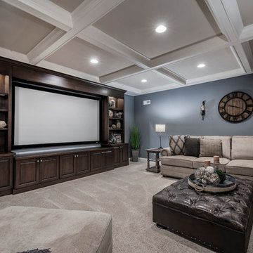
Buckeye Basements, Inc.
Central Ohio's Basement Finishing ExpertsBest Of Houzz '13-'21
 Advance Design Studio, Ltd.
This 1930's Barrington Hills farmhouse was in need of some TLC when it was purchased by this southern family of five who planned to make it their new home. The renovation taken on by Advance Design Studio's designer Scott Christensen and master carpenter Justin Davis included a custom porch, custom built in cabinetry in the living room and children's bedrooms, 2 children's on-suite baths, a guest powder room, a fabulous new master bath with custom closet and makeup area, a new upstairs laundry room, a workout basement, a mud room, new flooring and custom wainscot stairs with planked walls and ceilings throughout the home.
The home's original mechanicals were in dire need of updating, so HVAC, plumbing and electrical were all replaced with newer materials and equipment. A dramatic change to the exterior took place with the addition of a quaint standing seam metal roofed farmhouse porch perfect for sipping lemonade on a lazy hot summer day.
In addition to the changes to the home, a guest house on the property underwent a major transformation as well. Newly outfitted with updated gas and electric, a new stacking washer/dryer space was created along with an updated bath complete with a glass enclosed shower, something the bath did not previously have. A beautiful kitchenette with ample cabinetry space, refrigeration and a sink was transformed as well to provide all the comforts of home for guests visiting at the classic cottage retreat.
The biggest design challenge was to keep in line with the charm the old home possessed, all the while giving the family all the convenience and efficiency of modern functioning amenities. One of the most interesting uses of material was the porcelain "wood-looking" tile used in all the baths and most of the home's common areas. All the efficiency of porcelain tile, with the nostalgic look and feel of worn and weathered hardwood floors. The home’s casual entry has an 8" rustic antique barn wood look porcelain tile in a rich brown to create a warm and welcoming first impression.
Painted distressed cabinetry in muted shades of gray/green was used in the powder room to bring out the rustic feel of the space which was accentuated with wood planked walls and ceilings. Fresh white painted shaker cabinetry was used throughout the rest of the rooms, accentuated by bright chrome fixtures and muted pastel tones to create a calm and relaxing feeling throughout the home.
Custom cabinetry was designed and built by Advance Design specifically for a large 70” TV in the living room, for each of the children’s bedroom’s built in storage, custom closets, and book shelves, and for a mudroom fit with custom niches for each family member by name.
The ample master bath was fitted with double vanity areas in white. A generous shower with a bench features classic white subway tiles and light blue/green glass accents, as well as a large free standing soaking tub nestled under a window with double sconces to dim while relaxing in a luxurious bath. A custom classic white bookcase for plush towels greets you as you enter the sanctuary bath.
Joe Nowak
 Klopf Architecture
The Roger Lee designed house from 1962 was purchased by the current homeowners in almost original condition, as the previous owners elected to defer most maintenance projects over the years. The clients were able to see beyond the dated materials and finishes, single-paned glass and uninsulated walls and they approached Klopf Architecture to help them expand and update the entire home, one the family could settle into and enjoy for years to come. It was important that the new designs were aligned with Lee's original intent not only because of the client's appreciation for mid-century modern architecture, but also because the house was deemed historical. The Stanford Real Estate Office requires a stringent design review which safeguards the integrity of the community, which Klopf Architecture was happy to oblige going into their updated designs.
As with many original mid-century modern homes, the house was scaled to the 1960s lifestyle where rooms were smaller and openings to views were limited and tightly framed. The original conditions defined the direction the family of four would take in updating the house and making it comfortable for their modern lifestyle. Klopf designed a full gut remodel and major addition to bring the house into the 21st century and provide the living area needed for the client's family. The newly expanded house added just about 1,100 sf to create an airy, comfortable and family friendly house, taking full advantage of the beautiful southwestern views that extend out to the hills beyond. The enclosed garage created an additional 240 sf of covered space for long-term storage.
A cracked swimming pool created an eyesore taking up a majority of the backyard landscape, so it was one of the first elements to go during the transformation. Working with Outer Space Landscape Architects, the family asked for a mix of relaxing outdoor patio spaces that eventually blend into the native landscaping, extending their views outward toward the natural greenery of the trees beyond their property. Filling in the old pool was a smart way to expand the living spaces outward. The orientation of the house was designed to enjoy the views, but the original architecture provided the first homeowners with mere glimpses of the landscape outside.
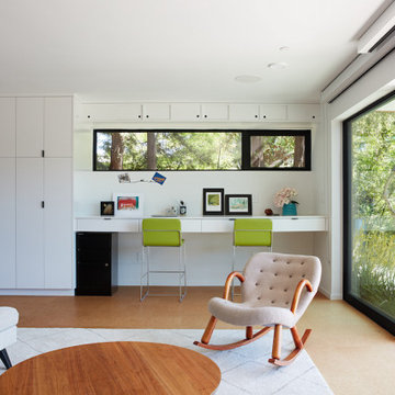
Klopf was able to broaden those views, continuing and extending on the original architecture to take full advantage of the unobstructed natural views across the rear facade of the house. Small horizontal openings in the primary bedroom and office were replaced with much taller windows that now follow the angled roof line upward, extending across almost all of the facade. We worked with Western Windows, whose designs included an oblique-shaped, operable casement that allowed our design to rise with the slope. A new corner office added to the primary suite, offers a bright and functional work-from-home solution that looks out at the distant views and added natural light from the expanded window configuration that now wraps around the corner.
The existing lower level was designed by Lee as a utilitarian space, serving as a wet pool room with a drain in the center of the floor, bathroom, laundry and storage areas. Without the need for a pool room, Klopf was able to convert the area into a much more comfortable and functional living space with a new family room and guest suite. The new spaces enjoy easy access to a new outdoor patio through floor to ceiling, full-width glass sliders.
Continuing along the rear facade, a previously exposed deck extending from the living room and hallway provided access to the backyard through a single set of stairs leading toward the side of the house which made sense when the pool was in place. The new deck was re-envisioned as an extension of the main living room and now serves as a second outdoor living room. A new slatted pergola above provides the homeowners welcome relief from the hot afternoon sun. A second set of stairs now creates a better connection to the redesigned lower level. Klopf was able to reconfigure the spaces, extending the living room outward toward the views, where the family now claims it as the heart of the home, spending a large majority of their time outdoors.
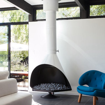
Back inside, the original wood-burning Malm fireplace was beautifully restored and a gas burner installed to comply with California's strict air standards. It now rests in front of a wall of Heath accent tiles where a dated red brick wall used to stand. A new taller window brings more light and views into the refreshed interior living room. The original glass doors opposite the fireplace were replaced by larger sliders that when fully opened, create a seamless transition to the new outdoor living area so the two spaces feel like one connected space. The original utilitarian kitchen was needlessly tucked into the far back corner and closed-off, out of sight from the living room, so the clients asked Klopf to open it up and expand the kitchen forward so it felt more connected. Today the much larger kitchen is connected to the living area where a short wall with a cutout offers a visual glimpse into the kitchen and a handy pass-through counter for serving guests. A new breakfast nook was also added to create another spot where the family can gather for casual meals. Just outside, a new built-in outdoor grill and prep area extends the kitchen outside and connects to a new outdoor dining spot nestled amongst the trees, taking advantage of the views out back.
Klopf was able to expand the other two bedrooms, add a new laundry room and half-bath and convert the carport to an enclosed garage to add more storage areas which was lost when the pool house was converted to the family and guest room.
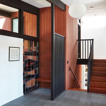
To maintain a historical connection to the original designs, the exterior siding was repeated on all exterior walls, a full-height stained glass window at the front entryway restored, and an interior slatted screen element repeated outside at the exterior entry courtyard and over the new outdoor living room to create a shade trellis. The new house stands proudly and shines against it's new landscaping features, while respecting and expanding on the original intent of Roger Lee's designs epitomizing the comforts of indoor-outdoor living in Northern California.
Completion year: 2020
Klopf Architecture project team: John Klopf, Klara Kevane, Noel Andrade
Contractor: ORB Construction, Brendan O'Reilly
Structural engineer: Sezen and Moon
Landscape architect: Outer space
Furnishings and decoration: Urbanism Designs
Photographer: Mariko Reed
 Save home
Why are White Shaker Cabinets Still Considered a Classic?
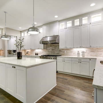
Every few years, if you remodel your kitchen because it feels old, then white shaker cabinets are what you need. Most homeowners feel the need to revamp their kitchen not because the cabinets have worn out but because the interior is a bit old-fashioned. One of the best solutions to this issue is to utilize white shaker cabinets. These are classic, timeless kitchen elements that last longer complements everything, and rarely make your kitchen look outdated.
For this reason, in this article, we have discussed why you need white shaker cabinets in your kitchen and how you can style them.
What is a White Shaker Cabinet?
White shaker cabinets are not new. In fact, these cabinets date back to 1700 when this style was found in every home. These cabinets have a classic look because of recessed door panels, a five-piece door, and a traditional look of pine, maple, or chestnut. Of course. white shaker cabinets are unique and attractive at the same time.
The material used to make these cabinets also makes them durable. You can easily purchase it in less pricing than other wood cabinets, and you can clean it easily. The simplistic structure of white shaker cabinets also makes them complement every type of kitchen; modern or traditional. You can find these cabinets in other light finishes as well, such as peach, off-white, brown, wood brown, etc. The reason we are focusing on white is that this color is timeless and the design of the shaker cabinet is too, which together makes the best combination. You can perfectly strike a chord between every kitchen element if you pair it with white shaker cabinets .
Why White?
The color which is always in style is white. It is highly unlikely to ruin your interior with this color if well-coordinated and properly lit. This is why white shaker cabinets are highly preferred by users.
Here are some reasons to choose white shaker cabinets over other options:
Timeless
Over years, our idea of perfect design changes, and our understanding of the interior also modify. This changes the way we want our kitchen interiors. Hence, if you select vibrant kitchen cabinets and off colors for your countertop, flooring, and paint, then you may end up changing it every few years.
To avoid that from happening, just use white shaker cabinets. In multiple decades, white shaker cabinets have never ceased being classic. White is timeless and it never goes out of trend. Even when you need to change the paint or fittings, you can reduce the cost of cabinets for multiple years.
Versatile
White shaker cabinets are versatile because you have an array of options. You can incorporate multiple elements in your kitchen and tweak color coding and design of countertop, flooring, and paint. For instance, with white shaker cabinets, you can pair white textured back tiles. You can even pair your white cabinets with a black marble countertop; two timeless interior elements together!
Clean
White is the color of clean. In hospitals, bathrooms, and hotel rooms, we find a lot of white because it is clean, fresh, and peaceful. This is why everyone is automatically attracted to this color; it looks clean.
However, you may actually have to make efforts to keep these white shaker cabinets clean from dust and dirt.
Complements Everything
Since cabinets form a big portion of your kitchen, it is necessary to make cabinets complement other interior elements. With white shaker cabinets, you don’t even need to worry about that. White compliments every choice of appliance, countertop, artwork, and flooring. If you decide to get marble grey flooring with white cabinets, you can make that work. If you want colorful kitchen furniture, white complements that too. If you wish to use artwork or warm lighting in your kitchen, white automatically goes well with it.
How to Style White Shaker Cabinets?
If you are styling your kitchen with new white shaker cabinets, here’s what you should keep in mind:
• If your kitchen is small, then white is definitely your color. It reflects more light, hence, makes your space look larger and shinier.
• When you have an open kitchen, you need to follow the same theme to the adjoining rooms and slowly phase it out. This consistency won’t make anything look odd.
• If the rest of the house is filled with artwork and colors, you need the same for your kitchen as well. All white may steal away the classic of shaker cabinets.
• Pair your wall textures and flooring choices with appliances, white cabinets, knobs, and other elements for the best look.
• If the theme for the rest of the house is subtle, then you can even design an all-white kitchen with white shaker cabinets.
Conclusion
Whether you are planning to revamp your kitchen/house or sell your property, white shaker cabinets are always classic. They make a statement in your kitchen and offer a new and clean look all the time. Just focus on coordinating other interior elements of your kitchen and stop worrying about cabinets. White shaker cabinets are durable, beautiful, and timeless! Purchase these classic units now.
For this reason, in this article, we have discussed why you need white shaker cabinets in your kitchen and how you can style them.
What is a White Shaker Cabinet?
White shaker cabinets are not new. In fact, these cabinets date back to 1700 when this style was found in every home. These cabinets have a classic look because of recessed door panels, a five-piece door, and a traditional look of pine, maple, or chestnut. Of course. white shaker cabinets are unique and attractive at the same time.
The material used to make these cabinets also makes them durable. You can easily purchase it in less pricing than other wood cabinets, and you can clean it easily. The simplistic structure of white shaker cabinets also makes them complement every type of kitchen; modern or traditional. You can find these cabinets in other light finishes as well, such as peach, off-white, brown, wood brown, etc. The reason we are focusing on white is that this color is timeless and the design of the shaker cabinet is too, which together makes the best combination. You can perfectly strike a chord between every kitchen element if you pair it with white shaker cabinets .
Why White?
The color which is always in style is white. It is highly unlikely to ruin your interior with this color if well-coordinated and properly lit. This is why white shaker cabinets are highly preferred by users.
Here are some reasons to choose white shaker cabinets over other options:
Timeless
Over years, our idea of perfect design changes, and our understanding of the interior also modify. This changes the way we want our kitchen interiors. Hence, if you select vibrant kitchen cabinets and off colors for your countertop, flooring, and paint, then you may end up changing it every few years.
To avoid that from happening, just use white shaker cabinets. In multiple decades, white shaker cabinets have never ceased being classic. White is timeless and it never goes out of trend. Even when you need to change the paint or fittings, you can reduce the cost of cabinets for multiple years.
Versatile
White shaker cabinets are versatile because you have an array of options. You can incorporate multiple elements in your kitchen and tweak color coding and design of countertop, flooring, and paint. For instance, with white shaker cabinets, you can pair white textured back tiles. You can even pair your white cabinets with a black marble countertop; two timeless interior elements together!
Clean
White is the color of clean. In hospitals, bathrooms, and hotel rooms, we find a lot of white because it is clean, fresh, and peaceful. This is why everyone is automatically attracted to this color; it looks clean.
However, you may actually have to make efforts to keep these white shaker cabinets clean from dust and dirt.
Complements Everything
Since cabinets form a big portion of your kitchen, it is necessary to make cabinets complement other interior elements. With white shaker cabinets, you don’t even need to worry about that. White compliments every choice of appliance, countertop, artwork, and flooring. If you decide to get marble grey flooring with white cabinets, you can make that work. If you want colorful kitchen furniture, white complements that too. If you wish to use artwork or warm lighting in your kitchen, white automatically goes well with it.
How to Style White Shaker Cabinets?
If you are styling your kitchen with new white shaker cabinets, here’s what you should keep in mind:
• If your kitchen is small, then white is definitely your color. It reflects more light, hence, makes your space look larger and shinier.
• When you have an open kitchen, you need to follow the same theme to the adjoining rooms and slowly phase it out. This consistency won’t make anything look odd.
• If the rest of the house is filled with artwork and colors, you need the same for your kitchen as well. All white may steal away the classic of shaker cabinets.
• Pair your wall textures and flooring choices with appliances, white cabinets, knobs, and other elements for the best look.
• If the theme for the rest of the house is subtle, then you can even design an all-white kitchen with white shaker cabinets.
Conclusion
Whether you are planning to revamp your kitchen/house or sell your property, white shaker cabinets are always classic. They make a statement in your kitchen and offer a new and clean look all the time. Just focus on coordinating other interior elements of your kitchen and stop worrying about cabinets. White shaker cabinets are durable, beautiful, and timeless! Purchase these classic units now.
 Tile Doctor Ltd
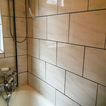
We were contacted by a client from the Levenshulme area of Greater Manchester who had just purchased a property there and hated the state of the grout which despite cleaning did not improve. The owner said she could not use the bathroom in this state as it looked disgusting and unclean and was keen to have it renovated. The rest of the house was being redecorated so whilst that was going on, I was called over to have a proper look at the grout and quote for sorting it out.
It didn’t take long to understand the issue, is seems the previous owner in an attempt to improve the appearance of the grout had touched it up by applying another thin layer of grout on top of the original. Now both the new and old was starting to flake off making a real mess.
I explained to the client we would need to scrape out the new layer, clean the original and then apply a grout colourant to improve the overall appearance. I gave her a price for the work, and she was happy for me to go ahead with the job.
My first task was to scrape off the new layer of grout, so I had a stable grout line to work from. I then started cleaning the grout up using a Tile Doctor Grout Colourant Pre-Treater cleaner, this cleans up the grout and being acidic it etches the surface to provide a better base for the grout colourant to adhere to. The dirt was rinsed off and then the area was dried using a heat gun.
Once dry I used a Tile Doctor Grout Colourant in Charcoal Grey (one bottle was sufficient). This product is equally effective for interior or exterior applications including bathrooms and kitchens and it is available in ten different colours. The client had requested to darken the grout and give it a completely new modern look. The colourant is painted onto the grout with a small brush and any excess which gets onto the tile is removed with a cloth before it dries.
The best thing about the grout colourant is it forms an easy to clean seal over the grout which ensures the grout is protected. Given Ceramic tiles are glazed and therefore don’t need sealing the new combination should ensure the tiles keep their appearance for a very long time with minimal cleaning. The silicone sealant between the bath and the wall tiles looked in good condition and had not discoloured so there was no need for this to be replaced.
The bathroom now looked clean and inviting and I’m pleased to report my client was very happy with the completed renovation and was finally happy to use the bathroom!
I recommended that for on-going cleaning that they use Tile Doctor Aqua-Pro, this is a pH neutral cleaner with a trigger action for easy application. It can be used in the bathroom every day. It helps to keep soap scum and limescale at bay and has a pleasant lemon smell so cleaning should not be too much of a chore.
Alex Logonzy
Greater Manchester Tile Doctor
 Marketplace and Russ Lyon Sothebys Intnl. Realty
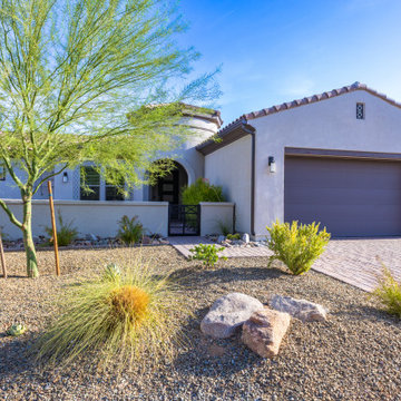
Just Listed - ARMLS# 6907696 - Offered at $1,095,000
Discover the epitome of upscale resort living in this stunning single-family home located in the prestigious gated community of Trilogy® at Verde River, a 55+ and All Ages Resort Community. This highly popular Brasada floor plan offers impeccable attention to detail and the finest finishes throughout. Custom upgrades totaling $180,000 include granite and quartz counter tops, wood-wrapped kitchen island, additional linen cabinets in both suites, high end GE Monogram SS Gourmet appliances, upgraded cabinets with soft close doors and drawers and cabinet rollouts, undercabinet kitchen lighting, extended 3-car garage, alarm system, fenced back yard, extended covered patio, porcelain tile flooring throughout, reverse osmosis water filter, and water softener. The primary suite offers a private sanctuary for relaxation, with a generous soaking tub, spacious walk-in closet, double sinks, custom barn door, and flush mount tiled shower. A second en-suite bedroom provides comfortable accommodations and privacy for family or guests. The home also includes a den with a custom barn door, adding versatility and functionality to the space. This exceptional residence, boasting 2,186 square feet of living space on a 0.29-acre lot, provides the ideal setting for comfortable daily living and entertaining. Step inside and be captivated by the open floor plan, high ceilings, and luxurious finishes throughout. Sliding doors in the primary suite, dining room, and great room beckon you to the expansive backyard with its manicured landscaping, fruit trees, extended covered patio, and stunning 15’x30’ heated pool, creating an inviting space for outdoor enjoyment. Trilogy at Verde River offers upscale resort living at its finest and the very best of all possible worlds, close to the conveniences of affluent North Scottsdale, yet secreted within the pristine privacy of the Sonoran Desert. The property is located within walking distance to world-class amenities including: the Tom Lehman-inspired eighteen-hole golf course, tennis courts, pickleball courts, bocce ball, heated lap pool, and a resort-style swimming pool, hot tub, Afterburn fitness center, Helen's demonstration Kitchen for cooking classes, and a 7.5-acre dog park. The community center has casual poolside dining at Eddy's Diner, gourmet dining at award-winning Needle Rock Kitchen and Tap, Alvea Spa with full-service Salon and Spa amenities, Art Loft, and events center. Trilogy at Verde River is adjacent to the Tonto National Forest and is situated in the middle of miles and miles of hiking and biking trails. Whether you're seeking a second Winter home or will live here year-round, Trilogy at Verde River is an ideal distance from the hustle and bustle of North Scottsdale. You'll love the resort living! ASSUMABLE 4.250% VA LOAN! Furnishings are available for purchase through a separate contract.
 Roeser Home Remodeling
This Mid-Century home had been updated except for the kitchen and master bath. After a few years of being empty nesters, and with the neighborhood turning over drastically to infill property in the millions, this couple decided the time was right to update the last remaining rooms.
Starting in the Kitchen
Taking a dark, u-shaped kitchen out of the past and updating it for the future, was a dream come true for this family. They knew what they wanted in order to entertain their large extended family, which included their three kids; plus, his family, consisting of nine children, spouses, and now grandchildren. Requirements of an open space to hang out and help out, a banquet for food presentation without obstruction, bright and clean, easy storage, a place for her mother’s china decanters, and an instant hot for tea were all part of the “must haves” for this kitchen. We also needed to work around the homeowners’ existing appliances since many of them were practically new.
Vaulted ceilings, lots of high windows, and large openings to other spaces in the house, were challenges that only a galley style kitchen could address. Blending and lacing the hardwood floor with new flooring required both the new and existing to be sanded down and refinished. This provided a coherent look to the entire first floor of this home. Matching casings, baseboards and base shoe helped to make the updates look fresh, but original to the house.
In the kitchen, choosing the sandstone slate finish on our Wellborn Maple select series cabinets kept the space soft; but really opened it, making the space lighter and brighter. The Harmony style door choice blended with the décor in the rest of the house, while also giving straight clean lines the homeowner desired. Grounding the row of cabinets with their refrigerator and a pantry cabinet, gave symmetry to this side of the kitchen.
On the opposite side, a built-in pantry cabinet mirrors the refrigerator. A row of drawer cabinets expanded the storage and banquet space, to lay out food for entertaining. Also added were some much-needed wall cabinets with glass inserts to mirror the windows and keep the space open. This also allowed the taller canister to be displayed and admired. A few smaller shelves were added above the window space, to house the smaller canisters so loved by the homeowner.
An artist by trade, this homeowner added two narrow cabinets to the side of the pantry and the side of the refrigerator panel to house and create easy access to the various spices her husband loves to use while cooking. She painted them to blend with Wellborn’s Sandstone finish. The Caesarstone countertop with a 3cm eased edge in London Gray has a small pattern that is subtle and interesting. Cutting down the Caesarstone to 2 cm and carrying the same London Gray pattern up the backsplash area, lended to the clean lines and easy cleaning this homeowner requested.
Choosing chrome plumbing fixtures from Moen’s Brantford line is timeless choice. Chrome is always popular and yet in today’s market, also very trendy. The Brantford faucet has a pull-down spray and one side handle, leaving space for the all-important request of a Transcape hot water dispenser, also in chrome.
Scraping away the past included smoothing out the popcorn ceiling. Adding LED slope cans to the vaulted ceilings provided the necessary task lighting to elevate these homeowners’ joy of cooking. Removing the dated “popcorn look” enhanced the clean and spacious feel created by the architecture of the ceiling. Adding Top Knob chrome hardware was the final element that tied the kitchen all together.
Master Bathroom
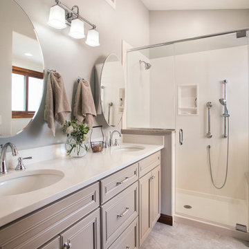
The original dated Master Bathroom had dark cabinets, a huge Jacuzzi tub and a small shower stall that provided barely enough room for even a child to shower. Removing the Jacuzzi tub that was never used, opened this floor plan to a grand shower that is comfortable and spacious. For easy cleaning, these homeowners opted for a panel system in their shower. Onyx shower walls with a shower seat and recess wide shower caddy were installed in place of the old Jacuzzi style tub.
The large panels were quite a challenge for our team, with an eight foot door and vaulted ceilings; but they were determined not to have a seam. These seamless panels are beautiful and very easy to clean. Keeping with the original floor plan, a double sink vanity from Wellborn’s select line with the Harmony door style in a pebble finish was installed. New Kohler Caxton under mount sinks were installed, along with the Moen Kinsley 8” wide spread faucets in chrome. Matching Kingsley 18” grab bars were added to the shower area, along with the Kohler Brantford fixed shower head and handheld slide bar.
The countertop was a beautiful Caesarstone in Frosty Carrina with an eased edge and 4” back and side splash. Matching Kinsley towel hooks were added, along with mirrors the homeowner purchased and we installed for her. Top Knobs chrome cabinet hardware finished the look along with a beautiful tile floor AO Mira 1224-S Silver Maple laid in a broken joint pattern. Matching marble sills were added on top of the knee walls and threshold in the doorway. A 3/8” frameless custom shower door with fixed panels surrounded the shower creating an open airy feel to the space.
Not shown: Kohler’s Wellworth highline toilet with a slow-close seat replaces the original toilet. The original shower stall became a space used to house a stackable washer and dryer, a top a safety pan and drain to slop sink in the basement. There was even enough room for small shelving to provide storage for laundry essentials. Adding a louver door keeps the laundry area behind the scene and opens the master area to multiple tasks needed.
Master Bedroom Fireplace
This homeowner really missed a bedroom fireplace they had in a previous home. Since we were going to be working on their master bathroom anyway; was there a way to create a fireplace without making it feel too odd in their large bedroom area? They had purchased a ventless gas fireplace and they had their original television as well.
Challenged by windows, a vaulted ceiling and the natural light streaming from the back window; this divided wall was created, keeping the lighting from the other side of the room and providing a dressing area opposite the fireplace. This was a perfect idea since the closets are now in the dressing area and the creative wall houses the fireplace and TV for cold winter nights of snuggling to a movie. Better yet, the fireplace and TV are all on remote control!

Sponsored
Sunbury, OH

J.Holderby - Renovations
Franklin County's Leading General Contractors - 2X Best of Houzz!

 Hearthstone Inc
Richard Herman is in the hospitality business and owns several upscale hotels in Florida and in other states as well as cattle ranches in both Florida and Missouri. Their farm in Ocala is by farm their most unique. The property serves as a 4-H demonstration project for the purpose of children’s education. They have been working with the Academy Prep of St. Pete which is dedicated to inner-city youths that are selected on the basis of need and achievement. Wife Diane spends her time on the farm raising Gypsy Vanners, a diminutive draft horse named after the job they did in Eastern Europe, pulling the wagons (vans) for gypsies that wandered across the continent. On the Ocala farm, there are several mules with a unique profession.
Richard had visited the Hearthstone display at a Log & Timber Home Shows at the Orlando Convention Center many years ago. He was impressed that Hearthstone had stayed in touch with him over the years by mailings, invitations to shows, and periodic phone calls. When the time came to start serious consideration of the design of barn, Hearthstone responded promptly and professionally to Richard and Diane’s requests for information and a review of their ideas for their barn, which would serve as the centerpiece for their new farm.
They wanted a multipurpose facility that could accommodate an educational environment and a large hall suitable for the fundraising events for his charities. Richard wanted a barn that reflected the look and feel of barns built at the dawn of the 20th century. Besides the rustic chicken houses and vegetable gardens, they have completely renovated a 1020’s era farmhouse to be as historically correct as possible and serves as the entry to the farm.
“They very careful to feel us out, get comfortable with our capabilities, and be convinced that we could perform as promised,” said Project Manager John Ricketson of Hearthstone.
Design Process
There were some initial drawings that gave us a start on the basic shape and size of the barn. From there, it was a process of narrowing down the uses of each area and the spans that could be achieved. The barn was going to have the traditional “board & batten” exterior siding and a metal roof. There is a cantilevered ‘hay hood” on the north gable end above the large sliding barn doors that open into the foyer and horse stalls. The wings house a combination of areas, beginning with the large restrooms to accommodate crowds for events. Other parts of the wings have garage areas for the farm vehicles, feed room, tack room, wash rack, storage, offices, and smaller restrooms.
Keeping with the look and feel of the turn of the century, Hearthstone developed a process for giving the timbers a surface texture that mimicked the circular cuts of timbers that had just come out of an old sawmill. This was easier said than done. Randy Giles guided his millwright (Wolfgang) in designing a machine that would do this effectively.
The barn was delivered in October of 2014 and was erected over the course of two weeks, thanks to a hardworking crew (Eric Foster) and near-perfect weather. After the Hearthstone crew completed the erection and roof dry-in, it was time for the local carpenters to step up and install some light conventional framing on the gable ends before applying the roof fascia and exterior board & batten siding. Next came the big sliding barn doors, plumbing, electrical, heating, and cooling. Large rustic fixtures were hung from the great hall roof timbers.
Exterior
The board & batten siding was cypress and allowed to turn color naturally as rain hit it and the sun started working on it with UV rays. This method causes a much grayer look closer to the ground and less so where the roof overhang provides protection. The North end has some large limestone boulders and planters arranged around the pad with tall pampas grass. The planters provide casual seating before events and during outside receptions. The entire area was sodded with lush St. Augustine grass and split rail fences were added to enclose the barn area. The corrugated metal roof was a special order material that immediately rusted after being exposed to moisture. The layer of rust protects the metal from the elements.
Interior
The board & batten theme was carried throughout most of the interior with the timbers left natural to show off the circular saw texture. All of the tongue & groove decking was shipped in advance to allow the local painter to pre-stain it with a dark brown transparent stain that is a beautiful background to the light color Eastern White Pine timbers.
“Everything was unique in this project” said Project Manager John Ricketson. “The setting on a small demonstration farm close to Ocala, the multipurpose design, the circular saw texture on the timbers.”
The Hermans are very proud of their farm’s outcome. Richard sent a note to Randy Giles, owner of Hearthstone: “The Barn is fantastic, not a single problem, period. Next month, we have Jo Dee Messina coming in to help with a fundraiser for a local center for abused kids. Folks love the farm, ...... but that barn gets all of the attention. I would encourage you to use me as a reference for your sales team, feel free to extend my cell phone to any prospective purchasers.”

 Pool Environments, Inc.
The client purchased this property with grand plans of renovating the entire place; from top to bottom, and from inside to outside. And while the inside canvas was very generous and even somewhat forgiving, the outside space would be anything but.
We wanted to squeeze in as much seating space as possible in their limited courtyard area, without encroaching on the already compact-sized pool. The first and most obvious solution was to get rid of the trees and shrubs that separated this house from its zero-lot-line neighbor. With the addition of Lueder limestone slabs, this alone would free up nearly 120 additional square feet, which happened to be the perfect amount of space for a mobile gas fire pit and sectional sofa. And all of this would make for the perfect place to enjoy the afternoon sunset with the implementation of a custom-built metal pergola standing above it all.
The next problem we saw was that around the patio area, there were too many levels of steps and stairs, which meant that it would have been difficult to have any sort of traditional furniture arrangement. Randy knew that it only made sense to bring in a wood deck that could be mated to the highest level of the patio, thus creating gaining the most continuous amount of flat space that the client was wanting. But even so, that flat space would be limited to a tight "L-shape" around the pool. And knowing this, the client decided that the larger space would be more valuable to them than the spa, so they opted to have a portion of the deck built over it in order to allow for a more generous amount of patio space.
And with the edge of the patio/deck dropping off almost 2 feet to the waterline, it now created the perfect opportunity to have a visually compelling raised wall that could be adorned with different hues of plank-shaped tiles. From inside the pool, the varying shades of brown were a great accent to the wood deck that sat just above.
However, the true visual crowning jewel of this project would end up being the raised back wall along the fence, fully encased in a large format, 24x24 slate grey tile, complete with a custom stainless steel, square-tube scupper bank, installed at just the right height to create the perfect amount of water noise.
But Randy wasn't done just yet. With two entirely new entertaining areas opened up at opposite ends of the pool, the only thing left to do now was to connect them. Knowing that he nor the client wanted to eliminate any more water space, he decided to bring a new traffic pattern right into the pool by way of two "floating", Lueder limestone stepper pads. It would be a visually perfect union of both pool and walking spaces.
The existing steps and walkways were then cut away and replaced with matching Lueder limestone caps and steppers. All remaining gaps were then filled with Mexican beach pebble, which helped to promote a very "zen-like" feel in this outdoor space.
The interior of the pool was coated with Wet Edge Primerastone "Blue Pacific Coast" plaster, and lit up with Pentair GloBrite LED pool lights.
In the end, the client ended up gaining the additional entertaining and seating space that they needed, and the updated, modern feel that they loved.
 Advance Design Studio, Ltd.
This 1930's Barrington Hills farmhouse was in need of some TLC when it was purchased by this southern family of five who planned to make it their new home. The renovation taken on by Advance Design Studio's designer Scott Christensen and master carpenter Justin Davis included a custom porch, custom built in cabinetry in the living room and children's bedrooms, 2 children's on-suite baths, a guest powder room, a fabulous new master bath with custom closet and makeup area, a new upstairs laundry room, a workout basement, a mud room, new flooring and custom wainscot stairs with planked walls and ceilings throughout the home.
The home's original mechanicals were in dire need of updating, so HVAC, plumbing and electrical were all replaced with newer materials and equipment. A dramatic change to the exterior took place with the addition of a quaint standing seam metal roofed farmhouse porch perfect for sipping lemonade on a lazy hot summer day.
In addition to the changes to the home, a guest house on the property underwent a major transformation as well. Newly outfitted with updated gas and electric, a new stacking washer/dryer space was created along with an updated bath complete with a glass enclosed shower, something the bath did not previously have. A beautiful kitchenette with ample cabinetry space, refrigeration and a sink was transformed as well to provide all the comforts of home for guests visiting at the classic cottage retreat.
The biggest design challenge was to keep in line with the charm the old home possessed, all the while giving the family all the convenience and efficiency of modern functioning amenities. One of the most interesting uses of material was the porcelain "wood-looking" tile used in all the baths and most of the home's common areas. All the efficiency of porcelain tile, with the nostalgic look and feel of worn and weathered hardwood floors. The home’s casual entry has an 8" rustic antique barn wood look porcelain tile in a rich brown to create a warm and welcoming first impression.
Painted distressed cabinetry in muted shades of gray/green was used in the powder room to bring out the rustic feel of the space which was accentuated with wood planked walls and ceilings. Fresh white painted shaker cabinetry was used throughout the rest of the rooms, accentuated by bright chrome fixtures and muted pastel tones to create a calm and relaxing feeling throughout the home.
Custom cabinetry was designed and built by Advance Design specifically for a large 70” TV in the living room, for each of the children’s bedroom’s built in storage, custom closets, and book shelves, and for a mudroom fit with custom niches for each family member by name.
The ample master bath was fitted with double vanity areas in white. A generous shower with a bench features classic white subway tiles and light blue/green glass accents, as well as a large free standing soaking tub nestled under a window with double sconces to dim while relaxing in a luxurious bath. A custom classic white bookcase for plush towels greets you as you enter the sanctuary bath.
Joe Nowak
 Advance Design Studio, Ltd.
This 1930's Barrington Hills farmhouse was in need of some TLC when it was purchased by this southern family of five who planned to make it their new home. The renovation taken on by Advance Design Studio's designer Scott Christensen and master carpenter Justin Davis included a custom porch, custom built in cabinetry in the living room and children's bedrooms, 2 children's on-suite baths, a guest powder room, a fabulous new master bath with custom closet and makeup area, a new upstairs laundry room, a workout basement, a mud room, new flooring and custom wainscot stairs with planked walls and ceilings throughout the home.
The home's original mechanicals were in dire need of updating, so HVAC, plumbing and electrical were all replaced with newer materials and equipment. A dramatic change to the exterior took place with the addition of a quaint standing seam metal roofed farmhouse porch perfect for sipping lemonade on a lazy hot summer day.
In addition to the changes to the home, a guest house on the property underwent a major transformation as well. Newly outfitted with updated gas and electric, a new stacking washer/dryer space was created along with an updated bath complete with a glass enclosed shower, something the bath did not previously have. A beautiful kitchenette with ample cabinetry space, refrigeration and a sink was transformed as well to provide all the comforts of home for guests visiting at the classic cottage retreat.
The biggest design challenge was to keep in line with the charm the old home possessed, all the while giving the family all the convenience and efficiency of modern functioning amenities. One of the most interesting uses of material was the porcelain "wood-looking" tile used in all the baths and most of the home's common areas. All the efficiency of porcelain tile, with the nostalgic look and feel of worn and weathered hardwood floors. The home’s casual entry has an 8" rustic antique barn wood look porcelain tile in a rich brown to create a warm and welcoming first impression.
Painted distressed cabinetry in muted shades of gray/green was used in the powder room to bring out the rustic feel of the space which was accentuated with wood planked walls and ceilings. Fresh white painted shaker cabinetry was used throughout the rest of the rooms, accentuated by bright chrome fixtures and muted pastel tones to create a calm and relaxing feeling throughout the home.
Custom cabinetry was designed and built by Advance Design specifically for a large 70” TV in the living room, for each of the children’s bedroom’s built in storage, custom closets, and book shelves, and for a mudroom fit with custom niches for each family member by name.
The ample master bath was fitted with double vanity areas in white. A generous shower with a bench features classic white subway tiles and light blue/green glass accents, as well as a large free standing soaking tub nestled under a window with double sconces to dim while relaxing in a luxurious bath. A custom classic white bookcase for plush towels greets you as you enter the sanctuary bath.
Joe Nowak
Sponsored
Sunbury, OH
J.Holderby - Renovations
Franklin County's Leading General Contractors - 2X Best of Houzz!

 All Roofing Specialists
Roofer in Bay Shore NY 11706 offer roofing, siding, skylight, chimney leak repair or install new one also your house need roof replacement contact us today.
 Klopf Architecture
The Roger Lee designed house from 1962 was purchased by the current homeowners in almost original condition, as the previous owners elected to defer most maintenance projects over the years. The clients were able to see beyond the dated materials and finishes, single-paned glass and uninsulated walls and they approached Klopf Architecture to help them expand and update the entire home, one the family could settle into and enjoy for years to come. It was important that the new designs were aligned with Lee's original intent not only because of the client's appreciation for mid-century modern architecture, but also because the house was deemed historical. The Stanford Real Estate Office requires a stringent design review which safeguards the integrity of the community, which Klopf Architecture was happy to oblige going into their updated designs.
As with many original mid-century modern homes, the house was scaled to the 1960s lifestyle where rooms were smaller and openings to views were limited and tightly framed. The original conditions defined the direction the family of four would take in updating the house and making it comfortable for their modern lifestyle. Klopf designed a full gut remodel and major addition to bring the house into the 21st century and provide the living area needed for the client's family. The newly expanded house added just about 1,100 sf to create an airy, comfortable and family friendly house, taking full advantage of the beautiful southwestern views that extend out to the hills beyond. The enclosed garage created an additional 240 sf of covered space for long-term storage.
A cracked swimming pool created an eyesore taking up a majority of the backyard landscape, so it was one of the first elements to go during the transformation. Working with Outer Space Landscape Architects, the family asked for a mix of relaxing outdoor patio spaces that eventually blend into the native landscaping, extending their views outward toward the natural greenery of the trees beyond their property. Filling in the old pool was a smart way to expand the living spaces outward. The orientation of the house was designed to enjoy the views, but the original architecture provided the first homeowners with mere glimpses of the landscape outside.
Klopf was able to broaden those views, continuing and extending on the original architecture to take full advantage of the unobstructed natural views across the rear facade of the house. Small horizontal openings in the primary bedroom and office were replaced with much taller windows that now follow the angled roof line upward, extending across almost all of the facade. We worked with Western Windows, whose designs included an oblique-shaped, operable casement that allowed our design to rise with the slope. A new corner office added to the primary suite, offers a bright and functional work-from-home solution that looks out at the distant views and added natural light from the expanded window configuration that now wraps around the corner.
The existing lower level was designed by Lee as a utilitarian space, serving as a wet pool room with a drain in the center of the floor, bathroom, laundry and storage areas. Without the need for a pool room, Klopf was able to convert the area into a much more comfortable and functional living space with a new family room and guest suite. The new spaces enjoy easy access to a new outdoor patio through floor to ceiling, full-width glass sliders.
Continuing along the rear facade, a previously exposed deck extending from the living room and hallway provided access to the backyard through a single set of stairs leading toward the side of the house which made sense when the pool was in place. The new deck was re-envisioned as an extension of the main living room and now serves as a second outdoor living room. A new slatted pergola above provides the homeowners welcome relief from the hot afternoon sun. A second set of stairs now creates a better connection to the redesigned lower level. Klopf was able to reconfigure the spaces, extending the living room outward toward the views, where the family now claims it as the heart of the home, spending a large majority of their time outdoors.
Back inside, the original wood-burning Malm fireplace was beautifully restored and a gas burner installed to comply with California's strict air standards. It now rests in front of a wall of Heath accent tiles where a dated red brick wall used to stand. A new taller window brings more light and views into the refreshed interior living room. The original glass doors opposite the fireplace were replaced by larger sliders that when fully opened, create a seamless transition to the new outdoor living area so the two spaces feel like one connected space. The original utilitarian kitchen was needlessly tucked into the far back corner and closed-off, out of sight from the living room, so the clients asked Klopf to open it up and expand the kitchen forward so it felt more connected. Today the much larger kitchen is connected to the living area where a short wall with a cutout offers a visual glimpse into the kitchen and a handy pass-through counter for serving guests. A new breakfast nook was also added to create another spot where the family can gather for casual meals. Just outside, a new built-in outdoor grill and prep area extends the kitchen outside and connects to a new outdoor dining spot nestled amongst the trees, taking advantage of the views out back.
Klopf was able to expand the other two bedrooms, add a new laundry room and half-bath and convert the carport to an enclosed garage to add more storage areas which was lost when the pool house was converted to the family and guest room.
To maintain a historical connection to the original designs, the exterior siding was repeated on all exterior walls, a full-height stained glass window at the front entryway restored, and an interior slatted screen element repeated outside at the exterior entry courtyard and over the new outdoor living room to create a shade trellis. The new house stands proudly and shines against it's new landscaping features, while respecting and expanding on the original intent of Roger Lee's designs epitomizing the comforts of indoor-outdoor living in Northern California.
Completion year: 2020
Klopf Architecture project team: John Klopf, Klara Kevane, Noel Andrade
Contractor: ORB Construction, Brendan O'Reilly
Structural engineer: Sezen and Moon
Landscape architect: Outer space
Furnishings and decoration: Urbanism Designs
Photographer: Mariko Reed
 Klopf Architecture
The Roger Lee designed house from 1962 was purchased by the current homeowners in almost original condition, as the previous owners elected to defer most maintenance projects over the years. The clients were able to see beyond the dated materials and finishes, single-paned glass and uninsulated walls and they approached Klopf Architecture to help them expand and update the entire home, one the family could settle into and enjoy for years to come. It was important that the new designs were aligned with Lee's original intent not only because of the client's appreciation for mid-century modern architecture, but also because the house was deemed historical. The Stanford Real Estate Office requires a stringent design review which safeguards the integrity of the community, which Klopf Architecture was happy to oblige going into their updated designs.
As with many original mid-century modern homes, the house was scaled to the 1960s lifestyle where rooms were smaller and openings to views were limited and tightly framed. The original conditions defined the direction the family of four would take in updating the house and making it comfortable for their modern lifestyle. Klopf designed a full gut remodel and major addition to bring the house into the 21st century and provide the living area needed for the client's family. The newly expanded house added just about 1,100 sf to create an airy, comfortable and family friendly house, taking full advantage of the beautiful southwestern views that extend out to the hills beyond. The enclosed garage created an additional 240 sf of covered space for long-term storage.
A cracked swimming pool created an eyesore taking up a majority of the backyard landscape, so it was one of the first elements to go during the transformation. Working with Outer Space Landscape Architects, the family asked for a mix of relaxing outdoor patio spaces that eventually blend into the native landscaping, extending their views outward toward the natural greenery of the trees beyond their property. Filling in the old pool was a smart way to expand the living spaces outward. The orientation of the house was designed to enjoy the views, but the original architecture provided the first homeowners with mere glimpses of the landscape outside.
Klopf was able to broaden those views, continuing and extending on the original architecture to take full advantage of the unobstructed natural views across the rear facade of the house. Small horizontal openings in the primary bedroom and office were replaced with much taller windows that now follow the angled roof line upward, extending across almost all of the facade. We worked with Western Windows, whose designs included an oblique-shaped, operable casement that allowed our design to rise with the slope. A new corner office added to the primary suite, offers a bright and functional work-from-home solution that looks out at the distant views and added natural light from the expanded window configuration that now wraps around the corner.
The existing lower level was designed by Lee as a utilitarian space, serving as a wet pool room with a drain in the center of the floor, bathroom, laundry and storage areas. Without the need for a pool room, Klopf was able to convert the area into a much more comfortable and functional living space with a new family room and guest suite. The new spaces enjoy easy access to a new outdoor patio through floor to ceiling, full-width glass sliders.
Continuing along the rear facade, a previously exposed deck extending from the living room and hallway provided access to the backyard through a single set of stairs leading toward the side of the house which made sense when the pool was in place. The new deck was re-envisioned as an extension of the main living room and now serves as a second outdoor living room. A new slatted pergola above provides the homeowners welcome relief from the hot afternoon sun. A second set of stairs now creates a better connection to the redesigned lower level. Klopf was able to reconfigure the spaces, extending the living room outward toward the views, where the family now claims it as the heart of the home, spending a large majority of their time outdoors.
Back inside, the original wood-burning Malm fireplace was beautifully restored and a gas burner installed to comply with California's strict air standards. It now rests in front of a wall of Heath accent tiles where a dated red brick wall used to stand. A new taller window brings more light and views into the refreshed interior living room. The original glass doors opposite the fireplace were replaced by larger sliders that when fully opened, create a seamless transition to the new outdoor living area so the two spaces feel like one connected space. The original utilitarian kitchen was needlessly tucked into the far back corner and closed-off, out of sight from the living room, so the clients asked Klopf to open it up and expand the kitchen forward so it felt more connected. Today the much larger kitchen is connected to the living area where a short wall with a cutout offers a visual glimpse into the kitchen and a handy pass-through counter for serving guests. A new breakfast nook was also added to create another spot where the family can gather for casual meals. Just outside, a new built-in outdoor grill and prep area extends the kitchen outside and connects to a new outdoor dining spot nestled amongst the trees, taking advantage of the views out back.
Klopf was able to expand the other two bedrooms, add a new laundry room and half-bath and convert the carport to an enclosed garage to add more storage areas which was lost when the pool house was converted to the family and guest room.
To maintain a historical connection to the original designs, the exterior siding was repeated on all exterior walls, a full-height stained glass window at the front entryway restored, and an interior slatted screen element repeated outside at the exterior entry courtyard and over the new outdoor living room to create a shade trellis. The new house stands proudly and shines against it's new landscaping features, while respecting and expanding on the original intent of Roger Lee's designs epitomizing the comforts of indoor-outdoor living in Northern California.
Completion year: 2020
Klopf Architecture project team: John Klopf, Klara Kevane, Noel Andrade
Contractor: ORB Construction, Brendan O'Reilly
Structural engineer: Sezen and Moon
Landscape architect: Outer space
Furnishings and decoration: Urbanism Designs
Photographer: Mariko Reed
87