
Search results for "Purchasers continuously" in Home Design Ideas
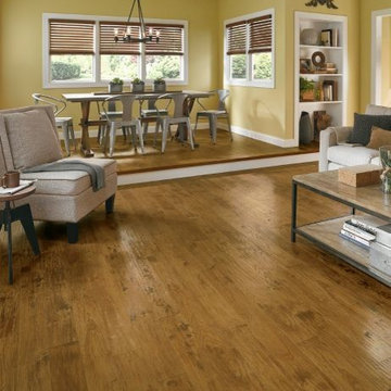
 Sarmazian Brothers Flooring
[Armstrong Laminate - Rustics Premium]
Crystal clear visuals that look and feel like hardwood or stone, plus a surface that resists scratches, stains, dents and moisture. Laminate flooring makes it all possible on a practical budget. Choose from countless traditional, rustic or modern styles, perfect for any room in your home – even your walls!
Over their 40-year history of selling top quality floor coverings, Sarmazian Bros. Ltd.'s reputation for high caliber products and service is continually being enhanced by the testimonials of its customers. As a family-owned business, the Sarmazian brothers and their staff pride themselves on the ability to provide the best end-to-end purchasing experience in the market. New flooring is the foundation of personal expression in any home; at the same time, it is one of the most costly investments. This is why Sarmazian's takes the extra time to supply the expert knowledge, exceptional pricing, and professional installation enabling to transfer optimum satisfaction to the customer.
Sarmazian's award winning showrooms allow the imagination to go wild. The spacious design and interactive layouts let customers browse, touch, and feel the extensive selection of merchandise in a friendly relaxed atmosphere. Because Sarmazian Bros. deals directly with the manufacturers and installers we offer quicker service, better support, and pass on the savings directly to you, the customer.
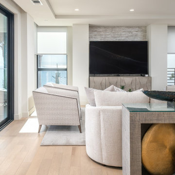
 Michelle Jett – Decorating Den Interiors
This Pacific Palisades home was purchased new as a vacation home for our client and his family. He wanted the home to incorporate transitional elements with clean lines and a simple design. We addressed adding privacy without obstructing or minimizing ocean views but allowing privacy from neighbors.
The family room features a transitional design with a neutral palette, that is both light and sophisticated. The chairs selected for this project are upholstered with comfortable wood edges and with tones that play off of both the light wood flooring and accented media wall.
We incorporated a glass coffee table with rattan poles that were bundled and twisted together to mimic earthy elements that added depth and structure to the core of the living space. A light rug was placed underneath the furniture to bring warmth to the room and continue the monochromatic color scheme.
Dark window edges opened up the entire room for focus to extend back and forth from a classy and comfortable interior to beautiful ocean views. Motorized window shades in a neutral color added privacy and shading for the setting sun and to easily raise for enjoying the ocean view.
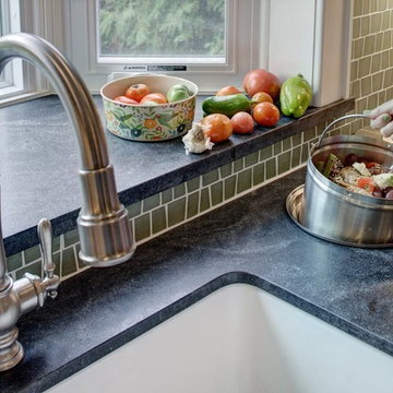
 Tracey Stephens Design, LLC
Memories TTL/Wing Wong
Mid-sized minimalist u-shaped slate floor kitchen photo in New York with a farmhouse sink, shaker cabinets, medium tone wood cabinets, granite countertops, glass tile backsplash, stainless steel appliances and an island
Mid-sized minimalist u-shaped slate floor kitchen photo in New York with a farmhouse sink, shaker cabinets, medium tone wood cabinets, granite countertops, glass tile backsplash, stainless steel appliances and an island
Find the right local pro for your project

 The Cultural Landscape Foundation
Sunday, April 12, 3:00-5:00pm
Register Online: https://tclf.org/event/garden-dialogues-dallas-fort-worth-2015
The Dallas Urban Reserve by Kevin Sloan, ASLA, M.Arch of Kevin Sloan Studio, with Robert Meckfessel, FAIA, DSGN Associates
Photos courtesy of Kevin Sloan Studio
Internationally recognized as an “innovative green project,” the award-winning Urban Reserve transformed a 10-acre site that had been an illegal landfill for more than 50 years into an exquisite Modernist community. In 2004, Urban Edge Developers in Dallas purchased the tract to construct a sustainable community, engaging landscape architect Kevin Sloan Studio and architects including Tod Williams and Billie Tsien. The refined aesthetics and careful grooming are equaled by environmentally sensitive details: the main street is a continuous biofilter; storm water is conveyed into rain gardens, separated by parking; cypress and reed plants filter water to sedimentation ponds for low-velocity drip irrigation. Concrete fragments and steel beams left over from its previous use as a landfill have been repurposed as “bricolage” for pavements and terraces. As part of the Dialogue, attendees will visit the landscapes of several private residences.
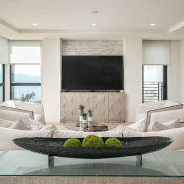 Michelle Jett – Decorating Den Interiors
This Pacific Palisades home was purchased new as a vacation home for our client and his family. He wanted the home to incorporate transitional elements with clean lines and a simple design. We addressed adding privacy without obstructing or minimizing ocean views but allowing privacy from neighbors.
The family room features a transitional design with a neutral palette, that is both light and sophisticated. The chairs selected for this project are upholstered with comfortable wood edges and with tones that play off of both the light wood flooring and accented media wall.
We incorporated a glass coffee table with rattan poles that were bundled and twisted together to mimic earthy elements that added depth and structure to the core of the living space. A light rug was placed underneath the furniture to bring warmth to the room and continue the monochromatic color scheme.
Dark window edges opened up the entire room for focus to extend back and forth from a classy and comfortable interior to beautiful ocean views. Motorized window shades in a neutral color added privacy and shading for the setting sun and to easily raise for enjoying the ocean view.
 Home Expressions Interiors by Laura Bloom Inc.
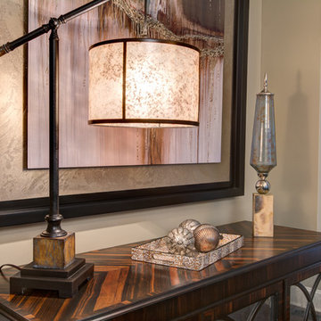
This client came to us wanting to enhance their existing space by using some creative finishes for walls. They hoped to make the home feel more modern with an urban rustic vibe as opposed to the traditional architectural style of the structure but did not know how to accomplish this transition. Upon our arrival it was noted that all walls had been painted white which was determined too harsh and did not achieve the modern feel the homeowner had hoped to evoke. The space was softened by using a subtle and fresh color palette with one accent color for impact. Teal was the color selected to create a continuous thread of pop in varying degrees in each room which included the Entry Hall, Dining Room and Living Room. Touches of black were injected into each space due to the client’s previous purchases of a drum fixture for the living room and black dining table; both gave direction on scale and style.
The Entry Hall was given powerful impact as someone enters the home by taking its cue from the abstract art selected for the Dining Room. A faux concrete wall was created with the use of artistically combined colors. In the Dining Room, the use of classic chairs are successfully made modern by upholstering in teal leather which added both continuity and unexpected interest next to the velvet Greek Key pattern found on host chairs. In the Living Room custom upholstered sofa and chairs are grounded by a rug that brings all colors together. A unique copper rivet finish was applied in the niches that flank the fireplace as a contrast to whimsical amber crystal mini chandeliers hung over modern consoles that display simple yet exciting teal bowls. The final furnishings, art and accessories ultimately brought the entire home together in a rustic, modern way that is warm and inviting reflecting the unique personality of the people who live there.
 Home Expressions Interiors by Laura Bloom Inc.
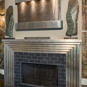
This client came to us wanting to enhance their existing space by using some creative finishes for walls. They hoped to make the home feel more urban, rustic and modern as opposed to the traditional architectural style of the structure but did not know how to accomplish this transition. Upon our arrival it was noted that all walls had been painted white which was determined too harsh and did not achieve the modern feel the homeowner had hoped to evoke. The space was softened by using a subtle and fresh color palette with one accent color for impact. Teal was the color selected to create a continuous thread of pop in varying degrees in each room which included the Entry Hall, Dining Room and Living Room. Touches of black were injected into each space due to the client’s previous purchases of a drum fixture for the living room and black dining table; both gave direction on scale and style.
The Entry Hall was made powerfully impactful as someone enters the home by taking its cue from the abstract art selected for the Dining Room. A faux concrete wall was created with the use of artistically combined colors. In the Dining Room, the use of classic chairs are successfully made modern by upholstering in teal leather which added both continuity and unexpected interest next to the velvet Greek Key pattern found on host chairs. In the Living Room custom upholstered sofa and chairs are grounded by a rug that brings all colors together. A unique copper rivet finish was applied in the niches that flank the fireplace as a contrast to whimsical amber crystal mini chandeliers hung over modern consoles that display simple yet exciting teal bowls. The final furnishings, art and accessories ultimately brought the entire home together in a rustic, modern way that is warm and inviting reflecting the unique personality of the people who live there.


 Dura Supreme Cabinetry
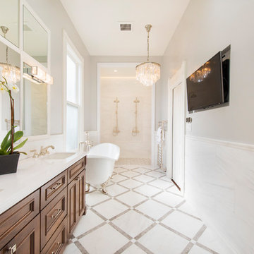
With an ideal location in the Pacific Heights neighborhood of San Francisco, this dated Victorian residence had "beautiful bones" but had been sitting on the market for a year before being purchased with plans to revitalize the interior. Interior designer, Noel Han, explained, "Historical Victorian homes in this area often have beautiful architectural elements that I aim to preserve, but the floor plan and layout tend to be stuffy, not live-able and not light filled. Modern families want bright, light-filled, spacious rooms that take advantage of outdoor views and living spaces, and function well for storage, meals and entertaining."
Preserving the architectural integrity and special features of the home was one of Han's goals but at the same time, she re-designed the space, moving walls and adding windows to create an open floorplan that flowed easily between the kitchen and outdoor living spaces. Where the range once stood in the original design, now an entire wall of windows provides panoramic views of the outdoors and fills the kitchen with light. Below the windows, Han designed a long bank of base cabinets with drawers to provide plenty of storage and work surface. Light now pours into the space even on foggy days. The range was moved to the opposite wall so that beautiful window views could be added to the kitchen.
Han selected a palette of finishes with an eye toward creating a "soft color aesthetic". "White painted finishes are very popular right now but would have felt stark and cold in this space," she explained. "The French grey paint from Dura Supreme was a perfect complement for this vintage Victorian home, to create a classic color scheme".
"This beautiful home already had hardware elements with a vintage brass finish, so I carefully selected antiqued, brushed brass hardware, plumbing and metal finishes to blend with the original elements," said Han. She continued, "The La Cornue French Range adds modern function with a French antique look."
"I appreciate working with Dura Supreme cabinetry because of the quality of the cabinetry, fast delivery and the custom options. I'm able to create beautiful architectural details like the pull-out columns on both sides of the range and the curved mullion doors on the furniture hutch, and they offer a stunning palette of finishes and styles," explained Han. For the bath cabinetry, Han created a similar palette of finishes and styles to create a complementary look throughout the entire home.
Product Details:
Perimeter: Dura Supreme Cabinetry shown in the St. Augustine door style and Mullion Pattern #15 door style with a “Zinc” painted finish.
Kitchen Island: Dura Supreme Cabinetry shown in the St. Augustine door style with a Clove stain and Black Accent finish on Cherry wood.
For more information about Noel Han, Interior Designer, click to her website here www.atelnoel.com.
For more information about Gilmans Kitchens and Baths, click to their website here www.gkandb.com.
Photography by: Ned Bonzi www.nedbonzi.com.
Request a FREE Dura Supreme Brochure Packet:
http://www.durasupreme.com/request-brochure
 Sceltas Custom Homes
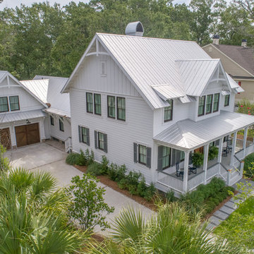
There are so many components of this space that show functionality and glamour. We kept the bright white theme throughout this custom home and extended the shiplap and white high-end materials into the bathroom. One of our favorite pieces that really captured the look included a Victoria + Albert free standing tub. Working with Krystine Edwards on the interior design, the homeowners chose oversized lanterns over the vanities, which were purchased from a local lighting store – Carolina Lanterns. And, the Moroccan style mirrors added just the extra touch of charm. Now, let’s talk about the oversized walk-in, frameless glass shower. It is simply breathtaking. We used Bianca Carerra marble, arabesque tile and penny round tiles on the floor. With three shower heads, there’s the option to set the temperature to each person’s liking. Once the valves are set you never have to change it again; you simply turn on the water! This classic white look will stand the test of time, and the glamorous selections make it one of the most beautiful master bathrooms we’ve constructed.
Drone photography by Nick Holzworth
 Unique Home Solutions Inc.
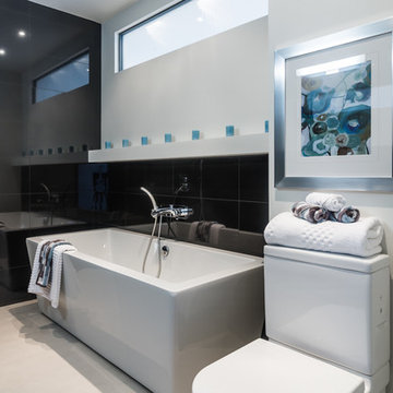
Adding furniture and accessories to a vacant property makes an incredible difference to the potential purchaser's perspective when they walk through the door for the first time. If you would like a consultation, give us a call at 514-222-5553.
We work with investors, home owners, realtors and house 'flippers'. Unique home Solutions Inc. has been in business since 2006 helping owners improve the look of their properties.
 Mark Brand Architecture
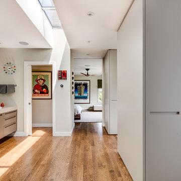
Our clients for this remodel of a 100 year old home in San Francisco’s Liberty Hill neighborhood recently moved to San Francisco. The house they purchased was very stately and had great bones, but lacked a true master suite and had recently been remodeled in a slightly generic modern style. We helped them with projects throughout the house. Our biggest project was creating a true master suite out of two bedrooms and an existing bathroom. We created an open concept bathroom with custom gray lacquer wardrobes and shoe storage units with a dramatic slot skylight overhead. Access to the master bedroom is through this room. The clean lines of the bathroom are complimented by a very long wall hung vanity with a CaesarStone counter which flows into the walk-in shower and becomes the curb. A variety of tiles including locally fabricated tile from Heath Ceramics were carefully selected to create a warm and inviting, yet modern, feeling. Oak floors similar to those in the rest of the house were used throughout the master suite for continuity. By using the same tile on the back wall of the bathroom we were able to create a visual unity from the shower through the vanity and the water closet. Our work also included a new fireplace in the living room. Photography by Christopher Stark.
 Klopf Architecture
The Roger Lee designed house from 1962 was purchased by the current homeowners in almost original condition, as the previous owners elected to defer most maintenance projects over the years. The clients were able to see beyond the dated materials and finishes, single-paned glass and uninsulated walls and they approached Klopf Architecture to help them expand and update the entire home, one the family could settle into and enjoy for years to come. It was important that the new designs were aligned with Lee's original intent not only because of the client's appreciation for mid-century modern architecture, but also because the house was deemed historical. The Stanford Real Estate Office requires a stringent design review which safeguards the integrity of the community, which Klopf Architecture was happy to oblige going into their updated designs.
As with many original mid-century modern homes, the house was scaled to the 1960s lifestyle where rooms were smaller and openings to views were limited and tightly framed. The original conditions defined the direction the family of four would take in updating the house and making it comfortable for their modern lifestyle. Klopf designed a full gut remodel and major addition to bring the house into the 21st century and provide the living area needed for the client's family. The newly expanded house added just about 1,100 sf to create an airy, comfortable and family friendly house, taking full advantage of the beautiful southwestern views that extend out to the hills beyond. The enclosed garage created an additional 240 sf of covered space for long-term storage.
A cracked swimming pool created an eyesore taking up a majority of the backyard landscape, so it was one of the first elements to go during the transformation. Working with Outer Space Landscape Architects, the family asked for a mix of relaxing outdoor patio spaces that eventually blend into the native landscaping, extending their views outward toward the natural greenery of the trees beyond their property. Filling in the old pool was a smart way to expand the living spaces outward. The orientation of the house was designed to enjoy the views, but the original architecture provided the first homeowners with mere glimpses of the landscape outside.
Klopf was able to broaden those views, continuing and extending on the original architecture to take full advantage of the unobstructed natural views across the rear facade of the house. Small horizontal openings in the primary bedroom and office were replaced with much taller windows that now follow the angled roof line upward, extending across almost all of the facade. We worked with Western Windows, whose designs included an oblique-shaped, operable casement that allowed our design to rise with the slope. A new corner office added to the primary suite, offers a bright and functional work-from-home solution that looks out at the distant views and added natural light from the expanded window configuration that now wraps around the corner.
The existing lower level was designed by Lee as a utilitarian space, serving as a wet pool room with a drain in the center of the floor, bathroom, laundry and storage areas. Without the need for a pool room, Klopf was able to convert the area into a much more comfortable and functional living space with a new family room and guest suite. The new spaces enjoy easy access to a new outdoor patio through floor to ceiling, full-width glass sliders.
Continuing along the rear facade, a previously exposed deck extending from the living room and hallway provided access to the backyard through a single set of stairs leading toward the side of the house which made sense when the pool was in place. The new deck was re-envisioned as an extension of the main living room and now serves as a second outdoor living room. A new slatted pergola above provides the homeowners welcome relief from the hot afternoon sun. A second set of stairs now creates a better connection to the redesigned lower level. Klopf was able to reconfigure the spaces, extending the living room outward toward the views, where the family now claims it as the heart of the home, spending a large majority of their time outdoors.
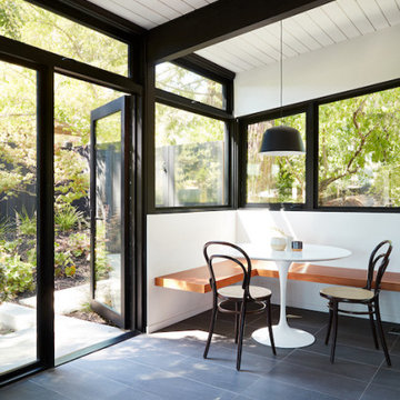
Back inside, the original wood-burning Malm fireplace was beautifully restored and a gas burner installed to comply with California's strict air standards. It now rests in front of a wall of Heath accent tiles where a dated red brick wall used to stand. A new taller window brings more light and views into the refreshed interior living room. The original glass doors opposite the fireplace were replaced by larger sliders that when fully opened, create a seamless transition to the new outdoor living area so the two spaces feel like one connected space. The original utilitarian kitchen was needlessly tucked into the far back corner and closed-off, out of sight from the living room, so the clients asked Klopf to open it up and expand the kitchen forward so it felt more connected. Today the much larger kitchen is connected to the living area where a short wall with a cutout offers a visual glimpse into the kitchen and a handy pass-through counter for serving guests. A new breakfast nook was also added to create another spot where the family can gather for casual meals. Just outside, a new built-in outdoor grill and prep area extends the kitchen outside and connects to a new outdoor dining spot nestled amongst the trees, taking advantage of the views out back.
Klopf was able to expand the other two bedrooms, add a new laundry room and half-bath and convert the carport to an enclosed garage to add more storage areas which was lost when the pool house was converted to the family and guest room.
To maintain a historical connection to the original designs, the exterior siding was repeated on all exterior walls, a full-height stained glass window at the front entryway restored, and an interior slatted screen element repeated outside at the exterior entry courtyard and over the new outdoor living room to create a shade trellis. The new house stands proudly and shines against it's new landscaping features, while respecting and expanding on the original intent of Roger Lee's designs epitomizing the comforts of indoor-outdoor living in Northern California.
Completion year: 2020
Klopf Architecture project team: John Klopf, Klara Kevane, Noel Andrade
Contractor: ORB Construction, Brendan O'Reilly
Structural engineer: Sezen and Moon
Landscape architect: Outer space
Furnishings and decoration: Urbanism Designs
Photographer: Mariko Reed
 Michael Nash Design, Build & Homes
2010 NARI CAPITAL COTY GRAND AWARD WINNER
A young couple with toddlers purchased this home and decided to do extensive renovations before they moved in. The existing galley kitchen and dining room were too small and separated by a load bearing wall. The sunken family room floor was less than ideal for small children to have to climb up and down.
The first step in the renovation involved eliminating the load bearing walls and replacing them with a new steel beam capable of handling the load. By doing so, Michael Nash Design, Build & Homes was able to combine the galley kitchen and dining room into one large family kitchen with an eating area.
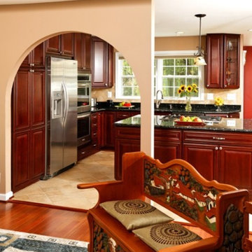
The focal point of the new space is a large multi-purpose island with a cooktop. Cherry stained cabinetry with a dark granite countertop provides plenty of storage and workspace, as well as bar seating. The same materials are used around the perimeter of the kitchen.
One wall features upper and lower cabinets which surround a stainless steel refrigerator and double wall ovens. A large pantry is included on this wall. The second wall houses the main kitchen sink and built-in dishwasher. A large window sits above the sink area allowing the parents to watch over children playing in the backyard. A butler area features a utility sink and an under-the-counter beverage refrigerator that is easy for the kids to access.
The family room floor was raised to be level with the rest of the first floor and Brazilian cherry wood floors provide continuity and richness throughout the space. Archways were built for style and pleasant viewing from each room.
The end result of the project is that this kitchen is the heart of the home. The living and dining area is now large enough for family gatherings and entertaining.

Sponsored
Sunbury, OH

J.Holderby - Renovations
Franklin County's Leading General Contractors - 2X Best of Houzz!
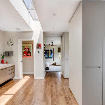 Mark Brand Architecture
Our clients for this remodel of a 100 year old home in San Francisco’s Liberty Hill neighborhood recently moved to San Francisco. The house they purchased was very stately and had great bones, but lacked a true master suite and had recently been remodeled in a slightly generic modern style. We helped them with projects throughout the house. Our biggest project was creating a true master suite out of two bedrooms and an existing bathroom. We created an open concept bathroom with custom gray lacquer wardrobes and shoe storage units with a dramatic slot skylight overhead. Access to the master bedroom is through this room. The clean lines of the bathroom are complimented by a very long wall hung vanity with a CaesarStone counter which flows into the walk-in shower and becomes the curb. A variety of tiles including locally fabricated tile from Heath Ceramics were carefully selected to create a warm and inviting, yet modern, feeling. Oak floors similar to those in the rest of the house were used throughout the master suite for continuity. By using the same tile on the back wall of the bathroom we were able to create a visual unity from the shower through the vanity and the water closet. Our work also included a new fireplace in the living room. Photography by Christopher Stark.
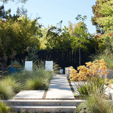 Klopf Architecture
The Roger Lee designed house from 1962 was purchased by the current homeowners in almost original condition, as the previous owners elected to defer most maintenance projects over the years. The clients were able to see beyond the dated materials and finishes, single-paned glass and uninsulated walls and they approached Klopf Architecture to help them expand and update the entire home, one the family could settle into and enjoy for years to come. It was important that the new designs were aligned with Lee's original intent not only because of the client's appreciation for mid-century modern architecture, but also because the house was deemed historical. The Stanford Real Estate Office requires a stringent design review which safeguards the integrity of the community, which Klopf Architecture was happy to oblige going into their updated designs.
As with many original mid-century modern homes, the house was scaled to the 1960s lifestyle where rooms were smaller and openings to views were limited and tightly framed. The original conditions defined the direction the family of four would take in updating the house and making it comfortable for their modern lifestyle. Klopf designed a full gut remodel and major addition to bring the house into the 21st century and provide the living area needed for the client's family. The newly expanded house added just about 1,100 sf to create an airy, comfortable and family friendly house, taking full advantage of the beautiful southwestern views that extend out to the hills beyond. The enclosed garage created an additional 240 sf of covered space for long-term storage.
A cracked swimming pool created an eyesore taking up a majority of the backyard landscape, so it was one of the first elements to go during the transformation. Working with Outer Space Landscape Architects, the family asked for a mix of relaxing outdoor patio spaces that eventually blend into the native landscaping, extending their views outward toward the natural greenery of the trees beyond their property. Filling in the old pool was a smart way to expand the living spaces outward. The orientation of the house was designed to enjoy the views, but the original architecture provided the first homeowners with mere glimpses of the landscape outside.
Klopf was able to broaden those views, continuing and extending on the original architecture to take full advantage of the unobstructed natural views across the rear facade of the house. Small horizontal openings in the primary bedroom and office were replaced with much taller windows that now follow the angled roof line upward, extending across almost all of the facade. We worked with Western Windows, whose designs included an oblique-shaped, operable casement that allowed our design to rise with the slope. A new corner office added to the primary suite, offers a bright and functional work-from-home solution that looks out at the distant views and added natural light from the expanded window configuration that now wraps around the corner.
The existing lower level was designed by Lee as a utilitarian space, serving as a wet pool room with a drain in the center of the floor, bathroom, laundry and storage areas. Without the need for a pool room, Klopf was able to convert the area into a much more comfortable and functional living space with a new family room and guest suite. The new spaces enjoy easy access to a new outdoor patio through floor to ceiling, full-width glass sliders.
Continuing along the rear facade, a previously exposed deck extending from the living room and hallway provided access to the backyard through a single set of stairs leading toward the side of the house which made sense when the pool was in place. The new deck was re-envisioned as an extension of the main living room and now serves as a second outdoor living room. A new slatted pergola above provides the homeowners welcome relief from the hot afternoon sun. A second set of stairs now creates a better connection to the redesigned lower level. Klopf was able to reconfigure the spaces, extending the living room outward toward the views, where the family now claims it as the heart of the home, spending a large majority of their time outdoors.
Back inside, the original wood-burning Malm fireplace was beautifully restored and a gas burner installed to comply with California's strict air standards. It now rests in front of a wall of Heath accent tiles where a dated red brick wall used to stand. A new taller window brings more light and views into the refreshed interior living room. The original glass doors opposite the fireplace were replaced by larger sliders that when fully opened, create a seamless transition to the new outdoor living area so the two spaces feel like one connected space. The original utilitarian kitchen was needlessly tucked into the far back corner and closed-off, out of sight from the living room, so the clients asked Klopf to open it up and expand the kitchen forward so it felt more connected. Today the much larger kitchen is connected to the living area where a short wall with a cutout offers a visual glimpse into the kitchen and a handy pass-through counter for serving guests. A new breakfast nook was also added to create another spot where the family can gather for casual meals. Just outside, a new built-in outdoor grill and prep area extends the kitchen outside and connects to a new outdoor dining spot nestled amongst the trees, taking advantage of the views out back.
Klopf was able to expand the other two bedrooms, add a new laundry room and half-bath and convert the carport to an enclosed garage to add more storage areas which was lost when the pool house was converted to the family and guest room.
To maintain a historical connection to the original designs, the exterior siding was repeated on all exterior walls, a full-height stained glass window at the front entryway restored, and an interior slatted screen element repeated outside at the exterior entry courtyard and over the new outdoor living room to create a shade trellis. The new house stands proudly and shines against it's new landscaping features, while respecting and expanding on the original intent of Roger Lee's designs epitomizing the comforts of indoor-outdoor living in Northern California.
Completion year: 2020
Klopf Architecture project team: John Klopf, Klara Kevane, Noel Andrade
Contractor: ORB Construction, Brendan O'Reilly
Structural engineer: Sezen and Moon
Landscape architect: Outer space
Furnishings and decoration: Urbanism Designs
Photographer: Mariko Reed
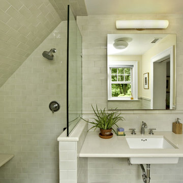
 Studio 1200
Design work for this eclectic 1900’s home in Maplewood started with making infrastructure improvements throughout the house. The new owners wanted systems that would be energy efficient and ecologically friendly. We installed a very high efficiency HVAC system, replaced the piping and plumbing throughout, and specified new super high efficiency windows. Other exterior improvements included new leaders and gutters, insulation, and new siding in some locations. These upgrades were balanced with maintaining as many as the original details of the house as possible.
When you walk into the house, you still sense the original character and charm of the house, but are surrounded by modern amenities and environmentally sensitive finishes. Specific renovations include updated and reconfigured bathrooms throughout, a new kitchen, finishing of the basement, and repurposing of several rooms so the house would have better flow.
In 2011 the family moved back to New York City, and new owners purchased this Maplewood home. We had the pleaser of working with them to design further improvements to the house necessitated by their growing family. We added a porte cochere, a family-room, and increased the ceiling height in their master bedroom. These improvements augmented our design work previously completed in 2008, and the house continues to be a blend of traditional old-house details with modern, contemporary furnishings that perfectly suite a family with young children.
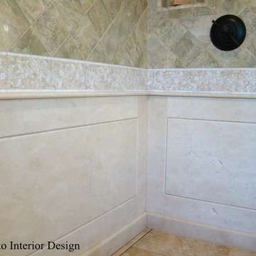
 Fiorito Interior Design
Like many California ranch homes built in the 1950s, this original master bathroom was not really a "master bath." My clients, who only three years ago purchased the home from the family of the original owner, were saddled with a small, dysfunctional space. Chief among the dysfunctions: a vanity only 30" high, and an inconveniently placed window that forced the too-low vanity mirror to reflect only the waist and partial torso--not the face--of anyone standing in front of it. They wanted not only a more spacious bathroom but a bedroom as well, so we worked in tandem with an architect and contractor to come up with a fantastic new space: a true Master Suite. In order to refine a design concept for the soon-to-be larger space, and thereby narrow down material choices, my clients and I had a brainstorming session: we spoke of an elegant Old World/ European bedroom and bathroom, a luxurious bath that would reference a Roman spa, and finally the idea of a Hammam was brought into the mix. We blended these ideas together in oil-rubbed bronze fixtures, and a tiny tile mosaic in beautiful Bursa Beige marble from Turkey and white Thassos marble from Greece. The new generously sized bathroom boasts a jetted soaking tub, a very large walk-in shower, a double-sided fireplace (facing the tub on the bath side), and a luxurious 8' long vanity with double sinks and a storage tower.
The vanity wall is covered with a mosaic vine pattern in a beautiful Bursa Beige marble from Turkey and white Thassos marble from Greece,. The custom Larson Juhl framed mirrors are flanked by gorgeous hand-wrought scones from Hubbardton Forge which echo the vine and leaf pattern in the mosaic. And the vanity itself features an LED strip in the toe-kick which allows one to see in the middle of the night without having to turn on a shockingly bright overhead fixture. At the other end of the master bath, a luxurious jetted tub nestles by a fireplace in the bay window area. Views of my clients' garden can be seen while soaking in bubbles. The over-sized walk-in shower features a paneled wainscoting effect which I designed in Crema Marfil marble. The vine mosaic continues in the shower, topped by green onyx squares. A rainshower head and a hand-held spray on a bar provides showering options. The shower floor slopes gently in one direction toward a hidden linear drain; this allows the floor to be read as a continuation of the main space, without being interrupted by a center drain.
Photo by Jeff Fiorito
Sponsored
Sunbury, OH
J.Holderby - Renovations
Franklin County's Leading General Contractors - 2X Best of Houzz!
 Dura Supreme Cabinetry
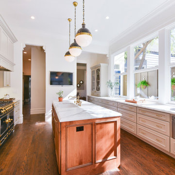
With an ideal location in the Pacific Heights neighborhood of San Francisco, this dated Victorian residence had "beautiful bones" but had been sitting on the market for a year before being purchased with plans to revitalize the interior. Interior designer, Noel Han, explained, "Historical Victorian homes in this area often have beautiful architectural elements that I aim to preserve, but the floor plan and layout tend to be stuffy, not live-able and not light filled. Modern families want bright, light-filled, spacious rooms that take advantage of outdoor views and living spaces, and function well for storage, meals and entertaining."
Preserving the architectural integrity and special features of the home was one of Han's goals but at the same time, she re-designed the space, moving walls and adding windows to create an open floorplan that flowed easily between the kitchen and outdoor living spaces. Where the range once stood in the original design, now an entire wall of windows provides panoramic views of the outdoors and fills the kitchen with light. Below the windows, Han designed a long bank of base cabinets with drawers to provide plenty of storage and work surface. Light now pours into the space even on foggy days. The range was moved to the opposite wall so that beautiful window views could be added to the kitchen.
Han selected a palette of finishes with an eye toward creating a "soft color aesthetic". "White painted finishes are very popular right now but would have felt stark and cold in this space," she explained. "The French grey paint from Dura Supreme was a perfect complement for this vintage Victorian home, to create a classic color scheme".
"This beautiful home already had hardware elements with a vintage brass finish, so I carefully selected antiqued, brushed brass hardware, plumbing and metal finishes to blend with the original elements," said Han. She continued, "The La Cornue French Range adds modern function with a French antique look."
"I appreciate working with Dura Supreme cabinetry because of the quality of the cabinetry, fast delivery and the custom options. I'm able to create beautiful architectural details like the pull-out columns on both sides of the range and the curved mullion doors on the furniture hutch, and they offer a stunning palette of finishes and styles," explained Han. For the bath cabinetry, Han created a similar palette of finishes and styles to create a complementary look throughout the entire home.
Product Details:
Perimeter: Dura Supreme Cabinetry shown in the St. Augustine door style and Mullion Pattern #15 door style with a “Zinc” painted finish.
Kitchen Island: Dura Supreme Cabinetry shown in the St. Augustine door style with a Clove stain and Black Accent finish on Cherry wood.
For more information about Noel Han, Interior Designer, click to her website here www.atelnoel.com.
For more information about Gilmans Kitchens and Baths, click to their website here www.gkandb.com.
Photography by: Ned Bonzi www.nedbonzi.com.
Request a FREE Dura Supreme Brochure Packet:
http://www.durasupreme.com/request-brochure
 Dura Supreme Cabinetry
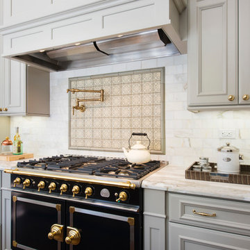
With an ideal location in the Pacific Heights neighborhood of San Francisco, this dated Victorian residence had "beautiful bones" but had been sitting on the market for a year before being purchased with plans to revitalize the interior. Interior designer, Noel Han, explained, "Historical Victorian homes in this area often have beautiful architectural elements that I aim to preserve, but the floor plan and layout tend to be stuffy, not live-able and not light filled. Modern families want bright, light-filled, spacious rooms that take advantage of outdoor views and living spaces, and function well for storage, meals and entertaining."
Preserving the architectural integrity and special features of the home was one of Han's goals but at the same time, she re-designed the space, moving walls and adding windows to create an open floorplan that flowed easily between the kitchen and outdoor living spaces. Where the range once stood in the original design, now an entire wall of windows provides panoramic views of the outdoors and fills the kitchen with light. Below the windows, Han designed a long bank of base cabinets with drawers to provide plenty of storage and work surface. Light now pours into the space even on foggy days. The range was moved to the opposite wall so that beautiful window views could be added to the kitchen.
Han selected a palette of finishes with an eye toward creating a "soft color aesthetic". "White painted finishes are very popular right now but would have felt stark and cold in this space," she explained. "The French grey paint from Dura Supreme was a perfect complement for this vintage Victorian home, to create a classic color scheme".
"This beautiful home already had hardware elements with a vintage brass finish, so I carefully selected antiqued, brushed brass hardware, plumbing and metal finishes to blend with the original elements," said Han. She continued, "The La Cornue French Range adds modern function with a French antique look."
"I appreciate working with Dura Supreme cabinetry because of the quality of the cabinetry, fast delivery and the custom options. I'm able to create beautiful architectural details like the pull-out columns on both sides of the range and the curved mullion doors on the furniture hutch, and they offer a stunning palette of finishes and styles," explained Han. For the bath cabinetry, Han created a similar palette of finishes and styles to create a complementary look throughout the entire home.
Product Details:
Perimeter: Dura Supreme Cabinetry shown in the St. Augustine door style and Mullion Pattern #15 door style with a “Zinc” painted finish.
Kitchen Island: Dura Supreme Cabinetry shown in the St. Augustine door style with a Clove stain and Black Accent finish on Cherry wood.
For more information about Noel Han, Interior Designer, click to her website here www.atelnoel.com.
For more information about Gilmans Kitchens and Baths, click to their website here www.gkandb.com.
Photography by: Ned Bonzi www.nedbonzi.com.
Request a FREE Dura Supreme Brochure Packet:
http://www.durasupreme.com/request-brochure
 Studio 1200
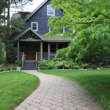
Design work for this eclectic 1900’s home in Maplewood started with making infrastructure improvements throughout the house. The new owners wanted systems that would be energy efficient and ecologically friendly. We installed a very high efficiency HVAC system, replaced the piping and plumbing throughout, and specified new super high efficiency windows. Other exterior improvements included new leaders and gutters, insulation, and new siding in some locations. These upgrades were balanced with maintaining as many as the original details of the house as possible.
When you walk into the house, you still sense the original character and charm of the house, but are surrounded by modern amenities and environmentally sensitive finishes. Specific renovations include updated and reconfigured bathrooms throughout, a new kitchen, finishing of the basement, and repurposing of several rooms so the house would have better flow.
In 2011 the family moved back to New York City, and new owners purchased this Maplewood home. We had the pleaser of working with them to design further improvements to the house necessitated by their growing family. We added a porte cochere, a family-room, and increased the ceiling height in their master bedroom. These improvements augmented our design work previously completed in 2008, and the house continues to be a blend of traditional old-house details with modern, contemporary furnishings that perfectly suite a family with young children.
39