
Search results for "Purchasers continuously" in Home Design Ideas
 Lincoln Lighthill Architect
This project is a story of how buildings and relationships evolve over time, and how the two are intertwined in the making of architecture.
The client, a single man, had just purchased a classic Edwardian flat on San Francisco’s Liberty Street, known for its historic homes and famous neighbors like Tracy Chapman, when his realtor connected him with LLA. The initial brief was to integrate a modern, minimalist kitchen and bathroom with the apartment's traditional aesthetic. The existing condition was a series of cramped rooms and a long hallway that divided the apartment into many separate spaces, some without natural light.
The solution was to remove most of the walls in the middle of the flat, with extensive structural work hidden from view. This created an open connection between the living, dining and kitchen areas that flooded the formerly dark core of the apartment with light.
Midway through the design process, the client and his partner, and avid cook, decided it was time to move in together. The project evolved further and LLA found inventive ways to pack more features and amenities into a design that was fundamentally about simplicity.
The result of this creative tension is a large open kitchen with deceptively simple forms- a long back counter with three rows of drawers below, an island with a central cooktop and double cantilevers for seating, and a slightly mysterious wood box at the back. The box conceals the refrigerator, storage, linens, and laundry, and through a secret door, a large walk-in pantry.
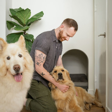
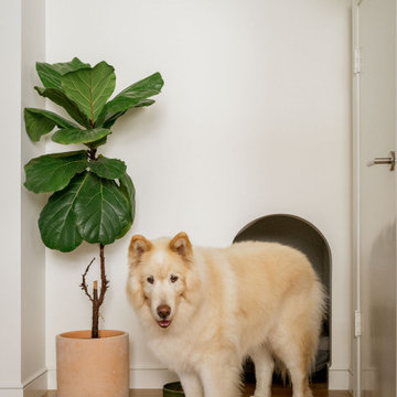
The bathroom evolved into a mini-spa, with a walk-through shower and Japanese-style soaking tub. The space shares light with the kitchen through a floor-to-ceiling translucent glass panel. Each client has a large dog, and so a small sliver of space under the upstairs neighbor's stair was turned into the perfect doggie den, complete with period correct doorway.
The newly blended family moved in together when the project was completed. A poignant footnote, Maverick, the blonder, fluffier dog in the photos, was very old and sadly passed away shortly after they moved in. It made the photoshoot feel like a special event that honored and preserved his memory in pictures. Like all families, theirs continues to evolve and change, just as their home has over its 90 year life.
 Lincoln Lighthill Architect
This project is a story of how buildings and relationships evolve over time, and how the two are intertwined in the making of architecture.
The client, a single man, had just purchased a classic Edwardian flat on San Francisco’s Liberty Street, known for its historic homes and famous neighbors like Tracy Chapman, when his realtor connected him with LLA. The initial brief was to integrate a modern, minimalist kitchen and bathroom with the apartment's traditional aesthetic. The existing condition was a series of cramped rooms and a long hallway that divided the apartment into many separate spaces, some without natural light.
The solution was to remove most of the walls in the middle of the flat, with extensive structural work hidden from view. This created an open connection between the living, dining and kitchen areas that flooded the formerly dark core of the apartment with light.
Midway through the design process, the client and his partner, and avid cook, decided it was time to move in together. The project evolved further and LLA found inventive ways to pack more features and amenities into a design that was fundamentally about simplicity.
The result of this creative tension is a large open kitchen with deceptively simple forms- a long back counter with three rows of drawers below, an island with a central cooktop and double cantilevers for seating, and a slightly mysterious wood box at the back. The box conceals the refrigerator, storage, linens, and laundry, and through a secret door, a large walk-in pantry.
The bathroom evolved into a mini-spa, with a walk-through shower and Japanese-style soaking tub. The space shares light with the kitchen through a floor-to-ceiling translucent glass panel. Each client has a large dog, and so a small sliver of space under the upstairs neighbor's stair was turned into the perfect doggie den, complete with period correct doorway.
The newly blended family moved in together when the project was completed. A poignant footnote, Maverick, the blonder, fluffier dog in the photos, was very old and sadly passed away shortly after they moved in. It made the photoshoot feel like a special event that honored and preserved his memory in pictures. Like all families, theirs continues to evolve and change, just as their home has over its 90 year life.
 Katie Hutchison Studio
When the owner of this petite c. 1910 cottage in Riverside, RI first considered purchasing it, he fell for its charming front façade and the stunning rear water views. But it needed work. The weather-worn, water-facing back of the house was in dire need of attention. The first-floor kitchen/living/dining areas were cramped. There was no first-floor bathroom, and the second-floor bathroom was a fright. Most surprisingly, there was no rear-facing deck off the kitchen or living areas to allow for outdoor living along the Providence River.
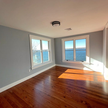
In collaboration with the homeowner, KHS proposed a number of renovations and additions. The first priority was a new cantilevered rear deck off an expanded kitchen/dining area and reconstructed sunroom, which was brought up to the main floor level. The cantilever of the deck prevents the need for awkwardly tall supporting posts that could potentially be undermined by a future storm event or rising sea level.
To gain more first-floor living space, KHS also proposed capturing the corner of the wrapping front porch as interior kitchen space in order to create a more generous open kitchen/dining/living area, while having minimal impact on how the cottage appears from the curb. Underutilized space in the existing mudroom was also reconfigured to contain a modest full bath and laundry closet. Upstairs, a new full bath was created in an addition between existing bedrooms. It can be accessed from both the master bedroom and the stair hall. Additional closets were added, too.
New windows and doors, new heart pine flooring stained to resemble the patina of old pine flooring that remained upstairs, new tile and countertops, new cabinetry, new plumbing and lighting fixtures, as well as a new color palette complete the updated look. Upgraded insulation in areas exposed during the construction and augmented HVAC systems also greatly improved indoor comfort. Today, the cottage continues to charm while also accommodating modern amenities and features.
Find the right local pro for your project
 Braswell Design+Build
This client sought to update their recently purchased home in Alexandria. A gourmet kitchen that complemented the size of the home and property was a top priority. They wanted more light-filled and connected living spaces for their growing family. Updating the finishes throughout the home was also a necessity.
Design challenges included an existing utility space that occupied a large portion of the kitchen footprint, making the kitchen cramped and narrow. In addition, the foyer was dark, confined and uninviting as a result of its organization and enclosed nature of the main stair.
To overcome the challenges, we relocated the utilities, creating a more usable footprint for the kitchen. The aging furnace was replaced with a high efficiency furnace located in a newly insulated and conditioned crawl space. A new hot water heater was placed in the finished attic, and the electrical panel was also relocated. Then, we designed a portion of the kitchen to mask the need for dropped structural headers: the refrigerator, freezer and pantry were placed under the area that necessitated a drop bulkhead, creating a sleek built-in area for the appliances.
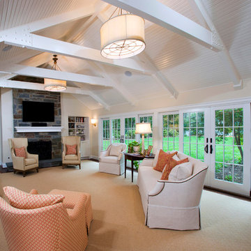
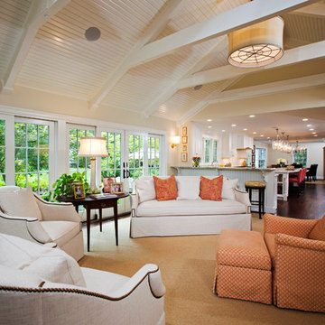
Once the utilities were moved, the kitchen could be opened up to a large family room and designed with a much-improved layout. Two new four-panel exterior doors replaced small doors at the family room to connect the main living space with the beautiful yard. In addition, white bead board was added to the family room ceiling, creating more visual continuity with the adjacent white kitchen.
To transform the foyer into a grand and welcoming entry, a small amount of space was taken from a large second floor bedroom, and the entire second floor structure was supported with a series of flush beams to allow the stair to be opened and expose the rail. New glass doors to the den, relocated at an angle from the main stair provide the foyer with more natural light and a wider, more inviting path to the kitchen.
In the master suite, the bedroom and bathroom entry doors were relocated to improve the room’s layout and offer more bathroom privacy and space for a walk-in closet. A room forgotten by the previous owner was turned into a family mudroom with built-ins and wainscoting to keep the family organized in style.
Photography by Greg Hadley
 Braswell Design+Build
This client sought to update their recently purchased home in Alexandria. A gourmet kitchen that complemented the size of the home and property was a top priority. They wanted more light-filled and connected living spaces for their growing family. Updating the finishes throughout the home was also a necessity.
Design challenges included an existing utility space that occupied a large portion of the kitchen footprint, making the kitchen cramped and narrow. In addition, the foyer was dark, confined and uninviting as a result of its organization and enclosed nature of the main stair.
To overcome the challenges, we relocated the utilities, creating a more usable footprint for the kitchen. The aging furnace was replaced with a high efficiency furnace located in a newly insulated and conditioned crawl space. A new hot water heater was placed in the finished attic, and the electrical panel was also relocated. Then, we designed a portion of the kitchen to mask the need for dropped structural headers: the refrigerator, freezer and pantry were placed under the area that necessitated a drop bulkhead, creating a sleek built-in area for the appliances.
Once the utilities were moved, the kitchen could be opened up to a large family room and designed with a much-improved layout. Two new four-panel exterior doors replaced small doors at the family room to connect the main living space with the beautiful yard. In addition, white bead board was added to the family room ceiling, creating more visual continuity with the adjacent white kitchen.
To transform the foyer into a grand and welcoming entry, a small amount of space was taken from a large second floor bedroom, and the entire second floor structure was supported with a series of flush beams to allow the stair to be opened and expose the rail. New glass doors to the den, relocated at an angle from the main stair provide the foyer with more natural light and a wider, more inviting path to the kitchen.
In the master suite, the bedroom and bathroom entry doors were relocated to improve the room’s layout and offer more bathroom privacy and space for a walk-in closet. A room forgotten by the previous owner was turned into a family mudroom with built-ins and wainscoting to keep the family organized in style.
Photography by Greg Hadley
 Lincoln Lighthill Architect
This project is a story of how buildings and relationships evolve over time, and how the two are intertwined in the making of architecture.
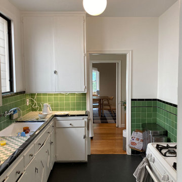
The client, a single man, had just purchased a classic Edwardian flat on San Francisco’s Liberty Street, known for its historic homes and famous neighbors like Tracy Chapman, when his realtor connected him with LLA. The initial brief was to integrate a modern, minimalist kitchen and bathroom with the apartment's traditional aesthetic. The existing condition was a series of cramped rooms and a long hallway that divided the apartment into many separate spaces, some without natural light.
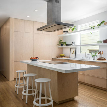
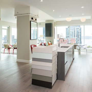
The solution was to remove most of the walls in the middle of the flat, with extensive structural work hidden from view. This created an open connection between the living, dining and kitchen areas that flooded the formerly dark core of the apartment with light.
Midway through the design process, the client and his partner, and avid cook, decided it was time to move in together. The project evolved further and LLA found inventive ways to pack more features and amenities into a design that was fundamentally about simplicity.
The result of this creative tension is a large open kitchen with deceptively simple forms- a long back counter with three rows of drawers below, an island with a central cooktop and double cantilevers for seating, and a slightly mysterious wood box at the back. The box conceals the refrigerator, storage, linens, and laundry, and through a secret door, a large walk-in pantry.
The bathroom evolved into a mini-spa, with a walk-through shower and Japanese-style soaking tub. The space shares light with the kitchen through a floor-to-ceiling translucent glass panel. Each client has a large dog, and so a small sliver of space under the upstairs neighbor's stair was turned into the perfect doggie den, complete with period correct doorway.
The newly blended family moved in together when the project was completed. A poignant footnote, Maverick, the blonder, fluffier dog in the photos, was very old and sadly passed away shortly after they moved in. It made the photoshoot feel like a special event that honored and preserved his memory in pictures. Like all families, theirs continues to evolve and change, just as their home has over its 90 year life.
 Lincoln Lighthill Architect
This project is a story of how buildings and relationships evolve over time, and how the two are intertwined in the making of architecture.
The client, a single man, had just purchased a classic Edwardian flat on San Francisco’s Liberty Street, known for its historic homes and famous neighbors like Tracy Chapman, when his realtor connected him with LLA. The initial brief was to integrate a modern, minimalist kitchen and bathroom with the apartment's traditional aesthetic. The existing condition was a series of cramped rooms and a long hallway that divided the apartment into many separate spaces, some without natural light.
The solution was to remove most of the walls in the middle of the flat, with extensive structural work hidden from view. This created an open connection between the living, dining and kitchen areas that flooded the formerly dark core of the apartment with light.
Midway through the design process, the client and his partner, and avid cook, decided it was time to move in together. The project evolved further and LLA found inventive ways to pack more features and amenities into a design that was fundamentally about simplicity.
The result of this creative tension is a large open kitchen with deceptively simple forms- a long back counter with three rows of drawers below, an island with a central cooktop and double cantilevers for seating, and a slightly mysterious wood box at the back. The box conceals the refrigerator, storage, linens, and laundry, and through a secret door, a large walk-in pantry.
The bathroom evolved into a mini-spa, with a walk-through shower and Japanese-style soaking tub. The space shares light with the kitchen through a floor-to-ceiling translucent glass panel. Each client has a large dog, and so a small sliver of space under the upstairs neighbor's stair was turned into the perfect doggie den, complete with period correct doorway.
The newly blended family moved in together when the project was completed. A poignant footnote, Maverick, the blonder, fluffier dog in the photos, was very old and sadly passed away shortly after they moved in. It made the photoshoot feel like a special event that honored and preserved his memory in pictures. Like all families, theirs continues to evolve and change, just as their home has over its 90 year life.

Sponsored
Sunbury, OH

J.Holderby - Renovations
Franklin County's Leading General Contractors - 2X Best of Houzz!
 Pathway Design & Construction
Water leaks can be frustrating and happen often unexpectedly… especially when the water is coming from your upstairs neighbor!
Once the leak occurred, the homeowners decided that it was the perfect opportunity to create their dream kitchen and entryway. The decision was made and the homeowners went shopping to purchase materials for their renovation. One problem; they hadn’t hired a contractor yet. They quickly discovered they would need help building their dream kitchen and entryway which is where we came in.
Scope:
Create a versatile space that reflects the homeowners’ vibrant personalities where they could cook, work, relax and entertain.
Desired features include:
Color changing LED tape lighting was essential to help create ambiance.
Smaller can lights with updated trim to modernize the lighting.
Disguising a “workspace” into the island design.
Installing a compost bin that doubles as a wine chiller for entertaining.
Separate wine bar.
Installing an intricate piece of mirror art and lighting in the entryway.
Installing custom waved back splash tile.
Challenges:
Creating a working set of construction plans from cabinet drawings was a challenge. The process entailed continuous communication with the clients including several walkthroughs before final installation of each aspect throughout the project.
Incorporating high-gloss and muted surfaces into the space without creating glare from the natural light coming in from many existing windows.
Wavy tile became difficult to install with the desired layout of backsplash outlet style and locations.
Solutions:
The core design issues were resolved with exceptional communication between our field team and the homeowners.
Satin finish countertops and matte paint offset the high gloss cabinetry and backsplash.
Because of the size of tiles in the space, the outlets needed to be cut in the center of the tile to look uniform. Time and a steady hand made this possible for the best visual result.
Result:
Thoughtful execution helped to create a versatile dream kitchen and entry way that also provides an at-home workspace. This now versatile space is useful and aesthetically pleasing, exceeding the homeowners’ vision. The small details ranging from accent lighting to the compost bin turned wine chiller make this a luxurious statement piece.
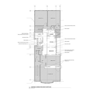 Lincoln Lighthill Architect
This project is a story of how buildings and relationships evolve over time, and how the two are intertwined in the making of architecture.
The client, a single man, had just purchased a classic Edwardian flat on San Francisco’s Liberty Street, known for its historic homes and famous neighbors like Tracy Chapman, when his realtor connected him with LLA. The initial brief was to integrate a modern, minimalist kitchen and bathroom with the apartment's traditional aesthetic. The existing condition was a series of cramped rooms and a long hallway that divided the apartment into many separate spaces, some without natural light.
The solution was to remove most of the walls in the middle of the flat, with extensive structural work hidden from view. This created an open connection between the living, dining and kitchen areas that flooded the formerly dark core of the apartment with light.
Midway through the design process, the client and his partner, and avid cook, decided it was time to move in together. The project evolved further and LLA found inventive ways to pack more features and amenities into a design that was fundamentally about simplicity.
The result of this creative tension is a large open kitchen with deceptively simple forms- a long back counter with three rows of drawers below, an island with a central cooktop and double cantilevers for seating, and a slightly mysterious wood box at the back. The box conceals the refrigerator, storage, linens, and laundry, and through a secret door, a large walk-in pantry.
The bathroom evolved into a mini-spa, with a walk-through shower and Japanese-style soaking tub. The space shares light with the kitchen through a floor-to-ceiling translucent glass panel. Each client has a large dog, and so a small sliver of space under the upstairs neighbor's stair was turned into the perfect doggie den, complete with period correct doorway.
The newly blended family moved in together when the project was completed. A poignant footnote, Maverick, the blonder, fluffier dog in the photos, was very old and sadly passed away shortly after they moved in. It made the photoshoot feel like a special event that honored and preserved his memory in pictures. Like all families, theirs continues to evolve and change, just as their home has over its 90 year life.
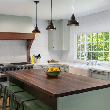
 Metropolis Drafting and Construction Inc
An original 1930’s English Tudor with only 2 bedrooms and 1 bath spanning about 1730 sq.ft. was purchased by a family with 2 amazing young kids, we saw the potential of this property to become a wonderful nest for the family to grow.
The plan was to reach a 2550 sq. ft. home with 4 bedroom and 4 baths spanning over 2 stories.
With continuation of the exiting architectural style of the existing home.
A large 1000sq. ft. addition was constructed at the back portion of the house to include the expended master bedroom and a second-floor guest suite with a large observation balcony overlooking the mountains of Angeles Forest.
An L shape staircase leading to the upstairs creates a moment of modern art with an all white walls and ceilings of this vaulted space act as a picture frame for a tall window facing the northern mountains almost as a live landscape painting that changes throughout the different times of day.
Tall high sloped roof created an amazing, vaulted space in the guest suite with 4 uniquely designed windows extruding out with separate gable roof above.
The downstairs bedroom boasts 9’ ceilings, extremely tall windows to enjoy the greenery of the backyard, vertical wood paneling on the walls add a warmth that is not seen very often in today’s new build.
The master bathroom has a showcase 42sq. walk-in shower with its own private south facing window to illuminate the space with natural morning light. A larger format wood siding was using for the vanity backsplash wall and a private water closet for privacy.
In the interior reconfiguration and remodel portion of the project the area serving as a family room was transformed to an additional bedroom with a private bath, a laundry room and hallway.
The old bathroom was divided with a wall and a pocket door into a powder room the leads to a tub room.
The biggest change was the kitchen area, as befitting to the 1930’s the dining room, kitchen, utility room and laundry room were all compartmentalized and enclosed.
We eliminated all these partitions and walls to create a large open kitchen area that is completely open to the vaulted dining room. This way the natural light the washes the kitchen in the morning and the rays of sun that hit the dining room in the afternoon can be shared by the two areas.
The opening to the living room remained only at 8’ to keep a division of space.
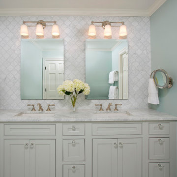 Braswell Design+Build
This client sought to update their recently purchased home in Alexandria. A gourmet kitchen that complemented the size of the home and property was a top priority. They wanted more light-filled and connected living spaces for their growing family. Updating the finishes throughout the home was also a necessity.
Design challenges included an existing utility space that occupied a large portion of the kitchen footprint, making the kitchen cramped and narrow. In addition, the foyer was dark, confined and uninviting as a result of its organization and enclosed nature of the main stair.
To overcome the challenges, we relocated the utilities, creating a more usable footprint for the kitchen. The aging furnace was replaced with a high efficiency furnace located in a newly insulated and conditioned crawl space. A new hot water heater was placed in the finished attic, and the electrical panel was also relocated. Then, we designed a portion of the kitchen to mask the need for dropped structural headers: the refrigerator, freezer and pantry were placed under the area that necessitated a drop bulkhead, creating a sleek built-in area for the appliances.
Once the utilities were moved, the kitchen could be opened up to a large family room and designed with a much-improved layout. Two new four-panel exterior doors replaced small doors at the family room to connect the main living space with the beautiful yard. In addition, white bead board was added to the family room ceiling, creating more visual continuity with the adjacent white kitchen.
To transform the foyer into a grand and welcoming entry, a small amount of space was taken from a large second floor bedroom, and the entire second floor structure was supported with a series of flush beams to allow the stair to be opened and expose the rail. New glass doors to the den, relocated at an angle from the main stair provide the foyer with more natural light and a wider, more inviting path to the kitchen.
In the master suite, the bedroom and bathroom entry doors were relocated to improve the room’s layout and offer more bathroom privacy and space for a walk-in closet. A room forgotten by the previous owner was turned into a family mudroom with built-ins and wainscoting to keep the family organized in style.
Photography by Greg Hadley
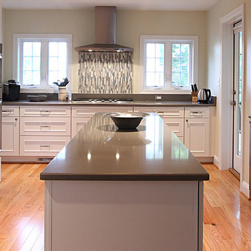
 Heartland Design and Remodeling
To learn more about us or the products we use, such as Dura Supreme, please call (571) 765-4450 or visit our website.
Kitchen - traditional kitchen idea in DC Metro
Kitchen - traditional kitchen idea in DC Metro
 Michael Nash Design, Build & Homes
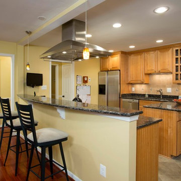
 When the homeowners purchased this traditional colonial in Vienna, Virginia, they were already planning on making some serious changes. The home’s original floor plan was boxy and closed in, making traffic flow from one room to the next virtually non-existent. Additionally, the existing décor left a lot to be desired. Their vision was to open up the layout and create a more contemporary look using lots of light, soft colors and high end materials.
They decided to add a two-story addition to the back of the home’s existing breakfast room and the small upstairs bedroom above it. The old breakfast area was too small for their daily meals and their teenage son needed more space in his bedroom. They also decided to add a sunroom/family room to the left side of their old family room. This new room offers a vaulted ceiling with four skylights and lots of windows with a better view of the side and backyard.
To create a more open floor plan, the team at Michael Nash Design, Build & Homes removed the load bearing wall between the kitchen and family room and installed a large beam to handle the second floor load. Not only did this open up the space, but it allowed for the addition of a breakfast bar.
The right side bearing wall of the old family room was also removed and replaced with structural beams. This action created a continuous flow between the new sunroom and old family room. Separated by a double-sided stone fireplace, this new sunroom is connected to a new outside sun deck built using a maintenance-free decking material. The old family room with new lighting now serves as a casual seating area. It also features an eight-foot long built-in desk.
The newly updated kitchen features granite countertops with matching tile backsplash, professional-quality appliances, a porcelain tile floor and custom cabinets, including a large pantry. The new breakfast room is more spacious and gets daylight from three different angles.
Upstairs, a new 12’ x 20’ bedroom is a great place for this teenage football fan to hang out. It provides significantly more closet space than the old room and lets in more sunlight as well.
The old laundry room was converted to a new mudroom with locker style cabinetry and a place for kids to store their bag packs. New plumbing and electrical were implemented in a new closet in an upper hallway to facilitate the new washer and dryer.
In this remodel, form and function have come together in an open concept design that meets the needs of the entire family.
Sponsored
Sunbury, OH
J.Holderby - Renovations
Franklin County's Leading General Contractors - 2X Best of Houzz!
 Klopf Architecture
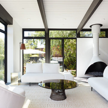
The Roger Lee designed house from 1962 was purchased by the current homeowners in almost original condition, as the previous owners elected to defer most maintenance projects over the years. The clients were able to see beyond the dated materials and finishes, single-paned glass and uninsulated walls and they approached Klopf Architecture to help them expand and update the entire home, one the family could settle into and enjoy for years to come. It was important that the new designs were aligned with Lee's original intent not only because of the client's appreciation for mid-century modern architecture, but also because the house was deemed historical. The Stanford Real Estate Office requires a stringent design review which safeguards the integrity of the community, which Klopf Architecture was happy to oblige going into their updated designs.
As with many original mid-century modern homes, the house was scaled to the 1960s lifestyle where rooms were smaller and openings to views were limited and tightly framed. The original conditions defined the direction the family of four would take in updating the house and making it comfortable for their modern lifestyle. Klopf designed a full gut remodel and major addition to bring the house into the 21st century and provide the living area needed for the client's family. The newly expanded house added just about 1,100 sf to create an airy, comfortable and family friendly house, taking full advantage of the beautiful southwestern views that extend out to the hills beyond. The enclosed garage created an additional 240 sf of covered space for long-term storage.
A cracked swimming pool created an eyesore taking up a majority of the backyard landscape, so it was one of the first elements to go during the transformation. Working with Outer Space Landscape Architects, the family asked for a mix of relaxing outdoor patio spaces that eventually blend into the native landscaping, extending their views outward toward the natural greenery of the trees beyond their property. Filling in the old pool was a smart way to expand the living spaces outward. The orientation of the house was designed to enjoy the views, but the original architecture provided the first homeowners with mere glimpses of the landscape outside.
Klopf was able to broaden those views, continuing and extending on the original architecture to take full advantage of the unobstructed natural views across the rear facade of the house. Small horizontal openings in the primary bedroom and office were replaced with much taller windows that now follow the angled roof line upward, extending across almost all of the facade. We worked with Western Windows, whose designs included an oblique-shaped, operable casement that allowed our design to rise with the slope. A new corner office added to the primary suite, offers a bright and functional work-from-home solution that looks out at the distant views and added natural light from the expanded window configuration that now wraps around the corner.
The existing lower level was designed by Lee as a utilitarian space, serving as a wet pool room with a drain in the center of the floor, bathroom, laundry and storage areas. Without the need for a pool room, Klopf was able to convert the area into a much more comfortable and functional living space with a new family room and guest suite. The new spaces enjoy easy access to a new outdoor patio through floor to ceiling, full-width glass sliders.
Continuing along the rear facade, a previously exposed deck extending from the living room and hallway provided access to the backyard through a single set of stairs leading toward the side of the house which made sense when the pool was in place. The new deck was re-envisioned as an extension of the main living room and now serves as a second outdoor living room. A new slatted pergola above provides the homeowners welcome relief from the hot afternoon sun. A second set of stairs now creates a better connection to the redesigned lower level. Klopf was able to reconfigure the spaces, extending the living room outward toward the views, where the family now claims it as the heart of the home, spending a large majority of their time outdoors.
Back inside, the original wood-burning Malm fireplace was beautifully restored and a gas burner installed to comply with California's strict air standards. It now rests in front of a wall of Heath accent tiles where a dated red brick wall used to stand. A new taller window brings more light and views into the refreshed interior living room. The original glass doors opposite the fireplace were replaced by larger sliders that when fully opened, create a seamless transition to the new outdoor living area so the two spaces feel like one connected space. The original utilitarian kitchen was needlessly tucked into the far back corner and closed-off, out of sight from the living room, so the clients asked Klopf to open it up and expand the kitchen forward so it felt more connected. Today the much larger kitchen is connected to the living area where a short wall with a cutout offers a visual glimpse into the kitchen and a handy pass-through counter for serving guests. A new breakfast nook was also added to create another spot where the family can gather for casual meals. Just outside, a new built-in outdoor grill and prep area extends the kitchen outside and connects to a new outdoor dining spot nestled amongst the trees, taking advantage of the views out back.
Klopf was able to expand the other two bedrooms, add a new laundry room and half-bath and convert the carport to an enclosed garage to add more storage areas which was lost when the pool house was converted to the family and guest room.
To maintain a historical connection to the original designs, the exterior siding was repeated on all exterior walls, a full-height stained glass window at the front entryway restored, and an interior slatted screen element repeated outside at the exterior entry courtyard and over the new outdoor living room to create a shade trellis. The new house stands proudly and shines against it's new landscaping features, while respecting and expanding on the original intent of Roger Lee's designs epitomizing the comforts of indoor-outdoor living in Northern California.
Completion year: 2020
Klopf Architecture project team: John Klopf, Klara Kevane, Noel Andrade
Contractor: ORB Construction, Brendan O'Reilly
Structural engineer: Sezen and Moon
Landscape architect: Outer space
Furnishings and decoration: Urbanism Designs
Photographer: Mariko Reed
 Greathouse
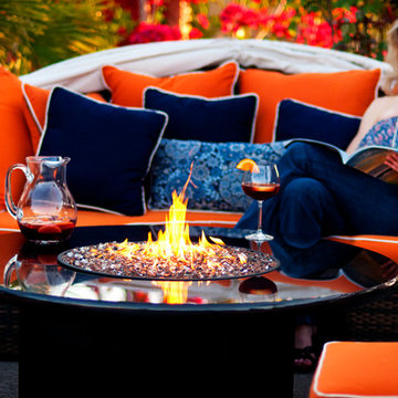
Greathouse is keeping you warm this season with fire tables by Oriflamme - exclusively in San Diego & Carlsbad. Enjoy the ambiance, warmth and style of your customizable fire table. Choose table top, burner design and artistic glass to match your own personal style.
Created by an artisan who sought to capture and share the “essence” of fire, the unique and innovative Oriflamme Fire Table offers the original designed fire. The Oriflamme Fire Table will be a centerpiece for conversation or contemplation and enhance your outdoor environment and experience.
Listing Includes:
48" Round Granite Top
Table Top
Burner
Fire Glass
20# Propane Tank
Protective Lid
Burner Puller
Also available in: 42" Round, 40" square and 45" Octagon
Also Available in 4 different Granite Finishes: Tropical Brown, Giallo Fiorito, Absolute Black & Giallo Santo
Features:
• Heat source up to 65,000 BTU’s
• Burn time lasts on average of 18-22 hours. Continuous burn times last 10-22 hours depending on outside temperature and flame height
• Adjustable flame height for warmth or ambiance
• Natural gas component kit available
• Portable
• Easy assembly (no tools required)
• All table components are interchangeable
• Hoses available for larger remote propane tanks
 Dura Supreme Cabinetry
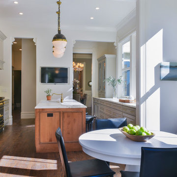
With an ideal location in the Pacific Heights neighborhood of San Francisco, this dated Victorian residence had "beautiful bones" but had been sitting on the market for a year before being purchased with plans to revitalize the interior. Interior designer, Noel Han, explained, "Historical Victorian homes in this area often have beautiful architectural elements that I aim to preserve, but the floor plan and layout tend to be stuffy, not live-able and not light filled. Modern families want bright, light-filled, spacious rooms that take advantage of outdoor views and living spaces, and function well for storage, meals and entertaining."
Preserving the architectural integrity and special features of the home was one of Han's goals but at the same time, she re-designed the space, moving walls and adding windows to create an open floorplan that flowed easily between the kitchen and outdoor living spaces. Where the range once stood in the original design, now an entire wall of windows provides panoramic views of the outdoors and fills the kitchen with light. Below the windows, Han designed a long bank of base cabinets with drawers to provide plenty of storage and work surface. Light now pours into the space even on foggy days. The range was moved to the opposite wall so that beautiful window views could be added to the kitchen.
Han selected a palette of finishes with an eye toward creating a "soft color aesthetic". "White painted finishes are very popular right now but would have felt stark and cold in this space," she explained. "The French grey paint from Dura Supreme was a perfect complement for this vintage Victorian home, to create a classic color scheme".
"This beautiful home already had hardware elements with a vintage brass finish, so I carefully selected antiqued, brushed brass hardware, plumbing and metal finishes to blend with the original elements," said Han. She continued, "The La Cornue French Range adds modern function with a French antique look."
"I appreciate working with Dura Supreme cabinetry because of the quality of the cabinetry, fast delivery and the custom options. I'm able to create beautiful architectural details like the pull-out columns on both sides of the range and the curved mullion doors on the furniture hutch, and they offer a stunning palette of finishes and styles," explained Han. For the bath cabinetry, Han created a similar palette of finishes and styles to create a complementary look throughout the entire home.
Product Details:
Perimeter: Dura Supreme Cabinetry shown in the St. Augustine door style and Mullion Pattern #15 door style with a “Zinc” painted finish.
Kitchen Island: Dura Supreme Cabinetry shown in the St. Augustine door style with a Clove stain and Black Accent finish on Cherry wood.
For more information about Noel Han, Interior Designer, click to her website here www.atelnoel.com.
For more information about Gilmans Kitchens and Baths, click to their website here www.gkandb.com.
Photography by: Ned Bonzi www.nedbonzi.com.
Request a FREE Dura Supreme Brochure Packet:
http://www.durasupreme.com/request-brochure
 Michael Nash Design, Build & Homes
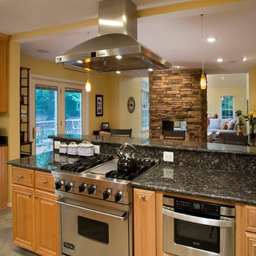
 When the homeowners purchased this traditional colonial in Vienna, Virginia, they were already planning on making some serious changes. The home’s original floor plan was boxy and closed in, making traffic flow from one room to the next virtually non-existent. Additionally, the existing décor left a lot to be desired. Their vision was to open up the layout and create a more contemporary look using lots of light, soft colors and high end materials.
They decided to add a two-story addition to the back of the home’s existing breakfast room and the small upstairs bedroom above it. The old breakfast area was too small for their daily meals and their teenage son needed more space in his bedroom. They also decided to add a sunroom/family room to the left side of their old family room. This new room offers a vaulted ceiling with four skylights and lots of windows with a better view of the side and backyard.
To create a more open floor plan, the team at Michael Nash Design, Build & Homes removed the load bearing wall between the kitchen and family room and installed a large beam to handle the second floor load. Not only did this open up the space, but it allowed for the addition of a breakfast bar.
The right side bearing wall of the old family room was also removed and replaced with structural beams. This action created a continuous flow between the new sunroom and old family room. Separated by a double-sided stone fireplace, this new sunroom is connected to a new outside sun deck built using a maintenance-free decking material. The old family room with new lighting now serves as a casual seating area. It also features an eight-foot long built-in desk.
The newly updated kitchen features granite countertops with matching tile backsplash, professional-quality appliances, a porcelain tile floor and custom cabinets, including a large pantry. The new breakfast room is more spacious and gets daylight from three different angles.
Upstairs, a new 12’ x 20’ bedroom is a great place for this teenage football fan to hang out. It provides significantly more closet space than the old room and lets in more sunlight as well.
The old laundry room was converted to a new mudroom with locker style cabinetry and a place for kids to store their bag packs. New plumbing and electrical were implemented in a new closet in an upper hallway to facilitate the new washer and dryer.
In this remodel, form and function have come together in an open concept design that meets the needs of the entire family.

Sponsored
Delaware, OH

Buckeye Basements, Inc.
Central Ohio's Basement Finishing ExpertsBest Of Houzz '13-'21
 Metropolis Drafting and Construction Inc
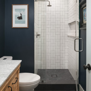
An original 1930’s English Tudor with only 2 bedrooms and 1 bath spanning about 1730 sq.ft. was purchased by a family with 2 amazing young kids, we saw the potential of this property to become a wonderful nest for the family to grow.
The plan was to reach a 2550 sq. ft. home with 4 bedroom and 4 baths spanning over 2 stories.
With continuation of the exiting architectural style of the existing home.
A large 1000sq. ft. addition was constructed at the back portion of the house to include the expended master bedroom and a second-floor guest suite with a large observation balcony overlooking the mountains of Angeles Forest.
An L shape staircase leading to the upstairs creates a moment of modern art with an all white walls and ceilings of this vaulted space act as a picture frame for a tall window facing the northern mountains almost as a live landscape painting that changes throughout the different times of day.
Tall high sloped roof created an amazing, vaulted space in the guest suite with 4 uniquely designed windows extruding out with separate gable roof above.
The downstairs bedroom boasts 9’ ceilings, extremely tall windows to enjoy the greenery of the backyard, vertical wood paneling on the walls add a warmth that is not seen very often in today’s new build.
The master bathroom has a showcase 42sq. walk-in shower with its own private south facing window to illuminate the space with natural morning light. A larger format wood siding was using for the vanity backsplash wall and a private water closet for privacy.
In the interior reconfiguration and remodel portion of the project the area serving as a family room was transformed to an additional bedroom with a private bath, a laundry room and hallway.
The old bathroom was divided with a wall and a pocket door into a powder room the leads to a tub room.
The biggest change was the kitchen area, as befitting to the 1930’s the dining room, kitchen, utility room and laundry room were all compartmentalized and enclosed.
We eliminated all these partitions and walls to create a large open kitchen area that is completely open to the vaulted dining room. This way the natural light the washes the kitchen in the morning and the rays of sun that hit the dining room in the afternoon can be shared by the two areas.
The opening to the living room remained only at 8’ to keep a division of space.
 Braswell Design+Build
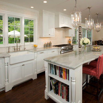
This client sought to update their recently purchased home in Alexandria. A gourmet kitchen that complemented the size of the home and property was a top priority. They wanted more light-filled and connected living spaces for their growing family. Updating the finishes throughout the home was also a necessity.
Design challenges included an existing utility space that occupied a large portion of the kitchen footprint, making the kitchen cramped and narrow. In addition, the foyer was dark, confined and uninviting as a result of its organization and enclosed nature of the main stair.
To overcome the challenges, we relocated the utilities, creating a more usable footprint for the kitchen. The aging furnace was replaced with a high efficiency furnace located in a newly insulated and conditioned crawl space. A new hot water heater was placed in the finished attic, and the electrical panel was also relocated. Then, we designed a portion of the kitchen to mask the need for dropped structural headers: the refrigerator, freezer and pantry were placed under the area that necessitated a drop bulkhead, creating a sleek built-in area for the appliances.
Once the utilities were moved, the kitchen could be opened up to a large family room and designed with a much-improved layout. Two new four-panel exterior doors replaced small doors at the family room to connect the main living space with the beautiful yard. In addition, white bead board was added to the family room ceiling, creating more visual continuity with the adjacent white kitchen.
To transform the foyer into a grand and welcoming entry, a small amount of space was taken from a large second floor bedroom, and the entire second floor structure was supported with a series of flush beams to allow the stair to be opened and expose the rail. New glass doors to the den, relocated at an angle from the main stair provide the foyer with more natural light and a wider, more inviting path to the kitchen.
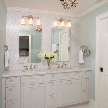
In the master suite, the bedroom and bathroom entry doors were relocated to improve the room’s layout and offer more bathroom privacy and space for a walk-in closet. A room forgotten by the previous owner was turned into a family mudroom with built-ins and wainscoting to keep the family organized in style.
Photography by Greg Hadley
 Braswell Design+Build
This client sought to update their recently purchased home in Alexandria. A gourmet kitchen that complemented the size of the home and property was a top priority. They wanted more light-filled and connected living spaces for their growing family. Updating the finishes throughout the home was also a necessity.
Design challenges included an existing utility space that occupied a large portion of the kitchen footprint, making the kitchen cramped and narrow. In addition, the foyer was dark, confined and uninviting as a result of its organization and enclosed nature of the main stair.
To overcome the challenges, we relocated the utilities, creating a more usable footprint for the kitchen. The aging furnace was replaced with a high efficiency furnace located in a newly insulated and conditioned crawl space. A new hot water heater was placed in the finished attic, and the electrical panel was also relocated. Then, we designed a portion of the kitchen to mask the need for dropped structural headers: the refrigerator, freezer and pantry were placed under the area that necessitated a drop bulkhead, creating a sleek built-in area for the appliances.
Once the utilities were moved, the kitchen could be opened up to a large family room and designed with a much-improved layout. Two new four-panel exterior doors replaced small doors at the family room to connect the main living space with the beautiful yard. In addition, white bead board was added to the family room ceiling, creating more visual continuity with the adjacent white kitchen.
To transform the foyer into a grand and welcoming entry, a small amount of space was taken from a large second floor bedroom, and the entire second floor structure was supported with a series of flush beams to allow the stair to be opened and expose the rail. New glass doors to the den, relocated at an angle from the main stair provide the foyer with more natural light and a wider, more inviting path to the kitchen.
In the master suite, the bedroom and bathroom entry doors were relocated to improve the room’s layout and offer more bathroom privacy and space for a walk-in closet. A room forgotten by the previous owner was turned into a family mudroom with built-ins and wainscoting to keep the family organized in style.
Photography by Greg Hadley
47