
Search results for "Question public" in Home Design Ideas
 Misiaszek Turpin pllc
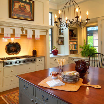
Resting upon a 120-acre rural hillside, this 17,500 square-foot residence has unencumbered mountain views to the east, south and west. The exterior design palette for the public side is a more formal Tudor style of architecture, including intricate brick detailing; while the materials for the private side tend toward a more casual mountain-home style of architecture with a natural stone base and hand-cut wood siding.
Primary living spaces and the master bedroom suite, are located on the main level, with guest accommodations on the upper floor of the main house and upper floor of the garage. The interior material palette was carefully chosen to match the stunning collection of antique furniture and artifacts, gathered from around the country. From the elegant kitchen to the cozy screened porch, this residence captures the beauty of the White Mountains and embodies classic New Hampshire living.
Photographer: Joseph St. Pierre
 Princeton Design Collaborative
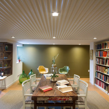
Family room library - mid-sized 1960s open concept brown floor family room library idea in New York with green walls, a standard fireplace and a brick fireplace
 Drewett Works
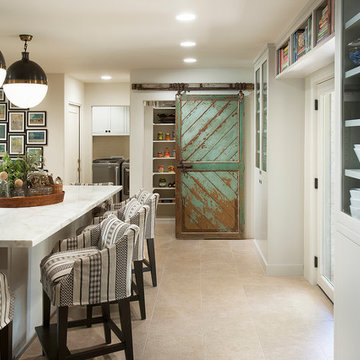
This Paradise Valley stunner was a down-to-the-studs renovation. The owner, a successful business woman and owner of Bungalow Scottsdale -- a fabulous furnishings store, had a very clear vision. DW's mission was to re-imagine the 1970's solid block home into a modern and open place for a family of three. The house initially was very compartmentalized including lots of small rooms and too many doors to count. With a mantra of simplify, simplify, simplify, Architect CP Drewett began to look for the hidden order to craft a space that lived well.
This residence is a Moroccan world of white topped with classic Morrish patterning and finished with the owner's fabulous taste. The kitchen was established as the home's center to facilitate the owner's heart and swagger for entertaining. The public spaces were reimagined with a focus on hospitality. Practicing great restraint with the architecture set the stage for the owner to showcase objects in space. Her fantastic collection includes a glass-top faux elephant tusk table from the set of the infamous 80's television series, Dallas.
It was a joy to create, collaborate, and now celebrate this amazing home.
Project Details:
Architecture: C.P. Drewett, AIA, NCARB; Drewett Works, Scottsdale, AZ
Interior Selections: Linda Criswell, Bungalow Scottsdale, Scottsdale, AZ
Photography: Dino Tonn, Scottsdale, AZ
Featured in: Phoenix Home and Garden, June 2015, "Eclectic Remodel", page 87.
Find the right local pro for your project
 NIELSEN DYE DESIGN, INC.
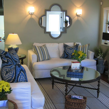
This small casual family room area is a part of the kitchen great room. Creating the bright coastal feel are 2 matching white canvas sofas with classic blue and white pillows. Soft greens, yellows and oatmeal add color accents to all the blue and white. Blue and oatmeal rug grounds the area around the wall mounted TV (not in photo).

 Jay Sifford
Donald Pell Farm. Design by Donald Pell. Photo by Jay Sifford.
This is an example of a farmhouse landscaping in Philadelphia.
This is an example of a farmhouse landscaping in Philadelphia.
 Robeson Design
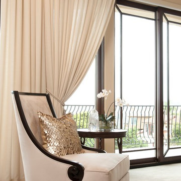
A perfect mix of coastal breeze and traditional luxury designed by Rebecca Robeson of Robeson Design.
David Harrison Photography
Transitional bedroom photo in San Diego
Transitional bedroom photo in San Diego
 Better Living SoCal
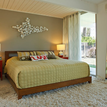
WIth the living spaces of Eichler homes so open, many of Eichler's later designs evolved to create a Master Suite area in a separate zone of the home. This allowed open and bright areas that were farther away from the public spaces but still shared views (and access) with many of the outdoor areas. Contact us with any questions on what you see here.
EichlerSoCal.com


 Harwick Homes
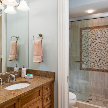
Stone flooring, granite countertops, and soft blue walls add richness and warmth to this guest bath.
Amber Frederiksen Photography
Small elegant kids' beige tile and porcelain tile porcelain tile alcove shower photo in Miami with an undermount sink, recessed-panel cabinets, medium tone wood cabinets, granite countertops and blue walls
Small elegant kids' beige tile and porcelain tile porcelain tile alcove shower photo in Miami with an undermount sink, recessed-panel cabinets, medium tone wood cabinets, granite countertops and blue walls
 Eldorado Stone
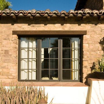
Perched high above the desert floor, this exclusive community of homes was designed specifically to take full advantage of close indoor/outdoor relationships, to showcase panoramic views and directional breezes. Adjacent mountains sweep across the site, and varied massing combined with rustic stone and wood beams recall historic European hill-towns. Each of the three plans incorporates multiple courtyards and porticos with a centralized, formal entry experience. The interplay of interior volumes articulates natural light and dramatic textures. Public and private spaces have been carefully zoned, to provide pockets of seclusion, balanced with generous entertainment areas. Inclusion of multiple water features combined with indigenous landscape seamlessly blend with the architecture to create a stunning sense of place among the rugged desert terrain.
Eldorado Stone featured: Veneto Fieldledge
Eldorado Brick featured: Brolio RomaBrick
Architect: Steve Sennikoff
Architecture Firm: Mark Scheurer Architect
Mason: Dan Stringer Masonry
 ZeroEnergy Design
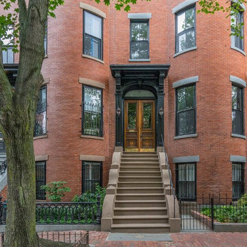
This renovated brick rowhome in Boston’s South End offers a modern aesthetic within a historic structure, creative use of space, exceptional thermal comfort, a reduced carbon footprint, and a passive stream of income.
DESIGN PRIORITIES. The goals for the project were clear - design the primary unit to accommodate the family’s modern lifestyle, rework the layout to create a desirable rental unit, improve thermal comfort and introduce a modern aesthetic. We designed the street-level entry as a shared entrance for both the primary and rental unit. The family uses it as their everyday entrance - we planned for bike storage and an open mudroom with bench and shoe storage to facilitate the change from shoes to slippers or bare feet as they enter their home. On the main level, we expanded the kitchen into the dining room to create an eat-in space with generous counter space and storage, as well as a comfortable connection to the living space. The second floor serves as master suite for the couple - a bedroom with a walk-in-closet and ensuite bathroom, and an adjacent study, with refinished original pumpkin pine floors. The upper floor, aside from a guest bedroom, is the child's domain with interconnected spaces for sleeping, work and play. In the play space, which can be separated from the work space with new translucent sliding doors, we incorporated recreational features inspired by adventurous and competitive television shows, at their son’s request.
MODERN MEETS TRADITIONAL. We left the historic front facade of the building largely unchanged - the security bars were removed from the windows and the single pane windows were replaced with higher performing historic replicas. We designed the interior and rear facade with a vision of warm modernism, weaving in the notable period features. Each element was either restored or reinterpreted to blend with the modern aesthetic. The detailed ceiling in the living space, for example, has a new matte monochromatic finish, and the wood stairs are covered in a dark grey floor paint, whereas the mahogany doors were simply refinished. New wide plank wood flooring with a neutral finish, floor-to-ceiling casework, and bold splashes of color in wall paint and tile, and oversized high-performance windows (on the rear facade) round out the modern aesthetic.
RENTAL INCOME. The existing rowhome was zoned for a 2-family dwelling but included an undesirable, single-floor studio apartment at the garden level with low ceiling heights and questionable emergency egress. In order to increase the quality and quantity of space in the rental unit, we reimagined it as a two-floor, 1 or 2 bedroom, 2 bathroom apartment with a modern aesthetic, increased ceiling height on the lowest level and provided an in-unit washer/dryer. The apartment was listed with Jackie O'Connor Real Estate and rented immediately, providing the owners with a source of passive income.
ENCLOSURE WITH BENEFITS. The homeowners sought a minimal carbon footprint, enabled by their urban location and lifestyle decisions, paired with the benefits of a high-performance home. The extent of the renovation allowed us to implement a deep energy retrofit (DER) to address air tightness, insulation, and high-performance windows. The historic front facade is insulated from the interior, while the rear facade is insulated on the exterior. Together with these building enclosure improvements, we designed an HVAC system comprised of continuous fresh air ventilation, and an efficient, all-electric heating and cooling system to decouple the house from natural gas. This strategy provides optimal thermal comfort and indoor air quality, improved acoustic isolation from street noise and neighbors, as well as a further reduced carbon footprint. We also took measures to prepare the roof for future solar panels, for when the South End neighborhood’s aging electrical infrastructure is upgraded to allow them.
URBAN LIVING. The desirable neighborhood location allows the both the homeowners and tenant to walk, bike, and use public transportation to access the city, while each charging their respective plug-in electric cars behind the building to travel greater distances.
OVERALL. The understated rowhouse is now ready for another century of urban living, offering the owners comfort and convenience as they live life as an expression of their values.
 ZeroEnergy Design
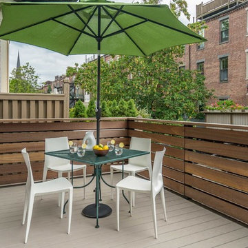
This renovated brick rowhome in Boston’s South End offers a modern aesthetic within a historic structure, creative use of space, exceptional thermal comfort, a reduced carbon footprint, and a passive stream of income.
DESIGN PRIORITIES. The goals for the project were clear - design the primary unit to accommodate the family’s modern lifestyle, rework the layout to create a desirable rental unit, improve thermal comfort and introduce a modern aesthetic. We designed the street-level entry as a shared entrance for both the primary and rental unit. The family uses it as their everyday entrance - we planned for bike storage and an open mudroom with bench and shoe storage to facilitate the change from shoes to slippers or bare feet as they enter their home. On the main level, we expanded the kitchen into the dining room to create an eat-in space with generous counter space and storage, as well as a comfortable connection to the living space. The second floor serves as master suite for the couple - a bedroom with a walk-in-closet and ensuite bathroom, and an adjacent study, with refinished original pumpkin pine floors. The upper floor, aside from a guest bedroom, is the child's domain with interconnected spaces for sleeping, work and play. In the play space, which can be separated from the work space with new translucent sliding doors, we incorporated recreational features inspired by adventurous and competitive television shows, at their son’s request.
MODERN MEETS TRADITIONAL. We left the historic front facade of the building largely unchanged - the security bars were removed from the windows and the single pane windows were replaced with higher performing historic replicas. We designed the interior and rear facade with a vision of warm modernism, weaving in the notable period features. Each element was either restored or reinterpreted to blend with the modern aesthetic. The detailed ceiling in the living space, for example, has a new matte monochromatic finish, and the wood stairs are covered in a dark grey floor paint, whereas the mahogany doors were simply refinished. New wide plank wood flooring with a neutral finish, floor-to-ceiling casework, and bold splashes of color in wall paint and tile, and oversized high-performance windows (on the rear facade) round out the modern aesthetic.
RENTAL INCOME. The existing rowhome was zoned for a 2-family dwelling but included an undesirable, single-floor studio apartment at the garden level with low ceiling heights and questionable emergency egress. In order to increase the quality and quantity of space in the rental unit, we reimagined it as a two-floor, 1 or 2 bedroom, 2 bathroom apartment with a modern aesthetic, increased ceiling height on the lowest level and provided an in-unit washer/dryer. The apartment was listed with Jackie O'Connor Real Estate and rented immediately, providing the owners with a source of passive income.
ENCLOSURE WITH BENEFITS. The homeowners sought a minimal carbon footprint, enabled by their urban location and lifestyle decisions, paired with the benefits of a high-performance home. The extent of the renovation allowed us to implement a deep energy retrofit (DER) to address air tightness, insulation, and high-performance windows. The historic front facade is insulated from the interior, while the rear facade is insulated on the exterior. Together with these building enclosure improvements, we designed an HVAC system comprised of continuous fresh air ventilation, and an efficient, all-electric heating and cooling system to decouple the house from natural gas. This strategy provides optimal thermal comfort and indoor air quality, improved acoustic isolation from street noise and neighbors, as well as a further reduced carbon footprint. We also took measures to prepare the roof for future solar panels, for when the South End neighborhood’s aging electrical infrastructure is upgraded to allow them.
URBAN LIVING. The desirable neighborhood location allows the both the homeowners and tenant to walk, bike, and use public transportation to access the city, while each charging their respective plug-in electric cars behind the building to travel greater distances.
OVERALL. The understated rowhouse is now ready for another century of urban living, offering the owners comfort and convenience as they live life as an expression of their values.
Photography: Eric Roth Photo
 J Design Group - Interior Designers Miami - Modern
AVENTURA MAGAZINE selected our client’s luxury 5000 Sf ocean front apartment in Miami Beach, to publish it in their issue and they Said:
Story by Linda Marx, Photography by Daniel Newcomb
Light & Bright
New York snowbirds redesigned their Miami Beach apartment to take advantage of the tropical lifestyle.
WHEN INTERIOR DESIGNER JENNIFER CORREDOR was asked to recreate a four-bedroom, six-bath condominium at The Bath Club in Miami Beach, she seized the opportunity to open the rooms and better utilize the vast ocean views.
In five months last year, the designer transformed a dark and closed 5,000-square-foot unit located on a high floor into a series of sweeping waterfront spaces and updated the well located apartment into a light and airy retreat for a sports-loving family of five.
“They come down from New York every other weekend and wanted to make their waterfront home a series of grand open spaces,” says Corrredor, of the J. Design Group in Coral Gables, a firm specializing in modern and contemporary interiors. “Since many of the rooms face the ocean, it made sense to open and lighten up the home, taking advantage of the awesome views of the sea and the bay.”
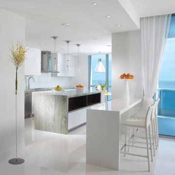
The designer used 40 x 40 all white tile throughout the apartment as a clean base. This way, her sophisticated use of color would stand out and bring the outdoors in.
The close-knit family members—two parents and three boys in college—like to do things together. But there were situations to overcome in the process of modernizing and opening the space. When Corredor was briefed on their desires, nothing seemed too daunting. The confident designer was ready to delve in. For example, she fixed an area at the front door
that was curved. “The wood was concave so I straightened it out,” she explains of a request from the clients. “It was an obstacle that I overcame as part of what I do in a redesign. I don’t consider it a difficult challenge. Improving what I see is part of the process.”
She also tackled the kitchen with gusto by demolishing a wall. The kitchen had formerly been enclosed, which was a waste of space and poor use of available waterfront ambience. To create a grand space linking the kitchen to the living room and dining room area, something had to go. Once the wall was yesterday’s news, she relocated the refrigerator and freezer (two separate appliances) to the other side of the room. This change was a natural functionality in the new open space. “By tearing out the wall, the family has a better view of the kitchen from the living and dining rooms,” says Corredor, who also made it easier to walk in and out of one area and into the other. “The views of the larger public space and the surrounding water are breathtaking.
Opening it up changed everything.”
They clients can now see the kitchen from the living and dining areas, and at the same time, dwell in an airy and open space instead of feeling stuck in a dark enclosed series of rooms. In fact, the high-top bar stools that Corredor selected for the kitchen can be twirled around to use for watching TV in the living room.
In keeping with the theme of moving seamlessly from one room to the other, Corredor designed a subtle wall of glass in the living room along with lots of comfortable seating. This way, all family members feel at ease while relaxing, talking, or watching sporting events on the large flat screen television. “For this room, I wanted more open space, light and a supreme airy feeling,” she says. “With the glass design making a statement, it quickly became the star of the show.”…….
….. To add texture and depth, Jennifer Corredor custom created wood doors here, and in other areas of the home. They provide a nice contrast to the open Florida tropical feel. “I added character to the openness by using exotic cherry wood,” she says. “I repeated this throughout the home and it works well.”
Known for capturing the client’s vision while adding her own innovative twists, Jennifer Corredor lightened the family room, giving it a contemporary and modern edge with colorful art and matching throw pillows on the sofas. She added a large beige leather ottoman as the center coffee table in the room. This round piece was punctuated with a bold-toned flowering plant atop. It effortlessly matches the pillows and colors of the contemporary canvas.
Miami,
Miami Interior Designers,
Miami Interior Designer,
Interior Designers Miami,
Interior Designer Miami,
Modern Interior Designers,
Modern Interior Designer,
Modern interior decorators,
Modern interior decorator,
Contemporary Interior Designers,
Contemporary Interior Designer,
Interior design decorators,
Interior design decorator,
Interior Decoration and Design,
Black Interior Designers,
Black Interior Designer,
Interior designer,
Interior designers,
Interior design decorators,
Interior design decorator,
Home interior designers,
Home interior designer,
Interior design companies,
Interior decorators,
Interior decorator,
Decorators,
Decorator,
Miami Decorators,
Miami Decorator,
Decorators Miami,
Decorator Miami,
Interior Design Firm,
Interior Design Firms,
Interior Designer Firm,
Interior Designer Firms,
Interior design,
Interior designs,
Home decorators,
Interior decorating Miami,
Best Interior Designers,
Interior design decorator,
Miami Beach


 Sabrina Alfin Interiors
Dean J. Birinyi Photography, copyright 2012-2014
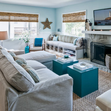
Example of a beach style living room design in San Francisco
Example of a beach style living room design in San Francisco
 Visbeen Architects
Builder: Falcon Custom Homes
Interior Designer: Mary Burns - Gallery
Photographer: Mike Buck
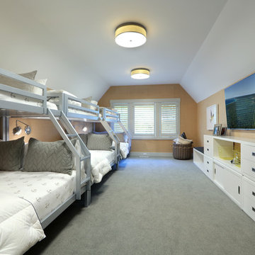
A perfectly proportioned story and a half cottage, the Farfield is full of traditional details and charm. The front is composed of matching board and batten gables flanking a covered porch featuring square columns with pegged capitols. A tour of the rear façade reveals an asymmetrical elevation with a tall living room gable anchoring the right and a low retractable-screened porch to the left.
Inside, the front foyer opens up to a wide staircase clad in horizontal boards for a more modern feel. To the left, and through a short hall, is a study with private access to the main levels public bathroom. Further back a corridor, framed on one side by the living rooms stone fireplace, connects the master suite to the rest of the house. Entrance to the living room can be gained through a pair of openings flanking the stone fireplace, or via the open concept kitchen/dining room. Neutral grey cabinets featuring a modern take on a recessed panel look, line the perimeter of the kitchen, framing the elongated kitchen island. Twelve leather wrapped chairs provide enough seating for a large family, or gathering of friends. Anchoring the rear of the main level is the screened in porch framed by square columns that match the style of those found at the front porch. Upstairs, there are a total of four separate sleeping chambers. The two bedrooms above the master suite share a bathroom, while the third bedroom to the rear features its own en suite. The fourth is a large bunkroom above the homes two-stall garage large enough to host an abundance of guests.
 EL & EL Wood Products Corp.
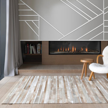
These S4S accent walls are all the rage these days. You can create any design that matches your style with the S4S and these can be put into any room.
S4S: 713MUL
Check out ELandELWoodProducts.com for more ideas and options.
 ZeroEnergy Design
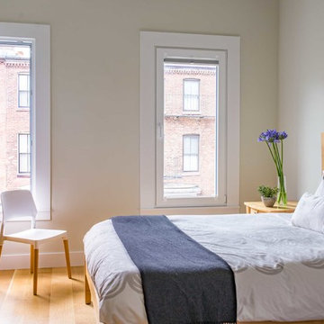
This renovated brick rowhome in Boston’s South End offers a modern aesthetic within a historic structure, creative use of space, exceptional thermal comfort, a reduced carbon footprint, and a passive stream of income.
DESIGN PRIORITIES. The goals for the project were clear - design the primary unit to accommodate the family’s modern lifestyle, rework the layout to create a desirable rental unit, improve thermal comfort and introduce a modern aesthetic. We designed the street-level entry as a shared entrance for both the primary and rental unit. The family uses it as their everyday entrance - we planned for bike storage and an open mudroom with bench and shoe storage to facilitate the change from shoes to slippers or bare feet as they enter their home. On the main level, we expanded the kitchen into the dining room to create an eat-in space with generous counter space and storage, as well as a comfortable connection to the living space. The second floor serves as master suite for the couple - a bedroom with a walk-in-closet and ensuite bathroom, and an adjacent study, with refinished original pumpkin pine floors. The upper floor, aside from a guest bedroom, is the child's domain with interconnected spaces for sleeping, work and play. In the play space, which can be separated from the work space with new translucent sliding doors, we incorporated recreational features inspired by adventurous and competitive television shows, at their son’s request.
MODERN MEETS TRADITIONAL. We left the historic front facade of the building largely unchanged - the security bars were removed from the windows and the single pane windows were replaced with higher performing historic replicas. We designed the interior and rear facade with a vision of warm modernism, weaving in the notable period features. Each element was either restored or reinterpreted to blend with the modern aesthetic. The detailed ceiling in the living space, for example, has a new matte monochromatic finish, and the wood stairs are covered in a dark grey floor paint, whereas the mahogany doors were simply refinished. New wide plank wood flooring with a neutral finish, floor-to-ceiling casework, and bold splashes of color in wall paint and tile, and oversized high-performance windows (on the rear facade) round out the modern aesthetic.
RENTAL INCOME. The existing rowhome was zoned for a 2-family dwelling but included an undesirable, single-floor studio apartment at the garden level with low ceiling heights and questionable emergency egress. In order to increase the quality and quantity of space in the rental unit, we reimagined it as a two-floor, 1 or 2 bedroom, 2 bathroom apartment with a modern aesthetic, increased ceiling height on the lowest level and provided an in-unit washer/dryer. The apartment was listed with Jackie O'Connor Real Estate and rented immediately, providing the owners with a source of passive income.
ENCLOSURE WITH BENEFITS. The homeowners sought a minimal carbon footprint, enabled by their urban location and lifestyle decisions, paired with the benefits of a high-performance home. The extent of the renovation allowed us to implement a deep energy retrofit (DER) to address air tightness, insulation, and high-performance windows. The historic front facade is insulated from the interior, while the rear facade is insulated on the exterior. Together with these building enclosure improvements, we designed an HVAC system comprised of continuous fresh air ventilation, and an efficient, all-electric heating and cooling system to decouple the house from natural gas. This strategy provides optimal thermal comfort and indoor air quality, improved acoustic isolation from street noise and neighbors, as well as a further reduced carbon footprint. We also took measures to prepare the roof for future solar panels, for when the South End neighborhood’s aging electrical infrastructure is upgraded to allow them.
URBAN LIVING. The desirable neighborhood location allows the both the homeowners and tenant to walk, bike, and use public transportation to access the city, while each charging their respective plug-in electric cars behind the building to travel greater distances.
OVERALL. The understated rowhouse is now ready for another century of urban living, offering the owners comfort and convenience as they live life as an expression of their values.
Eric Roth Photo

 J.THOM Residential Design & Cabinetry
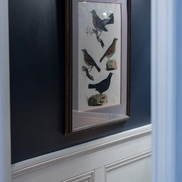
Clients wanted to keep a powder room on the first floor and desired to relocate it away from kitchen and update the look. We needed to minimize the powder room footprint and tuck it into a service area instead of an open public area.
We minimize the footprint and tucked the PR across from the basement stair which created a small ancillary room and buffer between the adjacent rooms. We used a small wall hung basin to make the small room feel larger by exposing more of the floor footprint. Wainscot paneling was installed to create balance, scale and contrasting finishes.
The new powder room exudes simple elegance from the polished nickel hardware, rich contrast and delicate accent lighting. The space is comfortable in scale and leaves you with a sense of eloquence.
Jonathan Kolbe, Photographer
 Leah Luczynski
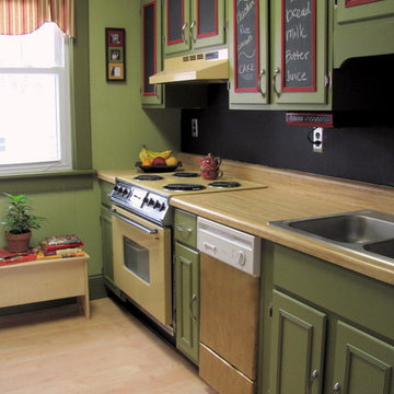
The purpose of the project was the make the 1970s Harvest Gold (that just wouldn't quit) feel like it was part of the space rather than an eyesore. This was achieved by using only paint. The budget for this project was very small--$1000 ($700 of which was earmarked for the flooring). The question was posed "how can we make this kitchen look better with only using paint?"
 Oliver Simon Design Inc.
Tracey Ayton Photography
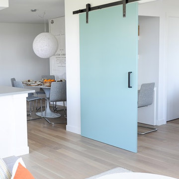
Dining room - scandinavian dining room idea in Vancouver
Dining room - scandinavian dining room idea in Vancouver
12