
Search results for "Range supports" in Home Design Ideas

 SGDI - Sarah Gallop Design Inc.
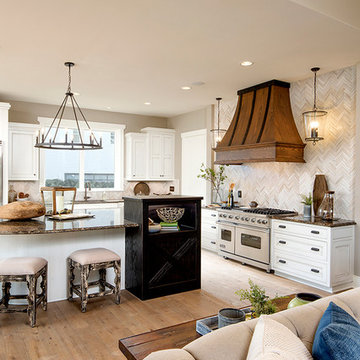
The objective was to create a warm neutral space to later customize to a specific colour palate/preference of the end user for this new construction home being built to sell. A high-end contemporary feel was requested to attract buyers in the area. An impressive kitchen that exuded high class and made an impact on guests as they entered the home, without being overbearing. The space offers an appealing open floorplan conducive to entertaining with indoor-outdoor flow.
Due to the spec nature of this house, the home had to remain appealing to the builder, while keeping a broad audience of potential buyers in mind. The challenge lay in creating a unique look, with visually interesting materials and finishes, while not being so unique that potential owners couldn’t envision making it their own. The focus on key elements elevates the look, while other features blend and offer support to these striking components. As the home was built for sale, profitability was important; materials were sourced at best value, while retaining high-end appeal. Adaptations to the home’s original design plan improve flow and usability within the kitchen-greatroom. The client desired a rich dark finish. The chosen colours tie the kitchen to the rest of the home (creating unity as combination, colours and materials, is repeated throughout).
Photos- Paul Grdina

 Utopia 360 Studio
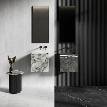
Leader Online, a UK-based company, approached us to support the launch of Nosa, a new sanitary ware brand targeting the British market.
With competition in the sector increasing, they required a cohesive set of visuals for their numerous products to establish a consistent visual language across e-commerce platforms, catalogs, and promotional materials.
It was a complete brand creation from scratch, and we pulled it off.
Key tasks:
- Develop a cohesive visual brand identity for Nosa
- Produce over 2,000 high-quality 3D visualizations
within five months
- Optimize workflows for high efficiency and a unified
visual standard
Our approach:
To efficiently manage high production volumes and accelerate feedback, we implemented an optimized workflow system. This transformed our render production into an assembly line, drastically cutting individual product processing time while upholding top image quality.
Nosa's unique marble, with its distinct veins and inclusions, was central to their brand. Since no existing textures matched, we requested physical samples.
Upon receiving the stone, we set up an improvised photo studio, capturing every detail. Our goal was
not just to replicate the marble in 3D, but to preserve
its raw, organic beauty.
We applied the same meticulous process to metal materials for accurate shade representation. Nosa prioritized authenticity, ensuring buyers saw the true material, not an over-polished version.
Result:
Nosa's market entry surpassed all expectations.
Fueled by its compelling visual identity, the brand achieved strong initial sales and is now rapidly expanding its product range, cementing its presence.
We are proud to continue our partnership with Nosa
to this day.

 LMB Interiors
Our clients wanted their home to be host to charity functions, community events, and their family and friends, as well as a showcase for their eclectic and colorful art collection featuring works by local Oakland artists.
Oh, and when they moved in, they did the work to register the house as an Oakland Historical Landmark.
The fact that the couple was looking to upgrade their living room in the Hollywood Regency style (which is known for bold colors, shiny metallics, luxe fabrics, and an eye to mixing opulence with comfort while holding true to the glamor of 1930s Hollywood) made this project all the more inspiring and fun for me and my team.
John recalls, “We wanted a place that was glamorous, and compelling, so that people who visit would be excited and inspired by it!”
Our mission was to bring the very grand living room with its high ceilings and leaded glass bay windows to the next level for the family (including grown children Tom and Mandela) and their guests — ranging in number from 6 to 60 or more, on any given day or night.
The Hollywood Regency aesthetic was a perfect canvas for mixing and matching with the couple’s significant and hyper-local pop art collection, including pieces by famed Oakland artists Mel Ramos and K-Dub.
Kim and John’s personal views and aesthetics, together with their vibrant art collection, called for a bold design that is more funky and eclectic overall than many owners of historic homes like this tend to prefer.
I mean, don’t get me wrong; many of our clients like to do something a little daring, and often they opt for elements of glam. However, John and Kim agreeing to our specification of a pair of peacock blue sofas — that is no small commitment to audacious color!
Another furnishing element I love from this project is the custom-designed birds-eye-maple and antique glass inset bar — on wheels, which allows flexibility: a bartender can serve a large party from behind it or it can be turned around for use as self-service for a more intimate gathering.
My team and I couldn’t be more proud to have created a design that inspires and supports this family so that they may continue to make significant contributions to their causes and community.
Find the right local pro for your project
 Utopia 360 Studio
Leader Online, a UK-based company, approached us to support the launch of Nosa, a new sanitary ware brand targeting the British market.
With competition in the sector increasing, they required a cohesive set of visuals for their numerous products to establish a consistent visual language across e-commerce platforms, catalogs, and promotional materials.
It was a complete brand creation from scratch, and we pulled it off.
Key tasks:
- Develop a cohesive visual brand identity for Nosa
- Produce over 2,000 high-quality 3D visualizations
within five months
- Optimize workflows for high efficiency and a unified
visual standard
Our approach:
To efficiently manage high production volumes and accelerate feedback, we implemented an optimized workflow system. This transformed our render production into an assembly line, drastically cutting individual product processing time while upholding top image quality.
Nosa's unique marble, with its distinct veins and inclusions, was central to their brand. Since no existing textures matched, we requested physical samples.
Upon receiving the stone, we set up an improvised photo studio, capturing every detail. Our goal was
not just to replicate the marble in 3D, but to preserve
its raw, organic beauty.
We applied the same meticulous process to metal materials for accurate shade representation. Nosa prioritized authenticity, ensuring buyers saw the true material, not an over-polished version.
Result:
Nosa's market entry surpassed all expectations.
Fueled by its compelling visual identity, the brand achieved strong initial sales and is now rapidly expanding its product range, cementing its presence.
We are proud to continue our partnership with Nosa
to this day.
 Drury Design
THE SETUP
Multiple ovens, multiple workspaces, multiple sinks – when you think about it, non-jewish kitchens have been adapting the criteria of kosher kitchens for years.
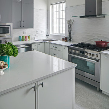
Gladys’ clients in West Rogers Park are Orthodox Jewish. The house they bought already had a kosher kitchen – it just wasn’t done that well. It needed some more things to be duplicated for the dairy side and the meat side. Plus, it was dark and the configuration wasn’t very conducive for a family of eight.
It was time for a remodel.
Design Objectives
Improve kosher kitchen
Add more storage in the island
Better lighting
More open, lighter feel
Change the wood floor in the kitchen to tile
THE REMODEL
Design Challenges
- We had originally planned on removing a wing wall by the breakfast area. During demolition, we learned it contained a support beam.
- The kitchen is a substantial size, but having two sinks, dishwashers, and ovens presented a challenge – how do we fit it all in and make it flow with the storage still accessible near the work areas?
Where do you stop the materials for the new space? - -- The right tile, paint, lighting, etc. would be needed to make the remodeled area cohesive with the rest of the main floor.
- An existing column limited cabinet options and thus, storage capacity. Could we conceal it without disrupting the cabinetry flow?
Design Solutions
- We had to keep the wing wall, but decided to continue the tile on the sides of the cabinets and maintain the height of the tile to line up with the rest of the backsplash. This actually presented a very nice and cohesive look, especially since the opposite side has a wing wall to the left of the refrigerator.
- We used “L-shaped” corner sinks instead of the rectangular ones set on an angle. This gave us more of the legs of the triangles versus the hypotenuse, which allowed for the two dishwashers, and the pullout utensil canisters and spice pullouts while still keeping the 3-drawer cabinets on either side of the range (by the sinks). The old island had the recess for stools which the family never used. By extending the width of the island 6” and utilizing this leg space, we were able to fit 18”-deep cabinets on this side – adding lots of accessible storage. The family can now work simultaneously on the dairy side (the side with the fridge) and the meat side (opposite) without getting in each other’s way. We separated the cooking by using the range oven for the meat and a built-in microwave in the base cabinet. The wall oven with built-in microwave on top is for dairy.
- Corner sinks opened up the middle area for a wider range – we went from a 30” to a 36”. Removing all the wall cabinets (on the range wall) made a big difference. That opened up the entire space while adding some visual impact. (Not pictured: We also made the cabinets directly opposite the range wall tall and removed the countertop, resulting in more room for rollouts and even more storage!) The kitchen now has more storage than it did before.
- We ended up painting the ceiling of the kitchen into the hallway that leads to the foyer. The living and dining rooms were separated by a soffit, so that became a natural boundary. We kept the tile in the kitchen by stopping it short of the hallway and lining it up with the pantry wall. This creates a border between the breakfast area and family room. The rest of the existing wood floors were refinished to refresh and make the hue darker. We also painted a dark accent wall and carried it into the breakfast area to make the rooms look deeper.
- The in-the-way column housed plumbing and couldn’t be moved. We still built cabinets in that spot – we just had to build a chase inside it to conceal the pipes. There was still plenty of room for new storage. We also took the cabinets all the way to the ceiling. The continuous tall cabinets added a functional elegance to the space.
THE RENEWED SPACE
The client’s long-awaited dream of a better kosher kitchen has finally been achieved, beautifully combining enhanced storage solutions with adherence to the family’s orthodox dietary laws. The kitchen’s standout feature, an expanded island, now offers a spacious and efficient workspace. This allows several family members to cook together comfortably, without the inconvenience of bumping into each other, ensuring a harmonious and productive cooking environment.
 Drury Design
THE SETUP
Multiple ovens, multiple workspaces, multiple sinks – when you think about it, non-jewish kitchens have been adapting the criteria of kosher kitchens for years.
Gladys’ clients in West Rogers Park are Orthodox Jewish. The house they bought already had a kosher kitchen – it just wasn’t done that well. It needed some more things to be duplicated for the dairy side and the meat side. Plus, it was dark and the configuration wasn’t very conducive for a family of eight.
It was time for a remodel.
Design Objectives
Improve kosher kitchen
Add more storage in the island
Better lighting
More open, lighter feel
Change the wood floor in the kitchen to tile
THE REMODEL
Design Challenges
- We had originally planned on removing a wing wall by the breakfast area. During demolition, we learned it contained a support beam.
- The kitchen is a substantial size, but having two sinks, dishwashers, and ovens presented a challenge – how do we fit it all in and make it flow with the storage still accessible near the work areas?
Where do you stop the materials for the new space? - -- The right tile, paint, lighting, etc. would be needed to make the remodeled area cohesive with the rest of the main floor.
- An existing column limited cabinet options and thus, storage capacity. Could we conceal it without disrupting the cabinetry flow?
Design Solutions
- We had to keep the wing wall, but decided to continue the tile on the sides of the cabinets and maintain the height of the tile to line up with the rest of the backsplash. This actually presented a very nice and cohesive look, especially since the opposite side has a wing wall to the left of the refrigerator.
- We used “L-shaped” corner sinks instead of the rectangular ones set on an angle. This gave us more of the legs of the triangles versus the hypotenuse, which allowed for the two dishwashers, and the pullout utensil canisters and spice pullouts while still keeping the 3-drawer cabinets on either side of the range (by the sinks). The old island had the recess for stools which the family never used. By extending the width of the island 6” and utilizing this leg space, we were able to fit 18”-deep cabinets on this side – adding lots of accessible storage. The family can now work simultaneously on the dairy side (the side with the fridge) and the meat side (opposite) without getting in each other’s way. We separated the cooking by using the range oven for the meat and a built-in microwave in the base cabinet. The wall oven with built-in microwave on top is for dairy.
- Corner sinks opened up the middle area for a wider range – we went from a 30” to a 36”. Removing all the wall cabinets (on the range wall) made a big difference. That opened up the entire space while adding some visual impact. (Not pictured: We also made the cabinets directly opposite the range wall tall and removed the countertop, resulting in more room for rollouts and even more storage!) The kitchen now has more storage than it did before.
- We ended up painting the ceiling of the kitchen into the hallway that leads to the foyer. The living and dining rooms were separated by a soffit, so that became a natural boundary. We kept the tile in the kitchen by stopping it short of the hallway and lining it up with the pantry wall. This creates a border between the breakfast area and family room. The rest of the existing wood floors were refinished to refresh and make the hue darker. We also painted a dark accent wall and carried it into the breakfast area to make the rooms look deeper.
- The in-the-way column housed plumbing and couldn’t be moved. We still built cabinets in that spot – we just had to build a chase inside it to conceal the pipes. There was still plenty of room for new storage. We also took the cabinets all the way to the ceiling. The continuous tall cabinets added a functional elegance to the space.
THE RENEWED SPACE
The client’s long-awaited dream of a better kosher kitchen has finally been achieved, beautifully combining enhanced storage solutions with adherence to the family’s orthodox dietary laws. The kitchen’s standout feature, an expanded island, now offers a spacious and efficient workspace. This allows several family members to cook together comfortably, without the inconvenience of bumping into each other, ensuring a harmonious and productive cooking environment.

 Michael Nash Design, Build & Homes
2010 NARI CAPITAL COTY FINALIST AWARD WINNER
A military couple bought this single family home in a prominent Mount Vernon neighborhood about a year ago. The home had a three-level deck on the back of the house which was falling apart and from which there was no access via the kitchen or breakfast area. Additionally, water run-off was washing a large amount of dirt against the lower level basement door because there was little in terms of landscaping in place. The homeowners wanted to entertain in the backyard and have a good flow from the family room and kitchen onto the back patio.
To help them achieve their goals, they hired Michael Nash Design, Build & Homes as their contractor. The first step in the renovation was to remove the entire back deck. Next, they designed and built an 18’x 45’ concrete foundation and slab; designed and built a tall retaining wall coved with flagstone to support the upper level patio; and installed a new patio with flagstone and brick pavers.
The new patio level only requires two short steps to get inside of the house. A new set of French doors with sidelights replaces the old breakfast room window to improve the traffic pattern. A new set of French doors with ½ arched transom and two side windows connects the new gourmet kitchen to the back patio.
The kitchen offers professional-grade stainless steel appliances, hard wood floors, granite countertops with a tile backsplash and beautiful custom cabinetry. A large center island is the focal point of the room and the gathering spot in this new space.

 Utopia 360 Studio
Leader Online, a UK-based company, approached us to support the launch of Nosa, a new sanitary ware brand targeting the British market.
With competition in the sector increasing, they required a cohesive set of visuals for their numerous products to establish a consistent visual language across e-commerce platforms, catalogs, and promotional materials.
It was a complete brand creation from scratch, and we pulled it off.
Key tasks:
- Develop a cohesive visual brand identity for Nosa
- Produce over 2,000 high-quality 3D visualizations
within five months
- Optimize workflows for high efficiency and a unified
visual standard
Our approach:
To efficiently manage high production volumes and accelerate feedback, we implemented an optimized workflow system. This transformed our render production into an assembly line, drastically cutting individual product processing time while upholding top image quality.
Nosa's unique marble, with its distinct veins and inclusions, was central to their brand. Since no existing textures matched, we requested physical samples.
Upon receiving the stone, we set up an improvised photo studio, capturing every detail. Our goal was
not just to replicate the marble in 3D, but to preserve
its raw, organic beauty.
We applied the same meticulous process to metal materials for accurate shade representation. Nosa prioritized authenticity, ensuring buyers saw the true material, not an over-polished version.
Result:
Nosa's market entry surpassed all expectations.
Fueled by its compelling visual identity, the brand achieved strong initial sales and is now rapidly expanding its product range, cementing its presence.
We are proud to continue our partnership with Nosa
to this day.
 LMB Interiors
Our clients wanted their home to be host to charity functions, community events, and their family and friends, as well as a showcase for their eclectic and colorful art collection featuring works by local Oakland artists.
Oh, and when they moved in, they did the work to register the house as an Oakland Historical Landmark.
The fact that the couple was looking to upgrade their living room in the Hollywood Regency style (which is known for bold colors, shiny metallics, luxe fabrics, and an eye to mixing opulence with comfort while holding true to the glamor of 1930s Hollywood) made this project all the more inspiring and fun for me and my team.
John recalls, “We wanted a place that was glamorous, and compelling, so that people who visit would be excited and inspired by it!”
Our mission was to bring the very grand living room with its high ceilings and leaded glass bay windows to the next level for the family (including grown children Tom and Mandela) and their guests — ranging in number from 6 to 60 or more, on any given day or night.
The Hollywood Regency aesthetic was a perfect canvas for mixing and matching with the couple’s significant and hyper-local pop art collection, including pieces by famed Oakland artists Mel Ramos and K-Dub.
Kim and John’s personal views and aesthetics, together with their vibrant art collection, called for a bold design that is more funky and eclectic overall than many owners of historic homes like this tend to prefer.
I mean, don’t get me wrong; many of our clients like to do something a little daring, and often they opt for elements of glam. However, John and Kim agreeing to our specification of a pair of peacock blue sofas — that is no small commitment to audacious color!
Another furnishing element I love from this project is the custom-designed birds-eye-maple and antique glass inset bar — on wheels, which allows flexibility: a bartender can serve a large party from behind it or it can be turned around for use as self-service for a more intimate gathering.
My team and I couldn’t be more proud to have created a design that inspires and supports this family so that they may continue to make significant contributions to their causes and community.
 Synergy Design & Construction
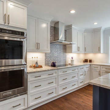
The Kitchen features Bertch cabinetry with the "Quincy” inset doorstyle for the upper cabinets & the “Lexington” full-overlay doorstyle for the rest. The perimeter cabinetry in “White” provides contrast with the “Cobalt” island. Stainless steel Kitchenaid 30" double wall ovens provide lots of cooking capacity.

 Ancient Surfaces
Stone Stairs by 'Ancient Surfaces'
Product: Antique Stone Stairs
Contacts: (212) 461-0245
Email: Sales@ancientsurfaces.com
Website: www.AncientSurfaces.com
Stairs are one of the most basic indoors and outdoors architectural feature that are a must both functionally and esthetically speaking.
In landscaping beside their obvious usefulness in helping you access various elevations on your property they will also allow you to divide and breakup various section of your outdoor design, they'll help you redirect your line of sight to specific focal points of interest and by themselves can make a powerful design statement that symbolizes hospitality and openness towards guests.
When creating staircases out of our antique stone building elements we focus on waring all of those hats that your stairs need to ware in order to serve their intended multipurpose role.
Most don't dwell or even think twice about this seemingly rudimentary and basic building element that on its surface seems unchanged from the days of the Roman empire.
However we've identified various stairs designs and cataloged over 30 divers stone stairs type that forms the bulk of our stone stair library. Here are a few that are noteworthy of mentioning:
1- The thick hexagon staggered stepping stone stairs ideal for any ancient, whimsical, 17th century English or Asiatic landscaping themes you may be using in your outdoors.
2- The 3" and 5" Thick foundation slab slices that are massive cut-out chunks from salvaged cornerstone foundation blocks that used to be laid underneath old farmhouses and building structures in medieval and renaissance Europe before the invention of modern cement and steel foundations.
3- The double stacked antique reclaimed limestone stair edge and risers. All made out of our various lines of very hard antique limestone paves that defies all weather types from sub-Saharan to Tundra climates and perfect for both indoors and outdoors applications.
4- Full blocked 8" thick (or more) )stairs with both the squared backs and the slanted backs ideal for the outdoors or for creating a self-supporting structure that will allow architects and designer an extended range of design options and usages.
5- Limestone stairs with Encaustic Tile raisers ideal for any coastal Spanish or Italian style home.
6- Thick and solid single pieced bull-nosed stairs and raisers flanked by wrist high limestone balustrades when used on the outdoor entryway staircase of your home.
All of those types of stairs and countless many others will play an invisible role in defining the character and feel of your future home.

 Renovisions
These South Shore of Boston homeowners desired a larger kitchen as their existing had limited space to host family events and entertain guests – they turned to Renovisions to help transform their small, outdated kitchen with separate walk-in pantry into a beautiful, open and spacious inspirational room.
Choosing the right cabinetry for the room and how to meet the needs of the client was critical to the overall success of this design. A traditional style was the framework of the home and the flat paneled doors on the white painted cabinetry support this aspect. Going vertical as possible with cabinets is a trend here to stay; keeping with that idea, we recommended the graceful tall pantry cabinet that flanks one side of the kitchen. This not only lends to an eye-appealing furniture-look, but adds significant storage space, allowing the cabinets to store items they may not use on a regular basis. In this case, the clients are amazed with the amount of storage they’ve gained and one that provides easy access to all interior items. Every inch of space was key to create this optimally functional kitchen. Must-haves such as tray dividers above the refrigerator are handy and the double pull-out trash/recycling bins on the right side of the sink were a simple and clean way to gain floor space and conceal unsightly trash.
The focal point of this kitchen is the expansive, soft-grey colored contrasting island with larger, deeper drawers for pots, pans and platters. The client was excited to switch to an induction chef-series range that featured a divided oven that can accommodate two different temperatures.
Fit and finish is important in any renovation and this certainly holds true in this kitchen project to personalize their space. The custom recessed panel columns with wainscot details add an architectural element that ties into the kitchen cabinet design and Carrera-look quartz countertops which provide a stunning classical look that ties nicely with the overall traditional style. These homeowners are excited to show off their open and spacious Renovision!
“We really enjoyed our new kitchen and it’s amazing improvement over the holidays. We got rave reviews from all of our guests!”
Steve & Mary S. (Duxbury)

 RAJ Kitchen and Bath, LLC
This space had the potential for greatness but was stuck in the 1980's era. We were able to transform and re-design this kitchen that now enables it to be called not just a "dream Kitchen", but also holds the award for "Best Kitchen in Westchester for 2016 by Westchester Home Magazine". Features in the kitchen are as follows: Inset cabinet construction, Maple Wood, Onyx finish, Raised Panel Door, sliding ladder, huge Island with seating, pull out drawers for big pots and baking pans, pullout storage under sink, mini bar, overhead television, builtin microwave in Island, massive stainless steel range and hood, Office area, Quartz counter top.
Sponsored
Plain City, OH

The Creative Kitchen Company
Columbus Area Kitchen Remodeling and Refacing Professional

 Spencer's Contracting LLC
This project was a collaborative effort between homeowners, the designer, the contractor and the trades that executed the design. Originally, when the house was constructed the ceiling height of the kitchen was lowered and as you stepped into that space you were surrounded on three sides by cabinets. This remodel changed just about everything but the location of the sink. We raised the ceiling height in the kitchen so that it would be continuous with the rest of the house. We also placed new shaker style cabinets and incorporated a large center island cabinet. All cabinets are solid wood construction with soft close concealed hinges. Where a hallway wall originally jetted out to support the lowered ceiling we removed and replaced with a rustic wood column. We placed new lighting at designated locations throughout to give an even uniform brightness. We also installed under cabinet lighting to give spot on brightness to the countertops. The finished result is very functional and beautiful. It was a pleasure to see this project fulfilled.

 TVL Creative Ltd.
Cramped kitchen be gone! That was the project motto and top priority. The goal was to transform the current layout from multiple smaller spaces into a connected whole that would activate the main level for our clients, a young family of four.
The biggest obstacle was the wall dividing the kitchen and the dining room. Removing this wall was central to opening up and integrating the main living spaces, but the existing ductwork that ran right through the center of the wall posed a design challenge, er design opportunity. The resulting design solution features a central pantry that captures the ductwork and provides valuable storage- especially when compared to the original kitchen's 18" wide pantry cabinet. The pantry also anchors the kitchen island and serves as a visual separation of space between the kitchen and homework area.
Through our design development process, we learned the formal living room was of no service to their lifestyle and therefore space they rarely spent time in. With that in mind, we proposed to eliminate the unused living room and make it the new dining room. Relocating the dining room to this space inherently felt right given the soaring ceiling and ample room for holiday dinners and celebrations. The new dining room was spacious enough for us to incorporate a conversational seating area in the warm, south-facing window alcove.
Now what to do with the old dining room?! To answer that question we took inspiration from our clients' shared profession in education and developed a craft area/homework station for both of their boys. The semi-custom cabinetry of the desk area carries over to the adjacent wall and forms window bench base with storage that we topped with butcher block for a touch of warmth. While the boys are young, the bench drawers are the perfect place for a stash of toys close to the kitchen.
The kitchen begins just beyond the window seat with their refrigerator enclosure. Opposite the refrigerator is the new pantry with twenty linear feet of shelving and space for brooms and a stick vacuum. Extending from the backside of the pantry the kitchen island design incorporates counter seating on the family room side and a cabinetry configuration on the kitchen side with drawer storage, a trashcan center, farmhouse sink, and dishwasher.
We took careful time in design and execution to align the range and sink because while it might seem like a small detail, it plays an important role in supporting the symmetrical configuration of the back wall of the kitchen. The rear wall design utilizes an appliance garage mirrors the visual impact of the refrigerator enclosure and helps keep the now open kitchen tidy. Between the appliance garage and refrigerator enclosure is the cooking zone with 30" of cabinetry and work surface on either side of the range, a chimney style vent hood, and a bold graphic tile backsplash.
The backsplash is just one of many personal touches we added to the space to reflect our client's modern eclectic style and love of color. Swooping lines of the mid-mod style barstools compliment the pendants and backsplash pattern. A pop of vibrant green on the frame of the pantry door adds a fresh wash of color to an otherwise neutral space. The big show stopper is the custom charcoal gray and copper chevron wall installation in the dining room. This was an idea our clients softly suggested, and we excitedly embraced the opportunity. It is also a kickass solution to the head-scratching design dilemma of how to fill a large and lofty wall.
We are so grateful to bring this design to life for our clients and now dear friends.
 Blue Sound Construction, Inc.
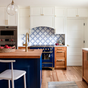
KItchen remodel with cherry cabinetry and butcherblock island countertop. Part of our Seattle Remodel and Addition on Capitol Hill of a 1904 Dutch Colonial that had been significantly remodeled in 1980, with Miriam Larson of Story Architecture and Photo by Miranda Estes.
Winner of a REX Award for Excellence in Remodeling 2023 from the Master Builder’s Association
Winner of an Excellence in Remodeling Award for Historic Renovation/Restoration 2023 from the Building Industry Association of Washington
 User
House Plan #464-4 : Houseplans.com
Questions? Call us at 1-800-913-2350
Photographs may show modified designs. All images are copyrighted.
Plan 464-4
1628 sq ft
3 beds
2.50 baths
25' wide
56' deep
×
Plans
Main Floor Plan
Upper Floor Plan
Plan Description
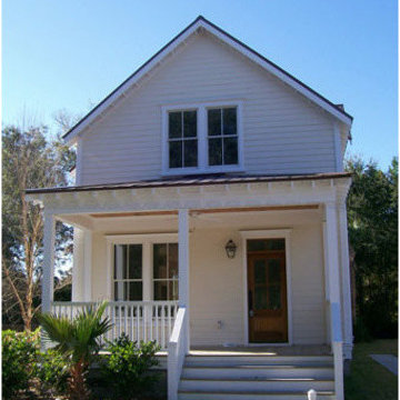
This 1628 square feet traditional style 3 bedroom, 2.5 bath with 0
garage stalls falls in the 1000-2000 square feet range. \
\
The floor plan features den/office/study/computer, open floor plan,
covered rear porch, kitchen island, walk-in closet, covered front porch,
great room/living room, main floor laundry, upstairs master bdrm, suited
for narrow lot, mud room, wheelchair adaptable. \
\
Allison Ramsey Architects, Inc.
Specifications
Plan Styles
Farmhouse
Traditional
Beach
Ceiling
Upper Ceiling Ft
9'
Main Ceiling Ft
10'
More
Wheelchair Adaptable
Lot Characteristics
Suited For Narrow Lot
Code
Irc 2006
Roof
Primary Pitch
10:12
Secondary Pitch
2:12
Roof Type
Metal
Roof Framing
stick
Entryway
Mud Room
Additional Rooms
Great Room Living Room
Den Office Study Computer
Main Floor Laundry
Kitchen Features
Kitchen Island
Area
Total Sq Ft
1628 sq ft
Main Floor Sq Ft
916 sq ft
Porch Sq Ft
262 sq ft
Upper Floor Sq Ft
712 sq ft
Bedroom Features
Walk In Closet
Upstairs Master Bdrm
Dimension
Height
25'
Depth
56'
Width
25'
Basic Features
Garage Stalls
0
Stories
2
Bedrooms
3
Potential Bedrooms
0
Baths
2.50
Exterior Wall Framing
Framing
2"x4"
Exterior Wall Finish
Shakes
Outdoor Spaces
Covered Rear Porch
Covered Front Porch
Pricing
Plan Set
Price
PDF Set
$1450.00
Reproducible Set
$1450.00
Foundation
Price
Crawlspace
+$0.00
Plan Content
All plans are drawn at ¼” scale or larger and include :
Foundation Plan: Drawn to 1/4" scale, this page shows all necessary notations and dimensions including support columns, walls and excavated and unexcavated areas. Most of our plans show a basement and alternate crawl space or slab plan.
Exterior Elevations: A blueprint picture of all four sides showing exterior materials and measurements

Sponsored
Plain City, OH
The Creative Kitchen Company
Columbus Area Kitchen Remodeling and Refacing Professional

 TKS Design Group
Free ebook, Creating the Ideal Kitchen. DOWNLOAD NOW
This Glen Ellyn couple wanted to transform their dated kitchen into a more family-friendly space to use on a daily basis for cooking family meals and for entertaining friends. The existing kitchen was quite chopped up with strange soffits and different ceiling heights. To make the space flow in a more logical manner, we borrowed an unused desk area from the adjoining hallway and reconfigured a neighboring bath. Getting it to work on paper was fairly straightforward, but there was a bit of complicated beam work involved as the new kitchen flows through what was an old exterior wall. The new ceiling is now completely flush as we were able to hide the support in the ceiling joists.
A new, larger window was added at the sink, the doorway to the room was widened and the resulting space creates a more easy flow from dining room to family room.
The clients chose white inset cabinets, white marble tops and an apron sink to keep the space feeling simple yet original to the home's Colonial styling.
Ship lap siding on the back of the island and at the pantry storage ceiling, a walnut butcher block, and antique brass details give the space an updated look.
Professional stainless appliances are functional and beautiful. In addition to a large built-in fridge and 36" range, a second oven is housed in the island for flexibility.
The pantry area has a convenience station that houses the family's espresso machine along with the microwave drawer. Another large bank of cabinets in the same area serves as pantry storage for dry goods.
The bathroom was also remodeled as part of this project. The full bath has a vanity, shower and convenient baby changing area.
The floor is encaustic tile, a type of concrete tile recognizable by its bold graphics. The mirror and lighting add a few modern touches to keep it in line with the Owner's personal style.
Designed by: Susan Klimala, CKD, CBD
Photography by: Carlos Vergara
For more information on kitchen and bath design ideas go to: www.kitchenstudio-ge.com

 TOC design & construction inc.
In today’s world; Basements are being re-utilized, re-purposed and sometimes converted into in-law suites. Both Laila & Maher’s parents live overseas and often visit so why not give them a space where everyone can coincide.
Homeowners’ request: We want at least 2 rooms, a large laundry room, an office, a play area, movie night area with a large sectional a bathroom and loads of storage – Yikes that’s a big wish list for only 1000 square feet, including the furnace room space.
Designer secret: Separating the bedrooms for the In-laws to the east side , the office and living space to the west side and creating a large central bathroom with extra long storage and a corridor with-in, I was able to turn this once gloomy and dingy basement into a family retreat . Light colors, durable waterproof VCT flooring, larger egress windows and better LED lighting enhances the space and opens the space so no one feels like they live underground. I also kept the open staircase in it’s space to minimize costs put gave it a face lift by painting all spindles and supports white and staining the stair treads to match floor.
Materials used: FLOOR; VCT vinyl 6mm floating floor 6” x 48” color walnut - WALL PAINT; 6206-21 Sketch paper – WALL SCONCE ; Parallax with Edison bulbs – STAIRS; Sanded, stained special walnut with a satin finish – DOORS & MOLDING; colonial by Boiserie Raymond - MEDIA UNIT; Ikea Besta – FURNITURE & DECOR; By client.

 Outwater Industries Inc
Encompassing a range of baluster rails, newel posts and complementary decorative accessories, Outwater's new, maintenance free Cast Stone Balustrade System is manufactured utilizing a unique process that combines a mixture of resins with crushed limestone and impregnated fade resistant textured colors to create balustrades that look and feel just like authentic limestone balusters at less than half of their cost and weight.
Intended for indoor or outdoor applications, which can be assembled by laypeople using traditional carpentry tools without the need for masonry, Outwater's Cast Stone Balustrade System meets the 4-inch sphere code when properly set up, and can be placed on sized dimensional lumber without the need for steel supports.
Moreover, unlike lesser quality balustrade systems, which use regular screws to attach their components, also taking into account that the screws' imminent corrosion renders them as an unsafe means by which to attach baluster rails, Outwater's Cast Stone Balustrade System employs a unique incorporated pipe system, connector pins and spacers to increase the Balustrade System's stability while allowing for a more secure and professional installation with barely perceptible seams.
Offered in 34-in. and 48-in. overall heights with a nominal 7-in rail width, baluster rails are sold by the foot up to 16-ft. long to accommodate most any installation.
100% mold resistant, non-porous and unaffected by the harshest elements, Outwater's Cast Stone Balustrade System does not require priming, painting or even occasional touch ups, further enhancing its appeal.
Product Features:
• Create balustrades that look and feel just like authentic stone balusters at less than half of their cost and weight
• Intended for indoor or outdoor use
• Can be installed by laypeople using traditional carpentry tools without the need for masonry
• Meets the 4-inch sphere code when properly set up, and can be placed on sized dimensional lumber without the need for steel supports
• Employs a unique incorporated pipe system, connector pins and spacers to increase stability while allowing for a more secure and professional installation
• Offered in 34-in. and 48-in. overall heights with a nominal 7-in rail width, baluster rails are sold by the foot up to 16-ft. long
• 100% mold resistant, non-porous and unaffected by the harshest elements. Does not require priming, painting or even occasional touch ups
Contact:
Architectural Products by Outwater
Sales & Product Information (USA & Canada):
1-800-631-8375 / 1-201-498-8750
Fax (USA & Canada): 1-800-888-3315 / 1-201-498-8751
Sales & Product Information (Outside of the USA & Canada):
1-201-498-8750
Fax (Outside of the USA & Canada): 1-201-498-8751
Email: info@outwaterplastics.com
Web: www.outwater.com
Visit us!
East Coast:
24 River Road
Bogota, NJ 07603
1-201-498-8750
West Coast:
4720 West Van Buren
Phoenix, AZ 85043
1-602-447-0936
About Architectural Products by Outwater:
It really is easy to shop with us!
Relied upon by more than 1,000,000 builders, renovators, architects designers, woodworkers, cabinet and furniture manufacturers, OEM's and retail consumers since 1972, Architectural Products by Outwater is an international manufacturer and distributor of more than 65,000 innovative and traditional Decorative Building Products that you possibly never knew existed or for which you simply could not find a reliable source. This is where Outwater truly shines!
“Now you can design, buy, build and dream like the Pros…”
Outwater’s products are, to say the least, very competitively priced and include interior and exterior architectural mouldings and millwork; columns and capitals; LED lighting and lighting accessories; balustrading; faux stone panels; faux wood beams; genuine stone tiles; decorative wood carvings; wrought iron components; stamped steel and polymer ceiling panels and backsplashes; wainscoting; wall coverings; fireplace surrounds and mantels; plastic "glass" block; period and contemporary hardware; home organization systems; kitchen and bath accessories; kitchen and bath cabinetry; bath vanities; furniture & cabinet components; knobs & pulls; casters; laminates; brass tubing & fittings; surfacing materials… and so much more!
In addition, with warehouse and distribution facilities in New Jersey and Arizona totaling over 300,000 square feet, Outwater facilitates purchases with reduced lead times and shipping costs, enabling us to fulfill and ship over 98% of our orders from stock within one to two business days!
At a time when many companies appear to have rapidly transitioned away from personalized customer service, having replaced their knowledgeable and immensely valuable human sales representatives with inanimate online marketing channels, which can be helpful to you if you were to know exactly what you might need and were not to encounter difficulties in placing your order, here at Outwater, we still believe that human interaction with a live, well versed, non-commissioned sales representative will undoubtedly better serve your needs in the long run. Even though you can always shop with us at www.outwater.com, you can also always deal directly with our extremely well versed and friendly sales and customer service representatives for their unparalleled support and assistance, most of whom have worked at Outwater for more than 15 years.
Whether you have been one of our loyal customers over the years or this is your first time in doing business with us, we would like to thank you for your expressed interest in our company and the products that we carry.
Please feel free to contact us with any questions at 1-800-631-8375 or visit us online at www.outwater.com
We look forward to serving you in the near future.
221