
Search results for "Reading typically" in Home Design Ideas

 ATA Architects Inc
Function meets form in the Delta House, which incorporates innovative building solutions for our challenging rural Canadian climate. Perhaps more akin to aeronautics than architecture, biomimetic processes drove the problem-solving approach while seeking multiple functions for each component. A typical Canadian home grows up and out of the site, exposing more of the facade to the elements. Instead of building up, the focus here was to make better use of the lower level. A section of the house was dug out on the south side, making room for three main glazed boxes. The spaces and bedrooms of a typical second floor were transferred to the more protected basement, thus lowering the volume of conditioned air within the dwelling.
To minimize energy losses through the glazing, ATA centralized the windows on the south side of the building, while minimizing the glazing on other facades. The centralized windows became the “three sisters” allowing the winter sun into the main floor and lower level of the house. The aerodynamic delta shape of the building was tested in a wind tunnel and was designed to minimize energy loss due to contact with the turbulent winter wind. The sisters are tilted 10 degrees towards the sun, leveraging the properties of glass as a reflector, when the sun is at a high angle of incidence in the summer.
The house also contains an innovative thermal mass battery in the basement slab and a connected radiative masonry fireplace. Excess heat, gathered at the top of the tent-like roof is directed down and reheated through the chimney before being drawn into the basement slab for storage. Openings in the floor areas ensure the energy is equally distributed throughout the dwelling.
Read an article in the Globe and Mail about ATA’s Delta project here.
 Art Van Furniture
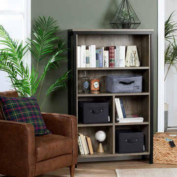
Sometimes all you need is a little organization, and this reading nook gets its calm and cozy vibe from the farmhouse-style bookcase. It effortlessly holds and display decorative items and books. Then add baskets to organize items that aren’t as decorative. It’s the perfect complement to an accent chair, instead of a typical end table. Complete the room with some potted plants and a rug to define a space for reading and daydreaming.
Like this look? Grab it by clicking here.
 Lim Design Studio, Inc
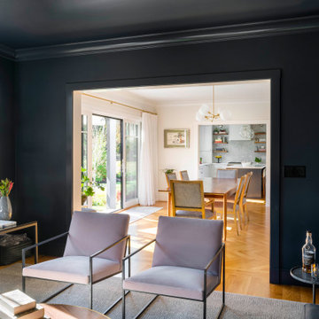
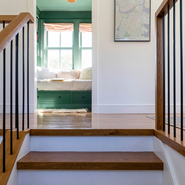
Located just outside of Boston, this home was built from the ground up to serve a bustling working family. The home contains a work/office space for client visits and an asymmetrical floor plan that distinguishes itself from typical New England vernacular. The entry sequence creates an enfilade to the main living spaces of the house. Smaller programmatic spaces such as the indoor pool, office, mud room, and staircase are kept to the perimeter of the main living areas on the lower floor. Upstairs, the stair ends at a reading nook and crafts area for children. Project featured in The Boston Globe. Completed in 2020. Photography by Sabrina Cole Quinn.
Find the right local pro for your project
 Lim Design Studio, Inc
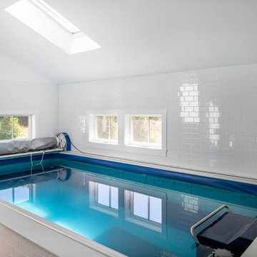
Located just outside of Boston, this home was built from the ground up to serve a bustling working family. The home contains a work/office space for client visits and an asymmetrical floor plan that distinguishes itself from typical New England vernacular. The entry sequence creates an enfilade to the main living spaces of the house. Smaller programmatic spaces such as the indoor pool, office, mud room, and staircase are kept to the perimeter of the main living areas on the lower floor. Upstairs, the stair ends at a reading nook and crafts area for children. Project featured in The Boston Globe. Completed in 2020. Photography by Sabrina Cole Quinn.
 Linda Banks Interiors
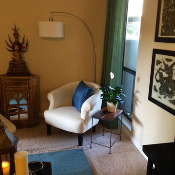
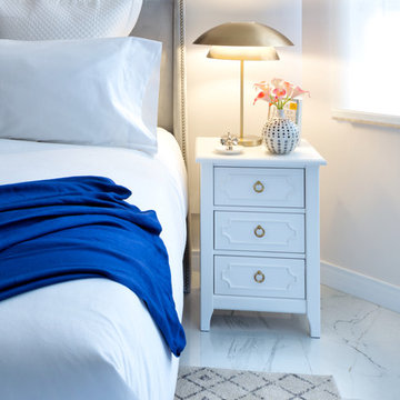
An apartment for a young couple just starting out: Great design was achieved on a small budget. A color scheme of blues, greens, and neutrals was used to turn a typical apartment into a warm and cozy home.
 Lim Design Studio, Inc
Located just outside of Boston, this home was built from the ground up to serve a bustling working family. The home contains a work/office space for client visits and an asymmetrical floor plan that distinguishes itself from typical New England vernacular. The entry sequence creates an enfilade to the main living spaces of the house. Smaller programmatic spaces such as the indoor pool, office, mud room, and staircase are kept to the perimeter of the main living areas on the lower floor. Upstairs, the stair ends at a reading nook and crafts area for children. Project featured in The Boston Globe. Completed in 2020. Photography by Sabrina Cole Quinn.
 Interiors by Maite Granda
Feature in: Luxe Magazine Miami & South Florida Luxury Magazine
If visitors to Robyn and Allan Webb’s one-bedroom Miami apartment expect the typical all-white Miami aesthetic, they’ll be pleasantly surprised upon stepping inside. There, bold theatrical colors, like a black textured wallcovering and bright teal sofa, mix with funky patterns,
such as a black-and-white striped chair, to create a space that exudes charm. In fact, it’s the wife’s style that initially inspired the design for the home on the 20th floor of a Brickell Key high-rise. “As soon as I saw her with a green leather jacket draped across her shoulders, I knew we would be doing something chic that was nothing like the typical all- white modern Miami aesthetic,” says designer Maite Granda of Robyn’s ensemble the first time they met. The Webbs, who often vacation in Paris, also had a clear vision for their new Miami digs: They wanted it to exude their own modern interpretation of French decor.
“We wanted a home that was luxurious and beautiful,”
says Robyn, noting they were downsizing from a four-story residence in Alexandria, Virginia. “But it also had to be functional.”
To read more visit: https:
https://maitegranda.com/wp-content/uploads/2018/01/LX_MIA18_HOM_MaiteGranda_10.pdf
Rolando Diaz

Sponsored
Sunbury, OH

J.Holderby - Renovations
Franklin County's Leading General Contractors - 2X Best of Houzz!
 Lim Design Studio, Inc
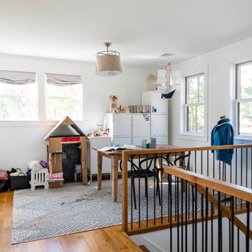
Located just outside of Boston, this home was built from the ground up to serve a bustling working family. The home contains a work/office space for client visits and an asymmetrical floor plan that distinguishes itself from typical New England vernacular. The entry sequence creates an enfilade to the main living spaces of the house. Smaller programmatic spaces such as the indoor pool, office, mud room, and staircase are kept to the perimeter of the main living areas on the lower floor. Upstairs, the stair ends at a reading nook and crafts area for children. Project featured in The Boston Globe. Completed in 2020. Photography by Sabrina Cole Quinn.
 DesignbyRuchi
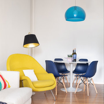
This project was for a young professional who had no tolerance for clutter but boy does she love to read. From the first site visit, I had my heart set on the books she had. She loves colors and is not scared of them. Client from heaven… She rents a typical railroad house in Brooklyn and it came with its own challenges as far as laying out the space. I created three zones for her and right in the middle sits her throne to read her gazillion books. Photography by Daniel Wang. Couch, library and dining / working… thats how I divided the space. The playful pendant lights add some much needed color in the tall ceiling and artless walls. The design classic WOMB chair in a beautiful Chartreuse Felt with chrome legs is the main feature in the room.
 Tile Doctor Ltd
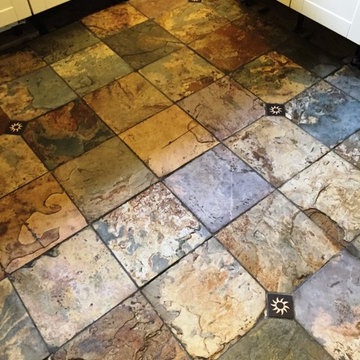
I recently visited a client living in the market town of Woodstock in Oxfordshire to rejuvenate a fantastic multi-coloured Slate floor that had been hidden under several years’ worth of dirt in their kitchen. Slate is a typically hard-wearing tile used for flooring high traffic areas of houses and public buildings but does need sealing to bring out its best features and in this case the sealer had long since worn off and dirt had become ingrained in the stone.
My first task in the cleaning process was to mix a strong solution of Tile Doctor Pro-Clean, which is a strong alkaline cleaner safe to use on Tile and Stone, and NanoTech HBU (Heavy Build-up Remover), which is a particularly powerful product that uses nano-sized particles to tackle muck in areas of the stone where typical cleaners simply can’t reach. I spread this solution across the floor and left it to seep into the stone, to get underneath and lift out the ingrained dirt.
After allowing the solution adequate time to dwell, I scrubbed the floor with a carbon brush to gradually reveal the fantastic natural colours of the Slate hidden beneath. Following this, I rinsed the entire floor several times with clean water, before soaking up the resulting soiled residue with a wet vacuum.
The next part of the cleaning process entailed paying particular attention to the grout lines. I used Tile Doctor Grout Clean-Up to scrub the grout lines and also to treat a small amount of efflorescence. The resulting residue was promptly extracted with the wet vacuum and I finished by giving the whole floor a rinse with Tile Doctor pH Neutral Tile Cleaner. This is a day to day tile cleaning product which is recommended for stone floors, many supermarket tile cleaning products are only suitable for ceramic tiles due to their acidic formula and can damage a floor over years of use so you should always read the label. I then left the floor to dry completely overnight.
On day two, the Slate tiled floor was dry and ready to seal. The floor had to be completely dry, as any excess moisture has the potential to the damage the performance of the sealer. Since my client had specifically requested a matte finish, I opted to use Tile Doctor Colour Grow. Colour Grow is an impregnating sealer that provides durable surface protection from within while also enhancing all of the natural mineral shades.
My client was very pleased with the results, particularly as they hadn’t realised they had such a great looking floor in their house when they had first purchased it!
Barry Woodward
Oxfordshire Tile Doctor
 Princeton Design Collaborative
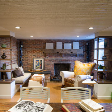
This is a basement renovation transforms the space into a Library for a client's personal book collection . Space includes all LED lighting , cork floorings , Reading area (pictured) and fireplace nook .
 Matt Fajkus Architecture
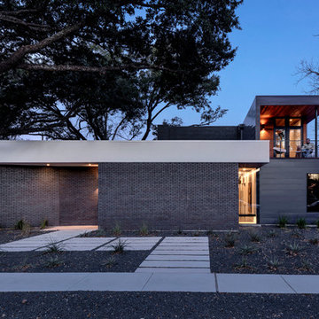
The Main Stay House exists as a straightforward proposal on an urban infill lot, paring down the components of a house to a minimal amount of planes and openings. The scheme is anchored by a modern entry sequence and a staircase volume, both clad in iron spot masonry externally and internally, creating thresholds between the respective realms of public, common and private, by minimal means. The masonry contrasts with an otherwise muted interior atmosphere of smooth, desaturated surfaces.
The entry sequence is a twist upon the conventional domestic front door, front facade, and fence. The front masonry wall replaces the typical residential fence and frames an indirect access to the front door, functioning as a privacy barrier while revealing slices of the interior to the public street.
The staircase bifurcates the layout to provide a clear division between the common and private zones of the house, while clearly reading as a mass from all outside view. Brick and glass become portals between common and private zones.
The design consolidates the service core along the west façade, allowing the structure to fully open the living zone to the pool court and existing trees. This directly connects interior and exterior, as well as human and nature. Freedom to vary the program or functional use of the area is enabled and strongly encouraged.
Photography: Charles Davis Smith
 World Class Tiles
Bliss Elements
Mid-sized elegant l-shaped eat-in kitchen photo in Detroit with white backsplash, glass tile backsplash and an island
Mid-sized elegant l-shaped eat-in kitchen photo in Detroit with white backsplash, glass tile backsplash and an island


 Princeton Design Collaborative
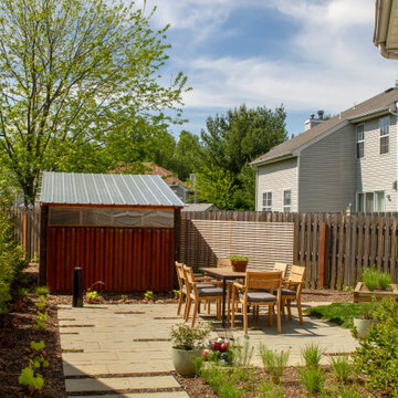
Sustainable Garden design on tight suburban lot with new shed as focal point.
This is an example of a small modern drought-tolerant, privacy and full sun backyard concrete paver landscaping in New York for spring.
This is an example of a small modern drought-tolerant, privacy and full sun backyard concrete paver landscaping in New York for spring.
 Isla Homes
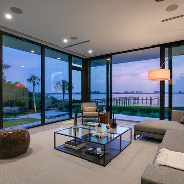
SeaThru is a new, waterfront, modern home. SeaThru was inspired by the mid-century modern homes from our area, known as the Sarasota School of Architecture.
This homes designed to offer more than the standard, ubiquitous rear-yard waterfront outdoor space. A central courtyard offer the residents a respite from the heat that accompanies west sun, and creates a gorgeous intermediate view fro guest staying in the semi-attached guest suite, who can actually SEE THROUGH the main living space and enjoy the bay views.
Noble materials such as stone cladding, oak floors, composite wood louver screens and generous amounts of glass lend to a relaxed, warm-contemporary feeling not typically common to these types of homes.
Photos by Ryan Gamma Photography


Sponsored
Sunbury, OH
J.Holderby - Renovations
Franklin County's Leading General Contractors - 2X Best of Houzz!
 American Woodmark
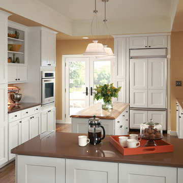
Example of a classic u-shaped eat-in kitchen design in DC Metro with an undermount sink, shaker cabinets, white cabinets, quartz countertops, brown backsplash, mosaic tile backsplash and stainless steel appliances
 Moose Tuchus LLC
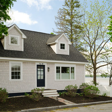
New Second Story Dormers, Roof, Windows and Siding.
Example of a beach style exterior home design in Portland Maine
Example of a beach style exterior home design in Portland Maine

19