
Search results for "Reading typically" in Home Design Ideas
 LoneStar Design Build
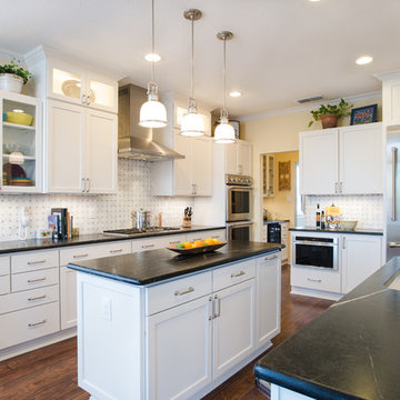
Eat-in kitchen - large transitional medium tone wood floor and brown floor eat-in kitchen idea in Dallas with an undermount sink, flat-panel cabinets, white cabinets, soapstone countertops, white backsplash, marble backsplash, stainless steel appliances and an island
 CONTENT Architecture
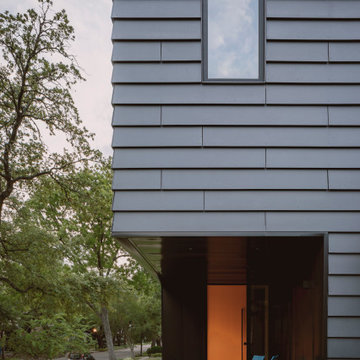
This home for a family of four in Houston Heights nods to the neighborhood’s historic bungalows with oversized 'clapboard' siding and a gable roof form with a distinctly modern reinterpretation. Two mature live oak trees at the front of the site provide a shaded canopy upon entry. The volume of the building tapers slightly from the peak at the center of the site to the primary bedroom at the front of the home where a large window at the foot of the bed frames a view of the tree canopy.
Spaces are carved away from the overall volume in order to bring outdoor space into the interior of the home. In addition to the porches at the front and back of the house that are typical to most homes, each bedroom also opens to a generous private patio recessed within the building’s volume. An interior atrium brings vegetation and natural light into the kitchen and dining spaces while a deep canopy provides shade to a broad opening just outside the living room. At the peak of the gabled roof, a skylight brings daylight into a lofted reading space.
The family’s penchant for puzzles inspired the details within the home. Throughout the house, irregularly shaped millwork door panels overlap with adjacent cabinet boxes to create interlocking planes. Staggered gaps in cabinet doors and drawers serve as handles, creating playful patterns. In the Puzzle Room, a custom designed table allows for puzzles in progress to be stored internally until homework is completed.
 TKS Design Group
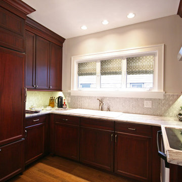
Typical of bungalows and city lots, the footprint of this home was narrow with living spaces in front, bedrooms in back and kitchen centrally located. However, unlike most bungalows, the hall running from front to back have been closed off to, presumably, accommodate a walk-in pantry. Couple that with the fact that this circa 1925 bungalow had seen a lot of living – read boisterous children and remodeling trends like z-brick, soffits, and fluorescent overhead lighting – the kitchen was due for a major overhaul.
Truly the hub of this house, the modest 11’ x 12’ kitchen was most in need of additional countertop space, convenient garbage/recycle bin, counter-depth refrigerator, storage aids, informal dining for two, and sound-proofing to enable this musically adept family to coexist despite varied schedules.
Gone are the wall soffits, boxy overhead lighting, six-foot baseboard heat unit, extra deep refrigerator, refurbished cabinets, laminate countertops, z-brick wall covering, and makeshift door swags. Enter rich mahogany cabinets, roll and pull-out storage units, endcap spice storage, gorgeous granite tops, marble backsplash, LED lighting, acoustic insulation and solid-wood doors.
Under the guise of such a handsome room, provisions such as a period style sink allow for more efficient use of corners with pull-out half-moon trays for storage. Redirecting the baseboard heat to a compact, toekick unit, means more cabinet and counter space – perfect for a baking and/or entertaining area removed from the basic work triangle. The eating area, also, doubles as a work station with drawers for office supplies and dedicated outlet for cable tv. Functional yet beautiful, this kitchen is at the ready as its owners look forward to their golden years.
Designed by: The Kitchen Studio of Glen Ellyn
Photography by: Dawn Jackman
For more information on kitchen and bath design ideas go to: www.kitchenstudio-ge.com
Find the right local pro for your project
 Custom Wine Cellars Houston
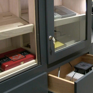
Water in regular humidifiers is typically replaced at least 1x a week. For this client's small wine cellar though, we assembled a self-refilling humidifier system that doesn't need much attention. We hid the system inside a semi-closing drawer so it does not distract the clean design of the cellar and humidor.
Read more about this project here: https://www.customwinecellarssanfrancisco.com/adding-a-humidor-to-beautiful-small-wine-cellars/
Custom Wine Cellars San Francisco
610 Leavenworth St
San Francisco, CA 94109
+1 (415) 508-8419
https://www.customwinecellarssanfrancisco.com/

 Ania Omski-Talwar Interior Design
Location: Alamo, CA, USA
When we hear about two interior designers collaborating on a project, we typically think of a massive-scale project like a boutique hotel or some not-to-be-named celebrity’s home. Not so for this project, a sunny poolside cabana in Walnut Creek, California. Former colleagues and friends, Heather Lund of Heather Lund Interior Design and Ania Omski-Talwar of Ania Omski-Talwar Interior Design, teamed up to transform this small space into a majority entertaining spot.
Project featured on Ruemag.com, click here to read more > http://ruemag.com/home-tour-2/rooms-we-love/a-napa-inspired-poolside-cabana-for-parties
Photographed by: Michael Alan Kaskel
 Joe McGuire Design
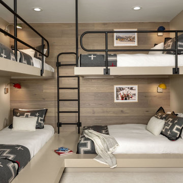
In transforming their retreat, our clients sought a departure from typical mountain decor. With an eclectic aesthetic, we lightened walls and refreshed furnishings, creating a stylish and cosmopolitan yet family-friendly and down-to-earth haven.
Comfort meets modern design in this inviting bedroom, which features bunk beds adorned with plush bedding. Beige walls complement a light wooden accent, while black railings add striking contrast.
 Custom Wine Cellars San Francisco
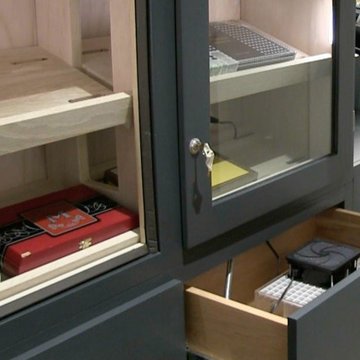
Water in regular humidifiers is typically replaced at least 1x a week. For this client's small wine cellar though, we assembled a self-refilling humidifier system that doesn't need much attention. We hid the system inside a semi-closing drawer so it does not distract the clean design of the cellar and humidor.
Read more about this project here: https://www.customwinecellarssanfrancisco.com/adding-a-humidor-to-beautiful-small-wine-cellars/
Custom Wine Cellars San Francisco
610 Leavenworth St
San Francisco, CA 94109
+1 (415) 508-8419
https://www.customwinecellarssanfrancisco.com/

Sponsored
Sunbury, OH

J.Holderby - Renovations
Franklin County's Leading General Contractors - 2X Best of Houzz!

 Melissa Hill Home Design
We loved this project! The transformation was incredible. Our client came to us asking for a master bedroom that created a space for them to retreat to at the end of a very busy day. They moved into this beautiful estate overlooking a Connecticut vineyard that yearned for a design to compliment the architecture of the home, yet personalize the transitional taste of this young couple. We wanted to bring them elements that included clean lines with some updated tradition. Gray has been the new neutral in design lately but to set it aside from the typical use of this hue, a favorite by many today, we added a touch of gold for warmth and elegance. The client's desire for a place to read and relax allowed for a seating area where they can transition to a doorway that leads them out to a beautiful stone veranda. We are excited as they are able to enjoy the start of a beautiful home redesign with a space that starts and ends their day in understated luxury.
Custom designed by Hartley and Hill Design. All materials and furnishings in this space are available through Hartley and Hill Design. www.hartleyandhilldesign.com 888-639-0639
 UpperKey
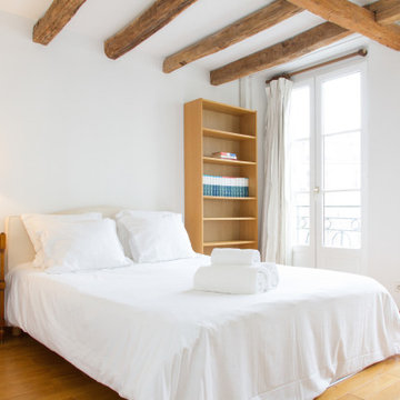
Master bedrooms in Paris apartments are designed to be elegant and comfortable retreats for residents. They are typically spacious and airy, with a blend of classic and contemporary decor. These rooms emphasize comfort, with plush seating areas, cozy reading nooks, and ample storage space. Many master bedrooms also feature luxurious en-suite bathrooms. Overall, master bedrooms in Paris apartments offer a luxurious and welcoming space for residents to relax and unwind.
 RAJ Kitchen and Bath, LLC
 “Full apartment design”.
IF you have not yet seen this apartment conversion before, we strongly urge you to go to the bottom left of this page and click on the short 2-minutes video. It would put a lot of things into perspective when you come back and continue reading this.
It is true we were literally handed the keys and told a list of things that they wanted to have happen and we were to go into the apartment, look at the space and come up with a design that would satisfy all of that need. UNTIL we showed up! The unit had really seen some better days but we knew we had to look past that and come up with a concept that would work for them.
The immediate challenges were centered around 3 big ideas:
1. Adding a second bedroom to the already small footprint
2. Figuring out a way to make the kitchen bigger, better and brighter
3. Creating a master room walk in closet
It’s always difficult to add new rooms into existing footprint without expanding out or up and not incurring any opportunity cost. In this case, that was exactly what we had to do. Item one and two above had to be tackled as one. We went ahead and switched out the location of the dining room and eliminating an area where there was a “nook” type eat-in area. By doing so, we were able to cut right into that footprint and change the layout of the kitchen.
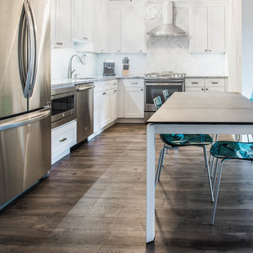
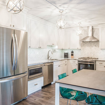
That one move allowed us to dig into the kitchen design because it was now the main focal point in the apartment. It was no longer an option to keep it in that tiny hole where it was, so we had to ensure that this design was functional and aesthetically pleasing at the same time. By adding the table into the space where an Island typically would go, we were able to both cut cost and still provide a dining experience. The Table serves as an Island as well when cooking.
We then proceeded to block in the existing doorway to the dining room. By doing this, we were able to create a full room which allowed us to put a door on the other side and called that room Bedroom #2. This was easier to do because all of the mechanicals were already in that space (light, heater and windows). By shifting things around, we also achieved a huge wall to wall closet from inside. PERFECT!
Then we moved into the Single bedroom. We thought it was a big room with a small closet, so by creatively adding an L shaped wall and steal some footprint into the bedroom side, we were able to put a door on that new room and design it for the walk-in closet. Even after this, the bedroom still holds a queen size bed with 2 night stands, a TV on the wall, a sitting chair and plenty of room to walk around. This was done by rethinking the location for the bed and night stands.
The bathroom was gutted to make sure there was no leaks and rebuild from the ground up. We kept all of the plumbing where it was, added a new vanity, medicine cabinet, tiles and lighting and it was done.
From there, the rest of the unit had new flooring all throughout, paint, and lighting. After completion and walk through, this project was handed over back to the clients.
Execution and collaboration between all the trades were: Reggie and his team from Premier Interiors and Rohan from RD Mechanical Services.
p.s. Please see our website to see the video.
 User
User
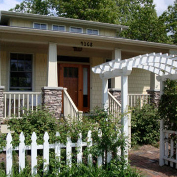
Craftsman house plan - 444-21 from Houseplans.com
Questions? Call us at 1-800-913-2350
Photographs may show modified designs. All images are copyrighted.
Plan 444-21
2 beds
2.00 baths
75' wide
29' deep
×
Plans
Main Floor Plan
Reverse
Upper Floor Plan
Reverse
Specifications
Plan Styles
Cottage
Craftsman
Area
Porch Sq Ft
131 sq ft
Main Floor Sq Ft
1278 sq ft
Basement Sq Ft
1298 sq ft
Garage Sq Ft
521 sq ft
Garage
Front Entry Garage
Outdoor Spaces
Covered Front Porch
Breezeway
Code
Irc 2006
Basic Features
Potential Bedrooms
3
Stories
2
Bedrooms
2
Baths
2.00
Garage Stalls
2
Dimension
Depth
29'
Width
75'
Height
17'
Exterior Wall Framing
Insulation
15
Framing
2"x4"
Wind Rating
90
Seismic Rating
C
Exterior Wall Finish
board and batten
Ceiling
Main Ceiling Ft
8'
Garage Ceiling Ft
10'
Bedroom Features
Main Floor Bed Bath
Main Floor Master Bed Bath
Walk In Closet
Structural
Foundation Drawing
More
Suited For Vacation Home
Wheelchair Adaptable
Economical To Build
Roof
Roof Type
Asphalt
Roof Framing
Trusses
Roof Load
67
Primary Pitch
5:12
Additional Rooms
Great Room Living Room
Unfinished Future Space
Main Floor Laundry
Den Office Study Computer
Kitchen Features
Walk In Pantry Cabinet Pantry
Nook Breakfast Area Dining
Pricing
Plan Set
Price
PDF Set
$885.00
Reproducible Set
$885.00
5 Copy Set
$935.00
CAD Set
$1645.00
Single Set
$635.00
PDF Study Set
$1270.00
Foundation
Price
Basement
+$0.00
Additional Construction Sets
$40.00/each
Mirror Reverse Sets
$0.00/each
Right-Reading Reverse
$150.00
Material List
$100.00
The Single Set and PDF Study Set are typically stamped "Not for Construction" and are to be used for studying / obtaining bids only. We do offer a 90% credit when you upgrade from a Single Set to a 5-Copy set (or greater).
Additional copies can be ordered at the time of purchase and within 90 days after your original purchase date.
Plan Content
All plans are drawn at ¼” scale or larger and include :
Foundation Plan: Drawn to 1/4" scale, this page shows all necessary
 Fresh Coat Painters of Monrovia
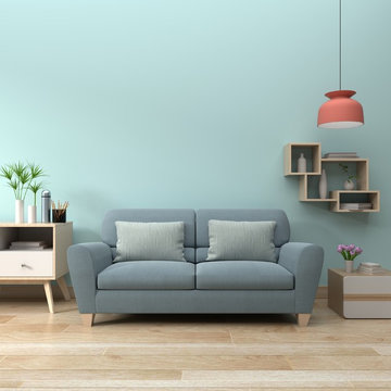
Want an HGTV Styled Room? Get an Accent Wall
If you’re moving into a new apartment/home or you’re finally getting to that laundry list of renovations;
here’s one statement piece that will set your place apart from the rest: an accent wall. An accent wall is
simply a wall that features a color that's different from the rest of the walls. It could be a green wall
along the sea of beige walls or a peach wall amongst a palette of white walls. It serves as an eye-opener
for guests entering the room, delivering an upbeat, fresh tone in your house.
Still need more convincing on why you need an accent wall? Here's a list of how accent walls are an
absolute game-changer for your place:
It gives your room personality. This rule is pretty straightforward. Add a bright or even neutral color to
just one wall, and it will make any room pop. The key is to select colors that play up a specific area in
your home. If you have a girl nursery room, you can paint one wall cotton candy pink to highlight the
plush toys and brightly colored crib. To make your office space look more "official," emphasize your
creative zone with a black, front-facing accent wall that shows off your flashy accessories and computers
while giving you the perfect color to concentrate in.
It modernizes your place without serious renovations. Since most homes typically have similarly
painted walls and tones, and accent wall gives off a modern, almost futuristic vibe. Accent walls
naturally draw in our eyes, and its color distinction causes objects in the room to take a unique form.
Instead of budgeting funds for new furniture, hone in a cool bohemian look with a cinnamon brown
accent wall. To play up the bohemian vibes, you can add wooden accessories like tables, picture frames,
vases, or compliment the brown with some colorful green houseplants!
Accent walls also work as an accessory. Living in a minimalist space? No problem! An accent wall with a
bright, unique hue will doll up your area without you having to add more objects. A burnt orange accent
wall is the perfect look for a living room space accompanied by a tall plant, rug, sofa, and coffee table.
The burnt orange opens up the room, drawing all eyes to the playful contrast of the plant’s green
against the orange while balancing the place out with a neutral rug and a wooden coffee table to play up
earthy tones. People will think you spent all day decorating your room when in reality you only painted
one wall.
You can manipulate your room to look bigger or smaller. Accent walls have a science behind them
depending on what color palette you select. If you’re rooming in a small space, to make it look bigger
use bright colors like lemon yellow or French roses pink to make your room more reflective, maximizing
all the natural light coming in. This will leave your room feeling open and breezy. On the contrast, if you
are stuck with too much space, or want to minimize a corner as a small reading nook, use dark colors
like seaweed green to absorb light and tighten up the space.
Hopefully, this list was able to get you excited to kick-off your new (or next set) of accent walls. Feel free
to marathon HGTV while you paint or wait for the painters to arrive. Stay tuned for future pieces on how
to accentuate and best practices for painting!
 Archimple LLC
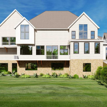
The farmhouse design is well-suited for multi-family houses plus apartment buildings with sloping sides. Their distinct design helps them create an eye-catching appearance, and the spacious porch welcomes guests and hosts inside. The modern cottage's main-floor layout flaunts a spacious and elegantly designed formal living area connected to a large back porch and an inviting fireplace to keep you warm in the winter. This room features a reading area with an office area with storage and a deck, a well-equipped kitchen with a modern counter, a complimentary breakfast point off the butler's kitchen, and a sun porch with a fireplace. The kitchen is connected to the laundry room, and the mudroom has a garage, which has 3 cars. In addition, the powder room and a mudroom are located on the lower level. This luxurious luxury home's interior includes living rooms with games, a fitness center, a half bath, and storage space. The upstairs level of the home features a master bedroom with a modern master bathroom with typical amenities and an assortment of bedrooms offering a private bathroom with closets and private alcoves. Each bedroom has a gorgeous walk-in closet. The spacious five-bedroom, four-bathroom bungalow-style house is intended for everyone to enjoy time together.


 RAJ Kitchen and Bath, LLC
 “Full apartment design”.
IF you have not yet seen this apartment conversion before, we strongly urge you to go to the bottom left of this page and click on the short 2-minutes video. It would put a lot of things into perspective when you come back and continue reading this.
It is true we were literally handed the keys and told a list of things that they wanted to have happen and we were to go into the apartment, look at the space and come up with a design that would satisfy all of that need. UNTIL we showed up! The unit had really seen some better days but we knew we had to look past that and come up with a concept that would work for them.
The immediate challenges were centered around 3 big ideas:
1. Adding a second bedroom to the already small footprint
2. Figuring out a way to make the kitchen bigger, better and brighter
3. Creating a master room walk in closet
It’s always difficult to add new rooms into existing footprint without expanding out or up and not incurring any opportunity cost. In this case, that was exactly what we had to do. Item one and two above had to be tackled as one. We went ahead and switched out the location of the dining room and eliminating an area where there was a “nook” type eat-in area. By doing so, we were able to cut right into that footprint and change the layout of the kitchen.
That one move allowed us to dig into the kitchen design because it was now the main focal point in the apartment. It was no longer an option to keep it in that tiny hole where it was, so we had to ensure that this design was functional and aesthetically pleasing at the same time. By adding the table into the space where an Island typically would go, we were able to both cut cost and still provide a dining experience. The Table serves as an Island as well when cooking.
We then proceeded to block in the existing doorway to the dining room. By doing this, we were able to create a full room which allowed us to put a door on the other side and called that room Bedroom #2. This was easier to do because all of the mechanicals were already in that space (light, heater and windows). By shifting things around, we also achieved a huge wall to wall closet from inside. PERFECT!
Then we moved into the Single bedroom. We thought it was a big room with a small closet, so by creatively adding an L shaped wall and steal some footprint into the bedroom side, we were able to put a door on that new room and design it for the walk-in closet. Even after this, the bedroom still holds a queen size bed with 2 night stands, a TV on the wall, a sitting chair and plenty of room to walk around. This was done by rethinking the location for the bed and night stands.
The bathroom was gutted to make sure there was no leaks and rebuild from the ground up. We kept all of the plumbing where it was, added a new vanity, medicine cabinet, tiles and lighting and it was done.
From there, the rest of the unit had new flooring all throughout, paint, and lighting. After completion and walk through, this project was handed over back to the clients.
Execution and collaboration between all the trades were: Reggie and his team from Premier Interiors and Rohan from RD Mechanical Services.
p.s. Please see our website to see the video.
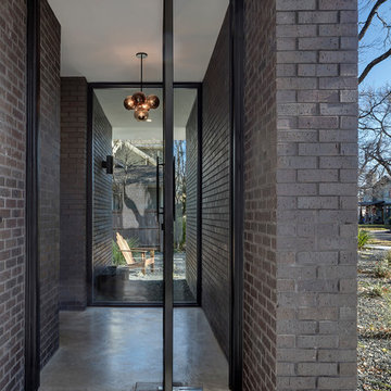
 Matt Fajkus Architecture
The Main Stay House exists as a straightforward proposal on an urban infill lot, paring down the components of a house to a minimal amount of planes and openings. The scheme is anchored by a modern entry sequence and a staircase volume, both clad in iron spot masonry externally and internally, creating thresholds between the respective realms of public, common and private, by minimal means. The masonry contrasts with an otherwise muted interior atmosphere of smooth, desaturated surfaces.
The entry sequence is a twist upon the conventional domestic front door, front facade, and fence. The front masonry wall replaces the typical residential fence and frames an indirect access to the front door, functioning as a privacy barrier while revealing slices of the interior to the public street.
The staircase bifurcates the layout to provide a clear division between the common and private zones of the house, while clearly reading as a mass from all outside view. Brick and glass become portals between common and private zones.
The design consolidates the service core along the west façade, allowing the structure to fully open the living zone to the pool court and existing trees. This directly connects interior and exterior, as well as human and nature. Freedom to vary the program or functional use of the area is enabled and strongly encouraged.
Photography: Charles Davis Smith
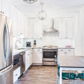 RAJ Kitchen and Bath, LLC
 “Full apartment design”.
IF you have not yet seen this apartment conversion before, we strongly urge you to go to the bottom left of this page and click on the short 2-minutes video. It would put a lot of things into perspective when you come back and continue reading this.
It is true we were literally handed the keys and told a list of things that they wanted to have happen and we were to go into the apartment, look at the space and come up with a design that would satisfy all of that need. UNTIL we showed up! The unit had really seen some better days but we knew we had to look past that and come up with a concept that would work for them.
The immediate challenges were centered around 3 big ideas:
1. Adding a second bedroom to the already small footprint
2. Figuring out a way to make the kitchen bigger, better and brighter
3. Creating a master room walk in closet
It’s always difficult to add new rooms into existing footprint without expanding out or up and not incurring any opportunity cost. In this case, that was exactly what we had to do. Item one and two above had to be tackled as one. We went ahead and switched out the location of the dining room and eliminating an area where there was a “nook” type eat-in area. By doing so, we were able to cut right into that footprint and change the layout of the kitchen.
That one move allowed us to dig into the kitchen design because it was now the main focal point in the apartment. It was no longer an option to keep it in that tiny hole where it was, so we had to ensure that this design was functional and aesthetically pleasing at the same time. By adding the table into the space where an Island typically would go, we were able to both cut cost and still provide a dining experience. The Table serves as an Island as well when cooking.
We then proceeded to block in the existing doorway to the dining room. By doing this, we were able to create a full room which allowed us to put a door on the other side and called that room Bedroom #2. This was easier to do because all of the mechanicals were already in that space (light, heater and windows). By shifting things around, we also achieved a huge wall to wall closet from inside. PERFECT!
Then we moved into the Single bedroom. We thought it was a big room with a small closet, so by creatively adding an L shaped wall and steal some footprint into the bedroom side, we were able to put a door on that new room and design it for the walk-in closet. Even after this, the bedroom still holds a queen size bed with 2 night stands, a TV on the wall, a sitting chair and plenty of room to walk around. This was done by rethinking the location for the bed and night stands.
The bathroom was gutted to make sure there was no leaks and rebuild from the ground up. We kept all of the plumbing where it was, added a new vanity, medicine cabinet, tiles and lighting and it was done.
From there, the rest of the unit had new flooring all throughout, paint, and lighting. After completion and walk through, this project was handed over back to the clients.
Execution and collaboration between all the trades were: Reggie and his team from Premier Interiors and Rohan from RD Mechanical Services.
p.s. Please see our website to see the video.
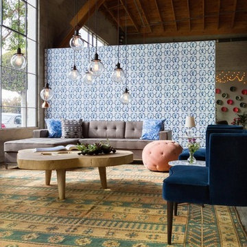
 The Rug Warehouse & More
AFGHANI NOMADIC MAIMANA
KILIM 8'8X13'7,
MADE IN AFGHANISTAN
Large minimalist home design photo in Los Angeles
Large minimalist home design photo in Los Angeles
Sponsored
Sunbury, OH
J.Holderby - Renovations
Franklin County's Leading General Contractors - 2X Best of Houzz!
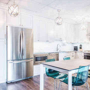 RAJ Kitchen and Bath, LLC
 “Full apartment design”.
IF you have not yet seen this apartment conversion before, we strongly urge you to go to the bottom left of this page and click on the short 2-minutes video. It would put a lot of things into perspective when you come back and continue reading this.
It is true we were literally handed the keys and told a list of things that they wanted to have happen and we were to go into the apartment, look at the space and come up with a design that would satisfy all of that need. UNTIL we showed up! The unit had really seen some better days but we knew we had to look past that and come up with a concept that would work for them.
The immediate challenges were centered around 3 big ideas:
1. Adding a second bedroom to the already small footprint
2. Figuring out a way to make the kitchen bigger, better and brighter
3. Creating a master room walk in closet
It’s always difficult to add new rooms into existing footprint without expanding out or up and not incurring any opportunity cost. In this case, that was exactly what we had to do. Item one and two above had to be tackled as one. We went ahead and switched out the location of the dining room and eliminating an area where there was a “nook” type eat-in area. By doing so, we were able to cut right into that footprint and change the layout of the kitchen.
That one move allowed us to dig into the kitchen design because it was now the main focal point in the apartment. It was no longer an option to keep it in that tiny hole where it was, so we had to ensure that this design was functional and aesthetically pleasing at the same time. By adding the table into the space where an Island typically would go, we were able to both cut cost and still provide a dining experience. The Table serves as an Island as well when cooking.
We then proceeded to block in the existing doorway to the dining room. By doing this, we were able to create a full room which allowed us to put a door on the other side and called that room Bedroom #2. This was easier to do because all of the mechanicals were already in that space (light, heater and windows). By shifting things around, we also achieved a huge wall to wall closet from inside. PERFECT!
Then we moved into the Single bedroom. We thought it was a big room with a small closet, so by creatively adding an L shaped wall and steal some footprint into the bedroom side, we were able to put a door on that new room and design it for the walk-in closet. Even after this, the bedroom still holds a queen size bed with 2 night stands, a TV on the wall, a sitting chair and plenty of room to walk around. This was done by rethinking the location for the bed and night stands.
The bathroom was gutted to make sure there was no leaks and rebuild from the ground up. We kept all of the plumbing where it was, added a new vanity, medicine cabinet, tiles and lighting and it was done.
From there, the rest of the unit had new flooring all throughout, paint, and lighting. After completion and walk through, this project was handed over back to the clients.
Execution and collaboration between all the trades were: Reggie and his team from Premier Interiors and Rohan from RD Mechanical Services.
p.s. Please see our website to see the video.
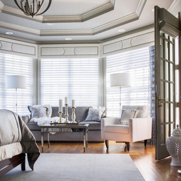 Melissa Hill Home Design
We loved this project! The transformation was incredible. Our client came to us asking for a master bedroom that created a space for them to retreat to at the end of a very busy day. They moved into this beautiful estate overlooking a Connecticut vineyard that yearned for a design to compliment the architecture of the home, yet personalize the transitional taste of this young couple. We wanted to bring them elements that included clean lines with some updated tradition. Gray has been the new neutral in design lately but to set it aside from the typical use of this hue, a favorite by many today, we added a touch of gold for warmth and elegance. The client's desire for a place to read and relax allowed for a seating area where they can transition to a doorway that leads them out to a beautiful stone veranda. We are excited as they are able to enjoy the start of a beautiful home redesign with a space that starts and ends their day in understated luxury.
Custom designed by Hartley and Hill Design. All materials and furnishings in this space are available through Hartley and Hill Design. www.hartleyandhilldesign.com 888-639-0639
 Mayflower Construction Group
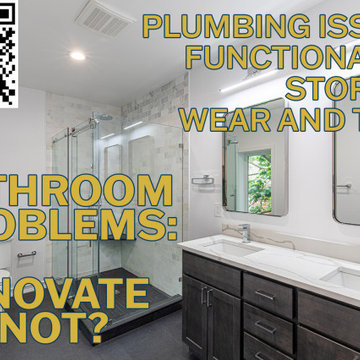
Bathroom renovations vary widely in scope and budget. You can renovate a small powder room for only a few thousand dollars while a luxury master bathroom may equal the cost of a mid-sized kitchen renovation.
With all this to consider, my bathroom clients typically call with a specific issue in mind. Sometimes it’s a dire insurance claim, but mostly, it’s just the everyday frustrations of using an old bathroom. Among my clients, I’ve found four main bathroom problems that drive them to renovate…
Read the full article on our website if you’re experiencing problems with your project. Use the QR code or link below! https://mayflowerva.com/bathroom-problems-renovate-or-not/
23