
Search results for "Reading typically" in Home Design Ideas
 Archimple LLC
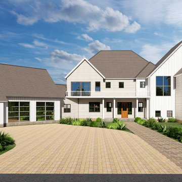
The farmhouse design is well-suited for multi-family houses plus apartment buildings with sloping sides. Their distinct design helps them create an eye-catching appearance, and the spacious porch welcomes guests and hosts inside. The modern cottage's main-floor layout flaunts a spacious and elegantly designed formal living area connected to a large back porch and an inviting fireplace to keep you warm in the winter. This room features a reading area with an office area with storage and a deck, a well-equipped kitchen with a modern counter, a complimentary breakfast point off the butler's kitchen, and a sun porch with a fireplace. The kitchen is connected to the laundry room, and the mudroom has a garage, which has 3 cars. In addition, the powder room and a mudroom are located on the lower level. This luxurious luxury home's interior includes living rooms with games, a fitness center, a half bath, and storage space. The upstairs level of the home features a master bedroom with a modern master bathroom with typical amenities and an assortment of bedrooms offering a private bathroom with closets and private alcoves. Each bedroom has a gorgeous walk-in closet. The spacious five-bedroom, four-bathroom bungalow-style house is intended for everyone to enjoy time together.
 Melissa Hill Home Design
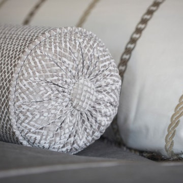
We loved this project! The transformation was incredible. Our client came to us asking for a master bedroom that created a space for them to retreat to at the end of a very busy day. They moved into this beautiful estate overlooking a Connecticut vineyard that yearned for a design to compliment the architecture of the home, yet personalize the transitional taste of this young couple. We wanted to bring them elements that included clean lines with some updated tradition. Gray has been the new neutral in design lately but to set it aside from the typical use of this hue, a favorite by many today, we added a touch of gold for warmth and elegance. The client's desire for a place to read and relax allowed for a seating area where they can transition to a doorway that leads them out to a beautiful stone veranda. We are excited as they are able to enjoy the start of a beautiful home redesign with a space that starts and ends their day in understated luxury.
Custom designed by Hartley and Hill Design. All materials and furnishings in this space are available through Hartley and Hill Design. www.hartleyandhilldesign.com 888-639-0639
 Matt Fajkus Architecture
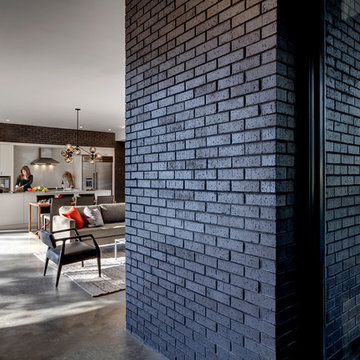
The Main Stay House exists as a straightforward proposal on an urban infill lot, paring down the components of a house to a minimal amount of planes and openings. The scheme is anchored by a modern entry sequence and a staircase volume, both clad in iron spot masonry externally and internally, creating thresholds between the respective realms of public, common and private, by minimal means. The masonry contrasts with an otherwise muted interior atmosphere of smooth, desaturated surfaces.
The entry sequence is a twist upon the conventional domestic front door, front facade, and fence. The front masonry wall replaces the typical residential fence and frames an indirect access to the front door, functioning as a privacy barrier while revealing slices of the interior to the public street.
The staircase bifurcates the layout to provide a clear division between the common and private zones of the house, while clearly reading as a mass from all outside view. Brick and glass become portals between common and private zones.
The design consolidates the service core along the west façade, allowing the structure to fully open the living zone to the pool court and existing trees. This directly connects interior and exterior, as well as human and nature. Freedom to vary the program or functional use of the area is enabled and strongly encouraged.
Photography: Charles Davis Smith
Find the right local pro for your project
 CONTENT Architecture
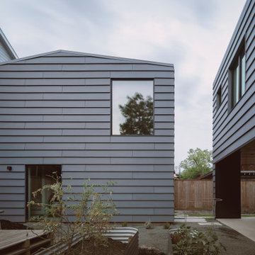
This home for a family of four in Houston Heights nods to the neighborhood’s historic bungalows with oversized 'clapboard' siding and a gable roof form with a distinctly modern reinterpretation. Two mature live oak trees at the front of the site provide a shaded canopy upon entry. The volume of the building tapers slightly from the peak at the center of the site to the primary bedroom at the front of the home where a large window at the foot of the bed frames a view of the tree canopy.
Spaces are carved away from the overall volume in order to bring outdoor space into the interior of the home. In addition to the porches at the front and back of the house that are typical to most homes, each bedroom also opens to a generous private patio recessed within the building’s volume. An interior atrium brings vegetation and natural light into the kitchen and dining spaces while a deep canopy provides shade to a broad opening just outside the living room. At the peak of the gabled roof, a skylight brings daylight into a lofted reading space.
The family’s penchant for puzzles inspired the details within the home. Throughout the house, irregularly shaped millwork door panels overlap with adjacent cabinet boxes to create interlocking planes. Staggered gaps in cabinet doors and drawers serve as handles, creating playful patterns. In the Puzzle Room, a custom designed table allows for puzzles in progress to be stored internally until homework is completed.
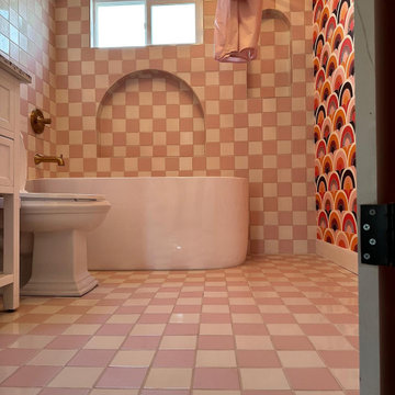
 Red Sea Tile & Stone Inc.
When we made the decision to renovate our primary bathroom in our home, knew without a doubt I wanted to incorporate checkerboard design into the design plan!
Checkerboard design have been gaining popularity in mainstream design lately, but this staple pattern has been a classic choice for centuries and never truly goes out of style. The history of the checkerboard floor can be dated all the way back to the ancient Egyptian temples and has been used over and over again in French country houses and 1950s American diners. I love the versatility of checkerboard floors and how many different ways they can be used throughout a home!
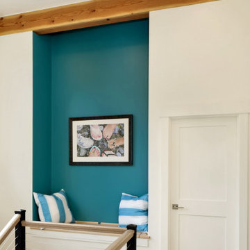
 Bellingham Bay Builders
Situated on the north shore of Birch Point this high-performance beach home enjoys a view across Boundary Bay to White Rock, BC and the BC Coastal Range beyond. Designed for indoor, outdoor living the many decks, patios, porches, outdoor fireplace, and firepit welcome friends and family to gather outside regardless of the weather.
From a high-performance perspective this home was built to and certified by the Department of Energy’s Zero Energy Ready Home program and the EnergyStar program. In fact, an independent testing/rating agency was able to show that the home will only use 53% of the energy of a typical new home, all while being more comfortable and healthier. As with all high-performance homes we find a sweet spot that returns an excellent, comfortable, healthy home to the owners, while also producing a building that minimizes its environmental footprint.
Design by JWR Design
Photography by Radley Muller Photography
Interior Design by Markie Nelson Interior Design
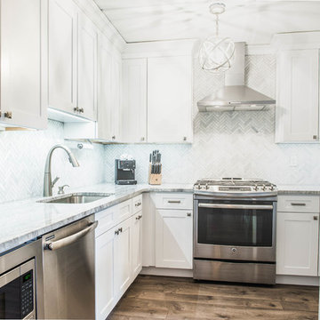
 RAJ Kitchen and Bath, LLC
 “Full apartment design”.
IF you have not yet seen this apartment conversion before, we strongly urge you to go to the bottom left of this page and click on the short 2-minutes video. It would put a lot of things into perspective when you come back and continue reading this.
It is true we were literally handed the keys and told a list of things that they wanted to have happen and we were to go into the apartment, look at the space and come up with a design that would satisfy all of that need. UNTIL we showed up! The unit had really seen some better days but we knew we had to look past that and come up with a concept that would work for them.
The immediate challenges were centered around 3 big ideas:
1. Adding a second bedroom to the already small footprint
2. Figuring out a way to make the kitchen bigger, better and brighter
3. Creating a master room walk in closet
It’s always difficult to add new rooms into existing footprint without expanding out or up and not incurring any opportunity cost. In this case, that was exactly what we had to do. Item one and two above had to be tackled as one. We went ahead and switched out the location of the dining room and eliminating an area where there was a “nook” type eat-in area. By doing so, we were able to cut right into that footprint and change the layout of the kitchen.
That one move allowed us to dig into the kitchen design because it was now the main focal point in the apartment. It was no longer an option to keep it in that tiny hole where it was, so we had to ensure that this design was functional and aesthetically pleasing at the same time. By adding the table into the space where an Island typically would go, we were able to both cut cost and still provide a dining experience. The Table serves as an Island as well when cooking.
We then proceeded to block in the existing doorway to the dining room. By doing this, we were able to create a full room which allowed us to put a door on the other side and called that room Bedroom #2. This was easier to do because all of the mechanicals were already in that space (light, heater and windows). By shifting things around, we also achieved a huge wall to wall closet from inside. PERFECT!
Then we moved into the Single bedroom. We thought it was a big room with a small closet, so by creatively adding an L shaped wall and steal some footprint into the bedroom side, we were able to put a door on that new room and design it for the walk-in closet. Even after this, the bedroom still holds a queen size bed with 2 night stands, a TV on the wall, a sitting chair and plenty of room to walk around. This was done by rethinking the location for the bed and night stands.
The bathroom was gutted to make sure there was no leaks and rebuild from the ground up. We kept all of the plumbing where it was, added a new vanity, medicine cabinet, tiles and lighting and it was done.
From there, the rest of the unit had new flooring all throughout, paint, and lighting. After completion and walk through, this project was handed over back to the clients.
Execution and collaboration between all the trades were: Reggie and his team from Premier Interiors and Rohan from RD Mechanical Services.
p.s. Please see our website to see the video.

Sponsored
Sunbury, OH

J.Holderby - Renovations
Franklin County's Leading General Contractors - 2X Best of Houzz!
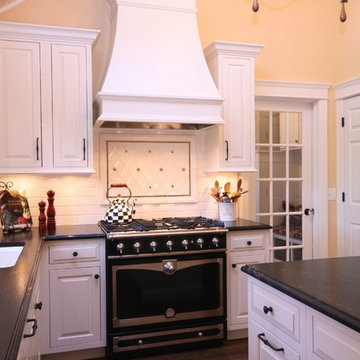
 TKS Design Group
Typical of bungalows and city lots, the footprint of this home was narrow with living spaces in front, bedrooms in back and kitchen centrally located. However, unlike most bungalows, the hall running from front to back have been closed off to, presumably, accommodate a walk-in pantry. Couple that with the fact that this circa 1925 bungalow had seen a lot of living – read boisterous children and remodeling trends like z-brick, soffits, and fluorescent overhead lighting – the kitchen was due for a major overhaul.
Truly the hub of this house, the modest 11’ x 12’ kitchen was most in need of additional countertop space, convenient garbage/recycle bin, counter-depth refrigerator, storage aids, informal dining for two, and sound-proofing to enable this musically adept family to coexist despite varied schedules.
Gone are the wall soffits, boxy overhead lighting, six-foot baseboard heat unit, extra deep refrigerator, refurbished cabinets, laminate countertops, z-brick wall covering, and makeshift door swags. Enter rich mahogany cabinets, roll and pull-out storage units, endcap spice storage, gorgeous granite tops, marble backsplash, LED lighting, acoustic insulation and solid-wood doors.
Under the guise of such a handsome room, provisions such as a period style sink allow for more efficient use of corners with pull-out half-moon trays for storage. Redirecting the baseboard heat to a compact, toekick unit, means more cabinet and counter space – perfect for a baking and/or entertaining area removed from the basic work triangle. The eating area, also, doubles as a work station with drawers for office supplies and dedicated outlet for cable tv. Functional yet beautiful, this kitchen is at the ready as its owners look forward to their golden years.
Designed by: The Kitchen Studio of Glen Ellyn
Photography by: Dawn Jackman
For more information on kitchen and bath design ideas go to: www.kitchenstudio-ge.com
URL http://www.kitchenstudio-ge.com
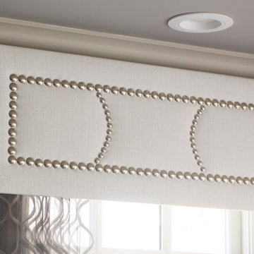 Melissa Hill Home Design
We loved this project! The transformation was incredible. Our client came to us asking for a master bedroom that created a space for them to retreat to at the end of a very busy day. They moved into this beautiful estate overlooking a Connecticut vineyard that yearned for a design to compliment the architecture of the home, yet personalize the transitional taste of this young couple. We wanted to bring them elements that included clean lines with some updated tradition. Gray has been the new neutral in design lately but to set it aside from the typical use of this hue, a favorite by many today, we added a touch of gold for warmth and elegance. The client's desire for a place to read and relax allowed for a seating area where they can transition to a doorway that leads them out to a beautiful stone veranda. We are excited as they are able to enjoy the start of a beautiful home redesign with a space that starts and ends their day in understated luxury.
Custom designed by Hartley and Hill Design. All materials and furnishings in this space are available through Hartley and Hill Design. www.hartleyandhilldesign.com 888-639-0639
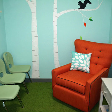
 Sherri Blum | Jack and Jill Interiors, Inc.
Children’s waiting room interior design project at Princeton University. I was beyond thrilled when contacted by a team of scientists ( psychologists and neurologists ) at Princeton University. This group of professors and graduate students from the Turk-Brown Laboratory are conducting research on the infant’s brain by using functional magnetic resonance imaging (or fMRI), to see how they learn, remember and think. My job was to turn a tiny 7’x10′ windowless study room into an inviting but not too “clinical” waiting room for the mothers or fathers and siblings of the babies being studied.
We needed to ensure a comfortable place for parents to rock and feed their babies while waiting their turn to go back to the laboratory, as well as a place to change the babies if needed. We wanted to stock some shelves with good books and while the room looks complete, we’re still sourcing something interactive to mount to the wall to help entertain toddlers who want something more active than reading or building blocks.
Since there are no windows, I wanted to bring the outdoors inside. Princeton University‘s colors are orange, gray and black and the history behind those colors is very interesting. It seems there are a lot of squirrels on campus and these colors were selected for the three colors of squirrels often seem scampering around the university grounds. The orange squirrels are now extinct, but the gray and black squirrels are abundant, as I found when touring the campus with my son on installation day. Therefore we wanted to reflect this history in the room and decided to paint silhouettes of squirrels in these three colors throughout the room.
While the ceilings are 10′ high in this tiny room, they’re very drab and boring. Given that it’s a drop ceiling, we can’t paint it a fun color as I typically do in my nurseries and kids’ rooms. To distract from the ugly ceiling, I contacted My Custom Creation through their Etsy shop and commissioned them to create a custom butterfly mobile to suspend from the ceiling to create a swath of butterflies moving across the room. Their customer service was impeccable and the end product was exactly what we wanted!
The flooring in the space was simply coated concrete so I decided to use Flor carpet tiles to give it warmth and a grass-like appeal. These tiles are super easy to install and can easily be removed without any residual on the floor. I’ll be using them more often for sure!
See more photos of our commercial interior design job below and contact us if you need a unique space designed for children. We don’t just design nurseries and bedrooms! We’re game for anything!
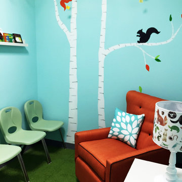 Sherri Blum | Jack and Jill Interiors, Inc.
Children’s waiting room interior design project at Princeton University. I was beyond thrilled when contacted by a team of scientists ( psychologists and neurologists ) at Princeton University. This group of professors and graduate students from the Turk-Brown Laboratory are conducting research on the infant’s brain by using functional magnetic resonance imaging (or fMRI), to see how they learn, remember and think. My job was to turn a tiny 7’x10′ windowless study room into an inviting but not too “clinical” waiting room for the mothers or fathers and siblings of the babies being studied.
We needed to ensure a comfortable place for parents to rock and feed their babies while waiting their turn to go back to the laboratory, as well as a place to change the babies if needed. We wanted to stock some shelves with good books and while the room looks complete, we’re still sourcing something interactive to mount to the wall to help entertain toddlers who want something more active than reading or building blocks.
Since there are no windows, I wanted to bring the outdoors inside. Princeton University‘s colors are orange, gray and black and the history behind those colors is very interesting. It seems there are a lot of squirrels on campus and these colors were selected for the three colors of squirrels often seem scampering around the university grounds. The orange squirrels are now extinct, but the gray and black squirrels are abundant, as I found when touring the campus with my son on installation day. Therefore we wanted to reflect this history in the room and decided to paint silhouettes of squirrels in these three colors throughout the room.
While the ceilings are 10′ high in this tiny room, they’re very drab and boring. Given that it’s a drop ceiling, we can’t paint it a fun color as I typically do in my nurseries and kids’ rooms. To distract from the ugly ceiling, I contacted My Custom Creation through their Etsy shop and commissioned them to create a custom butterfly mobile to suspend from the ceiling to create a swath of butterflies moving across the room. Their customer service was impeccable and the end product was exactly what we wanted!
The flooring in the space was simply coated concrete so I decided to use Flor carpet tiles to give it warmth and a grass-like appeal. These tiles are super easy to install and can easily be removed without any residual on the floor. I’ll be using them more often for sure!
See more photos of our commercial interior design job below and contact us if you need a unique space designed for children. We don’t just design nurseries and bedrooms! We’re game for anything!
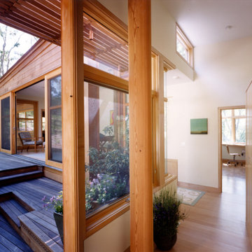
 Charles Rose Architects Inc.
A rustic stone path meanders through a wooded site to arrive at the entry of this 2,800-square-foot home on Martha’s Vineyard, completed in 2001. The path sets the tone for the project itself: simple, functional, and integrated with the natural environment. The couple that commissioned the residence uses it as a summer getaway for family and friends. A master bedroom wing, a guest wing, and a central living, dining, and kitchen area provide a variety of spaces for living and entertaining. Augmenting these spaces are a porch, terrace, and roof deck—providing places for quite reading, gathering for drinks, or taking in unobstructed views of the night sky. The house generates human interaction and connections with the natural world. Ground level terraces and rooftop decks promote this interactivity while large sliding windows and doors literally bring the outdoors inside and encourage individuals to venture outside. The typical inside vs. outside boundaries of traditional buildings are dissolved.
 C.E. Pontz Sons
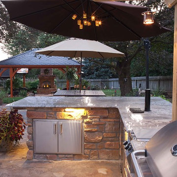
When homeowners Garry and Sherry bought their 1799 farmhouse in Lancaster, they prepared themselves for many years of renovation: 28 years, to be exact. They gradually tackled inside projects like the master bath, basement, a recent kitchen remodel and even an office-turned-Irish pub. During one painfully hot summer, they installed a pool that became their go-to for summer entertainment and parties. Now, Garry and Sherry’s four children have grown and the couple has found free time in not devoting their days to hockey, volleyball and softball games. So several years ago, they decided to take on the outdoor space.
The couple contacted Bobby Kenyon and Adrian Kapp of C.E. Pontz (www.cepontzsons.com) to create a design that would blend with the rustic look of their farmhouse. They hoped to increase the amount of entertaining space by enlarging the patio area and adding a pavilion and outdoor kitchen. Another must-have was a covered area that could ensure the party would not end even if the weather would not cooperate. After brainstorming with Bobby and Adrian, they decided to include a gas fireplace, an outdoor television in the pavilion, and a Kegerator in the kitchen.
For the outdoor overhaul, C.E. Pontz began by adding two separate patios of flagstone and natural stone that combine to a total area of 1,100 square feet. They laid large stone slabs to create a walkway connecting the kitchen and living area. For sunny days, C.E. Pontz installed an outdoor kitchen complete with granite countertops, sink, gas burner, grill and storage area. A pergola above the grill offers shade to whomever is tending the tongs that night. Sherry said that having an outdoor kitchen has made entertaining a time for sharing and enjoying food rather than preparing and serving it. When their indoor kitchen was being remodeled last summer, the family prepared nearly all of their meals outdoors, from eggs at breakfast to pasta at dinner. And they still love the summer staple of anything with grill marks. Because the perfect addition to charred meats and veggies is usually a cold draft, C.E. Pontz completed the kitchen with a Kegerator, placed conveniently in arm’s reach of the guest seating.
Across the walkway and above the adjoining stone patio, C.E. Pontz built a 16- by 20-foot pavilion, or, essentially, a living room under the trees. A fan hanging from the vaulted ceiling keeps guests cool while they lounge in plush wicker chairs, watching television. Sherry and Garry furnished the space with dark wicker seating from Wicker Imports in Lancaster (www.wickerimportsonline.com). They added pillows and cushions in earth-toned patterns for extra comfort and color. To keep the space alive after the sun sets, they decorated with lots of candles as well as copper lighting that Garry, having an electrical background, installed himself. Plus, C.E. Pontz constructed a gas-fed stone fireplace just outside the pavilion that illuminates the living area and provides a cozy warmth in colder months.
Garry, who has a green thumb according to his wife, sets out 18 to 20 large planters around the pool and patio in the summer. These complement the roses, nandina and various grasses that C.E. Pontz used to landscape around the patios. In spring, the couple works to beautify the beds so that in summer, they simply need to water the plants and enjoy the flora.
“It is truly an outdoor oasis that we utilize during the warm months and are sorry to see closed during the winter months,” Sherry says. After nearly thirty years of transformation, their 217-year-old home is the entertaining hot spot for friends, family and grandkids.
Fun Facts:
A Kegerator? Simpler than it sounds, a Kegerator is a dispensing device connected to a keg (typically of beer) that is kept in a refrigerated container. It maintains the quality of the beer for longer periods of time, even for several months.
Approximately 60 tons of stone base material were used for this project.
Two patios were added that combined a total area of 1,100 square feet of natural flagstone.
This landscape features about 18,000 pounds of flagstone.
This article appears in the April 2016 issue of Susquehanna Style
Did you like what you read here? Subscribe to Susquehanna Style »
http://www.susquehannastyle.com/April-2016/Historic-Hot-Spot/


 Summit Design Build LLC
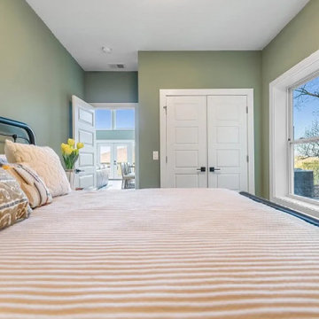
Quaint and cozy bedrooms with a view can offer a peaceful and relaxing retreat that brings the beauty of nature into the home.
A quaint and cozy bedroom is typically designed with a warm and inviting ambiance that encourages relaxation and rest. This can be achieved through the use of soft lighting, comfortable bedding, and tasteful decor that creates a calming atmosphere. The addition of a view can further enhance the peaceful atmosphere by providing a picturesque backdrop that can be enjoyed from the comfort of the bed.
The view can be of many different types of natural scenery, such as a mountain range, a lake, a forest, or a garden. It can be framed by large windows, a balcony, or a porch that allows for fresh air and natural light to flow into the room.
Together, a quaint and cozy bedroom with a view can create a peaceful and rejuvenating space where you can escape from the stresses of daily life and unwind in the beauty of nature. It can be the perfect place to read a book, enjoy a cup of tea or coffee, or simply relax and enjoy the view.
 Charles Rose Architects Inc.
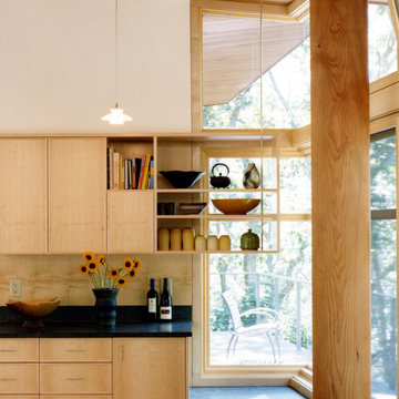
A rustic stone path meanders through a wooded site to arrive at the entry of this 2,800-square-foot home on Martha’s Vineyard, completed in 2001. The path sets the tone for the project itself: simple, functional, and integrated with the natural environment. The couple that commissioned the residence uses it as a summer getaway for family and friends. A master bedroom wing, a guest wing, and a central living, dining, and kitchen area provide a variety of spaces for living and entertaining. Augmenting these spaces are a porch, terrace, and roof deck—providing places for quite reading, gathering for drinks, or taking in unobstructed views of the night sky. The house generates human interaction and connections with the natural world. Ground level terraces and rooftop decks promote this interactivity while large sliding windows and doors literally bring the outdoors inside and encourage individuals to venture outside. The typical inside vs. outside boundaries of traditional buildings are dissolved.
 Bradford Custom Homes & Remodeling
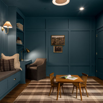
This custom basement study and lounge in Marietta, Georgia is part of Project Post Oak, a thoughtfully designed basement renovation that blends function, comfort, and timeless design. Enclosed with steel framed glass doors, the space features rich blue paneled walls, custom built in seating, and warm wood flooring that create an inviting and private retreat within the home.
Designed as a flexible space for work, reading, or quiet gatherings, the room incorporates layered lighting, integrated storage, and custom millwork that elevates the basement beyond a typical lower level finish. The tailored color palette and architectural detailing provide a refined atmosphere while maintaining durability and everyday usability.
This project showcases how a custom basement renovation can introduce purpose driven rooms that feel intentional, cohesive, and seamlessly connected to the rest of the home.
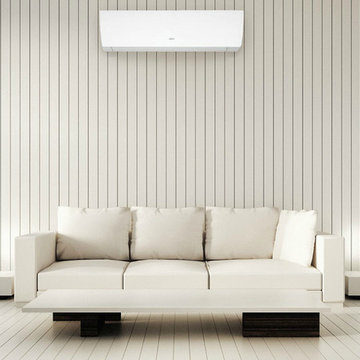
 Mainline Home Energy Services
Read "Fujitsu Answers FAQs About Ductless Mini-Split Air Conditioning" here!
http://mainlinehes.com/fujitsu-answers-faqs-about-ductless-mini-split-air-conditioning/
Sponsored
Sunbury, OH
J.Holderby - Renovations
Franklin County's Leading General Contractors - 2X Best of Houzz!
 RAJ Kitchen and Bath, LLC
 “Full apartment design”.
IF you have not yet seen this apartment conversion before, we strongly urge you to go to the bottom left of this page and click on the short 2-minutes video. It would put a lot of things into perspective when you come back and continue reading this.
It is true we were literally handed the keys and told a list of things that they wanted to have happen and we were to go into the apartment, look at the space and come up with a design that would satisfy all of that need. UNTIL we showed up! The unit had really seen some better days but we knew we had to look past that and come up with a concept that would work for them.
The immediate challenges were centered around 3 big ideas:
1. Adding a second bedroom to the already small footprint
2. Figuring out a way to make the kitchen bigger, better and brighter
3. Creating a master room walk in closet
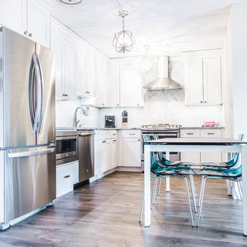
It’s always difficult to add new rooms into existing footprint without expanding out or up and not incurring any opportunity cost. In this case, that was exactly what we had to do. Item one and two above had to be tackled as one. We went ahead and switched out the location of the dining room and eliminating an area where there was a “nook” type eat-in area. By doing so, we were able to cut right into that footprint and change the layout of the kitchen.
That one move allowed us to dig into the kitchen design because it was now the main focal point in the apartment. It was no longer an option to keep it in that tiny hole where it was, so we had to ensure that this design was functional and aesthetically pleasing at the same time. By adding the table into the space where an Island typically would go, we were able to both cut cost and still provide a dining experience. The Table serves as an Island as well when cooking.
We then proceeded to block in the existing doorway to the dining room. By doing this, we were able to create a full room which allowed us to put a door on the other side and called that room Bedroom #2. This was easier to do because all of the mechanicals were already in that space (light, heater and windows). By shifting things around, we also achieved a huge wall to wall closet from inside. PERFECT!
Then we moved into the Single bedroom. We thought it was a big room with a small closet, so by creatively adding an L shaped wall and steal some footprint into the bedroom side, we were able to put a door on that new room and design it for the walk-in closet. Even after this, the bedroom still holds a queen size bed with 2 night stands, a TV on the wall, a sitting chair and plenty of room to walk around. This was done by rethinking the location for the bed and night stands.
The bathroom was gutted to make sure there was no leaks and rebuild from the ground up. We kept all of the plumbing where it was, added a new vanity, medicine cabinet, tiles and lighting and it was done.
From there, the rest of the unit had new flooring all throughout, paint, and lighting. After completion and walk through, this project was handed over back to the clients.
Execution and collaboration between all the trades were: Reggie and his team from Premier Interiors and Rohan from RD Mechanical Services.
p.s. Please see our website to see the video.
 USI Design & Remodeling
This master bathroom renovation in Frisco was completed for a repeat USI Design & Remodeling client as part of a larger first-floor transformation of the home. The original bathroom reflected a very typical North Texas layout of its era — dark stained cabinetry, granite countertops, compartmentalized vanities, a built-in tub adjoining a framed shower, and separated spaces that no longer aligned with how the homeowners wanted to live. As their aesthetic evolved toward a more transitional and contemporary direction, the goal became less about replacing finishes and more about redefining the experience of the room itself. The project needed to feel calmer, more architectural, and far more intentional in how the space functioned visually and emotionally.
One of the most important changes was removing the original shower curb and pony wall in favor of a fully open curbless shower with ultra-clear ½-inch heavy glass. Achieving that look required recessing the slab, re-floating the shower floor toward a linear drain, and engineering the space so the room would read as visually uninterrupted from end to end. Throughout the project, many of the design decisions were rooted in restraint rather than excess. The oversized 24x48 Porcelanosa flooring carries very little shade variation, creating a quieter visual field, while the cabinetry was executed in rift-sawn white oak specifically because it produces a far more controlled and consistent finish outcome than more common cuts of wood. In luxury projects, consistency itself becomes part of the refinement.
The floating vanity was designed more like custom furniture than traditional cabinetry, utilizing waterfall mitered edges and fully reworked plumbing locations so both homeowners could share in having generous functional countertop space. The original makeup station was repurposed into integrated storage with powered drawers and concealed organization for everyday items such as blow dryers and flat irons. Along the vanity wall, wall-mounted plumbing fixtures were paired with ribbed natural marble surfaces — a detail that required intentional planning long before construction began. Rather than allowing the ribbed material to terminate awkwardly behind the fixtures, the backsplash and stone transitions were specifically designed to resolve those conditions cleanly. Those are the types of details that distinguish highly coordinated design-build work from projects that simply assemble materials together.
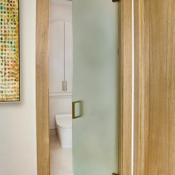
While the room contains a significant amount of luxury detailing — from the freestanding tub and geoprism marble focal wall to the custom rift-sawn white oak closet doors and elongated mirrors that leverage the 11-foot ceiling heights — the project was always guided by quiet luxury rather than visual competition. Even the water closet enclosure was handled with restraint through the use of a satin-etched glass door rather than another heavy solid opening. The intent throughout was to create a bathroom that feels restorative and serene rather than overdesigned. In our view, the best luxury spaces are the ones that feel composed long after the initial impression wears off.
 RAJ Kitchen and Bath, LLC
 “Full apartment design”.
IF you have not yet seen this apartment conversion before, we strongly urge you to go to the bottom left of this page and click on the short 2-minutes video. It would put a lot of things into perspective when you come back and continue reading this.
It is true we were literally handed the keys and told a list of things that they wanted to have happen and we were to go into the apartment, look at the space and come up with a design that would satisfy all of that need. UNTIL we showed up! The unit had really seen some better days but we knew we had to look past that and come up with a concept that would work for them.
The immediate challenges were centered around 3 big ideas:
1. Adding a second bedroom to the already small footprint
2. Figuring out a way to make the kitchen bigger, better and brighter
3. Creating a master room walk in closet
It’s always difficult to add new rooms into existing footprint without expanding out or up and not incurring any opportunity cost. In this case, that was exactly what we had to do. Item one and two above had to be tackled as one. We went ahead and switched out the location of the dining room and eliminating an area where there was a “nook” type eat-in area. By doing so, we were able to cut right into that footprint and change the layout of the kitchen.
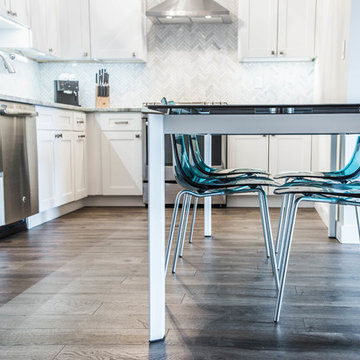
That one move allowed us to dig into the kitchen design because it was now the main focal point in the apartment. It was no longer an option to keep it in that tiny hole where it was, so we had to ensure that this design was functional and aesthetically pleasing at the same time. By adding the table into the space where an Island typically would go, we were able to both cut cost and still provide a dining experience. The Table serves as an Island as well when cooking.
We then proceeded to block in the existing doorway to the dining room. By doing this, we were able to create a full room which allowed us to put a door on the other side and called that room Bedroom #2. This was easier to do because all of the mechanicals were already in that space (light, heater and windows). By shifting things around, we also achieved a huge wall to wall closet from inside. PERFECT!
Then we moved into the Single bedroom. We thought it was a big room with a small closet, so by creatively adding an L shaped wall and steal some footprint into the bedroom side, we were able to put a door on that new room and design it for the walk-in closet. Even after this, the bedroom still holds a queen size bed with 2 night stands, a TV on the wall, a sitting chair and plenty of room to walk around. This was done by rethinking the location for the bed and night stands.
The bathroom was gutted to make sure there was no leaks and rebuild from the ground up. We kept all of the plumbing where it was, added a new vanity, medicine cabinet, tiles and lighting and it was done.
From there, the rest of the unit had new flooring all throughout, paint, and lighting. After completion and walk through, this project was handed over back to the clients.
Execution and collaboration between all the trades were: Reggie and his team from Premier Interiors and Rohan from RD Mechanical Services.
p.s. Please see our website to see the video.
28