
Search results for "Realizing" in Home Design Ideas
 McC | Architecture pllc
Photos: Scott Robert Larsen
Cabinetry: Sleepy Hollow Custom Kitchens
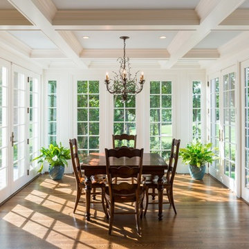
Example of a mid-sized classic medium tone wood floor and brown floor kitchen/dining room combo design in New York with beige walls and no fireplace
Example of a mid-sized classic medium tone wood floor and brown floor kitchen/dining room combo design in New York with beige walls and no fireplace
 Picture Perfect House
Picture Perfect House
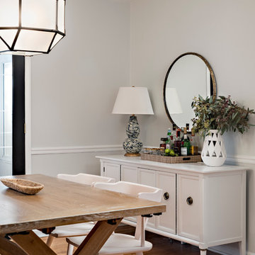
Example of a transitional light wood floor dining room design in Chicago with white walls
Example of a transitional light wood floor dining room design in Chicago with white walls
 True North Builders, Inc.
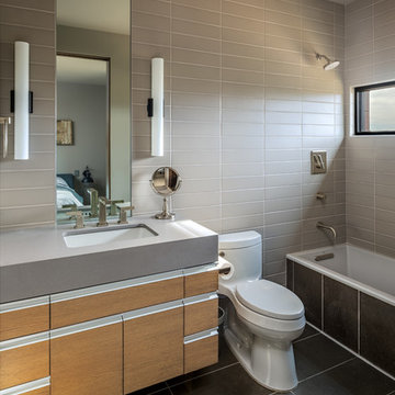
Inspiration for a contemporary 3/4 gray tile and subway tile gray floor bathroom remodel in Phoenix with flat-panel cabinets, medium tone wood cabinets, a one-piece toilet, an undermount sink, gray countertops and gray walls
Find the right local pro for your project
 Interiors by Dawn, Inc.
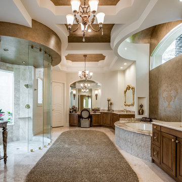
This Master Bathroom showcases faux paint accents on high flat ceilings, tub and shower ceiling. A special faux glaze and custom dimensional art detail was added to the tub wall.
 ECHT-ARCHITECTS
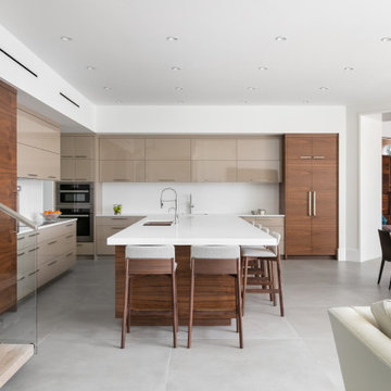
Sweeping views of Downtown Sarasota across the Bay from Bird Key create a dramatic backdrop for this Neo-Modern renovation.
Situated at the corner of a waterfront street, the original home had strong bones and great sight-lines. The owner sought to re-imagine the interiors in a more contemporary style, complementing the owner's eclectic art collection. Echt-Architects worked with the owner closely to realize this collaborative design, with the help of Interior Designer Marie Bowman, and General Contractor Nathan Cross.
The spaces are opened inward toward each other, and out toward the dramatic views. Large format concrete-look porcelain tiles blend them together. A tall walnut-stained front door welcomes guests into the Living Room, with a broad custom concrete fireplace surround with tapering edges, and a soaring walnut paneled over-mantle and ceiling detail.
A broad threshold overlooks the Dining area with Family Room beyond. A large, open Kitchen sits at center stage, with walnut and lacquer finishes. An elegant stair with a center stringer and wood block treads brings you upstairs to the guest suites.
Beside the Family Room, a custom concrete bartop with waterfall and tapering details provides ample space for relaxation and play.
 Margot Hartford Photography
Photo: Margot Hartford © 2017 Houzz
Design: Scandinavian Home Staging
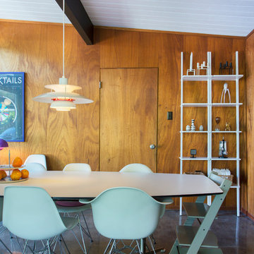
Dining room - 1960s dining room idea in Other
Dining room - 1960s dining room idea in Other
 Valentini Kids Furniture Brooklyn NY
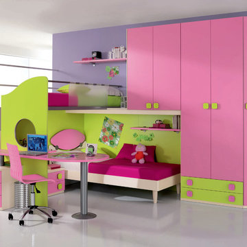
Kids Bunk Bedroom Set WEB-71 by SPAR
Made in Italy by Spar
WEB Junior by Spar is an Italian kids bedroom furniture collection that is remarkable for its innovative modern solutions that help not only safe so valuable space, but get maximum out of every inch of your kids room. Modern technologies, brilliant design and outstanding quality are met within this collection, giving you endless opportunities for color and size customization, so you could realize all your individuality and meet all the requirements. WEB Bedroom line by Spar thinks about you and your lovely kids, or teenagers, providing designer bedroom solutions for all occasions, making your child's room awesome for everything: sleeping, studying and playing. WEB Junior Bedroom Furniture collection is here to realize all your biggest dreams and take care of your kids!
All the pieces can be mixed & matched from one set to another and are available in a variety of sizes and colors. Please contact our office regarding customization of this kids bedroom set.
The starting price is for the "As Shown" kids bedroom set WEB 71 that includes the following items:
1 Bottom Twin Size Bed (bed fits US standard Twin size mattress 39" x 75")
1 Top Bed (bed fits special sized mattress 31.5" x 75")
1 Storage Ladder with storage extension-platform
1 Safety Bar (for top bed)
1 2-Drawer Nightstand
1 Desk with file cabinet
2 Wall Shelves W35.4"
1 Wall Shelf W59"
1 Storage Composition "Corner Loft-Bed"
1 Wardrobe (3 Doors & 2 Drawers)
Please Note: Room/Bed decorative accessories and the mattress are not included in the price.
MATERIAL/CONSTRUCTION:
E1-Class ecological panels, which are produced exclusively trough a wood recycling production process
Used lacquers conform to the norm 71/3 (toys directive)
Structure: 18 mm thick melamine-coated particle board
Shelves: 25mm thick melamine-coated particle board
Back panels: medium density coated fibreboard 5mm thick
Doors: 18 mm thick melamine-coated particle board finished on 4 sides
Hardware: metal runners with self-closing system and double stop; adjustable self closing hinges; quick-mount and braking systems
Dimensions:
Bottom Twin Size Bed: W42.7" x D79" x H38.2" (internal 39" x 75" US Standard)
Bottom Full Size Bed: W57.7" x D79" x H38.2" (internal 54" x 75" US Standard)
Top Bed (internal size): W31.5" x D75" (requires special sized mattress)
Storage Ladder (with Extension): W19.7" x D85.5" x H35.4"
Nightstand: W35.6" x D16.5" x H15.4"
Desk (with file cabinet): W71" x D31.5" x H30"
Wall Shelf: W35.4" x D10" x H1"
Wall Shelf: W59" x D10" x H1"
Corner Loft-Bed Composition: W(85.4" x 79.5")" x D23.6"/34.5" x H89.8" or H102.4"
3-Door Wardrobe: W52" x D23.6" x H89.8" or H102.4"
 Unik Parquet
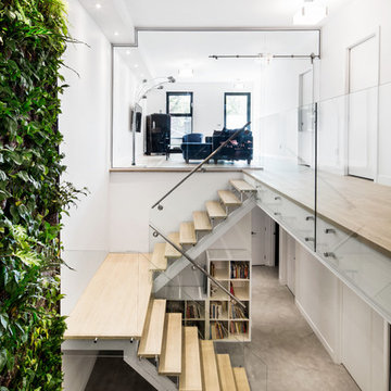
Stairs are made with the same wood (white oak) wire brushed color Corse (Corsica)
Realisation: Knightsbridge
White oak wire brushed color corse
Engineered flooring: 3/4'' x 5 3/16''
Knotty grade
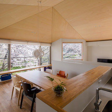

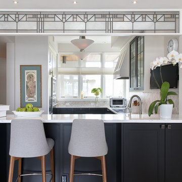

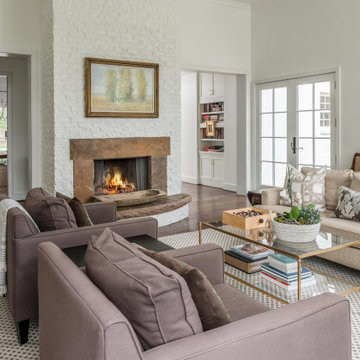

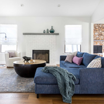
 Kristen Elizabeth Design
This family loves classic mid century design. We listened, and brought balance. Throughout the design, we conversed about a solution to the existing fireplace. Over time, we realized there was no solution needed. It is perfect as it is. It is quirky and fun, just like the owners. It is a conversation piece. We added rich color and texture in an adjoining room to balance the strength of the stone hearth . Purples, blues and greens find their way throughout the home adding cheer and whimsy. Beautifully sourced artwork compliments from the high end to the hand made. Every room has a special touch to reflect the family’s love of art, color and comfort.
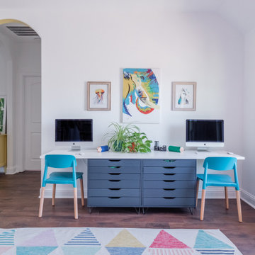
 Lauren Morgan Interiors
Inspiration for a large transitional gender-neutral vinyl floor and brown floor kids' room remodel in Dallas with white walls
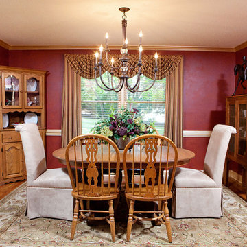
 Just Jill! Interiors
Megan Kime
Example of a mid-sized classic medium tone wood floor and brown floor enclosed dining room design in Raleigh with red walls and no fireplace
Example of a mid-sized classic medium tone wood floor and brown floor enclosed dining room design in Raleigh with red walls and no fireplace
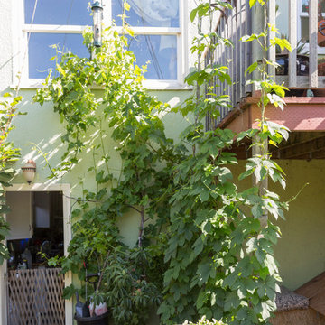
 SEN Creative
Photo: Lauren Edith Anderson © 2016 Houzz
Home design - traditional home design idea in San Francisco
Home design - traditional home design idea in San Francisco
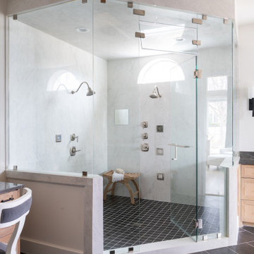
 Traci Connell Interiors
Perfectly embedded on an acre of land overlooking a pond, in the heart of Willow Bend of Plano, this dated, traditional home got more than a complete facelift. The wife is a “farmer’s daughter” and could have never imagined having a home like this to call her own one day. Finding a 15’ dining table was a tall task… especially for a family of four. Using a local craftsman, the most gorgeous white oak table was created to host everyone in the neighborhood! The clients told a lot of stories about their past and children. The designer realized that the stories were actually treasures as she incorporated their memories and symbols in every room. She brought these memories to life in a custom artwork collage above the family room mantel. From a tractor representing the grandfather, to the Russian alphabet portraying the roots of their adopted sons and some Cambodian script, there were meanings behind each piece. In order to bring nature indoors, the designer decided to demo the exterior wall to the patio to add a large folding door and blew out the wall dividing the formal dining room and breakfast room so there would be a clear sight through to the outdoors. Throughout the home, each family member was thought of. The fabrics and finishes had to withstand small boys, who were extremely active. The use of outdoor fabrics and beautiful scratch proof finishes were incorporated in every space – bring on the hotwheels.
 TKS Design Group
Download our free ebook, Creating the Ideal Kitchen. DOWNLOAD NOW
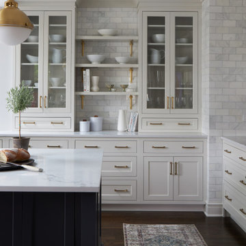
For many, extra time at home during COVID left them wanting more from their homes. Whether you realized the shortcomings of your space or simply wanted to combat boredom, a well-designed and functional home was no longer a want, it became a need. Tina found herself wanting more from her Old Irving Park home and reached out to The Kitchen Studio about adding function to her kitchen to make the most of the available real estate.
At the end of the day, there is nothing better than returning home to a bright and happy space you love. And this kitchen wasn’t that for Tina. Dark and dated, with a palette from the past and features that didn’t make the most of the available square footage, this remodel required vision and a fresh approach to the space. Lead designer, Stephanie Cole’s main design goal was better flow, while adding greater functionality with organized storage, accessible open shelving, and an overall sense of cohesion with the adjoining family room.
The original kitchen featured a large pizza oven, which was rarely used, yet its footprint limited storage space. The nearby pantry had become a catch-all, lacking the organization needed in the home. The initial plan was to keep the pizza oven, but eventually Tina realized she preferred the design possibilities that came from removing this cumbersome feature, with the goal of adding function throughout the upgraded and elevated space. Eliminating the pantry added square footage and length to the kitchen for greater function and more storage. This redesigned space reflects how she lives and uses her home, as well as her love for entertaining.
The kitchen features a classic, clean, and timeless palette. White cabinetry, with brass and bronze finishes, contrasts with rich wood flooring, and lets the large, deep blue island in Woodland’s custom color Harbor – a neutral, yet statement color – draw your eye.
The kitchen was the main priority. In addition to updating and elevating this space, Tina wanted to maximize what her home had to offer. From moving the location of the patio door and eliminating a window to removing an existing closet in the mudroom and the cluttered pantry, the kitchen footprint grew. Once the floorplan was set, it was time to bring cohesion to her home, creating connection between the kitchen and surrounding spaces.
The color palette carries into the mudroom, where we added beautiful new cabinetry, practical bench seating, and accessible hooks, perfect for guests and everyday living. The nearby bar continues the aesthetic, with stunning Carrara marble subway tile, hints of brass and bronze, and a design that further captures the vibe of the kitchen.
Every home has its unique design challenges. But with a fresh perspective and a bit of creativity, there is always a way to give the client exactly what they want [and need]. In this particular kitchen, the existing soffits and high slanted ceilings added a layer of complexity to the lighting layout and upper perimeter cabinets.
While a space needs to look good, it also needs to function well. This meant making the most of the height of the room and accounting for the varied ceiling features, while also giving Tina everything she wanted and more. Pendants and task lighting paired with an abundance of natural light amplify the bright aesthetic. The cabinetry layout and design compliments the soffits with subtle profile details that bring everything together. The tile selections add visual interest, drawing the eye to the focal area above the range. Glass-doored cabinets further customize the space and give the illusion of even more height within the room.
While her family may be grown and out of the house, Tina was focused on adding function without sacrificing a stunning aesthetic and dreamy finishes that make the kitchen the gathering place of any home. It was time to love her kitchen again, and if you’re wondering what she loves most, it’s the niche with glass door cabinetry and open shelving for display paired with the marble mosaic backsplash over the range and complimenting hood. Each of these features is a stunning point of interest within the kitchen – both brag-worthy additions to a perimeter layout that previously felt limited and lacking.
Whether your remodel is the result of special needs in your home or simply the excitement of focusing your energy on creating a fun new aesthetic, we are here for it. We love a good challenge because there is always a way to make a space better – adding function and beauty simultaneously.


 User
UserThomas Kuoh
Lights - Restoration Hardware
Bulbs - 1000bulbs
Planters - Accent Decor
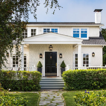
Traditional white two-story wood house exterior idea in San Francisco with a hip roof and a shingle roof
Traditional white two-story wood house exterior idea in San Francisco with a hip roof and a shingle roof
 Jarrett Design
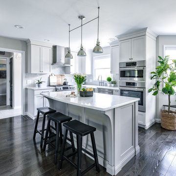
This stylish family of four came to us yearning for added functionality with flair. The couple recently updated other areas of the home on their own quite beautifully, but realized they needed the help of professionals when it came to the kitchen and mudroom. The new kitchen plan enlarged the island with additional seating, eliminated soffits for extra storage and an updated look, and swapped out the desk for a message center with a hidden charging/drop area. A cozy banquette was designed for the eat-in area of the kitchen. Drawers below the bench add storage to this gathering spot.
Aesthetic elements with a soft industrial feel to compliment the new interiors were desired. Beautiful island detailing with tall brackets, panels and base molding in a lovely grey paint in contrast to the white perimeter create a focal point for the space. The homeowner sourced a fun light fixture to top off the island. This along with a stainless chimney hood and appliances add to the overall industrial appeal.
Grey cabinetry in the mudroom flows with the kitchen while adding cubbies and a bench with lockers above. A cabinetry surround for the washer and dryer integrates the built-ins in a space that works hard while looking pretty.
49