
Search results for "Rectangular bedroom" in Home Design Ideas
 TKS Design Group
Download our free ebook, Creating the Ideal Kitchen. DOWNLOAD NOW
Lakefront property in the northwest suburbs of Chicago is hard to come by, so when we were hired by this young family with exactly that, we were immediately inspired by not just the unusually large footprint of this 1950’s colonial revival but also the lovely views of the manmade lake it was sited on. The large 5-bedroom home was solidly stuck in the 1980’s, but we saw tons of potential. We started out by updating the existing staircase with a fresh coat of paint and adding new herringbone slate to the entry hall.
The powder room off the entryway also got a refresh - new flooring, new cabinets and fixtures. We ran the new slate right through into this space for some consistency. A fun wallpaper and shiplap trim add a welcoming feel and set the tone for the home.
Next, we tackled the kitchen. Located away from the rest of the first floor, the kitchen felt a little isolated, so we immediately began planning for how to better connect it to the rest of the first floor. We landed on removing the wall between the kitchen and dining room and designed a modified galley style space with separate cooking and clean up zones. The cooking zone consists of the refrigerator, prep sink and cooktop, along with a nice long run of prep space at the island. The cleanup side of the kitchen consists of the main sink and dishwasher. Both areas are situated so that the user can view the lake during prep work and cleanup!
One of the home’s main puzzles was how to incorporate the mudroom and area in front of the patio doors at the back of the house. We already had a breakfast table area, so the space by the patio doors was a bit of a no man’s land. We decided to separate the kitchen proper from what became the new mudroom with a large set of barn doors. That way you can quickly hide any mudroom messes but have easy access to the light coming in through the patio doors as well as the outdoor grilling station. We also love the impact the barn doors add to the overall space.
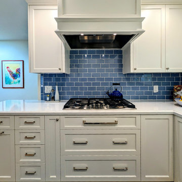
The homeowners’ first words to us were “it’s time to ditch the brown,” so we did! We chose a lovely blue pallet that reflects the home’s location on the lake which is also vibrant yet easy on the eye. Countertops are white quartz, and the natural oak floor works well with the other honey accents. The breakfast table was given a refresh with new chairs, chandelier and window treatments that frame the gorgeous views of the lake out the back.
We coordinated the slate mudroom flooring with that used in the home’s main entrance for a consistent feel. The storage area consists of open and closed storage to allow for some clutter control as needed.
Next on our “to do” list was revamping the dated brown bar area in the neighboring dining room. We eliminated the clutter by adding some closed cabinets and did some easy updates to help the space feel more current. One snag we ran into here was the discovery of a beam above the existing open shelving that had to be modified with a smaller structural beam to allow for our new design to work. This was an unexpected surprise, but in the end we think it was well worth it!
We kept the colors here a bit more muted to blend with the homeowner’s existing furnishings. Open shelving and polished nickel hardware add some simple detail to the new entertainment zone which also looks out onto the lake!
Next we tackled the upstairs starting with the homeowner’s son’s bath. The bath originally had both a tub shower and a separate shower, so we decided to swap out the shower for a new laundry area. This freed up some space downstairs in what used to be the mudroom/laundry room and is much more convenient for daily laundry needs.
We continued the blue palette here with navy cabinetry and the navy tile in the shower. Porcelain floor tile and chrome fixtures keep maintenance to a minimum while matte black mirrors and lighting add some depth the design. A low maintenance runner adds some warmth underfoot and ties the whole space together.
We added a pocket door to the bathroom to minimize interference with the door swings. The left door of the laundry closet is on a 180 degree hinge to allow for easy full access to the machines. Next we tackled the master bath which is an en suite arrangement. The original was typical of the 1980’s with the vanity outside of the bathroom, situated near the master closet. And the brown theme continued here with multiple shades of brown.
Our first move was to segment off the bath and the closet from the master bedroom. We created a short hall from the bedroom to the bathroom with his and hers walk-in closets on the left and right as well as a separate toilet closet outside of the main bathroom for privacy and flexibility.
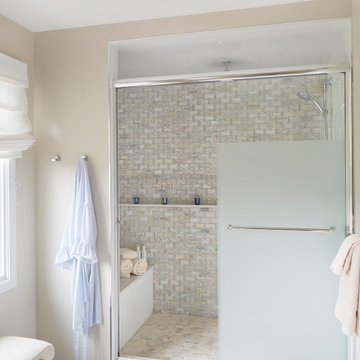
The original bathroom had a giant soaking tub with steps (dangerous!) as well as a small shower that did not work well for our homeowner who is 6’3”. With other bathtubs in the home, they decided to eliminate the tub and create an oversized shower which takes up the space where the old tub was located. The double vanity is on the opposite wall and a bench is located under the window for morning conversations and a place to set a couple of towels.
The pallet in here is light and airy with a mix of blond wood, creamy porcelain and marble tile, and brass accents. A simple roman shade adds some texture and it’s top-down mechanism allows for light and privacy.
This large whole house remodel gave our homeowners not only the ability to maximize the potential of their home but also created a lovely new frame from which to view their fabulous lake views.
Designed by: Susan Klimala, CKD, CBD
Photography by: Michael Kaskel
For more information on kitchen and bath design ideas go to: www.kitchenstudio-ge.com

 Fine Fixtures
For a stylish yet comforting home in the vicinity of several public schools, this apartment block is difficult to beat. It is brand-new, constructed in 2018 and stands proudly at 6 floors with twelve spacious apartments in the middle of Crown Heights. Each apartment has three family-sized bedrooms with a luxury bathroom. For those joyful family meals, If you enjoy skyline views during sunset or when all the city lights come alive, most apartments have private balconies, or you can avail the furnished deck on the roof.
Each of the modern master bathrooms is fitted with our Dawn Gray Vdara vanity cabinets. These have a predefined beauty with a sleek metal frame, and four different melamine finishes to bring out its simplistic elegance. It provides meticulous storage with a smooth touch bar and a shiny metal white frame for support. On top rests our Frameport Standard Sink in custom white with a traditional yet sophisticated finish. The MOTB2W Fine Fixtures standard white toilet seat is an elongated piece of interactive design with a dual flush function that efficiently saves water. For the most enviable centerpiece in any bathroom, our Drop-In and Alcove high-quality fiberglass tub does not disappoint. Its unique shape was built for comfort like no other. It is entirely scratch-resistant and retains heat to provide all the warmth you could possibly need.

 Nautilus Architects
Located on a marsh in the upper reaches of the Lieutenant River in Old Lyme, the existing house was well-sited and well-built, but the design failed to exploit the views and more importantly was a confused combination of contemporary and traditional elements. The new homeowners, a successful businesswoman and an accomplished artist and photographer, were interested in creating a fully-contemporary environment to open up space, connect indoors with outdoors, display artwork and showcase the husband’s distinctive photographs.
One glaring deficiency was the curb appeal and approach sequence: the grade sloped down and the path to the house followed, but this led to an uncomfortable dip and abrupt rise to the front door. By creating a virtual “moat,” occupied by a grid of raised-bed grasses contained in aluminum-clad boxes, and spanning the moat with an ipe bridge, the approach becomes level and engaging. The façade of the existing house was blank and bland, and with no cover. Adding a deep overhang with a wide porch creates a welcoming, covered condition, accentuated by a 6’ wide pivoting front door that feels more like a moving piece of wall.
Another deficiency was the connection to the outdoors. By adding glass to the front and back of the house, and removing interior walls selectively, the house takes on a diaphanous quality that allows one to see through to the marsh beyond, even when in the driveway. The raised-bed grasses act as abstract, geometric versions of the marsh beyond. A large, pyramidal skylight establishes a spatial hierarchy around which the rooms revolve.
The house featured several tray-ceilinged spaces – living room, kitchen, and master bedroom – that were poorly-proportioned and with panels at the top that resembled inset flat panel doors. The solution was to use a different strategy for each: the bedroom turns the ceiling into an eggshell through the use of a creative trim detail; the living room has an oversized sculptural, backlit lighting element; and the kitchen has a collage of painted rectangular forms that support or include lighting pieces.
A palette of concrete, blackened steel, stainless steel and colors carefully chosen by homeowner and architect create an interior and exterior environment punctuated by moments that are as artistic as the featured works in the black-ceilinged gallery.
 SoNo architects
Architects: SoNo Arhitekti
www.sono.si
www.facebook.com/SonoArhitekti
Location: Slovenia
Architects in Charge: Edvard Blažko, Marko Volk, Nina Tešanović, Samo Radinja
Area: 230 sqm
Year: 2015
Photographs: Aljoša Videtič
This family home is an example of a modern design filled with natural light and building blocks comprised of sustainable material – in this case wood, one of the if not the most strategic material of Slovenia . It's definitely not a typical prefabricated house out of catalogue as we tried to develop a residence that meets the needs of modern users while having functional floor plans and contemporary elegant exterior all appropriately settled into its landscape.
Main concept presents three volumes that are placed in a triangular composition partially overlayed with a rectangular form of the upper floor. While the dynamic shape of the groundfloor is covered with a flat roof, the 1st floor is completed with a gable –like roof, echoing the traditional architecture of the house's surroundings.
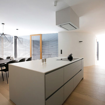
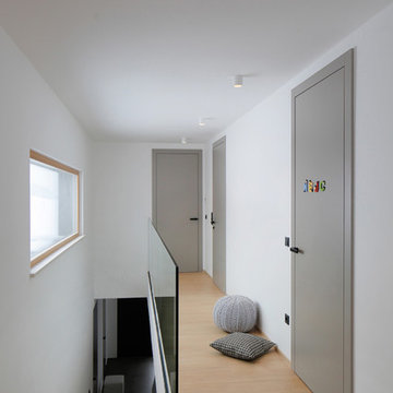
While we enter into an open spacious and dynamically shaped groundfloor we discover a pleasant intimate ambience. The living room and dining area offer a lot of natural light through the large glazed window surfaces. A prominent staircase leads us to the upper sleeping area that consists of the main bedroom with its own dressing room and a bathroom and children's rooms with a smaller bathroom.
Despite groundfloor's dynamic shape, its façade is monochrome - predominately a clean white surface in combination with bigger windows. On the contrary the simple form of the upper floor has a boldly designed façade - a combination of dark colour shades and natural larch wood’s textures.
Wood is the basic structural element and at the same time complements the facades, window frames, while also dominating the interiors.
 Liz Crivello
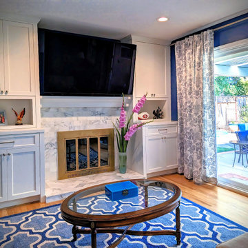
This suburban home was built back in the 1970s and still retained its original "charming" colored tile, petite shower, and a tiny 9x9 kitchen. The major issue? It was outdated and cramped! The owners desired additional space for their dining area, larger kitchen, bathrooms and updated finishes.
Our team managed to add square footage to the living room to accommodate a full sized dining table overlooking the garden. By moving the dining room out of the kitchen, this helped us almost double the kitchen's size where we added a bar, full pantry and plenty of storage.
We removed a hall closet to expand the bathroom area, enabling us to create two rectangular bathrooms instead of two intertwined bathrooms. In the primary bathroom, we added a full-sized shower with a bench, as well as plenty of cabinet storage.
Additionally, we gave the house a fresh look with new hardwood floors that matched the old ones (still visible in the bedrooms), as well as new solid core doors, hardware, and brand new paint throughout.
The exterior was revamped with new lighting, landscaping, cement patio, fresh paint, address numbers and an aluminum pergola to provide shade from the hot summer sun.
This remodel is the perfect example that you can still evoke luxury in smaller homes.
 Liz Crivello
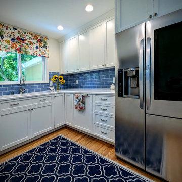
This suburban home was built back in the 1970s and still retained its original "charming" colored tile, petite shower, and a tiny 9x9 kitchen. The major issue? It was outdated and cramped! The owners desired additional space for their dining area, larger kitchen, bathrooms and updated finishes.
Our team managed to add square footage to the living room to accommodate a full sized dining table overlooking the garden. By moving the dining room out of the kitchen, this helped us almost double the kitchen's size where we added a bar, full pantry and plenty of storage.
We removed a hall closet to expand the bathroom area, enabling us to create two rectangular bathrooms instead of two intertwined bathrooms. In the primary bathroom, we added a full-sized shower with a bench, as well as plenty of cabinet storage.
Additionally, we gave the house a fresh look with new hardwood floors that matched the old ones (still visible in the bedrooms), as well as new solid core doors, hardware, and brand new paint throughout.
The exterior was revamped with new lighting, landscaping, cement patio, fresh paint, address numbers and an aluminum pergola to provide shade from the hot summer sun.
This remodel is the perfect example that you can still evoke luxury in smaller homes.
 Pearl Remodeling
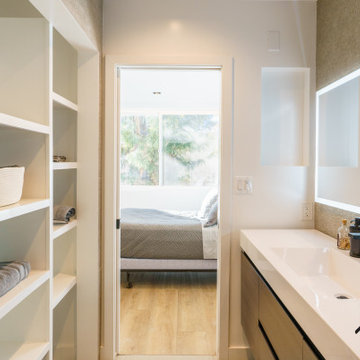
We upgraded this 380 sq. Koreatown condo with a modern style and features. To begin with, the kitchen has new semi-glossy beige/green flat panel cabinets. We installed premium quality Bosch appliances including an electric stovetop, range hood, microwave, and dishwasher. The kitchen has a beautiful stone countertop, deep stainless steel sink, matte black faucet, and bar countertop. The bedroom/living room space of the condo received a new fresh coat of paint, base modeling, a new rectangular Milgard window, and a new ductless A/C. The gorgeous bathroom received a major upgrade with a large LED mirror vanity, a floating wood vanity, stone countertop with a deep drop-in sink. For the bathroom, we installed a high-tech one-piece toilet, a new shower enclosure with 3/8 tempered glass, a dual shower head system with a waterfall head and handheld sprayer, a custom shower niche, and beautiful stone tiles. We installed 15 recessed lights, replaced the 100 AMP sub panel, new circuits, 20 outlets, and new exhaust vents.
 Pearl Remodeling
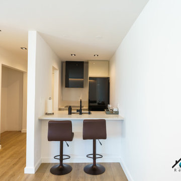
We upgraded this 380 sq. Koreatown condo with a modern style and features. To begin with, the kitchen has new semi-glossy beige/green flat panel cabinets. We installed premium quality Bosch appliances including an electric stovetop, range hood, microwave, and dishwasher. The kitchen has a beautiful stone countertop, deep stainless steel sink, matte black faucet, and bar countertop. The bedroom/living room space of the condo received a new fresh coat of paint, base modeling, a new rectangular Milgard window, and a new ductless A/C. The gorgeous bathroom received a major upgrade with a large LED mirror vanity, a floating wood vanity, stone countertop with a deep drop-in sink. For the bathroom, we installed a high-tech one-piece toilet, a new shower enclosure with 3/8 tempered glass, a dual shower head system with a waterfall head and handheld sprayer, a custom shower niche, and beautiful stone tiles. We installed 15 recessed lights, replaced the 100 AMP sub panel, new circuits, 20 outlets, and new exhaust vents.
 SoNo architects
Architects: SoNo Arhitekti
www.sono.si
www.facebook.com/SonoArhitekti
Location: Slovenia
Architects in Charge: Edvard Blažko, Marko Volk, Nina Tešanović, Samo Radinja
Area: 230 sqm
Year: 2015
Photographs: Aljoša Videtič
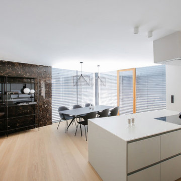
This family home is an example of a modern design filled with natural light and building blocks comprised of sustainable material – in this case wood, one of the if not the most strategic material of Slovenia . It's definitely not a typical prefabricated house out of catalogue as we tried to develop a residence that meets the needs of modern users while having functional floor plans and contemporary elegant exterior all appropriately settled into its landscape.
Main concept presents three volumes that are placed in a triangular composition partially overlayed with a rectangular form of the upper floor. While the dynamic shape of the groundfloor is covered with a flat roof, the 1st floor is completed with a gable –like roof, echoing the traditional architecture of the house's surroundings.
While we enter into an open spacious and dynamically shaped groundfloor we discover a pleasant intimate ambience. The living room and dining area offer a lot of natural light through the large glazed window surfaces. A prominent staircase leads us to the upper sleeping area that consists of the main bedroom with its own dressing room and a bathroom and children's rooms with a smaller bathroom.
Despite groundfloor's dynamic shape, its façade is monochrome - predominately a clean white surface in combination with bigger windows. On the contrary the simple form of the upper floor has a boldly designed façade - a combination of dark colour shades and natural larch wood’s textures.
Wood is the basic structural element and at the same time complements the facades, window frames, while also dominating the interiors.
 dSPACE Studio Architecture
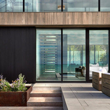
This home evokes a sensuous St. Barth lifestyle on Lake Michigan, designed for globetrotting clients who wanted a weekend sanctuary near their primary residence in Chicago. The project brief included open plan living for entertaining, a family lounge, and bedroom suites for houseguests.
The first level is a glass rectangular volume that makes the second level appear to float over the dune and offers water views through the structure. Clad in Accoya, the upper level will gray with age and blend into the landscape. These two horizontal volumes are connected by a double-height glass entry space that reveals a floating staircase.
A contemporary beach aesthetic unifies the interior through an edited palette of materials, including white oak millwork, large-format porcelain tile, and a range of warm whites. Interior tile extends out to the pool terrace, uniting the spaces and amplifying the connection to the outdoors.
The landscape design enhances the experience. A courtyard with sculptural Ginkgo trees offers refuge from lake breezes. On the pool terrace, custom Cor-Ten planters overflow with Russian Sage, selected for graceful foliage that sways in the breeze and offers a relaxing herbal aroma.
 Living with Lolo
Dining Room in Minton Circle | Room Type:
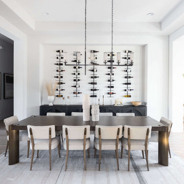
Full Home Design & Furnishing – Approximately 5,300 sq ft | 5 Bed | 5 ½ Bath (including office, primary bedroom/bath, dining room, family room, breakfast nook and wine wall).
Project Name:
Minton Circle |
Key Feature:
A Transitional/Modern home designed for multigenerational living, highlighted by a custom wine feature wall with built-in cabinetry, a fully custom arched pantry door, and layered lighting and furnishings that elevated the builder-grade finishes.
Challenge:
Designing a full dining room wine wall that would serve as a striking focal point without overwhelming the space or feeling heavy against the clean, modern architecture.
Solution:
We recessed the wine wall within the architectural niche to create depth and intentional framing. Slim, vertical metal racks were installed in a symmetrical layout, allowing the bottles themselves to become sculptural elements against the crisp white backdrop. By pairing the open wine display with low, dark cabinetry below, we grounded the feature and added concealed storage to balance form and function. The minimal metal detailing and negative space keep the installation feeling light and modern, while still delivering impact the moment you enter the room.
Materials:
Lighting: Circa Lighting, Regina Andrew.
Rugs: Loloi, JLeigh Carpets, Momeni.
Wallpaper: Phillip Jeffries.
Furnishings: Moss Studio, Bernhardt, Four Hands.
Art: Leftbank.
Timeline:
Completed March 2022.
 Nautilus Architects
Located on a marsh in the upper reaches of the Lieutenant River in Old Lyme, the existing house was well-sited and well-built, but the design failed to exploit the views and more importantly was a confused combination of contemporary and traditional elements. The new homeowners, a successful businesswoman and an accomplished artist and photographer, were interested in creating a fully-contemporary environment to open up space, connect indoors with outdoors, display artwork and showcase the husband’s distinctive photographs.
One glaring deficiency was the curb appeal and approach sequence: the grade sloped down and the path to the house followed, but this led to an uncomfortable dip and abrupt rise to the front door. By creating a virtual “moat,” occupied by a grid of raised-bed grasses contained in aluminum-clad boxes, and spanning the moat with an ipe bridge, the approach becomes level and engaging. The façade of the existing house was blank and bland, and with no cover. Adding a deep overhang with a wide porch creates a welcoming, covered condition, accentuated by a 6’ wide pivoting front door that feels more like a moving piece of wall.
Another deficiency was the connection to the outdoors. By adding glass to the front and back of the house, and removing interior walls selectively, the house takes on a diaphanous quality that allows one to see through to the marsh beyond, even when in the driveway. The raised-bed grasses act as abstract, geometric versions of the marsh beyond. A large, pyramidal skylight establishes a spatial hierarchy around which the rooms revolve.
The house featured several tray-ceilinged spaces – living room, kitchen, and master bedroom – that were poorly-proportioned and with panels at the top that resembled inset flat panel doors. The solution was to use a different strategy for each: the bedroom turns the ceiling into an eggshell through the use of a creative trim detail; the living room has an oversized sculptural, backlit lighting element; and the kitchen has a collage of painted rectangular forms that support or include lighting pieces.
A palette of concrete, blackened steel, stainless steel and colors carefully chosen by homeowner and architect create an interior and exterior environment punctuated by moments that are as artistic as the featured works in the black-ceilinged gallery.
 Liz Crivello
This suburban home was built back in the 1970s and still retained its original "charming" colored tile, petite shower, and a tiny 9x9 kitchen. The major issue? It was outdated and cramped! The owners desired additional space for their dining area, larger kitchen, bathrooms and updated finishes.
Our team managed to add square footage to the living room to accommodate a full sized dining table overlooking the garden. By moving the dining room out of the kitchen, this helped us almost double the kitchen's size where we added a bar, full pantry and plenty of storage.
We removed a hall closet to expand the bathroom area, enabling us to create two rectangular bathrooms instead of two intertwined bathrooms. In the primary bathroom, we added a full-sized shower with a bench, as well as plenty of cabinet storage.
Additionally, we gave the house a fresh look with new hardwood floors that matched the old ones (still visible in the bedrooms), as well as new solid core doors, hardware, and brand new paint throughout.
The exterior was revamped with new lighting, landscaping, cement patio, fresh paint, address numbers and an aluminum pergola to provide shade from the hot summer sun.
This remodel is the perfect example that you can still evoke luxury in smaller homes.
 SoNo architects
Architects: SoNo Arhitekti
www.sono.si
www.facebook.com/SonoArhitekti
Location: Slovenia
Architects in Charge: Edvard Blažko, Marko Volk, Nina Tešanović, Samo Radinja
Area: 230 sqm
Year: 2015
Photographs: Aljoša Videtič
This family home is an example of a modern design filled with natural light and building blocks comprised of sustainable material – in this case wood, one of the if not the most strategic material of Slovenia . It's definitely not a typical prefabricated house out of catalogue as we tried to develop a residence that meets the needs of modern users while having functional floor plans and contemporary elegant exterior all appropriately settled into its landscape.
Main concept presents three volumes that are placed in a triangular composition partially overlayed with a rectangular form of the upper floor. While the dynamic shape of the groundfloor is covered with a flat roof, the 1st floor is completed with a gable –like roof, echoing the traditional architecture of the house's surroundings.
While we enter into an open spacious and dynamically shaped groundfloor we discover a pleasant intimate ambience. The living room and dining area offer a lot of natural light through the large glazed window surfaces. A prominent staircase leads us to the upper sleeping area that consists of the main bedroom with its own dressing room and a bathroom and children's rooms with a smaller bathroom.
Despite groundfloor's dynamic shape, its façade is monochrome - predominately a clean white surface in combination with bigger windows. On the contrary the simple form of the upper floor has a boldly designed façade - a combination of dark colour shades and natural larch wood’s textures.
Wood is the basic structural element and at the same time complements the facades, window frames, while also dominating the interiors.
 Liz Crivello
This suburban home was built back in the 1970s and still retained its original "charming" colored tile, petite shower, and a tiny 9x9 kitchen. The major issue? It was outdated and cramped! The owners desired additional space for their dining area, larger kitchen, bathrooms and updated finishes.
Our team managed to add square footage to the living room to accommodate a full sized dining table overlooking the garden. By moving the dining room out of the kitchen, this helped us almost double the kitchen's size where we added a bar, full pantry and plenty of storage.
We removed a hall closet to expand the bathroom area, enabling us to create two rectangular bathrooms instead of two intertwined bathrooms. In the primary bathroom, we added a full-sized shower with a bench, as well as plenty of cabinet storage.
Additionally, we gave the house a fresh look with new hardwood floors that matched the old ones (still visible in the bedrooms), as well as new solid core doors, hardware, and brand new paint throughout.
The exterior was revamped with new lighting, landscaping, cement patio, fresh paint, address numbers and an aluminum pergola to provide shade from the hot summer sun.
This remodel is the perfect example that you can still evoke luxury in smaller homes.
 Nautilus Architects
Located on a marsh in the upper reaches of the Lieutenant River in Old Lyme, the existing house was well-sited and well-built, but the design failed to exploit the views and more importantly was a confused combination of contemporary and traditional elements. The new homeowners, a successful businesswoman and an accomplished artist and photographer, were interested in creating a fully-contemporary environment to open up space, connect indoors with outdoors, display artwork and showcase the husband’s distinctive photographs.
One glaring deficiency was the curb appeal and approach sequence: the grade sloped down and the path to the house followed, but this led to an uncomfortable dip and abrupt rise to the front door. By creating a virtual “moat,” occupied by a grid of raised-bed grasses contained in aluminum-clad boxes, and spanning the moat with an ipe bridge, the approach becomes level and engaging. The façade of the existing house was blank and bland, and with no cover. Adding a deep overhang with a wide porch creates a welcoming, covered condition, accentuated by a 6’ wide pivoting front door that feels more like a moving piece of wall.
Another deficiency was the connection to the outdoors. By adding glass to the front and back of the house, and removing interior walls selectively, the house takes on a diaphanous quality that allows one to see through to the marsh beyond, even when in the driveway. The raised-bed grasses act as abstract, geometric versions of the marsh beyond. A large, pyramidal skylight establishes a spatial hierarchy around which the rooms revolve.
The house featured several tray-ceilinged spaces – living room, kitchen, and master bedroom – that were poorly-proportioned and with panels at the top that resembled inset flat panel doors. The solution was to use a different strategy for each: the bedroom turns the ceiling into an eggshell through the use of a creative trim detail; the living room has an oversized sculptural, backlit lighting element; and the kitchen has a collage of painted rectangular forms that support or include lighting pieces.
A palette of concrete, blackened steel, stainless steel and colors carefully chosen by homeowner and architect create an interior and exterior environment punctuated by moments that are as artistic as the featured works in the black-ceilinged gallery.
 Fine Fixtures
For a stylish yet comforting home in the vicinity of several public schools, this apartment block is difficult to beat. It is brand-new, constructed in 2018 and stands proudly at 6 floors with twelve spacious apartments in the middle of Crown Heights. Each apartment has three family-sized bedrooms with a luxury bathroom. For those joyful family meals, If you enjoy skyline views during sunset or when all the city lights come alive, most apartments have private balconies, or you can avail the furnished deck on the roof.
Each of the modern master bathrooms is fitted with our Dawn Gray Vdara vanity cabinets. These have a predefined beauty with a sleek metal frame, and four different melamine finishes to bring out its simplistic elegance. It provides meticulous storage with a smooth touch bar and a shiny metal white frame for support. On top rests our Frameport Standard Sink in custom white with a traditional yet sophisticated finish. The MOTB2W Fine Fixtures standard white toilet seat is an elongated piece of interactive design with a dual flush function that efficiently saves water. For the most enviable centerpiece in any bathroom, our Drop-In and Alcove high-quality fiberglass tub does not disappoint. Its unique shape was built for comfort like no other. It is entirely scratch-resistant and retains heat to provide all the warmth you could possibly need.
 Liz Crivello
This suburban home was built back in the 1970s and still retained its original "charming" colored tile, petite shower, and a tiny 9x9 kitchen. The major issue? It was outdated and cramped! The owners desired additional space for their dining area, larger kitchen, bathrooms and updated finishes.
Our team managed to add square footage to the living room to accommodate a full sized dining table overlooking the garden. By moving the dining room out of the kitchen, this helped us almost double the kitchen's size where we added a bar, full pantry and plenty of storage.
We removed a hall closet to expand the bathroom area, enabling us to create two rectangular bathrooms instead of two intertwined bathrooms. In the primary bathroom, we added a full-sized shower with a bench, as well as plenty of cabinet storage.
Additionally, we gave the house a fresh look with new hardwood floors that matched the old ones (still visible in the bedrooms), as well as new solid core doors, hardware, and brand new paint throughout.
The exterior was revamped with new lighting, landscaping, cement patio, fresh paint, address numbers and an aluminum pergola to provide shade from the hot summer sun.
This remodel is the perfect example that you can still evoke luxury in smaller homes.
 Nautilus Architects
Located on a marsh in the upper reaches of the Lieutenant River in Old Lyme, the existing house was well-sited and well-built, but the design failed to exploit the views and more importantly was a confused combination of contemporary and traditional elements. The new homeowners, a successful businesswoman and an accomplished artist and photographer, were interested in creating a fully-contemporary environment to open up space, connect indoors with outdoors, display artwork and showcase the husband’s distinctive photographs.
One glaring deficiency was the curb appeal and approach sequence: the grade sloped down and the path to the house followed, but this led to an uncomfortable dip and abrupt rise to the front door. By creating a virtual “moat,” occupied by a grid of raised-bed grasses contained in aluminum-clad boxes, and spanning the moat with an ipe bridge, the approach becomes level and engaging. The façade of the existing house was blank and bland, and with no cover. Adding a deep overhang with a wide porch creates a welcoming, covered condition, accentuated by a 6’ wide pivoting front door that feels more like a moving piece of wall.
Another deficiency was the connection to the outdoors. By adding glass to the front and back of the house, and removing interior walls selectively, the house takes on a diaphanous quality that allows one to see through to the marsh beyond, even when in the driveway. The raised-bed grasses act as abstract, geometric versions of the marsh beyond. A large, pyramidal skylight establishes a spatial hierarchy around which the rooms revolve.
The house featured several tray-ceilinged spaces – living room, kitchen, and master bedroom – that were poorly-proportioned and with panels at the top that resembled inset flat panel doors. The solution was to use a different strategy for each: the bedroom turns the ceiling into an eggshell through the use of a creative trim detail; the living room has an oversized sculptural, backlit lighting element; and the kitchen has a collage of painted rectangular forms that support or include lighting pieces.
A palette of concrete, blackened steel, stainless steel and colors carefully chosen by homeowner and architect create an interior and exterior environment punctuated by moments that are as artistic as the featured works in the black-ceilinged gallery.

 Klopf Architecture
, Outer Space Landscape Architects, Sezen & Moon Structural Engineer and Flegels Construction updated a classic Eichler open, indoor-outdoor home.
Everyone loved the classic, original bones of this house, but it was in need of a major facelift both inside and out. The owners also wanted to remove the barriers between the kitchen and great room, and increase the size of the master bathroom as well as make other layout changes. No addition to the house was contemplated.
The owners worked with Klopf Architecture in part because of Klopf’s extensive mid-century modern / Eichler design portfolio, and in part because one of their neighbors who had worked with Klopf on their Eichler home remodel referred them. The Klopf team knew how to update the worn finishes to make a more sophisticated, higher quality home that both looks better and functions better.
In conjunction with the atrium and the landscaped rear yard / patio, the glassy living room feels open on both sides and allows an indoor / outdoor flow throughout. The new, natural wood exterior siding runs through the house from inside to outside to inside again, updating one of the classic design features of the Eichler homes.
Picking up on the wood siding, walnut vanities and cabinets offset the white walls. Gray porcelain tiles evoke the concrete slab floors and flow from interior to exterior to make the spaces appear to flow together. Similarly the ceiling decking has the same white-washed finish from inside to out. The continuity of materials and space enhances the sense of flow.
The large kitchen, perfect for entertaining, has a wall of built-ins and an oversized island. There’s plenty of storage and space for the whole group to prep and cook together.
One unique approach to the master bedroom is the bed wall. The head of the bed is tucked within a line of built-in wardrobes with a high window above. Replacing the master closet with this wall of wardrobes allowed for both a larger bathroom and a larger bedroom.
This 1,953 square foot, 4 bedroom, 2 bathroom Double Gable Eichler remodeled single-family house is located in Mountain View in the heart of the Silicon Valley.
Klopf Architecture Project Team: John Klopf, AIA, Klara Kevane, and Yegvenia Torres-Zavala
Landscape Architect: Outer Space Landscape Architects
Structural Engineer: Sezen & Moon
Contractor: Flegels Construction
Landscape Contractor: Roco's Gardening & Arroyo Vista Landscaping, Inc.
Photography ©2016 Mariko Reed
Location: Mountain View, CA
Year completed: 2015
155