
Search results for "Reduce changed" in Home Design Ideas

 Katie Hutchison Studio
The new owners of this house in Harvard, Massachusetts loved its location and authentic Shaker characteristics, but weren’t fans of its curious layout. A dated first-floor full bathroom could only be accessed by going up a few steps to a landing, opening the bathroom door and then going down the same number of steps to enter the room. The dark kitchen faced the driveway to the north, rather than the bucolic backyard fields to the south. The dining space felt more like an enlarged hall and could only comfortably seat four. Upstairs, a den/office had a woefully low ceiling; the master bedroom had limited storage, and a sad full bathroom featured a cramped shower.
KHS proposed a number of changes to create an updated home where the owners could enjoy cooking, entertaining, and being connected to the outdoors from the first-floor living spaces, while also experiencing more inviting and more functional private spaces upstairs.
On the first floor, the primary change was to capture space that had been part of an upper-level screen porch and convert it to interior space. To make the interior expansion seamless, we raised the floor of the area that had been the upper-level porch, so it aligns with the main living level, and made sure there would be no soffits in the planes of the walls we removed. We also raised the floor of the remaining lower-level porch to reduce the number of steps required to circulate from it to the newly expanded interior. New patio door systems now fill the arched openings that used to be infilled with screen. The exterior interventions (which also included some new casement windows in the dining area) were designed to be subtle, while affording significant improvements on the interior. Additionally, the first-floor bathroom was reconfigured, shifting one of its walls to widen the dining space, and moving the entrance to the bathroom from the stair landing to the kitchen instead.
These changes (which involved significant structural interventions) resulted in a much more open space to accommodate a new kitchen with a view of the lush backyard and a new dining space defined by a new built-in banquette that comfortably seats six, and -- with the addition of a table extension -- up to eight people.
Upstairs in the den/office, replacing the low, board ceiling with a raised, plaster, tray ceiling that springs from above the original board-finish walls – newly painted a light color -- created a much more inviting, bright, and expansive space. Re-configuring the master bath to accommodate a larger shower and adding built-in storage cabinets in the master bedroom improved comfort and function. A new whole-house color palette rounds out the improvements.
Photos by Katie Hutchison
 Andrew Mikhael Architect
Kitchen is Center
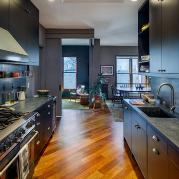
In our design to combine the apartments, we centered the kitchen - making it a dividing line between private and public space; vastly expanding the storage and work surface area. We discovered an existing unused roof penetration to run a duct to vent out a powerful kitchen hood.
The original bathroom skylight now illuminates the central kitchen space. Without changing the standard skylight size, we gave it architectural scale by carving out the ceiling to maximize daylight.
Light now dances off the vaulted, sculptural angles of the ceiling to bathe the entire space in natural light.
 Katie Hutchison Studio
The new owners of this house in Harvard, Massachusetts loved its location and authentic Shaker characteristics, but weren’t fans of its curious layout. A dated first-floor full bathroom could only be accessed by going up a few steps to a landing, opening the bathroom door and then going down the same number of steps to enter the room. The dark kitchen faced the driveway to the north, rather than the bucolic backyard fields to the south. The dining space felt more like an enlarged hall and could only comfortably seat four. Upstairs, a den/office had a woefully low ceiling; the master bedroom had limited storage, and a sad full bathroom featured a cramped shower.
KHS proposed a number of changes to create an updated home where the owners could enjoy cooking, entertaining, and being connected to the outdoors from the first-floor living spaces, while also experiencing more inviting and more functional private spaces upstairs.
On the first floor, the primary change was to capture space that had been part of an upper-level screen porch and convert it to interior space. To make the interior expansion seamless, we raised the floor of the area that had been the upper-level porch, so it aligns with the main living level, and made sure there would be no soffits in the planes of the walls we removed. We also raised the floor of the remaining lower-level porch to reduce the number of steps required to circulate from it to the newly expanded interior. New patio door systems now fill the arched openings that used to be infilled with screen. The exterior interventions (which also included some new casement windows in the dining area) were designed to be subtle, while affording significant improvements on the interior. Additionally, the first-floor bathroom was reconfigured, shifting one of its walls to widen the dining space, and moving the entrance to the bathroom from the stair landing to the kitchen instead.
These changes (which involved significant structural interventions) resulted in a much more open space to accommodate a new kitchen with a view of the lush backyard and a new dining space defined by a new built-in banquette that comfortably seats six, and -- with the addition of a table extension -- up to eight people.
Upstairs in the den/office, replacing the low, board ceiling with a raised, plaster, tray ceiling that springs from above the original board-finish walls – newly painted a light color -- created a much more inviting, bright, and expansive space. Re-configuring the master bath to accommodate a larger shower and adding built-in storage cabinets in the master bedroom improved comfort and function. A new whole-house color palette rounds out the improvements.
Photos by Katie Hutchison
Find the right local pro for your project

 safe ZOnea
Maintaining a pest-free home requires attention throughout the year. Seasonal changes affect pest behavior, and understanding these patterns can save homeowners from costly damage and health hazards. In this guide, we will explore practical strategies for spring pest prevention tips, ensuring your property stays protected through every season. From spotting early signs to implementing proactive measures, these steps empower homeowners to take control before infestations occur.
Understanding Seasonal Pest Patterns
Pests adapt to changing weather, and knowing their patterns helps prevent infestations effectively.
Spring: Awakening Pests
Spring signals the end of winter dormancy for many pests. Rodents, ants, and termites start seeking food and warmth. Effective spring pest prevention tips include:
● Cleaning gutters and removing debris
● Sealing cracks and gaps in exterior walls
● Inspecting wood piles and compost areas
● Monitoring early signs of termite activity
Pro Tip: Conduct a termite inspection or a professional evaluation to catch infestations early before they spread.
Summer: Peak Pest Season
Warm temperatures accelerate pest breeding cycles. For a comprehensive summer pest prevention guide:
● Maintain lawns and trim vegetation away from homes
● Check window and door screens for tears
● Store food in sealed containers
● Inspect water sources that attract mosquitoes
Do You Know? Mosquitoes can lay eggs in a teaspoon of water. Eliminating stagnant water is crucial to reducing their population.
Fall: Preparing for Winter
As temperatures drop, pests search for warm indoor spaces. Key actions include:
● Inspecting for winter rodent entry points
● Sealing attic vents, crawl spaces, and foundation gaps
● Cleaning storage areas to minimize hiding spots
● Checking chimney and fireplace openings
Quick Fact: Rodents can enter homes through openings as small as ¼ inch.
Seasonal Pest Checklist for Homeowners
Creating a structured seasonal pest checklist simplifies preventive measures and ensures nothing is overlooked.
Season
Key Actions
Spring
Inspect for termites, seal exterior gaps, clean gutters, and check compost
Summer
Repair screens, trim vegetation, remove standing water, and secure food
Fall
Seal entry points, inspect attic/crawlspace, clear debris, and prepare storage
Winter
Monitor indoor activity, keep firewood away from walls, and maintain traps
Inspection & Maintenance Tips
● Schedule annual pest inspections by professional Virginia pest control consultation to detect hidden problems
● Keep a log of pest sightings and treatment dates
● Regularly replace weather stripping and caulk cracks
Note: Even small preventive steps, when consistently applied, drastically reduce infestations.
Common Pests and Their Seasonal Behaviors
Understanding how different pests behave each season helps homeowners take timely action to protect their property.
● Ants and Termites: Ants emerge in spring seeking food, while termites become active and can damage wood unnoticed. Early detection is critical.
● Rodents and Mice: Fall and winter increase rodent intrusions. Block all entry points and keep food sealed.
● Mosquitoes and Flies: Summer creates the ideal breeding environment for mosquitoes. Eliminate standing water and use physical barriers like nets.
● Spiders and Other Insects: Seasonal shifts cause spiders to move indoors. Regular vacuuming and decluttering reduce hiding spots.
Eco-Friendly Prevention Methods
● Use natural repellents like peppermint oil or diatomaceous earth
● Encourage beneficial insects, such as ladybugs, to reduce pest populations
● Plant pest-deterring plants near home boundaries, like marigolds or lavender
Integrated Pest Management (IPM)
Adopt an IPM approach by combining physical barriers, monitoring, and environmentally safe treatments. This minimizes chemical use while maintaining a pest-free home.
Quote: “Prevention is the most effective form of pest control.” – National Pest Management Association
Seasonal Pest Prevention Tools
● Snap traps and humane rodent traps
● Sticky traps for insects
● Outdoor perimeter sprays (eco-friendly)
● Moisture meters to detect early termite or mold problems
Pro Tip: Keep tools organized and accessible to act quickly when pest activity is noticed.
Planning: Annual Pest Calendar
Month
Recommended Action
March-April
Spring pest prevention tips: Inspect, seal, clean gutters
June-July
Summer pest prevention guide: Screens, standing water, food storage
September
Seasonal pest checklist: Seal entries, declutter, prep storage
November
Winter rodent entry points: Monitor indoors, maintain traps
Key Takeaways
● Seasonal awareness prevents infestations and property damage
● Consistent inspections and maintenance are essential
● Simple eco-friendly measures can significantly reduce pests
● Use a structured checklist and calendar for effective prevention
Conclusion
Homeowners who stay proactive and follow spring pest prevention tips, along with year-round monitoring, ensure their properties remain safe and comfortable. Using a summer pest prevention guide, checking winter rodent entry points, and maintaining a seasonal pest checklist ensure your home remains safe and comfortable. Remember to combine inspections, physical barriers, and environmentally friendly methods for the best results.
FAQs
Q1: How often should I perform a termite inspection?
A1: Conduct inspections annually, especially in spring, to detect early signs of termite activity and prevent extensive damage.
Q2: Can pests enter my home during winter?
A2: Yes, rodents and insects seek warmth and shelter indoors. Sealing entry points and monitoring for activity is crucial.
Q3: What is the most effective eco-friendly method for pest prevention?
A3: Using natural repellents, encouraging beneficial insects, and eliminating water sources effectively reduces pest populations without chemicals.
Ensure your home is ready for every season. Schedule a professional Virginia pest control consultation or a termite inspection in Suffolk, VA, today and stay ahead of potential infestations.
 Katie Hutchison Studio
The new owners of this house in Harvard, Massachusetts loved its location and authentic Shaker characteristics, but weren’t fans of its curious layout. A dated first-floor full bathroom could only be accessed by going up a few steps to a landing, opening the bathroom door and then going down the same number of steps to enter the room. The dark kitchen faced the driveway to the north, rather than the bucolic backyard fields to the south. The dining space felt more like an enlarged hall and could only comfortably seat four. Upstairs, a den/office had a woefully low ceiling; the master bedroom had limited storage, and a sad full bathroom featured a cramped shower.
KHS proposed a number of changes to create an updated home where the owners could enjoy cooking, entertaining, and being connected to the outdoors from the first-floor living spaces, while also experiencing more inviting and more functional private spaces upstairs.
On the first floor, the primary change was to capture space that had been part of an upper-level screen porch and convert it to interior space. To make the interior expansion seamless, we raised the floor of the area that had been the upper-level porch, so it aligns with the main living level, and made sure there would be no soffits in the planes of the walls we removed. We also raised the floor of the remaining lower-level porch to reduce the number of steps required to circulate from it to the newly expanded interior. New patio door systems now fill the arched openings that used to be infilled with screen. The exterior interventions (which also included some new casement windows in the dining area) were designed to be subtle, while affording significant improvements on the interior. Additionally, the first-floor bathroom was reconfigured, shifting one of its walls to widen the dining space, and moving the entrance to the bathroom from the stair landing to the kitchen instead.
These changes (which involved significant structural interventions) resulted in a much more open space to accommodate a new kitchen with a view of the lush backyard and a new dining space defined by a new built-in banquette that comfortably seats six, and -- with the addition of a table extension -- up to eight people.
Upstairs in the den/office, replacing the low, board ceiling with a raised, plaster, tray ceiling that springs from above the original board-finish walls – newly painted a light color -- created a much more inviting, bright, and expansive space. Re-configuring the master bath to accommodate a larger shower and adding built-in storage cabinets in the master bedroom improved comfort and function. A new whole-house color palette rounds out the improvements.
Photos by Katie Hutchison
 Katie Hutchison Studio
The new owners of this house in Harvard, Massachusetts loved its location and authentic Shaker characteristics, but weren’t fans of its curious layout. A dated first-floor full bathroom could only be accessed by going up a few steps to a landing, opening the bathroom door and then going down the same number of steps to enter the room. The dark kitchen faced the driveway to the north, rather than the bucolic backyard fields to the south. The dining space felt more like an enlarged hall and could only comfortably seat four. Upstairs, a den/office had a woefully low ceiling; the master bedroom had limited storage, and a sad full bathroom featured a cramped shower.
KHS proposed a number of changes to create an updated home where the owners could enjoy cooking, entertaining, and being connected to the outdoors from the first-floor living spaces, while also experiencing more inviting and more functional private spaces upstairs.
On the first floor, the primary change was to capture space that had been part of an upper-level screen porch and convert it to interior space. To make the interior expansion seamless, we raised the floor of the area that had been the upper-level porch, so it aligns with the main living level, and made sure there would be no soffits in the planes of the walls we removed. We also raised the floor of the remaining lower-level porch to reduce the number of steps required to circulate from it to the newly expanded interior. New patio door systems now fill the arched openings that used to be infilled with screen. The exterior interventions (which also included some new casement windows in the dining area) were designed to be subtle, while affording significant improvements on the interior. Additionally, the first-floor bathroom was reconfigured, shifting one of its walls to widen the dining space, and moving the entrance to the bathroom from the stair landing to the kitchen instead.
These changes (which involved significant structural interventions) resulted in a much more open space to accommodate a new kitchen with a view of the lush backyard and a new dining space defined by a new built-in banquette that comfortably seats six, and -- with the addition of a table extension -- up to eight people.
Upstairs in the den/office, replacing the low, board ceiling with a raised, plaster, tray ceiling that springs from above the original board-finish walls – newly painted a light color -- created a much more inviting, bright, and expansive space. Re-configuring the master bath to accommodate a larger shower and adding built-in storage cabinets in the master bedroom improved comfort and function. A new whole-house color palette rounds out the improvements.
Photos by Katie Hutchison
 Treefrog Design
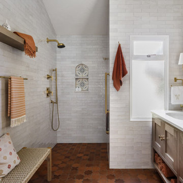
Inspiration for a large transitional master white tile and porcelain tile porcelain tile, orange floor, double-sink and vaulted ceiling double shower remodel in Seattle with light wood cabinets, a one-piece toilet, beige walls, an undermount sink, quartz countertops, white countertops, a niche, a floating vanity and shaker cabinets
Sponsored
Fredericksburg, OH

High Point Cabinets
Columbus' Experienced Custom Cabinet Builder | 4x Best of Houzz Winner

 Total System Service
As a manager of a building or property, you quickly learn the art of mediation. One minute you may be working with a vendor to keep the building’s operating system running efficient and smooth; the next moment you may be calming a tenant down after finding the change in the system disrupted his office’s workflow. Give and take; it’s the only way to make sure every day runs perfectly.
Overall, you have two goals to strive for in everything you do.
1. Keep the building running properly, upgrading systems as appropriate, and striving to do all you can on a pre-established budget.
2. Keep the building occupants happy, with as little disruption as possible.
While some changes are minor, barely registering on a building occupant’s mind, with HVAC challenges, that’s rarely the case. If a HVAC contractor is replacing an air handler, for instance, and disconnects one and moves to the next unit, it may cause major disruptions to sensitive areas of a building. And if the occupant wasn’t prepared for the disruption, you can have a mighty unhappy customer on your hand.
Anytime you are working on HVAC projects throughout your building, there are strategies you can put into place to keep things running smooth.
Communicate with occupants
Communication is key to any good relationship, and as a property manager, this rule is a great place to start. If you will be working with the HVAC equipment, block out the timeframe for work to be done, and understand the potential consequences of the process. Then communicate this process with every point of contact you have throughout the building. The more detail you can provide, the less surprises you’ll have throughout the process. You can also work with your building’s occupants before the process begins, finding out if there are better timeframes than others.
Establish a realistic schedule
As a property manager, its easy to provide your expectations for the HVAC project at hand, and request that the proposal be written in such a way that work is completed on your timeframe. Unfortunately, many contractors want your business and will agree to anything upfront in order to win the bid, knowing full well the work will take longer than specified. Instead of projecting your timeframes into the proposal process, ask for HVAC project bids to establish realistic schedules of how long the process will take, and what areas of your property will be most effected throughout the schedule. This will help you avoid crises between you and the contractor, and you and your tenants.
Plan for the whole system
If one small piece of your HVAC system is weak, its easy to fix that one small piece. But how will that impact your overall system? Will it cause weak spots in different parts of the building – maybe a corner office will have reduced air flow, and therefore be colder in the winter and warmer in the summer? When retrofitting new pieces with older existing systems, its easy to reduce the efficiency of your entire system. Before agreeing to certain repairs, make sure you understand how it will impact your entire system overall. An easy way of handling this problem is by working with the same HVAC contractor again and again, He will understand your system’s potential, and know when to make repairs, and when to replace.
Have points of contact available for immediate assistance
In many cases, problems arise because connections can’t be made. Can the HVAC contractor get a hold or you or another person that can make decisions at a moments notice if a problem arises? Do you have access to decision makers throughout the building that may be impacted by this change? Many projects have been put on hold simply because a person in authority can’t be found to give the go-ahead to move forward. If you have access to these people during the time of the project, you’ll be able to complete the project in record time.
Test
Finally, if you can test things in stages, or test when the potential for problems is the smallest, you reduce the chances of bigger emergency issues falling into your lap. If you’ll be installing a new terminal unit, can you make the switch on a Saturday morning when the building is largely unoccupied? If you’re replacing a large system, can you replace and test in phases so the entire project isn’t released at once?
Most issues can be avoided with just a little strategy from the beginning. If you’ve never had a HVAC maintenance team to help you stay on track with your building’s heating and cooling, now may be the time to find out how easy a team approach makes the process.

 Kitchen Design Concepts
This super transformative kitchen has become one of our favorites when it comes to how much it changed! Plus, not only does It have all the qualities of what’s on trend, but also has qualities of what’s going to last long-term. We love the brightness of the white cabinets on the perimeter paired with the warmer grey cabinets on the island. If you compare it with the original, it’s essentially night and day! Curious to learn more? Keep reading!
Cabinets
The biggest change to the space is the cabinetry. For the perimeter, we painted it white while painting the island a dark grey. In addition, the bar-height walls surrounding the island was reduced to a counter-height which helped open up the kitchen even more.
Countertops
Introducing even more warmth to the space, we spec’ed a 3 cm Caesarstone Quartz in London Grey. This is a great option if you’re looking for a material that has a marble look but want something a little more durable and low maintenance.
Backsplash
For backsplash we selected a 3×6 Arizona Tile H-Line series, in Pumice installed in a brick lay as field tile. As an insert in the main backsplash, we installed a Soci Oxford Blend in a Valencia Pattern.
remodel your kitchen island
Fixtures and Finishes
From Blanco, we have a Silgranit 1 & ¾ sink in the color Truffle. From Newport Brass, we have a Jacobean pulldown faucet in Satin Gold and a Jacobean cold water dispenser also in Satin Gold. From Mountain Plumbing, we have an air disposal switch in satin gold. As for hardware, we installed Top Knobs pulls on doors and drawer fronts in their gold finish.
 Katie Hutchison Studio
The new owners of this house in Harvard, Massachusetts loved its location and authentic Shaker characteristics, but weren’t fans of its curious layout. A dated first-floor full bathroom could only be accessed by going up a few steps to a landing, opening the bathroom door and then going down the same number of steps to enter the room. The dark kitchen faced the driveway to the north, rather than the bucolic backyard fields to the south. The dining space felt more like an enlarged hall and could only comfortably seat four. Upstairs, a den/office had a woefully low ceiling; the master bedroom had limited storage, and a sad full bathroom featured a cramped shower.
KHS proposed a number of changes to create an updated home where the owners could enjoy cooking, entertaining, and being connected to the outdoors from the first-floor living spaces, while also experiencing more inviting and more functional private spaces upstairs.
On the first floor, the primary change was to capture space that had been part of an upper-level screen porch and convert it to interior space. To make the interior expansion seamless, we raised the floor of the area that had been the upper-level porch, so it aligns with the main living level, and made sure there would be no soffits in the planes of the walls we removed. We also raised the floor of the remaining lower-level porch to reduce the number of steps required to circulate from it to the newly expanded interior. New patio door systems now fill the arched openings that used to be infilled with screen. The exterior interventions (which also included some new casement windows in the dining area) were designed to be subtle, while affording significant improvements on the interior. Additionally, the first-floor bathroom was reconfigured, shifting one of its walls to widen the dining space, and moving the entrance to the bathroom from the stair landing to the kitchen instead.
These changes (which involved significant structural interventions) resulted in a much more open space to accommodate a new kitchen with a view of the lush backyard and a new dining space defined by a new built-in banquette that comfortably seats six, and -- with the addition of a table extension -- up to eight people.
Upstairs in the den/office, replacing the low, board ceiling with a raised, plaster, tray ceiling that springs from above the original board-finish walls – newly painted a light color -- created a much more inviting, bright, and expansive space. Re-configuring the master bath to accommodate a larger shower and adding built-in storage cabinets in the master bedroom improved comfort and function. A new whole-house color palette rounds out the improvements.
Photos by Katie Hutchison

 Roland Oehme Landscape Architecture
This is an urban single family home situated on a narrow lot that is about 1/8 of an acre and is only 2 blocks from the Pacific Ocean. I designed a completely new garden and installed everything along with the client’s help. The garden I designed consisted of an ornamental grass garden, a xeriscape garden with decomposed granite mounds, fruit trees and shrubs located throughout, a jungle forest garden, and raised brick vegetable beds in the rear. Previously, there was a wood deck covering almost the entire property that was removed by the owner. We installed root guard around all of the walkways. I installed the raised brick vegetable beds and walkways around the vegetable beds. Many of the plants were chosen to provide food and habitat for pollinators as well. Dozens of fruiting plants were located in the garden. So, it is called the “Garden of Eatin”.
Landscape design and photo by Roland Oehme
 Lighting EVER
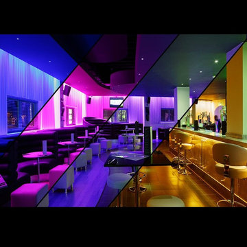
12V Flexible RGB LED Strip Lights, Multi-colored, 150 Units 5050 LEDs, Non-waterproof, 16.4Ft 5M Spool, LED Rope Light
Color: Multi color
Size of LEDs: 5050 (5.0mm*5.0mm)
Length of a tape: 5m
LEDs Quantity: 150
Working Voltage: 12 V DC
Waterproof: No
Brightness (lm/m) : 360 (only when white light)
Easy Installation. Plug and play without wiring.
Safe to use. the working voltage is 12V. Extremely low heat. It is touchable and safe to children.
Cuttable and linkable. It can be cut every 3 LEDs along the cutting marks, without damaging the rest strips.
Flexible operations. Slim, compact and flexible PCB strip. Mount end-to-end for bendable or angled patterns, or in continuous rows.
Reduce re-lamp frequency. Lifespan is over 50,000 hrs. Save effort and maintenance costs on changing lights frequently.
Eco-friendly. RoHS compliant. No battery. No lead or mercury. No UV or IR Radiation.
Application: Widely used for home, automobile, bicycle, hotels, clubs, shopping mails and architectural decoration emergency & security and ad sign lighting, decorative lights for holiday, event, show exhibition.

 Thinkterior LLC
Oasis in the Desert
You can find a whole lot of fun ready for the kids in this fun contemporary play-yard in the dessert.
Theme:
The overall theme of the play-yard is a blend of creative and active outdoor play that blends with the contemporary styling of this beautiful home.
Focus:
The overall focus for the design of this amazing play-yard was to provide this family with an outdoor space that would foster an active and creative playtime for their children of various ages. The visual focus of this space is the 15-foot tree placed in the middle of the turf yard. This fantastic structure beacons the children to climb the mini stumps and enjoy the slide or swing happily from the branches all the while creating a touch of whimsical nature not typically found in the desert.
Surrounding the tree the play-yard offers an array of activities for these lucky children from the chalkboard walls to create amazing pictures to the custom ball wall to practice their skills, the custom myWall system provides endless options for the kids and parents to keep the space exciting and new. Rock holds easily clip into the wall offering ever changing climbing routes, custom water toys and games can also be adapted to the wall to fit the fun of the day.
Storage:
The myWall system offers various storage options including shelving, closed cases or hanging baskets all of which can be moved to alternate locations on the wall as the homeowners want to customize the play-yard.
Growth:
The myWall system is built to grow with the users whether it is with changing taste, updating design or growing children, all the accessories can be moved or replaced while leaving the main frame in place. The materials used throughout the space were chosen for their durability and ability to withstand the harsh conditions for many years. The tree also includes 3 levels of swings offering children of varied ages the chance to swing from the branches.
Safety:
Safety is of critical concern with any play-yard and a space in the harsh conditions of the desert presented specific concerns which were addressed with light colored materials to reflect the sun and reduce heat buildup and stainless steel hardware was used to avoid rusting. The myWall accessories all use a locking mechanism which allows for easy adjustments but also securely locks the pieces into place once set. The flooring in the treehouse was also textured to eliminate skidding.
 Katie Hutchison Studio
The new owners of this house in Harvard, Massachusetts loved its location and authentic Shaker characteristics, but weren’t fans of its curious layout. A dated first-floor full bathroom could only be accessed by going up a few steps to a landing, opening the bathroom door and then going down the same number of steps to enter the room. The dark kitchen faced the driveway to the north, rather than the bucolic backyard fields to the south. The dining space felt more like an enlarged hall and could only comfortably seat four. Upstairs, a den/office had a woefully low ceiling; the master bedroom had limited storage, and a sad full bathroom featured a cramped shower.
KHS proposed a number of changes to create an updated home where the owners could enjoy cooking, entertaining, and being connected to the outdoors from the first-floor living spaces, while also experiencing more inviting and more functional private spaces upstairs.
On the first floor, the primary change was to capture space that had been part of an upper-level screen porch and convert it to interior space. To make the interior expansion seamless, we raised the floor of the area that had been the upper-level porch, so it aligns with the main living level, and made sure there would be no soffits in the planes of the walls we removed. We also raised the floor of the remaining lower-level porch to reduce the number of steps required to circulate from it to the newly expanded interior. New patio door systems now fill the arched openings that used to be infilled with screen. The exterior interventions (which also included some new casement windows in the dining area) were designed to be subtle, while affording significant improvements on the interior. Additionally, the first-floor bathroom was reconfigured, shifting one of its walls to widen the dining space, and moving the entrance to the bathroom from the stair landing to the kitchen instead.
These changes (which involved significant structural interventions) resulted in a much more open space to accommodate a new kitchen with a view of the lush backyard and a new dining space defined by a new built-in banquette that comfortably seats six, and -- with the addition of a table extension -- up to eight people.
Upstairs in the den/office, replacing the low, board ceiling with a raised, plaster, tray ceiling that springs from above the original board-finish walls – newly painted a light color -- created a much more inviting, bright, and expansive space. Re-configuring the master bath to accommodate a larger shower and adding built-in storage cabinets in the master bedroom improved comfort and function. A new whole-house color palette rounds out the improvements.
Photos by Katie Hutchison
 Katie Hutchison Studio
The new owners of this house in Harvard, Massachusetts loved its location and authentic Shaker characteristics, but weren’t fans of its curious layout. A dated first-floor full bathroom could only be accessed by going up a few steps to a landing, opening the bathroom door and then going down the same number of steps to enter the room. The dark kitchen faced the driveway to the north, rather than the bucolic backyard fields to the south. The dining space felt more like an enlarged hall and could only comfortably seat four. Upstairs, a den/office had a woefully low ceiling; the master bedroom had limited storage, and a sad full bathroom featured a cramped shower.
KHS proposed a number of changes to create an updated home where the owners could enjoy cooking, entertaining, and being connected to the outdoors from the first-floor living spaces, while also experiencing more inviting and more functional private spaces upstairs.
On the first floor, the primary change was to capture space that had been part of an upper-level screen porch and convert it to interior space. To make the interior expansion seamless, we raised the floor of the area that had been the upper-level porch, so it aligns with the main living level, and made sure there would be no soffits in the planes of the walls we removed. We also raised the floor of the remaining lower-level porch to reduce the number of steps required to circulate from it to the newly expanded interior. New patio door systems now fill the arched openings that used to be infilled with screen. The exterior interventions (which also included some new casement windows in the dining area) were designed to be subtle, while affording significant improvements on the interior. Additionally, the first-floor bathroom was reconfigured, shifting one of its walls to widen the dining space, and moving the entrance to the bathroom from the stair landing to the kitchen instead.
These changes (which involved significant structural interventions) resulted in a much more open space to accommodate a new kitchen with a view of the lush backyard and a new dining space defined by a new built-in banquette that comfortably seats six, and -- with the addition of a table extension -- up to eight people.
Upstairs in the den/office, replacing the low, board ceiling with a raised, plaster, tray ceiling that springs from above the original board-finish walls – newly painted a light color -- created a much more inviting, bright, and expansive space. Re-configuring the master bath to accommodate a larger shower and adding built-in storage cabinets in the master bedroom improved comfort and function. A new whole-house color palette rounds out the improvements.
Photos by Katie Hutchison
 Kitchen Design Concepts
This super transformative kitchen has become one of our favorites when it comes to how much it changed! Plus, not only does It have all the qualities of what’s on trend, but also has qualities of what’s going to last long-term. We love the brightness of the white cabinets on the perimeter paired with the warmer grey cabinets on the island. If you compare it with the original, it’s essentially night and day! Curious to learn more? Keep reading!
Cabinets
The biggest change to the space is the cabinetry. For the perimeter, we painted it white while painting the island a dark grey. In addition, the bar-height walls surrounding the island was reduced to a counter-height which helped open up the kitchen even more.
Countertops
Introducing even more warmth to the space, we spec’ed a 3 cm Caesarstone Quartz in London Grey. This is a great option if you’re looking for a material that has a marble look but want something a little more durable and low maintenance.
Backsplash
For backsplash we selected a 3×6 Arizona Tile H-Line series, in Pumice installed in a brick lay as field tile. As an insert in the main backsplash, we installed a Soci Oxford Blend in a Valencia Pattern.
remodel your kitchen island
Fixtures and Finishes
From Blanco, we have a Silgranit 1 & ¾ sink in the color Truffle. From Newport Brass, we have a Jacobean pulldown faucet in Satin Gold and a Jacobean cold water dispenser also in Satin Gold. From Mountain Plumbing, we have an air disposal switch in satin gold. As for hardware, we installed Top Knobs pulls on doors and drawer fronts in their gold finish.

 Smith & Sons Renovations & Extensions New Zealand
This executive home in the Christchurch Port Hills underwent some major works including the installation of a new kitchen, a new laundry and new media room. Soundproofing was also on the client's wishlist so solutions were found in the installation of new windows and a ventilation system. The exterior cladding and upper level deck and balustratde were also replaced.
Internally a new kitchen and laundry room was designed in conjunction with kitchen designer Nicky Claridge. Contrasting black and white handle-free cabinetry was chosen for the kitchen and an engineered oak floor. A white central bench maintains the black and white theme and provides a central entertaining space and the large wallpaper panel behind the clear splashback completes this kitchen's unique look. The laundry was designed to produce an efficient and functional space with maximum storage.
The new media room included an overhead projection on to a specially imported screen from the US which linked to the client's computer network to allow for gaming as well as movies. The hallway was also painted and specialty wallpaper was chosen for redecoration of a further 2 rooms in the house.
Externally the home was re-clad on the second storey, the existing polystyrene cladding system was removed and replaced with a barrier to provide bracing and sound and air seals. On top of this the large panel James Hardie Oblique board was chosen to give the traditional ship-lap style in keeping with the original building. The decking outside on the upper level balcony was also replaced with a hard wearing and low maintenance synthetic deck material by Outdure. The new balustrade was a bespoke steel to match the traditional look of the building and was manufactured by Christchurch Wrought Iron.
All of the windows were replaced on the upper level of the house. Working with the client and the glass supplier Fairview Windows, the aim was to produce a glass configuration that reduced traffic noise as much as possible. The new windows were installed with sound seals to further reduce sound as much as possible.
A mechanical ventilation system was also installed to allow the internal environment to be well ventilated without opening the windows and doors, creating a quieter and healthier home.
Working with Smith & Sons Christchurch Port Hills to project manage the various renovation works, the client achieved many changes and improvements to their home.
 Katie Hutchison Studio
The new owners of this house in Harvard, Massachusetts loved its location and authentic Shaker characteristics, but weren’t fans of its curious layout. A dated first-floor full bathroom could only be accessed by going up a few steps to a landing, opening the bathroom door and then going down the same number of steps to enter the room. The dark kitchen faced the driveway to the north, rather than the bucolic backyard fields to the south. The dining space felt more like an enlarged hall and could only comfortably seat four. Upstairs, a den/office had a woefully low ceiling; the master bedroom had limited storage, and a sad full bathroom featured a cramped shower.
KHS proposed a number of changes to create an updated home where the owners could enjoy cooking, entertaining, and being connected to the outdoors from the first-floor living spaces, while also experiencing more inviting and more functional private spaces upstairs.
On the first floor, the primary change was to capture space that had been part of an upper-level screen porch and convert it to interior space. To make the interior expansion seamless, we raised the floor of the area that had been the upper-level porch, so it aligns with the main living level, and made sure there would be no soffits in the planes of the walls we removed. We also raised the floor of the remaining lower-level porch to reduce the number of steps required to circulate from it to the newly expanded interior. New patio door systems now fill the arched openings that used to be infilled with screen. The exterior interventions (which also included some new casement windows in the dining area) were designed to be subtle, while affording significant improvements on the interior. Additionally, the first-floor bathroom was reconfigured, shifting one of its walls to widen the dining space, and moving the entrance to the bathroom from the stair landing to the kitchen instead.
These changes (which involved significant structural interventions) resulted in a much more open space to accommodate a new kitchen with a view of the lush backyard and a new dining space defined by a new built-in banquette that comfortably seats six, and -- with the addition of a table extension -- up to eight people.
Upstairs in the den/office, replacing the low, board ceiling with a raised, plaster, tray ceiling that springs from above the original board-finish walls – newly painted a light color -- created a much more inviting, bright, and expansive space. Re-configuring the master bath to accommodate a larger shower and adding built-in storage cabinets in the master bedroom improved comfort and function. A new whole-house color palette rounds out the improvements.
Photos by Katie Hutchison
 User
Anchored by the homeowner’s 42-foot-long painting, the interiors of this Palm Springs residence were designed to showcase the owner’s art collection, and create functional spaces for daily living that can be easily adapted for large social gatherings.
Referencing the environment and architecture in both form and material, the finishes and custom furnishings bring the interior to life. Alluding to the roofs that suspend over the building, the sofas seem to hover above the carpets while the knife-edge table top appears to float above a metal base. Bleached and cerused wood mimic the “desert effect” that would naturally occur in this environment, while the textiles on the sofa are the same shade as the rocks of the landscape.
Monolithic concrete floors connect all of the spaces while concealing mechanical systems, and stone thresholds signal vertical level changes and exterior transitions. Large wall masses provide the optimal backdrop for the homeowner’s oversized art. The wall structures ground the interior, while the opposing expanses of glass frame the desert views. The location and use of operable doors and windows allows the house to naturally ventilate, reducing cooling loads. The furnishings create spaces in an architectural fashion.
Designed and fabricated for flexibility, the pieces easily accommodate the owners’ large social gatherings. The dining table can be split into two and the sofas can be pushed out along the walls, opening the center of the space to entertain. The design of the interior spaces and furnishings seamlessly integrates the setting, architecture, artwork and spaces into a cohesive whole.
 Katie Hutchison Studio
The new owners of this house in Harvard, Massachusetts loved its location and authentic Shaker characteristics, but weren’t fans of its curious layout. A dated first-floor full bathroom could only be accessed by going up a few steps to a landing, opening the bathroom door and then going down the same number of steps to enter the room. The dark kitchen faced the driveway to the north, rather than the bucolic backyard fields to the south. The dining space felt more like an enlarged hall and could only comfortably seat four. Upstairs, a den/office had a woefully low ceiling; the master bedroom had limited storage, and a sad full bathroom featured a cramped shower.
KHS proposed a number of changes to create an updated home where the owners could enjoy cooking, entertaining, and being connected to the outdoors from the first-floor living spaces, while also experiencing more inviting and more functional private spaces upstairs.
On the first floor, the primary change was to capture space that had been part of an upper-level screen porch and convert it to interior space. To make the interior expansion seamless, we raised the floor of the area that had been the upper-level porch, so it aligns with the main living level, and made sure there would be no soffits in the planes of the walls we removed. We also raised the floor of the remaining lower-level porch to reduce the number of steps required to circulate from it to the newly expanded interior. New patio door systems now fill the arched openings that used to be infilled with screen. The exterior interventions (which also included some new casement windows in the dining area) were designed to be subtle, while affording significant improvements on the interior. Additionally, the first-floor bathroom was reconfigured, shifting one of its walls to widen the dining space, and moving the entrance to the bathroom from the stair landing to the kitchen instead.
These changes (which involved significant structural interventions) resulted in a much more open space to accommodate a new kitchen with a view of the lush backyard and a new dining space defined by a new built-in banquette that comfortably seats six, and -- with the addition of a table extension -- up to eight people.
Upstairs in the den/office, replacing the low, board ceiling with a raised, plaster, tray ceiling that springs from above the original board-finish walls – newly painted a light color -- created a much more inviting, bright, and expansive space. Re-configuring the master bath to accommodate a larger shower and adding built-in storage cabinets in the master bedroom improved comfort and function. A new whole-house color palette rounds out the improvements.
Photos by Katie Hutchison
43