
Search results for "Reduce changed" in Home Design Ideas

 ZeroEnergy Design
 (ZED) created this modern home for a progressive family in the desirable community of Lexington.
Thoughtful Land Connection. The residence is carefully sited on the infill lot so as to create privacy from the road and neighbors, while cultivating a side yard that captures the southern sun. The terraced grade rises to meet the house, allowing for it to maintain a structured connection with the ground while also sitting above the high water table. The elevated outdoor living space maintains a strong connection with the indoor living space, while the stepped edge ties it back to the true ground plane. Siting and outdoor connections were completed by ZED in collaboration with landscape designer Soren Deniord Design Studio.
Exterior Finishes and Solar. The exterior finish materials include a palette of shiplapped wood siding, through-colored fiber cement panels and stucco. A rooftop parapet hides the solar panels above, while a gutter and site drainage system directs rainwater into an irrigation cistern and dry wells that recharge the groundwater.
Cooking, Dining, Living. Inside, the kitchen, fabricated by Henrybuilt, is located between the indoor and outdoor dining areas. The expansive south-facing sliding door opens to seamlessly connect the spaces, using a retractable awning to provide shade during the summer while still admitting the warming winter sun. The indoor living space continues from the dining areas across to the sunken living area, with a view that returns again to the outside through the corner wall of glass.
Accessible Guest Suite. The design of the first level guest suite provides for both aging in place and guests who regularly visit for extended stays. The patio off the north side of the house affords guests their own private outdoor space, and privacy from the neighbor. Similarly, the second level master suite opens to an outdoor private roof deck.
Light and Access. The wide open interior stair with a glass panel rail leads from the top level down to the well insulated basement. The design of the basement, used as an away/play space, addresses the need for both natural light and easy access. In addition to the open stairwell, light is admitted to the north side of the area with a high performance, Passive House (PHI) certified skylight, covering a six by sixteen foot area. On the south side, a unique roof hatch set flush with the deck opens to reveal a glass door at the base of the stairwell which provides additional light and access from the deck above down to the play space.
Energy. Energy consumption is reduced by the high performance building envelope, high efficiency mechanical systems, and then offset with renewable energy. All windows and doors are made of high performance triple paned glass with thermally broken aluminum frames. The exterior wall assembly employs dense pack cellulose in the stud cavity, a continuous air barrier, and four inches exterior rigid foam insulation. The 10kW rooftop solar electric system provides clean energy production. The final air leakage testing yielded 0.6 ACH 50 - an extremely air tight house, a testament to the well-designed details, progress testing and quality construction. When compared to a new house built to code requirements, this home consumes only 19% of the energy.
Architecture & Energy Consulting: ZeroEnergy Design
Landscape Design: Soren Deniord Design
Paintings: Bernd Haussmann Studio
Photos: Eric Roth Photography


 Carlton Edwards
The Cherry Road project is a humble yet striking example of how small changes can have a big impact. A meaningful project as the final room to be renovated in this house, thus our completion aligned with the family’s move-in. The kitchen posed a number of problems the design worked to remedy. Such as an existing window oriented the room towards a neighboring driveway. The initial design move sought to reorganize the space internally, focusing the view from the sink back through the house to the pool and courtyard beyond. This simple repositioning allowed the range to center on the opposite wall, flanked by two windows that reduce direct views to the driveway while increasing the natural light of the space.
Opposite that opening to the dining room, we created a new custom hutch that has the upper doors bypass doors incorporate an antique mirror, then led they magnified the light and view opposite side of the room. The ceilings we were confined to eight-foot four, so we wanted to create as much verticality as possible. All the cabinetry was designed to go to the ceiling, incorporating a simple coat mold at the ceiling. The west wall of the kitchen is primarily floor-to-ceiling storage behind paneled doors. So the refrigeration and freezers are fully integrated.
Find the right local pro for your project


 Visbeen Architects
Rear Exterior
Photographer: Ashley Avila Photography
Modern exterior home idea in Grand Rapids
Modern exterior home idea in Grand Rapids

 Katie Hutchison Studio
The new owners of this house in Harvard, Massachusetts loved its location and authentic Shaker characteristics, but weren’t fans of its curious layout. A dated first-floor full bathroom could only be accessed by going up a few steps to a landing, opening the bathroom door and then going down the same number of steps to enter the room. The dark kitchen faced the driveway to the north, rather than the bucolic backyard fields to the south. The dining space felt more like an enlarged hall and could only comfortably seat four. Upstairs, a den/office had a woefully low ceiling; the master bedroom had limited storage, and a sad full bathroom featured a cramped shower.
KHS proposed a number of changes to create an updated home where the owners could enjoy cooking, entertaining, and being connected to the outdoors from the first-floor living spaces, while also experiencing more inviting and more functional private spaces upstairs.
On the first floor, the primary change was to capture space that had been part of an upper-level screen porch and convert it to interior space. To make the interior expansion seamless, we raised the floor of the area that had been the upper-level porch, so it aligns with the main living level, and made sure there would be no soffits in the planes of the walls we removed. We also raised the floor of the remaining lower-level porch to reduce the number of steps required to circulate from it to the newly expanded interior. New patio door systems now fill the arched openings that used to be infilled with screen. The exterior interventions (which also included some new casement windows in the dining area) were designed to be subtle, while affording significant improvements on the interior. Additionally, the first-floor bathroom was reconfigured, shifting one of its walls to widen the dining space, and moving the entrance to the bathroom from the stair landing to the kitchen instead.
These changes (which involved significant structural interventions) resulted in a much more open space to accommodate a new kitchen with a view of the lush backyard and a new dining space defined by a new built-in banquette that comfortably seats six, and -- with the addition of a table extension -- up to eight people.
Upstairs in the den/office, replacing the low, board ceiling with a raised, plaster, tray ceiling that springs from above the original board-finish walls – newly painted a light color -- created a much more inviting, bright, and expansive space. Re-configuring the master bath to accommodate a larger shower and adding built-in storage cabinets in the master bedroom improved comfort and function. A new whole-house color palette rounds out the improvements.
Photos by Katie Hutchison

 Kitchen Design Concepts
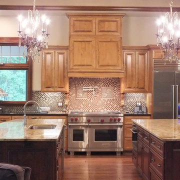
This super transformative kitchen has become one of our favorites when it comes to how much it changed! Plus, not only does It have all the qualities of what’s on trend, but also has qualities of what’s going to last long-term. We love the brightness of the white cabinets on the perimeter paired with the warmer grey cabinets on the island. If you compare it with the original, it’s essentially night and day! Curious to learn more? Keep reading!
Cabinets
The biggest change to the space is the cabinetry. For the perimeter, we painted it white while painting the island a dark grey. In addition, the bar-height walls surrounding the island was reduced to a counter-height which helped open up the kitchen even more.
Countertops
Introducing even more warmth to the space, we spec’ed a 3 cm Caesarstone Quartz in London Grey. This is a great option if you’re looking for a material that has a marble look but want something a little more durable and low maintenance.
Backsplash
For backsplash we selected a 3×6 Arizona Tile H-Line series, in Pumice installed in a brick lay as field tile. As an insert in the main backsplash, we installed a Soci Oxford Blend in a Valencia Pattern.
remodel your kitchen island
Fixtures and Finishes
From Blanco, we have a Silgranit 1 & ¾ sink in the color Truffle. From Newport Brass, we have a Jacobean pulldown faucet in Satin Gold and a Jacobean cold water dispenser also in Satin Gold. From Mountain Plumbing, we have an air disposal switch in satin gold. As for hardware, we installed Top Knobs pulls on doors and drawer fronts in their gold finish.
Sponsored
Fredericksburg, OH

High Point Cabinets
Columbus' Experienced Custom Cabinet Builder | 4x Best of Houzz Winner
 Kitchen Design Concepts
This super transformative kitchen has become one of our favorites when it comes to how much it changed! Plus, not only does It have all the qualities of what’s on trend, but also has qualities of what’s going to last long-term. We love the brightness of the white cabinets on the perimeter paired with the warmer grey cabinets on the island. If you compare it with the original, it’s essentially night and day! Curious to learn more? Keep reading!
Cabinets
The biggest change to the space is the cabinetry. For the perimeter, we painted it white while painting the island a dark grey. In addition, the bar-height walls surrounding the island was reduced to a counter-height which helped open up the kitchen even more.
Countertops
Introducing even more warmth to the space, we spec’ed a 3 cm Caesarstone Quartz in London Grey. This is a great option if you’re looking for a material that has a marble look but want something a little more durable and low maintenance.
Backsplash
For backsplash we selected a 3×6 Arizona Tile H-Line series, in Pumice installed in a brick lay as field tile. As an insert in the main backsplash, we installed a Soci Oxford Blend in a Valencia Pattern.
remodel your kitchen island
Fixtures and Finishes
From Blanco, we have a Silgranit 1 & ¾ sink in the color Truffle. From Newport Brass, we have a Jacobean pulldown faucet in Satin Gold and a Jacobean cold water dispenser also in Satin Gold. From Mountain Plumbing, we have an air disposal switch in satin gold. As for hardware, we installed Top Knobs pulls on doors and drawer fronts in their gold finish.

 Pacific Garden Design
After moving into a mid-century ranch home on Spokane's South Hill, these homeowners gave the tired landscape a dramatic makeover. The aging asphalt driveway was replaced by precast concrete pavers that coordinate with a new walkway of sandwashed concrete pads. A pared-down front lawn reduces the overall water use of the landscape, while sculptural boulders add character. A small flagstone patio creates a spot to enjoy the outdoors in the courtyard-like area between the house and the towering ponderosa pines. The backyard received a similar update, with a new garden area, water feature, and paver patio anchoring the updated space.

 User
Anchored by the homeowner’s 42-foot-long painting, the interiors of this Palm Springs residence were designed to showcase the owner’s art collection, and create functional spaces for daily living that can be easily adapted for large social gatherings.
Referencing the environment and architecture in both form and material, the finishes and custom furnishings bring the interior to life. Alluding to the roofs that suspend over the building, the sofas seem to hover above the carpets while the knife-edge table top appears to float above a metal base. Bleached and cerused wood mimic the “desert effect” that would naturally occur in this environment, while the textiles on the sofa are the same shade as the rocks of the landscape.
Monolithic concrete floors connect all of the spaces while concealing mechanical systems, and stone thresholds signal vertical level changes and exterior transitions. Large wall masses provide the optimal backdrop for the homeowner’s oversized art. The wall structures ground the interior, while the opposing expanses of glass frame the desert views. The location and use of operable doors and windows allows the house to naturally ventilate, reducing cooling loads. The furnishings create spaces in an architectural fashion.
Designed and fabricated for flexibility, the pieces easily accommodate the owners’ large social gatherings. The dining table can be split into two and the sofas can be pushed out along the walls, opening the center of the space to entertain. The design of the interior spaces and furnishings seamlessly integrates the setting, architecture, artwork and spaces into a cohesive whole.
 Kitchen Design Concepts
This super transformative kitchen has become one of our favorites when it comes to how much it changed! Plus, not only does It have all the qualities of what’s on trend, but also has qualities of what’s going to last long-term. We love the brightness of the white cabinets on the perimeter paired with the warmer grey cabinets on the island. If you compare it with the original, it’s essentially night and day! Curious to learn more? Keep reading!
Cabinets
The biggest change to the space is the cabinetry. For the perimeter, we painted it white while painting the island a dark grey. In addition, the bar-height walls surrounding the island was reduced to a counter-height which helped open up the kitchen even more.
Countertops
Introducing even more warmth to the space, we spec’ed a 3 cm Caesarstone Quartz in London Grey. This is a great option if you’re looking for a material that has a marble look but want something a little more durable and low maintenance.
Backsplash
For backsplash we selected a 3×6 Arizona Tile H-Line series, in Pumice installed in a brick lay as field tile. As an insert in the main backsplash, we installed a Soci Oxford Blend in a Valencia Pattern.
remodel your kitchen island
Fixtures and Finishes
From Blanco, we have a Silgranit 1 & ¾ sink in the color Truffle. From Newport Brass, we have a Jacobean pulldown faucet in Satin Gold and a Jacobean cold water dispenser also in Satin Gold. From Mountain Plumbing, we have an air disposal switch in satin gold. As for hardware, we installed Top Knobs pulls on doors and drawer fronts in their gold finish.

 Thinkterior LLC
Oasis in the Desert
You can find a whole lot of fun ready for the kids in this fun contemporary play-yard in the dessert.
Theme:
The overall theme of the play-yard is a blend of creative and active outdoor play that blends with the contemporary styling of this beautiful home.
Focus:
The overall focus for the design of this amazing play-yard was to provide this family with an outdoor space that would foster an active and creative playtime for their children of various ages. The visual focus of this space is the 15-foot tree placed in the middle of the turf yard. This fantastic structure beacons the children to climb the mini stumps and enjoy the slide or swing happily from the branches all the while creating a touch of whimsical nature not typically found in the desert.
Surrounding the tree the play-yard offers an array of activities for these lucky children from the chalkboard walls to create amazing pictures to the custom ball wall to practice their skills, the custom myWall system provides endless options for the kids and parents to keep the space exciting and new. Rock holds easily clip into the wall offering ever changing climbing routes, custom water toys and games can also be adapted to the wall to fit the fun of the day.
Storage:
The myWall system offers various storage options including shelving, closed cases or hanging baskets all of which can be moved to alternate locations on the wall as the homeowners want to customize the play-yard.
Growth:
The myWall system is built to grow with the users whether it is with changing taste, updating design or growing children, all the accessories can be moved or replaced while leaving the main frame in place. The materials used throughout the space were chosen for their durability and ability to withstand the harsh conditions for many years. The tree also includes 3 levels of swings offering children of varied ages the chance to swing from the branches.
Safety:
Safety is of critical concern with any play-yard and a space in the harsh conditions of the desert presented specific concerns which were addressed with light colored materials to reflect the sun and reduce heat buildup and stainless steel hardware was used to avoid rusting. The myWall accessories all use a locking mechanism which allows for easy adjustments but also securely locks the pieces into place once set. The flooring in the treehouse was also textured to eliminate skidding.
 User
Anchored by the homeowner’s 42-foot-long painting, the interiors of this Palm Springs residence were designed to showcase the owner’s art collection, and create functional spaces for daily living that can be easily adapted for large social gatherings.
Referencing the environment and architecture in both form and material, the finishes and custom furnishings bring the interior to life. Alluding to the roofs that suspend over the building, the sofas seem to hover above the carpets while the knife-edge table top appears to float above a metal base. Bleached and cerused wood mimic the “desert effect” that would naturally occur in this environment, while the textiles on the sofa are the same shade as the rocks of the landscape.
Monolithic concrete floors connect all of the spaces while concealing mechanical systems, and stone thresholds signal vertical level changes and exterior transitions. Large wall masses provide the optimal backdrop for the homeowner’s oversized art. The wall structures ground the interior, while the opposing expanses of glass frame the desert views. The location and use of operable doors and windows allows the house to naturally ventilate, reducing cooling loads. The furnishings create spaces in an architectural fashion.
Designed and fabricated for flexibility, the pieces easily accommodate the owners’ large social gatherings. The dining table can be split into two and the sofas can be pushed out along the walls, opening the center of the space to entertain. The design of the interior spaces and furnishings seamlessly integrates the setting, architecture, artwork and spaces into a cohesive whole.


 Robert Miller FAIA Architects
Images by Nic LeHoux
Designed as a home and studio for a photographer and his young family, Lightbox is located on a peninsula that extends south from British Columbia across the border to Point Roberts. The densely forested site lies beside a 180-acre park that overlooks the Strait of Georgia, the San Juan Islands and the Puget Sound.
Having experienced the world from under a black focusing cloth and large format camera lens, the photographer has a special fondness for simplicity and an appreciation of unique, genuine and well-crafted details.
The home was made decidedly modest, in size and means, with a building skin utilizing simple materials in a straightforward yet innovative configuration. The result is a structure crafted from affordable and common materials such as exposed wood two-bys that form the structural frame and directly support a prefabricated aluminum window system of standard glazing units uniformly sized to reduce the complexity and overall cost.
Accessed from the west on a sloped boardwalk that bisects its two contrasting forms, the house sits lightly on the land above the forest floor.
A south facing two-story glassy cage for living captures the sun and view as it celebrates the interplay of light and shadow in the forest. To the north, stairs are contained in a thin wooden box stained black with a traditional Finnish pine tar coating. Narrow apertures in the otherwise solid dark wooden wall sharply focus the vibrant cropped views of the old growth fir trees at the edge of the deep forest.
Lightbox is an uncomplicated yet powerful gesture that enables one to view the subtlety and beauty of the site while providing comfort and pleasure in the constantly changing light of the forest.
 Katie Hutchison Studio
The new owners of this house in Harvard, Massachusetts loved its location and authentic Shaker characteristics, but weren’t fans of its curious layout. A dated first-floor full bathroom could only be accessed by going up a few steps to a landing, opening the bathroom door and then going down the same number of steps to enter the room. The dark kitchen faced the driveway to the north, rather than the bucolic backyard fields to the south. The dining space felt more like an enlarged hall and could only comfortably seat four. Upstairs, a den/office had a woefully low ceiling; the master bedroom had limited storage, and a sad full bathroom featured a cramped shower.
KHS proposed a number of changes to create an updated home where the owners could enjoy cooking, entertaining, and being connected to the outdoors from the first-floor living spaces, while also experiencing more inviting and more functional private spaces upstairs.
On the first floor, the primary change was to capture space that had been part of an upper-level screen porch and convert it to interior space. To make the interior expansion seamless, we raised the floor of the area that had been the upper-level porch, so it aligns with the main living level, and made sure there would be no soffits in the planes of the walls we removed. We also raised the floor of the remaining lower-level porch to reduce the number of steps required to circulate from it to the newly expanded interior. New patio door systems now fill the arched openings that used to be infilled with screen. The exterior interventions (which also included some new casement windows in the dining area) were designed to be subtle, while affording significant improvements on the interior. Additionally, the first-floor bathroom was reconfigured, shifting one of its walls to widen the dining space, and moving the entrance to the bathroom from the stair landing to the kitchen instead.
These changes (which involved significant structural interventions) resulted in a much more open space to accommodate a new kitchen with a view of the lush backyard and a new dining space defined by a new built-in banquette that comfortably seats six, and -- with the addition of a table extension -- up to eight people.
Upstairs in the den/office, replacing the low, board ceiling with a raised, plaster, tray ceiling that springs from above the original board-finish walls – newly painted a light color -- created a much more inviting, bright, and expansive space. Re-configuring the master bath to accommodate a larger shower and adding built-in storage cabinets in the master bedroom improved comfort and function. A new whole-house color palette rounds out the improvements.
Photos by Katie Hutchison
 Kitchen Design Concepts
This super transformative kitchen has become one of our favorites when it comes to how much it changed! Plus, not only does It have all the qualities of what’s on trend, but also has qualities of what’s going to last long-term. We love the brightness of the white cabinets on the perimeter paired with the warmer grey cabinets on the island. If you compare it with the original, it’s essentially night and day! Curious to learn more? Keep reading!
Cabinets
The biggest change to the space is the cabinetry. For the perimeter, we painted it white while painting the island a dark grey. In addition, the bar-height walls surrounding the island was reduced to a counter-height which helped open up the kitchen even more.
Countertops
Introducing even more warmth to the space, we spec’ed a 3 cm Caesarstone Quartz in London Grey. This is a great option if you’re looking for a material that has a marble look but want something a little more durable and low maintenance.
Backsplash
For backsplash we selected a 3×6 Arizona Tile H-Line series, in Pumice installed in a brick lay as field tile. As an insert in the main backsplash, we installed a Soci Oxford Blend in a Valencia Pattern.
remodel your kitchen island
Fixtures and Finishes
From Blanco, we have a Silgranit 1 & ¾ sink in the color Truffle. From Newport Brass, we have a Jacobean pulldown faucet in Satin Gold and a Jacobean cold water dispenser also in Satin Gold. From Mountain Plumbing, we have an air disposal switch in satin gold. As for hardware, we installed Top Knobs pulls on doors and drawer fronts in their gold finish.

 Adaptiv DC
You can find a whole lot of fun ready for the kids in this fun contemporary play-yard. Theme: The overall theme of the play-yard is a blend of creative and active outdoor play that blends with the contemporary styling of this beautiful home. Focus: The overall focus for the design of this amazing play-yard was to provide this family with an outdoor space that would foster an active and creative playtime for their children of various ages. The visual focus of this space is the 15-foot tree placed in the middle of the turf yard. This fantastic structure beacons the children to climb the mini stumps and enjoy the slide or swing happily from the branches all the while creating a touch of whimsical nature. Surrounding the tree the play-yard offers an array of activities for these lucky children from the chalkboard walls to create amazing pictures to the custom ball wall to practice their skills, the custom myWall system provides endless options for the kids and parents to keep the space exciting and new. Rock holds easily clip into the wall offering ever changing climbing routes, custom water toys and games can also be adapted to the wall to fit the fun of the day. Storage: The myWall system offers various storage options including shelving, closed cases or hanging baskets all of which can be moved to alternate locations on the wall as the homeowners want to customize the play-yard. Growth: The myWall system is built to grow with the users whether it is with changing taste, updating design or growing children, all the accessories can be moved or replaced while leaving the main frame in place. The materials used throughout the space were chosen for their durability and ability to withstand the harsh conditions for many years. The tree also includes 3 levels of swings offering children of varied ages the chance to swing from the branches. Safety: Safety is of critical concern with any play-yard and a space in the harsh hot summers presented specific concerns which were addressed with light colored materials to reflect the sun and reduce heat buildup and stainless steel hardware was used to avoid rusting. The myWall accessories all use a locking mechanism which allows for easy adjustments but also securely locks the pieces into place once set. The flooring in the treehouse was also textured to eliminate skidding.
 User
Anchored by the homeowner’s 42-foot-long painting, the interiors of this Palm Springs residence were designed to showcase the owner’s art collection, and create functional spaces for daily living that can be easily adapted for large social gatherings.
Referencing the environment and architecture in both form and material, the finishes and custom furnishings bring the interior to life. Alluding to the roofs that suspend over the building, the sofas seem to hover above the carpets while the knife-edge table top appears to float above a metal base. Bleached and cerused wood mimic the “desert effect” that would naturally occur in this environment, while the textiles on the sofa are the same shade as the rocks of the landscape.
Monolithic concrete floors connect all of the spaces while concealing mechanical systems, and stone thresholds signal vertical level changes and exterior transitions. Large wall masses provide the optimal backdrop for the homeowner’s oversized art. The wall structures ground the interior, while the opposing expanses of glass frame the desert views. The location and use of operable doors and windows allows the house to naturally ventilate, reducing cooling loads. The furnishings create spaces in an architectural fashion.
Designed and fabricated for flexibility, the pieces easily accommodate the owners’ large social gatherings. The dining table can be split into two and the sofas can be pushed out along the walls, opening the center of the space to entertain. The design of the interior spaces and furnishings seamlessly integrates the setting, architecture, artwork and spaces into a cohesive whole.

 Native Edge Landscape
We had a several challenges to face with this project. Not only did we need to update a dated landscape to accommodate two seemingly different design tastes (modern & minimalistic vs natural english garden), we were tasked with improving the property’s drainage, improving the driveway access, reducing water usage and plant maintenance, and fixing a crumbling wall.
To marry the two design tastes, we started with the more modern elements of metal planters and softened the landscape with mass plantings of ornamental grasses and native sedge. These grasses act as a turf replacement that do not need to be mowed and require less regular watering. On each side of the yard we constructed new cedar fences to provide updated and additional privacy. In addition, we poured a new concrete wall to replace the existing retaining wall and play off the new modern vibe.
42