
Search results for "Reduce including" in Home Design Ideas

 Katie Hutchison Studio
The new owners of this house in Harvard, Massachusetts loved its location and authentic Shaker characteristics, but weren’t fans of its curious layout. A dated first-floor full bathroom could only be accessed by going up a few steps to a landing, opening the bathroom door and then going down the same number of steps to enter the room. The dark kitchen faced the driveway to the north, rather than the bucolic backyard fields to the south. The dining space felt more like an enlarged hall and could only comfortably seat four. Upstairs, a den/office had a woefully low ceiling; the master bedroom had limited storage, and a sad full bathroom featured a cramped shower.
KHS proposed a number of changes to create an updated home where the owners could enjoy cooking, entertaining, and being connected to the outdoors from the first-floor living spaces, while also experiencing more inviting and more functional private spaces upstairs.
On the first floor, the primary change was to capture space that had been part of an upper-level screen porch and convert it to interior space. To make the interior expansion seamless, we raised the floor of the area that had been the upper-level porch, so it aligns with the main living level, and made sure there would be no soffits in the planes of the walls we removed. We also raised the floor of the remaining lower-level porch to reduce the number of steps required to circulate from it to the newly expanded interior. New patio door systems now fill the arched openings that used to be infilled with screen. The exterior interventions (which also included some new casement windows in the dining area) were designed to be subtle, while affording significant improvements on the interior. Additionally, the first-floor bathroom was reconfigured, shifting one of its walls to widen the dining space, and moving the entrance to the bathroom from the stair landing to the kitchen instead.
These changes (which involved significant structural interventions) resulted in a much more open space to accommodate a new kitchen with a view of the lush backyard and a new dining space defined by a new built-in banquette that comfortably seats six, and -- with the addition of a table extension -- up to eight people.
Upstairs in the den/office, replacing the low, board ceiling with a raised, plaster, tray ceiling that springs from above the original board-finish walls – newly painted a light color -- created a much more inviting, bright, and expansive space. Re-configuring the master bath to accommodate a larger shower and adding built-in storage cabinets in the master bedroom improved comfort and function. A new whole-house color palette rounds out the improvements.
Photos by Katie Hutchison
 Katie Hutchison Studio
The new owners of this house in Harvard, Massachusetts loved its location and authentic Shaker characteristics, but weren’t fans of its curious layout. A dated first-floor full bathroom could only be accessed by going up a few steps to a landing, opening the bathroom door and then going down the same number of steps to enter the room. The dark kitchen faced the driveway to the north, rather than the bucolic backyard fields to the south. The dining space felt more like an enlarged hall and could only comfortably seat four. Upstairs, a den/office had a woefully low ceiling; the master bedroom had limited storage, and a sad full bathroom featured a cramped shower.
KHS proposed a number of changes to create an updated home where the owners could enjoy cooking, entertaining, and being connected to the outdoors from the first-floor living spaces, while also experiencing more inviting and more functional private spaces upstairs.
On the first floor, the primary change was to capture space that had been part of an upper-level screen porch and convert it to interior space. To make the interior expansion seamless, we raised the floor of the area that had been the upper-level porch, so it aligns with the main living level, and made sure there would be no soffits in the planes of the walls we removed. We also raised the floor of the remaining lower-level porch to reduce the number of steps required to circulate from it to the newly expanded interior. New patio door systems now fill the arched openings that used to be infilled with screen. The exterior interventions (which also included some new casement windows in the dining area) were designed to be subtle, while affording significant improvements on the interior. Additionally, the first-floor bathroom was reconfigured, shifting one of its walls to widen the dining space, and moving the entrance to the bathroom from the stair landing to the kitchen instead.
These changes (which involved significant structural interventions) resulted in a much more open space to accommodate a new kitchen with a view of the lush backyard and a new dining space defined by a new built-in banquette that comfortably seats six, and -- with the addition of a table extension -- up to eight people.
Upstairs in the den/office, replacing the low, board ceiling with a raised, plaster, tray ceiling that springs from above the original board-finish walls – newly painted a light color -- created a much more inviting, bright, and expansive space. Re-configuring the master bath to accommodate a larger shower and adding built-in storage cabinets in the master bedroom improved comfort and function. A new whole-house color palette rounds out the improvements.
Photos by Katie Hutchison
 Thyme & Place Design LLC
This medium sized bathroom had ample space to create a luxurious bathroom for this young professional couple with 3 young children. My clients really wanted a place to unplug and relax where they could retreat and recharge.
New cabinets were a must with customized interiors to reduce cluttered counter tops and make morning routines easier and more organized. We selected Hale Navy for the painted finish with an upscale recessed panel door. Honey bronze hardware is a nice contrast to the navy paint instead of an expected brushed silver. For storage, a grooming center to organize hair dryer, curling iron and brushes keeps everything in place for morning routines. On the opposite, a pull-out organizer outfitted with trays for smaller personal items keeps everything at the fingertips. I included a pull-out hamper to keep laundry and towels off the floor. Another design detail I like to include is drawers in the sink cabinets. It is much better to have drawers notched for the plumbing when organizing bathroom products instead of filling up a large base cabinet.
The room already had beautiful windows and was bathed in naturel light from an existing skylight. I enhanced the natural lighting with some recessed can lights, a light in the shower as well as sconces around the mirrored medicine cabinets. The best thing about the medicine cabinets is not only the additional storage but when both doors are opened you can see the back of your head. The inside of the cabinet doors are mirrored. Honey Bronze sconces are perfect lighting at the vanity for makeup and shaving.
A larger shower for my very tall client with a built-in bench was a priority for this bathroom. I recommend stream showers whenever designing a bathroom and my client loved the idea of that feature as a surprise for his wife. Steam adds to the wellness and health aspect of any good bathroom design. We were able to access a small closet space just behind the shower a perfect spot for the steam unit. In addition to the steam, a handheld shower is another “standard” item in our shower designs. I like to locate these near a bench so you can sit while you target sore shoulder and back muscles. Another benefit is cleanability of the shower walls and being able to take a quick shower without getting your hair wet. The slide bar is just the thing to accommodate different heights.
For Mrs. a tub for soaking and relaxing were the main ingredients required for this remodel. Here I specified a Bain Ultra freestanding tub complete with air massage, chromatherapy and a heated back rest. The tub filer is floor mounted and adds another element of elegance to the bath. I located the tub in a bay window so the bather can enjoy the beautiful view out of the window. It is also a great way to relax after a round of golf. Either way, both of my clients can enjoy the benefits of this tub.
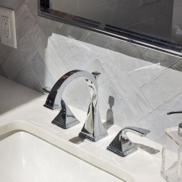
The tiles selected for the shower and the lower walls of the bathroom are a slightly oversized subway tile in a clean and bright white. The floors are a 12x24 porcelain marble. The shower floor features a flat cut marble pebble tile. Behind the vanity the wall is tiled with Zellage tile in a herringbone pattern. The colors of the tile connect all the colors used in the bath.
The final touches of elegance and luxury to complete our design, the soft lilac paint on the walls, the mix of metal materials on the faucets, cabinet hardware, lighting and yes, an oversized heated towel warmer complete with robe hooks.
This truly is a space for rejuvenation and wellness.
Find the right local pro for your project
 Katie Hutchison Studio
The new owners of this house in Harvard, Massachusetts loved its location and authentic Shaker characteristics, but weren’t fans of its curious layout. A dated first-floor full bathroom could only be accessed by going up a few steps to a landing, opening the bathroom door and then going down the same number of steps to enter the room. The dark kitchen faced the driveway to the north, rather than the bucolic backyard fields to the south. The dining space felt more like an enlarged hall and could only comfortably seat four. Upstairs, a den/office had a woefully low ceiling; the master bedroom had limited storage, and a sad full bathroom featured a cramped shower.
KHS proposed a number of changes to create an updated home where the owners could enjoy cooking, entertaining, and being connected to the outdoors from the first-floor living spaces, while also experiencing more inviting and more functional private spaces upstairs.
On the first floor, the primary change was to capture space that had been part of an upper-level screen porch and convert it to interior space. To make the interior expansion seamless, we raised the floor of the area that had been the upper-level porch, so it aligns with the main living level, and made sure there would be no soffits in the planes of the walls we removed. We also raised the floor of the remaining lower-level porch to reduce the number of steps required to circulate from it to the newly expanded interior. New patio door systems now fill the arched openings that used to be infilled with screen. The exterior interventions (which also included some new casement windows in the dining area) were designed to be subtle, while affording significant improvements on the interior. Additionally, the first-floor bathroom was reconfigured, shifting one of its walls to widen the dining space, and moving the entrance to the bathroom from the stair landing to the kitchen instead.
These changes (which involved significant structural interventions) resulted in a much more open space to accommodate a new kitchen with a view of the lush backyard and a new dining space defined by a new built-in banquette that comfortably seats six, and -- with the addition of a table extension -- up to eight people.
Upstairs in the den/office, replacing the low, board ceiling with a raised, plaster, tray ceiling that springs from above the original board-finish walls – newly painted a light color -- created a much more inviting, bright, and expansive space. Re-configuring the master bath to accommodate a larger shower and adding built-in storage cabinets in the master bedroom improved comfort and function. A new whole-house color palette rounds out the improvements.
Photos by Katie Hutchison
 Katie Hutchison Studio
The new owners of this house in Harvard, Massachusetts loved its location and authentic Shaker characteristics, but weren’t fans of its curious layout. A dated first-floor full bathroom could only be accessed by going up a few steps to a landing, opening the bathroom door and then going down the same number of steps to enter the room. The dark kitchen faced the driveway to the north, rather than the bucolic backyard fields to the south. The dining space felt more like an enlarged hall and could only comfortably seat four. Upstairs, a den/office had a woefully low ceiling; the master bedroom had limited storage, and a sad full bathroom featured a cramped shower.
KHS proposed a number of changes to create an updated home where the owners could enjoy cooking, entertaining, and being connected to the outdoors from the first-floor living spaces, while also experiencing more inviting and more functional private spaces upstairs.
On the first floor, the primary change was to capture space that had been part of an upper-level screen porch and convert it to interior space. To make the interior expansion seamless, we raised the floor of the area that had been the upper-level porch, so it aligns with the main living level, and made sure there would be no soffits in the planes of the walls we removed. We also raised the floor of the remaining lower-level porch to reduce the number of steps required to circulate from it to the newly expanded interior. New patio door systems now fill the arched openings that used to be infilled with screen. The exterior interventions (which also included some new casement windows in the dining area) were designed to be subtle, while affording significant improvements on the interior. Additionally, the first-floor bathroom was reconfigured, shifting one of its walls to widen the dining space, and moving the entrance to the bathroom from the stair landing to the kitchen instead.
These changes (which involved significant structural interventions) resulted in a much more open space to accommodate a new kitchen with a view of the lush backyard and a new dining space defined by a new built-in banquette that comfortably seats six, and -- with the addition of a table extension -- up to eight people.
Upstairs in the den/office, replacing the low, board ceiling with a raised, plaster, tray ceiling that springs from above the original board-finish walls – newly painted a light color -- created a much more inviting, bright, and expansive space. Re-configuring the master bath to accommodate a larger shower and adding built-in storage cabinets in the master bedroom improved comfort and function. A new whole-house color palette rounds out the improvements.
Photos by Katie Hutchison

 Hillcrest Builders
Our client wanted a SIP built home and we incorporated this and many other energy and sustainability features into this home which was in the Sheboygan County Parade of Homes.
Named "The Green Balanced Home", this project was all about creating practical and stunning living spaces that combined with sound environmental building materials and methods. By showcasing an assortment of leading-edge- green technologies, the Green Balanced Home was the talk of the Parade that year. In cooperation with our client, our methodology was:
Start with the site:
1. Protected tree lines
2. Drought resistant vegetation
3. High proportion of natural, plantings versus higher maintenance lawn
4. Optimal home placement on lot for solar exposure
5. Narrower streets
Build a high thermal envelope:
1. R-10 Gold Guard laminated EPS foam under basement, garage, and patio.
2. R-10 Gold Guard laminated EPS foam around exterior foundation walls.
3. R-10 ESP foam "shirt" around foundation
4. R-24 Structural Insulated panels (SIPs) for exterior walls, including garage
5. Sprayed foam in basement box sills and attic separation walls
6. R-15 garage door
7. R-60 blown cellulose attic insulation
Add efficient heating, cooling, ventilation, and electric utilization elements:
1. High efficiency fireplace with auxiliary ducting
2. Pull-out exterior wood-loading drawer
3. Air-to-air heat pump
4. 95% efficient, ultra-quiet variable capacity furnace
5. 19 SEER air conditioner
6. Five zones with programmable thermostats
7. Heat reclamation from hot water usage
8. LED lighting
9. Skylights
10. Energy Star appliances
11. Prep for in-floor heating system
12. Prep for photovoltaic (PV) solar
13. Prep for solar hot water
Incorporate water conservation:
1. Rain water recapture for toilet flushing and irrigation
2. Motion activated hot water circulation system
3. Power flush toilets
4. Dual flush toilets
Create high indoor air quality:
1. HEPA and UV filters
2. Air-to-air exchanger
3. Ultra-quiet bathroom fans with moisture sensor activation
Integrate sustainable, efficient materials:
* Expanded polystyrene (ESP) foam that does not emit HCFC "greenhouse" gases
* Oriented strand board (OSB) based siding, trim, and shutters
* SIPs panels that contain ESP an OSB
* Carpeting pads made from recycled materials
* Stewardship-certified cabinet manufacturing
* Job site recycling and reduce waste with SIPs

 Universal Appliance and Kitchen Center
Miele Appliances at Universal Appliance and Kitchen Center
26767 Agoura Road, Calabasas, CA 91302
Phone 818.880.0011 Fax 818.880.0411
12050 Ventura Blvd.,Studio City, CA 91604
Phone 818.755.1111 Fax 818.755.9111
www.uakc.com
Miele Generation 6000 is bringing design and innovation that exceed expectations. It includes two distinct design styles - PureLine and ContourLine - as well as several color options including Brilliant White and Truffle Brown.
Design for Miele is not simply the exterior. Like the design principle, form follows function; the true beauty of the Generation 6000 series is highlighted by its intuitive user interface, which ensures unsurpassed performance and convenience in the kitchen. With these new color options and the uniform design of the Generation 6000 series, Miele has created a series of appliances that will seamlessly integrate into any kitchen or lifestyle. Whether appliances are installed vertically, horizontally, as a square or in a T-shape configuration, the design is fully resolved.
M Touch – Top-class technology with a special touch
Whether it’s creating a double cappuccino at the touch of a single button, finding the desired MasterChef automatic program on the Combi-Steam Oven in an instant or selecting the operating mode and temperature in just a few simple steps – Miele eliminates the guesswork. All of these operations are easier than ever because of M Touch. Reminiscent of smart phones and tablets, M Touch is an intuitive user interface that allows the user to swipe or scroll through the menu with the tip of a finger. A new high resolution control panel with white TFT (Thin Film Transistor) text brings a brilliant display. And because the interface is universal across all Gen 6000 appliances, the transition from appliance to appliance is easier than ever.
Oven Innovations: Moisture Plus, Gourmet Center and MultiSteam
Developed exclusively for Miele USA, Moisture Plus is a truly unique steam injection system featured in Miele M Touch 30” Convection Ovens. Moisture Plus automatically injects a burst of steam into the oven cavity at pre-determined points during the cooking process. The addition of moisture improves results when proofing dough, gives loaves of bread a crisp crust and glossy finish and makes cuts of meat particularly crisp on the outside and succulent inside.
Also new to the 30” Convection Oven is the addition of MasterChef Plus programs. Ideal for the consummate baker at home, this exclusive new menu system houses 14 automatic bread programs and replicates results seen in artisan bakeries. Included are programs for sourdough, whole grain, rolls and baguettes.
A pioneer in steam oven technology, Generation 6000 Steam and Combi-Steam Ovens are equipped with MultiSteam technology, a revolutionary new steam cooking generation. The addition of six steam inlets in the Steam Oven and eight steam inlets in the Combi-Steam Oven, delivers fast, even steam distribution and incredibly quick heat-up times for even cooking results through a more powerful steam generator.
Long regarded for its ingredient-driven menu, Miele MasterChef programs are now located within the Gourmet Center. Choose from more than 100 easy to use programs for grains, vegetables, meats, fish and poultry. At just the touch of a button, the program will deliver menu options that guide the user step by step - from the desired oven mode to temperature - all resulting in the perfect dish.
Generation 6000 Coffee Systems impress with comfort and innovation
There are several new highlights to the Generation 6000 Whole Bean Coffee System including a new CupSensor, EasyClick Milk System and One Touch for Two features. Exclusive to Miele, the CupSensor automatically adjusts the height of the spout to the optimum position for different cup and glass sizes. Whether a tall latté macchiato or a dainty espresso is being prepared, the central spout automatically adjusts to the cup’s rim and eliminates splashing. The CupSensor even reacts precisely to beverages made with milk by raising the spout slightly to make room for the incoming espresso.
Also new is the EasyClick milk system which is a dishwasher safe glass, milk flask that effortlessly clicks into place at the front of the machine. And for easy maintenance, the new Miele Coffee Systems now automatically rinse all milk spouts and hoses with water after each use.
The One Touch for Two feature allows the user to prepare two coffee specialties such as cappuccino and latté macchiato at the same time, thus reducing prep time when two or more drinks are being served.
Miele Generation 6000 series is distinguished by its elegant design and remarkable innovations to deliver unmatched results that can be seen, touched and tasted. German engineered and tested to last 20 years, Generation 6000 reinforces the Miele Design for Life philosophy and solidifies Miele at the forefront of residential culinary appliances.
Sponsored
Delaware, OH

Buckeye Basements, Inc.
Central Ohio's Basement Finishing ExpertsBest Of Houzz '13-'21

 Bluworld HOMelements
This smaller lightweight version of the original Large Nojoqui Falls wall fountain is named after the beautiful 164 foot tall Nojoqui Falls waterfall, located in central California where the Water Wonders line was originated. These water fountains are a truly unique, engaging and an elegant addition to any indoor space. Redesigned, the Medium Nojoqui Falls fountain includes long-lasting super bright white LED lights rated for over 10,000 hours of use and an ergonomic finger slide remote control to easily dim or brighten the LED lights or turn them on and off. This water fountain glistens as water sheets over the genuine multi-color Indian Rajah Slate flowing past polished river rock creating a soothing sound and beautiful focal point for any room. This fountain is engineered with Bluworld's clog-free, splash-free design and features the Water Wonders NSI™ genuine light weight Slate. Installation is super easy with the lightweight nature of the NSI™ slate panels. Simply hang on the wall per the instructions.
This water fountain can be customized with your logo. Etched and hand-painted logos start at only $395.00. Contact our sales department for more information at 1-888-499-5433.
The Medium Nojoqui Falls fountain is the perfect size to hang on just about any wall, and it will instantly raise the level of class in any living room, foyer, office or lobby. These indoor water falls come with a choice of four finishes: Standard colors; Copper Vein and Black Onyx and premium finishes; Copper Patina,or Brushed Stainless Steel.
Water Wonders NSI™ Light Weight Slate™- Water fountains made with our NSI™ Light Weight Slate use our patent pending technology which sheers a layer of genuine Indian Raja Slate and fuses it to composite material with the same chipped edge technique as slab slate. They are indistinguishable from a thick slab of slate. All the beauty is retained and the weight is reduced by over 90% making it easier to hang a wall fountain. Once it's installed, your only concerns are setting the flow rate and turning on the accent light with your handy remote.
Please note that these units are handmade and measurements may vary slightly. Texture and color of aged rustic copper, metals and slate may also vary slightly with each fountain.

 ZeroEnergy Design
This LEED Platinum certified house reflects the homeowner's desire for an exceptionally healthy and comfortable living environment, within a traditional neighborhood.
INFILL SITE. The family, who moved from another area of Wellesley, sought out this property to be within walking distance of the high school and downtown area. An existing structure on the tight lot was removed to make way for the new home. 84% of the construction waste, from both the previous structure and the new home, was diverted from a landfill. ZED designed to preserve the existing mature trees on the perimeter of the property to minimize site impacts, and to maintain the character of the neighborhood as well as privacy on the site.
EXTERIOR EXPRESSION. The street facade of the home relates to the local New England vernacular. The rear uses contemporary language, a nod to the family’s Californian roots, to incorporate a roof deck, solar panels, outdoor living space, and the backyard swimming pool. ZED’s careful planning avoided to the need to face the garage doors towards the street, a common syndrome of a narrow lot.
THOUGHTFUL SPACE. Homes with dual entries can often result in duplicate and unused spaces. In this home, the everyday and formal entry areas are one and the same; the front and garage doors share the entry program of coat closets, mudroom storage with bench for removing your shoes, and a laundry room with generous closets for the children's sporting equipment. The entry area leads directly to the living space, encompassing the kitchen, dining and sitting area areas in an L-shaped open plan arrangement. The kitchen is placed at the south-west corner of the space to allow for a strong connection to the dining, sitting and outdoor living spaces. A fire pit on the deck satisfies the family’s desire for an open flame while a sealed gas fireplace is used indoors - ZED’s preference after omitting gas burning appliances completely from an airtight home. A small study, with a window seat, is conveniently located just off of the living space. A first floor guest bedroom includes an accessible bathroom for aging visitors and can be used as a master suite to accommodate aging in place.
HEALTHY LIVING. The client requested a home that was easy to clean and would provide a respite from seasonal allergies and common contaminants that are found in many indoor spaces. ZED selected easy to clean solid surface flooring throughout, provided ample space for cleaning supplies on each floor, and designed a mechanical system with ventilation that provides a constant supply of fresh outdoor air. ZED selected durable materials, finishes, cabinetry, and casework with low or no volatile organic compounds (VOCs) and no added urea formaldehyde.
YEAR-ROUND COMFORT. The home is super insulated and air-tight, paired with high performance triple-paned windows, to ensure it is draft-free throughout the winter (even when in front of the large windows and doors). ZED designed a right-sized heating and cooling system to pair with the thermally improved building enclosure to ensure year-round comfort. The glazing on the home maximizes passive solar gains, and facilitates cross ventilation and daylighting.
ENERGY EFFICIENT. As one of the most energy efficient houses built to date in Wellesley, the home highlights a practical solution for Massachusetts. First, the building enclosure reduces the largest energy requirement for typical houses (heating). Super-insulation, exceptional air sealing, a thermally broken wall assembly, triple pane windows, and passive solar gain combine for a sizable heating load reduction. Second, within the house only efficient systems consume energy. These include an air source heat pump for heating & cooling, a heat pump hot water heater, LED lighting, energy recovery ventilation, and high efficiency appliances. Lastly, photovoltaics provide renewable energy help offset energy consumption. The result is an 89% reduction in energy use compared to a similar brand new home built to code requirements.
RESILIENT. The home will fare well in extreme weather events. During a winter power outage, heat loss will be very slow due to the super-insulated and airtight envelope– taking multiple days to drop to 60 degrees even with no heat source. An engineered drainage system, paired with careful the detailing of the foundation, will help to keep the finished basement dry. A generator will provide full operation of the all-electric house during a power outage.
OVERALL. The home is a reflection of the family goals and an expression of their values, beautifully enabling health, comfort, safety, resilience, and utility, all while respecting the planet.
ZED - Architect & Mechanical Designer
Bevilacqua Builders Inc - Contractor
Creative Land & Water Engineering - Civil Engineering
Barbara Peterson Landscape - Landscape Design
Nest & Company - Interior Furnishings
Eric Roth Photography - Photography
 ZeroEnergy Design
This LEED Platinum certified house reflects the homeowner's desire for an exceptionally healthy and comfortable living environment, within a traditional neighborhood.
INFILL SITE. The family, who moved from another area of Wellesley, sought out this property to be within walking distance of the high school and downtown area. An existing structure on the tight lot was removed to make way for the new home. 84% of the construction waste, from both the previous structure and the new home, was diverted from a landfill. ZED designed to preserve the existing mature trees on the perimeter of the property to minimize site impacts, and to maintain the character of the neighborhood as well as privacy on the site.
EXTERIOR EXPRESSION. The street facade of the home relates to the local New England vernacular. The rear uses contemporary language, a nod to the family’s Californian roots, to incorporate a roof deck, solar panels, outdoor living space, and the backyard swimming pool. ZED’s careful planning avoided to the need to face the garage doors towards the street, a common syndrome of a narrow lot.
THOUGHTFUL SPACE. Homes with dual entries can often result in duplicate and unused spaces. In this home, the everyday and formal entry areas are one and the same; the front and garage doors share the entry program of coat closets, mudroom storage with bench for removing your shoes, and a laundry room with generous closets for the children's sporting equipment. The entry area leads directly to the living space, encompassing the kitchen, dining and sitting area areas in an L-shaped open plan arrangement. The kitchen is placed at the south-west corner of the space to allow for a strong connection to the dining, sitting and outdoor living spaces. A fire pit on the deck satisfies the family’s desire for an open flame while a sealed gas fireplace is used indoors - ZED’s preference after omitting gas burning appliances completely from an airtight home. A small study, with a window seat, is conveniently located just off of the living space. A first floor guest bedroom includes an accessible bathroom for aging visitors and can be used as a master suite to accommodate aging in place.
HEALTHY LIVING. The client requested a home that was easy to clean and would provide a respite from seasonal allergies and common contaminants that are found in many indoor spaces. ZED selected easy to clean solid surface flooring throughout, provided ample space for cleaning supplies on each floor, and designed a mechanical system with ventilation that provides a constant supply of fresh outdoor air. ZED selected durable materials, finishes, cabinetry, and casework with low or no volatile organic compounds (VOCs) and no added urea formaldehyde.
YEAR-ROUND COMFORT. The home is super insulated and air-tight, paired with high performance triple-paned windows, to ensure it is draft-free throughout the winter (even when in front of the large windows and doors). ZED designed a right-sized heating and cooling system to pair with the thermally improved building enclosure to ensure year-round comfort. The glazing on the home maximizes passive solar gains, and facilitates cross ventilation and daylighting.
ENERGY EFFICIENT. As one of the most energy efficient houses built to date in Wellesley, the home highlights a practical solution for Massachusetts. First, the building enclosure reduces the largest energy requirement for typical houses (heating). Super-insulation, exceptional air sealing, a thermally broken wall assembly, triple pane windows, and passive solar gain combine for a sizable heating load reduction. Second, within the house only efficient systems consume energy. These include an air source heat pump for heating & cooling, a heat pump hot water heater, LED lighting, energy recovery ventilation, and high efficiency appliances. Lastly, photovoltaics provide renewable energy help offset energy consumption. The result is an 89% reduction in energy use compared to a similar brand new home built to code requirements.
RESILIENT. The home will fare well in extreme weather events. During a winter power outage, heat loss will be very slow due to the super-insulated and airtight envelope– taking multiple days to drop to 60 degrees even with no heat source. An engineered drainage system, paired with careful the detailing of the foundation, will help to keep the finished basement dry. A generator will provide full operation of the all-electric house during a power outage.
OVERALL. The home is a reflection of the family goals and an expression of their values, beautifully enabling health, comfort, safety, resilience, and utility, all while respecting the planet.
ZED - Architect & Mechanical Designer
Bevilacqua Builders Inc - Contractor
Creative Land & Water Engineering - Civil Engineering
Barbara Peterson Landscape - Landscape Design
Nest & Company - Interior Furnishings
Eric Roth Photography - Photography
 Katie Hutchison Studio
The new owners of this house in Harvard, Massachusetts loved its location and authentic Shaker characteristics, but weren’t fans of its curious layout. A dated first-floor full bathroom could only be accessed by going up a few steps to a landing, opening the bathroom door and then going down the same number of steps to enter the room. The dark kitchen faced the driveway to the north, rather than the bucolic backyard fields to the south. The dining space felt more like an enlarged hall and could only comfortably seat four. Upstairs, a den/office had a woefully low ceiling; the master bedroom had limited storage, and a sad full bathroom featured a cramped shower.
KHS proposed a number of changes to create an updated home where the owners could enjoy cooking, entertaining, and being connected to the outdoors from the first-floor living spaces, while also experiencing more inviting and more functional private spaces upstairs.
On the first floor, the primary change was to capture space that had been part of an upper-level screen porch and convert it to interior space. To make the interior expansion seamless, we raised the floor of the area that had been the upper-level porch, so it aligns with the main living level, and made sure there would be no soffits in the planes of the walls we removed. We also raised the floor of the remaining lower-level porch to reduce the number of steps required to circulate from it to the newly expanded interior. New patio door systems now fill the arched openings that used to be infilled with screen. The exterior interventions (which also included some new casement windows in the dining area) were designed to be subtle, while affording significant improvements on the interior. Additionally, the first-floor bathroom was reconfigured, shifting one of its walls to widen the dining space, and moving the entrance to the bathroom from the stair landing to the kitchen instead.
These changes (which involved significant structural interventions) resulted in a much more open space to accommodate a new kitchen with a view of the lush backyard and a new dining space defined by a new built-in banquette that comfortably seats six, and -- with the addition of a table extension -- up to eight people.
Upstairs in the den/office, replacing the low, board ceiling with a raised, plaster, tray ceiling that springs from above the original board-finish walls – newly painted a light color -- created a much more inviting, bright, and expansive space. Re-configuring the master bath to accommodate a larger shower and adding built-in storage cabinets in the master bedroom improved comfort and function. A new whole-house color palette rounds out the improvements.
Photos by Katie Hutchison
 Katie Hutchison Studio
The new owners of this house in Harvard, Massachusetts loved its location and authentic Shaker characteristics, but weren’t fans of its curious layout. A dated first-floor full bathroom could only be accessed by going up a few steps to a landing, opening the bathroom door and then going down the same number of steps to enter the room. The dark kitchen faced the driveway to the north, rather than the bucolic backyard fields to the south. The dining space felt more like an enlarged hall and could only comfortably seat four. Upstairs, a den/office had a woefully low ceiling; the master bedroom had limited storage, and a sad full bathroom featured a cramped shower.
KHS proposed a number of changes to create an updated home where the owners could enjoy cooking, entertaining, and being connected to the outdoors from the first-floor living spaces, while also experiencing more inviting and more functional private spaces upstairs.
On the first floor, the primary change was to capture space that had been part of an upper-level screen porch and convert it to interior space. To make the interior expansion seamless, we raised the floor of the area that had been the upper-level porch, so it aligns with the main living level, and made sure there would be no soffits in the planes of the walls we removed. We also raised the floor of the remaining lower-level porch to reduce the number of steps required to circulate from it to the newly expanded interior. New patio door systems now fill the arched openings that used to be infilled with screen. The exterior interventions (which also included some new casement windows in the dining area) were designed to be subtle, while affording significant improvements on the interior. Additionally, the first-floor bathroom was reconfigured, shifting one of its walls to widen the dining space, and moving the entrance to the bathroom from the stair landing to the kitchen instead.
These changes (which involved significant structural interventions) resulted in a much more open space to accommodate a new kitchen with a view of the lush backyard and a new dining space defined by a new built-in banquette that comfortably seats six, and -- with the addition of a table extension -- up to eight people.
Upstairs in the den/office, replacing the low, board ceiling with a raised, plaster, tray ceiling that springs from above the original board-finish walls – newly painted a light color -- created a much more inviting, bright, and expansive space. Re-configuring the master bath to accommodate a larger shower and adding built-in storage cabinets in the master bedroom improved comfort and function. A new whole-house color palette rounds out the improvements.
Photos by Katie Hutchison
 Katie Hutchison Studio
The new owners of this house in Harvard, Massachusetts loved its location and authentic Shaker characteristics, but weren’t fans of its curious layout. A dated first-floor full bathroom could only be accessed by going up a few steps to a landing, opening the bathroom door and then going down the same number of steps to enter the room. The dark kitchen faced the driveway to the north, rather than the bucolic backyard fields to the south. The dining space felt more like an enlarged hall and could only comfortably seat four. Upstairs, a den/office had a woefully low ceiling; the master bedroom had limited storage, and a sad full bathroom featured a cramped shower.
KHS proposed a number of changes to create an updated home where the owners could enjoy cooking, entertaining, and being connected to the outdoors from the first-floor living spaces, while also experiencing more inviting and more functional private spaces upstairs.
On the first floor, the primary change was to capture space that had been part of an upper-level screen porch and convert it to interior space. To make the interior expansion seamless, we raised the floor of the area that had been the upper-level porch, so it aligns with the main living level, and made sure there would be no soffits in the planes of the walls we removed. We also raised the floor of the remaining lower-level porch to reduce the number of steps required to circulate from it to the newly expanded interior. New patio door systems now fill the arched openings that used to be infilled with screen. The exterior interventions (which also included some new casement windows in the dining area) were designed to be subtle, while affording significant improvements on the interior. Additionally, the first-floor bathroom was reconfigured, shifting one of its walls to widen the dining space, and moving the entrance to the bathroom from the stair landing to the kitchen instead.
These changes (which involved significant structural interventions) resulted in a much more open space to accommodate a new kitchen with a view of the lush backyard and a new dining space defined by a new built-in banquette that comfortably seats six, and -- with the addition of a table extension -- up to eight people.
Upstairs in the den/office, replacing the low, board ceiling with a raised, plaster, tray ceiling that springs from above the original board-finish walls – newly painted a light color -- created a much more inviting, bright, and expansive space. Re-configuring the master bath to accommodate a larger shower and adding built-in storage cabinets in the master bedroom improved comfort and function. A new whole-house color palette rounds out the improvements.
Photos by Katie Hutchison

Sponsored
Sunbury, OH

J.Holderby - Renovations
Franklin County's Leading General Contractors - 2X Best of Houzz!
 Katie Hutchison Studio
The new owners of this house in Harvard, Massachusetts loved its location and authentic Shaker characteristics, but weren’t fans of its curious layout. A dated first-floor full bathroom could only be accessed by going up a few steps to a landing, opening the bathroom door and then going down the same number of steps to enter the room. The dark kitchen faced the driveway to the north, rather than the bucolic backyard fields to the south. The dining space felt more like an enlarged hall and could only comfortably seat four. Upstairs, a den/office had a woefully low ceiling; the master bedroom had limited storage, and a sad full bathroom featured a cramped shower.
KHS proposed a number of changes to create an updated home where the owners could enjoy cooking, entertaining, and being connected to the outdoors from the first-floor living spaces, while also experiencing more inviting and more functional private spaces upstairs.
On the first floor, the primary change was to capture space that had been part of an upper-level screen porch and convert it to interior space. To make the interior expansion seamless, we raised the floor of the area that had been the upper-level porch, so it aligns with the main living level, and made sure there would be no soffits in the planes of the walls we removed. We also raised the floor of the remaining lower-level porch to reduce the number of steps required to circulate from it to the newly expanded interior. New patio door systems now fill the arched openings that used to be infilled with screen. The exterior interventions (which also included some new casement windows in the dining area) were designed to be subtle, while affording significant improvements on the interior. Additionally, the first-floor bathroom was reconfigured, shifting one of its walls to widen the dining space, and moving the entrance to the bathroom from the stair landing to the kitchen instead.
These changes (which involved significant structural interventions) resulted in a much more open space to accommodate a new kitchen with a view of the lush backyard and a new dining space defined by a new built-in banquette that comfortably seats six, and -- with the addition of a table extension -- up to eight people.
Upstairs in the den/office, replacing the low, board ceiling with a raised, plaster, tray ceiling that springs from above the original board-finish walls – newly painted a light color -- created a much more inviting, bright, and expansive space. Re-configuring the master bath to accommodate a larger shower and adding built-in storage cabinets in the master bedroom improved comfort and function. A new whole-house color palette rounds out the improvements.
Photos by Katie Hutchison
 Katie Hutchison Studio
The new owners of this house in Harvard, Massachusetts loved its location and authentic Shaker characteristics, but weren’t fans of its curious layout. A dated first-floor full bathroom could only be accessed by going up a few steps to a landing, opening the bathroom door and then going down the same number of steps to enter the room. The dark kitchen faced the driveway to the north, rather than the bucolic backyard fields to the south. The dining space felt more like an enlarged hall and could only comfortably seat four. Upstairs, a den/office had a woefully low ceiling; the master bedroom had limited storage, and a sad full bathroom featured a cramped shower.
KHS proposed a number of changes to create an updated home where the owners could enjoy cooking, entertaining, and being connected to the outdoors from the first-floor living spaces, while also experiencing more inviting and more functional private spaces upstairs.
On the first floor, the primary change was to capture space that had been part of an upper-level screen porch and convert it to interior space. To make the interior expansion seamless, we raised the floor of the area that had been the upper-level porch, so it aligns with the main living level, and made sure there would be no soffits in the planes of the walls we removed. We also raised the floor of the remaining lower-level porch to reduce the number of steps required to circulate from it to the newly expanded interior. New patio door systems now fill the arched openings that used to be infilled with screen. The exterior interventions (which also included some new casement windows in the dining area) were designed to be subtle, while affording significant improvements on the interior. Additionally, the first-floor bathroom was reconfigured, shifting one of its walls to widen the dining space, and moving the entrance to the bathroom from the stair landing to the kitchen instead.
These changes (which involved significant structural interventions) resulted in a much more open space to accommodate a new kitchen with a view of the lush backyard and a new dining space defined by a new built-in banquette that comfortably seats six, and -- with the addition of a table extension -- up to eight people.
Upstairs in the den/office, replacing the low, board ceiling with a raised, plaster, tray ceiling that springs from above the original board-finish walls – newly painted a light color -- created a much more inviting, bright, and expansive space. Re-configuring the master bath to accommodate a larger shower and adding built-in storage cabinets in the master bedroom improved comfort and function. A new whole-house color palette rounds out the improvements.
Photos by Katie Hutchison
 ZeroEnergy Design
 (ZED) created this modern home for a progressive family in the desirable community of Lexington.
Thoughtful Land Connection. The residence is carefully sited on the infill lot so as to create privacy from the road and neighbors, while cultivating a side yard that captures the southern sun. The terraced grade rises to meet the house, allowing for it to maintain a structured connection with the ground while also sitting above the high water table. The elevated outdoor living space maintains a strong connection with the indoor living space, while the stepped edge ties it back to the true ground plane. Siting and outdoor connections were completed by ZED in collaboration with landscape designer Soren Deniord Design Studio.
Exterior Finishes and Solar. The exterior finish materials include a palette of shiplapped wood siding, through-colored fiber cement panels and stucco. A rooftop parapet hides the solar panels above, while a gutter and site drainage system directs rainwater into an irrigation cistern and dry wells that recharge the groundwater.
Cooking, Dining, Living. Inside, the kitchen, fabricated by Henrybuilt, is located between the indoor and outdoor dining areas. The expansive south-facing sliding door opens to seamlessly connect the spaces, using a retractable awning to provide shade during the summer while still admitting the warming winter sun. The indoor living space continues from the dining areas across to the sunken living area, with a view that returns again to the outside through the corner wall of glass.
Accessible Guest Suite. The design of the first level guest suite provides for both aging in place and guests who regularly visit for extended stays. The patio off the north side of the house affords guests their own private outdoor space, and privacy from the neighbor. Similarly, the second level master suite opens to an outdoor private roof deck.
Light and Access. The wide open interior stair with a glass panel rail leads from the top level down to the well insulated basement. The design of the basement, used as an away/play space, addresses the need for both natural light and easy access. In addition to the open stairwell, light is admitted to the north side of the area with a high performance, Passive House (PHI) certified skylight, covering a six by sixteen foot area. On the south side, a unique roof hatch set flush with the deck opens to reveal a glass door at the base of the stairwell which provides additional light and access from the deck above down to the play space.
Energy. Energy consumption is reduced by the high performance building envelope, high efficiency mechanical systems, and then offset with renewable energy. All windows and doors are made of high performance triple paned glass with thermally broken aluminum frames. The exterior wall assembly employs dense pack cellulose in the stud cavity, a continuous air barrier, and four inches exterior rigid foam insulation. The 10kW rooftop solar electric system provides clean energy production. The final air leakage testing yielded 0.6 ACH 50 - an extremely air tight house, a testament to the well-designed details, progress testing and quality construction. When compared to a new house built to code requirements, this home consumes only 19% of the energy.
Architecture & Energy Consulting: ZeroEnergy Design
Landscape Design: Soren Deniord Design
Paintings: Bernd Haussmann Studio
Photos: Eric Roth Photography
 Katie Hutchison Studio
The new owners of this house in Harvard, Massachusetts loved its location and authentic Shaker characteristics, but weren’t fans of its curious layout. A dated first-floor full bathroom could only be accessed by going up a few steps to a landing, opening the bathroom door and then going down the same number of steps to enter the room. The dark kitchen faced the driveway to the north, rather than the bucolic backyard fields to the south. The dining space felt more like an enlarged hall and could only comfortably seat four. Upstairs, a den/office had a woefully low ceiling; the master bedroom had limited storage, and a sad full bathroom featured a cramped shower.
KHS proposed a number of changes to create an updated home where the owners could enjoy cooking, entertaining, and being connected to the outdoors from the first-floor living spaces, while also experiencing more inviting and more functional private spaces upstairs.
On the first floor, the primary change was to capture space that had been part of an upper-level screen porch and convert it to interior space. To make the interior expansion seamless, we raised the floor of the area that had been the upper-level porch, so it aligns with the main living level, and made sure there would be no soffits in the planes of the walls we removed. We also raised the floor of the remaining lower-level porch to reduce the number of steps required to circulate from it to the newly expanded interior. New patio door systems now fill the arched openings that used to be infilled with screen. The exterior interventions (which also included some new casement windows in the dining area) were designed to be subtle, while affording significant improvements on the interior. Additionally, the first-floor bathroom was reconfigured, shifting one of its walls to widen the dining space, and moving the entrance to the bathroom from the stair landing to the kitchen instead.
These changes (which involved significant structural interventions) resulted in a much more open space to accommodate a new kitchen with a view of the lush backyard and a new dining space defined by a new built-in banquette that comfortably seats six, and -- with the addition of a table extension -- up to eight people.
Upstairs in the den/office, replacing the low, board ceiling with a raised, plaster, tray ceiling that springs from above the original board-finish walls – newly painted a light color -- created a much more inviting, bright, and expansive space. Re-configuring the master bath to accommodate a larger shower and adding built-in storage cabinets in the master bedroom improved comfort and function. A new whole-house color palette rounds out the improvements.
Photos by Katie Hutchison
Sponsored
Sunbury, OH
J.Holderby - Renovations
Franklin County's Leading General Contractors - 2X Best of Houzz!
 Hillcrest Builders
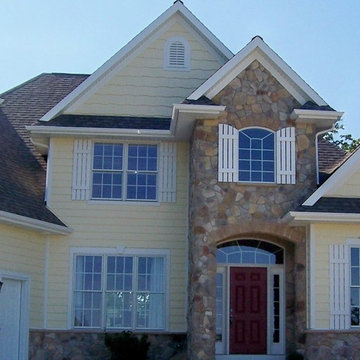
Our client wanted a SIP built home and we incorporated this and many other energy and sustainability features into this home which was in the Sheboygan County Parade of Homes.
Named "The Green Balanced Home", this project was all about creating practical and stunning living spaces that combined with sound environmental building materials and methods. By showcasing an assortment of leading-edge- green technologies, the Green Balanced Home was the talk of the Parade that year. In cooperation with our client, our methodology was:
Start with the site:
1. Protected tree lines
2. Drought resistant vegetation
3. High proportion of natural, plantings versus higher maintenance lawn
4. Optimal home placement on lot for solar exposure
5. Narrower streets
Build a high thermal envelope:
1. R-10 Gold Guard laminated EPS foam under basement, garage, and patio.
2. R-10 Gold Guard laminated EPS foam around exterior foundation walls.
3. R-10 ESP foam "shirt" around foundation
4. R-24 Structural Insulated panels (SIPs) for exterior walls, including garage
5. Sprayed foam in basement box sills and attic separation walls
6. R-15 garage door
7. R-60 blown cellulose attic insulation
Add efficient heating, cooling, ventilation, and electric utilization elements:
1. High efficiency fireplace with auxiliary ducting
2. Pull-out exterior wood-loading drawer
3. Air-to-air heat pump
4. 95% efficient, ultra-quiet variable capacity furnace
5. 19 SEER air conditioner
6. Five zones with programmable thermostats
7. Heat reclamation from hot water usage
8. LED lighting
9. Skylights
10. Energy Star appliances
11. Prep for in-floor heating system
12. Prep for photovoltaic (PV) solar
13. Prep for solar hot water
Incorporate water conservation:
1. Rain water recapture for toilet flushing and irrigation
2. Motion activated hot water circulation system
3. Power flush toilets
4. Dual flush toilets
Create high indoor air quality:
1. HEPA and UV filters
2. Air-to-air exchanger
3. Ultra-quiet bathroom fans with moisture sensor activation
Integrate sustainable, efficient materials:
* Expanded polystyrene (ESP) foam that does not emit HCFC "greenhouse" gases
* Oriented strand board (OSB) based siding, trim, and shutters
* SIPs panels that contain ESP an OSB
* Carpeting pads made from recycled materials
* Stewardship-certified cabinet manufacturing
* Job site recycling and reduce waste with SIPs
 Katie Hutchison Studio
The new owners of this house in Harvard, Massachusetts loved its location and authentic Shaker characteristics, but weren’t fans of its curious layout. A dated first-floor full bathroom could only be accessed by going up a few steps to a landing, opening the bathroom door and then going down the same number of steps to enter the room. The dark kitchen faced the driveway to the north, rather than the bucolic backyard fields to the south. The dining space felt more like an enlarged hall and could only comfortably seat four. Upstairs, a den/office had a woefully low ceiling; the master bedroom had limited storage, and a sad full bathroom featured a cramped shower.
KHS proposed a number of changes to create an updated home where the owners could enjoy cooking, entertaining, and being connected to the outdoors from the first-floor living spaces, while also experiencing more inviting and more functional private spaces upstairs.
On the first floor, the primary change was to capture space that had been part of an upper-level screen porch and convert it to interior space. To make the interior expansion seamless, we raised the floor of the area that had been the upper-level porch, so it aligns with the main living level, and made sure there would be no soffits in the planes of the walls we removed. We also raised the floor of the remaining lower-level porch to reduce the number of steps required to circulate from it to the newly expanded interior. New patio door systems now fill the arched openings that used to be infilled with screen. The exterior interventions (which also included some new casement windows in the dining area) were designed to be subtle, while affording significant improvements on the interior. Additionally, the first-floor bathroom was reconfigured, shifting one of its walls to widen the dining space, and moving the entrance to the bathroom from the stair landing to the kitchen instead.
These changes (which involved significant structural interventions) resulted in a much more open space to accommodate a new kitchen with a view of the lush backyard and a new dining space defined by a new built-in banquette that comfortably seats six, and -- with the addition of a table extension -- up to eight people.
Upstairs in the den/office, replacing the low, board ceiling with a raised, plaster, tray ceiling that springs from above the original board-finish walls – newly painted a light color -- created a much more inviting, bright, and expansive space. Re-configuring the master bath to accommodate a larger shower and adding built-in storage cabinets in the master bedroom improved comfort and function. A new whole-house color palette rounds out the improvements.
Photos by Katie Hutchison
 Lemon Remodeling & Services
Planning a Modern Kitchen Remodel
Every successful kitchen remodeling project begins with careful planning. Before construction starts, it is important to evaluate the existing layout, cabinet storage, lighting conditions, appliance placement, and how the kitchen connects to surrounding living spaces.
For this project, the primary design goals included:
Creating a brighter open concept kitchen
Improving functionality and circulation
Increasing pantry and cabinet storage
Maximizing natural light with skylight integration
Creating a clean and timeless design aesthetic
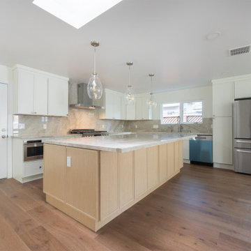
The final layout centered around a large kitchen island that functions as both a workspace and gathering area. Open concept kitchens remain highly desirable because they improve communication between living areas while helping the home feel larger and more connected.
Importance of Natural Light
Natural lighting plays a major role in modern kitchen remodeling. In this renovation, the skylight significantly improved brightness throughout the space and helped create a softer, more inviting atmosphere during the day.
Combined with recessed lighting and pendant fixtures above the island, the layered lighting design provides both functional task lighting and balanced ambient illumination.
Construction and Material Selection
Kitchen remodeling projects require coordination between multiple construction trades including demolition, framing, electrical, plumbing, drywall, flooring, cabinetry, countertops, and finish carpentry.
Bi-Color Kitchen Remodel Design
One of the standout features of this project is the bi-color kitchen remodel design. The warm natural wood island creates contrast against the surrounding white cabinetry while maintaining a clean and balanced appearance.
This approach helps:
Add visual depth to the kitchen
Create separation between functional zones
Prevent the space from feeling overly monochromatic
Introduce warmth into modern kitchen designs
The oversized island also provides additional storage, countertop workspace, and seating opportunities for everyday use and entertaining.
Countertops, Cabinetry, and Finishes
The kitchen includes:
Quartz countertops with waterfall-style edges
Custom shaker-style cabinetry
Stainless steel appliances
Modern pendant lighting
Wide plank engineered hardwood flooring
Full-height backsplash surfaces
The neutral color palette was selected to create a timeless appearance while allowing flexibility for future décor and furniture changes.
Pantry Kitchen Renovation
Storage planning is one of the most important aspects of kitchen remodeling. The pantry kitchen renovation focused on improving organization and accessibility while maximizing usable storage space.
Modern pantry systems help homeowners:
Reduce countertop clutter
Improve kitchen organization
Store small appliances more efficiently
Increase long-term functionality
Thoughtful storage design can significantly improve the daily usability of a kitchen without increasing square footage.
Real Estate Value and Long-Term Benefits
Kitchen remodeling remains one of the highest-value residential renovation projects in the Bay Area real estate market. A professionally designed open concept kitchen can improve buyer perception, increase property appeal, and modernize outdated layouts.
Features such as large islands, skylights, pantry storage, and bi-color cabinetry continue to remain highly desirable among homeowners and future buyers alike.
Common Kitchen Remodeling Mistakes
Some common mistakes homeowners should avoid include:
Insufficient lighting design
Poor circulation planning
Limited storage solutions
Choosing low-durability materials
Overcrowded layouts
Inadequate electrical preparation
Working with experienced remodeling professionals can help avoid costly design and construction issues later in the process.
Common Questions
How long does a kitchen remodel usually take?
Most kitchen remodeling projects take approximately 6–12 weeks depending on the project scope, inspections, material lead times, and structural modifications.
Do kitchen remodels require permits?
Permits are often required when plumbing, electrical, structural, or layout changes are involved. Requirements vary depending on the city and scope of work.
What is a bi-color kitchen remodel?
A bi-color kitchen remodel uses two cabinet finishes or tones to create visual contrast and a more customized design appearance.
Does an open concept kitchen increase home value?
Open concept kitchens are highly desirable because they improve functionality, natural lighting, and overall flow throughout the home.
Conclusion
A well-planned kitchen remodeling project combines thoughtful design, quality craftsmanship, and durable materials to create a space that is both functional and visually appealing. Features such as skylight integration, open concept layouts, pantry kitchen renovations, and bi-color cabinetry continue to remain popular among Bay Area homeowners seeking timeless and practical kitchen designs.
Careful planning, professional coordination, and attention to detail are essential for creating a kitchen that performs well aesthetically and functionally for many years.
------->
If you’re planning a kitchen remodeling project, consulting with an experienced contractor can help simplify the design and construction process while avoiding costly mistakes.
Book a consultation:
calendly.com/lemonremodeling
136