
Search results for "Reduce including" in Home Design Ideas
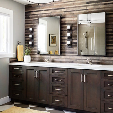
 Kristina Wolf Design
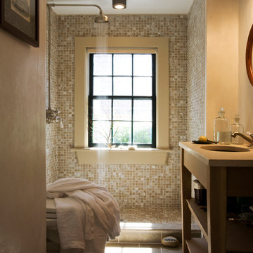
This master bathroom has everything you need to get you ready for the day. The beautiful backsplash has a mixture of brown tones that add dimension and texture to the focal wall. The lighting blends well with the other bathroom fixtures and the cabinets provide plenty of storage while demonstrating a simply beautiful style. Brad Knipstein was the photographer.
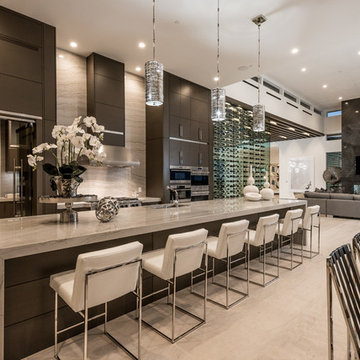
 Luxe-Design
Huge Custom Kitchen with Attached Chef Kitchen
Open concept kitchen - large contemporary beige floor and limestone floor open concept kitchen idea in Las Vegas with an undermount sink, flat-panel cabinets, dark wood cabinets, stainless steel appliances, an island, granite countertops, gray backsplash, stone slab backsplash and beige countertops
Open concept kitchen - large contemporary beige floor and limestone floor open concept kitchen idea in Las Vegas with an undermount sink, flat-panel cabinets, dark wood cabinets, stainless steel appliances, an island, granite countertops, gray backsplash, stone slab backsplash and beige countertops
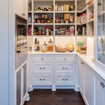
 Kristi Spouse Interiors
Inspiration for a traditional kitchen pantry in Seattle with recessed-panel cabinets, white cabinets, stainless steel appliances and dark hardwood floors.
Microwave and warming drawer tucked away.
Jessie Young - www.realestatephotographerseattle.com
Find the right local pro for your project
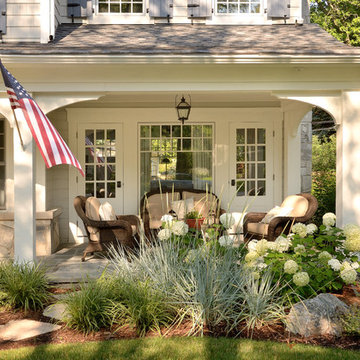
 Siena Custom Builders, Inc.
An added porch off to the side - a quiet place to relax and enjoy the pretty landscaping
Michael Lipman Photography
Elegant front porch photo in Chicago
Elegant front porch photo in Chicago
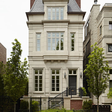
 Middlefork Luxury Home Builders
Beautiful French inspired home in the heart of Lincoln Park Chicago.
Rising amidst the grand homes of North Howe Street, this stately house has more than 6,600 SF. In total, the home has seven bedrooms, six full bathrooms and three powder rooms. Designed with an extra-wide floor plan (21'-2"), achieved through side-yard relief, and an attached garage achieved through rear-yard relief, it is a truly unique home in a truly stunning environment.
The centerpiece of the home is its dramatic, 11-foot-diameter circular stair that ascends four floors from the lower level to the roof decks where panoramic windows (and views) infuse the staircase and lower levels with natural light. Public areas include classically-proportioned living and dining rooms, designed in an open-plan concept with architectural distinction enabling them to function individually. A gourmet, eat-in kitchen opens to the home's great room and rear gardens and is connected via its own staircase to the lower level family room, mud room and attached 2-1/2 car, heated garage.
The second floor is a dedicated master floor, accessed by the main stair or the home's elevator. Features include a groin-vaulted ceiling; attached sun-room; private balcony; lavishly appointed master bath; tremendous closet space, including a 120 SF walk-in closet, and; an en-suite office. Four family bedrooms and three bathrooms are located on the third floor.
This home was sold early in its construction process.
Nathan Kirkman
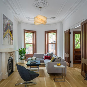
 ZeroEnergy Design
This renovated brick rowhome in Boston’s South End offers a modern aesthetic within a historic structure, creative use of space, exceptional thermal comfort, a reduced carbon footprint, and a passive stream of income.
DESIGN PRIORITIES. The goals for the project were clear - design the primary unit to accommodate the family’s modern lifestyle, rework the layout to create a desirable rental unit, improve thermal comfort and introduce a modern aesthetic. We designed the street-level entry as a shared entrance for both the primary and rental unit. The family uses it as their everyday entrance - we planned for bike storage and an open mudroom with bench and shoe storage to facilitate the change from shoes to slippers or bare feet as they enter their home. On the main level, we expanded the kitchen into the dining room to create an eat-in space with generous counter space and storage, as well as a comfortable connection to the living space. The second floor serves as master suite for the couple - a bedroom with a walk-in-closet and ensuite bathroom, and an adjacent study, with refinished original pumpkin pine floors. The upper floor, aside from a guest bedroom, is the child's domain with interconnected spaces for sleeping, work and play. In the play space, which can be separated from the work space with new translucent sliding doors, we incorporated recreational features inspired by adventurous and competitive television shows, at their son’s request.
MODERN MEETS TRADITIONAL. We left the historic front facade of the building largely unchanged - the security bars were removed from the windows and the single pane windows were replaced with higher performing historic replicas. We designed the interior and rear facade with a vision of warm modernism, weaving in the notable period features. Each element was either restored or reinterpreted to blend with the modern aesthetic. The detailed ceiling in the living space, for example, has a new matte monochromatic finish, and the wood stairs are covered in a dark grey floor paint, whereas the mahogany doors were simply refinished. New wide plank wood flooring with a neutral finish, floor-to-ceiling casework, and bold splashes of color in wall paint and tile, and oversized high-performance windows (on the rear facade) round out the modern aesthetic.
RENTAL INCOME. The existing rowhome was zoned for a 2-family dwelling but included an undesirable, single-floor studio apartment at the garden level with low ceiling heights and questionable emergency egress. In order to increase the quality and quantity of space in the rental unit, we reimagined it as a two-floor, 1 or 2 bedroom, 2 bathroom apartment with a modern aesthetic, increased ceiling height on the lowest level and provided an in-unit washer/dryer. The apartment was listed with Jackie O'Connor Real Estate and rented immediately, providing the owners with a source of passive income.
ENCLOSURE WITH BENEFITS. The homeowners sought a minimal carbon footprint, enabled by their urban location and lifestyle decisions, paired with the benefits of a high-performance home. The extent of the renovation allowed us to implement a deep energy retrofit (DER) to address air tightness, insulation, and high-performance windows. The historic front facade is insulated from the interior, while the rear facade is insulated on the exterior. Together with these building enclosure improvements, we designed an HVAC system comprised of continuous fresh air ventilation, and an efficient, all-electric heating and cooling system to decouple the house from natural gas. This strategy provides optimal thermal comfort and indoor air quality, improved acoustic isolation from street noise and neighbors, as well as a further reduced carbon footprint. We also took measures to prepare the roof for future solar panels, for when the South End neighborhood’s aging electrical infrastructure is upgraded to allow them.
URBAN LIVING. The desirable neighborhood location allows the both the homeowners and tenant to walk, bike, and use public transportation to access the city, while each charging their respective plug-in electric cars behind the building to travel greater distances.
OVERALL. The understated rowhouse is now ready for another century of urban living, offering the owners comfort and convenience as they live life as an expression of their values.
Eric Roth Photo
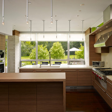
 Thomas Roszak Architecture, LLC
Photo credit: Scott McDonald @ Hedrich Blessing
7RR-Ecohome:
The design objective was to build a house for a couple recently married who both had kids from previous marriages. How to bridge two families together?
The design looks forward in terms of how people live today. The home is an experiment in transparency and solid form; removing borders and edges from outside to inside the house, and to really depict “flowing and endless space”. The house floor plan is derived by pushing and pulling the house’s form to maximize the backyard and minimize the public front yard while welcoming the sun in key rooms by rotating the house 45-degrees to true north. The angular form of the house is a result of the family’s program, the zoning rules, the lot’s attributes, and the sun’s path. We wanted to construct a house that is smart and efficient in terms of construction and energy, both in terms of the building and the user. We could tell a story of how the house is built in terms of the constructability, structure and enclosure, with a nod to Japanese wood construction in the method in which the siding is installed and the exposed interior beams are placed in the double height space. We engineered the house to be smart which not only looks modern but acts modern; every aspect of user control is simplified to a digital touch button, whether lights, shades, blinds, HVAC, communication, audio, video, or security. We developed a planning module based on a 6-foot square room size and a 6-foot wide connector called an interstitial space for hallways, bathrooms, stairs and mechanical, which keeps the rooms pure and uncluttered. The house is 6,200 SF of livable space, plus garage and basement gallery for a total of 9,200 SF. A large formal foyer celebrates the entry and opens up to the living, dining, kitchen and family rooms all focused on the rear garden. The east side of the second floor is the Master wing and a center bridge connects it to the kid’s wing on the west. Second floor terraces and sunscreens provide views and shade in this suburban setting. The playful mathematical grid of the house in the x, y and z axis also extends into the layout of the trees and hard-scapes, all centered on a suburban one-acre lot.
Many green attributes were designed into the home; Ipe wood sunscreens and window shades block out unwanted solar gain in summer, but allow winter sun in. Patio door and operable windows provide ample opportunity for natural ventilation throughout the open floor plan. Minimal windows on east and west sides to reduce heat loss in winter and unwanted gains in summer. Open floor plan and large window expanse reduces lighting demands and maximizes available daylight. Skylights provide natural light to the basement rooms. Durable, low-maintenance exterior materials include stone, ipe wood siding and decking, and concrete roof pavers. Design is based on a 2' planning grid to minimize construction waste. Basement foundation walls and slab are highly insulated. FSC-certified walnut wood flooring was used. Light colored concrete roof pavers to reduce cooling loads by as much as 15%. 2x6 framing allows for more insulation and energy savings. Super efficient windows have low-E argon gas filled units, and thermally insulated aluminum frames. Permeable brick and stone pavers reduce the site’s storm-water runoff. Countertops use recycled composite materials. Energy-Star rated furnaces and smart thermostats are located throughout the house to minimize duct runs and avoid energy loss. Energy-Star rated boiler that heats up both radiant floors and domestic hot water. Low-flow toilets and plumbing fixtures are used to conserve water usage. No VOC finish options and direct venting fireplaces maintain a high interior air quality. Smart home system controls lighting, HVAC, and shades to better manage energy use. Plumbing runs through interior walls reducing possibilities of heat loss and freezing problems. A large food pantry was placed next to kitchen to reduce trips to the grocery store. Home office reduces need for automobile transit and associated CO2 footprint. Plan allows for aging in place, with guest suite than can become the master suite, with no need to move as family members mature.

Sponsored
Delaware, OH

Buckeye Basements, Inc.
Central Ohio's Basement Finishing ExpertsBest Of Houzz '13-'21
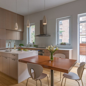 ZeroEnergy Design
This renovated brick rowhome in Boston’s South End offers a modern aesthetic within a historic structure, creative use of space, exceptional thermal comfort, a reduced carbon footprint, and a passive stream of income.
DESIGN PRIORITIES. The goals for the project were clear - design the primary unit to accommodate the family’s modern lifestyle, rework the layout to create a desirable rental unit, improve thermal comfort and introduce a modern aesthetic. We designed the street-level entry as a shared entrance for both the primary and rental unit. The family uses it as their everyday entrance - we planned for bike storage and an open mudroom with bench and shoe storage to facilitate the change from shoes to slippers or bare feet as they enter their home. On the main level, we expanded the kitchen into the dining room to create an eat-in space with generous counter space and storage, as well as a comfortable connection to the living space. The second floor serves as master suite for the couple - a bedroom with a walk-in-closet and ensuite bathroom, and an adjacent study, with refinished original pumpkin pine floors. The upper floor, aside from a guest bedroom, is the child's domain with interconnected spaces for sleeping, work and play. In the play space, which can be separated from the work space with new translucent sliding doors, we incorporated recreational features inspired by adventurous and competitive television shows, at their son’s request.
MODERN MEETS TRADITIONAL. We left the historic front facade of the building largely unchanged - the security bars were removed from the windows and the single pane windows were replaced with higher performing historic replicas. We designed the interior and rear facade with a vision of warm modernism, weaving in the notable period features. Each element was either restored or reinterpreted to blend with the modern aesthetic. The detailed ceiling in the living space, for example, has a new matte monochromatic finish, and the wood stairs are covered in a dark grey floor paint, whereas the mahogany doors were simply refinished. New wide plank wood flooring with a neutral finish, floor-to-ceiling casework, and bold splashes of color in wall paint and tile, and oversized high-performance windows (on the rear facade) round out the modern aesthetic.
RENTAL INCOME. The existing rowhome was zoned for a 2-family dwelling but included an undesirable, single-floor studio apartment at the garden level with low ceiling heights and questionable emergency egress. In order to increase the quality and quantity of space in the rental unit, we reimagined it as a two-floor, 1 or 2 bedroom, 2 bathroom apartment with a modern aesthetic, increased ceiling height on the lowest level and provided an in-unit washer/dryer. The apartment was listed with Jackie O'Connor Real Estate and rented immediately, providing the owners with a source of passive income.
ENCLOSURE WITH BENEFITS. The homeowners sought a minimal carbon footprint, enabled by their urban location and lifestyle decisions, paired with the benefits of a high-performance home. The extent of the renovation allowed us to implement a deep energy retrofit (DER) to address air tightness, insulation, and high-performance windows. The historic front facade is insulated from the interior, while the rear facade is insulated on the exterior. Together with these building enclosure improvements, we designed an HVAC system comprised of continuous fresh air ventilation, and an efficient, all-electric heating and cooling system to decouple the house from natural gas. This strategy provides optimal thermal comfort and indoor air quality, improved acoustic isolation from street noise and neighbors, as well as a further reduced carbon footprint. We also took measures to prepare the roof for future solar panels, for when the South End neighborhood’s aging electrical infrastructure is upgraded to allow them.
URBAN LIVING. The desirable neighborhood location allows the both the homeowners and tenant to walk, bike, and use public transportation to access the city, while each charging their respective plug-in electric cars behind the building to travel greater distances.
OVERALL. The understated rowhouse is now ready for another century of urban living, offering the owners comfort and convenience as they live life as an expression of their values.
Photography: Eric Roth Photo
 Rosenberg Kolb Architects
Rosenberg Kolb Architects is proud to announce our renovation of a 1747 timber frame house on Nantucket Island, completed in 2011. The first historic renovation project in Nantucket to receive LEED Gold status. The project was given a Grand Award by Eco Home Magazine in July, 2011.
The project included:
Restructuring the foundations to align and stabilize the structure in addition to providing for a new insulated crawl space;
A 260 square foot addition for a kitchen, bath, and new entry;
New cedar shingles, roof shingles, and restored historic windows;
The house met the strict regulations of Nantucket's Historic District.
On the inside, LEED Gold certification was met through:
High R-value insulation and reduced air leakage;
High efficiency heating, air conditioning, plumbing fixtures, and appliances;
Low-emission paints and finishes as well as a clay wall finish;
Using reclaimed materials from the original house and other sites.
The project has been published in:
N Magazine July 2011
Eco Home Magazine July 2011
New England Home June 2011
 Artistic Concrete Surfaces
Lindsey Denny
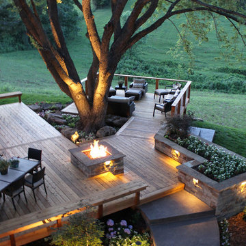
Example of a large trendy backyard deck design in Kansas City with a fire pit and no cover
Example of a large trendy backyard deck design in Kansas City with a fire pit and no cover
 TATCOR DESIGN BUILD
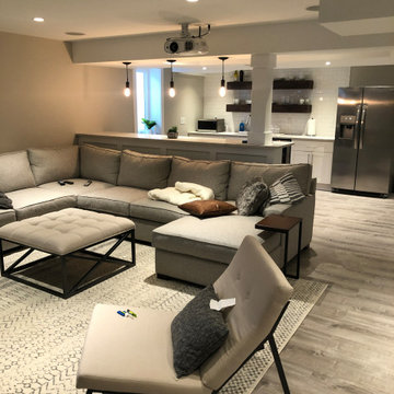
Due to the limited space and the budget, we chose to install a wall bar versus a two-level bar front. The wall bar included white cabinetry below a white/grey quartz counter top, open wood shelving, a drop-in sink, beverage cooler, and full fridge. For an excellent entertaining area along with a great view to the large projection screen, a half wall bar height top was installed with bar stool seating for four and custom lighting. The AV projectors were a great solution for providing an awesome entertainment area at reduced costs. HDMI cables and cat 6 wires were installed and run from the projector to a closet where the Yamaha AV receiver as placed giving the room a clean simple look along with the projection screen and speakers mounted on the walls.
 Alderwood Landscape Architecture and Construction
Brian Parks
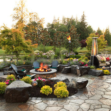
Example of a classic stone patio design in Seattle with a fire pit and no cover
Example of a classic stone patio design in Seattle with a fire pit and no cover
 Christopher Architecture & Interiors
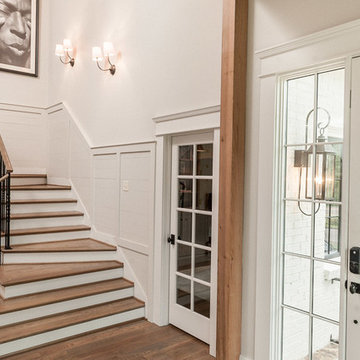
Inspiration for a transitional wooden l-shaped staircase remodel in Birmingham with painted risers
 Innovative Design Build
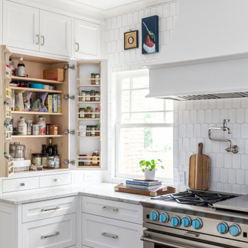
Our clients wanted to stay true to the style of this 1930's home with their kitchen renovation. Changing the footprint of the kitchen to include smaller rooms, we were able to provide this family their dream kitchen with all of the modern conveniences like a walk in pantry, a large seating island, custom cabinetry and appliances. It is now a sunny, open family kitchen.
 Eldorado Stone
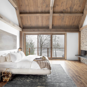
The classic elegance and intricate detail of small stones combined with the simplicity of a panel system give this stone the appearance of a precision hand-laid dry-stack set. Stones 4″ high and 8″, 12″ and 20″ long makes installation easy for expansive walls and column fascias alike.
Stone: Stacked Stone - Alderwood
Get a Sample of Stacked Stone: https://shop.eldoradostone.com/products/stacked-stone-sample
Photo and Design by Caitlin Stothers Design

 Fautt Homes
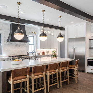
Amazing open kitchen with white shaker cabinets and stained center island with matching floating shelves. Bronze and brass lighting and marble subway backsplash.
 Studio Dearborn
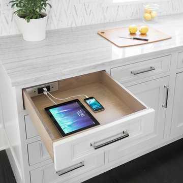
A 1920s colonial in a shorefront community in Westchester County had an expansive renovation with new kitchen by Studio Dearborn. Countertops White Macauba; interior design Lorraine Levinson. Photography, Timothy Lenz.

 FineLine Kitchens, Inc.
Hi everyone, I'm Sarah and Ogun we are here with fine line kitchens. So we are a couple working together. I do the interior design and remodeling of the space material selection meeting with the clients. And I handled operations outside, you know meaning all the construction work that is taking place the inside. The houses that we work in. I handle all the aspects of the construction, so today's project is very special. We're in Vienna and the client had a very big family. It's a family of seven that lives here. So we had a few aspects that we needed to keep in mind while designing this one. Having everybody be able to sit on the island. So we wanted plenty of seating all the way around. We didn't want anybody standing or anything like that. So what we did is we maximize the space. The center island is the biggest part of the kitchen. We use a natural stone to kind of give it a beautiful texture versus quartz. It's kind of standard white or kind of fabricated, so I wanted something very natural. We did this because I took my inspiration from the outside, so the inspiration if you look at the view right in front of me is there are so many greens there's a lot of brass accents and I wanted to bring this. Into this kitchen while designing it for my clients. She is very warm very. She wanted a very homey, comfy kind of look for the kitchen. So that's what we did today. As you can see, the cabinets are sage green, very light, so I still think it's a neutral, but it's a lighter color that again brings the outside in and we combine that with the oak right behind me so it's a slightly warm oak. It's not very dark. It's not very light. It's a medium brown and the same color went on the island. To kind of tie these two in and the backsplash, my favorite part is where you can see a little bit of design. It is, in my opinion still classic, but includes a pattern so the outside part is as we said in the beginning, is handled by my husband. I'd like him to speak a little bit about that. Thanks, Sarah, I want to talk to you guys a little bit about the construction part of this project. Originally this kitchen was located mostly in this area. They had their stove there sing. It was more of a peninsula layout in Sarah's and the customer vision they wanted. They wanted to get rid of the peninsula and they want to be able to have a huge island that can at least sit seven people because they're familiar with seven. So we wanted to make sure that we can achieve this design and bring it to life so that they can be happy with this layout. Some of the challenges we had, the house, the home being, you know, old home. There were a lot of you know the older electrical and plumbing that had to be replaced. We had to relocate the stove from here to this area. Over here we had put a nice foot fan that we had to relocate all the ductwork and the plumbing. Was being on the peninsula area. We had to relocate it to the center islands. So we achieved all this and kind of like bring it to bring in this kitchen up to date it looks beautiful. That's true, so yes, the old layout did not function for my clients because everything was kind of gathered on one side of the kitchen. So there was like a peninsula right there. So the end of this island kind of continued straight. And that was just the L shape. Kind of where everything was and there used to be another big table here, so they were using only kind of half of the space. So like I said at the beginning, our vision was to kind of feed everybody at the island, create some symmetry. 'cause I love that. So as you can see behind me, this is kind of the focal point symmetrical. Everything is kind of even we wanted to also panel the fridge here so it mimics the pantry and another size. So when you're looking at it, it is bringing again that symmetry back again. I hope you enjoyed this kitchen and this video and I'll see you soon. So how do you think this project turned out? It's nice. I like the color. I think it turned out nice. It's kind of like a little bit different color than what we always do. So I realize. Are you giving me a little bit of credit here that I did something different? Are you proud? I'm so proud of you. Other than that I like it. That they have kind of like a two sink. So if this was our kitchen, if we ever like you can have your own. I can have mine if we ever get into a fight then this can be like my own kitchen. Why are we gonna bring in a fight right now? So I'm cooking anyway. You're grilling most of the time, So what are you even talking about? My kitchen? That's my kitchen. You can just take the small sink. That's fine. It's always good to have your own space right there, so anyways. Thank you guys for watching. We hope to see you soon and if you have any questions please click the link below. It'll lead you to our website, house, YouTube and all of the social media is so nice to have you guys. We'll see you soon. Thanks bye bye-bye.

 Terri Brien Interiors
Complete bathroom remodel. this project was taken down to the studs. Custom design vanity with spa tower which incorporates a styling tools drawer, shallow makeup drawers and plenty of functional storage. To reduce waster space under the sink we made the cabinet below more shallow in order to have a drawer below which will optimize usable storage space.
1