
Search results for "Reduce items" in Home Design Ideas
 Universal Appliance and Kitchen Center
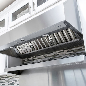
Viking 36" Wide 18" High Wall Hood - VWH53648
Available at Universal Appliance and Kitchen Center.
Appearance and Design
- Backlit LED knobs extend and illuminate to control lighting level and fan speed, then fully retract when not in use
- Seamless design provides a refined finish to your kitchen
- Optional recirculating kit accessory for ventless ducting sold separately
- Heavy-duty, commercial-type size, construction, design, and styling
Quiet, Efficient, and Maintenance-Free Ventilators*
- Tough-box ventilator housing protects blower and quietly removes smoke and odor
- Quietest hood and ventilator combination in the industry
- Multi-speed ventilator control knob allows precise adjustment to desired fan speed
- Maintenance-free ventilators never need to be cleaned with the commercial-type hood filters doing the dirty work
- Cook with peace of mind as the built-in heat sensor activates the ventilator to full power if cooking temperatures reach uncomfortable levels
* Ventilators must be purchased separately for 18"H. Hoods and are available in internal, external, and in-line models
Bright LED Lighting
- Dimmable lighting controls provide custom illumination for enhanced surface cooking visibility
- Long-life LED light bulbs are energy efficient and easily replaceable
Easy Maintenance and Clean-up
- Commercial-type baffle filters efficiently remove heat and grease vapors from the air
- Stainless steel dishwasher-safe filters are easily removed for quick cleaning
- Low-profile filter system reduces interior hood space, leaving less surface to clean
Optional Accessories
Wall Hood Duct Covers
- DCW36
- 12" depth, 12" height duct cover
- Available in finishes to match rangehoods
Wall Hood Backsplashes
- BKS36
- Protect wall space below hood
- Create a continuous finish between cooking surface and hood
- Low maintenance, easy to clean
- 30" high
- Available in stainless steel (SS) only
Wall Hood Warming Shelf Panels
- WGP36
- Hold cookware and condiments
- May be used with a heat lamp to keep food warm
- Fold up/down, heavy-duty warming shelves (non-removable) factory installed on stainless steel (SS) backsplashes
15 7/8" wide by 10 1/8" deep
- Model has two shelves
- Available in stainless steel (SS) only
In-Line Blower Accessories
- VSIL10 - Duct Silencer Accessory for 10" duct
- ILVK - Vibration Isolator Kit Accessory
Exclusive Color Finishes
- Available in Stainless Steel (SS), Black (BK), White (WH), Graphite Gray (GG), Burgundy (BU), and Cobalt Blue (CB)
Warranty Highlights*
- Three-year full warranty - complete unit
- Five-year limited - all ventilator motors
- Ninety-day full - cosmetic parts such as glass, painted items, and decorative items
Model numbers
VWH53648 - 36" width
 Chapman Design Group, Inc.
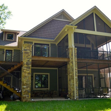
This rustic style home on Hartwell Lake was designed and built for the owners to enjoy with family and friends during their active weekend lifestyle. The home was built on a narrow, deep lot that was semi-level on the roadside and steep on the lakeside. The back half of the lot heavily wooded with mature oak and poplar trees reducing the harsh sun’s heat gain on the home.
The exterior utilizes fiber cement cedar shake and lap siding complimented by deep brown colors for the windows, soffit, trim and the large square columns. A nice balance of natural earth toned stacked stone rounds out the exterior materials completing the rustic casual lake living.
The home 5400 SF is designed and built on thee levels each having a primary focus. The main level creates primary daily living for the owners. This level features an open plan with an entry, stair, dining, kitchen and living areas leading to a large lakeside screened porch. A master suite is privately tucked off its own hallway and allowing it to enjoy the lakeside as well with its own private deck. On the opposite side are two bedrooms, a study and a shared bathroom for each to utilize. An open carport for two vehicles was created with the motor court and connects to the mudroom/utility room giving the owners direct entry into their home.
The upper level is for the grand children with an oversized bedroom, bathroom and loft area for play.
The lower level is the considered the party level. Its primary feature is an elevated stage for the owner’s band opened to a large seating area, dining and kitchen for viewing and listening with direct access to another screened porch. Flanking each side is a theater and two additional bedrooms and bathrooms.
Energy Efficient features include:
• The majority of the lower level sunk into the site below grade
• 6” thick walls utilizing advanced framing techniques
• Foil covered roof sheathing
• Extensive use of blown in cellulous
• All windows & doors are double paned low E argon filed glass
• Tank-less water heaters
• Three separate high efficiency HVAC units with programmable thermostats and a fresh air ERV.
Lastly the owner requested we make every effort to sound proof the home. Many materials and techniques gave a duel purpose and added to the energy efficiency.
These items include:
• 2x6 walls with staggered studs
• Extensive use if rock wool acoustic batting
• Tempered glass in all exterior doors and windows
• ¼ thick Mass Loaded Vinyl (MLV) was installed on the top and bottom of the floor trusses and on all lower level walls.
The combination of the design and detailing utilizing these specific materials enabled us to achieve a 5 Star Plus Energy Star Certification with a HERS Index Score of 50. This home received a the 2015 Pinnacle Award from the SC Home Builders Association for the “Best Achievement in Energy Efficiency” sponsored by the SC Department Commerce.
 Janvrin & Co.
A transformation of a modest raised ranch into a modern oasis. I was the interior designer and general contractor from mechanicals to finishing. It’s also my personal home.
The interior design style is that of modern minimalist meets organic modern. I wanted a space that reduced distractions and let the eyes, head, and soul rest. Where everything inside the home has a specific use and purpose. The objects in our home are fewer but each hold a great personal value. You might expect to see this airy aesthetic, with its gallery white walls, in California or New York. Not nestled in a modest 50 year old neighborhood in Omaha, Nebraska. Creating a minimal aesthetic is one of the trickiest design styles to pull off. It is more than just less stuff and lots of white. It means sticking to these design principals:
-weaving in an abundance of textures
-incorporating natural finishes
-keenly curating art
-giving extra attention to scale
-limiting purely decorative items
-maximizing natural light
This style is not to be confused with the frugality of reductive design. I have incorporated many elevated basics that create an aesthetic of quiet luxury:
-architectural bead for trim-less doors
-first-of-its kind interior door hardware made of terrazzo
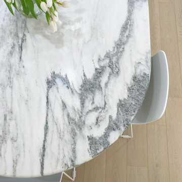
-historical marble found in landmark interiors like the NY Public Library
-premium flush air vents that disappear out of site
-luxury appliances from GE Café and Signature
-elegant and resilient terrazzo field tiles
Ours was not a simple interior remodel and addition:
-gutted and remodeled the existing 2,000 SF
-added on approximately another 1,000 SF
-moved and installed all new major mechanicals i.e. heating, plumbing and electrical.
-knocked through foundation walls to extend the space back
-dug down and built up
Find the right local pro for your project

 Crystal Kitchen + Bath
This laundry room and mudroom remodel was designed to create a clean, efficient, and welcoming space with elevated style. What was once a purely utilitarian area is now an organized, joyful, and multifunctional room that supports everyday routines and reduces clutter from the family’s frequent use of the garage entry. Thoughtful cabinetry, improved organization, durable work surfaces, and dedicated areas for air-drying, sorting, and folding make the room feel like a practical extension of the home rather than simply a utility space.
Functional Features
• A custom fold-down drying rack provides a beautiful and practical solution for air-drying delicate clothing.
• The tall drawer stack between the washer and dryer includes an oversized lower drawer that functions as a built-in hamper.
• A custom built-in bench with storage lockers keeps coats and shoes tidy yet accessible, while motion-sensor lighting in the shoe cubbies makes everyday use convenient at any time of day.
• Cabinetry extends to the ceiling, maximizing vertical storage and concealing bulk items such as paper goods, detergents, cleaning supplies, outdoor clothing, and other household essentials.
Materials and Finishes
Durable materials were selected to withstand frequent use while maintaining a cohesive, elevated look. Large-format dark floor tile helps conceal dirt tracked in from the garage, while a combination of warm white and deep cherry cabinetry adds richness and contrast. Stain-resistant white quartz was used for both the folding counter and bench top, and a 2 ½-inch round mosaic tile backsplash complements the palette. Brushed gold hardware adds warmth and visual appeal.
Lighting
Lighting enhancements further improve both function and atmosphere. Under-cabinet lighting at the folding counter adds task illumination, while motion-sensor lighting in the shoe cubbies increases convenience. An oversized statement ceiling fixture brings warmth, personality, and a finished designer touch to the space.

 KOZAK Hauling and Junk Removal
#1 JUNK REMOVAL KOZAK Hauling and Junk Removal is The Best New Port Richey Junk Removal Service! KOZAK Hauling and Junk Removal Is your local junk removal expert! Operating in the New Port Richey area, we are ready to help you reclaim your space! KOZAK Hauling and Junk Removal is a full-service junk removal company helping residential & commercial clients remove whatever type of junk you may have. Whether its junk removal, scrap metal recycling, mattress disposal, trash removal, electronics recycling, furniture disposal or a full office cleanout, whatever you call it, if you don't need it, we can take it! We do our very best to recycle and donate to local charities, keeping as much junk out of our landfills as possible. 727-455-5144
 San Luis Kitchen Co.
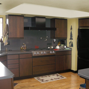
Doors and drawer-heads stained Dark Lager contrast with black face-frames for a dramatic look. The gray quartz counter is extended full height at the back splash.
A bank of floor to ceiling cabinets separates the dining area from the kitchen, confining the space in both rooms. Note the massive blank end of the cabinets – in desperation to reduce the scale of this monolith, the homeowners decorated it with a clock and small nick-knacks, but it didn’t help. This is not a welcoming entrance to the kitchen. On the dining side, there is a hutch (with mirrored back), which ostensibly could serve as a buffet, however it is inconvenient to the prep area of the kitchen as it is tucked behind the tall pantry cabinets. And on the opposite wall is a separate wet bar which could serve more conveniently with a more unified kitchen and dining space.
You would think that the large pantry cabinets would be a plus in a kitchen, however their placement and the deep fixed shelves belie any positive contribution.
The looming wall of cabinetry confines the space and is a claustrophobe’s nightmare. Then note the clutter and chaos of storing small food items (normally most of your daily supplies don’t come in giant bulk quantities and sizes) on deep fixed shelves. Nothing really fits and canned goods become lost behind cereal boxes while baking supplies are piled on top of the snacks!
The decision to remodel – the lady of the house wanted her kitchen to reflect the couples’ modern lifestyle. They are passionate people who love to entertain their friends and family – they need an open and accessible space that is both dramatic in bearing and easy to use on a daily basis.
San Luis Kitchen began design by helping the homeowners choose a style and color scheme for their kitchen. The decision was made – a slab style cabinet door in a “Dark Lager” stain on maple wood. Because the homeowners did not want handles on their cabinets, we used a face frame cabinet construction to allow for “finger-pull” opening of the doors and drawers. The face frame is colored black as a contrast to the doors for a bold finish. Dark gray engineered-quartz counters and full height backsplash complete the picture.
Kitchen layout and design is next. The sink remains at the corner window with the dishwasher moved to the left wall – giving space for a 36” range-top and dramatic 42” rectilinear hood. The refrigerator remains in place but is replaced with a black model. The cabinet above it is now 24” deep for a custom look and a built-in microwave/oven combo are placed to the right. Simple-line contemporary trim and uniform black and stainless modern appliances reinforce the linear aesthetic created by the doorstyle and face frame detailing.
In place of the pantry, San Luis Kitchen designed a true buffet – accessible from both kitchen and dining sides. The storage needs are met by upper cabinets, base corner swing-out shelves and drawers, and a tall (adjustable) roll-out shelf unit on the dining side. We added an end wall (with niches) and extended the cabinetry and counter beyond as a welcome to the kitchen. In the dining room glass doors for display items grace the buffet. The wet bar is now visually and functionally joined to the kitchen – matching cabinetry and the more open overall plan tie everything together as a whole.
Now in their new kitchen, the homeowners can prepare, serve, and enjoy a meal with their guests. The mosaic glass backsplash used at the bar adds pizzazz for fun gatherings and an evening’s entertainment.
 The Brooklyn Studio
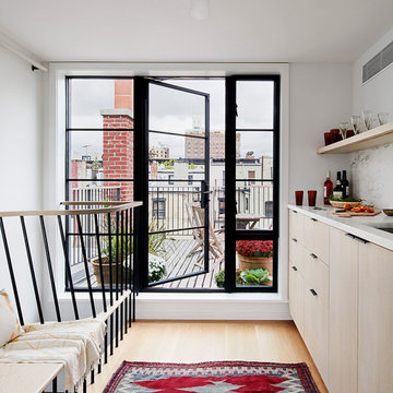
This residence was a complete gut renovation of a 4-story row house in Park Slope, and included a new rear extension and penthouse addition. The owners wished to create a warm, family home using a modern language that would act as a clean canvas to feature rich textiles and items from their world travels. As with most Brooklyn row houses, the existing house suffered from a lack of natural light and connection to exterior spaces, an issue that Principal Brendan Coburn is acutely aware of from his experience re-imagining historic structures in the New York area. The resulting architecture is designed around moments featuring natural light and views to the exterior, of both the private garden and the sky, throughout the house, and a stripped-down language of detailing and finishes allows for the concept of the modern-natural to shine.
Upon entering the home, the kitchen and dining space draw you in with views beyond through the large glazed opening at the rear of the house. An extension was built to allow for a large sunken living room that provides a family gathering space connected to the kitchen and dining room, but remains distinctly separate, with a strong visual connection to the rear garden. The open sculptural stair tower was designed to function like that of a traditional row house stair, but with a smaller footprint. By extending it up past the original roof level into the new penthouse, the stair becomes an atmospheric shaft for the spaces surrounding the core. All types of weather – sunshine, rain, lightning, can be sensed throughout the home through this unifying vertical environment. The stair space also strives to foster family communication, making open living spaces visible between floors. At the upper-most level, a free-form bench sits suspended over the stair, just by the new roof deck, which provides at-ease entertaining. Oak was used throughout the home as a unifying material element. As one travels upwards within the house, the oak finishes are bleached to further degrees as a nod to how light enters the home.
The owners worked with CWB to add their own personality to the project. The meter of a white oak and blackened steel stair screen was designed by the family to read “I love you” in Morse Code, and tile was selected throughout to reference places that hold special significance to the family. To support the owners’ comfort, the architectural design engages passive house technologies to reduce energy use, while increasing air quality within the home – a strategy which aims to respect the environment while providing a refuge from the harsh elements of urban living.
This project was published by Wendy Goodman as her Space of the Week, part of New York Magazine’s Design Hunting on The Cut.
Photography by Kevin Kunstadt

Sponsored
Delaware, OH

Buckeye Basements, Inc.
Central Ohio's Basement Finishing ExpertsBest Of Houzz '13-'21
 Janvrin & Co.
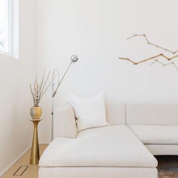
A transformation of a modest raised ranch into a modern oasis. I was the interior designer and general contractor from mechanicals to finishing. It’s also my personal home.
The interior design style is that of modern minimalist meets organic modern. I wanted a space that reduced distractions and let the eyes, head, and soul rest. Where everything inside the home has a specific use and purpose. The objects in our home are fewer but each hold a great personal value. You might expect to see this airy aesthetic, with its gallery white walls, in California or New York. Not nestled in a modest 50 year old neighborhood in Omaha, Nebraska. Creating a minimal aesthetic is one of the trickiest design styles to pull off. It is more than just less stuff and lots of white. It means sticking to these design principals:
-weaving in an abundance of textures
-incorporating natural finishes
-keenly curating art
-giving extra attention to scale
-limiting purely decorative items
-maximizing natural light
This style is not to be confused with the frugality of reductive design. I have incorporated many elevated basics that create an aesthetic of quiet luxury:
-architectural bead for trim-less doors
-first-of-its kind interior door hardware made of terrazzo
-historical marble found in landmark interiors like the NY Public Library
-premium flush air vents that disappear out of site
-luxury appliances from GE Café and Signature
-elegant and resilient terrazzo field tiles
Ours was not a simple interior remodel and addition:
-gutted and remodeled the existing 2,000 SF
-added on approximately another 1,000 SF
-moved and installed all new major mechanicals i.e. heating, plumbing and electrical.
-knocked through foundation walls to extend the space back
-dug down and built up
 Janvrin & Co.
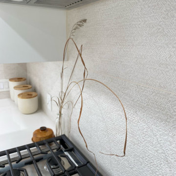
A transformation of a modest raised ranch into a modern oasis. I was the interior designer and general contractor from mechanicals to finishing. It’s also my personal home.
The interior design style is that of modern minimalist meets organic modern. I wanted a space that reduced distractions and let the eyes, head, and soul rest. Where everything inside the home has a specific use and purpose. The objects in our home are fewer but each hold a great personal value. You might expect to see this airy aesthetic, with its gallery white walls, in California or New York. Not nestled in a modest 50 year old neighborhood in Omaha, Nebraska. Creating a minimal aesthetic is one of the trickiest design styles to pull off. It is more than just less stuff and lots of white. It means sticking to these design principals:
-weaving in an abundance of textures
-incorporating natural finishes
-keenly curating art
-giving extra attention to scale
-limiting purely decorative items
-maximizing natural light
This style is not to be confused with the frugality of reductive design. I have incorporated many elevated basics that create an aesthetic of quiet luxury:
-architectural bead for trim-less doors
-first-of-its kind interior door hardware made of terrazzo
-historical marble found in landmark interiors like the NY Public Library
-premium flush air vents that disappear out of site
-luxury appliances from GE Café and Signature
-elegant and resilient terrazzo field tiles
Ours was not a simple interior remodel and addition:
-gutted and remodeled the existing 2,000 SF
-added on approximately another 1,000 SF
-moved and installed all new major mechanicals i.e. heating, plumbing and electrical.
-knocked through foundation walls to extend the space back
-dug down and built up
 Janvrin & Co.
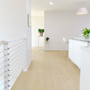
A transformation of a modest raised ranch into a modern oasis. I was the interior designer and general contractor from mechanicals to finishing. It’s also my personal home.
The interior design style is that of modern minimalist meets organic modern. I wanted a space that reduced distractions and let the eyes, head, and soul rest. Where everything inside the home has a specific use and purpose. The objects in our home are fewer but each hold a great personal value. You might expect to see this airy aesthetic, with its gallery white walls, in California or New York. Not nestled in a modest 50 year old neighborhood in Omaha, Nebraska. Creating a minimal aesthetic is one of the trickiest design styles to pull off. It is more than just less stuff and lots of white. It means sticking to these design principals:
-weaving in an abundance of textures
-incorporating natural finishes
-keenly curating art
-giving extra attention to scale
-limiting purely decorative items
-maximizing natural light
This style is not to be confused with the frugality of reductive design. I have incorporated many elevated basics that create an aesthetic of quiet luxury:
-architectural bead for trim-less doors
-first-of-its kind interior door hardware made of terrazzo
-historical marble found in landmark interiors like the NY Public Library
-premium flush air vents that disappear out of site
-luxury appliances from GE Café and Signature
-elegant and resilient terrazzo field tiles
Ours was not a simple interior remodel and addition:
-gutted and remodeled the existing 2,000 SF
-added on approximately another 1,000 SF
-moved and installed all new major mechanicals i.e. heating, plumbing and electrical.
-knocked through foundation walls to extend the space back
-dug down and built up
 TKS Design Group
Download our free ebook, Creating the Ideal Kitchen. DOWNLOAD NOW
This family from Wheaton was ready to remodel their kitchen, dining room and powder room. The project didn’t call for any structural or space planning changes but the makeover still had a massive impact on their home. The homeowners wanted to change their dated 1990’s brown speckled granite and light maple kitchen. They liked the welcoming feeling they got from the wood and warm tones in their current kitchen, but this style clashed with their vision of a deVOL type kitchen, a London-based furniture company. Their inspiration came from the country homes of the UK that mix the warmth of traditional detail with clean lines and modern updates.
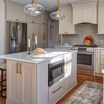
To create their vision, we started with all new framed cabinets with a modified overlay painted in beautiful, understated colors. Our clients were adamant about “no white cabinets.” Instead we used an oyster color for the perimeter and a custom color match to a specific shade of green chosen by the homeowner. The use of a simple color pallet reduces the visual noise and allows the space to feel open and welcoming. We also painted the trim above the cabinets the same color to make the cabinets look taller. The room trim was painted a bright clean white to match the ceiling.
In true English fashion our clients are not coffee drinkers, but they LOVE tea. We created a tea station for them where they can prepare and serve tea. We added plenty of glass to showcase their tea mugs and adapted the cabinetry below to accommodate storage for their tea items. Function is also key for the English kitchen and the homeowners. They requested a deep farmhouse sink and a cabinet devoted to their heavy mixer because they bake a lot. We then got rid of the stovetop on the island and wall oven and replaced both of them with a range located against the far wall. This gives them plenty of space on the island to roll out dough and prepare any number of baked goods. We then removed the bifold pantry doors and created custom built-ins with plenty of usable storage for all their cooking and baking needs.
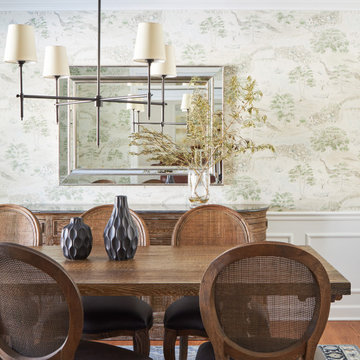
The client wanted a big change to the dining room but still wanted to use their own furniture and rug. We installed a toile-like wallpaper on the top half of the room and supported it with white wainscot paneling. We also changed out the light fixture, showing us once again that small changes can have a big impact.
As the final touch, we also re-did the powder room to be in line with the rest of the first floor. We had the new vanity painted in the same oyster color as the kitchen cabinets and then covered the walls in a whimsical patterned wallpaper. Although the homeowners like subtle neutral colors they were willing to go a bit bold in the powder room for something unexpected. For more design inspiration go to: www.kitchenstudio-ge.com
 Liebherr Appliances North America
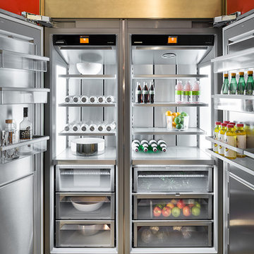
MONOLITH INCEPTION KITCHEN
designed by Richard T. Anuszkiewicz
Featured brands include
Premier Custom-Built Cabinetry
SUPERIORE ranges
KALLISTA Plumbing
Dekton by Cosentino countertops
Burchette & Burchette Hardwood Floors,
Bradley USA Bridget Beari Designs wallpaper
Grothouse Lumber Custom Wood Surfaces.
 TKS Design Group
Download our free ebook, Creating the Ideal Kitchen. DOWNLOAD NOW
This family from Wheaton was ready to remodel their kitchen, dining room and powder room. The project didn’t call for any structural or space planning changes but the makeover still had a massive impact on their home. The homeowners wanted to change their dated 1990’s brown speckled granite and light maple kitchen. They liked the welcoming feeling they got from the wood and warm tones in their current kitchen, but this style clashed with their vision of a deVOL type kitchen, a London-based furniture company. Their inspiration came from the country homes of the UK that mix the warmth of traditional detail with clean lines and modern updates.
To create their vision, we started with all new framed cabinets with a modified overlay painted in beautiful, understated colors. Our clients were adamant about “no white cabinets.” Instead we used an oyster color for the perimeter and a custom color match to a specific shade of green chosen by the homeowner. The use of a simple color pallet reduces the visual noise and allows the space to feel open and welcoming. We also painted the trim above the cabinets the same color to make the cabinets look taller. The room trim was painted a bright clean white to match the ceiling.
In true English fashion our clients are not coffee drinkers, but they LOVE tea. We created a tea station for them where they can prepare and serve tea. We added plenty of glass to showcase their tea mugs and adapted the cabinetry below to accommodate storage for their tea items. Function is also key for the English kitchen and the homeowners. They requested a deep farmhouse sink and a cabinet devoted to their heavy mixer because they bake a lot. We then got rid of the stovetop on the island and wall oven and replaced both of them with a range located against the far wall. This gives them plenty of space on the island to roll out dough and prepare any number of baked goods. We then removed the bifold pantry doors and created custom built-ins with plenty of usable storage for all their cooking and baking needs.
The client wanted a big change to the dining room but still wanted to use their own furniture and rug. We installed a toile-like wallpaper on the top half of the room and supported it with white wainscot paneling. We also changed out the light fixture, showing us once again that small changes can have a big impact.
As the final touch, we also re-did the powder room to be in line with the rest of the first floor. We had the new vanity painted in the same oyster color as the kitchen cabinets and then covered the walls in a whimsical patterned wallpaper. Although the homeowners like subtle neutral colors they were willing to go a bit bold in the powder room for something unexpected. For more design inspiration go to: www.kitchenstudio-ge.com

Sponsored
Columbus, OH

Hope Restoration & General Contracting
Columbus Design-Build, Kitchen & Bath Remodeling, Historic Renovations
 Kathleen Jennison
An Arts & Crafts Bungalow is one of my favorite styles of homes. We have quite a few of them in our Stockton Mid-Town area. And when C&L called us to help them remodel their 1923 American Bungalow, I was beyond thrilled.
As per usual, when we get a new inquiry, we quickly Google the project location while we are talking to you on the phone. My excitement escalated when I saw the Google Earth Image of the sweet Sage Green bungalow in Mid-Town Stockton. "Yes, we would be interested in working with you," I said trying to keep my cool.
But what made it even better was meeting C&L and touring their home, because they are the nicest young couple, eager to make their home period perfect. Unfortunately, it had been slightly molested by some bad house-flippers, and we needed to bring the bathroom back to it "roots."
We knew we had to banish the hideous brown tile and cheap vanity quickly. But C&L complained about the condensation problems and the constant fight with mold. This immediately told me that improper remodeling had occurred and we needed to remedy that right away.
The Before: Frustrations with a Botched Remodel
The bathroom needed to be brought back to period appropriate design with all the functionality of a modern bathroom. We thought of things like marble countertop, white mosaic floor tiles, white subway tile, board and batten molding, and of course a fabulous wallpaper.
This small (and only) bathroom on a tight budget required a little bit of design sleuthing to figure out how we could get the proper look and feel. Our goal was to determine where to splurge and where to economize and how to complete the remodel as quickly as possible because C&L would have to move out while construction was going on.
The Process: Hard Work to Remedy Design and Function
During our initial design study, (which included 2 hours in the owners’ home), we noticed framed images of William Morris Arts and Crafts textile patterns and knew this would be our design inspiration. We presented C&L with three options and they quickly selected the Pimpernel Design Concept.
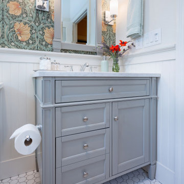
We had originally selected the Black and Olive colors with a black vanity, mirror, and black and white floor tile. C&L liked it but weren’t quite sure about the black, We went back to the drawing board and decided the William & Co Pimpernel Wallpaper in Bayleaf and Manilla color with a softer gray painted vanity and mirror and white floor tile was more to their liking.
After the Design Concept was approved, we went to work securing the building permit, procuring all the elements, and scheduling our trusted tradesmen to perform the work.
We did uncover some shoddy work by the flippers such as live electrical wires hidden behind the wall, plumbing venting cut-off and buried in the walls (hence the constant dampness), the tub barely balancing on two fence boards across the floor joist, and no insulation on the exterior wall.
All of the previous blunders were fixed and the bathroom put back to its previous glory. We could feel the house thanking us for making it pretty again.
The After Reveal: Cohesive Design Decisions
We selected a simple white subway tile for the tub/shower. This is always classic and in keeping with the style of the house.
We selected a pre-fab vanity and mirror, but they look rich with the quartz countertop. There is much more storage in this small vanity than you would think.
The Transformation: A Period Perfect Refresh
We began the remodel just as the pandemic reared and stay-in-place orders went into effect. As C&L were already moved out and living with relatives, we got the go-ahead from city officials to get the work done (after all, how can you shelter in place without a bathroom?).
All our tradesmen were scheduled to work so that only one crew was on the job site at a time. We stayed on the original schedule with only a one week delay.
The end result is the sweetest little bathroom I've ever seen (and I can't wait to start work on C&L's kitchen next).
Thank you for joining me in this project transformation. I hope this inspired you to think about being creative with your design projects, determining what works best in keeping with the architecture of your space, and carefully assessing how you can have the best life in your home.
 TKS Design Group
Download our free ebook, Creating the Ideal Kitchen. DOWNLOAD NOW
This family from Wheaton was ready to remodel their kitchen, dining room and powder room. The project didn’t call for any structural or space planning changes but the makeover still had a massive impact on their home. The homeowners wanted to change their dated 1990’s brown speckled granite and light maple kitchen. They liked the welcoming feeling they got from the wood and warm tones in their current kitchen, but this style clashed with their vision of a deVOL type kitchen, a London-based furniture company. Their inspiration came from the country homes of the UK that mix the warmth of traditional detail with clean lines and modern updates.
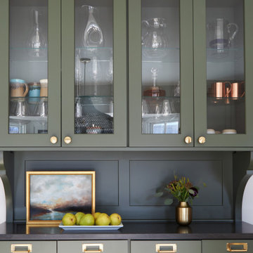
To create their vision, we started with all new framed cabinets with a modified overlay painted in beautiful, understated colors. Our clients were adamant about “no white cabinets.” Instead we used an oyster color for the perimeter and a custom color match to a specific shade of green chosen by the homeowner. The use of a simple color pallet reduces the visual noise and allows the space to feel open and welcoming. We also painted the trim above the cabinets the same color to make the cabinets look taller. The room trim was painted a bright clean white to match the ceiling.
In true English fashion our clients are not coffee drinkers, but they LOVE tea. We created a tea station for them where they can prepare and serve tea. We added plenty of glass to showcase their tea mugs and adapted the cabinetry below to accommodate storage for their tea items. Function is also key for the English kitchen and the homeowners. They requested a deep farmhouse sink and a cabinet devoted to their heavy mixer because they bake a lot. We then got rid of the stovetop on the island and wall oven and replaced both of them with a range located against the far wall. This gives them plenty of space on the island to roll out dough and prepare any number of baked goods. We then removed the bifold pantry doors and created custom built-ins with plenty of usable storage for all their cooking and baking needs.
The client wanted a big change to the dining room but still wanted to use their own furniture and rug. We installed a toile-like wallpaper on the top half of the room and supported it with white wainscot paneling. We also changed out the light fixture, showing us once again that small changes can have a big impact.
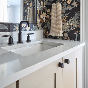
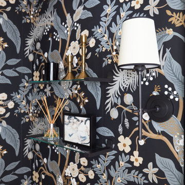
As the final touch, we also re-did the powder room to be in line with the rest of the first floor. We had the new vanity painted in the same oyster color as the kitchen cabinets and then covered the walls in a whimsical patterned wallpaper. Although the homeowners like subtle neutral colors they were willing to go a bit bold in the powder room for something unexpected. For more design inspiration go to: www.kitchenstudio-ge.com

 Klopf Architecture
From Mid-Century Classic to the Present
An iconic design updated with comfort, function, and flow for today.
A Remodel That Balances Past and Present
What started as a desire to update a classic Eichler soon became an exploration of how Mid-Century Modern design can successfully evolve for today. The client, a tech professional with a passion for scuba diving and underwater photography, wanted a home that would both honor its original character and feel tailored to his daily life. A lifelong technology enthusiast, he still owns the very first Mac desktop he saved up for as a teenager working at Radio Shack, a detail that underscores his appreciation for design that melds function and form.
Honoring Separation While Expanding Possibility
Unlike many contemporary remodels where walls are opened up to create expansive living spaces, this project took a more restrained approach. The client valued the defined rooms of the original plan and wanted to preserve as much wall space as possible for displaying his large-format underwater photography. The emphasis was not on dramatic spatial reinvention, but on thoughtful refinements. Klopf Architecture shaped a gallery-like backdrop while also expanding the primary suite, modernizing materials and fixtures throughout the home, and improving the functionality and layout of the kitchen. The finished home feels at once timeless and renewed, an Eichler that continues to inspire while fully supporting the lifestyle of its present-day owner.
A major turning point came mid-design. The original project brief had not included an addition, but as the reconfiguration of the primary bedroom and bath unfolded, it became clear that an expansion was the best approach to achieve the client’s vision of a more spacious suite. Fortunately, the adjustment came at a stage when revisions were still manageable and was integrated seamlessly, showing how thoughtful course corrections can strengthen a project rather than hinder it.
Navigating Challenges With Precision
The design development included multiple conceptual rounds, balancing preservation with subtle expansion. During construction, an existing post previously thought to be load-bearing turned out not to be. The structural engineer was able to pivot quickly, and both the post and the cross beam that had been intended to replace it could be omitted, allowing the original rhythm of the Eichler beam bays to be preserved.
Sustainability was not just a checklist item, but a way to align the home with the client’s values of simplicity, efficiency, and long-term functionality. R-38 roof insulation reduced energy usage, solar panels with battery storage provided independence and resilience, and passive comfort strategies eliminated the need forenergy-intensive air conditioning. An electric vehicle charger and an on-demand hot water recirculation system (with call buttons as opposed to having constant circulation) add to the home’s long-term efficiency factors. Together, these moves created a home that is quieter, more comfortable, and better equipped for the future, qualities that supported the client’s pragmatic approach to design and living lightly.
Details That Respect the Eichler DNA
The remodel carries forward the Eichler’s original spirit while introducing new layers of modern livability. Originally, the house was approached along a deep, narrow walk, with the garage on one side and the house on the other, leaving the front door tucked far back within this chasm-like space. By pulling the entry forward, the design reshaped the arrival experience, creating a clearer threshold and a natural drop-off zone for bags, shoes, and keys. This shift also made room for a custom bench at the entry that extends seamlessly through the glass sidelight. The bench and drop-off zone now work together as a single, integrated sequence that supports everyday living while offering a tactile reminder of Eichler’s philosophy of connectedness.
At the client’s request, Klopf reintroduced a classic Eichler gesture by extending the exterior siding into the entry and living room. The detail reinforces a sense of indoor/outdoor continuity while providing a subtle architectural surface that allows the client’s photography to take visual precedence.
The signature concrete masonry wall at the front was reconstructed using blocks sourced to match the originals, now strengthened with rebar for seismic resilience while maintaining a private outdoor courtyard, visually extending the kitchen outward. A decorative trellis element, a detail borrowed from a neighboring Eichler, restores a familiar mid-century modern architectural motif. At the courtyard entry door, a custom etched glass sidelight with an ocean-themed design featuring kelp and jellyfish serves as a subtle homage to the client’s passion for deep-sea diving.
Landscaping became an integral part of the overall transformation. The homeowner engaged landscape architect Randi Johnsen of Third Nature Studio to shape a series of calm, inviting outdoor rooms that read as a natural extension of the interiors. While technically outside of the core construction scope, the landscape design proved central to achieving a sense of completeness and connectedness across the property. Such whole-property considerations often emerge as design ideas take shape, underscoring the importance of flexibility in planning and budgeting, as well as close collaboration among the design team starting early in the process.
The Value of Evolving Scope
As with many custom residential projects, the scope evolved during the design process. What began as a targeted remodel grew to include a new/expanded primary suite, a rebuilt CMU patio wall for strength and longevity, and a solar panel array and battery storage for energy resilience and carbon-reduction. Each thoughtful decision represented a conscious investment in the home’s performance and character, rather than a cost overrun.
The result was a project delivered on schedule, tailored precisely to the client’s lifestyle, and positioned to add long-term value both functionally and aesthetically. By embracing scope evolution as an opportunity rather than a challenge, and relying on good design paired with transparent communication, this remodel demonstrates how Eichler homes can be adapted for contemporary living without erasing their DNA.
Klopf Architecture project team: John Klopf, AIA, and Klara Kevane, Elise Webb and Nicholas LaNasa.
Contractor: Golden Cove Construction
Landscape Design: Third Nature Studio
Structural Engineer: Daniel Bastiao Design
Photography: ©2025 Mariko Reed
Year Completed: 2024
Location: Sunnyvale, CA
 TKS Design Group
Download our free ebook, Creating the Ideal Kitchen. DOWNLOAD NOW
This family from Wheaton was ready to remodel their kitchen, dining room and powder room. The project didn’t call for any structural or space planning changes but the makeover still had a massive impact on their home. The homeowners wanted to change their dated 1990’s brown speckled granite and light maple kitchen. They liked the welcoming feeling they got from the wood and warm tones in their current kitchen, but this style clashed with their vision of a deVOL type kitchen, a London-based furniture company. Their inspiration came from the country homes of the UK that mix the warmth of traditional detail with clean lines and modern updates.
To create their vision, we started with all new framed cabinets with a modified overlay painted in beautiful, understated colors. Our clients were adamant about “no white cabinets.” Instead we used an oyster color for the perimeter and a custom color match to a specific shade of green chosen by the homeowner. The use of a simple color pallet reduces the visual noise and allows the space to feel open and welcoming. We also painted the trim above the cabinets the same color to make the cabinets look taller. The room trim was painted a bright clean white to match the ceiling.
In true English fashion our clients are not coffee drinkers, but they LOVE tea. We created a tea station for them where they can prepare and serve tea. We added plenty of glass to showcase their tea mugs and adapted the cabinetry below to accommodate storage for their tea items. Function is also key for the English kitchen and the homeowners. They requested a deep farmhouse sink and a cabinet devoted to their heavy mixer because they bake a lot. We then got rid of the stovetop on the island and wall oven and replaced both of them with a range located against the far wall. This gives them plenty of space on the island to roll out dough and prepare any number of baked goods. We then removed the bifold pantry doors and created custom built-ins with plenty of usable storage for all their cooking and baking needs.
The client wanted a big change to the dining room but still wanted to use their own furniture and rug. We installed a toile-like wallpaper on the top half of the room and supported it with white wainscot paneling. We also changed out the light fixture, showing us once again that small changes can have a big impact.
As the final touch, we also re-did the powder room to be in line with the rest of the first floor. We had the new vanity painted in the same oyster color as the kitchen cabinets and then covered the walls in a whimsical patterned wallpaper. Although the homeowners like subtle neutral colors they were willing to go a bit bold in the powder room for something unexpected. For more design inspiration go to: www.kitchenstudio-ge.com

Sponsored
Columbus, OH
Hope Restoration & General Contracting
Columbus Design-Build, Kitchen & Bath Remodeling, Historic Renovations
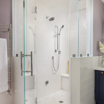
 Thyme & Place Design LLC
This medium sized bathroom had ample space to create a luxurious bathroom for this young professional couple with 3 young children. My clients really wanted a place to unplug and relax where they could retreat and recharge.
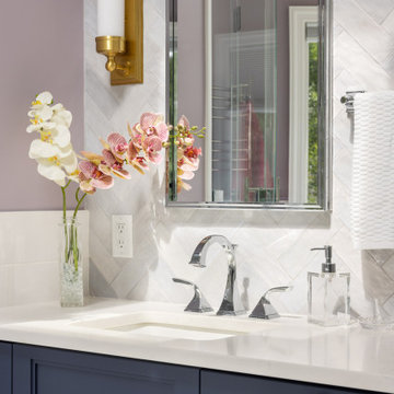
New cabinets were a must with customized interiors to reduce cluttered counter tops and make morning routines easier and more organized. We selected Hale Navy for the painted finish with an upscale recessed panel door. Honey bronze hardware is a nice contrast to the navy paint instead of an expected brushed silver. For storage, a grooming center to organize hair dryer, curling iron and brushes keeps everything in place for morning routines. On the opposite, a pull-out organizer outfitted with trays for smaller personal items keeps everything at the fingertips. I included a pull-out hamper to keep laundry and towels off the floor. Another design detail I like to include is drawers in the sink cabinets. It is much better to have drawers notched for the plumbing when organizing bathroom products instead of filling up a large base cabinet.
The room already had beautiful windows and was bathed in naturel light from an existing skylight. I enhanced the natural lighting with some recessed can lights, a light in the shower as well as sconces around the mirrored medicine cabinets. The best thing about the medicine cabinets is not only the additional storage but when both doors are opened you can see the back of your head. The inside of the cabinet doors are mirrored. Honey Bronze sconces are perfect lighting at the vanity for makeup and shaving.
A larger shower for my very tall client with a built-in bench was a priority for this bathroom. I recommend stream showers whenever designing a bathroom and my client loved the idea of that feature as a surprise for his wife. Steam adds to the wellness and health aspect of any good bathroom design. We were able to access a small closet space just behind the shower a perfect spot for the steam unit. In addition to the steam, a handheld shower is another “standard” item in our shower designs. I like to locate these near a bench so you can sit while you target sore shoulder and back muscles. Another benefit is cleanability of the shower walls and being able to take a quick shower without getting your hair wet. The slide bar is just the thing to accommodate different heights.
For Mrs. a tub for soaking and relaxing were the main ingredients required for this remodel. Here I specified a Bain Ultra freestanding tub complete with air massage, chromatherapy and a heated back rest. The tub filer is floor mounted and adds another element of elegance to the bath. I located the tub in a bay window so the bather can enjoy the beautiful view out of the window. It is also a great way to relax after a round of golf. Either way, both of my clients can enjoy the benefits of this tub.
The tiles selected for the shower and the lower walls of the bathroom are a slightly oversized subway tile in a clean and bright white. The floors are a 12x24 porcelain marble. The shower floor features a flat cut marble pebble tile. Behind the vanity the wall is tiled with Zellage tile in a herringbone pattern. The colors of the tile connect all the colors used in the bath.
The final touches of elegance and luxury to complete our design, the soft lilac paint on the walls, the mix of metal materials on the faucets, cabinet hardware, lighting and yes, an oversized heated towel warmer complete with robe hooks.
This truly is a space for rejuvenation and wellness.
 TKS Design Group
Download our free ebook, Creating the Ideal Kitchen. DOWNLOAD NOW
This family from Wheaton was ready to remodel their kitchen, dining room and powder room. The project didn’t call for any structural or space planning changes but the makeover still had a massive impact on their home. The homeowners wanted to change their dated 1990’s brown speckled granite and light maple kitchen. They liked the welcoming feeling they got from the wood and warm tones in their current kitchen, but this style clashed with their vision of a deVOL type kitchen, a London-based furniture company. Their inspiration came from the country homes of the UK that mix the warmth of traditional detail with clean lines and modern updates.
To create their vision, we started with all new framed cabinets with a modified overlay painted in beautiful, understated colors. Our clients were adamant about “no white cabinets.” Instead we used an oyster color for the perimeter and a custom color match to a specific shade of green chosen by the homeowner. The use of a simple color pallet reduces the visual noise and allows the space to feel open and welcoming. We also painted the trim above the cabinets the same color to make the cabinets look taller. The room trim was painted a bright clean white to match the ceiling.
In true English fashion our clients are not coffee drinkers, but they LOVE tea. We created a tea station for them where they can prepare and serve tea. We added plenty of glass to showcase their tea mugs and adapted the cabinetry below to accommodate storage for their tea items. Function is also key for the English kitchen and the homeowners. They requested a deep farmhouse sink and a cabinet devoted to their heavy mixer because they bake a lot. We then got rid of the stovetop on the island and wall oven and replaced both of them with a range located against the far wall. This gives them plenty of space on the island to roll out dough and prepare any number of baked goods. We then removed the bifold pantry doors and created custom built-ins with plenty of usable storage for all their cooking and baking needs.
The client wanted a big change to the dining room but still wanted to use their own furniture and rug. We installed a toile-like wallpaper on the top half of the room and supported it with white wainscot paneling. We also changed out the light fixture, showing us once again that small changes can have a big impact.
As the final touch, we also re-did the powder room to be in line with the rest of the first floor. We had the new vanity painted in the same oyster color as the kitchen cabinets and then covered the walls in a whimsical patterned wallpaper. Although the homeowners like subtle neutral colors they were willing to go a bit bold in the powder room for something unexpected. For more design inspiration go to: www.kitchenstudio-ge.com
 Thyme & Place Design LLC
This medium sized bathroom had ample space to create a luxurious bathroom for this young professional couple with 3 young children. My clients really wanted a place to unplug and relax where they could retreat and recharge.
New cabinets were a must with customized interiors to reduce cluttered counter tops and make morning routines easier and more organized. We selected Hale Navy for the painted finish with an upscale recessed panel door. Honey bronze hardware is a nice contrast to the navy paint instead of an expected brushed silver. For storage, a grooming center to organize hair dryer, curling iron and brushes keeps everything in place for morning routines. On the opposite, a pull-out organizer outfitted with trays for smaller personal items keeps everything at the fingertips. I included a pull-out hamper to keep laundry and towels off the floor. Another design detail I like to include is drawers in the sink cabinets. It is much better to have drawers notched for the plumbing when organizing bathroom products instead of filling up a large base cabinet.
The room already had beautiful windows and was bathed in naturel light from an existing skylight. I enhanced the natural lighting with some recessed can lights, a light in the shower as well as sconces around the mirrored medicine cabinets. The best thing about the medicine cabinets is not only the additional storage but when both doors are opened you can see the back of your head. The inside of the cabinet doors are mirrored. Honey Bronze sconces are perfect lighting at the vanity for makeup and shaving.
A larger shower for my very tall client with a built-in bench was a priority for this bathroom. I recommend stream showers whenever designing a bathroom and my client loved the idea of that feature as a surprise for his wife. Steam adds to the wellness and health aspect of any good bathroom design. We were able to access a small closet space just behind the shower a perfect spot for the steam unit. In addition to the steam, a handheld shower is another “standard” item in our shower designs. I like to locate these near a bench so you can sit while you target sore shoulder and back muscles. Another benefit is cleanability of the shower walls and being able to take a quick shower without getting your hair wet. The slide bar is just the thing to accommodate different heights.
For Mrs. a tub for soaking and relaxing were the main ingredients required for this remodel. Here I specified a Bain Ultra freestanding tub complete with air massage, chromatherapy and a heated back rest. The tub filer is floor mounted and adds another element of elegance to the bath. I located the tub in a bay window so the bather can enjoy the beautiful view out of the window. It is also a great way to relax after a round of golf. Either way, both of my clients can enjoy the benefits of this tub.
The tiles selected for the shower and the lower walls of the bathroom are a slightly oversized subway tile in a clean and bright white. The floors are a 12x24 porcelain marble. The shower floor features a flat cut marble pebble tile. Behind the vanity the wall is tiled with Zellage tile in a herringbone pattern. The colors of the tile connect all the colors used in the bath.
The final touches of elegance and luxury to complete our design, the soft lilac paint on the walls, the mix of metal materials on the faucets, cabinet hardware, lighting and yes, an oversized heated towel warmer complete with robe hooks.
This truly is a space for rejuvenation and wellness.
23