
Search results for "Reduce niche specific" in Home Design Ideas

 Advance Design Studio, Ltd.
This 1930's Barrington Hills farmhouse was in need of some TLC when it was purchased by this southern family of five who planned to make it their new home. The renovation taken on by Advance Design Studio's designer Scott Christensen and master carpenter Justin Davis included a custom porch, custom built in cabinetry in the living room and children's bedrooms, 2 children's on-suite baths, a guest powder room, a fabulous new master bath with custom closet and makeup area, a new upstairs laundry room, a workout basement, a mud room, new flooring and custom wainscot stairs with planked walls and ceilings throughout the home.
The home's original mechanicals were in dire need of updating, so HVAC, plumbing and electrical were all replaced with newer materials and equipment. A dramatic change to the exterior took place with the addition of a quaint standing seam metal roofed farmhouse porch perfect for sipping lemonade on a lazy hot summer day.
In addition to the changes to the home, a guest house on the property underwent a major transformation as well. Newly outfitted with updated gas and electric, a new stacking washer/dryer space was created along with an updated bath complete with a glass enclosed shower, something the bath did not previously have. A beautiful kitchenette with ample cabinetry space, refrigeration and a sink was transformed as well to provide all the comforts of home for guests visiting at the classic cottage retreat.
The biggest design challenge was to keep in line with the charm the old home possessed, all the while giving the family all the convenience and efficiency of modern functioning amenities. One of the most interesting uses of material was the porcelain "wood-looking" tile used in all the baths and most of the home's common areas. All the efficiency of porcelain tile, with the nostalgic look and feel of worn and weathered hardwood floors. The home’s casual entry has an 8" rustic antique barn wood look porcelain tile in a rich brown to create a warm and welcoming first impression.
Painted distressed cabinetry in muted shades of gray/green was used in the powder room to bring out the rustic feel of the space which was accentuated with wood planked walls and ceilings. Fresh white painted shaker cabinetry was used throughout the rest of the rooms, accentuated by bright chrome fixtures and muted pastel tones to create a calm and relaxing feeling throughout the home.
Custom cabinetry was designed and built by Advance Design specifically for a large 70” TV in the living room, for each of the children’s bedroom’s built in storage, custom closets, and book shelves, and for a mudroom fit with custom niches for each family member by name.
The ample master bath was fitted with double vanity areas in white. A generous shower with a bench features classic white subway tiles and light blue/green glass accents, as well as a large free standing soaking tub nestled under a window with double sconces to dim while relaxing in a luxurious bath. A custom classic white bookcase for plush towels greets you as you enter the sanctuary bath.
 TKS Design Group
Download our free ebook, Creating the Ideal Kitchen. DOWNLOAD NOW
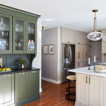
This family from Wheaton was ready to remodel their kitchen, dining room and powder room. The project didn’t call for any structural or space planning changes but the makeover still had a massive impact on their home. The homeowners wanted to change their dated 1990’s brown speckled granite and light maple kitchen. They liked the welcoming feeling they got from the wood and warm tones in their current kitchen, but this style clashed with their vision of a deVOL type kitchen, a London-based furniture company. Their inspiration came from the country homes of the UK that mix the warmth of traditional detail with clean lines and modern updates.
To create their vision, we started with all new framed cabinets with a modified overlay painted in beautiful, understated colors. Our clients were adamant about “no white cabinets.” Instead we used an oyster color for the perimeter and a custom color match to a specific shade of green chosen by the homeowner. The use of a simple color pallet reduces the visual noise and allows the space to feel open and welcoming. We also painted the trim above the cabinets the same color to make the cabinets look taller. The room trim was painted a bright clean white to match the ceiling.
In true English fashion our clients are not coffee drinkers, but they LOVE tea. We created a tea station for them where they can prepare and serve tea. We added plenty of glass to showcase their tea mugs and adapted the cabinetry below to accommodate storage for their tea items. Function is also key for the English kitchen and the homeowners. They requested a deep farmhouse sink and a cabinet devoted to their heavy mixer because they bake a lot. We then got rid of the stovetop on the island and wall oven and replaced both of them with a range located against the far wall. This gives them plenty of space on the island to roll out dough and prepare any number of baked goods. We then removed the bifold pantry doors and created custom built-ins with plenty of usable storage for all their cooking and baking needs.
The client wanted a big change to the dining room but still wanted to use their own furniture and rug. We installed a toile-like wallpaper on the top half of the room and supported it with white wainscot paneling. We also changed out the light fixture, showing us once again that small changes can have a big impact.
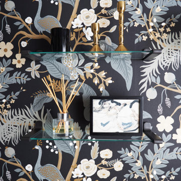
As the final touch, we also re-did the powder room to be in line with the rest of the first floor. We had the new vanity painted in the same oyster color as the kitchen cabinets and then covered the walls in a whimsical patterned wallpaper. Although the homeowners like subtle neutral colors they were willing to go a bit bold in the powder room for something unexpected. For more design inspiration go to: www.kitchenstudio-ge.com

 Chapman Design Group, Inc.
This rustic style home on Hartwell Lake was designed and built for the owners to enjoy with family and friends during their active weekend lifestyle. The home was built on a narrow, deep lot that was semi-level on the roadside and steep on the lakeside. The back half of the lot heavily wooded with mature oak and poplar trees reducing the harsh sun’s heat gain on the home.
The exterior utilizes fiber cement cedar shake and lap siding complimented by deep brown colors for the windows, soffit, trim and the large square columns. A nice balance of natural earth toned stacked stone rounds out the exterior materials completing the rustic casual lake living.
The home 5400 SF is designed and built on thee levels each having a primary focus. The main level creates primary daily living for the owners. This level features an open plan with an entry, stair, dining, kitchen and living areas leading to a large lakeside screened porch. A master suite is privately tucked off its own hallway and allowing it to enjoy the lakeside as well with its own private deck. On the opposite side are two bedrooms, a study and a shared bathroom for each to utilize. An open carport for two vehicles was created with the motor court and connects to the mudroom/utility room giving the owners direct entry into their home.
The upper level is for the grand children with an oversized bedroom, bathroom and loft area for play.
The lower level is the considered the party level. Its primary feature is an elevated stage for the owner’s band opened to a large seating area, dining and kitchen for viewing and listening with direct access to another screened porch. Flanking each side is a theater and two additional bedrooms and bathrooms.
Energy Efficient features include:
• The majority of the lower level sunk into the site below grade
• 6” thick walls utilizing advanced framing techniques
• Foil covered roof sheathing
• Extensive use of blown in cellulous
• All windows & doors are double paned low E argon filed glass
• Tank-less water heaters
• Three separate high efficiency HVAC units with programmable thermostats and a fresh air ERV.
Lastly the owner requested we make every effort to sound proof the home. Many materials and techniques gave a duel purpose and added to the energy efficiency.
These items include:
• 2x6 walls with staggered studs
• Extensive use if rock wool acoustic batting
• Tempered glass in all exterior doors and windows
• ¼ thick Mass Loaded Vinyl (MLV) was installed on the top and bottom of the floor trusses and on all lower level walls.
The combination of the design and detailing utilizing these specific materials enabled us to achieve a 5 Star Plus Energy Star Certification with a HERS Index Score of 50. This home received a the 2015 Pinnacle Award from the SC Home Builders Association for the “Best Achievement in Energy Efficiency” sponsored by the SC Department Commerce.
Find the right local pro for your project
 highland
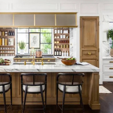
Renovating a home can completely transform the way a space looks, feels, and functions, but successful improvements require thoughtful planning rather than rushing into expensive changes. These renovation tips and tricks house ideas can help homeowners organize projects, control costs, select practical materials, and create rooms that remain useful for years. Start by identifying what genuinely needs improvement, such as outdated finishes, poor lighting, inefficient storage, damaged surfaces, or an inconvenient layout. Create a realistic budget that includes materials, labor, permits where applicable, and a contingency amount for unexpected issues. Taking measurements, collecting inspiration, and deciding priorities before work begins can prevent unnecessary purchases and make the renovation process much easier to manage.
One of the most useful renovation tips and tricks house projects can benefit from is improving the layout before focusing on decoration. A beautiful room will still feel inconvenient if furniture blocks walkways or storage is insufficient. Consider how people actually use each space and whether doors, windows, lighting, electrical outlets, and storage are positioned effectively. In kitchens, for example, practical work zones and accessible storage can make everyday tasks easier. In bedrooms and living rooms, built-in shelving, multifunctional furniture, and organized storage can reduce clutter without making the space feel crowded. Whenever possible, repair or improve the existing structure before replacing everything, because thoughtful upgrades can deliver significant results without creating unnecessary renovation costs.
Choosing materials carefully is another important part of renovation tips and tricks house planning. Look beyond appearance and consider durability, maintenance, safety, and suitability for the room. High-moisture areas require materials that can handle regular exposure to water, while frequently used floors and work surfaces should be selected for durability. Neutral foundations can also provide flexibility because wall colors, textiles, artwork, and accessories can be changed later without another major renovation. Lighting deserves equal attention: combine general illumination with task and accent lighting to make rooms more functional and visually comfortable. Energy-efficient lighting, improved insulation, weather sealing, and efficient fixtures may also contribute to better long-term household performance.
Before beginning major work, divide the project into manageable stages. A useful approach is to complete structural or repair work first, followed by electrical or plumbing updates when necessary, then walls, flooring, cabinetry, fixtures, and finally decorative details. This order can reduce the chance of damaging newly finished surfaces. Keep a record of measurements, product specifications, receipts, and important project decisions so replacements or future repairs are easier. For specialized work involving structural changes, electrical systems, plumbing, gas, or other regulated areas, consult appropriately qualified professionals and follow local requirements. Among the most practical renovation tips and tricks house owners can follow is to avoid changing too many things simultaneously; completing priority areas systematically makes budgets, timelines, and quality easier to control.
Finally, focus on improvements that combine appearance with everyday usefulness. Fresh paint, updated hardware, better organization, improved lighting, refreshed flooring, and carefully selected fixtures can make a noticeable difference without requiring a complete transformation. Outdoor areas can also benefit from simple maintenance, improved lighting, seating, planting, or repaired surfaces that extend the usable living space. Before declaring the project finished, inspect each room for functionality, storage, lighting, ventilation, safety, and finishing quality. The best renovation tips and tricks house approach is not necessarily about spending more it is about making informed choices that solve real problems and create a home that feels comfortable, practical, and personal.
One of the most useful renovation tips and tricks house projects can benefit from is improving the layout before focusing on decoration. A beautiful room will still feel inconvenient if furniture blocks walkways or storage is insufficient. Consider how people actually use each space and whether doors, windows, lighting, electrical outlets, and storage are positioned effectively. In kitchens, for example, practical work zones and accessible storage can make everyday tasks easier. In bedrooms and living rooms, built-in shelving, multifunctional furniture, and organized storage can reduce clutter without making the space feel crowded. Whenever possible, repair or improve the existing structure before replacing everything, because thoughtful upgrades can deliver significant results without creating unnecessary renovation costs.
Choosing materials carefully is another important part of renovation tips and tricks house planning. Look beyond appearance and consider durability, maintenance, safety, and suitability for the room. High-moisture areas require materials that can handle regular exposure to water, while frequently used floors and work surfaces should be selected for durability. Neutral foundations can also provide flexibility because wall colors, textiles, artwork, and accessories can be changed later without another major renovation. Lighting deserves equal attention: combine general illumination with task and accent lighting to make rooms more functional and visually comfortable. Energy-efficient lighting, improved insulation, weather sealing, and efficient fixtures may also contribute to better long-term household performance.
Before beginning major work, divide the project into manageable stages. A useful approach is to complete structural or repair work first, followed by electrical or plumbing updates when necessary, then walls, flooring, cabinetry, fixtures, and finally decorative details. This order can reduce the chance of damaging newly finished surfaces. Keep a record of measurements, product specifications, receipts, and important project decisions so replacements or future repairs are easier. For specialized work involving structural changes, electrical systems, plumbing, gas, or other regulated areas, consult appropriately qualified professionals and follow local requirements. Among the most practical renovation tips and tricks house owners can follow is to avoid changing too many things simultaneously; completing priority areas systematically makes budgets, timelines, and quality easier to control.
Finally, focus on improvements that combine appearance with everyday usefulness. Fresh paint, updated hardware, better organization, improved lighting, refreshed flooring, and carefully selected fixtures can make a noticeable difference without requiring a complete transformation. Outdoor areas can also benefit from simple maintenance, improved lighting, seating, planting, or repaired surfaces that extend the usable living space. Before declaring the project finished, inspect each room for functionality, storage, lighting, ventilation, safety, and finishing quality. The best renovation tips and tricks house approach is not necessarily about spending more it is about making informed choices that solve real problems and create a home that feels comfortable, practical, and personal.
 Drury Design
THE SETUP
This client lives in a great high-rise condo in downtown Chicago. Alicia has already remodeled a few areas of her home, including her kitchen and home office. The bathroom is one of the last big places the client wanted to update. The existing bathroom had a large, outdated whirlpool tub in the corner. It was a darker space that had a lack of natural light. There are no windows (due to the bathroom’s location within the high-rise building). So, the idea was to brighten up the space and give the client an updated, elegant primary bathroom that is more her style and tailor-made for her routines.
Design Objectives:
- Make the space brighter.
- Create different daily routine stations to maximize functionality while keeping things clutter-free – a makeup station, a blow-dry station, and a sink-needs station.
- Achieve the client’s specific style and function needs while also keeping the look and design open to future possibilities: different users of the space/resale clients.
Design Challenges:
- Toilet cannot be moved. (In a high-rise, you can’t really move plumbing around too much when reimagining a space)
- Existing bathroom had a soffit that hid a lot of electrical wiring, so completely removing the soffit wasn’t an option.
- The blow-dry station needs to accommodate the client’s preference for standing up.
- Finding a place for the make-up station, which the client wants oriented for sitting.
- Create storage within the shower that can eliminate the clutter of personal care products that are actually needed every day. Do this, while keeping the client’s favorite things about the existing shower: the shower bench, a tub filler faucet (for rinsing shaving cream when shaving legs) and a low niche for placing her foot when shaving her legs.
THE RENEWED SPACE
Design Solutions:
- Extended a bit of wall near the toilet to give the commode its own area within the space, but without closing it off into a claustrophobic WC.
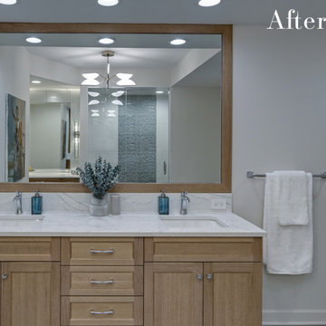
- Worked within the reality of the existing soffit situation, reshaping it to align with the new shower. Can lights were also added. Installed a beautiful ceiling light fixture that works within the new soffit shape, commanding attention and adding light, as if the sofit shape was chosen for it.
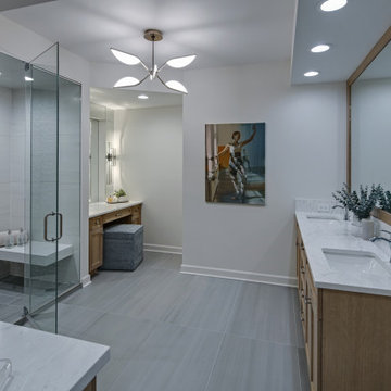
- Created a nice, furniture-looking 42”-high cabinet with pullout drawers to be the blow-dry station, complete with a mirror and a nice top. The pullout drawers are all powered, concealing a Dyson dryer and curling iron (and all the accoutrements) while keeping them plugged in, which is ideal for easy usage and put away. A stylish mirror on the wall above the cabinet, and proper lighting, make this the perfect blow-dry station. The top has a grommet that can accommodate a power cord should the client ever want to have a powered device on top of the cabinet.
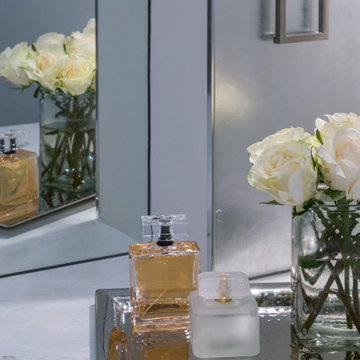
- Put the sit-down makeup station where the tub used to be, putting the mirror back into a new recessed wall just a bit, allowing the area to have more room.
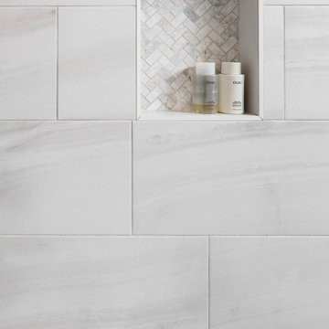
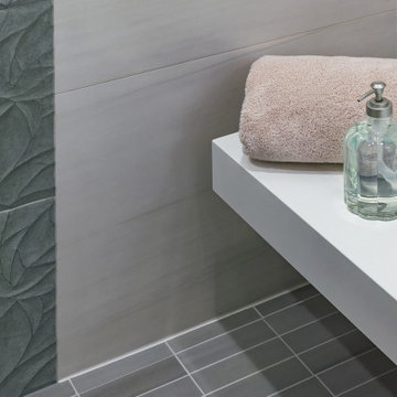
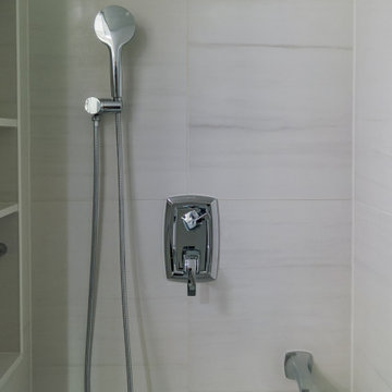
- Created a niche in the shower’s inner wall so that you can’t see it unless you are literally inside the shower. At the client’s request, it also has a hook so she can hang her loofa. Hiding the utility niche in this way allowed us to use the full main wall of the shower as a canvas for a beautiful accent stripe of raised decorative tile. The new shower has her old favorites, too: the tub filler, foot niche and bench.
Alicia’s client loves her new primary bathroom, especially the blow dry area. It is very accommodating for her, as a tall lady, while being very easy to use. The drawers store everything. Being powered, they make using already-plugged in appliances very easy to use and put away.
Her previous makeup station was a freestanding vanity with a single drawer, so beauty products were all over the surface top. With her new makeup station, everything is nicely tucked away and organized in drawers.
The new lighting is fantastic and the colors are light and soft. The clients loves the overall look and feel of her new bathroom and raves about how well the functionality-minded design makes her morning routine – and her life – easier and enjoyable!
 Drury Design
THE SETUP
This client lives in a great high-rise condo in downtown Chicago. Alicia has already remodeled a few areas of her home, including her kitchen and home office. The bathroom is one of the last big places the client wanted to update. The existing bathroom had a large, outdated whirlpool tub in the corner. It was a darker space that had a lack of natural light. There are no windows (due to the bathroom’s location within the high-rise building). So, the idea was to brighten up the space and give the client an updated, elegant primary bathroom that is more her style and tailor-made for her routines.
Design Objectives:
- Make the space brighter.
- Create different daily routine stations to maximize functionality while keeping things clutter-free – a makeup station, a blow-dry station, and a sink-needs station.
- Achieve the client’s specific style and function needs while also keeping the look and design open to future possibilities: different users of the space/resale clients.
Design Challenges:
- Toilet cannot be moved. (In a high-rise, you can’t really move plumbing around too much when reimagining a space)
- Existing bathroom had a soffit that hid a lot of electrical wiring, so completely removing the soffit wasn’t an option.
- The blow-dry station needs to accommodate the client’s preference for standing up.
- Finding a place for the make-up station, which the client wants oriented for sitting.
- Create storage within the shower that can eliminate the clutter of personal care products that are actually needed every day. Do this, while keeping the client’s favorite things about the existing shower: the shower bench, a tub filler faucet (for rinsing shaving cream when shaving legs) and a low niche for placing her foot when shaving her legs.
THE RENEWED SPACE
Design Solutions:
- Extended a bit of wall near the toilet to give the commode its own area within the space, but without closing it off into a claustrophobic WC.
- Worked within the reality of the existing soffit situation, reshaping it to align with the new shower. Can lights were also added. Installed a beautiful ceiling light fixture that works within the new soffit shape, commanding attention and adding light, as if the sofit shape was chosen for it.
- Created a nice, furniture-looking 42”-high cabinet with pullout drawers to be the blow-dry station, complete with a mirror and a nice top. The pullout drawers are all powered, concealing a Dyson dryer and curling iron (and all the accoutrements) while keeping them plugged in, which is ideal for easy usage and put away. A stylish mirror on the wall above the cabinet, and proper lighting, make this the perfect blow-dry station. The top has a grommet that can accommodate a power cord should the client ever want to have a powered device on top of the cabinet.
- Put the sit-down makeup station where the tub used to be, putting the mirror back into a new recessed wall just a bit, allowing the area to have more room.
- Created a niche in the shower’s inner wall so that you can’t see it unless you are literally inside the shower. At the client’s request, it also has a hook so she can hang her loofa. Hiding the utility niche in this way allowed us to use the full main wall of the shower as a canvas for a beautiful accent stripe of raised decorative tile. The new shower has her old favorites, too: the tub filler, foot niche and bench.
Alicia’s client loves her new primary bathroom, especially the blow dry area. It is very accommodating for her, as a tall lady, while being very easy to use. The drawers store everything. Being powered, they make using already-plugged in appliances very easy to use and put away.
Her previous makeup station was a freestanding vanity with a single drawer, so beauty products were all over the surface top. With her new makeup station, everything is nicely tucked away and organized in drawers.
The new lighting is fantastic and the colors are light and soft. The clients loves the overall look and feel of her new bathroom and raves about how well the functionality-minded design makes her morning routine – and her life – easier and enjoyable!
 TKS Design Group
Download our free ebook, Creating the Ideal Kitchen. DOWNLOAD NOW
This family from Wheaton was ready to remodel their kitchen, dining room and powder room. The project didn’t call for any structural or space planning changes but the makeover still had a massive impact on their home. The homeowners wanted to change their dated 1990’s brown speckled granite and light maple kitchen. They liked the welcoming feeling they got from the wood and warm tones in their current kitchen, but this style clashed with their vision of a deVOL type kitchen, a London-based furniture company. Their inspiration came from the country homes of the UK that mix the warmth of traditional detail with clean lines and modern updates.
To create their vision, we started with all new framed cabinets with a modified overlay painted in beautiful, understated colors. Our clients were adamant about “no white cabinets.” Instead we used an oyster color for the perimeter and a custom color match to a specific shade of green chosen by the homeowner. The use of a simple color pallet reduces the visual noise and allows the space to feel open and welcoming. We also painted the trim above the cabinets the same color to make the cabinets look taller. The room trim was painted a bright clean white to match the ceiling.
In true English fashion our clients are not coffee drinkers, but they LOVE tea. We created a tea station for them where they can prepare and serve tea. We added plenty of glass to showcase their tea mugs and adapted the cabinetry below to accommodate storage for their tea items. Function is also key for the English kitchen and the homeowners. They requested a deep farmhouse sink and a cabinet devoted to their heavy mixer because they bake a lot. We then got rid of the stovetop on the island and wall oven and replaced both of them with a range located against the far wall. This gives them plenty of space on the island to roll out dough and prepare any number of baked goods. We then removed the bifold pantry doors and created custom built-ins with plenty of usable storage for all their cooking and baking needs.
The client wanted a big change to the dining room but still wanted to use their own furniture and rug. We installed a toile-like wallpaper on the top half of the room and supported it with white wainscot paneling. We also changed out the light fixture, showing us once again that small changes can have a big impact.
As the final touch, we also re-did the powder room to be in line with the rest of the first floor. We had the new vanity painted in the same oyster color as the kitchen cabinets and then covered the walls in a whimsical patterned wallpaper. Although the homeowners like subtle neutral colors they were willing to go a bit bold in the powder room for something unexpected. For more design inspiration go to: www.kitchenstudio-ge.com
 TKS Design Group
Download our free ebook, Creating the Ideal Kitchen. DOWNLOAD NOW
This family from Wheaton was ready to remodel their kitchen, dining room and powder room. The project didn’t call for any structural or space planning changes but the makeover still had a massive impact on their home. The homeowners wanted to change their dated 1990’s brown speckled granite and light maple kitchen. They liked the welcoming feeling they got from the wood and warm tones in their current kitchen, but this style clashed with their vision of a deVOL type kitchen, a London-based furniture company. Their inspiration came from the country homes of the UK that mix the warmth of traditional detail with clean lines and modern updates.
To create their vision, we started with all new framed cabinets with a modified overlay painted in beautiful, understated colors. Our clients were adamant about “no white cabinets.” Instead we used an oyster color for the perimeter and a custom color match to a specific shade of green chosen by the homeowner. The use of a simple color pallet reduces the visual noise and allows the space to feel open and welcoming. We also painted the trim above the cabinets the same color to make the cabinets look taller. The room trim was painted a bright clean white to match the ceiling.
In true English fashion our clients are not coffee drinkers, but they LOVE tea. We created a tea station for them where they can prepare and serve tea. We added plenty of glass to showcase their tea mugs and adapted the cabinetry below to accommodate storage for their tea items. Function is also key for the English kitchen and the homeowners. They requested a deep farmhouse sink and a cabinet devoted to their heavy mixer because they bake a lot. We then got rid of the stovetop on the island and wall oven and replaced both of them with a range located against the far wall. This gives them plenty of space on the island to roll out dough and prepare any number of baked goods. We then removed the bifold pantry doors and created custom built-ins with plenty of usable storage for all their cooking and baking needs.
The client wanted a big change to the dining room but still wanted to use their own furniture and rug. We installed a toile-like wallpaper on the top half of the room and supported it with white wainscot paneling. We also changed out the light fixture, showing us once again that small changes can have a big impact.
As the final touch, we also re-did the powder room to be in line with the rest of the first floor. We had the new vanity painted in the same oyster color as the kitchen cabinets and then covered the walls in a whimsical patterned wallpaper. Although the homeowners like subtle neutral colors they were willing to go a bit bold in the powder room for something unexpected. For more design inspiration go to: www.kitchenstudio-ge.com
 StoneUnlimited Kitchen and Bath Remodeling
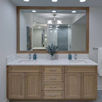
This aesthetically pleasing master bathroom is the perfect place for our clients to start and end each day. Fully customized shower fixtures and a deep soaking tub will provide the perfect solutions to destress and unwind. Our client's love for plants translates beautifully into this space with a sage green double vanity that brings life and serenity into their master bath retreat. Opting to utilize softer patterned tile throughout the space, makes it more visually expansive while gold accessories, natural wood elements, and strategically placed rugs throughout the room, make it warm and inviting.
Committing to a color scheme in a space can be overwhelming at times when considering the number of options that are available. This master bath is a perfect example of how to incorporate color into a room tastefully, while still having a cohesive design.
Items used in this space include:
Waypoint Living Spaces Cabinetry in Sage Green
Calacatta Italia Manufactured Quartz Vanity Tops
Elegant Stone Onice Bianco Tile
Natural Marble Herringbone Tile
Delta Cassidy Collection Fixtures
Want to see more samples of our work or before and after photographs of this project?
Visit the Stoneunlimited Kitchen and Bath website:
www.stoneunlimited.net
Stoneunlimited Kitchen and Bath is a full scope, full service, turnkey business. We do it all so that you don’t have to. You get to do the fun part of approving the design, picking your materials and making selections with our guidance and we take care of everything else. We provide you with 3D and 4D conceptual designs so that you can see your project come to life. Materials such as tile, fixtures, sinks, shower enclosures, flooring, cabinetry and countertops are ordered through us, inspected by us and installed by us. We are also a fabricator, so we fabricate all the countertops. We assign and manage the schedule and the workers that will be in your home taking care of the installation. We provide painting, electrical, plumbing as well as cabinetry services for your project from start to finish. So, when I say we do it, we truly do it all!
 Drury Design
THE SETUP
This client lives in a great high-rise condo in downtown Chicago. Alicia has already remodeled a few areas of her home, including her kitchen and home office. The bathroom is one of the last big places the client wanted to update. The existing bathroom had a large, outdated whirlpool tub in the corner. It was a darker space that had a lack of natural light. There are no windows (due to the bathroom’s location within the high-rise building). So, the idea was to brighten up the space and give the client an updated, elegant primary bathroom that is more her style and tailor-made for her routines.
Design Objectives:
- Make the space brighter.
- Create different daily routine stations to maximize functionality while keeping things clutter-free – a makeup station, a blow-dry station, and a sink-needs station.
- Achieve the client’s specific style and function needs while also keeping the look and design open to future possibilities: different users of the space/resale clients.
Design Challenges:
- Toilet cannot be moved. (In a high-rise, you can’t really move plumbing around too much when reimagining a space)
- Existing bathroom had a soffit that hid a lot of electrical wiring, so completely removing the soffit wasn’t an option.
- The blow-dry station needs to accommodate the client’s preference for standing up.
- Finding a place for the make-up station, which the client wants oriented for sitting.
- Create storage within the shower that can eliminate the clutter of personal care products that are actually needed every day. Do this, while keeping the client’s favorite things about the existing shower: the shower bench, a tub filler faucet (for rinsing shaving cream when shaving legs) and a low niche for placing her foot when shaving her legs.
THE RENEWED SPACE
Design Solutions:
- Extended a bit of wall near the toilet to give the commode its own area within the space, but without closing it off into a claustrophobic WC.
- Worked within the reality of the existing soffit situation, reshaping it to align with the new shower. Can lights were also added. Installed a beautiful ceiling light fixture that works within the new soffit shape, commanding attention and adding light, as if the sofit shape was chosen for it.
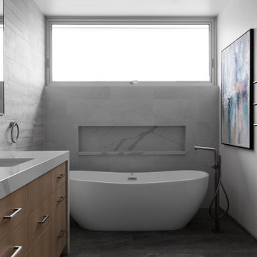
- Created a nice, furniture-looking 42”-high cabinet with pullout drawers to be the blow-dry station, complete with a mirror and a nice top. The pullout drawers are all powered, concealing a Dyson dryer and curling iron (and all the accoutrements) while keeping them plugged in, which is ideal for easy usage and put away. A stylish mirror on the wall above the cabinet, and proper lighting, make this the perfect blow-dry station. The top has a grommet that can accommodate a power cord should the client ever want to have a powered device on top of the cabinet.
- Put the sit-down makeup station where the tub used to be, putting the mirror back into a new recessed wall just a bit, allowing the area to have more room.
- Created a niche in the shower’s inner wall so that you can’t see it unless you are literally inside the shower. At the client’s request, it also has a hook so she can hang her loofa. Hiding the utility niche in this way allowed us to use the full main wall of the shower as a canvas for a beautiful accent stripe of raised decorative tile. The new shower has her old favorites, too: the tub filler, foot niche and bench.
Alicia’s client loves her new primary bathroom, especially the blow dry area. It is very accommodating for her, as a tall lady, while being very easy to use. The drawers store everything. Being powered, they make using already-plugged in appliances very easy to use and put away.
Her previous makeup station was a freestanding vanity with a single drawer, so beauty products were all over the surface top. With her new makeup station, everything is nicely tucked away and organized in drawers.
The new lighting is fantastic and the colors are light and soft. The clients loves the overall look and feel of her new bathroom and raves about how well the functionality-minded design makes her morning routine – and her life – easier and enjoyable!
 Eyoh Design
Louisa, San Clemente Coastal Modern Architecture
The brief for this modern coastal home was to create a place where the clients and their children and their families could gather to enjoy all the beauty of living in Southern California. Maximizing the lot was key to unlocking the potential of this property so the decision was made to excavate the entire property to allow natural light and ventilation to circulate through the lower level of the home.
A courtyard with a green wall and olive tree act as the lung for the building as the coastal breeze brings fresh air in and circulates out the old through the courtyard.
The concept for the home was to be living on a deck, so the large expanse of glass doors fold away to allow a seamless connection between the indoor and outdoors and feeling of being out on the deck is felt on the interior. A huge cantilevered beam in the roof allows for corner to completely disappear as the home looks to a beautiful ocean view and Dana Point harbor in the distance. All of the spaces throughout the home have a connection to the outdoors and this creates a light, bright and healthy environment.
Passive design principles were employed to ensure the building is as energy efficient as possible. Solar panels keep the building off the grid and and deep overhangs help in reducing the solar heat gains of the building. Ultimately this home has become a place that the families can all enjoy together as the grand kids create those memories of spending time at the beach.
Images and Video by Aandid Media.
 Drury Design
THE SETUP
This client lives in a great high-rise condo in downtown Chicago. Alicia has already remodeled a few areas of her home, including her kitchen and home office. The bathroom is one of the last big places the client wanted to update. The existing bathroom had a large, outdated whirlpool tub in the corner. It was a darker space that had a lack of natural light. There are no windows (due to the bathroom’s location within the high-rise building). So, the idea was to brighten up the space and give the client an updated, elegant primary bathroom that is more her style and tailor-made for her routines.
Design Objectives:
- Make the space brighter.
- Create different daily routine stations to maximize functionality while keeping things clutter-free – a makeup station, a blow-dry station, and a sink-needs station.
- Achieve the client’s specific style and function needs while also keeping the look and design open to future possibilities: different users of the space/resale clients.
Design Challenges:
- Toilet cannot be moved. (In a high-rise, you can’t really move plumbing around too much when reimagining a space)
- Existing bathroom had a soffit that hid a lot of electrical wiring, so completely removing the soffit wasn’t an option.
- The blow-dry station needs to accommodate the client’s preference for standing up.
- Finding a place for the make-up station, which the client wants oriented for sitting.
- Create storage within the shower that can eliminate the clutter of personal care products that are actually needed every day. Do this, while keeping the client’s favorite things about the existing shower: the shower bench, a tub filler faucet (for rinsing shaving cream when shaving legs) and a low niche for placing her foot when shaving her legs.
THE RENEWED SPACE
Design Solutions:
- Extended a bit of wall near the toilet to give the commode its own area within the space, but without closing it off into a claustrophobic WC.
- Worked within the reality of the existing soffit situation, reshaping it to align with the new shower. Can lights were also added. Installed a beautiful ceiling light fixture that works within the new soffit shape, commanding attention and adding light, as if the sofit shape was chosen for it.
- Created a nice, furniture-looking 42”-high cabinet with pullout drawers to be the blow-dry station, complete with a mirror and a nice top. The pullout drawers are all powered, concealing a Dyson dryer and curling iron (and all the accoutrements) while keeping them plugged in, which is ideal for easy usage and put away. A stylish mirror on the wall above the cabinet, and proper lighting, make this the perfect blow-dry station. The top has a grommet that can accommodate a power cord should the client ever want to have a powered device on top of the cabinet.
- Put the sit-down makeup station where the tub used to be, putting the mirror back into a new recessed wall just a bit, allowing the area to have more room.
- Created a niche in the shower’s inner wall so that you can’t see it unless you are literally inside the shower. At the client’s request, it also has a hook so she can hang her loofa. Hiding the utility niche in this way allowed us to use the full main wall of the shower as a canvas for a beautiful accent stripe of raised decorative tile. The new shower has her old favorites, too: the tub filler, foot niche and bench.
Alicia’s client loves her new primary bathroom, especially the blow dry area. It is very accommodating for her, as a tall lady, while being very easy to use. The drawers store everything. Being powered, they make using already-plugged in appliances very easy to use and put away.
Her previous makeup station was a freestanding vanity with a single drawer, so beauty products were all over the surface top. With her new makeup station, everything is nicely tucked away and organized in drawers.
The new lighting is fantastic and the colors are light and soft. The clients loves the overall look and feel of her new bathroom and raves about how well the functionality-minded design makes her morning routine – and her life – easier and enjoyable!

 Wine Cellar Specialists
This is a high reveal display row. It showcases wines in a label forward fashion, and promotes ease of identification and selection.
Note the mural in the background. It was created by Janina Pazdan.
Also shown is a 'Niche Size' rack. It accommodates bottles individually. The combination of high reveal display racks and individual bottle racking makes for an aesthetically appealing and highly functional wine room.
The display row displays the bottle at a 15-degree angle to keep the cork moist.
Wine Cellar Specialists https://www.facebook.com/winecellarspecialistschicago
Chicago Design Office
858 W. Armitage Ave #385
Chicago, IL 60614
+1 (773) 234-0112
Watch the video tour of this project: https://www.youtube.com/watch?v=hlo1jBvHTNM&feature=youtu.be
 Drury Design
THE SETUP
This client lives in a great high-rise condo in downtown Chicago. Alicia has already remodeled a few areas of her home, including her kitchen and home office. The bathroom is one of the last big places the client wanted to update. The existing bathroom had a large, outdated whirlpool tub in the corner. It was a darker space that had a lack of natural light. There are no windows (due to the bathroom’s location within the high-rise building). So, the idea was to brighten up the space and give the client an updated, elegant primary bathroom that is more her style and tailor-made for her routines.
Design Objectives:
- Make the space brighter.
- Create different daily routine stations to maximize functionality while keeping things clutter-free – a makeup station, a blow-dry station, and a sink-needs station.
- Achieve the client’s specific style and function needs while also keeping the look and design open to future possibilities: different users of the space/resale clients.
Design Challenges:
- Toilet cannot be moved. (In a high-rise, you can’t really move plumbing around too much when reimagining a space)
- Existing bathroom had a soffit that hid a lot of electrical wiring, so completely removing the soffit wasn’t an option.
- The blow-dry station needs to accommodate the client’s preference for standing up.
- Finding a place for the make-up station, which the client wants oriented for sitting.
- Create storage within the shower that can eliminate the clutter of personal care products that are actually needed every day. Do this, while keeping the client’s favorite things about the existing shower: the shower bench, a tub filler faucet (for rinsing shaving cream when shaving legs) and a low niche for placing her foot when shaving her legs.
THE RENEWED SPACE
Design Solutions:
- Extended a bit of wall near the toilet to give the commode its own area within the space, but without closing it off into a claustrophobic WC.
- Worked within the reality of the existing soffit situation, reshaping it to align with the new shower. Can lights were also added. Installed a beautiful ceiling light fixture that works within the new soffit shape, commanding attention and adding light, as if the sofit shape was chosen for it.
- Created a nice, furniture-looking 42”-high cabinet with pullout drawers to be the blow-dry station, complete with a mirror and a nice top. The pullout drawers are all powered, concealing a Dyson dryer and curling iron (and all the accoutrements) while keeping them plugged in, which is ideal for easy usage and put away. A stylish mirror on the wall above the cabinet, and proper lighting, make this the perfect blow-dry station. The top has a grommet that can accommodate a power cord should the client ever want to have a powered device on top of the cabinet.
- Put the sit-down makeup station where the tub used to be, putting the mirror back into a new recessed wall just a bit, allowing the area to have more room.
- Created a niche in the shower’s inner wall so that you can’t see it unless you are literally inside the shower. At the client’s request, it also has a hook so she can hang her loofa. Hiding the utility niche in this way allowed us to use the full main wall of the shower as a canvas for a beautiful accent stripe of raised decorative tile. The new shower has her old favorites, too: the tub filler, foot niche and bench.
Alicia’s client loves her new primary bathroom, especially the blow dry area. It is very accommodating for her, as a tall lady, while being very easy to use. The drawers store everything. Being powered, they make using already-plugged in appliances very easy to use and put away.
Her previous makeup station was a freestanding vanity with a single drawer, so beauty products were all over the surface top. With her new makeup station, everything is nicely tucked away and organized in drawers.
The new lighting is fantastic and the colors are light and soft. The clients loves the overall look and feel of her new bathroom and raves about how well the functionality-minded design makes her morning routine – and her life – easier and enjoyable!
 Drury Design
THE SETUP
This client lives in a great high-rise condo in downtown Chicago. Alicia has already remodeled a few areas of her home, including her kitchen and home office. The bathroom is one of the last big places the client wanted to update. The existing bathroom had a large, outdated whirlpool tub in the corner. It was a darker space that had a lack of natural light. There are no windows (due to the bathroom’s location within the high-rise building). So, the idea was to brighten up the space and give the client an updated, elegant primary bathroom that is more her style and tailor-made for her routines.
Design Objectives:
- Make the space brighter.
- Create different daily routine stations to maximize functionality while keeping things clutter-free – a makeup station, a blow-dry station, and a sink-needs station.
- Achieve the client’s specific style and function needs while also keeping the look and design open to future possibilities: different users of the space/resale clients.
Design Challenges:
- Toilet cannot be moved. (In a high-rise, you can’t really move plumbing around too much when reimagining a space)
- Existing bathroom had a soffit that hid a lot of electrical wiring, so completely removing the soffit wasn’t an option.
- The blow-dry station needs to accommodate the client’s preference for standing up.
- Finding a place for the make-up station, which the client wants oriented for sitting.
- Create storage within the shower that can eliminate the clutter of personal care products that are actually needed every day. Do this, while keeping the client’s favorite things about the existing shower: the shower bench, a tub filler faucet (for rinsing shaving cream when shaving legs) and a low niche for placing her foot when shaving her legs.
THE RENEWED SPACE
Design Solutions:
- Extended a bit of wall near the toilet to give the commode its own area within the space, but without closing it off into a claustrophobic WC.
- Worked within the reality of the existing soffit situation, reshaping it to align with the new shower. Can lights were also added. Installed a beautiful ceiling light fixture that works within the new soffit shape, commanding attention and adding light, as if the sofit shape was chosen for it.
- Created a nice, furniture-looking 42”-high cabinet with pullout drawers to be the blow-dry station, complete with a mirror and a nice top. The pullout drawers are all powered, concealing a Dyson dryer and curling iron (and all the accoutrements) while keeping them plugged in, which is ideal for easy usage and put away. A stylish mirror on the wall above the cabinet, and proper lighting, make this the perfect blow-dry station. The top has a grommet that can accommodate a power cord should the client ever want to have a powered device on top of the cabinet.
- Put the sit-down makeup station where the tub used to be, putting the mirror back into a new recessed wall just a bit, allowing the area to have more room.
- Created a niche in the shower’s inner wall so that you can’t see it unless you are literally inside the shower. At the client’s request, it also has a hook so she can hang her loofa. Hiding the utility niche in this way allowed us to use the full main wall of the shower as a canvas for a beautiful accent stripe of raised decorative tile. The new shower has her old favorites, too: the tub filler, foot niche and bench.
Alicia’s client loves her new primary bathroom, especially the blow dry area. It is very accommodating for her, as a tall lady, while being very easy to use. The drawers store everything. Being powered, they make using already-plugged in appliances very easy to use and put away.
Her previous makeup station was a freestanding vanity with a single drawer, so beauty products were all over the surface top. With her new makeup station, everything is nicely tucked away and organized in drawers.
The new lighting is fantastic and the colors are light and soft. The clients loves the overall look and feel of her new bathroom and raves about how well the functionality-minded design makes her morning routine – and her life – easier and enjoyable!
 Drury Design
THE SETUP
This client lives in a great high-rise condo in downtown Chicago. Alicia has already remodeled a few areas of her home, including her kitchen and home office. The bathroom is one of the last big places the client wanted to update. The existing bathroom had a large, outdated whirlpool tub in the corner. It was a darker space that had a lack of natural light. There are no windows (due to the bathroom’s location within the high-rise building). So, the idea was to brighten up the space and give the client an updated, elegant primary bathroom that is more her style and tailor-made for her routines.
Design Objectives:
- Make the space brighter.
- Create different daily routine stations to maximize functionality while keeping things clutter-free – a makeup station, a blow-dry station, and a sink-needs station.
- Achieve the client’s specific style and function needs while also keeping the look and design open to future possibilities: different users of the space/resale clients.
Design Challenges:
- Toilet cannot be moved. (In a high-rise, you can’t really move plumbing around too much when reimagining a space)
- Existing bathroom had a soffit that hid a lot of electrical wiring, so completely removing the soffit wasn’t an option.
- The blow-dry station needs to accommodate the client’s preference for standing up.
- Finding a place for the make-up station, which the client wants oriented for sitting.
- Create storage within the shower that can eliminate the clutter of personal care products that are actually needed every day. Do this, while keeping the client’s favorite things about the existing shower: the shower bench, a tub filler faucet (for rinsing shaving cream when shaving legs) and a low niche for placing her foot when shaving her legs.
THE RENEWED SPACE
Design Solutions:
- Extended a bit of wall near the toilet to give the commode its own area within the space, but without closing it off into a claustrophobic WC.
- Worked within the reality of the existing soffit situation, reshaping it to align with the new shower. Can lights were also added. Installed a beautiful ceiling light fixture that works within the new soffit shape, commanding attention and adding light, as if the sofit shape was chosen for it.
- Created a nice, furniture-looking 42”-high cabinet with pullout drawers to be the blow-dry station, complete with a mirror and a nice top. The pullout drawers are all powered, concealing a Dyson dryer and curling iron (and all the accoutrements) while keeping them plugged in, which is ideal for easy usage and put away. A stylish mirror on the wall above the cabinet, and proper lighting, make this the perfect blow-dry station. The top has a grommet that can accommodate a power cord should the client ever want to have a powered device on top of the cabinet.
- Put the sit-down makeup station where the tub used to be, putting the mirror back into a new recessed wall just a bit, allowing the area to have more room.
- Created a niche in the shower’s inner wall so that you can’t see it unless you are literally inside the shower. At the client’s request, it also has a hook so she can hang her loofa. Hiding the utility niche in this way allowed us to use the full main wall of the shower as a canvas for a beautiful accent stripe of raised decorative tile. The new shower has her old favorites, too: the tub filler, foot niche and bench.
Alicia’s client loves her new primary bathroom, especially the blow dry area. It is very accommodating for her, as a tall lady, while being very easy to use. The drawers store everything. Being powered, they make using already-plugged in appliances very easy to use and put away.
Her previous makeup station was a freestanding vanity with a single drawer, so beauty products were all over the surface top. With her new makeup station, everything is nicely tucked away and organized in drawers.
The new lighting is fantastic and the colors are light and soft. The clients loves the overall look and feel of her new bathroom and raves about how well the functionality-minded design makes her morning routine – and her life – easier and enjoyable!
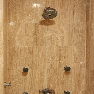 Drury Design
THE SETUP
This client lives in a great high-rise condo in downtown Chicago. Alicia has already remodeled a few areas of her home, including her kitchen and home office. The bathroom is one of the last big places the client wanted to update. The existing bathroom had a large, outdated whirlpool tub in the corner. It was a darker space that had a lack of natural light. There are no windows (due to the bathroom’s location within the high-rise building). So, the idea was to brighten up the space and give the client an updated, elegant primary bathroom that is more her style and tailor-made for her routines.
Design Objectives:
- Make the space brighter.
- Create different daily routine stations to maximize functionality while keeping things clutter-free – a makeup station, a blow-dry station, and a sink-needs station.
- Achieve the client’s specific style and function needs while also keeping the look and design open to future possibilities: different users of the space/resale clients.
Design Challenges:
- Toilet cannot be moved. (In a high-rise, you can’t really move plumbing around too much when reimagining a space)
- Existing bathroom had a soffit that hid a lot of electrical wiring, so completely removing the soffit wasn’t an option.
- The blow-dry station needs to accommodate the client’s preference for standing up.
- Finding a place for the make-up station, which the client wants oriented for sitting.
- Create storage within the shower that can eliminate the clutter of personal care products that are actually needed every day. Do this, while keeping the client’s favorite things about the existing shower: the shower bench, a tub filler faucet (for rinsing shaving cream when shaving legs) and a low niche for placing her foot when shaving her legs.
THE RENEWED SPACE
Design Solutions:
- Extended a bit of wall near the toilet to give the commode its own area within the space, but without closing it off into a claustrophobic WC.
- Worked within the reality of the existing soffit situation, reshaping it to align with the new shower. Can lights were also added. Installed a beautiful ceiling light fixture that works within the new soffit shape, commanding attention and adding light, as if the sofit shape was chosen for it.
- Created a nice, furniture-looking 42”-high cabinet with pullout drawers to be the blow-dry station, complete with a mirror and a nice top. The pullout drawers are all powered, concealing a Dyson dryer and curling iron (and all the accoutrements) while keeping them plugged in, which is ideal for easy usage and put away. A stylish mirror on the wall above the cabinet, and proper lighting, make this the perfect blow-dry station. The top has a grommet that can accommodate a power cord should the client ever want to have a powered device on top of the cabinet.
- Put the sit-down makeup station where the tub used to be, putting the mirror back into a new recessed wall just a bit, allowing the area to have more room.
- Created a niche in the shower’s inner wall so that you can’t see it unless you are literally inside the shower. At the client’s request, it also has a hook so she can hang her loofa. Hiding the utility niche in this way allowed us to use the full main wall of the shower as a canvas for a beautiful accent stripe of raised decorative tile. The new shower has her old favorites, too: the tub filler, foot niche and bench.
Alicia’s client loves her new primary bathroom, especially the blow dry area. It is very accommodating for her, as a tall lady, while being very easy to use. The drawers store everything. Being powered, they make using already-plugged in appliances very easy to use and put away.
Her previous makeup station was a freestanding vanity with a single drawer, so beauty products were all over the surface top. With her new makeup station, everything is nicely tucked away and organized in drawers.
The new lighting is fantastic and the colors are light and soft. The clients loves the overall look and feel of her new bathroom and raves about how well the functionality-minded design makes her morning routine – and her life – easier and enjoyable!
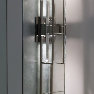 Drury Design
THE SETUP
This client lives in a great high-rise condo in downtown Chicago. Alicia has already remodeled a few areas of her home, including her kitchen and home office. The bathroom is one of the last big places the client wanted to update. The existing bathroom had a large, outdated whirlpool tub in the corner. It was a darker space that had a lack of natural light. There are no windows (due to the bathroom’s location within the high-rise building). So, the idea was to brighten up the space and give the client an updated, elegant primary bathroom that is more her style and tailor-made for her routines.
Design Objectives:
- Make the space brighter.
- Create different daily routine stations to maximize functionality while keeping things clutter-free – a makeup station, a blow-dry station, and a sink-needs station.
- Achieve the client’s specific style and function needs while also keeping the look and design open to future possibilities: different users of the space/resale clients.
Design Challenges:
- Toilet cannot be moved. (In a high-rise, you can’t really move plumbing around too much when reimagining a space)
- Existing bathroom had a soffit that hid a lot of electrical wiring, so completely removing the soffit wasn’t an option.
- The blow-dry station needs to accommodate the client’s preference for standing up.
- Finding a place for the make-up station, which the client wants oriented for sitting.
- Create storage within the shower that can eliminate the clutter of personal care products that are actually needed every day. Do this, while keeping the client’s favorite things about the existing shower: the shower bench, a tub filler faucet (for rinsing shaving cream when shaving legs) and a low niche for placing her foot when shaving her legs.
THE RENEWED SPACE
Design Solutions:
- Extended a bit of wall near the toilet to give the commode its own area within the space, but without closing it off into a claustrophobic WC.
- Worked within the reality of the existing soffit situation, reshaping it to align with the new shower. Can lights were also added. Installed a beautiful ceiling light fixture that works within the new soffit shape, commanding attention and adding light, as if the sofit shape was chosen for it.
- Created a nice, furniture-looking 42”-high cabinet with pullout drawers to be the blow-dry station, complete with a mirror and a nice top. The pullout drawers are all powered, concealing a Dyson dryer and curling iron (and all the accoutrements) while keeping them plugged in, which is ideal for easy usage and put away. A stylish mirror on the wall above the cabinet, and proper lighting, make this the perfect blow-dry station. The top has a grommet that can accommodate a power cord should the client ever want to have a powered device on top of the cabinet.
- Put the sit-down makeup station where the tub used to be, putting the mirror back into a new recessed wall just a bit, allowing the area to have more room.
- Created a niche in the shower’s inner wall so that you can’t see it unless you are literally inside the shower. At the client’s request, it also has a hook so she can hang her loofa. Hiding the utility niche in this way allowed us to use the full main wall of the shower as a canvas for a beautiful accent stripe of raised decorative tile. The new shower has her old favorites, too: the tub filler, foot niche and bench.
Alicia’s client loves her new primary bathroom, especially the blow dry area. It is very accommodating for her, as a tall lady, while being very easy to use. The drawers store everything. Being powered, they make using already-plugged in appliances very easy to use and put away.
Her previous makeup station was a freestanding vanity with a single drawer, so beauty products were all over the surface top. With her new makeup station, everything is nicely tucked away and organized in drawers.
The new lighting is fantastic and the colors are light and soft. The clients loves the overall look and feel of her new bathroom and raves about how well the functionality-minded design makes her morning routine – and her life – easier and enjoyable!

 TVL Creative Ltd.
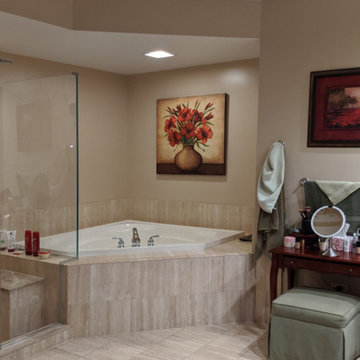
Our clients’ recently purchase home is set in a picturesque location in Golden, Colorado. With idyllic square footage for raising a family, it was almost just what they wanted. However, the 90’s interior furnishings and dated layout didn’t feel like home. So, they reached out to TVL Creative to help them get the place move-in ready and feeling more 'them.' The scope of work included an overhaul of the master bathroom, full-home paint scheme, lighting updates, and new staircase railings. The most profound transformation within our scope was the master bathroom renovation. This luxurious space, built by TVL’s own Team Angel, is a calming retreat with gorgeous detailing throughout. Every part of this bathroom was gutted and we worked to establish a new concept and functional layout that would better serve our clients. As part of the transformative design, a calming symmetry was created by marrying the new vanity design with the existing architecture of the room. A feature tile accentuates the symmetrical composition of vanity and vaulted ceiling: large beveled mirrors and linear sconces bring the eye upward. Custom built-ins flanking the master bathroom sinks were designed to provide ample organized storage for linens and toiletries. A make-up vanity accented by a full height mirror and coordinating pendant rounds out the custom built-ins. Opposite the vanity wall is the commode room, bathtub, and a large shower. In the bathtub nook, the sculptural form of the Elise tub by MTI Baths compliments the arc of the picture window above. The Kohler Archer tub filler adds transitional and classy styling to the area. A quartz-topped bench running the length of the back wall provides a perfect spot for a glass of wine near the bath, while doubling as a gorgeous and functional seat in the shower. The bench was also utilized to move the bathtub off of the exterior wall and reduce the amount of awkward-to-clean floor space. In the shower, the upgrades feel limitless. We relocated the valve controls to the entry half wall for easy on/off access. We also created functionals shower niches that are tucked out of view for handy storage without aesthetic compromise. The shower features a lovely three-dimensional diamond accent tile and is wrapped in frameless glass for added light entry. In general, the space is outfitted with other stunning features including Kohler Archer fixtures throughout, Feiss decorative lighting, Amerock hardware on all built-ins, and cabinetry from Waypoint Living Spaces. From bachelor pad to first family home, it's been a pleasure to work with our client over the years! We will especially cherish our time working with them this time around to make their new house feel more like home.
 Drury Design
THE SETUP
This client lives in a great high-rise condo in downtown Chicago. Alicia has already remodeled a few areas of her home, including her kitchen and home office. The bathroom is one of the last big places the client wanted to update. The existing bathroom had a large, outdated whirlpool tub in the corner. It was a darker space that had a lack of natural light. There are no windows (due to the bathroom’s location within the high-rise building). So, the idea was to brighten up the space and give the client an updated, elegant primary bathroom that is more her style and tailor-made for her routines.
Design Objectives:
- Make the space brighter.
- Create different daily routine stations to maximize functionality while keeping things clutter-free – a makeup station, a blow-dry station, and a sink-needs station.
- Achieve the client’s specific style and function needs while also keeping the look and design open to future possibilities: different users of the space/resale clients.
Design Challenges:
- Toilet cannot be moved. (In a high-rise, you can’t really move plumbing around too much when reimagining a space)
- Existing bathroom had a soffit that hid a lot of electrical wiring, so completely removing the soffit wasn’t an option.
- The blow-dry station needs to accommodate the client’s preference for standing up.
- Finding a place for the make-up station, which the client wants oriented for sitting.
- Create storage within the shower that can eliminate the clutter of personal care products that are actually needed every day. Do this, while keeping the client’s favorite things about the existing shower: the shower bench, a tub filler faucet (for rinsing shaving cream when shaving legs) and a low niche for placing her foot when shaving her legs.
THE RENEWED SPACE
Design Solutions:
- Extended a bit of wall near the toilet to give the commode its own area within the space, but without closing it off into a claustrophobic WC.
- Worked within the reality of the existing soffit situation, reshaping it to align with the new shower. Can lights were also added. Installed a beautiful ceiling light fixture that works within the new soffit shape, commanding attention and adding light, as if the sofit shape was chosen for it.
- Created a nice, furniture-looking 42”-high cabinet with pullout drawers to be the blow-dry station, complete with a mirror and a nice top. The pullout drawers are all powered, concealing a Dyson dryer and curling iron (and all the accoutrements) while keeping them plugged in, which is ideal for easy usage and put away. A stylish mirror on the wall above the cabinet, and proper lighting, make this the perfect blow-dry station. The top has a grommet that can accommodate a power cord should the client ever want to have a powered device on top of the cabinet.
- Put the sit-down makeup station where the tub used to be, putting the mirror back into a new recessed wall just a bit, allowing the area to have more room.
- Created a niche in the shower’s inner wall so that you can’t see it unless you are literally inside the shower. At the client’s request, it also has a hook so she can hang her loofa. Hiding the utility niche in this way allowed us to use the full main wall of the shower as a canvas for a beautiful accent stripe of raised decorative tile. The new shower has her old favorites, too: the tub filler, foot niche and bench.
Alicia’s client loves her new primary bathroom, especially the blow dry area. It is very accommodating for her, as a tall lady, while being very easy to use. The drawers store everything. Being powered, they make using already-plugged in appliances very easy to use and put away.
Her previous makeup station was a freestanding vanity with a single drawer, so beauty products were all over the surface top. With her new makeup station, everything is nicely tucked away and organized in drawers.
The new lighting is fantastic and the colors are light and soft. The clients loves the overall look and feel of her new bathroom and raves about how well the functionality-minded design makes her morning routine – and her life – easier and enjoyable!
77