
Search results for "Reduce originally" in Home Design Ideas
 ZeroEnergy Design
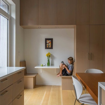
This renovated brick rowhome in Boston’s South End offers a modern aesthetic within a historic structure, creative use of space, exceptional thermal comfort, a reduced carbon footprint, and a passive stream of income.
DESIGN PRIORITIES. The goals for the project were clear - design the primary unit to accommodate the family’s modern lifestyle, rework the layout to create a desirable rental unit, improve thermal comfort and introduce a modern aesthetic. We designed the street-level entry as a shared entrance for both the primary and rental unit. The family uses it as their everyday entrance - we planned for bike storage and an open mudroom with bench and shoe storage to facilitate the change from shoes to slippers or bare feet as they enter their home. On the main level, we expanded the kitchen into the dining room to create an eat-in space with generous counter space and storage, as well as a comfortable connection to the living space. The second floor serves as master suite for the couple - a bedroom with a walk-in-closet and ensuite bathroom, and an adjacent study, with refinished original pumpkin pine floors. The upper floor, aside from a guest bedroom, is the child's domain with interconnected spaces for sleeping, work and play. In the play space, which can be separated from the work space with new translucent sliding doors, we incorporated recreational features inspired by adventurous and competitive television shows, at their son’s request.
MODERN MEETS TRADITIONAL. We left the historic front facade of the building largely unchanged - the security bars were removed from the windows and the single pane windows were replaced with higher performing historic replicas. We designed the interior and rear facade with a vision of warm modernism, weaving in the notable period features. Each element was either restored or reinterpreted to blend with the modern aesthetic. The detailed ceiling in the living space, for example, has a new matte monochromatic finish, and the wood stairs are covered in a dark grey floor paint, whereas the mahogany doors were simply refinished. New wide plank wood flooring with a neutral finish, floor-to-ceiling casework, and bold splashes of color in wall paint and tile, and oversized high-performance windows (on the rear facade) round out the modern aesthetic.
RENTAL INCOME. The existing rowhome was zoned for a 2-family dwelling but included an undesirable, single-floor studio apartment at the garden level with low ceiling heights and questionable emergency egress. In order to increase the quality and quantity of space in the rental unit, we reimagined it as a two-floor, 1 or 2 bedroom, 2 bathroom apartment with a modern aesthetic, increased ceiling height on the lowest level and provided an in-unit washer/dryer. The apartment was listed with Jackie O'Connor Real Estate and rented immediately, providing the owners with a source of passive income.
ENCLOSURE WITH BENEFITS. The homeowners sought a minimal carbon footprint, enabled by their urban location and lifestyle decisions, paired with the benefits of a high-performance home. The extent of the renovation allowed us to implement a deep energy retrofit (DER) to address air tightness, insulation, and high-performance windows. The historic front facade is insulated from the interior, while the rear facade is insulated on the exterior. Together with these building enclosure improvements, we designed an HVAC system comprised of continuous fresh air ventilation, and an efficient, all-electric heating and cooling system to decouple the house from natural gas. This strategy provides optimal thermal comfort and indoor air quality, improved acoustic isolation from street noise and neighbors, as well as a further reduced carbon footprint. We also took measures to prepare the roof for future solar panels, for when the South End neighborhood’s aging electrical infrastructure is upgraded to allow them.
URBAN LIVING. The desirable neighborhood location allows the both the homeowners and tenant to walk, bike, and use public transportation to access the city, while each charging their respective plug-in electric cars behind the building to travel greater distances.
OVERALL. The understated rowhouse is now ready for another century of urban living, offering the owners comfort and convenience as they live life as an expression of their values.
Photography: Eric Roth Photo

 Klopf Architecture
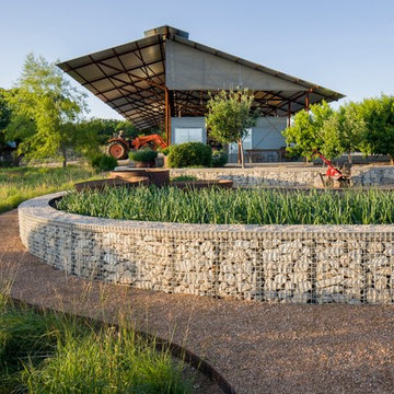
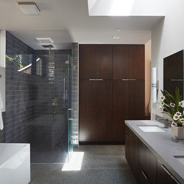
Klopf Architecture, Arterra Landscape Architects and Henry Calvert of Calvert Ventures Designed and built a new warm, modern, Eichler-inspired, open, indoor-outdoor home on a deeper-than-usual San Mateo Highlands property where an original Eichler house had burned to the ground.
The owners wanted multi-generational living and larger spaces than the original home offered, but all parties agreed that the house should respect the neighborhood and blend in stylistically with the other Eichlers. At first the Klopf team considered re-using what little was left of the original home and expanding on it. But after discussions with the owner and builder, all parties agreed that the last few remaining elements of the house were not practical to re-use, so Klopf Architecture designed a new home that pushes the Eichler approach in new directions.
One disadvantage of Eichler production homes is that the house designs were not optimized for each specific lot. A new custom home offered the team a chance to start over. In this case, a longer house that opens up sideways to the south fit the lot better than the original square-ish house that used to open to the rear (west). Accordingly, the Klopf team designed an L-shaped “bar” house with a large glass wall with large sliding glass doors that faces sideways instead of to the rear like a typical Eichler. This glass wall opens to a pool and landscaped yard designed by Arterra Landscape Architects.
Driving by the house, one might assume at first glance it is an Eichler because of the horizontality, the overhanging flat roof eaves, the dark gray vertical siding, and orange solid panel front door, but the house is designed for the 21st Century and is not meant to be a “Likeler.” You won't see any posts and beams in this home. Instead, the ceiling decking is a western red cedar that covers over all the beams. Like Eichlers, this cedar runs continuously from inside to out, enhancing the indoor / outdoor feeling of the house, but unlike Eichlers it conceals a cavity for lighting, wiring, and insulation. Ceilings are higher, rooms are larger and more open, the master bathroom is light-filled and more generous, with a separate tub and shower and a separate toilet compartment, and there is plenty of storage. The garage even easily fits two of today's vehicles with room to spare.
A massive 49-foot by 12-foot wall of glass and the continuity of materials from inside to outside enhance the inside-outside living concept, so the owners and their guests can flow freely from house to pool deck to BBQ to pool and back.
During construction in the rough framing stage, Klopf thought the front of the house appeared too tall even though the house had looked right in the design renderings (probably because the house is uphill from the street). So Klopf Architecture paid the framer to change the roofline from how we had designed it to be lower along the front, allowing the home to blend in better with the neighborhood. One project goal was for people driving up the street to pass the home without immediately noticing there is an "imposter" on this lot, and making that change was essential to achieve that goal.
This 2,606 square foot, 3 bedroom, 3 bathroom Eichler-inspired new house is located in San Mateo in the heart of the Silicon Valley.
Klopf Architecture Project Team: John Klopf, AIA, Klara Kevane
Landscape Architect: Arterra Landscape Architects
Contractor: Henry Calvert of Calvert Ventures
Photography ©2016 Mariko Reed
Location: San Mateo, CA
Year completed: 2016
Find the right local pro for your project
 building Lab, inc.
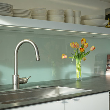
Eichler in Marinwood - The primary organizational element of the interior is the kitchen. Embedded within the simple post and beam structure, the kitchen was conceived as a programmatic block from which we would carve in order to contribute to both sense of function and organization.
photo: scott hargis
 Thyme & Place Design LLC
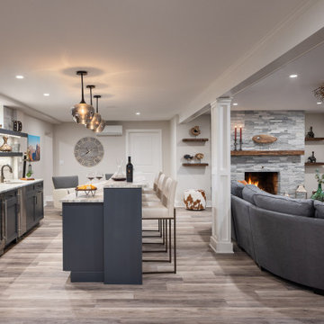
When my client had to move from her company office to work at home, she set up in the dining room. Despite her best efforts, this was not the long-term solution she was looking for. My client realized she needed a dedicated space not on the main floor of the home. On one hand, having your office space right next to the kitchen is handy. On the other hand, it made separating work and home life was not that easy.
The house was a ranch. In essence, the basement would run entire length of the home. As we came down the steps, we entered a time capsule. The house was built in the 1950’s. The walls were covered with original knotty pine paneling. There was a wood burning fireplace and considering this was a basement, high ceilings. In addition, there was everything her family could not store at their own homes. As we wound though the space, I though “wow this has potential”, Eventually, after walking through the laundry room we came to a small nicely lit room. This would be the office.
My client looked at me and asked what I thought. Undoubtedly, I said, this can be a great workspace, but do you really want to walk through this basement and laundry to get here? Without reservation, my client said where do we start?
Once the design was in place, we started the renovation. The knotty pine paneling had to go. Specifically, to add some insulation and control the dampness and humidity. The laundry room wall was relocated to create a hallway to the office.
At the far end of the room, we designated a workout zone. Weights, mats, exercise bike and television are at the ready for morning or afternoon workouts. The space can be concealed by a folding screen for party time. Doors to an old closet under the stairs were relocated to the workout area for hidden storage. Now we had nice wall for a beautiful console and mirror for storage and serving during parties.
In order to add architectural details, we covered the old ugly support columns with simple recessed millwork panels. This detail created a visual division between the bar area and the seating area in front of the fireplace. The old red brick on the fireplace surround was replaced with stack stone. A mantle was made from reclaimed wood. Additional reclaimed wood floating shelves left and right of the fireplace provides decorative display while maintaining a rustic element balancing the copper end table and leather swivel rocker.
We found an amazing rug which tied all of the colors together further defining the gathering space. Russet and burnt orange became the accent color unifying each space. With a bit of whimsy, a rather unusual light fixture which looks like roots from a tree growing through the ceiling is a conversation piece.
The office space is quite and removed from the main part of the basement. There is a desk large enough for multiple screens, a small bookcase holding office supplies and a comfortable chair for conference calls. Because working from home requires many online meetings, we added a shiplap wall painted in Hale Navy to contrast with the orange fabric on the chair. We finished the décor with a painting from my client’s father. This is the background online visitors will see.
The last and best part of the renovation is the beautiful bar. My client is an avid collector of wine. She already had the EuroCave refrigerator, so I incorporated it into the design. The cabinets are painted Temptation Grey from Benjamin Moore. The counter tops are my favorite hard working quartzite Brown Fantasy. The backsplash is a combination of rustic wood and old tin ceiling like porcelain tiles. Together with the textures of the reclaimed wood and hide poofs balanced against the smooth finish of the cabinets, we created a comfortable luxury for relaxing.
There is ample storage for bottles, cans, glasses, and anything else you can think of for a great party. In addition to the wine storage, we incorporated a beverage refrigerator, an ice maker, and a sink. Floating shelves with integrated lighting illuminate the back bar. The raised height of the front bar provides the perfect wine tasting and paring spot. I especially love the pendant lights which look like wine glasses.
Finally, I selected carpet for the stairs and office. It is perfect for noise reduction. Meanwhile for the overall flooring, I specifically selected a high-performance vinyl plank floor. We often use this product as it is perfect to install on a concrete floor. It is soft to walk on, easy to clean and does not reduce the overall height of the space.


 June Scott Design
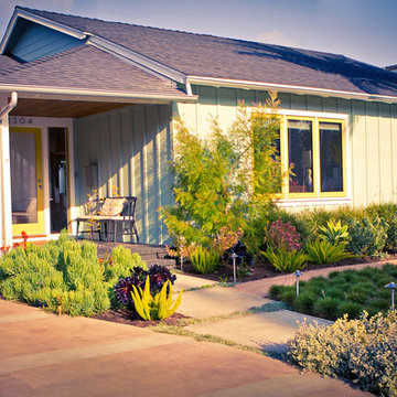
Succulents, grasses and low-water shrubs with vivid foliage give this coastal garden a rich, textured look with minimal maintenance. Exterior colors and furniture selection by Julie McMahon. Photos by Daniel Bosler

Sponsored
Columbus, OH

Wannemacher Interiors
Customized Award-Winning Interior Design Solutions in Franklin Cnty OH

 FMSProjects, Inc.
Skylight provides extra light on cloudy day. Very bright kitchen with painted white cabinets. Preserved and repaired the original stained glass windows.
 FineLine Kitchens, Inc.
Our designer has achieved a stylish look by combining dark cabinets and light-colored marbles.
 Griffin Designs LLC
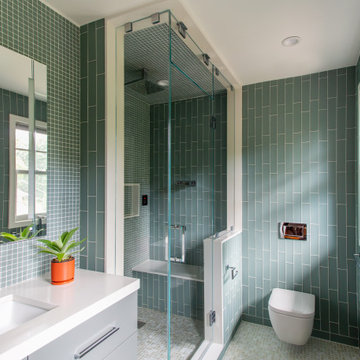
Smokey turquoise glass tiles cover this luxury bath with an interplay of stacked and gridded tile patterns that enhances the sophistication of the monochromatic palette.
Floor to ceiling glass panes define a breathtaking steam shower. Every detail takes the homeowner’s needs into account, including an in-wall waterfall element above the shower bench. Griffin Designs measured not only the space but also the seated homeowner to ensure a soothing stream of water that cascades onto the shoulders, hits just the right places, and melts away the stresses of the day.
Space conserving features such as the wall-hung toilet allowed for more flexibility in the layout. With more possibilities came more storage. Replacing the original pedestal sink, a bureau-style vanity spans four feet and offers six generously sized drawers. One drawer comes complete with outlets to discretely hide away accessories, like a hair dryer, while maximizing function. An additional recessed medicine cabinet measures almost six feet in height.
The comforts of this primary bath continue with radiant floor heating, a built-in towel warmer, and thoughtfully placed niches to hold all the bits and bobs in style.
 Whitten Architects
Jonathan Reece
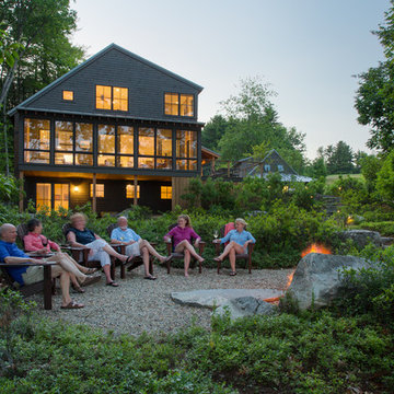
Mid-sized transitional brown backyard and two-story gravel and wood gable roof photo in Portland Maine with a fire pit, no cover and a metal roof
Mid-sized transitional brown backyard and two-story gravel and wood gable roof photo in Portland Maine with a fire pit, no cover and a metal roof

 Andrew Heiser
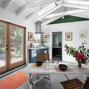
Example of a small beach style concrete floor and gray floor kitchen/dining room combo design in Los Angeles with white walls

Sponsored
Columbus, OH
Wannemacher Interiors
Customized Award-Winning Interior Design Solutions in Franklin Cnty OH
 Merits Design Group, Inc.
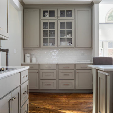
We reduced the number of glass profiles in the uppers to hide the practical items that aren't as pretty. Swapping about huge base cabinets with useful drawers offered more options for this service area.
 A.Jennison Interiors
Photo - Jessica Glynn Photography
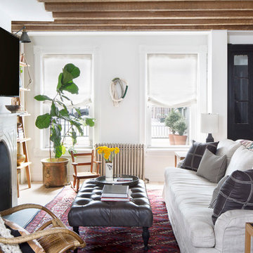
Example of a mid-sized transitional enclosed light wood floor and beige floor living room design in New York with multicolored walls, a standard fireplace, a stone fireplace and a wall-mounted tv
Example of a mid-sized transitional enclosed light wood floor and beige floor living room design in New York with multicolored walls, a standard fireplace, a stone fireplace and a wall-mounted tv
 dcap pllc
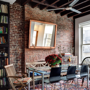
Adding a penthouse perch to this 1899 row house with a harbor view demanded unusual tactics. To circumvent municipal limitations on floor area, a section of floor was removed from one level and “transferred” to the roof as a new studio space. To comply with local height limitations, an innovative structure of solid wood studs was deployed to reduce floor and ceiling thicknesses to the bare minimum. Aside from creating the desired rooftop refuge, these gymnastics also created a dynamic cascade of interior living spaces for an urban designer and his family.
Photos by Bruce Buck.
 Kelly Scanlon Interior Design
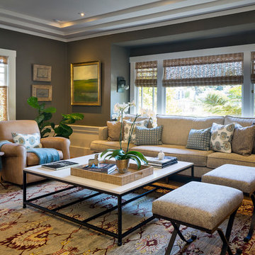
a 1916 Craftsman in Oakland, CA gets new life. A complete overhaul of the original space while preserving all of the original detail in the casework and flooring. Overhead lighting (LED!) enhances the homeowners beautiful art collection, custom sized furniture provides increased seating and loads of texture and warmth, reducing any clutter. While remodeling the fireplace and adding period appropriate mantle detail, original windows were revealed, bringing more natural light into this illuminated living/family room.
Scott Hargis Photo

Sponsored
Columbus, OH
Wannemacher Interiors
Customized Award-Winning Interior Design Solutions in Franklin Cnty OH
 SHM Architects
Photography: Dan Piassick
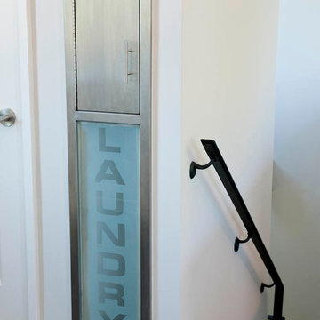
Transitional dark wood floor hallway photo in Dallas with white walls
Transitional dark wood floor hallway photo in Dallas with white walls
 David Heide Design Studio
Architecture & Interior Design: David Heide Design Studio
Photo: Susan Gilmore Photography
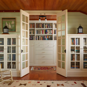
Inspiration for a coastal master medium tone wood floor family room library remodel in Minneapolis with green walls, no fireplace and no tv
Inspiration for a coastal master medium tone wood floor family room library remodel in Minneapolis with green walls, no fireplace and no tv
 Elms Interior Design
Photography by Michael J. Lee
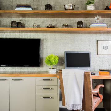
Study room - transitional built-in desk study room idea in Boston with gray walls
Study room - transitional built-in desk study room idea in Boston with gray walls
3