
Search results for "Reduce originally" in Home Design Ideas
 Forward Design Build Remodel
Formerly a very divided bathroom, our goal was to open the space up allowing the natural light from the window to pass through the entire bathroom while still providing privacy.
We worked to creatively incorporate additional storage and to close off the toilet into a private closet. The homeowners were very interested in a Japanese soaking tub and maintaining a very clean and modern space to relax after working heavily in color and pattern with their work. We created a taller showering space by moving the plumbing into the floor. We used a floor length linear drain to allow for the large format tiles throughout reducing grout lines.
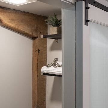
All beams were original to the space and were important to keep visible for cohesiveness throughout the home. They really bring an element of warmth and a touch of rustic to an otherwise very modern space.
With thoughtful modern finishes and a neutral color palette, we were able to create a space that is relaxing for the mind and body.
 EmV Design Build
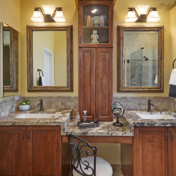
Robin Stancliff photo credits.My goal with this project was to create a glamorous, luxurious bathroom with plenty of space and a Mediterranean-inspired aesthetic. My client felt as though her old bathroom was constantly cluttered and filled with wasted space. As a dancer, she
wanted her bathroom to be a place where she could prepare for her performances, and also relax and unwind after her performances. Since she never used her tub, I removed it and expanded the shower, providing an extra foot of shower space. Because she
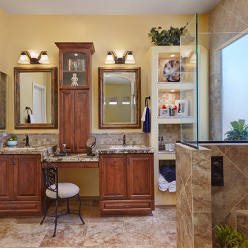
loves the travertine floor that was already in the bathroom, I found a porcelain look-alike to include in the shower, and for the shower bench. The original travertine in the bathroom was impossible to find, but locating the porcelain look-alike was a worthwhile challenge which resulted in a budget-friendly shower that is beautiful and easy to clean at the same time. This remodeled bathroom also includes open shelving
to display artwork and store items, as well as a special vanity designed with makeup application in mind. The height of the vanity was increased to executive height, adding custom convenience for the client. I also increased lighting throughout the bathroom,
replacing the original lighting with LED, and adding light into the center tower of the vanity as well as the display shelving. The new design of the vanity added extra space for storing makeup and toiletries to reduce clutter, and it also helped my client ergonomically. By blending unique textures and warm colors, I was able to create a
gorgeous bathroom evocative of a Tuscan home with a spa-like feel.
 CRC Builders Inc.
A five-bedroom, five-bath, 5,000 square foot home in Danville was in need of a make-over.
Originally, the family room had a shed roof from the first floor to second floor hallway that didn’t leave sufficient head room in the hallway, and reduced the view. The roof was removed and replaced with a gable end roof. New windows added more light and a view of the swimming pool.
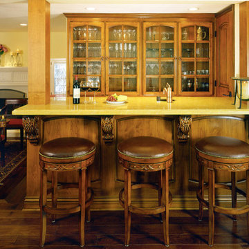
The home’s tired 70’s look was transformed to an Old World design, keeping with the feel of the neighborhood. A detailed bar was added to the family room; the laundry was moved upstairs.
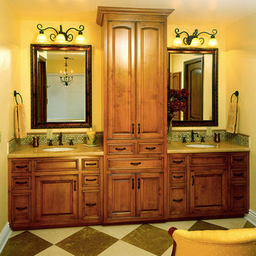
New custom cabinetry now adorns the dining room and great room. In the new kitchen, a custom island has four turned legs, keeping with the Old World look. Its visually stunning, labor intensive, hand rubbed finish was achieved by staining and lacquering the piece, then spraying it with a pigmented conversion varnish, after which the edges were lightly sanded, giving the unit a rubbed, aged appearance.
“Now that we have a state-of-the-art cabinet shop, we enjoy showing off our technical cabinetry skills,” Jim Pitcher said. “The shop gives us the opportunity to deliver unique cabinets and built-in furniture pieces that enhance our projects.”
Find the right local pro for your project
 Forward Design Build Remodel
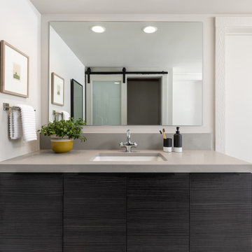
Formerly a very divided bathroom, our goal was to open the space up allowing the natural light from the window to pass through the entire bathroom while still providing privacy.
We worked to creatively incorporate additional storage and to close off the toilet into a private closet. The homeowners were very interested in a Japanese soaking tub and maintaining a very clean and modern space to relax after working heavily in color and pattern with their work. We created a taller showering space by moving the plumbing into the floor. We used a floor length linear drain to allow for the large format tiles throughout reducing grout lines.
All beams were original to the space and were important to keep visible for cohesiveness throughout the home. They really bring an element of warmth and a touch of rustic to an otherwise very modern space.
With thoughtful modern finishes and a neutral color palette, we were able to create a space that is relaxing for the mind and body.
 Deskins Group LLC
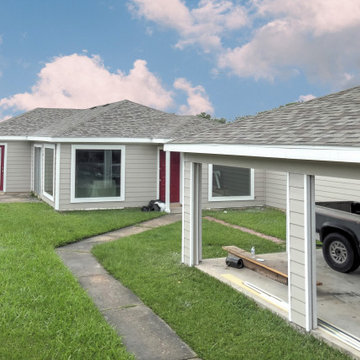
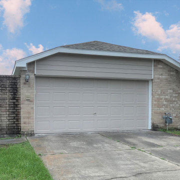
This zero lot line patio home was in serious need of attention—the original siding was literally falling off, leaving the structure exposed to Houston’s heat, humidity, and heavy rain. The homeowner needed a durable, long-term solution that would restore protection, efficiency, and curb appeal.
We removed the failing materials and installed new HardiePlank® siding and HardieTrim®, giving the home a clean, modern, and structurally sound exterior built specifically to withstand Houston’s Gulf Coast climate. To further improve comfort and energy performance, we upgraded the home with Simonton high‑efficiency windows, dramatically enhancing insulation and reducing air loss.
Once the new siding and windows were in place, we completed the transformation with a full exterior repaint using premium Sherwin‑Williams exterior paint, delivering a crisp, long-lasting finish that will hold up beautifully for years to come.
This project is a perfect example of how the right materials—and the right contractor—can completely revive a home’s exterior, boost efficiency, and add long-term value in the Houston market.
Ready to restore or upgrade your home’s exterior? Contact Deskins Siding & Exteriors today for a free consultation and let’s bring your home back to life.
 Forward Design Build Remodel
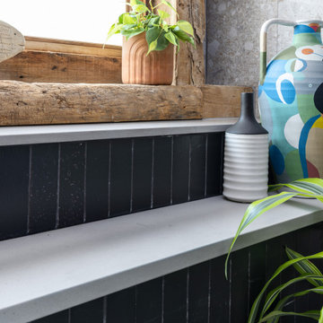
Formerly a very divided bathroom, our goal was to open the space up allowing the natural light from the window to pass through the entire bathroom while still providing privacy.
We worked to creatively incorporate additional storage and to close off the toilet into a private closet. The homeowners were very interested in a Japanese soaking tub and maintaining a very clean and modern space to relax after working heavily in color and pattern with their work. We created a taller showering space by moving the plumbing into the floor. We used a floor length linear drain to allow for the large format tiles throughout reducing grout lines.
All beams were original to the space and were important to keep visible for cohesiveness throughout the home. They really bring an element of warmth and a touch of rustic to an otherwise very modern space.
With thoughtful modern finishes and a neutral color palette, we were able to create a space that is relaxing for the mind and body.
 Story Homes
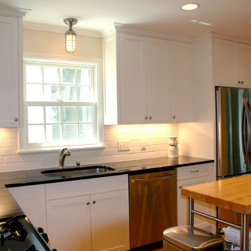
A galley kitchen places all counters, cabinetry and appliances along one or both long walls. The style was designed with space efficiency in mind, but it also makes cooking and entertaining convenient.
The original kitchen in this project had knotty pine cabinets and a soffit that framed the kitchen but reduced storage. A butcher block on wheels became a center island that the owner wanted to keep.
The remodeling design called for new stainless steel appliances, with antique white upper and lower cabinets and black granite countertops. The soffit was eliminated which allowed the upper cabinets to reach to the ceiling, adding more than 24 cubic feet of storage space.
Note the single light above the stainless steel sink that reinforces a nautical theme. The walls below the cabinets and the back splash feature white subway tiling, and under-cabinet lighting makes the whole kitchen feel more open and spacious.
This design makes the most out of long, narrow spaces to create an inviting kitchen for entertaining family and friends.

Sponsored
Columbus, OH

Wannemacher Interiors
Customized Award-Winning Interior Design Solutions in Franklin Cnty OH
 Stairworks
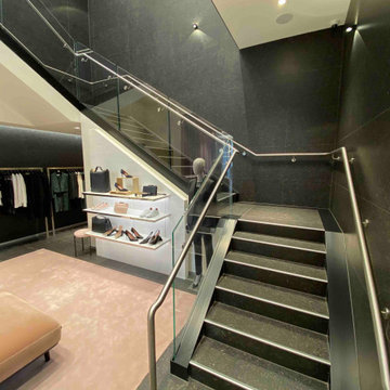
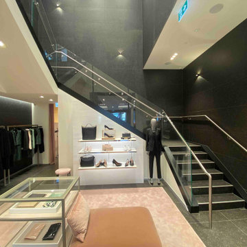
This commercial staircase in Commercial Bay Shopping Centre in Auckland was built for the purpose of structure, rigidity, and functionality. The shopping mall gives out a standard staircase for the retail shops, so Hugo Boss re-designed a staircase to better suit their needs. We were able to reuse the new, 120mm thick, solid concrete treads in order to reduce costs. Because the new staircase was slightly narrower than the original, we trimmed down the treads to accommodate the new dimensions of the replacement stairs.
What made this project a challenge was that it was really heavy (the finished stairs weighed about 2 tons) and we had to adhere to pretty strict structural requirements because it’s a commercial staircase. We were able to do the installation in 2 days by getting everything in on the first day, and then having Grant spend a week there with the mini crane lifting up all the steel and placing the treads.
The structural materials we used were concrete and steel. Hugo Boss then tiled over top of it, and we finished it off with a brush, stainless steel handrail. We then had to work closely with the glass balustrade company to make sure the holes were in the right place in correspondence with the staircase and that everything ran smoothly and on time.
 EmV Design Build
Robin Stancliff photo credits.My goal with this project was to create a glamorous, luxurious bathroom with plenty of space and a Mediterranean-inspired aesthetic. My client felt as though her old bathroom was constantly cluttered and filled with wasted space. As a dancer, she
wanted her bathroom to be a place where she could prepare for her performances, and also relax and unwind after her performances. Since she never used her tub, I removed it and expanded the shower, providing an extra foot of shower space. Because she
loves the travertine floor that was already in the bathroom, I found a porcelain look-alike to include in the shower, and for the shower bench. The original travertine in the bathroom was impossible to find, but locating the porcelain look-alike was a worthwhile challenge which resulted in a budget-friendly shower that is beautiful and easy to clean at the same time. This remodeled bathroom also includes open shelving
to display artwork and store items, as well as a special vanity designed with makeup application in mind. The height of the vanity was increased to executive height, adding custom convenience for the client. I also increased lighting throughout the bathroom,
replacing the original lighting with LED, and adding light into the center tower of the vanity as well as the display shelving. The new design of the vanity added extra space for storing makeup and toiletries to reduce clutter, and it also helped my client ergonomically. By blending unique textures and warm colors, I was able to create a
gorgeous bathroom evocative of a Tuscan home with a spa-like feel.
 Deskins Group LLC
This zero lot line patio home was in serious need of attention—the original siding was literally falling off, leaving the structure exposed to Houston’s heat, humidity, and heavy rain. The homeowner needed a durable, long-term solution that would restore protection, efficiency, and curb appeal.
We removed the failing materials and installed new HardiePlank® siding and HardieTrim®, giving the home a clean, modern, and structurally sound exterior built specifically to withstand Houston’s Gulf Coast climate. To further improve comfort and energy performance, we upgraded the home with Simonton high‑efficiency windows, dramatically enhancing insulation and reducing air loss.
Once the new siding and windows were in place, we completed the transformation with a full exterior repaint using premium Sherwin‑Williams exterior paint, delivering a crisp, long-lasting finish that will hold up beautifully for years to come.
This project is a perfect example of how the right materials—and the right contractor—can completely revive a home’s exterior, boost efficiency, and add long-term value in the Houston market.
Ready to restore or upgrade your home’s exterior? Contact Deskins Siding & Exteriors today for a free consultation and let’s bring your home back to life.
 CRC Builders Inc.
A five-bedroom, five-bath, 5,000 square foot home in Danville was in need of a make-over.
Originally, the family room had a shed roof from the first floor to second floor hallway that didn’t leave sufficient head room in the hallway, and reduced the view. The roof was removed and replaced with a gable end roof. New windows added more light and a view of the swimming pool.
The home’s tired 70’s look was transformed to an Old World design, keeping with the feel of the neighborhood. A detailed bar was added to the family room; the laundry was moved upstairs.
New custom cabinetry now adorns the dining room and great room. In the new kitchen, a custom island has four turned legs, keeping with the Old World look. Its visually stunning, labor intensive, hand rubbed finish was achieved by staining and lacquering the piece, then spraying it with a pigmented conversion varnish, after which the edges were lightly sanded, giving the unit a rubbed, aged appearance.
“Now that we have a state-of-the-art cabinet shop, we enjoy showing off our technical cabinetry skills,” Jim Pitcher said. “The shop gives us the opportunity to deliver unique cabinets and built-in furniture pieces that enhance our projects.”
 Stairworks
This commercial staircase in Commercial Bay Shopping Centre in Auckland was built for the purpose of structure, rigidity, and functionality. The shopping mall gives out a standard staircase for the retail shops, so Hugo Boss re-designed a staircase to better suit their needs. We were able to reuse the new, 120mm thick, solid concrete treads in order to reduce costs. Because the new staircase was slightly narrower than the original, we trimmed down the treads to accommodate the new dimensions of the replacement stairs.
What made this project a challenge was that it was really heavy (the finished stairs weighed about 2 tons) and we had to adhere to pretty strict structural requirements because it’s a commercial staircase. We were able to do the installation in 2 days by getting everything in on the first day, and then having Grant spend a week there with the mini crane lifting up all the steel and placing the treads.
The structural materials we used were concrete and steel. Hugo Boss then tiled over top of it, and we finished it off with a brush, stainless steel handrail. We then had to work closely with the glass balustrade company to make sure the holes were in the right place in correspondence with the staircase and that everything ran smoothly and on time.
 Forward Design Build Remodel
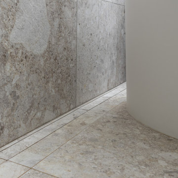
Formerly a very divided bathroom, our goal was to open the space up allowing the natural light from the window to pass through the entire bathroom while still providing privacy.
We worked to creatively incorporate additional storage and to close off the toilet into a private closet. The homeowners were very interested in a Japanese soaking tub and maintaining a very clean and modern space to relax after working heavily in color and pattern with their work. We created a taller showering space by moving the plumbing into the floor. We used a floor length linear drain to allow for the large format tiles throughout reducing grout lines.
All beams were original to the space and were important to keep visible for cohesiveness throughout the home. They really bring an element of warmth and a touch of rustic to an otherwise very modern space.
With thoughtful modern finishes and a neutral color palette, we were able to create a space that is relaxing for the mind and body.

Sponsored
Columbus, OH
Wannemacher Interiors
Customized Award-Winning Interior Design Solutions in Franklin Cnty OH
 EmV Design Build
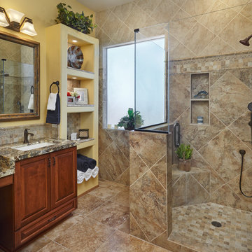
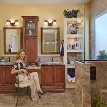
Robin Stancliff photo credits.My goal with this project was to create a glamorous, luxurious bathroom with plenty of space and a Mediterranean-inspired aesthetic. My client felt as though her old bathroom was constantly cluttered and filled with wasted space. As a dancer, she
wanted her bathroom to be a place where she could prepare for her performances, and also relax and unwind after her performances. Since she never used her tub, I removed it and expanded the shower, providing an extra foot of shower space. Because she
loves the travertine floor that was already in the bathroom, I found a porcelain look-
alike to include in the shower, and for the shower bench. The original travertine in the
bathroom was impossible to find, but locating the porcelain look-alike was a worthwhile challenge which resulted in a budget-friendly shower that is beautiful and easy to clean at the same time. This remodeled bathroom also includes open shelving to display artwork and store items, as well as a special vanity designed with makeup application in mind. The height of the vanity was increased to executive height, adding
custom convenience for the client. I also increased lighting throughout the bathroom, replacing the original lighting with LED, and adding light into the center tower of the vanity as well as the display shelving. The new design of the vanity added extra space for storing makeup and toiletries to reduce clutter, and it also helped my client ergonomically. By blending unique textures and warm colors, I was able to create a
gorgeous bathroom evocative of a Tuscan home with a spa-like feel.
 EmV Design Build
Robin Stancliff photo credits.My goal with this project was to create a glamorous, luxurious bathroom with plenty of space and a Mediterranean-inspired aesthetic. My client felt as though her old bathroom was constantly cluttered and filled with wasted space. As a dancer, she
wanted her bathroom to be a place where she could prepare for her performances, and also relax and unwind after her performances. Since she never used her tub, I removed it and expanded the shower, providing an extra foot of shower space. Because she
loves the travertine floor that was already in the bathroom, I found a porcelain look-alike to include in the shower, and for the shower bench. The original travertine in the bathroom was impossible to find, but locating the porcelain look-alike was a worthwhile challenge which resulted in a budget-friendly shower that is beautiful and easy to clean at the same time. This remodeled bathroom also includes open shelving
to display artwork and store items, as well as a special vanity designed with makeup application in mind. The height of the vanity was increased to executive height, adding custom convenience for the client. I also increased lighting throughout the bathroom,
replacing the original lighting with LED, and adding light into the center tower of the vanity as well as the display shelving. The new design of the vanity added extra space for storing makeup and toiletries to reduce clutter, and it also helped my client ergonomically. By blending unique textures and warm colors, I was able to create a
gorgeous bathroom evocative of a Tuscan home with a spa-like feel.
 DSA Architects
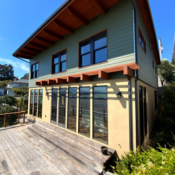
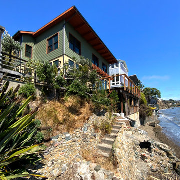
After half a century of exposure to wind and weather, this unique home at the Point Richmond shoreline was in dire need of complete renovation. The original mansard was removed and the new exterior takes its cues from the Craftsman interior of the home, featuring a new façade with lap siding, an accent gable facing the street, and a deep overhang facing San Francisco Bay. This reconfiguration makes the most out of the interior vistas, and it also opens up the bay view from the street. The project passed the Point Richmond Neighborhood Council, the city design review, as well as the SF Bay Conservation and Development Council with flying colors.
The owners set ambitious environmental goals and allowed us to follow through with a design for net-zero energy performance, meaning that the home could produce the annual power consumption from the rooftop solar system; the gas line was disconnected. Improved insulation and window upgrades go hand in hand with highly efficient heat pumps for space heating and domestic hot water. The bath fans recycle heat from the exhaust air, and the incoming air goes through a filter for improved indoor air quality, notably during wildfire season. The home also received substantial seismic upgrades.
Interior remodeling focused on the kitchen and master bath, while for most other rooms the challenge was to preserve and refresh the original character. Kasten Builders was the general contractor and got this home ready for the next 50+ years with a tremendously reduced carbon footprint.
 DSA Architects
After half a century of exposure to wind and weather, this unique home at the Point Richmond shoreline was in dire need of complete renovation. The original mansard was removed and the new exterior takes its cues from the Craftsman interior of the home, featuring a new façade with lap siding, an accent gable facing the street, and a deep overhang facing San Francisco Bay. This reconfiguration makes the most out of the interior vistas, and it also opens up the bay view from the street. The project passed the Point Richmond Neighborhood Council, the city design review, as well as the SF Bay Conservation and Development Council with flying colors.
The owners set ambitious environmental goals and allowed us to follow through with a design for net-zero energy performance, meaning that the home could produce the annual power consumption from the rooftop solar system; the gas line was disconnected. Improved insulation and window upgrades go hand in hand with highly efficient heat pumps for space heating and domestic hot water. The bath fans recycle heat from the exhaust air, and the incoming air goes through a filter for improved indoor air quality, notably during wildfire season. The home also received substantial seismic upgrades.
Interior remodeling focused on the kitchen and master bath, while for most other rooms the challenge was to preserve and refresh the original character. Kasten Builders was the general contractor and got this home ready for the next 50+ years with a tremendously reduced carbon footprint.

Sponsored
Columbus, OH
Wannemacher Interiors
Customized Award-Winning Interior Design Solutions in Franklin Cnty OH
 John Lum Architecture, Inc. AIA
Photos Courtesy of Paul Dyer
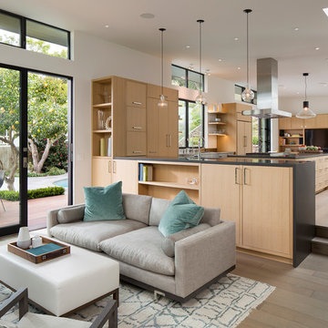
Inspiration for a contemporary family room remodel in San Francisco
Inspiration for a contemporary family room remodel in San Francisco
 DHD Architecture and Interior Design
Union Square Loft II
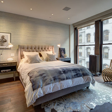
DHD Interiors worked with this couple to furnish their new recently renovated Flatiron loft. Navigating the dark wood paneling and flooring, DHD selected furniture and finishes that felt rich in color and texture while still cool and casual. Layers of grass cloth wallpapers were added to the main bedrooms to reduce the contrast of the dark wood and walls, adding brightness to the loft’s overall feel. Greys and mink-toned browns served as the foundation for a base palette, with deep burgundies and blues working as accents. This loft feels like a true downtown loft with its original brick and an industrial dining table, but stays balanced with softly upholstered furniture. Each piece, from the Dunbar chaise lounge to the organically shaped coffee table, displays a sculptural quality that contributes to a visually dynamic space.
2 Bedrooms / 2,000 Square Feet
Architecture and Photography:
Danny Forster Design Studio
 The Brooklyn Studio
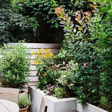
This residence was a complete gut renovation of a 4-story row house in Park Slope, and included a new rear extension and penthouse addition. The owners wished to create a warm, family home using a modern language that would act as a clean canvas to feature rich textiles and items from their world travels. As with most Brooklyn row houses, the existing house suffered from a lack of natural light and connection to exterior spaces, an issue that Principal Brendan Coburn is acutely aware of from his experience re-imagining historic structures in the New York area. The resulting architecture is designed around moments featuring natural light and views to the exterior, of both the private garden and the sky, throughout the house, and a stripped-down language of detailing and finishes allows for the concept of the modern-natural to shine.
Upon entering the home, the kitchen and dining space draw you in with views beyond through the large glazed opening at the rear of the house. An extension was built to allow for a large sunken living room that provides a family gathering space connected to the kitchen and dining room, but remains distinctly separate, with a strong visual connection to the rear garden. The open sculptural stair tower was designed to function like that of a traditional row house stair, but with a smaller footprint. By extending it up past the original roof level into the new penthouse, the stair becomes an atmospheric shaft for the spaces surrounding the core. All types of weather – sunshine, rain, lightning, can be sensed throughout the home through this unifying vertical environment. The stair space also strives to foster family communication, making open living spaces visible between floors. At the upper-most level, a free-form bench sits suspended over the stair, just by the new roof deck, which provides at-ease entertaining. Oak was used throughout the home as a unifying material element. As one travels upwards within the house, the oak finishes are bleached to further degrees as a nod to how light enters the home.
The owners worked with CWB to add their own personality to the project. The meter of a white oak and blackened steel stair screen was designed by the family to read “I love you” in Morse Code, and tile was selected throughout to reference places that hold special significance to the family. To support the owners’ comfort, the architectural design engages passive house technologies to reduce energy use, while increasing air quality within the home – a strategy which aims to respect the environment while providing a refuge from the harsh elements of urban living.
This project was published by Wendy Goodman as her Space of the Week, part of New York Magazine’s Design Hunting on The Cut.
Photography by Kevin Kunstadt
32