
Search results for "Reduce originally" in Home Design Ideas
 The Brooklyn Studio
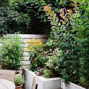
This residence was a complete gut renovation of a 4-story row house in Park Slope, and included a new rear extension and penthouse addition. The owners wished to create a warm, family home using a modern language that would act as a clean canvas to feature rich textiles and items from their world travels. As with most Brooklyn row houses, the existing house suffered from a lack of natural light and connection to exterior spaces, an issue that Principal Brendan Coburn is acutely aware of from his experience re-imagining historic structures in the New York area. The resulting architecture is designed around moments featuring natural light and views to the exterior, of both the private garden and the sky, throughout the house, and a stripped-down language of detailing and finishes allows for the concept of the modern-natural to shine.
Upon entering the home, the kitchen and dining space draw you in with views beyond through the large glazed opening at the rear of the house. An extension was built to allow for a large sunken living room that provides a family gathering space connected to the kitchen and dining room, but remains distinctly separate, with a strong visual connection to the rear garden. The open sculptural stair tower was designed to function like that of a traditional row house stair, but with a smaller footprint. By extending it up past the original roof level into the new penthouse, the stair becomes an atmospheric shaft for the spaces surrounding the core. All types of weather – sunshine, rain, lightning, can be sensed throughout the home through this unifying vertical environment. The stair space also strives to foster family communication, making open living spaces visible between floors. At the upper-most level, a free-form bench sits suspended over the stair, just by the new roof deck, which provides at-ease entertaining. Oak was used throughout the home as a unifying material element. As one travels upwards within the house, the oak finishes are bleached to further degrees as a nod to how light enters the home.
The owners worked with CWB to add their own personality to the project. The meter of a white oak and blackened steel stair screen was designed by the family to read “I love you” in Morse Code, and tile was selected throughout to reference places that hold special significance to the family. To support the owners’ comfort, the architectural design engages passive house technologies to reduce energy use, while increasing air quality within the home – a strategy which aims to respect the environment while providing a refuge from the harsh elements of urban living.
This project was published by Wendy Goodman as her Space of the Week, part of New York Magazine’s Design Hunting on The Cut.
Photography by Kevin Kunstadt
 Kathleen Jennison
An Arts & Crafts Bungalow is one of my favorite styles of homes. We have quite a few of them in our Stockton Mid-Town area. And when C&L called us to help them remodel their 1923 American Bungalow, I was beyond thrilled.
As per usual, when we get a new inquiry, we quickly Google the project location while we are talking to you on the phone. My excitement escalated when I saw the Google Earth Image of the sweet Sage Green bungalow in Mid-Town Stockton. "Yes, we would be interested in working with you," I said trying to keep my cool.
But what made it even better was meeting C&L and touring their home, because they are the nicest young couple, eager to make their home period perfect. Unfortunately, it had been slightly molested by some bad house-flippers, and we needed to bring the bathroom back to it "roots."
We knew we had to banish the hideous brown tile and cheap vanity quickly. But C&L complained about the condensation problems and the constant fight with mold. This immediately told me that improper remodeling had occurred and we needed to remedy that right away.
The Before: Frustrations with a Botched Remodel
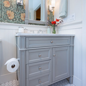
The bathroom needed to be brought back to period appropriate design with all the functionality of a modern bathroom. We thought of things like marble countertop, white mosaic floor tiles, white subway tile, board and batten molding, and of course a fabulous wallpaper.
This small (and only) bathroom on a tight budget required a little bit of design sleuthing to figure out how we could get the proper look and feel. Our goal was to determine where to splurge and where to economize and how to complete the remodel as quickly as possible because C&L would have to move out while construction was going on.
The Process: Hard Work to Remedy Design and Function
During our initial design study, (which included 2 hours in the owners’ home), we noticed framed images of William Morris Arts and Crafts textile patterns and knew this would be our design inspiration. We presented C&L with three options and they quickly selected the Pimpernel Design Concept.
We had originally selected the Black and Olive colors with a black vanity, mirror, and black and white floor tile. C&L liked it but weren’t quite sure about the black, We went back to the drawing board and decided the William & Co Pimpernel Wallpaper in Bayleaf and Manilla color with a softer gray painted vanity and mirror and white floor tile was more to their liking.
After the Design Concept was approved, we went to work securing the building permit, procuring all the elements, and scheduling our trusted tradesmen to perform the work.
We did uncover some shoddy work by the flippers such as live electrical wires hidden behind the wall, plumbing venting cut-off and buried in the walls (hence the constant dampness), the tub barely balancing on two fence boards across the floor joist, and no insulation on the exterior wall.
All of the previous blunders were fixed and the bathroom put back to its previous glory. We could feel the house thanking us for making it pretty again.
The After Reveal: Cohesive Design Decisions
We selected a simple white subway tile for the tub/shower. This is always classic and in keeping with the style of the house.
We selected a pre-fab vanity and mirror, but they look rich with the quartz countertop. There is much more storage in this small vanity than you would think.
The Transformation: A Period Perfect Refresh
We began the remodel just as the pandemic reared and stay-in-place orders went into effect. As C&L were already moved out and living with relatives, we got the go-ahead from city officials to get the work done (after all, how can you shelter in place without a bathroom?).
All our tradesmen were scheduled to work so that only one crew was on the job site at a time. We stayed on the original schedule with only a one week delay.
The end result is the sweetest little bathroom I've ever seen (and I can't wait to start work on C&L's kitchen next).
Thank you for joining me in this project transformation. I hope this inspired you to think about being creative with your design projects, determining what works best in keeping with the architecture of your space, and carefully assessing how you can have the best life in your home.
 Scott Simpson Design + Build
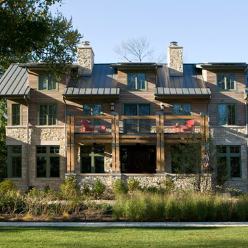
The original homeowner’s plan was to do an extensive renovation to the existing structure. Scott Simpson and Tom Kenny, owners of Scott Simpson Builders, collaborated with the homeowners and the architect, John Holbert, and decided to do new construction to utilize as many green technologies and building practices as possible. As the project progressed, more and more elements were employed to make this home a unique, environmentally sensitive structure.
GREENER BUILDING
Green technologies used in construction include:
--8,000 kw of photovoltaic cells.
--Installation of a net meter system by which excess energy can be sold back to the electric company.
--Solar panels to heat home’s floors through a radiant system and to heat the home’s water.
--Low VOC water-based urethane used to seal concrete basement floor and low VOC finishes throughout.
--Roof was made from Galvalume-an aluminum that reflects solar energy off the roof and reduces the need for air conditioning.
--The installation of an 8,000 gallon tank under the driveway to harvest rain water and re use it to water drought resistant trees and grasses. This is the FIRST rain water harvest system to be installed in the Village of Wilmette.
--Green roof located over garage.
--Benches used are Gabians, traditionally used for erosion control. The bricks used in the benches were recycled from the original brick home on the site.
--A rain garden was installed in the backyard as part of the storm water management system.
Innovative and creative solutions include:
--Creating mantles from trees that had to be removed from the property prior to construction.
--Stone for the fireplaces was made from Chilton Stone from Sussex, Wisconsin.
--1,500 s.f. of Villeroy & Boch tile through out house sourced and reused from a local convent that was converted into condominiums.
--Exterior siding from recycled pickle barrels.
--Recycled barn wood used throughout for closet doors and cabinetry.
--Grade school gymnasium floor recycled and used for children’s basement playroom.
--Decorative beams, hardwood flooring originated from timbers from the Thomas Edison factory in New London, Wisconsin.
--Shelving in the living room was built by Amish cabinetmakers, Lambright Woodworking, using reclaimed walnut.
Find the right local pro for your project
 Nar Design Group
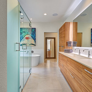
Creating this open airy master retreat involved removing a space consuming corner W.C. and an awkwardly deep linen closet. Using tall glass panels to separate the shower and toilet gives privacy while maintaining the newly acquired spaciousness. The glass panels transition from frosted around the toilet to clear around the roomy barrier free shower. By reducing the original closet opening, we gained necessary wall space for a modern freestanding tub. Tall cabinets provide plenty of storage space for linens and toiletries. A pair of pull-out cabinets – one on each side of the sink – conceal convenient grooming stations. An extra wide sink can easily accommodate two and still leaves plenty of counterspace on either side. The large mirror is mounted to a shallow framework concealing recessed lighting and softly illuminating the wall behind. The faucets and hand-held shower feature a knurled detail lending a bit of biker industrial to the modern surroundings. Access to the walk-in-closet is through a clean open doorway, while a wide modern style barn door slides open on the master bedroom side.
Photo credit: Fred Donham of Photographerlink
 DHD Architecture and Interior Design
Union Square Loft II
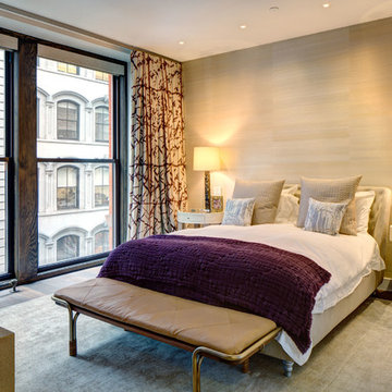
DHD Interiors worked with this couple to furnish their new recently renovated Flatiron loft. Navigating the dark wood paneling and flooring, DHD selected furniture and finishes that felt rich in color and texture while still cool and casual. Layers of grass cloth wallpapers were added to the main bedrooms to reduce the contrast of the dark wood and walls, adding brightness to the loft’s overall feel. Greys and mink-toned browns served as the foundation for a base palette, with deep burgundies and blues working as accents. This loft feels like a true downtown loft with its original brick and an industrial dining table, but stays balanced with softly upholstered furniture. Each piece, from the Dunbar chaise lounge to the organically shaped coffee table, displays a sculptural quality that contributes to a visually dynamic space.
2 Bedrooms / 2,000 Square Feet
Architecture and Photography:
Danny Forster Design Studio
 R-Squared Design
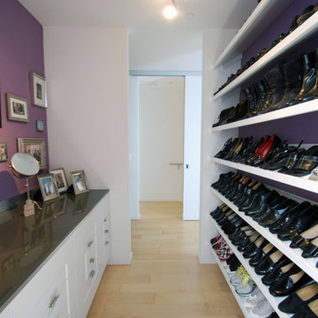
A narrow passageway to the master bathroom was originally intended to be an "open closet space"... we did not approve of this inellegant idea. Instead, we helped our client achieve a life-long dream: a shoe wall! Left to right, top to bottom and back-painted in a color both flattering to her complexion and her fabulous footwear. Custom cabinetry was installed directly opposite for various accessories and "unmentionables" and to create a casual dressing table.
Photo: Rick Rifle
 User
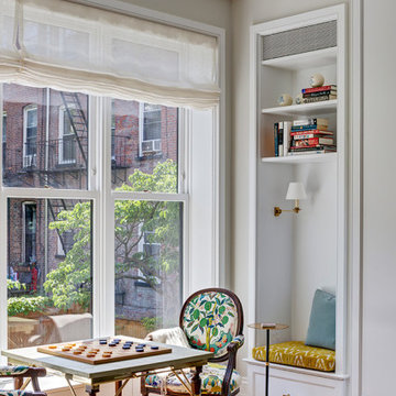
UserThis Greek Revival row house in Boerum Hill was previously owned by a local architect who renovated it several times, including the addition of a two-story steel and glass extension at the rear. The new owners came to us seeking to restore the house and its original formality, while adapting it to the modern needs of a family of five. The detailing of the 25 x 36 foot structure had been lost and required some sleuthing into the history of Greek Revival style in historic Brooklyn neighborhoods.
In addition to completely re-framing the interior, the house also required a new south-facing brick façade due to significant deterioration. The modern extension was replaced with a more traditionally detailed wood and copper- clad bay, still open to natural light and the garden view without sacrificing comfort. The kitchen was relocated from the first floor to the garden level with an adjacent formal dining room. Both rooms were enlarged from their previous iterations to accommodate weekly dinners with extended family. The kitchen includes a home office and breakfast nook that doubles as a homework station. The cellar level was further excavated to accommodate finished storage space and a playroom where activity can be monitored from the kitchen workspaces.
The parlor floor is now reserved for entertaining. New pocket doors can be closed to separate the formal front parlor from the more relaxed back portion, where the family plays games or watches TV together. At the end of the hall, a powder room with brass details, and a luxe bar with antique mirrored backsplash and stone tile flooring, leads to the deck and direct garden access. Because of the property width, the house is able to provide ample space for the interior program within a shorter footprint. This allows the garden to remain expansive, with a small lawn for play, an outdoor food preparation area with a cast-in-place concrete bench, and a place for entertaining towards the rear. The newly designed landscaping will continue to develop, further enhancing the yard’s feeling of escape, and filling-in the views from the kitchen and back parlor above. A less visible, but equally as conscious, addition is a rooftop PV solar array that provides nearly 100% of the daily electrical usage, with the exception of the AC system on hot summer days.
The well-appointed interiors connect the traditional backdrop of the home to a youthful take on classic design and functionality. The materials are elegant without being precious, accommodating a young, growing family. Unique colors and patterns provide a feeling of luxury while inviting inhabitants and guests to relax and enjoy this classic Brooklyn brownstone.
This project won runner-up in the architecture category for the 2017 NYC&G Innovation in Design Awards and was featured in The American House: 100 Contemporary Homes.
Photography by Francis Dzikowski / OTTO

Sponsored
Columbus, OH

Wannemacher Interiors
Customized Award-Winning Interior Design Solutions in Franklin Cnty OH
 CRAFT Artisan Wood Floors
Q: Tell us about your Valencia floor.
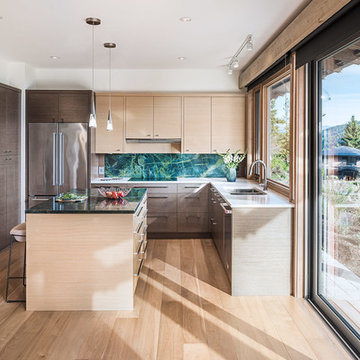
A: Out of all our interior selections, we began with our choice of flooring. Even though the Valencia Walnut flooring is softer than most wood species, we are careful with it, and Walnut is what we wanted. Our Walnut floor feels almost cushiony underfoot compared to Oak or Hickory. We are careful not to drag furniture over it and we do not wear our outside shoes in the house.
I’ve done a lot of work with Walnut so I knew how it would perform. The feeling you get from Walnut is worth putting up with the risk of damage. I love that it’s like a piece of beautiful furniture. We lie on it and do our stretches on it. It’s super comfortable. The Walnut flooring is the significant feature for creating the luxurious, warm and cozy atmosphere for the house we were wanting.
 Woodwright Custom Builders LLC
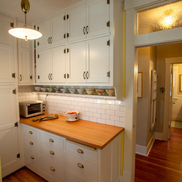
Looking west past the pantry into the hallway and master bath. The hard maple breadboard from CuttingBoards.com, the countertop made from clear fir salvaged from our old kitchen floor. The drawer pulls are 100-year-old painted bin pulls we found on Ebay. The new oak floor matches the living room and dining room, bright white 3"x6" Daltile subway tile backsplash with Mapei "iron" grout, the brass "bow" style pulls from Van Dyke Restorers and the original brass ornamental butt hinges from the kitchen's east wall of cabinets. The cabinets above the fir counter were salvaged from above the fridge on the north wall of the original kitchen and their depth reduced from 20" to 15". The shelf beneath them is an ad lib to break up the space between the countertop and the bottom of the cabinets. Barely visible in this photo is a 20 amp combination LED light/power strip that runs the full length of the counter underneath the shelf. The tall cabinets on the far end of the pantry are for storing brooms, etc. The hinges on those cabinets are replica Half Surface hinges from House of Antique Hardware similar to the original cabinet hinges. The adjustable overhead light is a hold-over from when the pantry was used as a breakfast nook, a common feature of bungalows. The "Autumn Leaves" pattern of Pilkington obscure glass for the transom was something we had seen in our hotel in Edinburgh, Scotland and was obtained from GlassGurus.com. The pocket door was salvaged from the pantry and reinstalled to provide privacy for the living areas of the home. The pulls are Eastlake sash pulls we found on Ebay. The 20" deep cabinet above the fridge is new, modeled after existing cabinets. The fridge is a Samsung 18 cubic foot counter depth model with French doors and 6 cubic foot bottom freezer that tripled the capacity of our former apartment-sized fridge. The key to the entire remodel was finding a place to put the fridge. We ended up stealing this spot by sacrificing a hall closet. With the popularity of of stainless steel appliances, it was a challenge to find a white, French door, counter-depth, bottom-freezer refrigerator. We had our eyes on the Big Chill Classic fridge, but budget overruns put it on hold. The brick exterior wall of the pantry and chimney has been revealed for texture and color interest.
 Master Remodelers Inc.
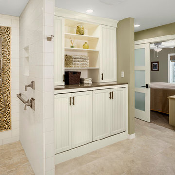
A new master bath addition doubled the original footage. Universal Design principles in the master suite feature an expanded entrance, a walk-in no threshold shower, handheld shower wand, levered handles, and French doors to the bath. The master bath addition also includes custom bead board cabinetry to house the washer and dryer, Robern medicine cabinets, LED recessed lights.
GENERAL CONTRACTOR: Regis McQuaide, Master Remodelers… architectural designer: Junko Higashibeppu... Interior designer: Rachel Pavilack, Pavilack Design… Photography: George Mendell
 Flavin Architects
Devereux Beach House
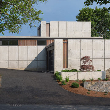
Our client presented Flavin Architects with a unique challenge. On a site that previously hosted two houses, our client asked us to design a modestly sized house and separate art studio. Both structures reduce the height and bulk of the original buildings. The modern concrete house we designed is situated on the brow of a steep cliff overlooking Marblehead harbor. The concrete visually anchors the house to stone outcroppings on the property, and the low profile ensures the structure doesn’t conflict with the surround of traditional, gabled homes.
Three primary concrete walls run north to south in parallel, forming the structural walls of the home. The entry sequence is carefully considered. The front door is hidden from view from the street. An entry path leads to an intimate courtyard, from which the front door is first visible. Upon entering, the visitor gets the first glimpse of the sea, framed by a portal of cast-in-place concrete. The kitchen, living, and dining space have a soaring 10-foot ceiling creating an especially spacious sense of interiority. A cantilevered deck runs the length of the living room, with a solid railing providing privacy from beach below. Where the house grows from a single to a two-story structure, the concrete walls rise magisterially to the full height of the building. The exterior concrete walls are accented with zinc gutters and downspouts, and wooden Ipe slats which softly filter light through the windows.
 Flying Dormer
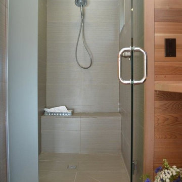
The European homeowners wanted to create a space for a new sauna and hot tub, as well as a place to relax afterwards. It needed to be light and bright, and have a warm but modern feel. We built this addition under the existing deck, and spruced up the deck at the same time to enjoy the nice territorial views.
The walls of the addition are cedar, with built-ins and deep cabinets for storage. There is a walk-in, tiled shower with built-in bench just off the sauna, and a seating area with tv for relaxing. The floor is stained concrete.
The 14-foot wall of windows (including a door to the hot tub), and the secondary window wall that includes french doors allows the maximum amount of light into the space and really creates that spa feeling.
The plans evolved during construction to include a larger sauna (thereby reducing the shower size somewhat) and a much larger hot tub than originally planned. The solution was to move the hot tub outside, which had the benefit of opening up more space inside for a yoga/ workout area. The hot tub is covered by a glass roof so it can be enjoyed year-round under the stars.
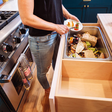
 The Jack + Mare | Portland Design & Build
Compost Drawer.
The Jack + Mare designed and built this custom kitchen and dining remodel for a family in Portland's Sellwood Westmoreland Neighborhood.
The wall between the kitchen and dining room was removed to create an inviting and flowing space with custom details in all directions. The custom maple dining table was locally milled and crafted from a tree that had previously fallen in Portland's Laurelhurst neighborhood; and the built-in L-shaped maple banquette provides unique comfortable seating with drawer storage beneath. The integrated kitchen and dining room has become the social hub of the house – the table can comfortably sit up to 10 people!
Being that the kitchen is visible from the dining room, the refrigerator and dishwasher are hidden behind cabinet door fronts that seamlessly tie-in with the surrounding cabinetry creating a warm and inviting space.
The end result is a highly functional kitchen for the chef and a comfortable and practical space for family and friends.
Details: custom cabinets (designed by The J+M) with shaker door fronts, a baker's pantry, built-in banquette with integrated storage, custom local silver maple table, solid oak flooring to match original 1925 flooring, white ceramic tile backsplash, new lighting plan featuring a Cedar + Moss pendant, all L.E.D. can lights, Carrara marble countertops, new larger windows to bring in more natural light and new trim.
The combined kitchen and dining room is 281 Square feet.
Photos by: Jason Quigley Photography

Sponsored
Columbus, OH
Wannemacher Interiors
Customized Award-Winning Interior Design Solutions in Franklin Cnty OH
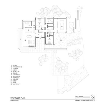 Flavin Architects
Devereux Beach House
Our client presented Flavin Architects with a unique challenge. On a site that previously hosted two houses, our client asked us to design a modestly sized house and separate art studio. Both structures reduce the height and bulk of the original buildings. The modern concrete house we designed is situated on the brow of a steep cliff overlooking Marblehead harbor. The concrete visually anchors the house to stone outcroppings on the property, and the low profile ensures the structure doesn’t conflict with the surround of traditional, gabled homes.
Three primary concrete walls run north to south in parallel, forming the structural walls of the home. The entry sequence is carefully considered. The front door is hidden from view from the street. An entry path leads to an intimate courtyard, from which the front door is first visible. Upon entering, the visitor gets the first glimpse of the sea, framed by a portal of cast-in-place concrete. The kitchen, living, and dining space have a soaring 10-foot ceiling creating an especially spacious sense of interiority. A cantilevered deck runs the length of the living room, with a solid railing providing privacy from beach below. Where the house grows from a single to a two-story structure, the concrete walls rise magisterially to the full height of the building. The exterior concrete walls are accented with zinc gutters and downspouts, and wooden Ipe slats which softly filter light through the windows.

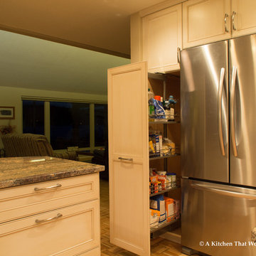
 McCabe By Design LLC
Pull-out pantry is accessible from both sides reducing the need for entry to the kitchen when only a snack is desired.
Large transitional u-shaped medium tone wood floor and brown floor eat-in kitchen photo in Seattle with an undermount sink, recessed-panel cabinets, white cabinets, granite countertops, stone slab backsplash, stainless steel appliances, an island, brown backsplash and brown countertops
Large transitional u-shaped medium tone wood floor and brown floor eat-in kitchen photo in Seattle with an undermount sink, recessed-panel cabinets, white cabinets, granite countertops, stone slab backsplash, stainless steel appliances, an island, brown backsplash and brown countertops
 Woodwright Custom Builders LLC
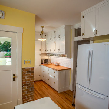
Looking west past the pantry into the hallway and master bath. The hard maple breadboard from CuttingBoards.com, the countertop made from clear fir salvaged from our old kitchen floor. The drawer pulls are 100-year-old painted bin pulls we found on Ebay. The new oak floor matches the living room and dining room, bright white 3"x6" Daltile subway tile backsplash with Mapei "iron" grout, the brass "bow" style pulls from Van Dyke Restorers and the original brass ornamental butt hinges from the kitchen's east wall of cabinets. The cabinets above the fir counter were salvaged from above the fridge on the north wall of the original kitchen and their depth reduced from 20" to 15". The shelf beneath them is an ad lib to break up the space between the countertop and the bottom of the cabinets. Barely visible in this photo is a 20 amp combination LED light/power strip that runs the full length of the counter underneath the shelf. The tall cabinets on the far end of the pantry are for storing brooms, etc. The hinges on those cabinets are replica Half Surface hinges from House of Antique Hardware similar to the original cabinet hinges. The adjustable overhead light is a hold-over from when the pantry was used as a breakfast nook, a common feature of bungalows. The "Autumn Leaves" pattern of Pilkington obscure glass for the transom was something we had seen in our hotel in Edinburgh, Scotland and was obtained from GlassGurus.com. The pocket door was salvaged from the pantry and reinstalled to provide privacy for the living areas of the home. The pulls are Eastlake sash pulls we found on Ebay. The 20" deep cabinet above the fridge is new, modeled after existing cabinets. The fridge is a Samsung 18 cubic foot counter depth model with French doors and 6 cubic foot bottom freezer that tripled the capacity of our former apartment-sized fridge. The key to the entire remodel was finding a place to put the fridge. We ended up stealing this spot by sacrificing a hall closet. With the popularity of of stainless steel appliances, it was a challenge to find a white, French door, counter-depth, bottom-freezer refrigerator. We had our eyes on the Big Chill Classic fridge, but budget overruns put it on hold. The brick exterior wall of the pantry and chimney has been revealed for texture and color interest.

Sponsored
Columbus, OH
Wannemacher Interiors
Customized Award-Winning Interior Design Solutions in Franklin Cnty OH

 Flavin Architects
Devereux Beach House
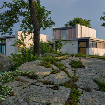
Our client presented Flavin Architects with a unique challenge. On a site that previously hosted two houses, our client asked us to design a modestly sized house and separate art studio. Both structures reduce the height and bulk of the original buildings. The modern concrete house we designed is situated on the brow of a steep cliff overlooking Marblehead harbor. The concrete visually anchors the house to stone outcroppings on the property, and the low profile ensures the structure doesn’t conflict with the surround of traditional, gabled homes.
Three primary concrete walls run north to south in parallel, forming the structural walls of the home. The entry sequence is carefully considered. The front door is hidden from view from the street. An entry path leads to an intimate courtyard, from which the front door is first visible. Upon entering, the visitor gets the first glimpse of the sea, framed by a portal of cast-in-place concrete. The kitchen, living, and dining space have a soaring 10-foot ceiling creating an especially spacious sense of interiority. A cantilevered deck runs the length of the living room, with a solid railing providing privacy from beach below. Where the house grows from a single to a two-story structure, the concrete walls rise magisterially to the full height of the building. The exterior concrete walls are accented with zinc gutters and downspouts, and wooden Ipe slats which softly filter light through the windows.
 Nar Design Group
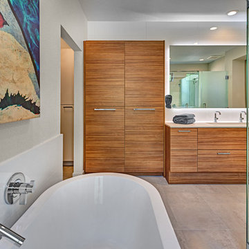
Creating this open airy master retreat involved removing a space consuming corner W.C. and an awkwardly deep linen closet. Using tall glass panels to separate the shower and toilet gives privacy while maintaining the newly acquired spaciousness. The glass panels transition from frosted around the toilet to clear around the roomy barrier free shower. By reducing the original closet opening, we gained necessary wall space for a modern freestanding tub. Tall cabinets provide plenty of storage space for linens and toiletries. A pair of pull-out cabinets – one on each side of the sink – conceal convenient grooming stations. An extra wide sink can easily accommodate two and still leaves plenty of counterspace on either side. The large mirror is mounted to a shallow framework concealing recessed lighting and softly illuminating the wall behind. The faucets and hand-held shower feature a knurled detail lending a bit of biker industrial to the modern surroundings. Access to the walk-in-closet is through a clean open doorway, while a wide modern style barn door slides open on the master bedroom side.
Photo credit: Fred Donham of Photographerlink
33