
Search results for "Reduce originally" in Home Design Ideas
 Reico Kitchen & Bath
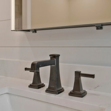
Bryon Berrier of Reico Kitchen and Bath in Timonium, MD collaborated with R Solomon Construction to design a transitional style inspired primary bathroom featuring Masterpiece cabinetry.
The cabinets feature the Bolton door style in Maple in a Translucent Driftwood finish, complemented by Silestone Etheral Haze quartz vanity tops.
Fixture selections for the bathroom are Kohler provided by GROF.
After remodeling the client's kitchen, Bryon was contacted to update the primary bathroom. "The original design had two separate rooms: one for the vanity and drop-in tub, and another for the shower and toilet, separated by a wall. We removed a wall to create a more open space, making the shower area feel less enclosed and used a free-standing tub to reduce crowding," Bryon explained.
"My favorite part is how well the materials coordinate and the use of Matte Black Hardware. I enjoyed working with the clients because they had a clear vision for the remodel and were easy to collaborate with.”
Photos courtesy of BTW Images.
 Metta Home
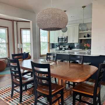
Designed to feel relaxed, welcoming, and deeply connected to the surrounding living spaces, this dining area bridges the kitchen, reading nook, and main living room to support easy gathering and everyday coastal living.
A Jaipur Living indoor/outdoor rug anchors the space with layered color and durability an intentional choice for a home that continues to function as a vacation rental while evolving toward more full-time living for the homeowners. Above, a sculptural beaded fixture from Hudson Valley Lighting introduces softness and texture against the home’s soaring architecture.
In keeping with the spirit of thoughtful renovation, the original dining table was retained and layered into the updated design, while the kitchen appliances were repurposed from the previous kitchen renovation to reduce unnecessary waste and maximize the project budget. The result feels collected rather than overly new balancing functionality, sustainability, and a relaxed coastal warmth.
 The Galante Architecture Studio, Inc.
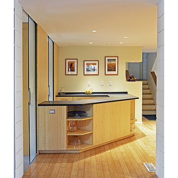
Originally built in 1972, these eight interlocked residential units and the accompanying House Master’s Residence won an AIA award for their unique spatial complexity, balancing standard units of construction with volumetric interplay, all while bringing natural light into living spaces. However, nearly 40 years later
These 1970’s era, interlocked faculty housing units won an AIA award when first completed. They were unique in spatial complexity, By early 2,000’s they were showing signs of age, and had become outdated on many levels. Working with project management for the Faculty of Arts & Sciences, we prepared one prototype design to bring the buildings into the 21st century. New insulated skylights, standing seam metal siding, cedar decks and trellises, exchanging black roofs for well insulated white roofs, were all part of a larger planning program to renovate all nine units. The prototype was implemented in 2012, to great approval and result. In 2013 a few more units were done. In 2014 the “House Masters” unit was done, with the remaining four units planned for future budgets.
Sustainable features include re-use of most materials on site, (former siding was able to become sheathing below metal panels), implementing the Stretch Energy Code for insulation, and putting new white roof membranes in place. Using FSC certified wood for decks and trellises, and using Rheinzink siding, a “200 year material” according to the manufacturer.
After nearly 40 years, Ronald Gourley’s AIA award winning Faculty Housing (1972) was beginning to show its age – plywood siding was delaminating, wooden decks splintering, and custom windows failing. Therefore, the opportunity to reinvent a piece of Mid-Century Modernism presented itself when two of the building’s eight alternating rooftop designs were to be rebuilt as prototypes for the remainder of the structure.
The strength of the original design was its rectilinear and symmetrical arrangement of internal and external spaces, but the difference between the two had become blurred over the decades. New zinc siding, mahogany decking, and stainless steel railings accentuate the defining elements and more clearly articulate the living spaces, breathing new life into the building and reinvigorating the surrounding campus.
Furthermore, the renovation also provided a chance to bring the structure up to modern energy standards and help meet Harvard’s lofty environmental goals. Insulation within the ceilings was more than tripled, white TPO roofing reduces the heat island effect, construction waste was minimized by recasting the siding as sheathing, and materials were selected not only for aesthetics, but for their longevity and ability to be recycled as well.
Harvard’s energy standards brought an uncharacteristic level of environmental care to this building. Roof structures are triple insulated, allowing separating interior from exterior in the most thermally efficient manner. North facing triple insulated skylights and white TPO roofing reduces the heat gain, but allows natural light to pour in. Materials were selected not only for aesthetics, but for their longevity. Zinc, for example, is made of 100% recycled material, and has duration of 200 years. Uncharacteristic levels of environmental care were common on this project.
Find the right local pro for your project

 Pool & Hot Tub Alliance
ur clients contacted us to transform their dated pool into an aesthetically pleasing water feature they could enjoy with friends and take pleasure in seeing when they arrived home. The existing pool and spa are prominently featured in the front yard and are a focal point for everyone to appreciate as they arrive at the estate. One of the goals for the remodel was to create a synergetic relationship between the native oak trees, rock outcroppings and man-made swimming pool. The original design did not have a fluid continuity between the materials used, creating awkward transitions. The pools vanishing edge wall leaked through cracks in the gunite down into an undersized catch basin and a traditional pool sweep detracted from the sense of a natural body of water flowing down stream. After removing the original plaster finish from the gunite shell, we found several areas of soft gunite that needed to be removed. An additional 6 of water depth was added to the existing catch basin to gain the correct holding capacity. One section of the pool wall was extended up to create a new seat wall at the edge of the patio. The floor of the existing pool and catch basin were cut out and a new Paramount in-floor cleaning system was installed. The entire pool was re-plumbed, the skimmer was replaced and a new equipment pad was constructed. Throughout the construction process we did our best to minimize the impact our construction work had on the mature landscaping and oak trees that surround the pool. To evoke life along a waterway, we converted the attached spa into a patio area wrapped by a waterfall flowing into the pool. The new waterfall provides a source of flowing water into the pool before streaming over the weir wall. A reduced water flow over the vanishing edge wall creates an enjoyable sound of water movement. Sierra Boulders from the surrounding foothills create the waterfalls and are notched into the pools water line to elevate the sense of a natural body of water.
 Reico Kitchen & Bath
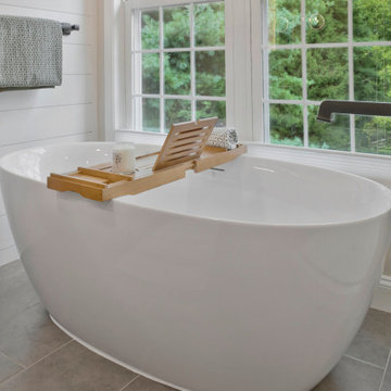
Bryon Berrier of Reico Kitchen and Bath in Timonium, MD collaborated with R Solomon Construction to design a transitional style inspired primary bathroom featuring Masterpiece cabinetry.
The cabinets feature the Bolton door style in Maple in a Translucent Driftwood finish, complemented by Silestone Etheral Haze quartz vanity tops.
Fixture selections for the bathroom are Kohler provided by GROF.
After remodeling the client's kitchen, Bryon was contacted to update the primary bathroom. "The original design had two separate rooms: one for the vanity and drop-in tub, and another for the shower and toilet, separated by a wall. We removed a wall to create a more open space, making the shower area feel less enclosed and used a free-standing tub to reduce crowding," Bryon explained.
"My favorite part is how well the materials coordinate and the use of Matte Black Hardware. I enjoyed working with the clients because they had a clear vision for the remodel and were easy to collaborate with.”
Photos courtesy of BTW Images.
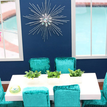
 Log Cabins Over The Ages
Various Types Of Rugs
Rugs are necessary for every household as it makes the house look good as well as provides relief for bare feet. Rugs are better than carpets because they are easier to clean and they are also available in many colours. There are many types of rugs such as the classical rugs which are usually from Persia and other Oriental countries and the machine made rugs of today which are made everywhere. Rugs make a room complete.
A popular rug of the 70’s was the shaggy rug and this rug is making a comeback now. It is an affordable rug and it makes your room look a lot comfortable. It adds a lot of warmth to the room. The shaggy rugs come in a variety of colours and you can match them with your furniture or wall. These rugs are great for your bedroom too as it adds the necessary warmth in the cool winters.
Another type of rug is the area rug which is usually rectangle in shape but comes in other shapes as well. These rugs cover the area completely and protect your floor well. These rugs also insulate the room from heat too.
Persian rugs are very famous and they are handmade. The designs have been in existence for over centuries and Iran is the place where these rugs are made majorly. Persian rugs are woven very tight compared to others. If you like history or if you like the classic look then you should opt for a Persian rug.
Another classic rug that has its origins in Greece is the Flokati rug. These rugs are traditional rugs that are made from very fine quality wool. A Flokati rug adds luxury to your room. These types of rugs are used extensively for photography and many photographers use it in photo shoots.
If you have slippery stairways or slippery floors, you can add rugs known as Runner rugs. These rugs cover the stairs or are great under dining tables. Runner rugs are known to reduce accidents as chances of slipping reduces considerably.
There are many rug websites like Rug Traders, where you can get many types of rugs at very low prices. You can just search on any search engine for quality rugs or cheap rugs and you will get a list of rug traders, you can visit their websites and compare the prices, quality, delivery time etc. Once you are satisfied that you are getting a good price, you can then buy the rug of your choice.
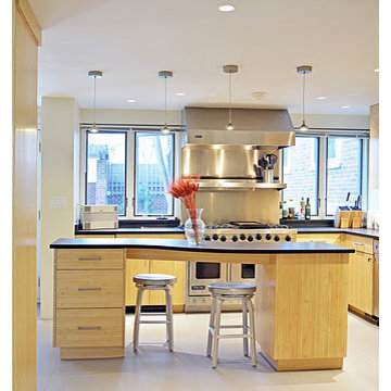 The Galante Architecture Studio, Inc.
Originally built in 1972, these eight interlocked residential units and the accompanying House Master’s Residence won an AIA award for their unique spatial complexity, balancing standard units of construction with volumetric interplay, all while bringing natural light into living spaces. However, nearly 40 years later
These 1970’s era, interlocked faculty housing units won an AIA award when first completed. They were unique in spatial complexity, By early 2,000’s they were showing signs of age, and had become outdated on many levels. Working with project management for the Faculty of Arts & Sciences, we prepared one prototype design to bring the buildings into the 21st century. New insulated skylights, standing seam metal siding, cedar decks and trellises, exchanging black roofs for well insulated white roofs, were all part of a larger planning program to renovate all nine units. The prototype was implemented in 2012, to great approval and result. In 2013 a few more units were done. In 2014 the “House Masters” unit was done, with the remaining four units planned for future budgets.
Sustainable features include re-use of most materials on site, (former siding was able to become sheathing below metal panels), implementing the Stretch Energy Code for insulation, and putting new white roof membranes in place. Using FSC certified wood for decks and trellises, and using Rheinzink siding, a “200 year material” according to the manufacturer.
After nearly 40 years, Ronald Gourley’s AIA award winning Faculty Housing (1972) was beginning to show its age – plywood siding was delaminating, wooden decks splintering, and custom windows failing. Therefore, the opportunity to reinvent a piece of Mid-Century Modernism presented itself when two of the building’s eight alternating rooftop designs were to be rebuilt as prototypes for the remainder of the structure.
The strength of the original design was its rectilinear and symmetrical arrangement of internal and external spaces, but the difference between the two had become blurred over the decades. New zinc siding, mahogany decking, and stainless steel railings accentuate the defining elements and more clearly articulate the living spaces, breathing new life into the building and reinvigorating the surrounding campus.
Furthermore, the renovation also provided a chance to bring the structure up to modern energy standards and help meet Harvard’s lofty environmental goals. Insulation within the ceilings was more than tripled, white TPO roofing reduces the heat island effect, construction waste was minimized by recasting the siding as sheathing, and materials were selected not only for aesthetics, but for their longevity and ability to be recycled as well.
Harvard’s energy standards brought an uncharacteristic level of environmental care to this building. Roof structures are triple insulated, allowing separating interior from exterior in the most thermally efficient manner. North facing triple insulated skylights and white TPO roofing reduces the heat gain, but allows natural light to pour in. Materials were selected not only for aesthetics, but for their longevity. Zinc, for example, is made of 100% recycled material, and has duration of 200 years. Uncharacteristic levels of environmental care were common on this project.

Sponsored
Columbus, OH

Wannemacher Interiors
Customized Award-Winning Interior Design Solutions in Franklin Cnty OH
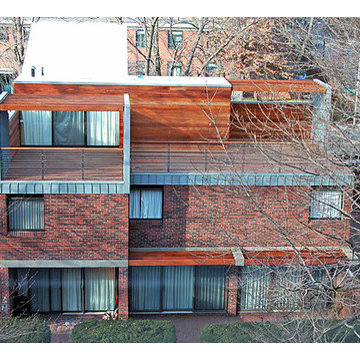 The Galante Architecture Studio, Inc.
Originally built in 1972, these eight interlocked residential units and the accompanying House Master’s Residence won an AIA award for their unique spatial complexity, balancing standard units of construction with volumetric interplay, all while bringing natural light into living spaces. However, nearly 40 years later
These 1970’s era, interlocked faculty housing units won an AIA award when first completed. They were unique in spatial complexity, By early 2,000’s they were showing signs of age, and had become outdated on many levels. Working with project management for the Faculty of Arts & Sciences, we prepared one prototype design to bring the buildings into the 21st century. New insulated skylights, standing seam metal siding, cedar decks and trellises, exchanging black roofs for well insulated white roofs, were all part of a larger planning program to renovate all nine units. The prototype was implemented in 2012, to great approval and result. In 2013 a few more units were done. In 2014 the “House Masters” unit was done, with the remaining four units planned for future budgets.
Sustainable features include re-use of most materials on site, (former siding was able to become sheathing below metal panels), implementing the Stretch Energy Code for insulation, and putting new white roof membranes in place. Using FSC certified wood for decks and trellises, and using Rheinzink siding, a “200 year material” according to the manufacturer.
After nearly 40 years, Ronald Gourley’s AIA award winning Faculty Housing (1972) was beginning to show its age – plywood siding was delaminating, wooden decks splintering, and custom windows failing. Therefore, the opportunity to reinvent a piece of Mid-Century Modernism presented itself when two of the building’s eight alternating rooftop designs were to be rebuilt as prototypes for the remainder of the structure.
The strength of the original design was its rectilinear and symmetrical arrangement of internal and external spaces, but the difference between the two had become blurred over the decades. New zinc siding, mahogany decking, and stainless steel railings accentuate the defining elements and more clearly articulate the living spaces, breathing new life into the building and reinvigorating the surrounding campus.
Furthermore, the renovation also provided a chance to bring the structure up to modern energy standards and help meet Harvard’s lofty environmental goals. Insulation within the ceilings was more than tripled, white TPO roofing reduces the heat island effect, construction waste was minimized by recasting the siding as sheathing, and materials were selected not only for aesthetics, but for their longevity and ability to be recycled as well.
Harvard’s energy standards brought an uncharacteristic level of environmental care to this building. Roof structures are triple insulated, allowing separating interior from exterior in the most thermally efficient manner. North facing triple insulated skylights and white TPO roofing reduces the heat gain, but allows natural light to pour in. Materials were selected not only for aesthetics, but for their longevity. Zinc, for example, is made of 100% recycled material, and has duration of 200 years. Uncharacteristic levels of environmental care were common on this project.
 Sprig
SprigA bento box is more than just a lunch container—it’s a reflection of Japanese culture, mindful eating, and balanced nutrition. Traditionally used in Japan, bento boxes have gained global popularity due to their practicality, aesthetic appeal, and ability to promote healthy eating habits.
What Is a Bento Box?
A bento box is a single-portion packed meal, neatly arranged in a compartmentalized container. The word “bento” originates from the Chinese term meaning convenient, which perfectly describes its purpose. A typical bento includes rice or noodles, protein like fish, meat, or tofu, and a variety of vegetables or side dishes, all placed in separate sections to maintain flavor and presentation.
Cultural Significance of Bento Boxes
In Japan, bento boxes represent care, effort, and balance. Parents often prepare bento meals for their children as a symbol of love, while office workers rely on them for nutritious meals during busy days. Special versions like ekiben (railway station bento) and character bento (decorated meals shaped like animals or cartoons) highlight the creativity and cultural importance of bento-making.
Health Benefits of Using a Bento Box
One of the biggest advantages of a bento box is its role in portion control and balanced nutrition. Since the box has fixed compartments, it encourages variety without overeating. A well-prepared bento typically follows the principle of:
40–50% carbohydrates
30–40% vegetables
20–30% protein
This balance helps maintain energy levels, supports digestion, and reduces the reliance on unhealthy fast food.
Modern Bento Boxes and Their Uses
Today’s bento boxes are designed to suit modern lifestyles. They are available in microwave-safe, leak-proof, and eco-friendly materials such as stainless steel, BPA-free plastic, and bamboo fiber. Many come with insulated layers, sauce containers, and cutlery, making them ideal for:
Office lunches
School meals
Travel and picnics
Fitness and meal-prep routines
With the rise of sustainable living, reusable bento boxes also help reduce single-use plastic waste.
Bento Boxes in Everyday Life
Bento boxes are no longer limited to Japanese cuisine. People worldwide use them to pack Indian, Western, vegan, or keto meals. From chapati and sabzi to pasta and salads, bento boxes adapt easily to different food preferences while keeping meals fresh and organized.
Why Bento Boxes Are So Popular Today
The popularity of bento boxes is driven by busy schedules, health awareness, and social media trends. Platforms like Instagram and Pinterest showcase beautifully arranged bento meals, inspiring people to eat better and enjoy the process of food preparation. They combine functionality, aesthetics, and mindfulness, making meals more enjoyable.
Conclusion
A bento box is a smart and stylish way to enjoy homemade meals while staying healthy and organized. Whether you’re looking to improve your diet, save money, or reduce environmental impact, a bento box offers a simple yet effective solution. With its deep cultural roots and modern versatility, the bento box continues to be a timeless companion for everyday meals.
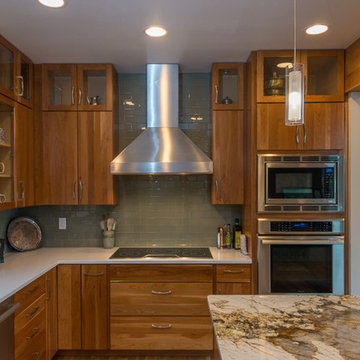
 Rodwin Architecture & Skycastle Construction
Rodwin Architecture and Skycastle Homes
Location: Boulder, CO, United States
We recently completed the design and construction of this beautiful 3800 s.f. contemporary Colorado mountain home, above the foothills of Boulder. We designed the house to maximize the sweeping views of Indian Peaks mountain range, while simultaneously optimizing passive solar design. The open floor plan brings natural light and passive cooling into every part of the house; the vaulted ceilings create an airy, sunny feeling. Every room opens to generous patios and decks to facilitate easy indoor/outdoor living. White Oak floors, granite counters and local flagstone finishes lend a warm modern texture to the home. We carefully preserved one hand-built quartz wall that was part of the house that formerly occupied the site, and restored the original adjacent homestead, successfully receiving Historic Landmark designation. This very energy efficient home (HERS 40 – uses 60% less energy than allowed by code), uses solar–photovoltaics, foam insulation, Energy Star windows & appliances, LED lighting, and a high-efficiency mechanical system. It uses EPA Watersense plumbing fixtures and Xeric landscaping to dramatically reduce water
 Flavin Architects
Devereux Beach House
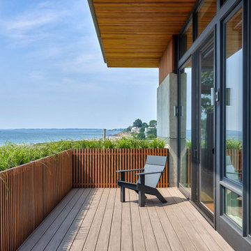
Our client presented Flavin Architects with a unique challenge. On a site that previously hosted two houses, our client asked us to design a modestly sized house and separate art studio. Both structures reduce the height and bulk of the original buildings. The modern concrete house we designed is situated on the brow of a steep cliff overlooking Marblehead harbor. The concrete visually anchors the house to stone outcroppings on the property, and the low profile ensures the structure doesn’t conflict with the surround of traditional, gabled homes.
Three primary concrete walls run north to south in parallel, forming the structural walls of the home. The entry sequence is carefully considered. The front door is hidden from view from the street. An entry path leads to an intimate courtyard, from which the front door is first visible. Upon entering, the visitor gets the first glimpse of the sea, framed by a portal of cast-in-place concrete. The kitchen, living, and dining space have a soaring 10-foot ceiling creating an especially spacious sense of interiority. A cantilevered deck runs the length of the living room, with a solid railing providing privacy from beach below. Where the house grows from a single to a two-story structure, the concrete walls rise magisterially to the full height of the building. The exterior concrete walls are accented with zinc gutters and downspouts, and wooden Ipe slats which softly filter light through the windows.
 ZeroEnergy Design
This renovated brick rowhome in Boston’s South End offers a modern aesthetic within a historic structure, creative use of space, exceptional thermal comfort, a reduced carbon footprint, and a passive stream of income.
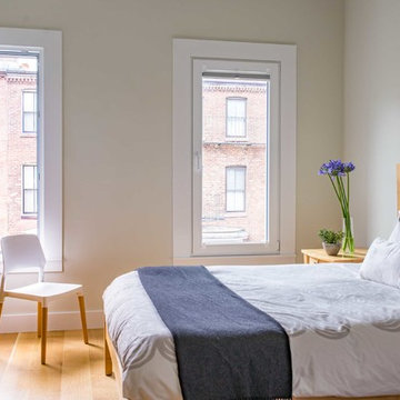
DESIGN PRIORITIES. The goals for the project were clear - design the primary unit to accommodate the family’s modern lifestyle, rework the layout to create a desirable rental unit, improve thermal comfort and introduce a modern aesthetic. We designed the street-level entry as a shared entrance for both the primary and rental unit. The family uses it as their everyday entrance - we planned for bike storage and an open mudroom with bench and shoe storage to facilitate the change from shoes to slippers or bare feet as they enter their home. On the main level, we expanded the kitchen into the dining room to create an eat-in space with generous counter space and storage, as well as a comfortable connection to the living space. The second floor serves as master suite for the couple - a bedroom with a walk-in-closet and ensuite bathroom, and an adjacent study, with refinished original pumpkin pine floors. The upper floor, aside from a guest bedroom, is the child's domain with interconnected spaces for sleeping, work and play. In the play space, which can be separated from the work space with new translucent sliding doors, we incorporated recreational features inspired by adventurous and competitive television shows, at their son’s request.
MODERN MEETS TRADITIONAL. We left the historic front facade of the building largely unchanged - the security bars were removed from the windows and the single pane windows were replaced with higher performing historic replicas. We designed the interior and rear facade with a vision of warm modernism, weaving in the notable period features. Each element was either restored or reinterpreted to blend with the modern aesthetic. The detailed ceiling in the living space, for example, has a new matte monochromatic finish, and the wood stairs are covered in a dark grey floor paint, whereas the mahogany doors were simply refinished. New wide plank wood flooring with a neutral finish, floor-to-ceiling casework, and bold splashes of color in wall paint and tile, and oversized high-performance windows (on the rear facade) round out the modern aesthetic.
RENTAL INCOME. The existing rowhome was zoned for a 2-family dwelling but included an undesirable, single-floor studio apartment at the garden level with low ceiling heights and questionable emergency egress. In order to increase the quality and quantity of space in the rental unit, we reimagined it as a two-floor, 1 or 2 bedroom, 2 bathroom apartment with a modern aesthetic, increased ceiling height on the lowest level and provided an in-unit washer/dryer. The apartment was listed with Jackie O'Connor Real Estate and rented immediately, providing the owners with a source of passive income.
ENCLOSURE WITH BENEFITS. The homeowners sought a minimal carbon footprint, enabled by their urban location and lifestyle decisions, paired with the benefits of a high-performance home. The extent of the renovation allowed us to implement a deep energy retrofit (DER) to address air tightness, insulation, and high-performance windows. The historic front facade is insulated from the interior, while the rear facade is insulated on the exterior. Together with these building enclosure improvements, we designed an HVAC system comprised of continuous fresh air ventilation, and an efficient, all-electric heating and cooling system to decouple the house from natural gas. This strategy provides optimal thermal comfort and indoor air quality, improved acoustic isolation from street noise and neighbors, as well as a further reduced carbon footprint. We also took measures to prepare the roof for future solar panels, for when the South End neighborhood’s aging electrical infrastructure is upgraded to allow them.
URBAN LIVING. The desirable neighborhood location allows the both the homeowners and tenant to walk, bike, and use public transportation to access the city, while each charging their respective plug-in electric cars behind the building to travel greater distances.
OVERALL. The understated rowhouse is now ready for another century of urban living, offering the owners comfort and convenience as they live life as an expression of their values.
Eric Roth Photo
 Nick Lee Architecture
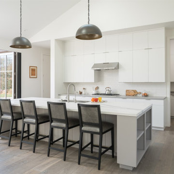
Kitchen - large farmhouse medium tone wood floor, brown floor and vaulted ceiling kitchen idea in San Francisco with a drop-in sink, flat-panel cabinets, white cabinets, marble countertops, white backsplash, subway tile backsplash, stainless steel appliances, an island and white countertops

Sponsored
Columbus, OH
Wannemacher Interiors
Customized Award-Winning Interior Design Solutions in Franklin Cnty OH
 Flavin Architects
Devereux Beach House
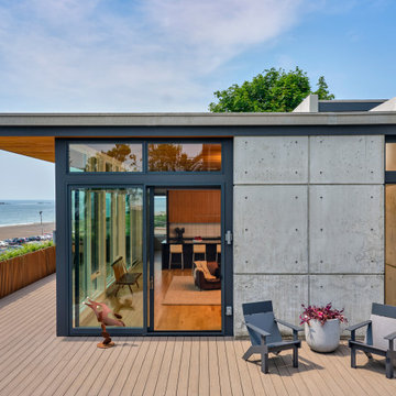
Our client presented Flavin Architects with a unique challenge. On a site that previously hosted two houses, our client asked us to design a modestly sized house and separate art studio. Both structures reduce the height and bulk of the original buildings. The modern concrete house we designed is situated on the brow of a steep cliff overlooking Marblehead harbor. The concrete visually anchors the house to stone outcroppings on the property, and the low profile ensures the structure doesn’t conflict with the surround of traditional, gabled homes.
Three primary concrete walls run north to south in parallel, forming the structural walls of the home. The entry sequence is carefully considered. The front door is hidden from view from the street. An entry path leads to an intimate courtyard, from which the front door is first visible. Upon entering, the visitor gets the first glimpse of the sea, framed by a portal of cast-in-place concrete. The kitchen, living, and dining space have a soaring 10-foot ceiling creating an especially spacious sense of interiority. A cantilevered deck runs the length of the living room, with a solid railing providing privacy from beach below. Where the house grows from a single to a two-story structure, the concrete walls rise magisterially to the full height of the building. The exterior concrete walls are accented with zinc gutters and downspouts, and wooden Ipe slats which softly filter light through the windows.
 Thyme & Place Design LLC
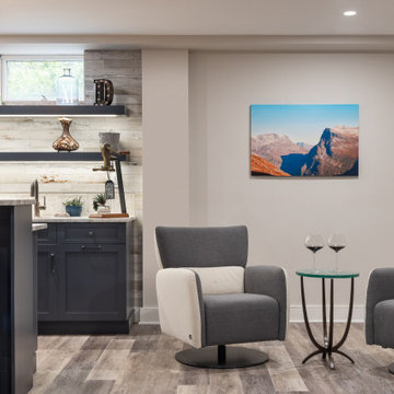
When my client had to move from her company office to work at home, she set up in the dining room. Despite her best efforts, this was not the long-term solution she was looking for. My client realized she needed a dedicated space not on the main floor of the home. On one hand, having your office space right next to the kitchen is handy. On the other hand, it made separating work and home life was not that easy.
The house was a ranch. In essence, the basement would run entire length of the home. As we came down the steps, we entered a time capsule. The house was built in the 1950’s. The walls were covered with original knotty pine paneling. There was a wood burning fireplace and considering this was a basement, high ceilings. In addition, there was everything her family could not store at their own homes. As we wound though the space, I though “wow this has potential”, Eventually, after walking through the laundry room we came to a small nicely lit room. This would be the office.
My client looked at me and asked what I thought. Undoubtedly, I said, this can be a great workspace, but do you really want to walk through this basement and laundry to get here? Without reservation, my client said where do we start?
Once the design was in place, we started the renovation. The knotty pine paneling had to go. Specifically, to add some insulation and control the dampness and humidity. The laundry room wall was relocated to create a hallway to the office.
At the far end of the room, we designated a workout zone. Weights, mats, exercise bike and television are at the ready for morning or afternoon workouts. The space can be concealed by a folding screen for party time. Doors to an old closet under the stairs were relocated to the workout area for hidden storage. Now we had nice wall for a beautiful console and mirror for storage and serving during parties.
In order to add architectural details, we covered the old ugly support columns with simple recessed millwork panels. This detail created a visual division between the bar area and the seating area in front of the fireplace. The old red brick on the fireplace surround was replaced with stack stone. A mantle was made from reclaimed wood. Additional reclaimed wood floating shelves left and right of the fireplace provides decorative display while maintaining a rustic element balancing the copper end table and leather swivel rocker.
We found an amazing rug which tied all of the colors together further defining the gathering space. Russet and burnt orange became the accent color unifying each space. With a bit of whimsy, a rather unusual light fixture which looks like roots from a tree growing through the ceiling is a conversation piece.
The office space is quite and removed from the main part of the basement. There is a desk large enough for multiple screens, a small bookcase holding office supplies and a comfortable chair for conference calls. Because working from home requires many online meetings, we added a shiplap wall painted in Hale Navy to contrast with the orange fabric on the chair. We finished the décor with a painting from my client’s father. This is the background online visitors will see.
The last and best part of the renovation is the beautiful bar. My client is an avid collector of wine. She already had the EuroCave refrigerator, so I incorporated it into the design. The cabinets are painted Temptation Grey from Benjamin Moore. The counter tops are my favorite hard working quartzite Brown Fantasy. The backsplash is a combination of rustic wood and old tin ceiling like porcelain tiles. Together with the textures of the reclaimed wood and hide poofs balanced against the smooth finish of the cabinets, we created a comfortable luxury for relaxing.
There is ample storage for bottles, cans, glasses, and anything else you can think of for a great party. In addition to the wine storage, we incorporated a beverage refrigerator, an ice maker, and a sink. Floating shelves with integrated lighting illuminate the back bar. The raised height of the front bar provides the perfect wine tasting and paring spot. I especially love the pendant lights which look like wine glasses.
Finally, I selected carpet for the stairs and office. It is perfect for noise reduction. Meanwhile for the overall flooring, I specifically selected a high-performance vinyl plank floor. We often use this product as it is perfect to install on a concrete floor. It is soft to walk on, easy to clean and does not reduce the overall height of the space.
 Paradise Found Construction
The homes in Heritage Hills in Chapel Hill, NC are representative of the popularity and explosive growth of American Home Ownership that occurred during the economic expansion that followed the end of WW II. They were designed and built to foster the benefits and sense of “community”, where families could come together and share theirs and their children’s lives. They are typically in very desirable locations within their larger communities, and remodeling them with modern amenities, increasing the performance and efficiency of them, and having them Green Certified (independent third-party verified) makes them extremely attractive to buyers, and helps to raise other property values within the neighborhood.
Green Certified Remodeled Homes offer significant value and advantage in the marketplace over similar homes in their area, which is especially important as a new, younger era of home buyers enter the market. Current trends suggest that younger (as well as many “seasoned”) homeowners are interested in smaller, more efficient (and thus affordable) homes situated closer to shopping, their work, entertainment opportunities, and access to the economic and environmental benefits of mass transit.
These older homes also offer an additional value that is continuing to gain visibility and appreciation in the market place. They were built from lumber from slower-growth trees (denser and harder wood), and as such offer superior structural support compared to the same home built using lumber from today’s faster-growing (softer and less-dense wood) trees.
Robin and Kent had lived in their 2-story Gambrel Roof home in Heritage Hills since 1994. The house was structurally sound, due in large part to the old-growth (and denser) yellow pine that was used in its framing. They loved the quiet neighborhood, its sense of community and amenities, and their home. It suited their life-style and needs; and they had decided that they would remain in the home. It was showing its age, and was in need of general repairs and maintenance, and its energy, water, and indoor air quality performance was continuing to increase their ongoing cost of ownership.
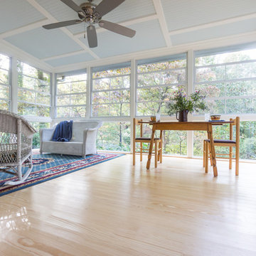
Robin loved the screen porch that looked out on their private and nicely landscaped back yard, but she wanted to be able to use it in the colder months of the year. She was unsatisfied with the kitchen and the mud room / laundry room, and the darkness of other living spaces. A previous water leak in the laundry room had resulted in a large patch of mold that had compromised flooring, wall board, and insulation and contributed to the homes reduced indoor air quality.
The home lacked insulation in the crawl, and inadequate insulation in the attic. The single HVAC unit had been replaced a few years earlier with a more efficient unit, but with a single programmable thermostat control on the first floor and aging and un-insulated ducting, the second floor was often over-heated in the summer months.
The original wood windows had begun to deteriorate and were drafty and inefficient, and the original wood-burning fireplace was an open conduit for escaping conditioned air as well as an inlet for wood-smoke smelling air being pulled into the home. The siding had been replaced a few years earlier with a cement-fiber product, but the exterior wood trim was compromised and beginning to look unsightly. Its original architecture had been altered over the years in ways that presented ongoing maintenance and durability issues, as well as disrupting the elegance of the original design.
Kent has worked for over 30 years in the Environmental Sciences field, and is considered to be a national expert in understanding the sources of, and human exposure to pollutants in indoor environments. He had always been very conscious and cautious about the effects on indoor air quality that the construction, furnishings, and products used in home had on him and his family.
Project Goals
Increase the performance of their home by improving energy efficiency by at least 40% and lowering their natural gas and electric utility costs.
Increase the performance of their home by reducing water usage by at least 40% and lowering the water utility costs.
Increase the comfort of their home that was being compromised by an inadequate HVAC design, inadequate insulation, inefficient and compromised wood windows, and copious air intrusions and drafts.
Improve the healthiness of the homes indoor air quality that was being compromised by an open wood-burning fireplace, and prior water intrusion that had allowed colonies of mold to thrive.
Create a new Kitchen, Family Room, Home Office, Mudroom, and Laundry Room that featured some of the latest designs and trends and harmonized with the rest of the homes charm.
Increase the usefulness and aesthetics of the screened porch by creating a warm and inviting semi-conditioned 3-Season Room that extended the times during the year that it was comfortable.
Introduce day-lighting into areas of the home that were dark and uninviting.
Brighten and harmonize all of the interior finishes.
Protect and restore the exterior of the home with superior-performing products and finishes.
Achieve Gold Level Green Home Certification in conformance with the ICC 700-2012 National Green Building Standards (NGBS).
 Albert, Righter & Tittmann Architects, Inc.
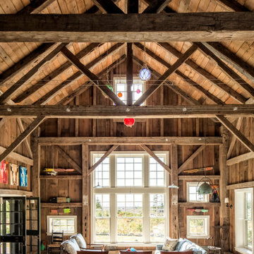
A summer house built around salvaged barn beams.
Not far from the beach, the secluded site faces south to the ocean and views.
The large main barn room embraces the main living spaces, including the kitchen. The barn room is anchored on the north with a stone fireplace and on the south with a large bay window. The wing to the east organizes the entry hall and sleeping rooms.

Sponsored
Columbus, OH
Wannemacher Interiors
Customized Award-Winning Interior Design Solutions in Franklin Cnty OH
 Jeffrey H. Dean - Creative Fires Studio
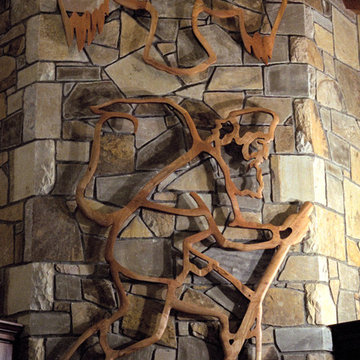
Fireplace mantle and pierced cherry relief of hiking mountain man and raven. In 1991 I was asked to make a wall piece for the chimney wall in this Linville, NC home.
My first impression when seeing the beautiful stone work was that sure didn’t want to cover it up.
I gazed at it for a while and began to see an appropriate picture in the stone work. I made a full sized rubbing of the wall to map the grout lines in the masonry. Back in the studio, I overlaid it with a grid and reduced it to an 8.5″ x 14″ piece of paper on which I could do my design.
After approval, I scoured the woods and fields along the mountain roads near our home in the Banner Elk, NC area and found a standing dead cherry tree. I cut it up preserving the forked branches. With a homemade chainsaw lumbering jig, I cut it into forked boards and had them planed and kiln dried.
I drew the design on the original rubbing, marked the joints and cut out patterns which were glued to the forked boards and cut out with a jigsaw. The joints were mitered and spline grooves cut. Parts were then clamped end to end, drilled and pegged to lock the splines in place. All the edges were then sanded to a refined shape and oiled before fastening to the masonry.
 Horizon Interior Design
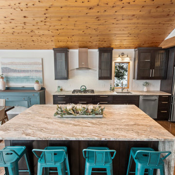
As a busy family of four with two boys and three cats, this client was ready for a kitchen remodel that made family life easier. With dated finishes, appliances, cabinetry, counters, and an oversized laundry room that could be better used as kitchen space, there were many aspects they wanted to change.
They had five different flooring surfaces within the line of sight, kept bumping into each other in the congested hallway, wanted to move their cooktop to the perimeter of their island rather than in the middle, hated their refrigerator location, and didn’t like having an island with two heights. Good thing they came to Horizon Interior Design, where we developed solutions for every problem!
We ran hardwood flooring throughout the main level to make it feel uniform and cohesive, opened up the hallway, and decreased the size of the laundry room to significantly extend their kitchen space and remove congestion in their hallway. We added more functional pull-out shelves to their pantry to replace the original rickety, narrow shelving and placed their refrigerator and cooktop on the perimeter wall, allowing for a large island with a solid surface and a decorative range hood.
We reduced the size of their kitchen windows to allow for more upper cabinetry space and added a granite waterfall feature on the island for a wow factor while placing the counter stools in such a way that they didn't block up main walkways. Dark cabinetry tied in nicely with the knots in the pine ceiling, and white tile backsplash brightened up the space beautifully. Our new kitchen layout meant the family had a nicer view while walking down the stairs, rather than staring at the top of kitchen cabinets.
Gugel Photography
 kimberly peck architect
photos by Pedro Marti
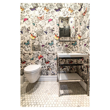
For this project the client hired us to renovate the top unit of this two family brownstone located in the historic district of Bedstuy in Brooklyn, NY. The upper apartment of the house is a three story home of which the lower two floors were fully renovated. The Clients wanted to keep the historic charm and original detail of the home as well as the general historic layout. The main layout change was to move the kitchen from the top floor to what was previously a living room at the rear of the first floor, creating an open dining/kitchen area. The kitchen consists of a large island with a farmhouse sink and a wall of paneled white and gray cabinetry. The rear window in the kitchen was enlarged and two large French doors were installed which lead out to a new elevated ipe deck with a stair that leads down to the garden. A powder room on the parlor floor from a previous renovation was reduced in size to give extra square footage to the dining room, its main feature is a colorful butterfly wallpaper. On the second floor The existing bedrooms were maintained but the center of the floor was gutted to create an additional bathroom in a previous walk-in closet. This new bathroom is a large ensuite masterbath featuring a multicolored glass mosaic tile detail adjacent to a more classic subway tile. To make up for the lost closet space where the masterbath was installed we chose to install new French swinging doors with historic bubble glass beneath an arched entry to an alcove in the master bedroom thus creating a large walk-in closet while maintaining the light in the room.
35