
Search results for "Reduce paintings" in Home Design Ideas
 KCBR Design | Remodel
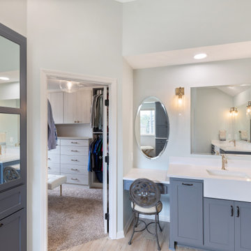
The client wanted to update their bathroom to have an elevated farmhouse feel, so we designed the vanities with a contemporary apron front countertop and used plumbing fixtures that give a nod to old fashioned water pump handles and lighting that is reminiscent of lanterns. They wanted to reduce the tub footprint, so we included a free-standing tub that is custom painted to coordinate with the shower floor tiles. They wanted to incorporate more functionality including space for laundry, jewelry organization, a coffee bar, ice maker and beverage center as well as a more organized feel overall.

 Margaret Jane Design Group
Spacecrafting Photography, Inc.
Elegant enclosed medium tone wood floor and brown floor living room photo in Minneapolis with yellow walls, a standard fireplace and a stone fireplace
Elegant enclosed medium tone wood floor and brown floor living room photo in Minneapolis with yellow walls, a standard fireplace and a stone fireplace

 Kohn Shnier architects
This single family home sits on a tight, sloped site. Within a modest budget, the goal was to provide direct access to grade at both the front and back of the house.
The solution is a multi-split-level home with unconventional relationships between floor levels. Between the entrance level and the lower level of the family room, the kitchen and dining room are located on an interstitial level. Within the stair space “floats” a small bathroom.
The generous stair is celebrated with a back-painted red glass wall which treats users to changing refractive ambient light throughout the house.
Black brick, grey-tinted glass and mirrors contribute to the reasonably compact massing of the home. A cantilevered upper volume shades south facing windows and the home’s limited material palette meant a more efficient construction process. Cautious landscaping retains water run-off on the sloping site and home offices reduce the client’s use of their vehicle.
The house achieves its vision within a modest footprint and with a design restraint that will ensure it becomes a long-lasting asset in the community.
Photo by Tom Arban
Find the right local pro for your project
 TKS Design Group
Download our free ebook, Creating the Ideal Kitchen. DOWNLOAD NOW
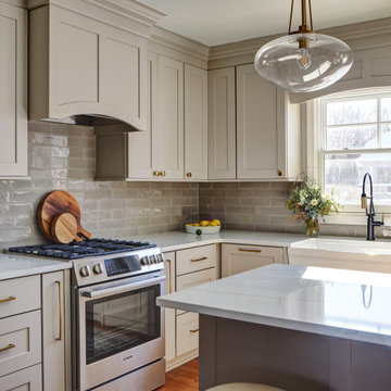
This family from Wheaton was ready to remodel their kitchen, dining room and powder room. The project didn’t call for any structural or space planning changes but the makeover still had a massive impact on their home. The homeowners wanted to change their dated 1990’s brown speckled granite and light maple kitchen. They liked the welcoming feeling they got from the wood and warm tones in their current kitchen, but this style clashed with their vision of a deVOL type kitchen, a London-based furniture company. Their inspiration came from the country homes of the UK that mix the warmth of traditional detail with clean lines and modern updates.
To create their vision, we started with all new framed cabinets with a modified overlay painted in beautiful, understated colors. Our clients were adamant about “no white cabinets.” Instead we used an oyster color for the perimeter and a custom color match to a specific shade of green chosen by the homeowner. The use of a simple color pallet reduces the visual noise and allows the space to feel open and welcoming. We also painted the trim above the cabinets the same color to make the cabinets look taller. The room trim was painted a bright clean white to match the ceiling.
In true English fashion our clients are not coffee drinkers, but they LOVE tea. We created a tea station for them where they can prepare and serve tea. We added plenty of glass to showcase their tea mugs and adapted the cabinetry below to accommodate storage for their tea items. Function is also key for the English kitchen and the homeowners. They requested a deep farmhouse sink and a cabinet devoted to their heavy mixer because they bake a lot. We then got rid of the stovetop on the island and wall oven and replaced both of them with a range located against the far wall. This gives them plenty of space on the island to roll out dough and prepare any number of baked goods. We then removed the bifold pantry doors and created custom built-ins with plenty of usable storage for all their cooking and baking needs.
The client wanted a big change to the dining room but still wanted to use their own furniture and rug. We installed a toile-like wallpaper on the top half of the room and supported it with white wainscot paneling. We also changed out the light fixture, showing us once again that small changes can have a big impact.
As the final touch, we also re-did the powder room to be in line with the rest of the first floor. We had the new vanity painted in the same oyster color as the kitchen cabinets and then covered the walls in a whimsical patterned wallpaper. Although the homeowners like subtle neutral colors they were willing to go a bit bold in the powder room for something unexpected. For more design inspiration go to: www.kitchenstudio-ge.com

 Kristi Spouse Interiors
Our client wanted to update many rooms including the kitchen, family room and den. We focused on reducing cost by utilizing the existing cabinets and refacing them with white painted shaker cabinet doors. We also extended the cabinets by filling in the void (aka Dust Trap) between the top cabinets and the ceiling. This lengthens the cabinets and gives them a built in custom cabinet look. The added crown trim, mill work panels and glossy paint looks great and avoids the "what do I put in the void above the cabinet" question. We added glass subway tile for back splash and honed Carrera marble counter tops.
Photos by Rebecca Anne Photography
 Kohn Shnier architects
This single family home sits on a tight, sloped site. Within a modest budget, the goal was to provide direct access to grade at both the front and back of the house.
The solution is a multi-split-level home with unconventional relationships between floor levels. Between the entrance level and the lower level of the family room, the kitchen and dining room are located on an interstitial level. Within the stair space “floats” a small bathroom.
The generous stair is celebrated with a back-painted red glass wall which treats users to changing refractive ambient light throughout the house.
Black brick, grey-tinted glass and mirrors contribute to the reasonably compact massing of the home. A cantilevered upper volume shades south facing windows and the home’s limited material palette meant a more efficient construction process. Cautious landscaping retains water run-off on the sloping site and home offices reduce the client’s use of their vehicle.
The house achieves its vision within a modest footprint and with a design restraint that will ensure it becomes a long-lasting asset in the community.
Photo by Tom Arban
 Kristi Spouse Interiors
Our client wanted to update many rooms including the kitchen, family room and den. We focused on reducing cost by utilizing the existing cabinets and refacing them with white painted shaker cabinet doors. We also extended the cabinets by filling in the void (aka Dust Trap) between the top cabinets and the ceiling. This lengthens the cabinets and gives them a built in custom cabinet look. The added crown trim, mill work panels and glossy paint looks great and avoids the "what do I put in the void above the cabinet" question. We added glass subway tile for back splash and honed Carrera marble counter tops.
Photos by Rebecca Anne Photography


 New Life Restorations and Properties
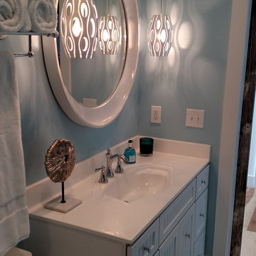
This hall bath felt cramped and closed off with a full wall separating the toilet from the sink. The wall was reduced to a pony wall and topped with a custom shelf. New vanity, counter, sinks, faucets and floors helped the original yellow tile pop.
 Kristi Spouse Interiors
Our client wanted to update many rooms including the kitchen, family room and den. We focused on reducing cost by utilizing the existing cabinets and refacing them with white painted shaker cabinet doors. We also extended the cabinets by filling in the void (aka Dust Trap) between the top cabinets and the ceiling. This lengthens the cabinets and gives them a built in custom cabinet look. The added crown trim, mill work panels and glossy paint looks great and avoids the "what do I put in the void above the cabinet" question. We added glass subway tile for back splash and honed Carrera marble counter tops.
Photos by Rebecca Anne Photography
 Kristi Spouse Interiors
Our client wanted to update many rooms including the kitchen, family room and den. We focused on reducing cost by utilizing the existing cabinets and refacing them with white painted shaker cabinet doors. We also extended the cabinets by filling in the void (aka Dust Trap) between the top cabinets and the ceiling. This lengthens the cabinets and gives them a built in custom cabinet look. The added crown trim, mill work panels and glossy paint looks great and avoids the "what do I put in the void above the cabinet" question. We added glass subway tile for back splash and honed Carrera marble counter tops.
Photos by Rebecca Anne Photography

 Constantine Design Group, Inc.
This early 20th century Indianapolis, IN basement remodel was in desperate need of help. The original and still operating hydronic radiant heating system had its plumbing configured without regard to any other use of the space. Fearful of harming the aged system and the high cost of doing so, these Clients were adamant that the existing system remain intact. Architect Lee Constantine developed a design that maintained the existing heating system while creating "niches" around the perimeter that would conceal the unsightly plumbing. Additionally, by removing free-standing structural supporting posts, amore flexible and inviting space was achieved. Because of an already low ceiling condition, the floor-ceiling structure above was kept exposed, painted and highlighted with indirect lighting to avoid further reducing the ceiling height. Constantine incorporated "clouds" on this ceiling to conceal certain existing components that either were cost prohibitive to relocate or couldn't be relocated. These "clouds"become a "visual element" through their geometry and hidden "indirect" light source rather than an undesirable complication. Now this family entertains frequently in the basement and reports "it doesn't feel like we're in a basement anymore"
 McCabe By Design LLC
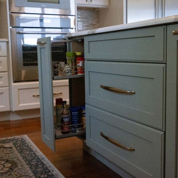
Many ergonomic convenience hardware elements were installed including base pull-out pantries on either side of the cooktop, Tandem pull-out trash/recycling, dish peg board, corner Super Susan, and tray dividers. Lastly, all the fixed shelving in the walk-in pantry were replaced with solid wood adjustable shelves and a beverage fridge was added, mounted on a platform to reduce the need to bend.
SHOWN IN IMAGE: Dura Supreme Cabinetry in Style Covington painted Linen White, and on the Island, style Carson painted SW Evergreen Fog | Top Knobs Torbay Pull in Honey Bronze | Cambria Countertop on Island in Brittania Gold Warm, Cambria MonTaaj perimeter countertop | Thermador Appliances | Lunada Bay Mosaic Glass Tile in Agate Taiko in Cortona on Backsplash |
 Cosentino North America
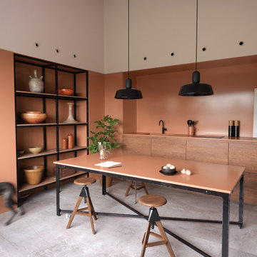
Presenting the first Carbon Neutral collection by Silestone®. A commitment to sustainability in which we reduce and offset the emissions of the manufacturing process with reforestation projects. Sunlit Days is inspired by the evocative Mediterranean shades of a unique lifestyle.

 TKS Design Group
Download our free ebook, Creating the Ideal Kitchen. DOWNLOAD NOW
This family from Wheaton was ready to remodel their kitchen, dining room and powder room. The project didn’t call for any structural or space planning changes but the makeover still had a massive impact on their home. The homeowners wanted to change their dated 1990’s brown speckled granite and light maple kitchen. They liked the welcoming feeling they got from the wood and warm tones in their current kitchen, but this style clashed with their vision of a deVOL type kitchen, a London-based furniture company. Their inspiration came from the country homes of the UK that mix the warmth of traditional detail with clean lines and modern updates.
To create their vision, we started with all new framed cabinets with a modified overlay painted in beautiful, understated colors. Our clients were adamant about “no white cabinets.” Instead we used an oyster color for the perimeter and a custom color match to a specific shade of green chosen by the homeowner. The use of a simple color pallet reduces the visual noise and allows the space to feel open and welcoming. We also painted the trim above the cabinets the same color to make the cabinets look taller. The room trim was painted a bright clean white to match the ceiling.
In true English fashion our clients are not coffee drinkers, but they LOVE tea. We created a tea station for them where they can prepare and serve tea. We added plenty of glass to showcase their tea mugs and adapted the cabinetry below to accommodate storage for their tea items. Function is also key for the English kitchen and the homeowners. They requested a deep farmhouse sink and a cabinet devoted to their heavy mixer because they bake a lot. We then got rid of the stovetop on the island and wall oven and replaced both of them with a range located against the far wall. This gives them plenty of space on the island to roll out dough and prepare any number of baked goods. We then removed the bifold pantry doors and created custom built-ins with plenty of usable storage for all their cooking and baking needs.
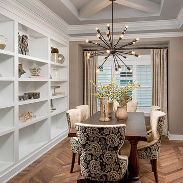
The client wanted a big change to the dining room but still wanted to use their own furniture and rug. We installed a toile-like wallpaper on the top half of the room and supported it with white wainscot paneling. We also changed out the light fixture, showing us once again that small changes can have a big impact.
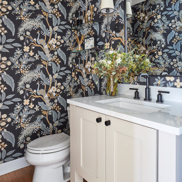
As the final touch, we also re-did the powder room to be in line with the rest of the first floor. We had the new vanity painted in the same oyster color as the kitchen cabinets and then covered the walls in a whimsical patterned wallpaper. Although the homeowners like subtle neutral colors they were willing to go a bit bold in the powder room for something unexpected. For more design inspiration go to: www.kitchenstudio-ge.com

 Rosenberg Kolb Architects
 is proud to announce our renovation of a 1747 timber frame house on Nantucket Island, completed in 2011. The first historic renovation project in Nantucket to receive LEED Gold status. The project was given a Grand Award by Eco Home Magazine in July, 2011.
The project included:
Restructuring the foundations to align and stabilize the structure in addition to providing for a new insulated crawl space;
A 260 square foot addition for a kitchen, bath, and new entry;
New cedar shingles, roof shingles, and restored historic windows;
The house met the strict regulations of Nantucket's Historic District.
On the inside, LEED Gold certification was met through:
High R-value insulation and reduced air leakage;
High efficiency heating, air conditioning, plumbing fixtures, and appliances;
Low-emission paints and finishes as well as a clay wall finish;
Using reclaimed materials from the original house and other sites.
The project has been published in:
N Magazine July 2011
Eco Home Magazine July 2011
New England Home June 2011

 Danze & Davis Architects, Inc.
Madeline Harper Photography
Large transitional open concept light wood floor and brown floor family room photo in Austin with gray walls, a standard fireplace, a stone fireplace and a wall-mounted tv
Large transitional open concept light wood floor and brown floor family room photo in Austin with gray walls, a standard fireplace, a stone fireplace and a wall-mounted tv

 ODS Architecture
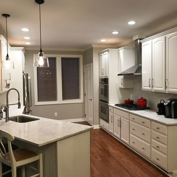
A relatively new existing home on a steep downsloping lot where you park and enter at the upper floor needed to have a dramatic stairway entry. By refining and reducing structure and scale, introducing new glass railing and a combination of wood and white cabinetry, the space now expresses a clean, crisp aesthetic reflecting how the owners want to live.
Working with German cabinets by Leicht the kitchen area was sculpted to create more usable cabinet pantry and counter area in a combination of white oak and gloss white lacquer paint. Final touches include a new porcelain tiled fireplace surround and hearth with gas insert and powder room with figured wall and floating walnut vanity. Previously partially blocked by cabinetry, now the new kitchen, dining and living rooms now all share equal access to dramatic views of the bay.
Photo Credits: Treve Johnson.

 ZeroEnergy Design
 (ZED) created this modern home for a progressive family in the desirable community of Lexington.
Thoughtful Land Connection. The residence is carefully sited on the infill lot so as to create privacy from the road and neighbors, while cultivating a side yard that captures the southern sun. The terraced grade rises to meet the house, allowing for it to maintain a structured connection with the ground while also sitting above the high water table. The elevated outdoor living space maintains a strong connection with the indoor living space, while the stepped edge ties it back to the true ground plane. Siting and outdoor connections were completed by ZED in collaboration with landscape designer Soren Deniord Design Studio.
Exterior Finishes and Solar. The exterior finish materials include a palette of shiplapped wood siding, through-colored fiber cement panels and stucco. A rooftop parapet hides the solar panels above, while a gutter and site drainage system directs rainwater into an irrigation cistern and dry wells that recharge the groundwater.
Cooking, Dining, Living. Inside, the kitchen, fabricated by Henrybuilt, is located between the indoor and outdoor dining areas. The expansive south-facing sliding door opens to seamlessly connect the spaces, using a retractable awning to provide shade during the summer while still admitting the warming winter sun. The indoor living space continues from the dining areas across to the sunken living area, with a view that returns again to the outside through the corner wall of glass.
Accessible Guest Suite. The design of the first level guest suite provides for both aging in place and guests who regularly visit for extended stays. The patio off the north side of the house affords guests their own private outdoor space, and privacy from the neighbor. Similarly, the second level master suite opens to an outdoor private roof deck.
Light and Access. The wide open interior stair with a glass panel rail leads from the top level down to the well insulated basement. The design of the basement, used as an away/play space, addresses the need for both natural light and easy access. In addition to the open stairwell, light is admitted to the north side of the area with a high performance, Passive House (PHI) certified skylight, covering a six by sixteen foot area. On the south side, a unique roof hatch set flush with the deck opens to reveal a glass door at the base of the stairwell which provides additional light and access from the deck above down to the play space.
Energy. Energy consumption is reduced by the high performance building envelope, high efficiency mechanical systems, and then offset with renewable energy. All windows and doors are made of high performance triple paned glass with thermally broken aluminum frames. The exterior wall assembly employs dense pack cellulose in the stud cavity, a continuous air barrier, and four inches exterior rigid foam insulation. The 10kW rooftop solar electric system provides clean energy production. The final air leakage testing yielded 0.6 ACH 50 - an extremely air tight house, a testament to the well-designed details, progress testing and quality construction. When compared to a new house built to code requirements, this home consumes only 19% of the energy.
Architecture & Energy Consulting: ZeroEnergy Design
Landscape Design: Soren Deniord Design
Paintings: Bernd Haussmann Studio
Photos: Eric Roth Photography
 Rosenberg Kolb Architects
 is proud to announce our renovation of a 1747 timber frame house on Nantucket Island, completed in 2011. The first historic renovation project in Nantucket to receive LEED Gold status. The project was given a Grand Award by Eco Home Magazine in July, 2011.
The project included:
Restructuring the foundations to align and stabilize the structure in addition to providing for a new insulated crawl space;
A 260 square foot addition for a kitchen, bath, and new entry;
New cedar shingles, roof shingles, and restored historic windows;
The house met the strict regulations of Nantucket's Historic District.
On the inside, LEED Gold certification was met through:
High R-value insulation and reduced air leakage;
High efficiency heating, air conditioning, plumbing fixtures, and appliances;
Low-emission paints and finishes as well as a clay wall finish;
Using reclaimed materials from the original house and other sites.
The project has been published in:
N Magazine July 2011
Eco Home Magazine July 2011
New England Home June 2011

 Anthony Wilder Design/Build, Inc.
Inspiration for a mid-sized transitional galley medium tone wood floor eat-in kitchen remodel in DC Metro with an island, recessed-panel cabinets, gray cabinets, quartzite countertops, beige backsplash, stainless steel appliances and an undermount sink
55