
Search results for "Reduce paintings" in Home Design Ideas

 Ohana Home & Design
This 1800's Minneapolis kitchen needed to be updated! The homeowners were looking to preserve the integrity of the home and the era that it was built in, yet make it current and more functional for their family. We removed the dropped header and replaced it with a hidden header, reduced the size of the back of the fireplace, which faces the formal dining room, and took down all the yellow toile wallpaper and red paint. There was a bathroom where the new back entry comes into the dinette area, this was moved to the other side of the room to make the kitchen area more spacious. The woodwork in this house is truly a work of art, so the cabinets had to co-exist and work well with the existing. The cabinets are quartersawn oak and are shaker doors and drawers. The casing on the doors and windows differed depending on the area you were in, so we created custom moldings to recreate the gorgeous casing that existed on the kitchen windows and door. We used Cambria for the countertops and a gorgeous marble tile for the backsplash. What a beautiful kitchen!
SpaceCrafting

 McCabe By Design LLC
Photo: A Kitchen That Works LLC
Example of a mid-sized transitional l-shaped cork floor and beige floor kitchen design in Seattle with a farmhouse sink, shaker cabinets, dark wood cabinets, quartz countertops, white backsplash, stone slab backsplash, stainless steel appliances, an island and white countertops
Example of a mid-sized transitional l-shaped cork floor and beige floor kitchen design in Seattle with a farmhouse sink, shaker cabinets, dark wood cabinets, quartz countertops, white backsplash, stone slab backsplash, stainless steel appliances, an island and white countertops
 Lincoln Lighthill Architect
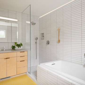
This Eichler-esque house, in a neighborhood known for its tracts of homes by the famous developer, was a little different from the rest- a one-off custom build from 1962 that had mid-century modern bones but funky, neo-traditional finishes in the worn-out, time capsule state that the new owners found it. This called for an almost-gut remodel to keep the good, upgrade the building’s envelope and MEP systems, and reimagine the home’s character. To create a home that feels of its times, both now and then- A mid-century for the 21st century.
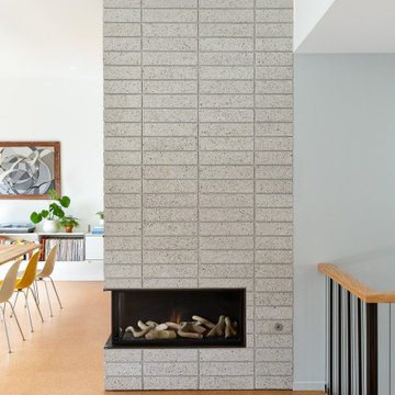
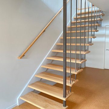
At the center of the existing home was a long, slender rectangular form that contained a fireplace, an indoor BBQ, and kitchen storage, and on the other side an original, suspended wood and steel rod stair down to the bedroom level below. Under the carpeted treads we were sure we’d find beautiful oak, as this stair was identical to one at our earlier Clarendon heights mid-century project.
This elegant core was obscured by walls that enclosed the kitchen and breakfast areas and a jumble of aged finishes that hid the elegance of this defining element. Lincoln Lighthill Architect removed the walls and unified the core’s finishes with light grey ground-face concrete block on the upgraded fireplace and BBQ, lacquered cabinets, and chalkboard paint at the stair wall for the owners’ young children to decorate. A new skylight above the stair washes this wall with light and brightens up the formerly dark center of the house.
The rest of the interior is a combination of mid-century-inspired elements and modern updates. New finishes throughout- cork flooring, ground-face concrete block, Heath tile, and white birch millwork give the interior the mid-century character it never fully had, while modern, minimalist detailing gives it a timeless, serene simplicity.
New lighting throughout, mostly indirect and all warm-dim LED , subtly and efficiently lights the home. All new plumbing and fixtures similarly reduce the home’s use of precious resources. On the exterior, new windows, insulation, and roofing provide modern standards of comfort and efficiency, while a new paint job and brick stain give the house an elegant yet playful character, with the golden yellow Heath tile from the primary bathroom floor reappearing on the front door.
Find the right local pro for your project

 Kitchen Design Concepts
This super transformative kitchen has become one of our favorites when it comes to how much it changed! Plus, not only does It have all the qualities of what’s on trend, but also has qualities of what’s going to last long-term. We love the brightness of the white cabinets on the perimeter paired with the warmer grey cabinets on the island. If you compare it with the original, it’s essentially night and day! Curious to learn more? Keep reading!
Cabinets
The biggest change to the space is the cabinetry. For the perimeter, we painted it white while painting the island a dark grey. In addition, the bar-height walls surrounding the island was reduced to a counter-height which helped open up the kitchen even more.
Countertops
Introducing even more warmth to the space, we spec’ed a 3 cm Caesarstone Quartz in London Grey. This is a great option if you’re looking for a material that has a marble look but want something a little more durable and low maintenance.
Backsplash
For backsplash we selected a 3×6 Arizona Tile H-Line series, in Pumice installed in a brick lay as field tile. As an insert in the main backsplash, we installed a Soci Oxford Blend in a Valencia Pattern.
remodel your kitchen island
Fixtures and Finishes
From Blanco, we have a Silgranit 1 & ¾ sink in the color Truffle. From Newport Brass, we have a Jacobean pulldown faucet in Satin Gold and a Jacobean cold water dispenser also in Satin Gold. From Mountain Plumbing, we have an air disposal switch in satin gold. As for hardware, we installed Top Knobs pulls on doors and drawer fronts in their gold finish.

 ZeroEnergy Design
 (ZED) created this modern home for a progressive family in the desirable community of Lexington.
Thoughtful Land Connection. The residence is carefully sited on the infill lot so as to create privacy from the road and neighbors, while cultivating a side yard that captures the southern sun. The terraced grade rises to meet the house, allowing for it to maintain a structured connection with the ground while also sitting above the high water table. The elevated outdoor living space maintains a strong connection with the indoor living space, while the stepped edge ties it back to the true ground plane. Siting and outdoor connections were completed by ZED in collaboration with landscape designer Soren Deniord Design Studio.
Exterior Finishes and Solar. The exterior finish materials include a palette of shiplapped wood siding, through-colored fiber cement panels and stucco. A rooftop parapet hides the solar panels above, while a gutter and site drainage system directs rainwater into an irrigation cistern and dry wells that recharge the groundwater.
Cooking, Dining, Living. Inside, the kitchen, fabricated by Henrybuilt, is located between the indoor and outdoor dining areas. The expansive south-facing sliding door opens to seamlessly connect the spaces, using a retractable awning to provide shade during the summer while still admitting the warming winter sun. The indoor living space continues from the dining areas across to the sunken living area, with a view that returns again to the outside through the corner wall of glass.
Accessible Guest Suite. The design of the first level guest suite provides for both aging in place and guests who regularly visit for extended stays. The patio off the north side of the house affords guests their own private outdoor space, and privacy from the neighbor. Similarly, the second level master suite opens to an outdoor private roof deck.
Light and Access. The wide open interior stair with a glass panel rail leads from the top level down to the well insulated basement. The design of the basement, used as an away/play space, addresses the need for both natural light and easy access. In addition to the open stairwell, light is admitted to the north side of the area with a high performance, Passive House (PHI) certified skylight, covering a six by sixteen foot area. On the south side, a unique roof hatch set flush with the deck opens to reveal a glass door at the base of the stairwell which provides additional light and access from the deck above down to the play space.
Energy. Energy consumption is reduced by the high performance building envelope, high efficiency mechanical systems, and then offset with renewable energy. All windows and doors are made of high performance triple paned glass with thermally broken aluminum frames. The exterior wall assembly employs dense pack cellulose in the stud cavity, a continuous air barrier, and four inches exterior rigid foam insulation. The 10kW rooftop solar electric system provides clean energy production. The final air leakage testing yielded 0.6 ACH 50 - an extremely air tight house, a testament to the well-designed details, progress testing and quality construction. When compared to a new house built to code requirements, this home consumes only 19% of the energy.
Architecture & Energy Consulting: ZeroEnergy Design
Landscape Design: Soren Deniord Design
Paintings: Bernd Haussmann Studio
Photos: Eric Roth Photography

 Pacific Northwest Cabinetry
Example of a mid-sized open concept dark wood floor family room design in Portland with gray walls, a standard fireplace, a tile fireplace and a wall-mounted tv
Example of a mid-sized open concept dark wood floor family room design in Portland with gray walls, a standard fireplace, a tile fireplace and a wall-mounted tv
 Ohana Home & Design
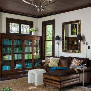
This 1800's Minneapolis kitchen needed to be updated! The homeowners were looking to preserve the integrity of the home and the era that it was built in, yet make it current and more functional for their family. We removed the dropped header and replaced it with a hidden header, reduced the size of the back of the fireplace, which faces the formal dining room, and took down all the yellow toile wallpaper and red paint. There was a bathroom where the new back entry comes into the dinette area, this was moved to the other side of the room to make the kitchen area more spacious. The woodwork in this house is truly a work of art, so the cabinets had to co-exist and work well with the existing. The cabinets are quartersawn oak and are shaker doors and drawers. The casing on the doors and windows differed depending on the area you were in, so we created custom moldings to recreate the gorgeous casing that existed on the kitchen windows and door. We used Cambria for the countertops and a gorgeous marble tile for the backsplash. What a beautiful kitchen!
SpaceCrafting
Sponsored
Columbus, OH

Wannemacher Interiors
Customized Award-Winning Interior Design Solutions in Franklin Cnty OH

 Accoya Wood
Accoya was selected as the ideal material for this breathtaking home in West Vancouver. Accoya was used for the railing, siding, fencing and soffits throughout the property. In addition, an Accoya handrail was specifically custom designed by Upper Canada Forest Products.
Design Duo Matt McLeod and Lisa Bovell of McLeod Bovell Modern houses switched between fluidity, plasticity, malleability and even volumetric design to try capture their process of space-making.
Unlike anything surrounding it, this home’s irregular shape and atypical residential building materials are more akin to modern-day South American projects that stem from their surroundings to showcase concrete’s versatility. This is why the Accoya was left in its rough state, to accentuate the minimalist and harmonious aesthetics of its natural environment.
Photo Credit: Martin Tessler
 Alcon Lighting
Lighting at home is mainly tied to user preference, but research shows there are steps everyone can take to create a calm, pleasing environment.
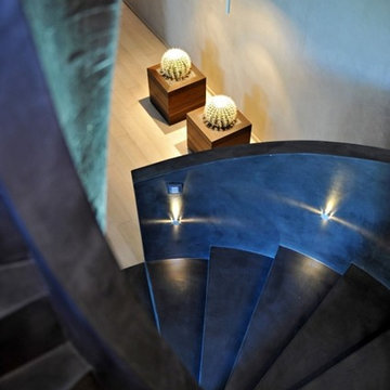
“At night, lower light levels and warmer color temperatures – those that fall in the 2,700 to 3,000 Kelvin range – emulate the outside environment’s evening light and help us get ready for sleep by reducing our blood pressure and creating a restful feel,” said Rebecca Hadley, manager of Eaton’s SOURCE lighting education center. “If you’re cooking or entertaining guests in the evening, you may find that higher light levels and color temperatures are beneficial. However, people generally tend to prefer warmer light at home.
Flexibility is one natural benefit of smart lighting design. New advancements in Lighting Controls have made lighting for mood easier than ever.
“Studies show that wall color can affect heart rate and irritability levels, but you can adjust your light more readily than the paint on your walls,” said Hadley. “For example, you can use high-intensity light to complete a craft activity at the kitchen table; an hour later, you can serve dinner to your family at that same table beneath a warmer, lower-intensity light.”
When it comes to designing for mood, advanced controls have the most room to develop. Controls will become more personalized in environments ranging from the home to offices, hospitality settings and health care facilities. Controls that were once accessed via a wall switch are already making the jump to app-based technology. And as LED technology improves at lightning speed, adaptability – and energy savings – will only continue to grow.
 Kitchen Design Concepts
This super transformative kitchen has become one of our favorites when it comes to how much it changed! Plus, not only does It have all the qualities of what’s on trend, but also has qualities of what’s going to last long-term. We love the brightness of the white cabinets on the perimeter paired with the warmer grey cabinets on the island. If you compare it with the original, it’s essentially night and day! Curious to learn more? Keep reading!
Cabinets
The biggest change to the space is the cabinetry. For the perimeter, we painted it white while painting the island a dark grey. In addition, the bar-height walls surrounding the island was reduced to a counter-height which helped open up the kitchen even more.
Countertops
Introducing even more warmth to the space, we spec’ed a 3 cm Caesarstone Quartz in London Grey. This is a great option if you’re looking for a material that has a marble look but want something a little more durable and low maintenance.
Backsplash
For backsplash we selected a 3×6 Arizona Tile H-Line series, in Pumice installed in a brick lay as field tile. As an insert in the main backsplash, we installed a Soci Oxford Blend in a Valencia Pattern.
remodel your kitchen island
Fixtures and Finishes
From Blanco, we have a Silgranit 1 & ¾ sink in the color Truffle. From Newport Brass, we have a Jacobean pulldown faucet in Satin Gold and a Jacobean cold water dispenser also in Satin Gold. From Mountain Plumbing, we have an air disposal switch in satin gold. As for hardware, we installed Top Knobs pulls on doors and drawer fronts in their gold finish.
 Lincoln Lighthill Architect
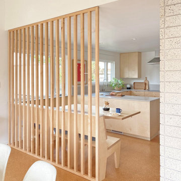
This Eichler-esque house, in a neighborhood known for its tracts of homes by the famous developer, was a little different from the rest- a one-off custom build from 1962 that had mid-century modern bones but funky, neo-traditional finishes in the worn-out, time capsule state that the new owners found it. This called for an almost-gut remodel to keep the good, upgrade the building’s envelope and MEP systems, and reimagine the home’s character. To create a home that feels of its times, both now and then- A mid-century for the 21st century.
At the center of the existing home was a long, slender rectangular form that contained a fireplace, an indoor BBQ, and kitchen storage, and on the other side an original, suspended wood and steel rod stair down to the bedroom level below. Under the carpeted treads we were sure we’d find beautiful oak, as this stair was identical to one at our earlier Clarendon heights mid-century project.
This elegant core was obscured by walls that enclosed the kitchen and breakfast areas and a jumble of aged finishes that hid the elegance of this defining element. Lincoln Lighthill Architect removed the walls and unified the core’s finishes with light grey ground-face concrete block on the upgraded fireplace and BBQ, lacquered cabinets, and chalkboard paint at the stair wall for the owners’ young children to decorate. A new skylight above the stair washes this wall with light and brightens up the formerly dark center of the house.
The rest of the interior is a combination of mid-century-inspired elements and modern updates. New finishes throughout- cork flooring, ground-face concrete block, Heath tile, and white birch millwork give the interior the mid-century character it never fully had, while modern, minimalist detailing gives it a timeless, serene simplicity.
New lighting throughout, mostly indirect and all warm-dim LED , subtly and efficiently lights the home. All new plumbing and fixtures similarly reduce the home’s use of precious resources. On the exterior, new windows, insulation, and roofing provide modern standards of comfort and efficiency, while a new paint job and brick stain give the house an elegant yet playful character, with the golden yellow Heath tile from the primary bathroom floor reappearing on the front door.
 Lincoln Lighthill Architect
This Eichler-esque house, in a neighborhood known for its tracts of homes by the famous developer, was a little different from the rest- a one-off custom build from 1962 that had mid-century modern bones but funky, neo-traditional finishes in the worn-out, time capsule state that the new owners found it. This called for an almost-gut remodel to keep the good, upgrade the building’s envelope and MEP systems, and reimagine the home’s character. To create a home that feels of its times, both now and then- A mid-century for the 21st century.
At the center of the existing home was a long, slender rectangular form that contained a fireplace, an indoor BBQ, and kitchen storage, and on the other side an original, suspended wood and steel rod stair down to the bedroom level below. Under the carpeted treads we were sure we’d find beautiful oak, as this stair was identical to one at our earlier Clarendon heights mid-century project.
This elegant core was obscured by walls that enclosed the kitchen and breakfast areas and a jumble of aged finishes that hid the elegance of this defining element. Lincoln Lighthill Architect removed the walls and unified the core’s finishes with light grey ground-face concrete block on the upgraded fireplace and BBQ, lacquered cabinets, and chalkboard paint at the stair wall for the owners’ young children to decorate. A new skylight above the stair washes this wall with light and brightens up the formerly dark center of the house.
The rest of the interior is a combination of mid-century-inspired elements and modern updates. New finishes throughout- cork flooring, ground-face concrete block, Heath tile, and white birch millwork give the interior the mid-century character it never fully had, while modern, minimalist detailing gives it a timeless, serene simplicity.
New lighting throughout, mostly indirect and all warm-dim LED , subtly and efficiently lights the home. All new plumbing and fixtures similarly reduce the home’s use of precious resources. On the exterior, new windows, insulation, and roofing provide modern standards of comfort and efficiency, while a new paint job and brick stain give the house an elegant yet playful character, with the golden yellow Heath tile from the primary bathroom floor reappearing on the front door.
 Fitch Design Company
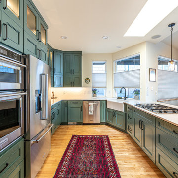
Beautiful eucalyptus green cabinetry showcases Rookwood Americana Pottery.
Mid-sized transitional u-shaped medium tone wood floor and brown floor open concept kitchen photo in Seattle with a farmhouse sink, green cabinets, white backsplash, stainless steel appliances, white countertops, flat-panel cabinets, quartz countertops, ceramic backsplash and a peninsula
Mid-sized transitional u-shaped medium tone wood floor and brown floor open concept kitchen photo in Seattle with a farmhouse sink, green cabinets, white backsplash, stainless steel appliances, white countertops, flat-panel cabinets, quartz countertops, ceramic backsplash and a peninsula
Sponsored
Columbus, OH

Trish Takacs Design
Award Winning & Highly Skilled Kitchen & Bath Designer in Columbus
 Lincoln Lighthill Architect
This Eichler-esque house, in a neighborhood known for its tracts of homes by the famous developer, was a little different from the rest- a one-off custom build from 1962 that had mid-century modern bones but funky, neo-traditional finishes in the worn-out, time capsule state that the new owners found it. This called for an almost-gut remodel to keep the good, upgrade the building’s envelope and MEP systems, and reimagine the home’s character. To create a home that feels of its times, both now and then- A mid-century for the 21st century.
At the center of the existing home was a long, slender rectangular form that contained a fireplace, an indoor BBQ, and kitchen storage, and on the other side an original, suspended wood and steel rod stair down to the bedroom level below. Under the carpeted treads we were sure we’d find beautiful oak, as this stair was identical to one at our earlier Clarendon heights mid-century project.
This elegant core was obscured by walls that enclosed the kitchen and breakfast areas and a jumble of aged finishes that hid the elegance of this defining element. Lincoln Lighthill Architect removed the walls and unified the core’s finishes with light grey ground-face concrete block on the upgraded fireplace and BBQ, lacquered cabinets, and chalkboard paint at the stair wall for the owners’ young children to decorate. A new skylight above the stair washes this wall with light and brightens up the formerly dark center of the house.
The rest of the interior is a combination of mid-century-inspired elements and modern updates. New finishes throughout- cork flooring, ground-face concrete block, Heath tile, and white birch millwork give the interior the mid-century character it never fully had, while modern, minimalist detailing gives it a timeless, serene simplicity.
New lighting throughout, mostly indirect and all warm-dim LED , subtly and efficiently lights the home. All new plumbing and fixtures similarly reduce the home’s use of precious resources. On the exterior, new windows, insulation, and roofing provide modern standards of comfort and efficiency, while a new paint job and brick stain give the house an elegant yet playful character, with the golden yellow Heath tile from the primary bathroom floor reappearing on the front door.

 Ehrlich Yanai Rhee Chaney Architects
The ground floor volumes wrapped in an elongated hand-fired brick, emphasizing the horizontality of the architecture that lays solidly on the land.
(Photography by: Matthew Millman)
 Kitchen Design Concepts
This super transformative kitchen has become one of our favorites when it comes to how much it changed! Plus, not only does It have all the qualities of what’s on trend, but also has qualities of what’s going to last long-term. We love the brightness of the white cabinets on the perimeter paired with the warmer grey cabinets on the island. If you compare it with the original, it’s essentially night and day! Curious to learn more? Keep reading!
Cabinets
The biggest change to the space is the cabinetry. For the perimeter, we painted it white while painting the island a dark grey. In addition, the bar-height walls surrounding the island was reduced to a counter-height which helped open up the kitchen even more.
Countertops
Introducing even more warmth to the space, we spec’ed a 3 cm Caesarstone Quartz in London Grey. This is a great option if you’re looking for a material that has a marble look but want something a little more durable and low maintenance.
Backsplash
For backsplash we selected a 3×6 Arizona Tile H-Line series, in Pumice installed in a brick lay as field tile. As an insert in the main backsplash, we installed a Soci Oxford Blend in a Valencia Pattern.
remodel your kitchen island
Fixtures and Finishes
From Blanco, we have a Silgranit 1 & ¾ sink in the color Truffle. From Newport Brass, we have a Jacobean pulldown faucet in Satin Gold and a Jacobean cold water dispenser also in Satin Gold. From Mountain Plumbing, we have an air disposal switch in satin gold. As for hardware, we installed Top Knobs pulls on doors and drawer fronts in their gold finish.


Sponsored
Columbus, OH
Free consultation for landscape design!

Peabody Landscape Group
Columbus' Reliable Landscape Design & Contracting
 Thyme & Place Design LLC
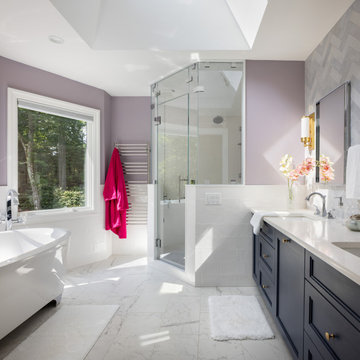
This medium sized bathroom had ample space to create a luxurious bathroom for this young professional couple with 3 young children. My clients really wanted a place to unplug and relax where they could retreat and recharge.
New cabinets were a must with customized interiors to reduce cluttered counter tops and make morning routines easier and more organized. We selected Hale Navy for the painted finish with an upscale recessed panel door. Honey bronze hardware is a nice contrast to the navy paint instead of an expected brushed silver. For storage, a grooming center to organize hair dryer, curling iron and brushes keeps everything in place for morning routines. On the opposite, a pull-out organizer outfitted with trays for smaller personal items keeps everything at the fingertips. I included a pull-out hamper to keep laundry and towels off the floor. Another design detail I like to include is drawers in the sink cabinets. It is much better to have drawers notched for the plumbing when organizing bathroom products instead of filling up a large base cabinet.
The room already had beautiful windows and was bathed in naturel light from an existing skylight. I enhanced the natural lighting with some recessed can lights, a light in the shower as well as sconces around the mirrored medicine cabinets. The best thing about the medicine cabinets is not only the additional storage but when both doors are opened you can see the back of your head. The inside of the cabinet doors are mirrored. Honey Bronze sconces are perfect lighting at the vanity for makeup and shaving.
A larger shower for my very tall client with a built-in bench was a priority for this bathroom. I recommend stream showers whenever designing a bathroom and my client loved the idea of that feature as a surprise for his wife. Steam adds to the wellness and health aspect of any good bathroom design. We were able to access a small closet space just behind the shower a perfect spot for the steam unit. In addition to the steam, a handheld shower is another “standard” item in our shower designs. I like to locate these near a bench so you can sit while you target sore shoulder and back muscles. Another benefit is cleanability of the shower walls and being able to take a quick shower without getting your hair wet. The slide bar is just the thing to accommodate different heights.
For Mrs. a tub for soaking and relaxing were the main ingredients required for this remodel. Here I specified a Bain Ultra freestanding tub complete with air massage, chromatherapy and a heated back rest. The tub filer is floor mounted and adds another element of elegance to the bath. I located the tub in a bay window so the bather can enjoy the beautiful view out of the window. It is also a great way to relax after a round of golf. Either way, both of my clients can enjoy the benefits of this tub.
The tiles selected for the shower and the lower walls of the bathroom are a slightly oversized subway tile in a clean and bright white. The floors are a 12x24 porcelain marble. The shower floor features a flat cut marble pebble tile. Behind the vanity the wall is tiled with Zellige tile in a herringbone pattern. The colors of the tile connect all the colors used in the bath.
The final touches of elegance and luxury to complete our design, the soft lilac paint on the walls, the mix of metal materials on the faucets, cabinet hardware, lighting and yes, an oversized heated towel warmer complete with robe hooks.
This truly is a space for rejuvenation and wellness.
 Lincoln Lighthill Architect
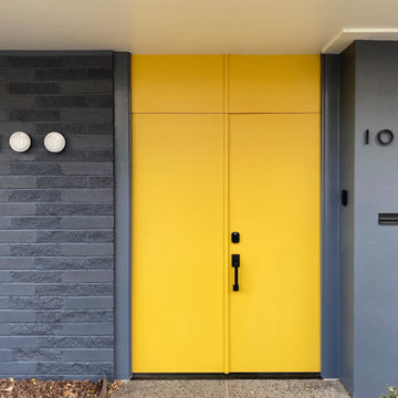
This Eichler-esque house, in a neighborhood known for its tracts of homes by the famous developer, was a little different from the rest- a one-off custom build from 1962 that had mid-century modern bones but funky, neo-traditional finishes in the worn-out, time capsule state that the new owners found it. This called for an almost-gut remodel to keep the good, upgrade the building’s envelope and MEP systems, and reimagine the home’s character. To create a home that feels of its times, both now and then- A mid-century for the 21st century.
At the center of the existing home was a long, slender rectangular form that contained a fireplace, an indoor BBQ, and kitchen storage, and on the other side an original, suspended wood and steel rod stair down to the bedroom level below. Under the carpeted treads we were sure we’d find beautiful oak, as this stair was identical to one at our earlier Clarendon heights mid-century project.
This elegant core was obscured by walls that enclosed the kitchen and breakfast areas and a jumble of aged finishes that hid the elegance of this defining element. Lincoln Lighthill Architect removed the walls and unified the core’s finishes with light grey ground-face concrete block on the upgraded fireplace and BBQ, lacquered cabinets, and chalkboard paint at the stair wall for the owners’ young children to decorate. A new skylight above the stair washes this wall with light and brightens up the formerly dark center of the house.
The rest of the interior is a combination of mid-century-inspired elements and modern updates. New finishes throughout- cork flooring, ground-face concrete block, Heath tile, and white birch millwork give the interior the mid-century character it never fully had, while modern, minimalist detailing gives it a timeless, serene simplicity.
New lighting throughout, mostly indirect and all warm-dim LED , subtly and efficiently lights the home. All new plumbing and fixtures similarly reduce the home’s use of precious resources. On the exterior, new windows, insulation, and roofing provide modern standards of comfort and efficiency, while a new paint job and brick stain give the house an elegant yet playful character, with the golden yellow Heath tile from the primary bathroom floor reappearing on the front door.

 TVL Creative Ltd.
Our clients’ recently purchase home is set in a picturesque location in Golden, Colorado. With idyllic square footage for raising a family, it was almost just what they wanted. However, the 90’s interior furnishings and dated layout didn’t feel like home. So, they reached out to TVL Creative to help them get the place move-in ready and feeling more 'them.' The scope of work included an overhaul of the master bathroom, full-home paint scheme, lighting updates, and new staircase railings. The most profound transformation within our scope was the master bathroom renovation. This luxurious space, built by TVL’s own Team Angel, is a calming retreat with gorgeous detailing throughout. Every part of this bathroom was gutted and we worked to establish a new concept and functional layout that would better serve our clients. As part of the transformative design, a calming symmetry was created by marrying the new vanity design with the existing architecture of the room. A feature tile accentuates the symmetrical composition of vanity and vaulted ceiling: large beveled mirrors and linear sconces bring the eye upward. Custom built-ins flanking the master bathroom sinks were designed to provide ample organized storage for linens and toiletries. A make-up vanity accented by a full height mirror and coordinating pendant rounds out the custom built-ins. Opposite the vanity wall is the commode room, bathtub, and a large shower. In the bathtub nook, the sculptural form of the Elise tub by MTI Baths compliments the arc of the picture window above. The Kohler Archer tub filler adds transitional and classy styling to the area. A quartz-topped bench running the length of the back wall provides a perfect spot for a glass of wine near the bath, while doubling as a gorgeous and functional seat in the shower. The bench was also utilized to move the bathtub off of the exterior wall and reduce the amount of awkward-to-clean floor space. In the shower, the upgrades feel limitless. We relocated the valve controls to the entry half wall for easy on/off access. We also created functionals shower niches that are tucked out of view for handy storage without aesthetic compromise. The shower features a lovely three-dimensional diamond accent tile and is wrapped in frameless glass for added light entry. In general, the space is outfitted with other stunning features including Kohler Archer fixtures throughout, Feiss decorative lighting, Amerock hardware on all built-ins, and cabinetry from Waypoint Living Spaces. From bachelor pad to first family home, it's been a pleasure to work with our client over the years! We will especially cherish our time working with them this time around to make their new house feel more like home.
76