
Search results for "Reduce paintings" in Home Design Ideas


 Katie Hutchison Studio
The new owners of this house in Harvard, Massachusetts loved its location and authentic Shaker characteristics, but weren’t fans of its curious layout. A dated first-floor full bathroom could only be accessed by going up a few steps to a landing, opening the bathroom door and then going down the same number of steps to enter the room. The dark kitchen faced the driveway to the north, rather than the bucolic backyard fields to the south. The dining space felt more like an enlarged hall and could only comfortably seat four. Upstairs, a den/office had a woefully low ceiling; the master bedroom had limited storage, and a sad full bathroom featured a cramped shower.
KHS proposed a number of changes to create an updated home where the owners could enjoy cooking, entertaining, and being connected to the outdoors from the first-floor living spaces, while also experiencing more inviting and more functional private spaces upstairs.
On the first floor, the primary change was to capture space that had been part of an upper-level screen porch and convert it to interior space. To make the interior expansion seamless, we raised the floor of the area that had been the upper-level porch, so it aligns with the main living level, and made sure there would be no soffits in the planes of the walls we removed. We also raised the floor of the remaining lower-level porch to reduce the number of steps required to circulate from it to the newly expanded interior. New patio door systems now fill the arched openings that used to be infilled with screen. The exterior interventions (which also included some new casement windows in the dining area) were designed to be subtle, while affording significant improvements on the interior. Additionally, the first-floor bathroom was reconfigured, shifting one of its walls to widen the dining space, and moving the entrance to the bathroom from the stair landing to the kitchen instead.
These changes (which involved significant structural interventions) resulted in a much more open space to accommodate a new kitchen with a view of the lush backyard and a new dining space defined by a new built-in banquette that comfortably seats six, and -- with the addition of a table extension -- up to eight people.
Upstairs in the den/office, replacing the low, board ceiling with a raised, plaster, tray ceiling that springs from above the original board-finish walls – newly painted a light color -- created a much more inviting, bright, and expansive space. Re-configuring the master bath to accommodate a larger shower and adding built-in storage cabinets in the master bedroom improved comfort and function. A new whole-house color palette rounds out the improvements.
Photos by Katie Hutchison
 Thyme & Place Design LLC
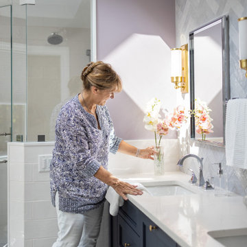
This medium sized bathroom had ample space to create a luxurious bathroom for this young professional couple with 3 young children. My clients really wanted a place to unplug and relax where they could retreat and recharge.
New cabinets were a must with customized interiors to reduce cluttered counter tops and make morning routines easier and more organized. We selected Hale Navy for the painted finish with an upscale recessed panel door. Honey bronze hardware is a nice contrast to the navy paint instead of an expected brushed silver. For storage, a grooming center to organize hair dryer, curling iron and brushes keeps everything in place for morning routines. On the opposite, a pull-out organizer outfitted with trays for smaller personal items keeps everything at the fingertips. I included a pull-out hamper to keep laundry and towels off the floor. Another design detail I like to include is drawers in the sink cabinets. It is much better to have drawers notched for the plumbing when organizing bathroom products instead of filling up a large base cabinet.
The room already had beautiful windows and was bathed in naturel light from an existing skylight. I enhanced the natural lighting with some recessed can lights, a light in the shower as well as sconces around the mirrored medicine cabinets. The best thing about the medicine cabinets is not only the additional storage but when both doors are opened you can see the back of your head. The inside of the cabinet doors are mirrored. Honey Bronze sconces are perfect lighting at the vanity for makeup and shaving.
A larger shower for my very tall client with a built-in bench was a priority for this bathroom. I recommend stream showers whenever designing a bathroom and my client loved the idea of that feature as a surprise for his wife. Steam adds to the wellness and health aspect of any good bathroom design. We were able to access a small closet space just behind the shower a perfect spot for the steam unit. In addition to the steam, a handheld shower is another “standard” item in our shower designs. I like to locate these near a bench so you can sit while you target sore shoulder and back muscles. Another benefit is cleanability of the shower walls and being able to take a quick shower without getting your hair wet. The slide bar is just the thing to accommodate different heights.
For Mrs. a tub for soaking and relaxing were the main ingredients required for this remodel. Here I specified a Bain Ultra freestanding tub complete with air massage, chromatherapy and a heated back rest. The tub filer is floor mounted and adds another element of elegance to the bath. I located the tub in a bay window so the bather can enjoy the beautiful view out of the window. It is also a great way to relax after a round of golf. Either way, both of my clients can enjoy the benefits of this tub.
The tiles selected for the shower and the lower walls of the bathroom are a slightly oversized subway tile in a clean and bright white. The floors are a 12x24 porcelain marble. The shower floor features a flat cut marble pebble tile. Behind the vanity the wall is tiled with Zellage tile in a herringbone pattern. The colors of the tile connect all the colors used in the bath.
The final touches of elegance and luxury to complete our design, the soft lilac paint on the walls, the mix of metal materials on the faucets, cabinet hardware, lighting and yes, an oversized heated towel warmer complete with robe hooks.
This truly is a space for rejuvenation and wellness.
Find the right local pro for your project
 Katie Hutchison Studio
The new owners of this house in Harvard, Massachusetts loved its location and authentic Shaker characteristics, but weren’t fans of its curious layout. A dated first-floor full bathroom could only be accessed by going up a few steps to a landing, opening the bathroom door and then going down the same number of steps to enter the room. The dark kitchen faced the driveway to the north, rather than the bucolic backyard fields to the south. The dining space felt more like an enlarged hall and could only comfortably seat four. Upstairs, a den/office had a woefully low ceiling; the master bedroom had limited storage, and a sad full bathroom featured a cramped shower.
KHS proposed a number of changes to create an updated home where the owners could enjoy cooking, entertaining, and being connected to the outdoors from the first-floor living spaces, while also experiencing more inviting and more functional private spaces upstairs.
On the first floor, the primary change was to capture space that had been part of an upper-level screen porch and convert it to interior space. To make the interior expansion seamless, we raised the floor of the area that had been the upper-level porch, so it aligns with the main living level, and made sure there would be no soffits in the planes of the walls we removed. We also raised the floor of the remaining lower-level porch to reduce the number of steps required to circulate from it to the newly expanded interior. New patio door systems now fill the arched openings that used to be infilled with screen. The exterior interventions (which also included some new casement windows in the dining area) were designed to be subtle, while affording significant improvements on the interior. Additionally, the first-floor bathroom was reconfigured, shifting one of its walls to widen the dining space, and moving the entrance to the bathroom from the stair landing to the kitchen instead.
These changes (which involved significant structural interventions) resulted in a much more open space to accommodate a new kitchen with a view of the lush backyard and a new dining space defined by a new built-in banquette that comfortably seats six, and -- with the addition of a table extension -- up to eight people.
Upstairs in the den/office, replacing the low, board ceiling with a raised, plaster, tray ceiling that springs from above the original board-finish walls – newly painted a light color -- created a much more inviting, bright, and expansive space. Re-configuring the master bath to accommodate a larger shower and adding built-in storage cabinets in the master bedroom improved comfort and function. A new whole-house color palette rounds out the improvements.
Photos by Katie Hutchison
 Katie Hutchison Studio
The new owners of this house in Harvard, Massachusetts loved its location and authentic Shaker characteristics, but weren’t fans of its curious layout. A dated first-floor full bathroom could only be accessed by going up a few steps to a landing, opening the bathroom door and then going down the same number of steps to enter the room. The dark kitchen faced the driveway to the north, rather than the bucolic backyard fields to the south. The dining space felt more like an enlarged hall and could only comfortably seat four. Upstairs, a den/office had a woefully low ceiling; the master bedroom had limited storage, and a sad full bathroom featured a cramped shower.
KHS proposed a number of changes to create an updated home where the owners could enjoy cooking, entertaining, and being connected to the outdoors from the first-floor living spaces, while also experiencing more inviting and more functional private spaces upstairs.
On the first floor, the primary change was to capture space that had been part of an upper-level screen porch and convert it to interior space. To make the interior expansion seamless, we raised the floor of the area that had been the upper-level porch, so it aligns with the main living level, and made sure there would be no soffits in the planes of the walls we removed. We also raised the floor of the remaining lower-level porch to reduce the number of steps required to circulate from it to the newly expanded interior. New patio door systems now fill the arched openings that used to be infilled with screen. The exterior interventions (which also included some new casement windows in the dining area) were designed to be subtle, while affording significant improvements on the interior. Additionally, the first-floor bathroom was reconfigured, shifting one of its walls to widen the dining space, and moving the entrance to the bathroom from the stair landing to the kitchen instead.
These changes (which involved significant structural interventions) resulted in a much more open space to accommodate a new kitchen with a view of the lush backyard and a new dining space defined by a new built-in banquette that comfortably seats six, and -- with the addition of a table extension -- up to eight people.
Upstairs in the den/office, replacing the low, board ceiling with a raised, plaster, tray ceiling that springs from above the original board-finish walls – newly painted a light color -- created a much more inviting, bright, and expansive space. Re-configuring the master bath to accommodate a larger shower and adding built-in storage cabinets in the master bedroom improved comfort and function. A new whole-house color palette rounds out the improvements.
Photos by Katie Hutchison

 Ohana Home & Design
This 1800's Minneapolis kitchen needed to be updated! The homeowners were looking to preserve the integrity of the home and the era that it was built in, yet make it current and more functional for their family. We removed the dropped header and replaced it with a hidden header, reduced the size of the back of the fireplace, which faces the formal dining room, and took down all the yellow toile wallpaper and red paint. There was a bathroom where the new back entry comes into the dinette area, this was moved to the other side of the room to make the kitchen area more spacious. The woodwork in this house is truly a work of art, so the cabinets had to co-exist and work well with the existing. The cabinets are quartersawn oak and are shaker doors and drawers. The casing on the doors and windows differed depending on the area you were in, so we created custom moldings to recreate the gorgeous casing that existed on the kitchen windows and door. We used Cambria for the countertops and a gorgeous marble tile for the backsplash. What a beautiful kitchen!
SpaceCrafting




 Crystal Kitchen + Bath
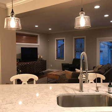
After 11 years on the Gull Lake chain in Nisswa, this couple decided to sell their cabin. Their current home has the lake view, pine trees and “up north” feel right here in Plymouth. The goal of this remodel was to incorporate some of the Nisswa cabin features into an “urban cabin”.
The first step was, large windows were installed to take in the view of the lake. Some features borrowed from the cabin are the interior wood tongue & groove siding, ledge stone fireplace and scraped hickory flooring. Designer, Carol Kornak, reconfigured the appliance locations and reoriented the kitchen by added an island with eating space. And, a subtle but rewarding change occurred in the back hall. Often a bottleneck, the hallway to the garage was a catch-all for coats, boots, mail, etc. With a little design magic (by removing a wall, reducing pantry depth) and adding a boot bench and hooks for coats, the narrow hallway feels more spacious. To keep them organized there is a mail sorting and charging station hidden behind closed doors.
Admittedly, the couple isn’t roughing it with their Wolf/Sub-Zero appliance package including refrigerator, wine cooler, cooktop, steam oven and warming drawer. The new cabinetry from Crystal Cabinet Works in rustic hickory and painted finish pairs beautifully with the two Cambria countertops and completes the transformation into the “Urban Cabin”. The only thing missing is the 2 ½ hour drive and the dock & boat. Luckily, Lake Minnetonka is only a short drive away.
 Katie Hutchison Studio
The new owners of this house in Harvard, Massachusetts loved its location and authentic Shaker characteristics, but weren’t fans of its curious layout. A dated first-floor full bathroom could only be accessed by going up a few steps to a landing, opening the bathroom door and then going down the same number of steps to enter the room. The dark kitchen faced the driveway to the north, rather than the bucolic backyard fields to the south. The dining space felt more like an enlarged hall and could only comfortably seat four. Upstairs, a den/office had a woefully low ceiling; the master bedroom had limited storage, and a sad full bathroom featured a cramped shower.
KHS proposed a number of changes to create an updated home where the owners could enjoy cooking, entertaining, and being connected to the outdoors from the first-floor living spaces, while also experiencing more inviting and more functional private spaces upstairs.
On the first floor, the primary change was to capture space that had been part of an upper-level screen porch and convert it to interior space. To make the interior expansion seamless, we raised the floor of the area that had been the upper-level porch, so it aligns with the main living level, and made sure there would be no soffits in the planes of the walls we removed. We also raised the floor of the remaining lower-level porch to reduce the number of steps required to circulate from it to the newly expanded interior. New patio door systems now fill the arched openings that used to be infilled with screen. The exterior interventions (which also included some new casement windows in the dining area) were designed to be subtle, while affording significant improvements on the interior. Additionally, the first-floor bathroom was reconfigured, shifting one of its walls to widen the dining space, and moving the entrance to the bathroom from the stair landing to the kitchen instead.
These changes (which involved significant structural interventions) resulted in a much more open space to accommodate a new kitchen with a view of the lush backyard and a new dining space defined by a new built-in banquette that comfortably seats six, and -- with the addition of a table extension -- up to eight people.
Upstairs in the den/office, replacing the low, board ceiling with a raised, plaster, tray ceiling that springs from above the original board-finish walls – newly painted a light color -- created a much more inviting, bright, and expansive space. Re-configuring the master bath to accommodate a larger shower and adding built-in storage cabinets in the master bedroom improved comfort and function. A new whole-house color palette rounds out the improvements.
Photos by Katie Hutchison

 Bluworld HOMelements
This smaller lightweight version of the original Large Nojoqui Falls wall fountain is named after the beautiful 164 foot tall Nojoqui Falls waterfall, located in central California where the Water Wonders line was originated. These water fountains are a truly unique, engaging and an elegant addition to any indoor space. Redesigned, the Medium Nojoqui Falls fountain includes long-lasting super bright white LED lights rated for over 10,000 hours of use and an ergonomic finger slide remote control to easily dim or brighten the LED lights or turn them on and off. This water fountain glistens as water sheets over the genuine multi-color Indian Rajah Slate flowing past polished river rock creating a soothing sound and beautiful focal point for any room. This fountain is engineered with Bluworld's clog-free, splash-free design and features the Water Wonders NSI™ genuine light weight Slate. Installation is super easy with the lightweight nature of the NSI™ slate panels. Simply hang on the wall per the instructions.
This water fountain can be customized with your logo. Etched and hand-painted logos start at only $395.00. Contact our sales department for more information at 1-888-499-5433.
The Medium Nojoqui Falls fountain is the perfect size to hang on just about any wall, and it will instantly raise the level of class in any living room, foyer, office or lobby. These indoor water falls come with a choice of four finishes: Standard colors; Copper Vein and Black Onyx and premium finishes; Copper Patina,or Brushed Stainless Steel.
Water Wonders NSI™ Light Weight Slate™- Water fountains made with our NSI™ Light Weight Slate use our patent pending technology which sheers a layer of genuine Indian Raja Slate and fuses it to composite material with the same chipped edge technique as slab slate. They are indistinguishable from a thick slab of slate. All the beauty is retained and the weight is reduced by over 90% making it easier to hang a wall fountain. Once it's installed, your only concerns are setting the flow rate and turning on the accent light with your handy remote.
Please note that these units are handmade and measurements may vary slightly. Texture and color of aged rustic copper, metals and slate may also vary slightly with each fountain.
 Katie Hutchison Studio
The new owners of this house in Harvard, Massachusetts loved its location and authentic Shaker characteristics, but weren’t fans of its curious layout. A dated first-floor full bathroom could only be accessed by going up a few steps to a landing, opening the bathroom door and then going down the same number of steps to enter the room. The dark kitchen faced the driveway to the north, rather than the bucolic backyard fields to the south. The dining space felt more like an enlarged hall and could only comfortably seat four. Upstairs, a den/office had a woefully low ceiling; the master bedroom had limited storage, and a sad full bathroom featured a cramped shower.
KHS proposed a number of changes to create an updated home where the owners could enjoy cooking, entertaining, and being connected to the outdoors from the first-floor living spaces, while also experiencing more inviting and more functional private spaces upstairs.
On the first floor, the primary change was to capture space that had been part of an upper-level screen porch and convert it to interior space. To make the interior expansion seamless, we raised the floor of the area that had been the upper-level porch, so it aligns with the main living level, and made sure there would be no soffits in the planes of the walls we removed. We also raised the floor of the remaining lower-level porch to reduce the number of steps required to circulate from it to the newly expanded interior. New patio door systems now fill the arched openings that used to be infilled with screen. The exterior interventions (which also included some new casement windows in the dining area) were designed to be subtle, while affording significant improvements on the interior. Additionally, the first-floor bathroom was reconfigured, shifting one of its walls to widen the dining space, and moving the entrance to the bathroom from the stair landing to the kitchen instead.
These changes (which involved significant structural interventions) resulted in a much more open space to accommodate a new kitchen with a view of the lush backyard and a new dining space defined by a new built-in banquette that comfortably seats six, and -- with the addition of a table extension -- up to eight people.
Upstairs in the den/office, replacing the low, board ceiling with a raised, plaster, tray ceiling that springs from above the original board-finish walls – newly painted a light color -- created a much more inviting, bright, and expansive space. Re-configuring the master bath to accommodate a larger shower and adding built-in storage cabinets in the master bedroom improved comfort and function. A new whole-house color palette rounds out the improvements.
Photos by Katie Hutchison

 TVL Creative Ltd.
Our clients’ recently purchase home is set in a picturesque location in Golden, Colorado. With idyllic square footage for raising a family, it was almost just what they wanted. However, the 90’s interior furnishings and dated layout didn’t feel like home. So, they reached out to TVL Creative to help them get the place move-in ready and feeling more 'them.' The scope of work included an overhaul of the master bathroom, full-home paint scheme, lighting updates, and new staircase railings. The most profound transformation within our scope was the master bathroom renovation. This luxurious space, built by TVL’s own Team Angel, is a calming retreat with gorgeous detailing throughout. Every part of this bathroom was gutted and we worked to establish a new concept and functional layout that would better serve our clients. As part of the transformative design, a calming symmetry was created by marrying the new vanity design with the existing architecture of the room. A feature tile accentuates the symmetrical composition of vanity and vaulted ceiling: large beveled mirrors and linear sconces bring the eye upward. Custom built-ins flanking the master bathroom sinks were designed to provide ample organized storage for linens and toiletries. A make-up vanity accented by a full height mirror and coordinating pendant rounds out the custom built-ins. Opposite the vanity wall is the commode room, bathtub, and a large shower. In the bathtub nook, the sculptural form of the Elise tub by MTI Baths compliments the arc of the picture window above. The Kohler Archer tub filler adds transitional and classy styling to the area. A quartz-topped bench running the length of the back wall provides a perfect spot for a glass of wine near the bath, while doubling as a gorgeous and functional seat in the shower. The bench was also utilized to move the bathtub off of the exterior wall and reduce the amount of awkward-to-clean floor space. In the shower, the upgrades feel limitless. We relocated the valve controls to the entry half wall for easy on/off access. We also created functionals shower niches that are tucked out of view for handy storage without aesthetic compromise. The shower features a lovely three-dimensional diamond accent tile and is wrapped in frameless glass for added light entry. In general, the space is outfitted with other stunning features including Kohler Archer fixtures throughout, Feiss decorative lighting, Amerock hardware on all built-ins, and cabinetry from Waypoint Living Spaces. From bachelor pad to first family home, it's been a pleasure to work with our client over the years! We will especially cherish our time working with them this time around to make their new house feel more like home.
 Katie Hutchison Studio
The new owners of this house in Harvard, Massachusetts loved its location and authentic Shaker characteristics, but weren’t fans of its curious layout. A dated first-floor full bathroom could only be accessed by going up a few steps to a landing, opening the bathroom door and then going down the same number of steps to enter the room. The dark kitchen faced the driveway to the north, rather than the bucolic backyard fields to the south. The dining space felt more like an enlarged hall and could only comfortably seat four. Upstairs, a den/office had a woefully low ceiling; the master bedroom had limited storage, and a sad full bathroom featured a cramped shower.
KHS proposed a number of changes to create an updated home where the owners could enjoy cooking, entertaining, and being connected to the outdoors from the first-floor living spaces, while also experiencing more inviting and more functional private spaces upstairs.
On the first floor, the primary change was to capture space that had been part of an upper-level screen porch and convert it to interior space. To make the interior expansion seamless, we raised the floor of the area that had been the upper-level porch, so it aligns with the main living level, and made sure there would be no soffits in the planes of the walls we removed. We also raised the floor of the remaining lower-level porch to reduce the number of steps required to circulate from it to the newly expanded interior. New patio door systems now fill the arched openings that used to be infilled with screen. The exterior interventions (which also included some new casement windows in the dining area) were designed to be subtle, while affording significant improvements on the interior. Additionally, the first-floor bathroom was reconfigured, shifting one of its walls to widen the dining space, and moving the entrance to the bathroom from the stair landing to the kitchen instead.
These changes (which involved significant structural interventions) resulted in a much more open space to accommodate a new kitchen with a view of the lush backyard and a new dining space defined by a new built-in banquette that comfortably seats six, and -- with the addition of a table extension -- up to eight people.
Upstairs in the den/office, replacing the low, board ceiling with a raised, plaster, tray ceiling that springs from above the original board-finish walls – newly painted a light color -- created a much more inviting, bright, and expansive space. Re-configuring the master bath to accommodate a larger shower and adding built-in storage cabinets in the master bedroom improved comfort and function. A new whole-house color palette rounds out the improvements.
Photos by Katie Hutchison
Sponsored
Columbus, OH

Hope Restoration & General Contracting
Columbus Design-Build, Kitchen & Bath Remodeling, Historic Renovations
 Katie Hutchison Studio
The new owners of this house in Harvard, Massachusetts loved its location and authentic Shaker characteristics, but weren’t fans of its curious layout. A dated first-floor full bathroom could only be accessed by going up a few steps to a landing, opening the bathroom door and then going down the same number of steps to enter the room. The dark kitchen faced the driveway to the north, rather than the bucolic backyard fields to the south. The dining space felt more like an enlarged hall and could only comfortably seat four. Upstairs, a den/office had a woefully low ceiling; the master bedroom had limited storage, and a sad full bathroom featured a cramped shower.
KHS proposed a number of changes to create an updated home where the owners could enjoy cooking, entertaining, and being connected to the outdoors from the first-floor living spaces, while also experiencing more inviting and more functional private spaces upstairs.
On the first floor, the primary change was to capture space that had been part of an upper-level screen porch and convert it to interior space. To make the interior expansion seamless, we raised the floor of the area that had been the upper-level porch, so it aligns with the main living level, and made sure there would be no soffits in the planes of the walls we removed. We also raised the floor of the remaining lower-level porch to reduce the number of steps required to circulate from it to the newly expanded interior. New patio door systems now fill the arched openings that used to be infilled with screen. The exterior interventions (which also included some new casement windows in the dining area) were designed to be subtle, while affording significant improvements on the interior. Additionally, the first-floor bathroom was reconfigured, shifting one of its walls to widen the dining space, and moving the entrance to the bathroom from the stair landing to the kitchen instead.
These changes (which involved significant structural interventions) resulted in a much more open space to accommodate a new kitchen with a view of the lush backyard and a new dining space defined by a new built-in banquette that comfortably seats six, and -- with the addition of a table extension -- up to eight people.
Upstairs in the den/office, replacing the low, board ceiling with a raised, plaster, tray ceiling that springs from above the original board-finish walls – newly painted a light color -- created a much more inviting, bright, and expansive space. Re-configuring the master bath to accommodate a larger shower and adding built-in storage cabinets in the master bedroom improved comfort and function. A new whole-house color palette rounds out the improvements.
Photos by Katie Hutchison
 Tile Doctor Ltd
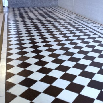
Sometimes you survey a job and you know that if you get the chance to restore it the results will be totally fantastic! This was the case with this Victorian black & white chequer tiled floor in the hallway of a large terraced Victorian house in Cardiff which dated back to around 1900 and was now looking well past its best, I know this because my family used to live in the house opposite. It was a well laid floor with no readings of dampness; I believe it’s imperative you check a floor for dampness before starting so you know what the baseline damp level is and which sealers will work with the floor.
My first action was to hoover the floor and then scrape as much debris off the surface as possible, and then as always I mixed 50/50 Tile Doctor HBU (Heavy Build-Up) remover with Pro-Clean and on this occasion because I wanted the white tiles to become really white I added the same amount of Tile Doctor Grout Clean-Up. This special recipe created a very formidable and strong cleaning solution which is what the job called for. I swept it over the whole floor letting it soak in for about ten minutes and then worked it into the floor using a scrubbing machine fitted with a coarse black pad adding more of the solution to the floor where it was drying out as I went.
The next step was to rinse the floor twice with water and extract the now filthy cleaning solution using a wet vacuum. At this point I inspected the tiles and I could see there were still a few stubborn areas with spots of paint and glue which I addressed with a decorators steam plate together with a scraper and hand held scrubbing pad.
I was now happy that the floor was clean and ready to be sealed, before sealing though it’s important to remove any trace of cleaning solution as it may contaminate the sealer so I gave the floor a thorough rinse and extracted as much of the water as possible to reduce drying times.
I left the floor to dry for 48hrs before coming back to seal the tiles taking a reader on my damp meter first to establish they had indeed dried out. To seal the floor I used eight coats of Tile Doctor Seal & Go which really works well on Victorian tiles and in this case made the whites really stand out.
The customer wanted this floor to look good because they were selling the property and were due to have an open day. The clean tiles really gave the house the wow factor and period features are so desirable these days so I don’t think it will take long to sell.
 Bluworld HOMelements
This smaller lightweight version of the original Large Nojoqui Falls wall fountain is named after the beautiful 164 foot tall Nojoqui Falls waterfall, located in central California where the Water Wonders line was originated. These water fountains are a truly unique, engaging and an elegant addition to any indoor space. Redesigned, the Medium Nojoqui Falls fountain includes long-lasting super bright white LED lights rated for over 10,000 hours of use and an ergonomic finger slide remote control to easily dim or brighten the LED lights or turn them on and off. This water fountain glistens as water sheets over the genuine multi-color Indian Rajah Slate flowing past polished river rock creating a soothing sound and beautiful focal point for any room. This fountain is engineered with Bluworld's clog-free, splash-free design and features the Water Wonders NSI™ genuine light weight Slate. Installation is super easy with the lightweight nature of the NSI™ slate panels. Simply hang on the wall per the instructions.
This water fountain can be customized with your logo. Etched and hand-painted logos start at only $395.00. Contact our sales department for more information at 1-888-499-5433.
The Medium Nojoqui Falls fountain is the perfect size to hang on just about any wall, and it will instantly raise the level of class in any living room, foyer, office or lobby. These indoor water falls come with a choice of four finishes: Standard colors; Copper Vein and Black Onyx and premium finishes; Copper Patina,or Brushed Stainless Steel.
Water Wonders NSI™ Light Weight Slate™- Water fountains made with our NSI™ Light Weight Slate use our patent pending technology which sheers a layer of genuine Indian Raja Slate and fuses it to composite material with the same chipped edge technique as slab slate. They are indistinguishable from a thick slab of slate. All the beauty is retained and the weight is reduced by over 90% making it easier to hang a wall fountain. Once it's installed, your only concerns are setting the flow rate and turning on the accent light with your handy remote.
Please note that these units are handmade and measurements may vary slightly. Texture and color of aged rustic copper, metals and slate may also vary slightly with each fountain.

 RENATA ART
Example of a mid-sized minimalist formal and open concept light wood floor and beige floor living room design in Miami with white walls, no fireplace and no tv
Sponsored
Columbus, OH

Wannemacher Interiors
Customized Award-Winning Interior Design Solutions in Franklin Cnty OH
 Katie Hutchison Studio
The new owners of this house in Harvard, Massachusetts loved its location and authentic Shaker characteristics, but weren’t fans of its curious layout. A dated first-floor full bathroom could only be accessed by going up a few steps to a landing, opening the bathroom door and then going down the same number of steps to enter the room. The dark kitchen faced the driveway to the north, rather than the bucolic backyard fields to the south. The dining space felt more like an enlarged hall and could only comfortably seat four. Upstairs, a den/office had a woefully low ceiling; the master bedroom had limited storage, and a sad full bathroom featured a cramped shower.
KHS proposed a number of changes to create an updated home where the owners could enjoy cooking, entertaining, and being connected to the outdoors from the first-floor living spaces, while also experiencing more inviting and more functional private spaces upstairs.
On the first floor, the primary change was to capture space that had been part of an upper-level screen porch and convert it to interior space. To make the interior expansion seamless, we raised the floor of the area that had been the upper-level porch, so it aligns with the main living level, and made sure there would be no soffits in the planes of the walls we removed. We also raised the floor of the remaining lower-level porch to reduce the number of steps required to circulate from it to the newly expanded interior. New patio door systems now fill the arched openings that used to be infilled with screen. The exterior interventions (which also included some new casement windows in the dining area) were designed to be subtle, while affording significant improvements on the interior. Additionally, the first-floor bathroom was reconfigured, shifting one of its walls to widen the dining space, and moving the entrance to the bathroom from the stair landing to the kitchen instead.
These changes (which involved significant structural interventions) resulted in a much more open space to accommodate a new kitchen with a view of the lush backyard and a new dining space defined by a new built-in banquette that comfortably seats six, and -- with the addition of a table extension -- up to eight people.
Upstairs in the den/office, replacing the low, board ceiling with a raised, plaster, tray ceiling that springs from above the original board-finish walls – newly painted a light color -- created a much more inviting, bright, and expansive space. Re-configuring the master bath to accommodate a larger shower and adding built-in storage cabinets in the master bedroom improved comfort and function. A new whole-house color palette rounds out the improvements.
Photos by Katie Hutchison

 CRES Builders Corp.
The Smith’s hired us to do several home improvement projects to the exterior of their house, which were inspired by two other homes in the neighborhood. To start, they were looking to add a front porch with a more prominent entrance, as well as a garage eyebrow. In addition, since they were also not happy with the color of their home’s stucco or brick, we were asked to design a new color palette which would utilize the new window color, while also reducing the focus of the stucco.
With that, since the homeowners were concerned about efficiency and making sure the house was properly maintained, they requested new windows, as well as new gutters, downspouts, and covers. Their siding was also an issue since a large portion of it had started to rot and since the rear sunroom and deck had sunk 4+ inches, structural issues were also a problem.
Our Process: In an effort to create the pleasing exterior that was requested, we reached out to an architectural team member who helped us envision a four color paint palette. We installed a rustic cedar porch post, craftsman-style shutters, and metal roof details for a very pleasing result.
As requested, we also installed all-new windows throughout the home and replaced their gutters, downspouts, and covers, as well as the siding that had rotted away.
Since their deck was improperly installed, we removed the old sun room and deck footings, and poured new ones. However, I was not comfortable fixing the issue without knowing the cause, so upon closer inspection, we discovered that water from the neighbor’s house, the driveway, and the Smith’s roof was causing drainage issues. To fix the problem, we installed two main underground drainage lines which would divert water away from the home. From there, we were able to bring both structures to level heights where they could be properly secured and as a finishing touch, we added new tile to the sunroom to give it a more rustic feel.
As a result of the drainage issues, a large section of the driveway had sunk as well, so we removed the concrete and poured it with proper underlayment, rebar, stronger concrete, and a proper pitch.
Extras: While working at the home, the owners asked us to install a new wood-burning fireplace, as well as a new front door and an exhaust fan in the master bathroom. In addition, since we overheard the homeowner say that they wanted to be able to park their car in the garage, we made a point to organize it for them so there was adequate space for a vehicle.
Result: The Smith’s had originally found us on Houzz.com and were incredibly pleased with our quality of work, as well as our ability to stay within their budget and stick to a set timeline. Not only did they give us an excellent review, but hugs were given upon our final goodbye as well. It was a great day.
 Alexandra Crafton
Photo: Alexandra Crafton © 2016 Houzz
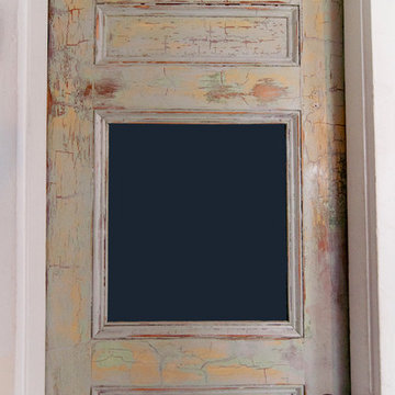
Home design - eclectic home design idea in Boston
Home design - eclectic home design idea in Boston
80