
Search results for "Reduce requests" in Home Design Ideas

 River Valley Landscapes
After - Blending contemporary forms and lush plantings, this Garden maximizes the sensory experience of the materials and planting from inside and outside the home. The garden occupies an interior courtyard framed by four interior walls. The home, designed by Architect Cliff May was built in 1948 and the following year was featured in House Beautiful Magazine. The clients list of needs and desires was brief. They wanted a space that would complement the mid century modern home and provide visual interest from inside the home. Some form of water was also requested. They had a budget of $30,000. In order to stay within their budget the clients performed the demolition of the old garden. The designer’s intent was to create a garden that would possess a clear sculptural quality and would be as visually striking from inside the home as it would be from inside the courtyard. The strategy behind the design was to use hardscape materials characterized by simple geometric forms and a planting palette that would emphasize form over color, and then to arrange the materials to achieve an interpretation of modern aesthetic.
The views from inside the homes three main living rooms present the garden as a graphic composition of space, hardscape materials and planting. Inside the courtyard the edges are defined by stone and planting. The floor is composed of rectangular slabs of Teakwood flagstone with a counterpoint of Mexican beach pebbles set within the joints and around the edges. Concrete along the edges of the Teakwood pads reduces migration of the modified stone and sand base. The contrast of the Mexican beach pebbles accentuates the pattern of the flagstone. The outside perimeter of the pebbles is contained with low profile edging. An existing catch drain was utilized for storm water runoff. A concrete block pier set on a concrete footing is covered with black stucco and provides a perch for a custom made copper bowl that circulates water into the L shaped water feature. The water features subterranean basin is constructed of pressure treated wood with a custom box liner insert. Since the Teakwood flagstone was unavailable as coping for the water feature, the designer chose Shawnee Buff stone to complement the Teakwood flagstone. The subtle sound of water spilling from the copper bowl and the reflective qualities of the water help to create an atmosphere of relaxation. The planting is composed of shades of green with white flowers in order to accentuate the graphic design. ‘Justin Brouwer’ Boxwood, ‘Sum and Substance’ Hosta, white Anemones, black bamboo and ornamental grasses contrast dramatically with the clean lines of the hardscape elements. The black bamboo is set in 30” diameter concrete containers to control the vigorous plant from spreading.
The construction of the interior courtyard space challenged the building team. They set up baffles between the front door and the door to the courtyard as well as temporary protection over the floor to allow the process to move forward without too much disturbance to the client’s lives. All of the materials were shuffled through the temporary portal.
The clients love the space and recently said that “the design is so well thought out and simple that they would never get tired of it.” The designs sculptural quality compliments the modern feel of the home and creates a sublime yet dramatic view from within the house or within the courtyard. The clients plan to purchase two black Bertoia Diamond chairs with red cushions which should perfectly integrate with the space.

 ZeroEnergy Design
This LEED Platinum certified house reflects the homeowner's desire for an exceptionally healthy and comfortable living environment, within a traditional neighborhood.
INFILL SITE. The family, who moved from another area of Wellesley, sought out this property to be within walking distance of the high school and downtown area. An existing structure on the tight lot was removed to make way for the new home. 84% of the construction waste, from both the previous structure and the new home, was diverted from a landfill. ZED designed to preserve the existing mature trees on the perimeter of the property to minimize site impacts, and to maintain the character of the neighborhood as well as privacy on the site.
EXTERIOR EXPRESSION. The street facade of the home relates to the local New England vernacular. The rear uses contemporary language, a nod to the family’s Californian roots, to incorporate a roof deck, solar panels, outdoor living space, and the backyard swimming pool. ZED’s careful planning avoided to the need to face the garage doors towards the street, a common syndrome of a narrow lot.
THOUGHTFUL SPACE. Homes with dual entries can often result in duplicate and unused spaces. In this home, the everyday and formal entry areas are one and the same; the front and garage doors share the entry program of coat closets, mudroom storage with bench for removing your shoes, and a laundry room with generous closets for the children's sporting equipment. The entry area leads directly to the living space, encompassing the kitchen, dining and sitting area areas in an L-shaped open plan arrangement. The kitchen is placed at the south-west corner of the space to allow for a strong connection to the dining, sitting and outdoor living spaces. A fire pit on the deck satisfies the family’s desire for an open flame while a sealed gas fireplace is used indoors - ZED’s preference after omitting gas burning appliances completely from an airtight home. A small study, with a window seat, is conveniently located just off of the living space. A first floor guest bedroom includes an accessible bathroom for aging visitors and can be used as a master suite to accommodate aging in place.
HEALTHY LIVING. The client requested a home that was easy to clean and would provide a respite from seasonal allergies and common contaminants that are found in many indoor spaces. ZED selected easy to clean solid surface flooring throughout, provided ample space for cleaning supplies on each floor, and designed a mechanical system with ventilation that provides a constant supply of fresh outdoor air. ZED selected durable materials, finishes, cabinetry, and casework with low or no volatile organic compounds (VOCs) and no added urea formaldehyde.
YEAR-ROUND COMFORT. The home is super insulated and air-tight, paired with high performance triple-paned windows, to ensure it is draft-free throughout the winter (even when in front of the large windows and doors). ZED designed a right-sized heating and cooling system to pair with the thermally improved building enclosure to ensure year-round comfort. The glazing on the home maximizes passive solar gains, and facilitates cross ventilation and daylighting.
ENERGY EFFICIENT. As one of the most energy efficient houses built to date in Wellesley, the home highlights a practical solution for Massachusetts. First, the building enclosure reduces the largest energy requirement for typical houses (heating). Super-insulation, exceptional air sealing, a thermally broken wall assembly, triple pane windows, and passive solar gain combine for a sizable heating load reduction. Second, within the house only efficient systems consume energy. These include an air source heat pump for heating & cooling, a heat pump hot water heater, LED lighting, energy recovery ventilation, and high efficiency appliances. Lastly, photovoltaics provide renewable energy help offset energy consumption. The result is an 89% reduction in energy use compared to a similar brand new home built to code requirements.
RESILIENT. The home will fare well in extreme weather events. During a winter power outage, heat loss will be very slow due to the super-insulated and airtight envelope– taking multiple days to drop to 60 degrees even with no heat source. An engineered drainage system, paired with careful the detailing of the foundation, will help to keep the finished basement dry. A generator will provide full operation of the all-electric house during a power outage.
OVERALL. The home is a reflection of the family goals and an expression of their values, beautifully enabling health, comfort, safety, resilience, and utility, all while respecting the planet.
ZED - Architect & Mechanical Designer
Bevilacqua Builders Inc - Contractor
Creative Land & Water Engineering - Civil Engineering
Barbara Peterson Landscape - Landscape Design
Nest & Company - Interior Furnishings
Eric Roth Photography - Photography


Find the right local pro for your project
 ZeroEnergy Design
This LEED Platinum certified house reflects the homeowner's desire for an exceptionally healthy and comfortable living environment, within a traditional neighborhood.
INFILL SITE. The family, who moved from another area of Wellesley, sought out this property to be within walking distance of the high school and downtown area. An existing structure on the tight lot was removed to make way for the new home. 84% of the construction waste, from both the previous structure and the new home, was diverted from a landfill. ZED designed to preserve the existing mature trees on the perimeter of the property to minimize site impacts, and to maintain the character of the neighborhood as well as privacy on the site.
EXTERIOR EXPRESSION. The street facade of the home relates to the local New England vernacular. The rear uses contemporary language, a nod to the family’s Californian roots, to incorporate a roof deck, solar panels, outdoor living space, and the backyard swimming pool. ZED’s careful planning avoided to the need to face the garage doors towards the street, a common syndrome of a narrow lot.
THOUGHTFUL SPACE. Homes with dual entries can often result in duplicate and unused spaces. In this home, the everyday and formal entry areas are one and the same; the front and garage doors share the entry program of coat closets, mudroom storage with bench for removing your shoes, and a laundry room with generous closets for the children's sporting equipment. The entry area leads directly to the living space, encompassing the kitchen, dining and sitting area areas in an L-shaped open plan arrangement. The kitchen is placed at the south-west corner of the space to allow for a strong connection to the dining, sitting and outdoor living spaces. A fire pit on the deck satisfies the family’s desire for an open flame while a sealed gas fireplace is used indoors - ZED’s preference after omitting gas burning appliances completely from an airtight home. A small study, with a window seat, is conveniently located just off of the living space. A first floor guest bedroom includes an accessible bathroom for aging visitors and can be used as a master suite to accommodate aging in place.
HEALTHY LIVING. The client requested a home that was easy to clean and would provide a respite from seasonal allergies and common contaminants that are found in many indoor spaces. ZED selected easy to clean solid surface flooring throughout, provided ample space for cleaning supplies on each floor, and designed a mechanical system with ventilation that provides a constant supply of fresh outdoor air. ZED selected durable materials, finishes, cabinetry, and casework with low or no volatile organic compounds (VOCs) and no added urea formaldehyde.
YEAR-ROUND COMFORT. The home is super insulated and air-tight, paired with high performance triple-paned windows, to ensure it is draft-free throughout the winter (even when in front of the large windows and doors). ZED designed a right-sized heating and cooling system to pair with the thermally improved building enclosure to ensure year-round comfort. The glazing on the home maximizes passive solar gains, and facilitates cross ventilation and daylighting.
ENERGY EFFICIENT. As one of the most energy efficient houses built to date in Wellesley, the home highlights a practical solution for Massachusetts. First, the building enclosure reduces the largest energy requirement for typical houses (heating). Super-insulation, exceptional air sealing, a thermally broken wall assembly, triple pane windows, and passive solar gain combine for a sizable heating load reduction. Second, within the house only efficient systems consume energy. These include an air source heat pump for heating & cooling, a heat pump hot water heater, LED lighting, energy recovery ventilation, and high efficiency appliances. Lastly, photovoltaics provide renewable energy help offset energy consumption. The result is an 89% reduction in energy use compared to a similar brand new home built to code requirements.
RESILIENT. The home will fare well in extreme weather events. During a winter power outage, heat loss will be very slow due to the super-insulated and airtight envelope– taking multiple days to drop to 60 degrees even with no heat source. An engineered drainage system, paired with careful the detailing of the foundation, will help to keep the finished basement dry. A generator will provide full operation of the all-electric house during a power outage.
OVERALL. The home is a reflection of the family goals and an expression of their values, beautifully enabling health, comfort, safety, resilience, and utility, all while respecting the planet.
ZED - Architect & Mechanical Designer
Bevilacqua Builders Inc - Contractor
Creative Land & Water Engineering - Civil Engineering
Barbara Peterson Landscape - Landscape Design
Nest & Company - Interior Furnishings
Eric Roth Photography - Photography


 Bella Domicile
Dale Hall Photography, LLC
Eat-in kitchen - traditional eat-in kitchen idea in Milwaukee with an undermount sink, flat-panel cabinets, medium tone wood cabinets, quartzite countertops and stainless steel appliances
Eat-in kitchen - traditional eat-in kitchen idea in Milwaukee with an undermount sink, flat-panel cabinets, medium tone wood cabinets, quartzite countertops and stainless steel appliances
 TKS Design Group
Download our free ebook, Creating the Ideal Kitchen. DOWNLOAD NOW
This family from Wheaton was ready to remodel their kitchen, dining room and powder room. The project didn’t call for any structural or space planning changes but the makeover still had a massive impact on their home. The homeowners wanted to change their dated 1990’s brown speckled granite and light maple kitchen. They liked the welcoming feeling they got from the wood and warm tones in their current kitchen, but this style clashed with their vision of a deVOL type kitchen, a London-based furniture company. Their inspiration came from the country homes of the UK that mix the warmth of traditional detail with clean lines and modern updates.
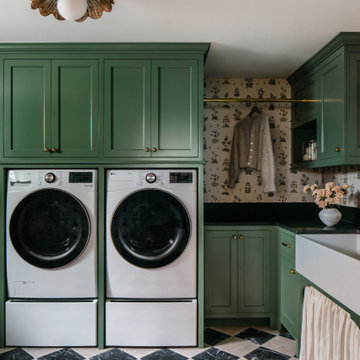
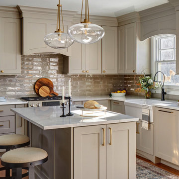
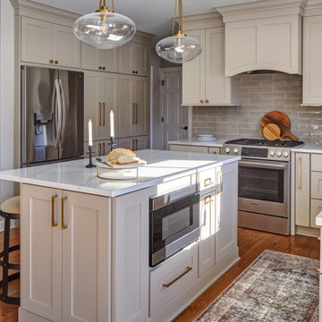
To create their vision, we started with all new framed cabinets with a modified overlay painted in beautiful, understated colors. Our clients were adamant about “no white cabinets.” Instead we used an oyster color for the perimeter and a custom color match to a specific shade of green chosen by the homeowner. The use of a simple color pallet reduces the visual noise and allows the space to feel open and welcoming. We also painted the trim above the cabinets the same color to make the cabinets look taller. The room trim was painted a bright clean white to match the ceiling.
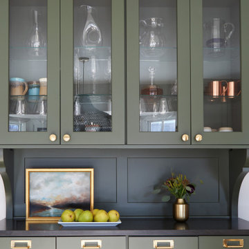
In true English fashion our clients are not coffee drinkers, but they LOVE tea. We created a tea station for them where they can prepare and serve tea. We added plenty of glass to showcase their tea mugs and adapted the cabinetry below to accommodate storage for their tea items. Function is also key for the English kitchen and the homeowners. They requested a deep farmhouse sink and a cabinet devoted to their heavy mixer because they bake a lot. We then got rid of the stovetop on the island and wall oven and replaced both of them with a range located against the far wall. This gives them plenty of space on the island to roll out dough and prepare any number of baked goods. We then removed the bifold pantry doors and created custom built-ins with plenty of usable storage for all their cooking and baking needs.
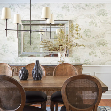
The client wanted a big change to the dining room but still wanted to use their own furniture and rug. We installed a toile-like wallpaper on the top half of the room and supported it with white wainscot paneling. We also changed out the light fixture, showing us once again that small changes can have a big impact.
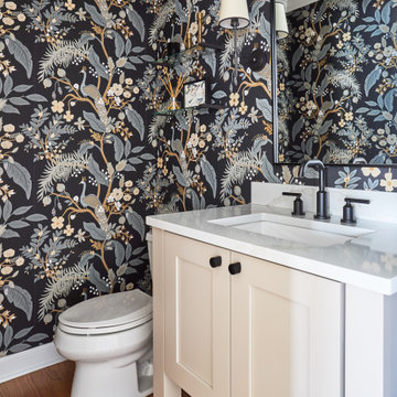
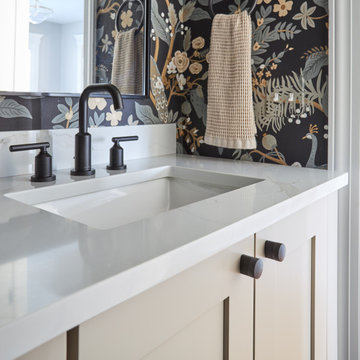
As the final touch, we also re-did the powder room to be in line with the rest of the first floor. We had the new vanity painted in the same oyster color as the kitchen cabinets and then covered the walls in a whimsical patterned wallpaper. Although the homeowners like subtle neutral colors they were willing to go a bit bold in the powder room for something unexpected. For more design inspiration go to: www.kitchenstudio-ge.com
 TKS Design Group
Download our free ebook, Creating the Ideal Kitchen. DOWNLOAD NOW
This family from Wheaton was ready to remodel their kitchen, dining room and powder room. The project didn’t call for any structural or space planning changes but the makeover still had a massive impact on their home. The homeowners wanted to change their dated 1990’s brown speckled granite and light maple kitchen. They liked the welcoming feeling they got from the wood and warm tones in their current kitchen, but this style clashed with their vision of a deVOL type kitchen, a London-based furniture company. Their inspiration came from the country homes of the UK that mix the warmth of traditional detail with clean lines and modern updates.
To create their vision, we started with all new framed cabinets with a modified overlay painted in beautiful, understated colors. Our clients were adamant about “no white cabinets.” Instead we used an oyster color for the perimeter and a custom color match to a specific shade of green chosen by the homeowner. The use of a simple color pallet reduces the visual noise and allows the space to feel open and welcoming. We also painted the trim above the cabinets the same color to make the cabinets look taller. The room trim was painted a bright clean white to match the ceiling.
In true English fashion our clients are not coffee drinkers, but they LOVE tea. We created a tea station for them where they can prepare and serve tea. We added plenty of glass to showcase their tea mugs and adapted the cabinetry below to accommodate storage for their tea items. Function is also key for the English kitchen and the homeowners. They requested a deep farmhouse sink and a cabinet devoted to their heavy mixer because they bake a lot. We then got rid of the stovetop on the island and wall oven and replaced both of them with a range located against the far wall. This gives them plenty of space on the island to roll out dough and prepare any number of baked goods. We then removed the bifold pantry doors and created custom built-ins with plenty of usable storage for all their cooking and baking needs.
The client wanted a big change to the dining room but still wanted to use their own furniture and rug. We installed a toile-like wallpaper on the top half of the room and supported it with white wainscot paneling. We also changed out the light fixture, showing us once again that small changes can have a big impact.
As the final touch, we also re-did the powder room to be in line with the rest of the first floor. We had the new vanity painted in the same oyster color as the kitchen cabinets and then covered the walls in a whimsical patterned wallpaper. Although the homeowners like subtle neutral colors they were willing to go a bit bold in the powder room for something unexpected. For more design inspiration go to: www.kitchenstudio-ge.com

 Chapman Design Group, Inc.
This rustic style home on Hartwell Lake was designed and built for the owners to enjoy with family and friends during their active weekend lifestyle. The home was built on a narrow, deep lot that was semi-level on the roadside and steep on the lakeside. The back half of the lot heavily wooded with mature oak and poplar trees reducing the harsh sun’s heat gain on the home.
The exterior utilizes fiber cement cedar shake and lap siding complimented by deep brown colors for the windows, soffit, trim and the large square columns. A nice balance of natural earth toned stacked stone rounds out the exterior materials completing the rustic casual lake living.
The home 5400 SF is designed and built on thee levels each having a primary focus. The main level creates primary daily living for the owners. This level features an open plan with an entry, stair, dining, kitchen and living areas leading to a large lakeside screened porch. A master suite is privately tucked off its own hallway and allowing it to enjoy the lakeside as well with its own private deck. On the opposite side are two bedrooms, a study and a shared bathroom for each to utilize. An open carport for two vehicles was created with the motor court and connects to the mudroom/utility room giving the owners direct entry into their home.
The upper level is for the grand children with an oversized bedroom, bathroom and loft area for play.
The lower level is the considered the party level. Its primary feature is an elevated stage for the owner’s band opened to a large seating area, dining and kitchen for viewing and listening with direct access to another screened porch. Flanking each side is a theater and two additional bedrooms and bathrooms.
Energy Efficient features include:
• The majority of the lower level sunk into the site below grade
• 6” thick walls utilizing advanced framing techniques
• Foil covered roof sheathing
• Extensive use of blown in cellulous
• All windows & doors are double paned low E argon filed glass
• Tank-less water heaters
• Three separate high efficiency HVAC units with programmable thermostats and a fresh air ERV.
Lastly the owner requested we make every effort to sound proof the home. Many materials and techniques gave a duel purpose and added to the energy efficiency.
These items include:
• 2x6 walls with staggered studs
• Extensive use if rock wool acoustic batting
• Tempered glass in all exterior doors and windows
• ¼ thick Mass Loaded Vinyl (MLV) was installed on the top and bottom of the floor trusses and on all lower level walls.
The combination of the design and detailing utilizing these specific materials enabled us to achieve a 5 Star Plus Energy Star Certification with a HERS Index Score of 50. This home received a the 2015 Pinnacle Award from the SC Home Builders Association for the “Best Achievement in Energy Efficiency” sponsored by the SC Department Commerce.

 TBS Construction Inc.
Working on this beautiful Los Altos residence has been a wonderful opportunity for our team. Located in an upscale neighborhood young owner’s of this house wanted to upgrade the whole house design which included major kitchen and master bathroom remodel.
The combination of a simple white cabinetry with the clean lined wood, contemporary countertops and glass tile create a perfect modern style which is what customers were looking for.
 Bella Domicile
Dale Hall Photography, LLC
Example of a classic eat-in kitchen design in Milwaukee with an undermount sink, recessed-panel cabinets, medium tone wood cabinets, quartzite countertops, beige backsplash, ceramic backsplash and stainless steel appliances
Example of a classic eat-in kitchen design in Milwaukee with an undermount sink, recessed-panel cabinets, medium tone wood cabinets, quartzite countertops, beige backsplash, ceramic backsplash and stainless steel appliances
 TKS Design Group
Download our free ebook, Creating the Ideal Kitchen. DOWNLOAD NOW
This family from Wheaton was ready to remodel their kitchen, dining room and powder room. The project didn’t call for any structural or space planning changes but the makeover still had a massive impact on their home. The homeowners wanted to change their dated 1990’s brown speckled granite and light maple kitchen. They liked the welcoming feeling they got from the wood and warm tones in their current kitchen, but this style clashed with their vision of a deVOL type kitchen, a London-based furniture company. Their inspiration came from the country homes of the UK that mix the warmth of traditional detail with clean lines and modern updates.
To create their vision, we started with all new framed cabinets with a modified overlay painted in beautiful, understated colors. Our clients were adamant about “no white cabinets.” Instead we used an oyster color for the perimeter and a custom color match to a specific shade of green chosen by the homeowner. The use of a simple color pallet reduces the visual noise and allows the space to feel open and welcoming. We also painted the trim above the cabinets the same color to make the cabinets look taller. The room trim was painted a bright clean white to match the ceiling.
In true English fashion our clients are not coffee drinkers, but they LOVE tea. We created a tea station for them where they can prepare and serve tea. We added plenty of glass to showcase their tea mugs and adapted the cabinetry below to accommodate storage for their tea items. Function is also key for the English kitchen and the homeowners. They requested a deep farmhouse sink and a cabinet devoted to their heavy mixer because they bake a lot. We then got rid of the stovetop on the island and wall oven and replaced both of them with a range located against the far wall. This gives them plenty of space on the island to roll out dough and prepare any number of baked goods. We then removed the bifold pantry doors and created custom built-ins with plenty of usable storage for all their cooking and baking needs.
The client wanted a big change to the dining room but still wanted to use their own furniture and rug. We installed a toile-like wallpaper on the top half of the room and supported it with white wainscot paneling. We also changed out the light fixture, showing us once again that small changes can have a big impact.
As the final touch, we also re-did the powder room to be in line with the rest of the first floor. We had the new vanity painted in the same oyster color as the kitchen cabinets and then covered the walls in a whimsical patterned wallpaper. Although the homeowners like subtle neutral colors they were willing to go a bit bold in the powder room for something unexpected. For more design inspiration go to: www.kitchenstudio-ge.com
 TKS Design Group
Download our free ebook, Creating the Ideal Kitchen. DOWNLOAD NOW
This family from Wheaton was ready to remodel their kitchen, dining room and powder room. The project didn’t call for any structural or space planning changes but the makeover still had a massive impact on their home. The homeowners wanted to change their dated 1990’s brown speckled granite and light maple kitchen. They liked the welcoming feeling they got from the wood and warm tones in their current kitchen, but this style clashed with their vision of a deVOL type kitchen, a London-based furniture company. Their inspiration came from the country homes of the UK that mix the warmth of traditional detail with clean lines and modern updates.
To create their vision, we started with all new framed cabinets with a modified overlay painted in beautiful, understated colors. Our clients were adamant about “no white cabinets.” Instead we used an oyster color for the perimeter and a custom color match to a specific shade of green chosen by the homeowner. The use of a simple color pallet reduces the visual noise and allows the space to feel open and welcoming. We also painted the trim above the cabinets the same color to make the cabinets look taller. The room trim was painted a bright clean white to match the ceiling.
In true English fashion our clients are not coffee drinkers, but they LOVE tea. We created a tea station for them where they can prepare and serve tea. We added plenty of glass to showcase their tea mugs and adapted the cabinetry below to accommodate storage for their tea items. Function is also key for the English kitchen and the homeowners. They requested a deep farmhouse sink and a cabinet devoted to their heavy mixer because they bake a lot. We then got rid of the stovetop on the island and wall oven and replaced both of them with a range located against the far wall. This gives them plenty of space on the island to roll out dough and prepare any number of baked goods. We then removed the bifold pantry doors and created custom built-ins with plenty of usable storage for all their cooking and baking needs.
The client wanted a big change to the dining room but still wanted to use their own furniture and rug. We installed a toile-like wallpaper on the top half of the room and supported it with white wainscot paneling. We also changed out the light fixture, showing us once again that small changes can have a big impact.
As the final touch, we also re-did the powder room to be in line with the rest of the first floor. We had the new vanity painted in the same oyster color as the kitchen cabinets and then covered the walls in a whimsical patterned wallpaper. Although the homeowners like subtle neutral colors they were willing to go a bit bold in the powder room for something unexpected. For more design inspiration go to: www.kitchenstudio-ge.com

 Total System Service
As a manager of a building or property, you quickly learn the art of mediation. One minute you may be working with a vendor to keep the building’s operating system running efficient and smooth; the next moment you may be calming a tenant down after finding the change in the system disrupted his office’s workflow. Give and take; it’s the only way to make sure every day runs perfectly.
Overall, you have two goals to strive for in everything you do.
1. Keep the building running properly, upgrading systems as appropriate, and striving to do all you can on a pre-established budget.
2. Keep the building occupants happy, with as little disruption as possible.
While some changes are minor, barely registering on a building occupant’s mind, with HVAC challenges, that’s rarely the case. If a HVAC contractor is replacing an air handler, for instance, and disconnects one and moves to the next unit, it may cause major disruptions to sensitive areas of a building. And if the occupant wasn’t prepared for the disruption, you can have a mighty unhappy customer on your hand.
Anytime you are working on HVAC projects throughout your building, there are strategies you can put into place to keep things running smooth.
Communicate with occupants
Communication is key to any good relationship, and as a property manager, this rule is a great place to start. If you will be working with the HVAC equipment, block out the timeframe for work to be done, and understand the potential consequences of the process. Then communicate this process with every point of contact you have throughout the building. The more detail you can provide, the less surprises you’ll have throughout the process. You can also work with your building’s occupants before the process begins, finding out if there are better timeframes than others.
Establish a realistic schedule
As a property manager, its easy to provide your expectations for the HVAC project at hand, and request that the proposal be written in such a way that work is completed on your timeframe. Unfortunately, many contractors want your business and will agree to anything upfront in order to win the bid, knowing full well the work will take longer than specified. Instead of projecting your timeframes into the proposal process, ask for HVAC project bids to establish realistic schedules of how long the process will take, and what areas of your property will be most effected throughout the schedule. This will help you avoid crises between you and the contractor, and you and your tenants.
Plan for the whole system
If one small piece of your HVAC system is weak, its easy to fix that one small piece. But how will that impact your overall system? Will it cause weak spots in different parts of the building – maybe a corner office will have reduced air flow, and therefore be colder in the winter and warmer in the summer? When retrofitting new pieces with older existing systems, its easy to reduce the efficiency of your entire system. Before agreeing to certain repairs, make sure you understand how it will impact your entire system overall. An easy way of handling this problem is by working with the same HVAC contractor again and again, He will understand your system’s potential, and know when to make repairs, and when to replace.
Have points of contact available for immediate assistance
In many cases, problems arise because connections can’t be made. Can the HVAC contractor get a hold or you or another person that can make decisions at a moments notice if a problem arises? Do you have access to decision makers throughout the building that may be impacted by this change? Many projects have been put on hold simply because a person in authority can’t be found to give the go-ahead to move forward. If you have access to these people during the time of the project, you’ll be able to complete the project in record time.
Test
Finally, if you can test things in stages, or test when the potential for problems is the smallest, you reduce the chances of bigger emergency issues falling into your lap. If you’ll be installing a new terminal unit, can you make the switch on a Saturday morning when the building is largely unoccupied? If you’re replacing a large system, can you replace and test in phases so the entire project isn’t released at once?
Most issues can be avoided with just a little strategy from the beginning. If you’ve never had a HVAC maintenance team to help you stay on track with your building’s heating and cooling, now may be the time to find out how easy a team approach makes the process.

 Dianne Davant and Associates
Master Bedroom with Red Bed Frame and custom drapery and bedding.
Bedroom - traditional master light wood floor bedroom idea in Charlotte
Bedroom - traditional master light wood floor bedroom idea in Charlotte
 TKS Design Group
Download our free ebook, Creating the Ideal Kitchen. DOWNLOAD NOW
This family from Wheaton was ready to remodel their kitchen, dining room and powder room. The project didn’t call for any structural or space planning changes but the makeover still had a massive impact on their home. The homeowners wanted to change their dated 1990’s brown speckled granite and light maple kitchen. They liked the welcoming feeling they got from the wood and warm tones in their current kitchen, but this style clashed with their vision of a deVOL type kitchen, a London-based furniture company. Their inspiration came from the country homes of the UK that mix the warmth of traditional detail with clean lines and modern updates.
To create their vision, we started with all new framed cabinets with a modified overlay painted in beautiful, understated colors. Our clients were adamant about “no white cabinets.” Instead we used an oyster color for the perimeter and a custom color match to a specific shade of green chosen by the homeowner. The use of a simple color pallet reduces the visual noise and allows the space to feel open and welcoming. We also painted the trim above the cabinets the same color to make the cabinets look taller. The room trim was painted a bright clean white to match the ceiling.
In true English fashion our clients are not coffee drinkers, but they LOVE tea. We created a tea station for them where they can prepare and serve tea. We added plenty of glass to showcase their tea mugs and adapted the cabinetry below to accommodate storage for their tea items. Function is also key for the English kitchen and the homeowners. They requested a deep farmhouse sink and a cabinet devoted to their heavy mixer because they bake a lot. We then got rid of the stovetop on the island and wall oven and replaced both of them with a range located against the far wall. This gives them plenty of space on the island to roll out dough and prepare any number of baked goods. We then removed the bifold pantry doors and created custom built-ins with plenty of usable storage for all their cooking and baking needs.
The client wanted a big change to the dining room but still wanted to use their own furniture and rug. We installed a toile-like wallpaper on the top half of the room and supported it with white wainscot paneling. We also changed out the light fixture, showing us once again that small changes can have a big impact.
As the final touch, we also re-did the powder room to be in line with the rest of the first floor. We had the new vanity painted in the same oyster color as the kitchen cabinets and then covered the walls in a whimsical patterned wallpaper. Although the homeowners like subtle neutral colors they were willing to go a bit bold in the powder room for something unexpected. For more design inspiration go to: www.kitchenstudio-ge.com
 TKS Design Group
Download our free ebook, Creating the Ideal Kitchen. DOWNLOAD NOW
This family from Wheaton was ready to remodel their kitchen, dining room and powder room. The project didn’t call for any structural or space planning changes but the makeover still had a massive impact on their home. The homeowners wanted to change their dated 1990’s brown speckled granite and light maple kitchen. They liked the welcoming feeling they got from the wood and warm tones in their current kitchen, but this style clashed with their vision of a deVOL type kitchen, a London-based furniture company. Their inspiration came from the country homes of the UK that mix the warmth of traditional detail with clean lines and modern updates.
To create their vision, we started with all new framed cabinets with a modified overlay painted in beautiful, understated colors. Our clients were adamant about “no white cabinets.” Instead we used an oyster color for the perimeter and a custom color match to a specific shade of green chosen by the homeowner. The use of a simple color pallet reduces the visual noise and allows the space to feel open and welcoming. We also painted the trim above the cabinets the same color to make the cabinets look taller. The room trim was painted a bright clean white to match the ceiling.
In true English fashion our clients are not coffee drinkers, but they LOVE tea. We created a tea station for them where they can prepare and serve tea. We added plenty of glass to showcase their tea mugs and adapted the cabinetry below to accommodate storage for their tea items. Function is also key for the English kitchen and the homeowners. They requested a deep farmhouse sink and a cabinet devoted to their heavy mixer because they bake a lot. We then got rid of the stovetop on the island and wall oven and replaced both of them with a range located against the far wall. This gives them plenty of space on the island to roll out dough and prepare any number of baked goods. We then removed the bifold pantry doors and created custom built-ins with plenty of usable storage for all their cooking and baking needs.
The client wanted a big change to the dining room but still wanted to use their own furniture and rug. We installed a toile-like wallpaper on the top half of the room and supported it with white wainscot paneling. We also changed out the light fixture, showing us once again that small changes can have a big impact.
As the final touch, we also re-did the powder room to be in line with the rest of the first floor. We had the new vanity painted in the same oyster color as the kitchen cabinets and then covered the walls in a whimsical patterned wallpaper. Although the homeowners like subtle neutral colors they were willing to go a bit bold in the powder room for something unexpected. For more design inspiration go to: www.kitchenstudio-ge.com
 River Valley Landscapes
Blending contemporary forms and lush plantings, this Garden maximizes the sensory experience of the materials and planting from inside and outside the home. The garden occupies an interior courtyard framed by four interior walls. The home, designed by Architect Cliff May was built in 1948 and the following year was featured in House Beautiful Magazine. The clients list of needs and desires was brief. They wanted a space that would complement the mid century modern home and provide visual interest from inside the home. Some form of water was also requested. They had a budget of $30,000. In order to stay within their budget the clients performed the demolition of the old garden. The designer’s intent was to create a garden that would possess a clear sculptural quality and would be as visually striking from inside the home as it would be from inside the courtyard. The strategy behind the design was to use hardscape materials characterized by simple geometric forms and a planting palette that would emphasize form over color, and then to arrange the materials to achieve an interpretation of modern aesthetic.
The views from inside the homes three main living rooms present the garden as a graphic composition of space, hardscape materials and planting. Inside the courtyard the edges are defined by stone and planting. The floor is composed of rectangular slabs of Teakwood flagstone with a counterpoint of Mexican beach pebbles set within the joints and around the edges. Concrete along the edges of the Teakwood pads reduces migration of the modified stone and sand base. The contrast of the Mexican beach pebbles accentuates the pattern of the flagstone. The outside perimeter of the pebbles is contained with low profile edging. An existing catch drain was utilized for storm water runoff. A concrete block pier set on a concrete footing is covered with black stucco and provides a perch for a custom made copper bowl that circulates water into the L shaped water feature. The water features subterranean basin is constructed of pressure treated wood with a custom box liner insert. Since the Teakwood flagstone was unavailable as coping for the water feature, the designer chose Shawnee Buff stone to complement the Teakwood flagstone. The subtle sound of water spilling from the copper bowl and the reflective qualities of the water help to create an atmosphere of relaxation. The planting is composed of shades of green with white flowers in order to accentuate the graphic design. ‘Justin Brouwer’ Boxwood, ‘Sum and Substance’ Hosta, white Anemones, black bamboo and ornamental grasses contrast dramatically with the clean lines of the hardscape elements. The black bamboo is set in 30” diameter concrete containers to control the vigorous plant from spreading.
The construction of the interior courtyard space challenged the building team. They set up baffles between the front door and the door to the courtyard as well as temporary protection over the floor to allow the process to move forward without too much disturbance to the client’s lives. All of the materials were shuffled through the temporary portal.
The clients love the space and recently said that “the design is so well thought out and simple that they would never get tired of it.” The designs sculptural quality compliments the modern feel of the home and creates a sublime yet dramatic view from within the house or within the courtyard. The clients plan to purchase two black Bertoia Diamond chairs with red cushions which should perfectly integrate with the space.
 Bella Domicile
Dale Hall Photography, LLC
Elegant eat-in kitchen photo in Milwaukee with an undermount sink, recessed-panel cabinets, medium tone wood cabinets, quartzite countertops, beige backsplash, ceramic backsplash and stainless steel appliances
Elegant eat-in kitchen photo in Milwaukee with an undermount sink, recessed-panel cabinets, medium tone wood cabinets, quartzite countertops, beige backsplash, ceramic backsplash and stainless steel appliances

 McCabe By Design LLC
Photo: A Kitchen That Works LLC
Example of a mid-sized transitional l-shaped cork floor and beige floor kitchen design in Seattle with a farmhouse sink, shaker cabinets, dark wood cabinets, quartz countertops, white backsplash, stone slab backsplash, stainless steel appliances, an island and white countertops
Example of a mid-sized transitional l-shaped cork floor and beige floor kitchen design in Seattle with a farmhouse sink, shaker cabinets, dark wood cabinets, quartz countertops, white backsplash, stone slab backsplash, stainless steel appliances, an island and white countertops
8