
Search results for "Referenced" in Home Design Ideas
 Platinum Poolcare
Request Free Quote
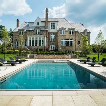
This Swimming Pool and Hot Tub in Burr Ridge IL measures 20'0" x 40'0", and the spa which is inside the pool measures 7'0" x 8'0". Both bodies of water are covered by an automatic pool safety cover. The sunshelf measures 5'0" x 11'0" and has connected steps for entry and exit. The coping is Valders Wisconsin limestone as well as the decking. The pool interior is French Gray. Photos by Larry Huene
 Eldorado Stone
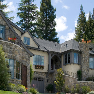
The design goal of this home was to create an old English cottage. Francis Garcia of Francis Garcia Architect studied the architecture of aged English cottages through photos as well as referenced various homes in Carmel, CA. In search of a stone to complement the client’s stylistic goals, Eldorado Stone’s York Limestone proved to be exactly what they were looking for. The sense of age and authenticity in conjunction with a consistent color palette and profile cut produced the exact feel Garcia was hoping to recreate. Having experienced a great deal of success with the installation, both Francis Garcia and Ken Blaise of Blaise Construction & Development receive a great deal of requests from people inquiring about the kind of stone that brought such a strong sense of authenticity to the client’s home.
Eldorado Stone Profile Featured: York Limestone
Architect & Photographer: Francis Garcia of Francis Garcia Architect
Phone: (925) 984 9983
Website: www.francisgarciaarchitect.com
Builder: Ken Blaise of Blaise Construction & Development
Phone: (925) 820-4737
Website: www.blaise-construction.com
 J&J Carpet One Floor & Home
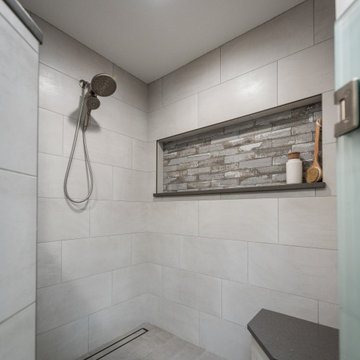
Shower Walls: Iron, Glacier 12x24 porcelain tile from Happy Floors.
Shower Seat: Iron, Glacier 12x24 porcelain tile from Happy Floors.
Shower Niche & Wall: Urban Bricks in Loft Gray from Soho Studio Corp.
Shower Floor: Iron, Pearl 12x24 porcelain tile from Happy Floors, with a 40" Tile Insert Linear Drain.
Shower Curb & Sills: Quartz from Pompeii in Sparkle Grey with an easted edge.
Find the right local pro for your project
 Brooks + Scarpa Architects
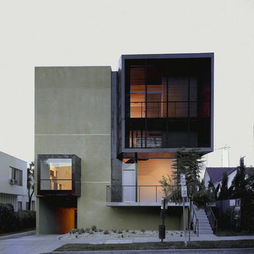
Located in a neighborhood characterized by traditional bungalow style single-family residences, Orange Grove is a new landmark for the City of West Hollywood. The building is sensitively designed and compatible with the neighborhood, but differs in material palette and scale from its neighbors. Referencing architectural conventions of modernism rather than the pitched roof forms of traditional domesticity, the project presents a characteristic that is consistent with the eclectic and often unconventional demographic of West Hollywood. Distinct from neighboring structures, the building creates a strong relationship to the street by virtue of its large amount of highly usable balcony area in the front façade.
While there are dramatic and larger scale elements that define the building, it is also broken down into comprehensible human scale parts, and is itself broken down into two different buildings. Orange Grove displays a similar kind of iconoclasm as the Schindler House, an icon of California modernism, located a short distance away. Like the Schindler House, the conventional architectural elements of windows and porches become part of an abstract sculptural ensemble. At the Schindler House, windows are found in the gaps between structural concrete wall panels. At Orange Grove, windows are inserted in gaps between different sections of the building.
The design of Orange Grove is generated by a subtle balance of tensions. Building volumes and the placement of windows, doors and balconies are not static but rather constitute an active three-dimensional composition in motion. Each piece of the building is a strong and clearly defined shape, such as the corrugated metal surround that encloses the second story balcony in the east and north facades. Another example of this clear delineation is the use of two square profile balcony surrounds in the front façade that set up a dialogue between them—one is small, the other large, one is open at the front, the other is veiled with stainless steel slats. At the same time each balcony is balanced and related to other elements in the building, the smaller one to the driveway gate below and the other to the roll-up door and first floor balcony. Each building element is intended to read as an abstract form in itself—such as a window becoming a slit or windows becoming a framed box, while also becoming part of a larger whole. Although this building may not mirror the status quo it answers to the desires of consumers in a burgeoning niche market who want large, simple interior volumes of space, and a paradigm based on space, light and industrial materials of the loft rather than the bungalow.

 HAVEN design+building llc
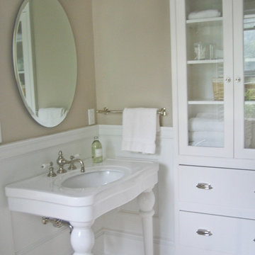
For this 1890s historic home in Burlington’s hill section, homeowners needed to update a master bath last renovated in the 1950s. The goal was in incorporate modern, state-of-the-art amenities while restoring the style of the original architecture. Working within the confines of the room’s modest size, we were able to carve out space for a double walk-in shower, an air jetted chromatherapy tub with a custom mahogany deck and a charming vintage style console sink. The custom cabinetry, paneled wainscoting, doors and trim we designer for this project replicated the period millwork of the home, while the polished nickel fittings provided state-of-the-art function with vintage style. Above the tub we added an interior stained glass window that referenced other such period windows in the home.
 KD Landscape
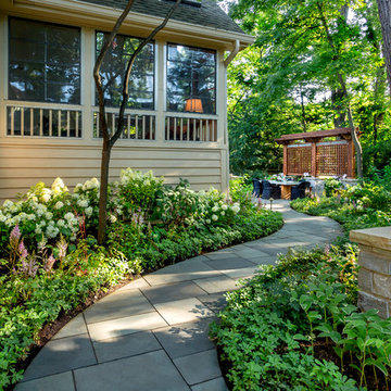
Bluestone is a timeless and versatile sandstone product, quarried mostly in Pennsylvania. Bluestone blends subtly with a wide assortment of other materials as evidenced here in combination with limestone and cedar. This is thermal bluestone in a range commonly referenced as blue/blue.
 Signature Designs Kitchen | Bath | Interiors
Fun built in patio offers an overflow room where you can sit and read a book or play a game of cards.
Mid-sized transitional side yard patio photo in Denver with a roof extension
Mid-sized transitional side yard patio photo in Denver with a roof extension
 Charleston Building and Development
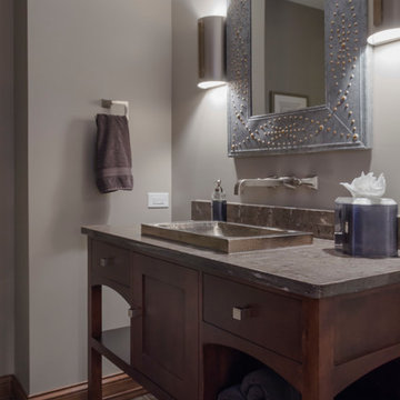
Example of a small transitional gray tile and porcelain tile porcelain tile powder room design in Chicago with furniture-like cabinets, medium tone wood cabinets, gray walls, a drop-in sink, quartz countertops and a two-piece toilet
 Francesca Owings Interior Design
Exterior
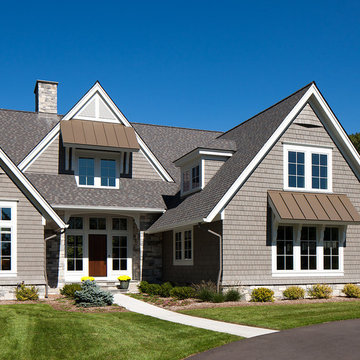
Inspiration for a large transitional exterior home remodel in Grand Rapids
Inspiration for a large transitional exterior home remodel in Grand Rapids
 Wiebenson & Dorman Architects PC
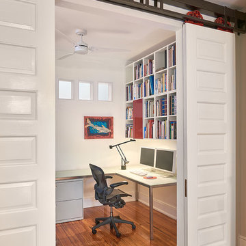
Referencing the wife and 3 daughters for which the house was named, four distinct but cohesive design criteria were considered for the 2016 renovation of the circa 1890, three story masonry rowhouse:
1. To keep the significant original elements – such as
the grand stair and Lincrusta wainscoting.
2. To repurpose original elements such as the former
kitchen pocket doors fitted to their new location on
the second floor with custom track.
3. To improve original elements - such as the new "sky
deck" with its bright green steel frame, a new
kitchen and modern baths.
4. To insert unifying elements such as the 3 wall
benches, wall openings and sculptural ceilings.
Photographer Jesse Gerard - Hoachlander Davis Photography
 The Mine
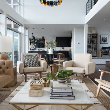
Living room - large 1950s open concept medium tone wood floor living room idea in Seattle with beige walls, a standard fireplace, a wood fireplace surround and no tv
 Nar Design Group
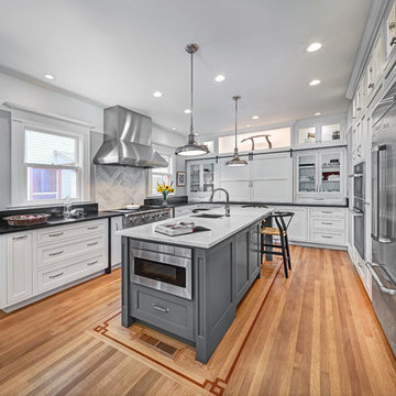
Built in 1915, this classic craftsman style home is located in the Capitol Mansions Historic District. When the time came to remodel, the homeowners wanted to continue to celebrate its history by keeping with the craftsman style but elevating the kitchen’s function to include the latest in quality cabinetry and modern appliances.
The new spacious kitchen (and adjacent walk-in pantry) provides the perfect environment for a couple who loves to cook and entertain. White perimeter cabinets and dark soapstone counters make a timeless and classic color palette. Designed to have a more furniture-like feel, the large island has seating on one end and is finished in an historically inspired warm grey paint color. The vertical stone “legs” on either side of the gas range-top highlight the cooking area and add custom detail within the long run of cabinets. Wide barn doors designed to match the cabinet inset door style slide open to reveal a spacious appliance garage, and close when the kitchen goes into entertainer mode. Finishing touches such as the brushed nickel pendants add period style over the island.
A bookcase anchors the corner between the kitchen and breakfast area providing convenient access for frequently referenced cookbooks from either location.
Just around the corner from the kitchen, a large walk-in butler’s pantry in cheerful yellow provides even more counter space and storage ability. Complete with an undercounter wine refrigerator, a deep prep sink, and upper storage at a glance, it’s any chef’s happy place.
Photo credit: Fred Donham of Photographerlink
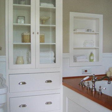 HAVEN design+building llc
For this 1890s historic home in Burlington’s hill section, homeowners needed to update a master bath last renovated in the 1950s. The goal was in incorporate modern, state-of-the-art amenities while restoring the style of the original architecture. Working within the confines of the room’s modest size, we were able to carve out space for a double walk-in shower, an air jetted chromatherapy tub with a custom mahogany deck and a charming vintage style console sink. The custom cabinetry, paneled wainscoting, doors and trim we designer for this project replicated the period millwork of the home, while the polished nickel fittings provided state-of-the-art function with vintage style. Above the tub we added an interior stained glass window that referenced other such period windows in the home.
 User
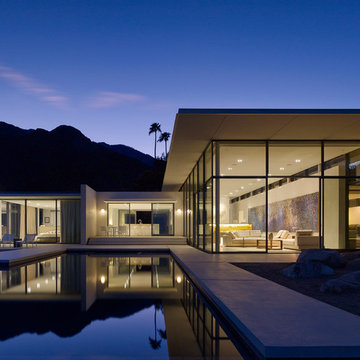
UserAnchored by the homeowner’s 42-foot-long painting, the interiors of this Palm Springs residence were designed to showcase the owner’s art collection, and create functional spaces for daily living that can be easily adapted for large social gatherings.
Referencing the environment and architecture in both form and material, the finishes and custom furnishings bring the interior to life. Alluding to the roofs that suspend over the building, the sofas seem to hover above the carpets while the knife-edge table top appears to float above a metal base. Bleached and cerused wood mimic the “desert effect” that would naturally occur in this environment, while the textiles on the sofa are the same shade as the rocks of the landscape.
Monolithic concrete floors connect all of the spaces while concealing mechanical systems, and stone thresholds signal vertical level changes and exterior transitions. Large wall masses provide the optimal backdrop for the homeowner’s oversized art. The wall structures ground the interior, while the opposing expanses of glass frame the desert views. The location and use of operable doors and windows allows the house to naturally ventilate, reducing cooling loads. The furnishings create spaces in an architectural fashion.
Designed and fabricated for flexibility, the pieces easily accommodate the owners’ large social gatherings. The dining table can be split into two and the sofas can be pushed out along the walls, opening the center of the space to entertain. The design of the interior spaces and furnishings seamlessly integrates the setting, architecture, artwork and spaces into a cohesive whole.
 Donald Lococo Architects
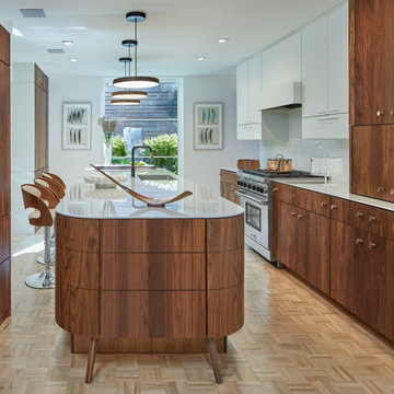
The kitchen was designed two years ago and was then erased and redesigned when the world became a different place a year later. As everyone attempted to flatten the curve, our goal in this regard was to create a kitchen that looked forward to a sharp curve down and of a happier time To that promise for happier times, the redesign, a goal was to make the kitchen brighter and more optimistic. This was done by using simple, primary shapes and circular pendants and emphasizing them in contrast, adding a playful countenance. The selection of a dynamic grain of figured walnut also contributes as this once-living material and its sinuous grain adds motion, rhythm, and scale.
Proud of their 1970s home, one challenge of the design was to balance a 1970's feel and stay current. However, many ‘70s references looked and felt outdated. The first step was a changed mindset. Just like the return of the ‘40s bath and the retro movement a few years ago, every era returns in some way. Chronologically, the '70s will soon be here. Our design looked to era-specific furniture and materials of the decade. Figured walnut was so pervasive in the era: this motif was used on car exteriors such as the 1970 Town and Country Station Wagon, which debuted the same year the existing home was built. We also looked at furniture specific to the decade. The console stereo is referenced not only by high legs on the island but also by the knurled metal cabinet knobs reminiscent of often-used stereo dials. Knurled metalwork is also used on the kitchen faucet. The design references the second piece of '70s furniture in our modern TV tray, which is angled to face the television in the family room. Its round pencil and mug holder cutouts follow the design of walnut consoles and dashboard of the station wagon and other elements of the time.
 Funda-Mantels
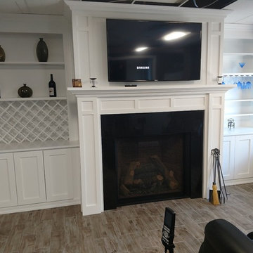
Mid-sized arts and crafts porcelain tile and brown floor family room photo in New York with gray walls, a standard fireplace, a wood fireplace surround and a wall-mounted tv
 Axis Mundi
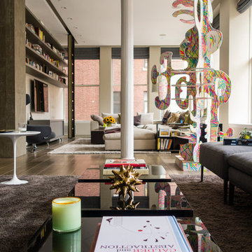
This NoHo apartment, in a landmarked circa 1870 building designed by Stephen Decatur Hatch and converted to lofts in 1987, had been interestingly renovated by a rock musician before being purchased by a young hedge fund manager and his gallery director girlfriend. Naturally, the couple brought to the project their collection of painting, photography and sculpture, mostly by young emerging artists. Axis Mundi accommodated these pieces within a neutral palette accented with occasional flashes of bright color that referenced the various artworks. Major furniture pieces – a sectional in the library, a 12-foot-long dining table–along with a rich blend of textures such as leather, linen, fur and warm woods, helped bring the sprawling dimensions of the loft down to human scale.
Size: 3,400 sf
Design Team: John Beckmann and Nick Messerlian
Architect: Nemaworkshop
Photography: Durston Saylor, and Mark Roskams
© Axis Mundi Design LLC
 Ocean Bottega
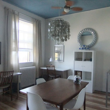
He said modern, She said antiques. He said I want style, She said I want it to look like it didn’t come out of a big box store. They both said they wanted a meeting place where clients could come, feel comfortable and conduct their affairs with a successful boutique business and feel great about it.
I said can do!
I took our inspiration from the written word and it’s relationship with progressive thinking and technology as reflected by their business model. While the overall essence is an eclectic mix of modern I threw in some retro, vintage and teak for a cultured and timeless feeling. My favourite features include the ten foot blue ceiling referencing the company’s colour brand and the wood floor with it’s banded detail; simple and elegant ways to infuse personality without expanding the budget. I also love the beverage station, the client’s addition, so that a meeting here is a truly personal experience.
 American Institute of Architects, San Francisco
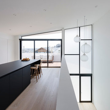
Located in San Francisco’s Noe Valley neighborhood, the Switchback House is a new construction, ground-up home. The new home consists of two separate residential units arranged over three, split-level floor plates. The primary residential unit occupies the upper two floors while the secondary unit is located on the ground floor with direct access to the rear yard. Designed to be as sensitive as possible to the surrounding neighborhood, the new architecture is unapologetically modern while still referencing the broader Victorian context beyond. Generous amounts of glazing immerse the interior living spaces with natural light. Multi-slide glass doors recess into wall pockets to further erode the barriers between interior and exterior and provide direct access to the outdoor spaces and the views of the city beyond. A simple material pallet of white, gallery-like walls and white oak flooring run continuously throughout the home making a calm and serene interior environment.
Photo by Joe Fletcher
15