
Search results for "Referenced" in Home Design Ideas
 Deik
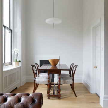
DeikProject: Residential interior refurbishment
Site: Kensington, London
Designer: Deik (www.deik.co.uk)
Photographer: Anna Stathaki
Floral/prop stylish: Simone Bell
We have also recently completed a commercial design project for Café Kitsuné in Pantechnicon (a Nordic-Japanese inspired shop, restaurant and café).
Simplicity and understated luxury
The property is a Grade II listed building in the Queen’s Gate Conservation area. It has been carefully refurbished to make the most out of its existing period features, with all structural elements and mechanical works untouched and preserved.
The client asked for modest, understated modern luxury, and wanted to keep some of the family antique furniture.
The flat has been transformed with the use of neutral, clean and simple elements that blend subtly with the architecture of the shell. Classic furniture and modern details complement and enhance one another.
The focus in this project is on craftsmanship, handiwork and the use of traditional, natural, timeless materials. A mix of solid oak, stucco plaster, marble and bronze emphasize the building’s heritage.
The raw stucco walls provide a simple, earthy warmth, referencing artisanal plasterwork. With its muted tones and rough-hewn simplicity, stucco is the perfect backdrop for the timeless furniture and interiors.
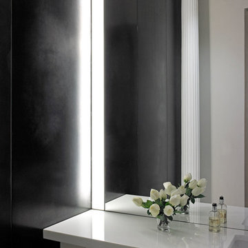
Feature wall lights have been carefully placed to bring out the surface of the stucco, creating a dramatic feel throughout the living room and corridor.
The bathroom and shower room employ subtle, minimal details, with elegant grey marble tiles and pale oak joinery creating warm, calming tones and a relaxed atmosphere.

 LiLu Interiors
LiLu transformed a St. Anthony Park neighborhood church into this sanctuary for treatment. The interior offers a balance of old and new: referencing the historic setting while creating a contemporary environment that appeals to a youthful spirit. LiLu’s design also meets the residents’ medical needs, offering space for social interaction and self-reflection to enhance both physical and emotional healing.
----
Project designed by Minneapolis interior design studio LiLu Interiors. They serve the Minneapolis-St. Paul area including Wayzata, Edina, and Rochester, and they travel to the far-flung destinations that their upscale clientele own second homes in.
----
For more about LiLu Interiors, click here: https://www.liluinteriors.com/
-----
To learn more about this project, click here:
https://www.liluinteriors.com/blog/portfolio-items/healing-haven/
 Thermally Broken Steel USA
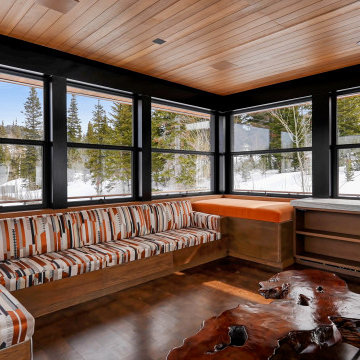
Referencing the forest-fire watchtowers found in national parks, this 19 x 19ft eagle's eye nest with wrap-around windows furnishes a cozy, panoramic perch to take in the views of the peaks and valleys of the Wasatch mountains.
Custom windows, doors, and hardware designed and furnished by Thermally Broken Steel USA.
Find the right local pro for your project
 Wiebenson & Dorman Architects PC
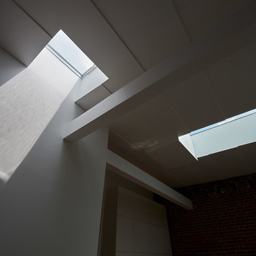
Referencing the wife and 3 daughters for which the house was named, four distinct but cohesive design criteria were considered for the 2016 renovation of the circa 1890, three story masonry rowhouse:
1. To keep the significant original elements – such as
the grand stair and Lincrusta wainscoting.
2. To repurpose original elements such as the former
kitchen pocket doors fitted to their new location on
the second floor with custom track.
3. To improve original elements - such as the new "sky
deck" with its bright green steel frame, a new
kitchen and modern baths.
4. To insert unifying elements such as the 3 wall
benches, wall openings and sculptural ceilings.
Photographer Jesse Gerard - Hoachlander Davis Photography
 hungryeye
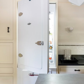
Kitchen in a 1926 bungalow, done to my client's brief that it should look 'original' to the house.
The three 'jewels' of the kitchen are the immaculately restored 1928 Wedgwood high-oven stove, the SubZero refrigerator/freezer designed to look like an old-fashioned ice box, and the island referencing a farmhouse table with pie-save cabinet underneath, done in ebonized oak and painted bead-board.
The red Marmoleum floor has double inlaid borders, the counters are honed black granite, and the walls, cabinets, and trim are all painted a soft ocher-based cream-colour taken from a 1926 DutchBoy paint deck. Virtually everything is custom, save the sink, faucets, and pulls, done to my original designs. The Bosch dishwasher, washer, and dryer are all hidden in the cabinetry.
All photographs courtesy David Duncan Livingston. (Kitchen featured in Fall 2018 AMERICAN BUNGALOW magazine)
 Donald Lococo Architects
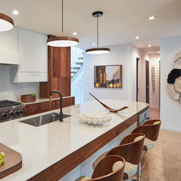
The kitchen was designed two years ago and was then erased and redesigned when the world became a different place a year later. As everyone attempted to flatten the curve, our goal in this regard was to create a kitchen that looked forward to a sharp curve down and of a happier time To that promise for happier times, the redesign, a goal was to make the kitchen brighter and more optimistic. This was done by using simple, primary shapes and circular pendants and emphasizing them in contrast, adding a playful countenance. The selection of a dynamic grain of figured walnut also contributes as this once-living material and its sinuous grain adds motion, rhythm, and scale.
Proud of their 1970s home, one challenge of the design was to balance a 1970's feel and stay current. However, many ‘70s references looked and felt outdated. The first step was a changed mindset. Just like the return of the ‘40s bath and the retro movement a few years ago, every era returns in some way. Chronologically, the '70s will soon be here. Our design looked to era-specific furniture and materials of the decade. Figured walnut was so pervasive in the era: this motif was used on car exteriors such as the 1970 Town and Country Station Wagon, which debuted the same year the existing home was built. We also looked at furniture specific to the decade. The console stereo is referenced not only by high legs on the island but also by the knurled metal cabinet knobs reminiscent of often-used stereo dials. Knurled metalwork is also used on the kitchen faucet. The design references the second piece of '70s furniture in our modern TV tray, which is angled to face the television in the family room. Its round pencil and mug holder cutouts follow the design of walnut consoles and dashboard of the station wagon and other elements of the time.
 Clawson Architects, LLC
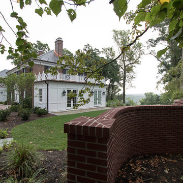
Significant Additions to a Georgian Revival House: The original house was constructed by a sea captain and many of the details are a nod to nautical details fabricated by shipwrights. The new owners wanted to improve the internal circulation and interior proportions of the house. The front entry and family room addition respond to near and distance views of the surrounding landscape and the historic Hobart Gap. The side French doors open onto a private garden and serpentine wall referencing the historical gardens of the Lawn at University of Virginia, where the owner attend.
 Donald Lococo Architects
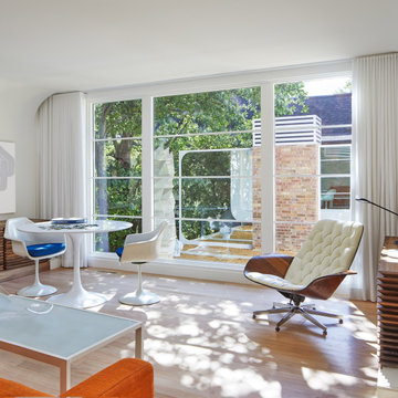
Designed in 1970 for an art collector, the existing referenced 70’s architectural principles. With its cadence of ‘70’s brick masses punctuated by a garage and a 4-foot-deep entrance recess. This recess, however, didn’t convey to the interior, which was occupied by disjointed service spaces. To solve, service spaces are moved and reorganized in open void in the garage. (See plan) This also organized the home: Service & utility on the left, reception central, and communal living spaces on the right.
To maintain clarity of the simple one-story 70’s composition, the second story add is recessive. A flex-studio/extra bedroom and office are designed ensuite creating a slender form and orienting them front to back and setting it back allows the add recede. Curves create a definite departure from the 70s home and by detailing it to "hover like a thought" above the first-floor roof and mentally removable sympathetic add.Existing unrelenting interior walls and a windowless entry, although ideal for fine art was unconducive for the young family of three. Added glass at the front recess welcomes light view and the removal of interior walls not only liberate rooms to communicate with each other but also reinform the cleared central entry space as a hub.
Even though the renovation reinforms its relationship with art, the joy and appreciation of art was not dismissed. A metal sculpture lost in the corner of the south side yard bumps the sculpture at the front entrance to the kitchen terrace over an added pedestal. (See plans) Since the roof couldn’t be railed without compromising the one-story '70s composition, the sculpture garden remains physically inaccessible however mirrors flanking the chimney allow the sculptures to be appreciated in three dimensions. The mirrors also afford privacy from the adjacent Tudor's large master bedroom addition 16-feet away.
 Cure Design Group
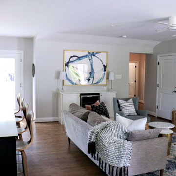
a classic city home, built in the 50’s. Her family moved in August of ’18, and in less than a year, she’s already completed a number of remodel projects including additions to the master bedroom and 2-bedroom + bath “kids’ wing.” She’s opened walls from the kitchen to the living and dining rooms creating a massive open floor plan and refinished all the original hardwood floors. After seeing her beautifully furnished space and hearing her listing everything she’s done to get her house the way it looks today, I had so many exciting ideas to help her add the finishing touches she was needing and to give her the look she was going for.
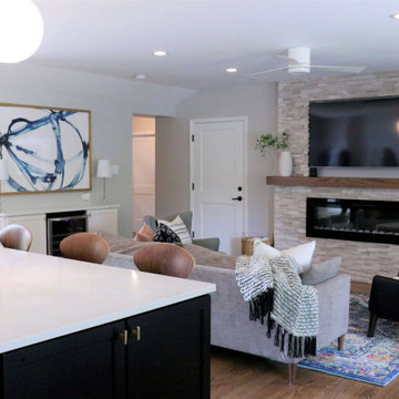
Referencing her inspiration pics saved to Houzz and Pinterest, the first item on the list was to add window treatments. These were presented in a soft, crisp white fabric which maintains the brightness for each room, diffusing the sunlight throughout, keeping each space light and airy. The simple functional panels give her the privacy she wanted from all the passersby walking the park, which are lined to help regulate the temperature differences she needed. The hardware for these panels is something to mention –simple, modern, matte black rods and brackets, highlighted with acrylic finials and gold rings. This combination is an exclamation point showcasing what custom window treatments can really do for a room. The main dining room window boasts a striking contrast of rich black wide leather tape, drawing your eye right to the beautiful picture window, which in and of itself is a perfect accent to this space.
From there, adding the right wall hangings and artwork, task lighting, accessories, and accents layered throughout, mixing lots of textures, metal finishes, and varying shades of color synchronizes one room to the next buttoning up the entire design concept she was striving to achieve.
 Axis Mundi Design
This NoHo apartment, in a landmarked circa 1870 building designed by Stephen Decatur Hatch and converted to lofts in 1987, had been interestingly renovated by a rock musician before being purchased by a young hedge fund manager and his gallery director girlfriend. Naturally, the couple brought to the project their collection of painting, photography and sculpture, mostly by young emerging artists. Axis Mundi accommodated these pieces within a neutral palette accented with occasional flashes of bright color that referenced the various artworks. Major furniture pieces – a sectional in the library, a 12-foot-long dining table–along with a rich blend of textures such as leather, linen, fur and warm woods, helped bring the sprawling dimensions of the loft down to human scale.
Size: 3,400 sf
Design Team: John Beckmann and Nick Messerlian
Architect: Nemaworkshop
Photography: Durston Saylor, and Mark Roskams
© Axis Mundi Design LLC
 Cure Design Group
a classic city home, built in the 50’s. Her family moved in August of ’18, and in less than a year, she’s already completed a number of remodel projects including additions to the master bedroom and 2-bedroom + bath “kids’ wing.” She’s opened walls from the kitchen to the living and dining rooms creating a massive open floor plan and refinished all the original hardwood floors. After seeing her beautifully furnished space and hearing her listing everything she’s done to get her house the way it looks today, I had so many exciting ideas to help her add the finishing touches she was needing and to give her the look she was going for.
Referencing her inspiration pics saved to Houzz and Pinterest, the first item on the list was to add window treatments. These were presented in a soft, crisp white fabric which maintains the brightness for each room, diffusing the sunlight throughout, keeping each space light and airy. The simple functional panels give her the privacy she wanted from all the passersby walking the park, which are lined to help regulate the temperature differences she needed. The hardware for these panels is something to mention –simple, modern, matte black rods and brackets, highlighted with acrylic finials and gold rings. This combination is an exclamation point showcasing what custom window treatments can really do for a room. The main dining room window boasts a striking contrast of rich black wide leather tape, drawing your eye right to the beautiful picture window, which in and of itself is a perfect accent to this space.
From there, adding the right wall hangings and artwork, task lighting, accessories, and accents layered throughout, mixing lots of textures, metal finishes, and varying shades of color synchronizes one room to the next buttoning up the entire design concept she was striving to achieve.
 Andrea Schumacher Interiors
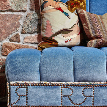
This blue velvet sofa includes a custom "RR" embroidery along the bottom-- referencing the house's history as "Remount Ranch." The pillows perfectly blend together the color of the couch, and the color of the exposed brick walls.
 Acorn Cottage Style
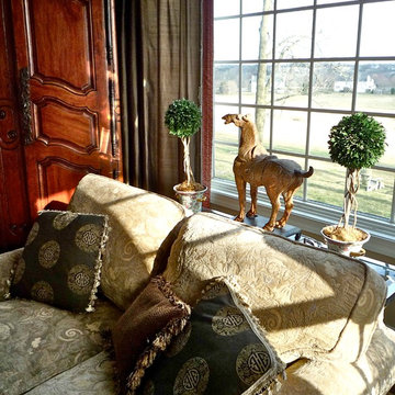
The confluence of French and Asian has a very long history. This house in Chester County, PA sits in the middle of famous horse country. And so the horse looking out over Chester County fields...a classical Tang horse in distressed gilded iron on its own wooden pedestal. The French topiaries of boxwood are a classical French touch reflecting not only the countryside outside the window, but also referencing the beautiful antique French armoire brought by the family when they moved to the US from Europe. The sofas are typical soft American lounging pieces to watch television and chat by the fireplace. All the upholstery is in a very practical slipcover with zippers for washing, and in a cuddly chenille fabric. Hence, classy, cozy and practical; both can be achieved. The oversized TV is hidden in the old French armoire.
 Patrician Design
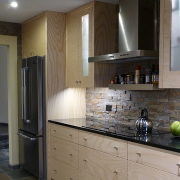
This dated interior provided a challenging starting point for a single man who found value in the purchase and saw beyond the current appearance. Recognizing certain elements such as the wooden ceilings, handsome exposed adobe, stone fireplace… he asked that we create a design that spoke of modern finishes and clean lines. Read more and see before and after pictures at the above referenced website.
 Nar Design Group
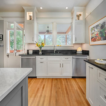
Built in 1915, this classic craftsman style home is located in the Capitol Mansions Historic District. When the time came to remodel, the homeowners wanted to continue to celebrate its history by keeping with the craftsman style but elevating the kitchen’s function to include the latest in quality cabinetry and modern appliances.
The new spacious kitchen (and adjacent walk-in pantry) provides the perfect environment for a couple who loves to cook and entertain. White perimeter cabinets and dark soapstone counters make a timeless and classic color palette. Designed to have a more furniture-like feel, the large island has seating on one end and is finished in an historically inspired warm grey paint color. The vertical stone “legs” on either side of the gas range-top highlight the cooking area and add custom detail within the long run of cabinets. Wide barn doors designed to match the cabinet inset door style slide open to reveal a spacious appliance garage, and close when the kitchen goes into entertainer mode. Finishing touches such as the brushed nickel pendants add period style over the island.
A bookcase anchors the corner between the kitchen and breakfast area providing convenient access for frequently referenced cookbooks from either location.
Just around the corner from the kitchen, a large walk-in butler’s pantry in cheerful yellow provides even more counter space and storage ability. Complete with an undercounter wine refrigerator, a deep prep sink, and upper storage at a glance, it’s any chef’s happy place.
Photo credit: Fred Donham of Photographerlink
 Dynia Architects
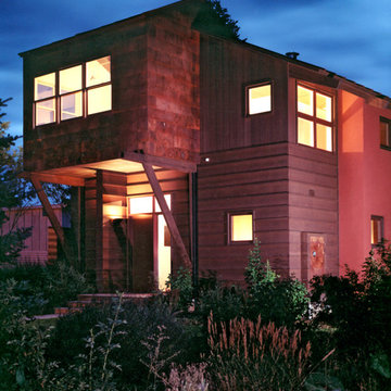
This 2,500 square foot “studio” is located in a neighborhood bisected by alleys and containing charming remnants of indigenous outbuildings common to the region. The desire was to create a clean, open, contemporary interior in a building that outwardly referenced its context. The primary form of the house took shape from the long, narrow lot. On the north end, which faces an alley, a patinated clad steel structure forms a canopy for the entry. This carefully scaled “cabin”, raised above the upper level to access a glimpse of the mountains, pays homage to the many sheds lining the alley.
The south end features a terrace above the garage that is an extension of the primary interior space. The masonry west wall of the building provides privacy from the adjacent lot. This functional “spine” contains program elements on both levels and is visible internally and externally. A gently curved wall provides continuity between the floors and shields a bathroom and dressing area. This wall stops short of the ceiling, allowing the uninterrupted plane of maple veneer plywood to form a canopy unifying the spaces.
A.I.A. Wyoming Chapter Design Award of Honor 2004

 Tomecek Studio Architecture
Standing atop a hill overlooking the park entry, focused on the panorama of the foothills of the Rocky Mountains beyond, the Sunset Pavilion marks the intersection of multiple paths along a regional trail system. In concert with 8 additional pavilions throughout the park, the Sunset structure speaks to the simplicity of construction and the honesty of natural materials.
The dramatic steel structure cantilevers from grade, sheltering visitors from the harsh Colorado sun. Acting as a lens, the pavilion’s details are designed to emphasize the phenomenal qualities of the sun’s path throughout the day. A carefully diagrammed set of perforations along the overhead plane tracks the sun’s movement during the autumnal and vernal equinox.
Simultaneous construction, on and off site, allowed the Sunset Pavilion to be completed in just over 4 months. Rough and final grading, as well as landscape and site work on the gabion wall, were commencing in conjunction with off-site steel and concrete fabrication. Upon completion of the pavilion’s foundation and gabion walls, the steel structure was delivered and craned into place in little more than an hours time. Local craftsmen were able to complete their tasks in a controlled environment allowing their work to be expressed in its true beauty. Speed and controlled construction were paramount to the completion of the Pavilion with little site disturbance for this new community amenity.
The fluid shape of the concrete bench beneath the pavilion roof invites visitors to sit, climb, recline and view the landscape. The curves, referencing the topography of the mountains, evolved from an algorithmic abstraction from the core of the pavilion, and the point at which the geographic monuments in the distance are plotted. The sheer weight and materiality of the bench contrasts with the seemingly delicate and temporal structure overhead. Both combine to offer a functional opportunity for rest and shade while making present the natural phenomenon that speak to the power of the Rocky Mountains.
 Clawson Architects, LLC
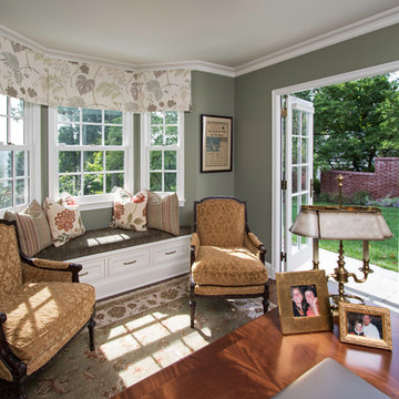
Significant Additions to a Georgian Revival House: The original house was constructed by a sea captain and many of the details are a nod to nautical details fabricated by shipwrights. Theo new owners wanted to improve the internal circulation and interior proportions of the house. The front entry and family room and home office addition respond to near and distance views of the surrounding landscape and the historic Hobart Gap. the side French doors open onto a private garden and serpentine wall referencing the historical gardens of the Lawn at University of Virginia, where the owner attend.
Interiors by Ashlee Anthony Designs
 Axis Mundi Design
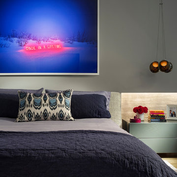
This NoHo apartment, in a landmarked circa 1870 building designed by Stephen Decatur Hatch and converted to lofts in 1987, had been interestingly renovated by a rock musician before being purchased by a young hedge fund manager and his gallery director girlfriend. Naturally, the couple brought to the project their collection of painting, photography and sculpture, mostly by young emerging artists. Axis Mundi accommodated these pieces within a neutral palette accented with occasional flashes of bright color that referenced the various artworks. Major furniture pieces – a sectional in the library, a 12-foot-long dining table–along with a rich blend of textures such as leather, linen, fur and warm woods, helped bring the sprawling dimensions of the loft down to human scale.
Size: 3,400 sf
Design Team: John Beckmann and Nick Messerlian
Architect: Nemaworkshop
Photography: Durston Saylor, and Mark Roskams
© Axis Mundi Design LLC
 Donald Lococo Architects
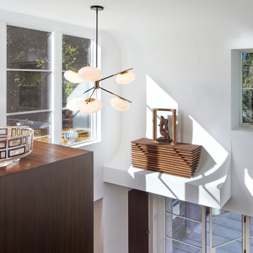
Designed in 1970 for an art collector, the existing referenced 70’s architectural principles. With its cadence of ‘70’s brick masses punctuated by a garage and a 4-foot-deep entrance recess. This recess, however, didn’t convey to the interior, which was occupied by disjointed service spaces. To solve, service spaces are moved and reorganized in open void in the garage. (See plan) This also organized the home: Service & utility on the left, reception central, and communal living spaces on the right.
To maintain clarity of the simple one-story 70’s composition, the second story add is recessive. A flex-studio/extra bedroom and office are designed ensuite creating a slender form and orienting them front to back and setting it back allows the add recede. Curves create a definite departure from the 70s home and by detailing it to "hover like a thought" above the first-floor roof and mentally removable sympathetic add.Existing unrelenting interior walls and a windowless entry, although ideal for fine art was unconducive for the young family of three. Added glass at the front recess welcomes light view and the removal of interior walls not only liberate rooms to communicate with each other but also reinform the cleared central entry space as a hub.
Even though the renovation reinforms its relationship with art, the joy and appreciation of art was not dismissed. A metal sculpture lost in the corner of the south side yard bumps the sculpture at the front entrance to the kitchen terrace over an added pedestal. (See plans) Since the roof couldn’t be railed without compromising the one-story '70s composition, the sculpture garden remains physically inaccessible however mirrors flanking the chimney allow the sculptures to be appreciated in three dimensions. The mirrors also afford privacy from the adjacent Tudor's large master bedroom addition 16-feet away.
19