
Search results for "Referenced" in Home Design Ideas
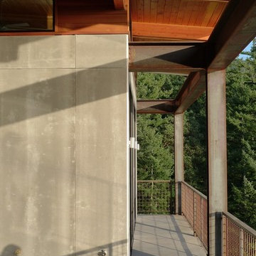

 Deik
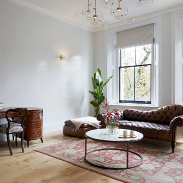
DeikProject: Residential interior refurbishment
Site: Kensington, London
Designer: Deik (www.deik.co.uk)
Photographer: Anna Stathaki
Floral/prop stylish: Simone Bell
We have also recently completed a commercial design project for Café Kitsuné in Pantechnicon (a Nordic-Japanese inspired shop, restaurant and café).
Simplicity and understated luxury
The property is a Grade II listed building in the Queen’s Gate Conservation area. It has been carefully refurbished to make the most out of its existing period features, with all structural elements and mechanical works untouched and preserved.
The client asked for modest, understated modern luxury, and wanted to keep some of the family antique furniture.
The flat has been transformed with the use of neutral, clean and simple elements that blend subtly with the architecture of the shell. Classic furniture and modern details complement and enhance one another.
The focus in this project is on craftsmanship, handiwork and the use of traditional, natural, timeless materials. A mix of solid oak, stucco plaster, marble and bronze emphasize the building’s heritage.
The raw stucco walls provide a simple, earthy warmth, referencing artisanal plasterwork. With its muted tones and rough-hewn simplicity, stucco is the perfect backdrop for the timeless furniture and interiors.
Feature wall lights have been carefully placed to bring out the surface of the stucco, creating a dramatic feel throughout the living room and corridor.
The bathroom and shower room employ subtle, minimal details, with elegant grey marble tiles and pale oak joinery creating warm, calming tones and a relaxed atmosphere.

Find the right local pro for your project
 John Lum Architecture, Inc. AIA
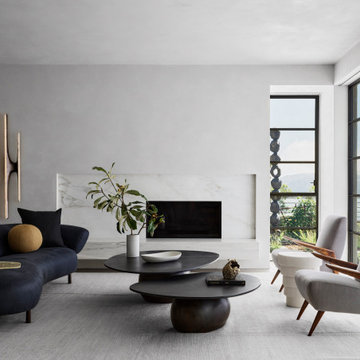
Architecture: John Lum Architecture
Interior Design: NicoleHollis
Contractor: Jetton Construction
Landscape: Arterra Landscape Architects
Photography: Douglas Friedman
We reworked a spec-level Mediterranean into a design that quietly fits its spectacular bay-side setting. Referencing Sausalito’s fishing village roots, the stucco and styrofoam detailing were replaced with environmentally-conscious materials designed to weather, utilizing a palette of Kebony, cement plaster, and copper standing seam roof.
 Jon Eric Christner ARCHITECT INC.
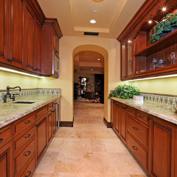
Basement Level Galley -
General Contractor: Forte Estate Homes
Example of a tuscan galley enclosed kitchen design in Orange County with an undermount sink, raised-panel cabinets, medium tone wood cabinets, granite countertops, stainless steel appliances and no island
Example of a tuscan galley enclosed kitchen design in Orange County with an undermount sink, raised-panel cabinets, medium tone wood cabinets, granite countertops, stainless steel appliances and no island
 MATHISON | MATHISON ARCHITECTS
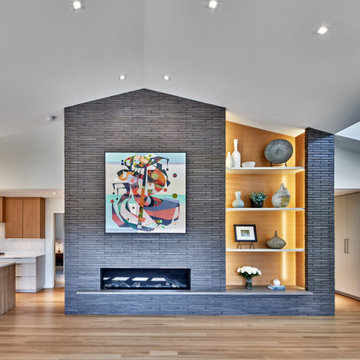
Watermark Residence was conceived as a “downsizing” project for Owners looking to transition from the home where they raised their family to a simpler lifestyle. The footprint and exterior massing of the single family condo was prescribed, but MMA wove new details into these constraints and was urged by the Owner to completely reinvent the interior experience.
From the exterior, the home sits subtly on a corner lot, referencing the neighborhood in its style, but with a warmth and crispness that speaks also to the interiors.
The primary goal of the project was to provide an open, inviting atmosphere of connected spaces that allowed natural light into all areas of the home. Upon entry, there is an immediate involvement in the daily activities with the living and dining rooms being the focal point, and a more intimate kitchen slightly out of view.
Throughout the home, the idea of privacy and transparency plays an important role in the organization of spaces and materials chosen. More private corridors lead to intimate bedroom spaces and functional laundry and mudrooms. A two-floor, semi-transparent slat wall shields direct visibility from the street, while also providing connection between the entertaining spaces of the home. Combined with the white oak, open staircase, the movement between levels feels intuitive and inviting.
A simple palette of materials, understated in their appearance but detailed in their execution, are threaded throughout the home. Gathering spaces are represented with open slats, grounding brick, white oak, and bright walls. Movement deeper into the house brings refined slat panels with integrated hardware at kitchen millwork, softly painted cabinetry, and warm tones of walnut in furniture elements. The most private spaces of the home further extrude the slat element into fluted panels, painted in deeper colors.
 Brooks + Scarpa Architects
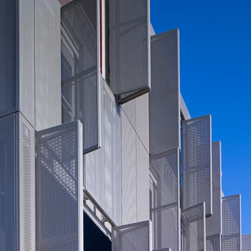
Located in a neighborhood characterized by traditional bungalow style single-family residences, Orange Grove is a new landmark for the City of West Hollywood. The building is sensitively designed and compatible with the neighborhood, but differs in material palette and scale from its neighbors. Referencing architectural conventions of modernism rather than the pitched roof forms of traditional domesticity, the project presents a characteristic that is consistent with the eclectic and often unconventional demographic of West Hollywood. Distinct from neighboring structures, the building creates a strong relationship to the street by virtue of its large amount of highly usable balcony area in the front façade.
While there are dramatic and larger scale elements that define the building, it is also broken down into comprehensible human scale parts, and is itself broken down into two different buildings. Orange Grove displays a similar kind of iconoclasm as the Schindler House, an icon of California modernism, located a short distance away. Like the Schindler House, the conventional architectural elements of windows and porches become part of an abstract sculptural ensemble. At the Schindler House, windows are found in the gaps between structural concrete wall panels. At Orange Grove, windows are inserted in gaps between different sections of the building.
The design of Orange Grove is generated by a subtle balance of tensions. Building volumes and the placement of windows, doors and balconies are not static but rather constitute an active three-dimensional composition in motion. Each piece of the building is a strong and clearly defined shape, such as the corrugated metal surround that encloses the second story balcony in the east and north facades. Another example of this clear delineation is the use of two square profile balcony surrounds in the front façade that set up a dialogue between them—one is small, the other large, one is open at the front, the other is veiled with stainless steel slats. At the same time each balcony is balanced and related to other elements in the building, the smaller one to the driveway gate below and the other to the roll-up door and first floor balcony. Each building element is intended to read as an abstract form in itself—such as a window becoming a slit or windows becoming a framed box, while also becoming part of a larger whole. Although this building may not mirror the status quo it answers to the desires of consumers in a burgeoning niche market who want large, simple interior volumes of space, and a paradigm based on space, light and industrial materials of the loft rather than the bungalow.
 Wiebenson & Dorman Architects PC
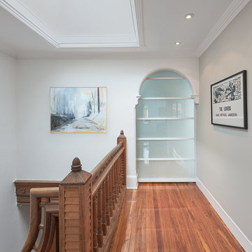
Referencing the wife and 3 daughters for which the house was named, four distinct but cohesive design criteria were considered for the 2016 renovation of the circa 1890, three story masonry rowhouse:
1. To keep the significant original elements – such as
the grand stair and Lincrusta wainscoting.
2. To repurpose original elements such as the former
kitchen pocket doors fitted to their new location on
the second floor with custom track.
3. To improve original elements - such as the new "sky
deck" with its bright green steel frame, a new
kitchen and modern baths.
4. To insert unifying elements such as the 3 wall
benches, wall openings and sculptural ceilings.
Photographer Jesse Gerard - Hoachlander Davis Photography
 User
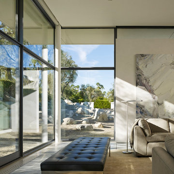
UserAnchored by the homeowner’s 42-foot-long painting, the interiors of this Palm Springs residence were designed to showcase the owner’s art collection, and create functional spaces for daily living that can be easily adapted for large social gatherings.
Referencing the environment and architecture in both form and material, the finishes and custom furnishings bring the interior to life. Alluding to the roofs that suspend over the building, the sofas seem to hover above the carpets while the knife-edge table top appears to float above a metal base. Bleached and cerused wood mimic the “desert effect” that would naturally occur in this environment, while the textiles on the sofa are the same shade as the rocks of the landscape.
Monolithic concrete floors connect all of the spaces while concealing mechanical systems, and stone thresholds signal vertical level changes and exterior transitions. Large wall masses provide the optimal backdrop for the homeowner’s oversized art. The wall structures ground the interior, while the opposing expanses of glass frame the desert views. The location and use of operable doors and windows allows the house to naturally ventilate, reducing cooling loads. The furnishings create spaces in an architectural fashion.
Designed and fabricated for flexibility, the pieces easily accommodate the owners’ large social gatherings. The dining table can be split into two and the sofas can be pushed out along the walls, opening the center of the space to entertain. The design of the interior spaces and furnishings seamlessly integrates the setting, architecture, artwork and spaces into a cohesive whole.
 Frankel Design Build
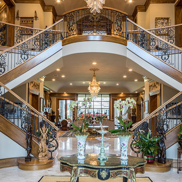
This estate on Rivercrest incorporates more than 27,000. The house is 26,369, the Pool House is 2,181, the stables are 3,597 (total covered area) square feet of covered structure, including poolside entertaining space, and stables.
This home is very much a traditional meets modern layout. It’s formalized. Referencing heavily upon Andrea Palladio, the home uses symmetry as a major design element.
Connie Anderson Photography

 Deik
DeikProject: Residential interior refurbishment
Site: Kensington, London
Designer: Deik (www.deik.co.uk)
Photographer: Anna Stathaki
Floral/prop stylish: Simone Bell
We have also recently completed a commercial design project for Café Kitsuné in Pantechnicon (a Nordic-Japanese inspired shop, restaurant and café).
Simplicity and understated luxury
The property is a Grade II listed building in the Queen’s Gate Conservation area. It has been carefully refurbished to make the most out of its existing period features, with all structural elements and mechanical works untouched and preserved.
The client asked for modest, understated modern luxury, and wanted to keep some of the family antique furniture.
The flat has been transformed with the use of neutral, clean and simple elements that blend subtly with the architecture of the shell. Classic furniture and modern details complement and enhance one another.
The focus in this project is on craftsmanship, handiwork and the use of traditional, natural, timeless materials. A mix of solid oak, stucco plaster, marble and bronze emphasize the building’s heritage.
The raw stucco walls provide a simple, earthy warmth, referencing artisanal plasterwork. With its muted tones and rough-hewn simplicity, stucco is the perfect backdrop for the timeless furniture and interiors.
Feature wall lights have been carefully placed to bring out the surface of the stucco, creating a dramatic feel throughout the living room and corridor.
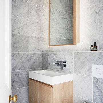
The bathroom and shower room employ subtle, minimal details, with elegant grey marble tiles and pale oak joinery creating warm, calming tones and a relaxed atmosphere.
 studioWTA
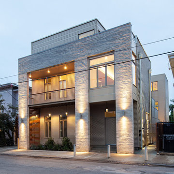
The project is the outcome of two major design challenges; the clients desire to create a contemporary building capable of referencing its historic setting and maximizing the built square footage on a limited site.
Photo by Jeffrey Johnston
 User
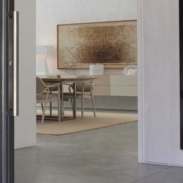
UserAnchored by the homeowner’s 42-foot-long painting, the interiors of this Palm Springs residence were designed to showcase the owner’s art collection, and create functional spaces for daily living that can be easily adapted for large social gatherings.
Referencing the environment and architecture in both form and material, the finishes and custom furnishings bring the interior to life. Alluding to the roofs that suspend over the building, the sofas seem to hover above the carpets while the knife-edge table top appears to float above a metal base. Bleached and cerused wood mimic the “desert effect” that would naturally occur in this environment, while the textiles on the sofa are the same shade as the rocks of the landscape.
Monolithic concrete floors connect all of the spaces while concealing mechanical systems, and stone thresholds signal vertical level changes and exterior transitions. Large wall masses provide the optimal backdrop for the homeowner’s oversized art. The wall structures ground the interior, while the opposing expanses of glass frame the desert views. The location and use of operable doors and windows allows the house to naturally ventilate, reducing cooling loads. The furnishings create spaces in an architectural fashion.
Designed and fabricated for flexibility, the pieces easily accommodate the owners’ large social gatherings. The dining table can be split into two and the sofas can be pushed out along the walls, opening the center of the space to entertain. The design of the interior spaces and furnishings seamlessly integrates the setting, architecture, artwork and spaces into a cohesive whole.
 MATHISON | MATHISON ARCHITECTS
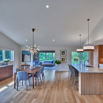
Watermark Residence was conceived as a “downsizing” project for Owners looking to transition from the home where they raised their family to a simpler lifestyle. The footprint and exterior massing of the single family condo was prescribed, but MMA wove new details into these constraints and was urged by the Owner to completely reinvent the interior experience.
From the exterior, the home sits subtly on a corner lot, referencing the neighborhood in its style, but with a warmth and crispness that speaks also to the interiors.
The primary goal of the project was to provide an open, inviting atmosphere of connected spaces that allowed natural light into all areas of the home. Upon entry, there is an immediate involvement in the daily activities with the living and dining rooms being the focal point, and a more intimate kitchen slightly out of view.
Throughout the home, the idea of privacy and transparency plays an important role in the organization of spaces and materials chosen. More private corridors lead to intimate bedroom spaces and functional laundry and mudrooms. A two-floor, semi-transparent slat wall shields direct visibility from the street, while also providing connection between the entertaining spaces of the home. Combined with the white oak, open staircase, the movement between levels feels intuitive and inviting.
A simple palette of materials, understated in their appearance but detailed in their execution, are threaded throughout the home. Gathering spaces are represented with open slats, grounding brick, white oak, and bright walls. Movement deeper into the house brings refined slat panels with integrated hardware at kitchen millwork, softly painted cabinetry, and warm tones of walnut in furniture elements. The most private spaces of the home further extrude the slat element into fluted panels, painted in deeper colors.
 MATHISON | MATHISON ARCHITECTS
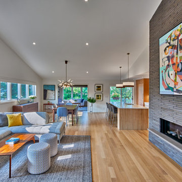
Watermark Residence was conceived as a “downsizing” project for Owners looking to transition from the home where they raised their family to a simpler lifestyle. The footprint and exterior massing of the single family condo was prescribed, but MMA wove new details into these constraints and was urged by the Owner to completely reinvent the interior experience.
From the exterior, the home sits subtly on a corner lot, referencing the neighborhood in its style, but with a warmth and crispness that speaks also to the interiors.
The primary goal of the project was to provide an open, inviting atmosphere of connected spaces that allowed natural light into all areas of the home. Upon entry, there is an immediate involvement in the daily activities with the living and dining rooms being the focal point, and a more intimate kitchen slightly out of view.
Throughout the home, the idea of privacy and transparency plays an important role in the organization of spaces and materials chosen. More private corridors lead to intimate bedroom spaces and functional laundry and mudrooms. A two-floor, semi-transparent slat wall shields direct visibility from the street, while also providing connection between the entertaining spaces of the home. Combined with the white oak, open staircase, the movement between levels feels intuitive and inviting.
A simple palette of materials, understated in their appearance but detailed in their execution, are threaded throughout the home. Gathering spaces are represented with open slats, grounding brick, white oak, and bright walls. Movement deeper into the house brings refined slat panels with integrated hardware at kitchen millwork, softly painted cabinetry, and warm tones of walnut in furniture elements. The most private spaces of the home further extrude the slat element into fluted panels, painted in deeper colors.
 Patrician Design
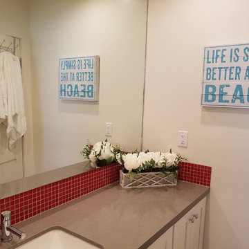
When designing for a vacation rental property, the first order of business is to select things that are durable and easy to maintain. This means finishes to furnishings. I know this from practical life experiences and also working with commercial/hospitality interiors. Here, an owner in Maine with property in San Diego wanted to bring her beloved Lobster to Pacific Beach. Read more and see more photographs at the above referenced website.
 Shorebird Interiors, LLC
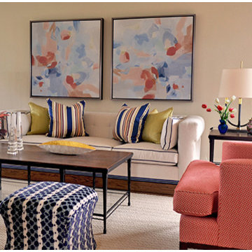
A house on Popponesset Beach in New Seabury, MA gets a Living/Dining Room and Master Bedroom Makeover. The clients, who are from the Boston area, wanted the living room to have a nautical feel, without being too “beachy cute” or kitsch. We referenced nautical themes in the palette and materials, trying not to be too literal in our approach. Brass and oil rubbed bronze fixtures, as well as dark wood tones and sail cloth help achieve the look. The furniture in the living room and sitting areas, as well as the herringbone topped dining table, were custom made for the client. The floor coverings were custom cut to fit the octagonal shape of the Master Bedroom and the sitting area of the Living Room.
In the Master Bedroom, serenity was the order of the day with a softer palette reminiscent of beach tones found in the sand, sky water and driftwood. We were careful with the palette so that it was not too flat, but also that the juxtapositions were harmonious, not too jarring. Light blues, taupes, driftwood tones with hits of white were the basic tools to achieve this.
 Blondie's Treehouse Inc
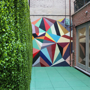
Referencing this square footage as an internal courtyard might be a stretch. A more accurate description would perhaps be the awesome things that New Yorkers can do with the tiny spaces we have.
The parameters of the project lend to its description. This Tribeca residential building’s shared amenity space and gym on the lower level opens up onto a 350 square foot space of brick walls and concrete pavers. The south wall of this space is made up by the terraces belonging to the residential units above and while the setting allows for minimal ambient light, each balcony looks down onto the shared space below.
In order to provide visual interest from the gym and the overhead views, Blondie’s designers Sara Baerwald and Eva Vessio utilized Jay Scott’s rectangle containers lining the north wall as well as surrounding the utilities in the southwest corner. They then created 8 foot faux boxwood hedge on the north wall and the appropriate height to conceal the utilities. From below the hedge creates the feeling of a courtyard and from above it softens the view of the once barren space. Adding color and functionality, the concrete pavers were replaced with rubber tiles in a bright aqua. To play off of this color and add a unique level of visual impact, artist Chris Pearson designed and painted a multi-color prism mural. Primarily on the east wall and then stretching over the hedges to the south, the depth and dimension that this mural provides for the space is incredible. It is a testament to the successful solutions we conjure when thinking outside the box and allowing for unique site specific resolutions.
 Marble of the World
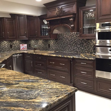
Kitchen featuring Magma Gold Granite by Marble of the World. Fabrication and Installation by Baltic Design Custom Marble and Granite
Kitchen - u-shaped marble floor kitchen idea in Miami with an undermount sink, dark wood cabinets, granite countertops, mosaic tile backsplash and stainless steel appliances
Kitchen - u-shaped marble floor kitchen idea in Miami with an undermount sink, dark wood cabinets, granite countertops, mosaic tile backsplash and stainless steel appliances
16