
Search results for "Referenced" in Home Design Ideas
 Andra Martens Design Studio
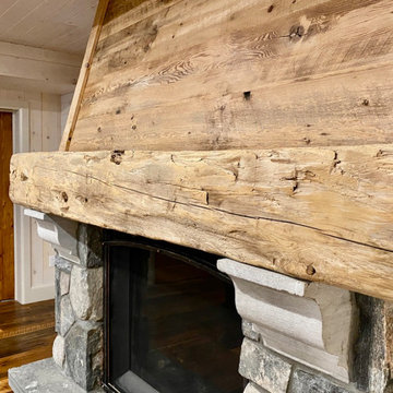
We were hired to finish the basement of our clients cottage in Haliburton. The house is a woodsy craftsman style. Basements can be dark so we used pickled pine to brighten up this 3000 sf space which allowed us to remain consistent with the vibe of the overall cottage. We delineated the large open space in to four functions - a Family Room (with projector screen TV viewing above the fireplace and a reading niche); a Game Room with access to large doors open to the lake; a Guest Bedroom with sitting nook; and an Exercise Room. Glass was used in the french and barn doors to allow light to penetrate each space. Shelving units were used to provide some visual separation between the Family Room and Game Room. The fireplace referenced the upstairs fireplace with added inspiration from a photo our clients saw and loved. We provided all construction docs and furnishings will installed soon.
 RetractableAwnings.com Inc.
PROJECT DESCRIPTION:
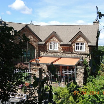
The client requested a large (19 foot wide by 15 foot projection) two-span retractable waterproof patio cover system to provide heavy rain, hail, heat, sun, glare and UV protection. This would allow our client to sit outside and enjoy their garden throughout the year, extending their outdoor entertainment space. For functionality they requested that water drain from the rear of the system into the front beam and down inside the right end post, exiting at the bottom from a tiny hole and draining into the flower beds thus preventing rain water from simply dropping off the front of the unit. The entire system used one continuous piece of fabric and one motor. The uprights and guides meet together at a smooth L-shaped angle, flush at the top for a perfectly smooth profile. The system has a Beaufort wind load rating Scale 10 (up to 63 mph) with the fabric fully extended and in use. A grey hood was also used to prevent rain water, debris and snow from collecting in the folds of fabric when not in use. A running profile from end to end in the rear of the unit was used to attach the Somfy RTS motor which is installed inside a motor safety box. Circular concrete footers were installed in the grassy area in front of the unit for mounting the 3 posts. To allow for a flat vertical mounting surface, a ledger board using pressure-treated wood was mounted the full 19-foot wall width, as the client’s house was made of uneven, thick stone.
PURPOSE OF THE PROJECT:
The client’s intention was for installation of a retractable waterproof patio cover system to provide heavy rain, hail, heat, sun, glare and UV protection for their backyard patio area.
What is unique or complex about the project?
This project was difficult for two main reasons: 1. Very large installation fasteners needed to be used to install through the above referenced ledger board and deep in to the stone structure of the house. 2. The motor cable needed to be placed through deeply drilled holes as the stone wall house wall is 15” thick. Drilling through en-even stone was definitely a challenge.
PROJECT RESULTS
The client was delighted with the results. The retractable patio cover system now makes it possible for the client to use a very large area in the rear of their house 24/7, 365 with the exclusion of snow. Since the client was very happy, they will be covering the ends, front and sides with our motorized vertical drop zippered awnings. Gable ends will also be covered with fixed fabric panels. Enclosing the entire area will allow the customer to heat the space in the winter and air condition the space in the summer.
 Moto Designshop
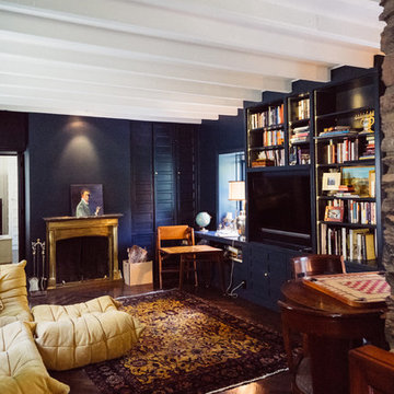
Originally built in 1809 and situated on 20+ acres, this country farm house was extensively renovated to serve as a getaway for the owners. With a strong desire to entertain, play, swim and relax, the owners requirement for spatial flexibility provided context for the various design interventions. To make use of the relatively small upper floors of the main house, a new stair tower was created external to the main footprint. Separated by glass and clad in copper the tower modernizes the property while referencing its history. The ground floor restores the historic fireplace and rock walls and is opened to the sprawling hillside, creek and pool through a retractable glazing system. Throughout the project’s interior, are unique moments of mixed materials, pattern and texture. The chef’s kitchen is warmly detailed with glazed tiles, steel and wood and is accented with found relics making up the island. Many of the wood floors, ceilings, and furniture were milled from fallen walnut, oak and elm trees harvested from the property. The guest house is executed in a minimalist Japanese palate and highlighted by exquisite detailing. The garage was rebuilt and expanded with an art studio and work/play space.
Find the right local pro for your project
 Donald Lococo Architects
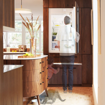
The kitchen was designed two years ago and was then erased and redesigned when the world became a different place a year later. As everyone attempted to flatten the curve, our goal in this regard was to create a kitchen that looked forward to a sharp curve down and of a happier time To that promise for happier times, the redesign, a goal was to make the kitchen brighter and more optimistic. This was done by using simple, primary shapes and circular pendants and emphasizing them in contrast, adding a playful countenance. The selection of a dynamic grain of figured walnut also contributes as this once-living material and its sinuous grain adds motion, rhythm, and scale.
Proud of their 1970s home, one challenge of the design was to balance a 1970's feel and stay current. However, many ‘70s references looked and felt outdated. The first step was a changed mindset. Just like the return of the ‘40s bath and the retro movement a few years ago, every era returns in some way. Chronologically, the '70s will soon be here. Our design looked to era-specific furniture and materials of the decade. Figured walnut was so pervasive in the era: this motif was used on car exteriors such as the 1970 Town and Country Station Wagon, which debuted the same year the existing home was built. We also looked at furniture specific to the decade. The console stereo is referenced not only by high legs on the island but also by the knurled metal cabinet knobs reminiscent of often-used stereo dials. Knurled metalwork is also used on the kitchen faucet. The design references the second piece of '70s furniture in our modern TV tray, which is angled to face the television in the family room. Its round pencil and mug holder cutouts follow the design of walnut consoles and dashboard of the station wagon and other elements of the time.
 Axis Mundi | Chicago
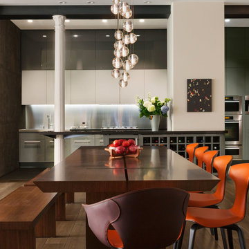
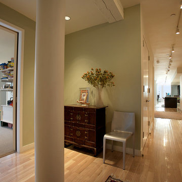
This NoHo apartment, in a landmarked circa 1870 building designed by Stephen Decatur Hatch and converted to lofts in 1987, had been interestingly renovated by a rock musician before being purchased by a young hedge fund manager and his gallery director girlfriend. Naturally, the couple brought to the project their collection of painting, photography and sculpture, mostly by young emerging artists. Axis Mundi accommodated these pieces within a neutral palette accented with occasional flashes of bright color that referenced the various artworks. Major furniture pieces – a sectional in the library, a 12-foot-long dining table–along with a rich blend of textures such as leather, linen, fur and warm woods, helped bring the sprawling dimensions of the loft down to human scale.
Size: 3,400 sf
Design Team: John Beckmann and Nick Messerlian
Architect: Nemaworkshop
Photography: Durston Saylor, and Mark Roskams
© Axis Mundi Design LLC.

 John Lum Architecture, Inc. AIA
Architecture: John Lum Architecture
Interior Design: NicoleHollis
Contractor: Jetton Construction
Landscape: Arterra Landscape Architects
Photography: Adam Rouse Photography
We reworked a spec-level Mediterranean into a design that quietly fits its spectacular bay-side setting. Referencing Sausalito’s fishing village roots, the stucco and styrofoam detailing were replaced with environmentally-conscious materials designed to weather, utilizing a palette of Kebony, cement plaster, and copper standing seam roof.
 Dynia Architects
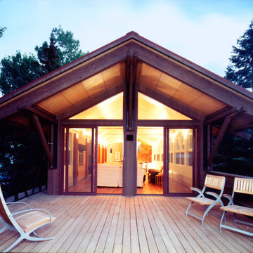
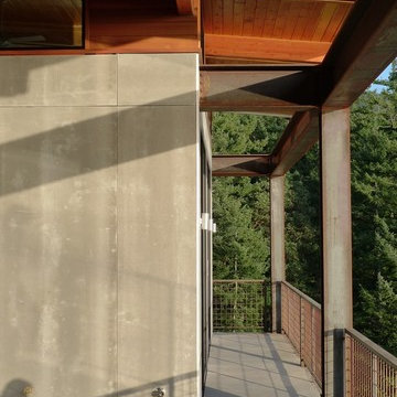
This 2,500 square foot “studio” is located in a neighborhood bisected by alleys and containing charming remnants of indigenous outbuildings common to the region. The desire was to create a clean, open, contemporary interior in a building that outwardly referenced its context. The primary form of the house took shape from the long, narrow lot. On the north end, which faces an alley, a patinated clad steel structure forms a canopy for the entry. This carefully scaled “cabin”, raised above the upper level to access a glimpse of the mountains, pays homage to the many sheds lining the alley.
The south end features a terrace above the garage that is an extension of the primary interior space. The masonry west wall of the building provides privacy from the adjacent lot. This functional “spine” contains program elements on both levels and is visible internally and externally. A gently curved wall provides continuity between the floors and shields a bathroom and dressing area. This wall stops short of the ceiling, allowing the uninterrupted plane of maple veneer plywood to form a canopy unifying the spaces.
A.I.A. Wyoming Chapter Design Award of Honor 2004
 Axis Mundi Design
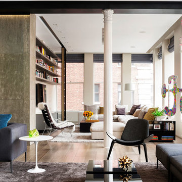
This NoHo apartment, in a landmarked circa 1870 building designed by Stephen Decatur Hatch and converted to lofts in 1987, had been interestingly renovated by a rock musician before being purchased by a young hedge fund manager and his gallery director girlfriend. Naturally, the couple brought to the project their collection of painting, photography and sculpture, mostly by young emerging artists. Axis Mundi accommodated these pieces within a neutral palette accented with occasional flashes of bright color that referenced the various artworks. Major furniture pieces – a sectional in the library, a 12-foot-long dining table–along with a rich blend of textures such as leather, linen, fur and warm woods, helped bring the sprawling dimensions of the loft down to human scale.
Size: 3,400 sf
Design Team: John Beckmann and Nick Messerlian
Architect: Nemaworkshop
Photography: Durston Saylor, and Mark Roskams
© Axis Mundi Design LLC

 Deik
DeikProject: Residential interior refurbishment
Site: Kensington, London
Designer: Deik (www.deik.co.uk)
Photographer: Anna Stathaki
Floral/prop stylish: Simone Bell
We have also recently completed a commercial design project for Café Kitsuné in Pantechnicon (a Nordic-Japanese inspired shop, restaurant and café).
Simplicity and understated luxury
The property is a Grade II listed building in the Queen’s Gate Conservation area. It has been carefully refurbished to make the most out of its existing period features, with all structural elements and mechanical works untouched and preserved.
The client asked for modest, understated modern luxury, and wanted to keep some of the family antique furniture.
The flat has been transformed with the use of neutral, clean and simple elements that blend subtly with the architecture of the shell. Classic furniture and modern details complement and enhance one another.
The focus in this project is on craftsmanship, handiwork and the use of traditional, natural, timeless materials. A mix of solid oak, stucco plaster, marble and bronze emphasize the building’s heritage.
The raw stucco walls provide a simple, earthy warmth, referencing artisanal plasterwork. With its muted tones and rough-hewn simplicity, stucco is the perfect backdrop for the timeless furniture and interiors.
Feature wall lights have been carefully placed to bring out the surface of the stucco, creating a dramatic feel throughout the living room and corridor.
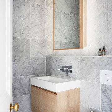
The bathroom and shower room employ subtle, minimal details, with elegant grey marble tiles and pale oak joinery creating warm, calming tones and a relaxed atmosphere.

 Naikoon Contracting Ltd
Architect: M3 Architecture Inc.
Interior Design: Mocoro Studio
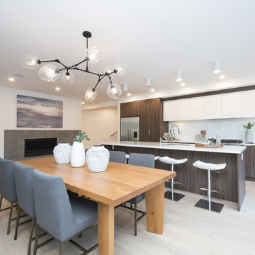
We recently completed a development project in the Pemberton Heights area of North Vancouver. These 2 houses were built to benefit the long-term durability through the selection of efficient materials and process which will give a longer lifespan with lower maintenance and energy costs. This project was a perfect fit for us to assist in the design and execute the construction while working with some outstanding clients and consultants. A win for all of us!
The original home was recycled hitting our target goals of 90%, leading way to a couple of stealth looking homes with performance levels right there with the best of them. Our mechanical engineer designed the mechanical systems to achieve maximum efficiency and hit our internal target goals that we have set for ourselves in accordance with our Vision here at Naikoon. These homes came in at EnerGuide score of 85% which can also be referenced in GJ with a score of 54GJ. To give you an idea of how this rating relates to an average home of this size, these 2 beauties on Mackay are about 80% more efficient. The main components in the design and equipment selection that leads to this are:
1) Space heating and Cooling
2) Water Heating
3) Lights and Appliances
4) Wall assemblies and insulation
Like all of our projects, we take pride in looking at the small details of the house. Things like, insulated water lines, domestic hot water heat recovery units, electric car plug-ins, solar power ready, extensive use of environmentally friendly materials, hot water heat pumps and stringent testing and inspection point along the way, led to a successful completion of 2 certified high-performance homes with Built Green Platinum and EnergyStar certifications.
Photo credits: vopenhouse.ca

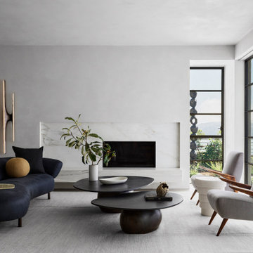 John Lum Architecture, Inc. AIA
Architecture: John Lum Architecture
Interior Design: NicoleHollis
Contractor: Jetton Construction
Landscape: Arterra Landscape Architects
Photography: Douglas Friedman
We reworked a spec-level Mediterranean into a design that quietly fits its spectacular bay-side setting. Referencing Sausalito’s fishing village roots, the stucco and styrofoam detailing were replaced with environmentally-conscious materials designed to weather, utilizing a palette of Kebony, cement plaster, and copper standing seam roof.
 Jon Eric Christner ARCHITECT INC.
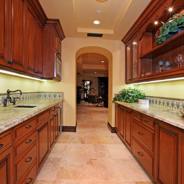
Basement Level Galley -
General Contractor: Forte Estate Homes
Example of a tuscan galley enclosed kitchen design in Orange County with an undermount sink, raised-panel cabinets, medium tone wood cabinets, granite countertops, stainless steel appliances and no island
Example of a tuscan galley enclosed kitchen design in Orange County with an undermount sink, raised-panel cabinets, medium tone wood cabinets, granite countertops, stainless steel appliances and no island
 Frankel Design Build
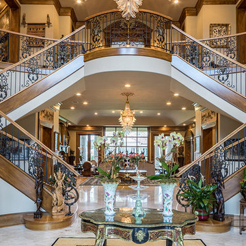
This estate on Rivercrest incorporates more than 27,000. The house is 26,369, the Pool House is 2,181, the stables are 3,597 (total covered area) square feet of covered structure, including poolside entertaining space, and stables.
This home is very much a traditional meets modern layout. It’s formalized. Referencing heavily upon Andrea Palladio, the home uses symmetry as a major design element.
Connie Anderson Photography
 User
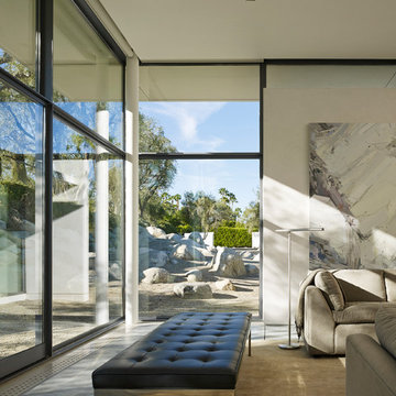
UserAnchored by the homeowner’s 42-foot-long painting, the interiors of this Palm Springs residence were designed to showcase the owner’s art collection, and create functional spaces for daily living that can be easily adapted for large social gatherings.
Referencing the environment and architecture in both form and material, the finishes and custom furnishings bring the interior to life. Alluding to the roofs that suspend over the building, the sofas seem to hover above the carpets while the knife-edge table top appears to float above a metal base. Bleached and cerused wood mimic the “desert effect” that would naturally occur in this environment, while the textiles on the sofa are the same shade as the rocks of the landscape.
Monolithic concrete floors connect all of the spaces while concealing mechanical systems, and stone thresholds signal vertical level changes and exterior transitions. Large wall masses provide the optimal backdrop for the homeowner’s oversized art. The wall structures ground the interior, while the opposing expanses of glass frame the desert views. The location and use of operable doors and windows allows the house to naturally ventilate, reducing cooling loads. The furnishings create spaces in an architectural fashion.
Designed and fabricated for flexibility, the pieces easily accommodate the owners’ large social gatherings. The dining table can be split into two and the sofas can be pushed out along the walls, opening the center of the space to entertain. The design of the interior spaces and furnishings seamlessly integrates the setting, architecture, artwork and spaces into a cohesive whole.
 Axis Mundi | Chicago
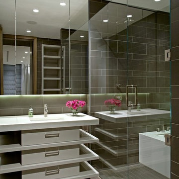
This NoHo apartment, in a landmarked circa 1870 building designed by Stephen Decatur Hatch and converted to lofts in 1987, had been interestingly renovated by a rock musician before being purchased by a young hedge fund manager and his gallery director girlfriend. Naturally, the couple brought to the project their collection of painting, photography and sculpture, mostly by young emerging artists. Axis Mundi accommodated these pieces within a neutral palette accented with occasional flashes of bright color that referenced the various artworks. Major furniture pieces – a sectional in the library, a 12-foot-long dining table–along with a rich blend of textures such as leather, linen, fur and warm woods, helped bring the sprawling dimensions of the loft down to human scale.
Size: 3,400 sf
Design Team: John Beckmann and Nick Messerlian
Architect: Nemaworkshop
Photography: Durston Saylor, and Mark Roskams
© Axis Mundi Design LLC.
 Wiebenson & Dorman Architects PC
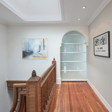
Referencing the wife and 3 daughters for which the house was named, four distinct but cohesive design criteria were considered for the 2016 renovation of the circa 1890, three story masonry rowhouse:
1. To keep the significant original elements – such as
the grand stair and Lincrusta wainscoting.
2. To repurpose original elements such as the former
kitchen pocket doors fitted to their new location on
the second floor with custom track.
3. To improve original elements - such as the new "sky
deck" with its bright green steel frame, a new
kitchen and modern baths.
4. To insert unifying elements such as the 3 wall
benches, wall openings and sculptural ceilings.
Photographer Jesse Gerard - Hoachlander Davis Photography
 MATHISON | MATHISON ARCHITECTS
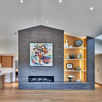
Watermark Residence was conceived as a “downsizing” project for Owners looking to transition from the home where they raised their family to a simpler lifestyle. The footprint and exterior massing of the single family condo was prescribed, but MMA wove new details into these constraints and was urged by the Owner to completely reinvent the interior experience.
From the exterior, the home sits subtly on a corner lot, referencing the neighborhood in its style, but with a warmth and crispness that speaks also to the interiors.
The primary goal of the project was to provide an open, inviting atmosphere of connected spaces that allowed natural light into all areas of the home. Upon entry, there is an immediate involvement in the daily activities with the living and dining rooms being the focal point, and a more intimate kitchen slightly out of view.
Throughout the home, the idea of privacy and transparency plays an important role in the organization of spaces and materials chosen. More private corridors lead to intimate bedroom spaces and functional laundry and mudrooms. A two-floor, semi-transparent slat wall shields direct visibility from the street, while also providing connection between the entertaining spaces of the home. Combined with the white oak, open staircase, the movement between levels feels intuitive and inviting.
A simple palette of materials, understated in their appearance but detailed in their execution, are threaded throughout the home. Gathering spaces are represented with open slats, grounding brick, white oak, and bright walls. Movement deeper into the house brings refined slat panels with integrated hardware at kitchen millwork, softly painted cabinetry, and warm tones of walnut in furniture elements. The most private spaces of the home further extrude the slat element into fluted panels, painted in deeper colors.
29