
Search results for "Referenced" in Home Design Ideas
 Wiebenson & Dorman Architects PC
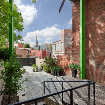
Referencing the wife and 3 daughters for which the house was named, four distinct but cohesive design criteria were considered for the 2016 renovation of the circa 1890, three story masonry rowhouse:
1. To keep the significant original elements – such as
the grand stair and Lincrusta wainscoting.
2. To repurpose original elements such as the former
kitchen pocket doors fitted to their new location on
the second floor with custom track.
3. To improve original elements - such as the new "sky
deck" with its bright green steel frame, a new
kitchen and modern baths.
4. To insert unifying elements such as the 3 wall
benches, wall openings and sculptural ceilings.
Photographer Jesse Gerard - Hoachlander Davis Photography
 Interior Enhancement Group
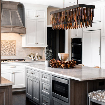
How do you blend two cabinet finishes in a kitchen? We referenced the soft white and greige in the jazzy fabric of the counter stools and the mosaic inset of the stove-top backsplash. Success!
Photo by Matt Warren Photography
 Axis Mundi Design
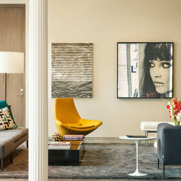
This NoHo apartment, in a landmarked circa 1870 building designed by Stephen Decatur Hatch and converted to lofts in 1987, had been interestingly renovated by a rock musician before being purchased by a young hedge fund manager and his gallery director girlfriend. Naturally, the couple brought to the project their collection of painting, photography and sculpture, mostly by young emerging artists. Axis Mundi accommodated these pieces within a neutral palette accented with occasional flashes of bright color that referenced the various artworks. Major furniture pieces – a sectional in the library, a 12-foot-long dining table–along with a rich blend of textures such as leather, linen, fur and warm woods, helped bring the sprawling dimensions of the loft down to human scale.
Size: 3,400 sf
Design Team: John Beckmann and Nick Messerlian
Architect: Nemaworkshop
Photography: Durston Saylor, and Mark Roskams
© Axis Mundi Design LLC
Find the right local pro for your project

 Touch Of Distinction
This, property with paint scrapings, color associations of the period and with catalog referencing now has much of its original charm and character revealed as an 1857 Italianate style country home.
 Sub-Zero, Wolf, and Cove Showroom Columbia
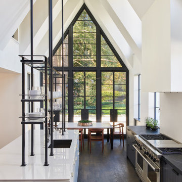
The stark, two story untrimmed ceiling with pitch identical to the existing hovers over the kitchen space, referencing the existing home's plaster walls pierced by a 13-foot steel tower that references existing steel door and window members.
 User
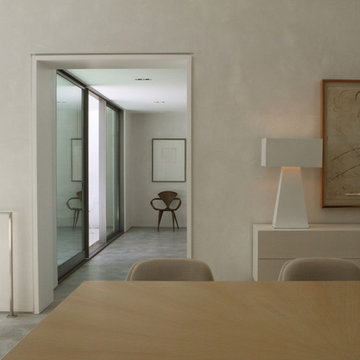
UserAnchored by the homeowner’s 42-foot-long painting, the interiors of this Palm Springs residence were designed to showcase the owner’s art collection, and create functional spaces for daily living that can be easily adapted for large social gatherings.
Referencing the environment and architecture in both form and material, the finishes and custom furnishings bring the interior to life. Alluding to the roofs that suspend over the building, the sofas seem to hover above the carpets while the knife-edge table top appears to float above a metal base. Bleached and cerused wood mimic the “desert effect” that would naturally occur in this environment, while the textiles on the sofa are the same shade as the rocks of the landscape.
Monolithic concrete floors connect all of the spaces while concealing mechanical systems, and stone thresholds signal vertical level changes and exterior transitions. Large wall masses provide the optimal backdrop for the homeowner’s oversized art. The wall structures ground the interior, while the opposing expanses of glass frame the desert views. The location and use of operable doors and windows allows the house to naturally ventilate, reducing cooling loads. The furnishings create spaces in an architectural fashion.
Designed and fabricated for flexibility, the pieces easily accommodate the owners’ large social gatherings. The dining table can be split into two and the sofas can be pushed out along the walls, opening the center of the space to entertain. The design of the interior spaces and furnishings seamlessly integrates the setting, architecture, artwork and spaces into a cohesive whole.
 hungryeye
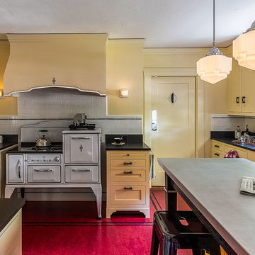
Kitchen in a 1926 bungalow, done to my client's brief that it should look 'original' to the house.
The three 'jewels' of the kitchen are the immaculately restored 1928 Wedgwood high-oven stove, the SubZero refrigerator/freezer designed to look like an old-fashioned ice box, and the island referencing a farmhouse table with pie-save cabinet underneath, done in ebonized oak and painted bead-board.
The red Marmoleum floor has double inlaid borders, the counters are honed black granite, and the walls, cabinets, and trim are all painted a soft ocher-based cream-colour taken from a 1926 DutchBoy paint deck. Virtually everything is custom, save the sink, faucets, and pulls, done to my original designs. The Bosch dishwasher, washer, and dryer are all hidden in the cabinetry.
All photographs courtesy David Duncan Livingston. (Kitchen featured in Fall 2018 AMERICAN BUNGALOW magazine)
 Sweet Sparkman Architects
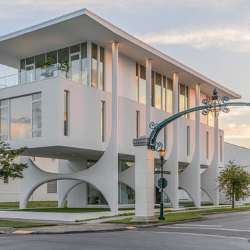
Located in a redeveloped historic district of downtown Pensacola, "Top of the 9th" is a contemporary residence that integrates historical architectural elements. The design preserves the area’s vernacular by incorporating among other characteristics symmetrical facades, full-height windows, and single-room width volumes.
A defining feature is the "whale bone" arches, which encircle the floating main living spaces, referencing Pensacola's maritime heritage. These structural elements are both functional and sculptural, enhancing the home's modern aesthetic while grounding it in local history.
Understanding the historic preservation as the best form of sustainability, the house also Incorporates high performance insulated windows, passive solar design techniques for shading, geothermal system for heating and cooling and LED lighting.
The house respects its context while standing as an architectural statement, with the design carefully presented to the local architectural review board to ensure compatibility with the surrounding area. It also engages with the public space, offering views of the park and neighborhood. The client’s civic commitment is reflected in plans to contribute public sculptures, further embedding the residence into the community fabric.
 User
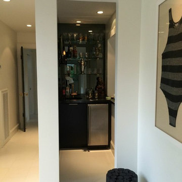
UserGlass Shelves rest on pin set brass supports against smoked mirror in this modern bar area. Further lighting is supplied by an Arteriors Home Sconce referencing the original by Hervé Van Der Straeten. A modern brass oval fixture is set against the smoked mirror bring in the gold elements present throughout the residence. Art is by Artist Gary Komarin.
 Cure Design Group
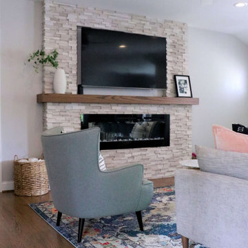
a classic city home, built in the 50’s. Her family moved in August of ’18, and in less than a year, she’s already completed a number of remodel projects including additions to the master bedroom and 2-bedroom + bath “kids’ wing.” She’s opened walls from the kitchen to the living and dining rooms creating a massive open floor plan and refinished all the original hardwood floors. After seeing her beautifully furnished space and hearing her listing everything she’s done to get her house the way it looks today, I had so many exciting ideas to help her add the finishing touches she was needing and to give her the look she was going for.
Referencing her inspiration pics saved to Houzz and Pinterest, the first item on the list was to add window treatments. These were presented in a soft, crisp white fabric which maintains the brightness for each room, diffusing the sunlight throughout, keeping each space light and airy. The simple functional panels give her the privacy she wanted from all the passersby walking the park, which are lined to help regulate the temperature differences she needed. The hardware for these panels is something to mention –simple, modern, matte black rods and brackets, highlighted with acrylic finials and gold rings. This combination is an exclamation point showcasing what custom window treatments can really do for a room. The main dining room window boasts a striking contrast of rich black wide leather tape, drawing your eye right to the beautiful picture window, which in and of itself is a perfect accent to this space.
From there, adding the right wall hangings and artwork, task lighting, accessories, and accents layered throughout, mixing lots of textures, metal finishes, and varying shades of color synchronizes one room to the next buttoning up the entire design concept she was striving to achieve.
 Wiebenson & Dorman Architects PC
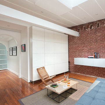
Referencing the wife and 3 daughters for which the house was named, four distinct but cohesive design criteria were considered for the 2016 renovation of the circa 1890, three story masonry rowhouse:
1. To keep the significant original elements – such as
the grand stair and Lincrusta wainscoting.
2. To repurpose original elements such as the former
kitchen pocket doors fitted to their new location on
the second floor with custom track.
3. To improve original elements - such as the new "sky
deck" with its bright green steel frame, a new
kitchen and modern baths.
4. To insert unifying elements such as the 3 wall
benches, wall openings and sculptural ceilings.
Photographer Jesse Gerard - Hoachlander Davis Photography
 Naikoon Contracting Ltd
Architect: M3 Architecture Inc.
Interior Design: Mocoro Studio
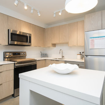
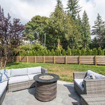
We recently completed a development project in the Pemberton Heights area of North Vancouver. These 2 houses were built to benefit the long-term durability through the selection of efficient materials and process which will give a longer lifespan with lower maintenance and energy costs. This project was a perfect fit for us to assist in the design and execute the construction while working with some outstanding clients and consultants. A win for all of us!
The original home was recycled hitting our target goals of 90%, leading way to a couple of stealth looking homes with performance levels right there with the best of them. Our mechanical engineer designed the mechanical systems to achieve maximum efficiency and hit our internal target goals that we have set for ourselves in accordance with our Vision here at Naikoon. These homes came in at EnerGuide score of 85% which can also be referenced in GJ with a score of 54GJ. To give you an idea of how this rating relates to an average home of this size, these 2 beauties on Mackay are about 80% more efficient. The main components in the design and equipment selection that leads to this are:
1) Space heating and Cooling
2) Water Heating
3) Lights and Appliances
4) Wall assemblies and insulation
Like all of our projects, we take pride in looking at the small details of the house. Things like, insulated water lines, domestic hot water heat recovery units, electric car plug-ins, solar power ready, extensive use of environmentally friendly materials, hot water heat pumps and stringent testing and inspection point along the way, led to a successful completion of 2 certified high-performance homes with Built Green Platinum and EnergyStar certifications.
Photo credits: vopenhouse.ca
 Donald Lococo Architects
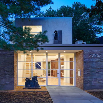
Designed in 1970 for an art collector, the existing referenced 70’s architectural principles. With its cadence of ‘70’s brick masses punctuated by a garage and a 4-foot-deep entrance recess. This recess, however, didn’t convey to the interior, which was occupied by disjointed service spaces. To solve, service spaces are moved and reorganized in open void in the garage. (See plan) This also organized the home: Service & utility on the left, reception central, and communal living spaces on the right.
To maintain clarity of the simple one-story 70’s composition, the second story add is recessive. A flex-studio/extra bedroom and office are designed ensuite creating a slender form and orienting them front to back and setting it back allows the add recede. Curves create a definite departure from the 70s home and by detailing it to "hover like a thought" above the first-floor roof and mentally removable sympathetic add.Existing unrelenting interior walls and a windowless entry, although ideal for fine art was unconducive for the young family of three. Added glass at the front recess welcomes light view and the removal of interior walls not only liberate rooms to communicate with each other but also reinform the cleared central entry space as a hub.
Even though the renovation reinforms its relationship with art, the joy and appreciation of art was not dismissed. A metal sculpture lost in the corner of the south side yard bumps the sculpture at the front entrance to the kitchen terrace over an added pedestal. (See plans) Since the roof couldn’t be railed without compromising the one-story '70s composition, the sculpture garden remains physically inaccessible however mirrors flanking the chimney allow the sculptures to be appreciated in three dimensions. The mirrors also afford privacy from the adjacent Tudor's large master bedroom addition 16-feet away.
 John Lum Architecture, Inc. AIA
Architecture: John Lum Architecture
Interior Design: NicoleHollis
Contractor: Jetton Construction
Landscape: Arterra Landscape Architects
Photography: Adam Rouse Photography
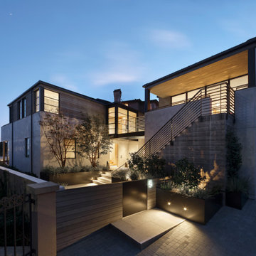
We reworked a spec-level Mediterranean into a design that quietly fits its spectacular bay-side setting. Referencing Sausalito’s fishing village roots, the stucco and styrofoam detailing were replaced with environmentally-conscious materials designed to weather, utilizing a palette of Kebony, cement plaster, and copper standing seam roof.

 LiLu Interiors
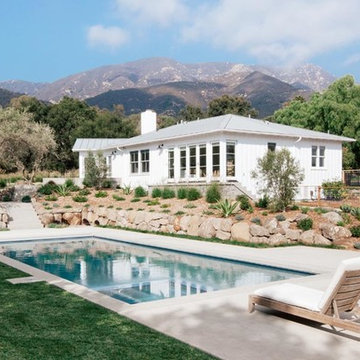
LiLu transformed a St. Anthony Park neighborhood church into this sanctuary for treatment. The interior offers a balance of old and new: referencing the historic setting while creating a contemporary environment that appeals to a youthful spirit. LiLu’s design also meets the residents’ medical needs, offering space for social interaction and self-reflection to enhance both physical and emotional healing.
----
Project designed by Minneapolis interior design studio LiLu Interiors. They serve the Minneapolis-St. Paul area including Wayzata, Edina, and Rochester, and they travel to the far-flung destinations that their upscale clientele own second homes in.
----
For more about LiLu Interiors, click here: https://www.liluinteriors.com/
---
To learn more about this project, click here:
https://www.liluinteriors.com/blog/portfolio-items/healing-haven/

 Patrician Design
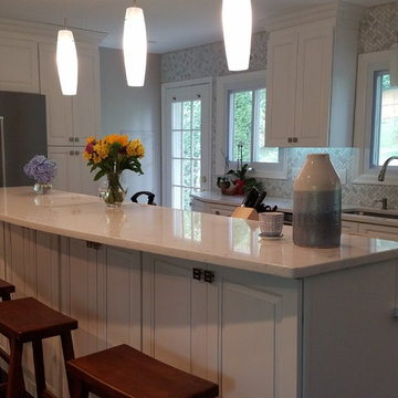
We all know that traditional housing floor plans are changing to maximize smaller footprints. The result is a more open layout. This preference, often seen in “loft” design where warehouse space is converted to living spaces – without many walls and with an eye on the interestingly industrial finishes of the existing space. But this same concept applies to new home construction for starters or down-sizing to smaller homes and is definitely applicable in remodels of existing traditionally compartmentalized plans. Read more and see before and after pictures at the above referenced website.
 Clawson Architects, LLC
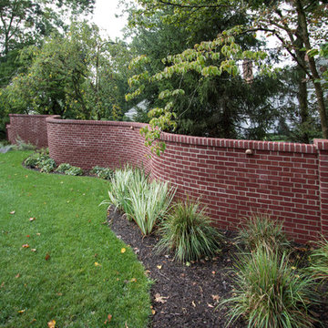
The side French doors open onto a private garden and serpentine wall referencing the historical gardens of the Lawn at University of Virginia, where the owner attend.
 Weldrick & Co.
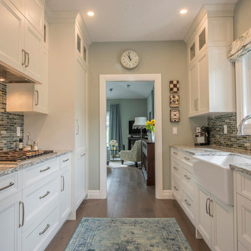
Premium finishes and appliances create a cook's dream kitchen. The palette provides a soft and serene environment, while referencing the property's proximity to water and woods.
 Naikoon Contracting Ltd
Architect: M3 Architecture Inc.
Interior Design: Mocoro Studio
We recently completed a development project in the Pemberton Heights area of North Vancouver. These 2 houses were built to benefit the long-term durability through the selection of efficient materials and process which will give a longer lifespan with lower maintenance and energy costs. This project was a perfect fit for us to assist in the design and execute the construction while working with some outstanding clients and consultants. A win for all of us!
The original home was recycled hitting our target goals of 90%, leading way to a couple of stealth looking homes with performance levels right there with the best of them. Our mechanical engineer designed the mechanical systems to achieve maximum efficiency and hit our internal target goals that we have set for ourselves in accordance with our Vision here at Naikoon. These homes came in at EnerGuide score of 85% which can also be referenced in GJ with a score of 54GJ. To give you an idea of how this rating relates to an average home of this size, these 2 beauties on Mackay are about 80% more efficient. The main components in the design and equipment selection that leads to this are:
1) Space heating and Cooling
2) Water Heating
3) Lights and Appliances
4) Wall assemblies and insulation
Like all of our projects, we take pride in looking at the small details of the house. Things like, insulated water lines, domestic hot water heat recovery units, electric car plug-ins, solar power ready, extensive use of environmentally friendly materials, hot water heat pumps and stringent testing and inspection point along the way, led to a successful completion of 2 certified high-performance homes with Built Green Platinum and EnergyStar certifications.
Photo credits: vopenhouse.ca
26