
Search results for "Referenced" in Home Design Ideas
 Cure Design Group
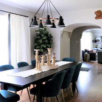
a classic city home, built in the 50’s. Her family moved in August of ’18, and in less than a year, she’s already completed a number of remodel projects including additions to the master bedroom and 2-bedroom + bath “kids’ wing.” She’s opened walls from the kitchen to the living and dining rooms creating a massive open floor plan and refinished all the original hardwood floors. After seeing her beautifully furnished space and hearing her listing everything she’s done to get her house the way it looks today, I had so many exciting ideas to help her add the finishing touches she was needing and to give her the look she was going for.
Referencing her inspiration pics saved to Houzz and Pinterest, the first item on the list was to add window treatments. These were presented in a soft, crisp white fabric which maintains the brightness for each room, diffusing the sunlight throughout, keeping each space light and airy. The simple functional panels give her the privacy she wanted from all the passersby walking the park, which are lined to help regulate the temperature differences she needed. The hardware for these panels is something to mention –simple, modern, matte black rods and brackets, highlighted with acrylic finials and gold rings. This combination is an exclamation point showcasing what custom window treatments can really do for a room. The main dining room window boasts a striking contrast of rich black wide leather tape, drawing your eye right to the beautiful picture window, which in and of itself is a perfect accent to this space.
From there, adding the right wall hangings and artwork, task lighting, accessories, and accents layered throughout, mixing lots of textures, metal finishes, and varying shades of color synchronizes one room to the next buttoning up the entire design concept she was striving to achieve.
 Cabico Custom Cabinetry
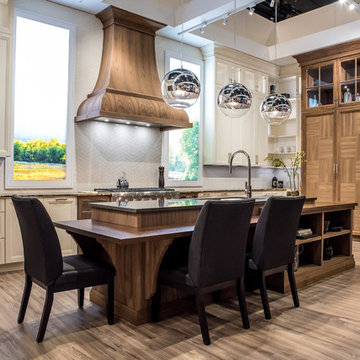
Our Elmwood Series by Cabico display from KBIS 2017. Simply White Cashmere Velvet cabinets complimented by Walnut Island and Accent Pieces in a Natural Velvet finish.
 Childress & Cunningham, Inc
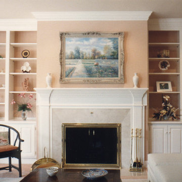
The Living Room has simple, traditional adornment, in keeping with the era it was inspired by.
Copyright © Childress & Cunningham, Inc.
Elegant enclosed carpeted living room photo in Cincinnati with a standard fireplace and no tv
Elegant enclosed carpeted living room photo in Cincinnati with a standard fireplace and no tv
Find the right local pro for your project
 Clawson Architects, LLC
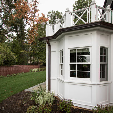
Significant Additions to a Georgian Revival House: The original house was constructed by a sea captain and many of the details are a nod to nautical details fabricated by shipwrights. The new owners wanted to improve the internal circulation and interior proportions of the house. The front entry and family room addition respond to near and distance views of the surrounding landscape and the historic Hobart Gap. The side French doors open onto a private garden and serpentine wall referencing the historical gardens of the Lawn at University of Virginia, where the owner attend.
 Donald Lococo Architects
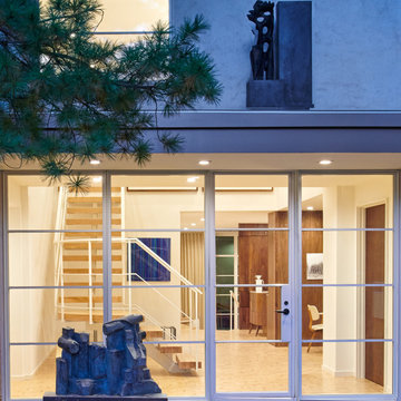
Designed in 1970 for an art collector, the existing referenced 70’s architectural principles. With its cadence of ‘70’s brick masses punctuated by a garage and a 4-foot-deep entrance recess. This recess, however, didn’t convey to the interior, which was occupied by disjointed service spaces. To solve, service spaces are moved and reorganized in open void in the garage. (See plan) This also organized the home: Service & utility on the left, reception central, and communal living spaces on the right.
To maintain clarity of the simple one-story 70’s composition, the second story add is recessive. A flex-studio/extra bedroom and office are designed ensuite creating a slender form and orienting them front to back and setting it back allows the add recede. Curves create a definite departure from the 70s home and by detailing it to "hover like a thought" above the first-floor roof and mentally removable sympathetic add.Existing unrelenting interior walls and a windowless entry, although ideal for fine art was unconducive for the young family of three. Added glass at the front recess welcomes light view and the removal of interior walls not only liberate rooms to communicate with each other but also reinform the cleared central entry space as a hub.
Even though the renovation reinforms its relationship with art, the joy and appreciation of art was not dismissed. A metal sculpture lost in the corner of the south side yard bumps the sculpture at the front entrance to the kitchen terrace over an added pedestal. (See plans) Since the roof couldn’t be railed without compromising the one-story '70s composition, the sculpture garden remains physically inaccessible however mirrors flanking the chimney allow the sculptures to be appreciated in three dimensions. The mirrors also afford privacy from the adjacent Tudor's large master bedroom addition 16-feet away.
 Donald Lococo Architects
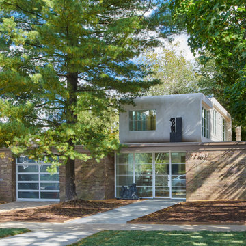
Designed in 1970 for an art collector, the existing referenced 70’s architectural principles. With its cadence of ‘70’s brick masses punctuated by a garage and a 4-foot-deep entrance recess. This recess, however, didn’t convey to the interior, which was occupied by disjointed service spaces. To solve, service spaces are moved and reorganized in open void in the garage. (See plan) This also organized the home: Service & utility on the left, reception central, and communal living spaces on the right.
To maintain clarity of the simple one-story 70’s composition, the second story add is recessive. A flex-studio/extra bedroom and office are designed ensuite creating a slender form and orienting them front to back and setting it back allows the add recede. Curves create a definite departure from the 70s home and by detailing it to "hover like a thought" above the first-floor roof and mentally removable sympathetic add.Existing unrelenting interior walls and a windowless entry, although ideal for fine art was unconducive for the young family of three. Added glass at the front recess welcomes light view and the removal of interior walls not only liberate rooms to communicate with each other but also reinform the cleared central entry space as a hub.
Even though the renovation reinforms its relationship with art, the joy and appreciation of art was not dismissed. A metal sculpture lost in the corner of the south side yard bumps the sculpture at the front entrance to the kitchen terrace over an added pedestal. (See plans) Since the roof couldn’t be railed without compromising the one-story '70s composition, the sculpture garden remains physically inaccessible however mirrors flanking the chimney allow the sculptures to be appreciated in three dimensions. The mirrors also afford privacy from the adjacent Tudor's large master bedroom addition 16-feet away.
 John Lum Architecture, Inc. AIA
Architecture: John Lum Architecture
Interior Design: NicoleHollis
Contractor: Jetton Construction
Landscape: Arterra Landscape Architects
Photography: Douglas Friedman
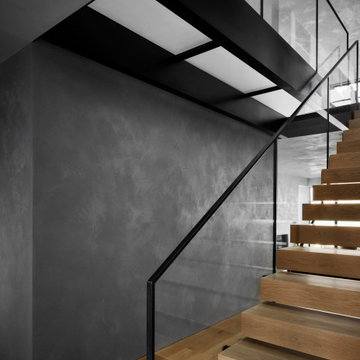
We reworked a spec-level Mediterranean into a design that quietly fits its spectacular bay-side setting. Referencing Sausalito’s fishing village roots, the stucco and styrofoam detailing were replaced with environmentally-conscious materials designed to weather, utilizing a palette of Kebony, cement plaster, and copper standing seam roof.
 Casa Dega Design
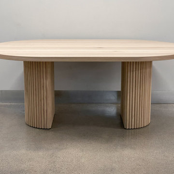
The Aura dining table features a solid wood oval top, with two half-moon fluted legs. Several coats of water-based finish are sprayed on Aura’s natural wood surface & add a layer of extra protection.
Aura was originally commissioned using solid white oak, but can be customized to suit your wood preference.
Aura is an astronomical term referencing an energy field around a given source. (And we know the energy of Aura will knock your houseguests right over).
Material: White Oak
Dimensions: 78”L x 57”W x 30”H
Tabletop thickness: 1.5”
Finish: Natural clear coat
 Optimicity
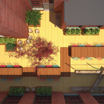
The Cotton Factory is a collection of historic industrial buildings housing artist studios, non-profits and other creative industries. This courtyard space acts as both a common area for the workers, as well as an event space fed by the adjacent catering kitchen.
The space provides several unique conversation spaces, as well as table seating for 24. The tables are able to be moved to suit whatever event needs may arise. Small unprogrammed open spaces allow for temporary art installations or additional seating should the need arise.
In an effort to adhere to a tight budget, all elements are comprised of affordable and even reclaimed materials using simple construction methods. These elements also suit the eclectic style of the buildings inhabitants, while referencing the industrial past of the building itself.
 Dynia Architects
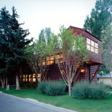
This 2,500 square foot “studio” is located in a neighborhood bisected by alleys and containing charming remnants of indigenous outbuildings common to the region. The desire was to create a clean, open, contemporary interior in a building that outwardly referenced its context. The primary form of the house took shape from the long, narrow lot. On the north end, which faces an alley, a patinated clad steel structure forms a canopy for the entry. This carefully scaled “cabin”, raised above the upper level to access a glimpse of the mountains, pays homage to the many sheds lining the alley.
The south end features a terrace above the garage that is an extension of the primary interior space. The masonry west wall of the building provides privacy from the adjacent lot. This functional “spine” contains program elements on both levels and is visible internally and externally. A gently curved wall provides continuity between the floors and shields a bathroom and dressing area. This wall stops short of the ceiling, allowing the uninterrupted plane of maple veneer plywood to form a canopy unifying the spaces.
A.I.A. Wyoming Chapter Design Award of Honor 2004
 Patrician Design
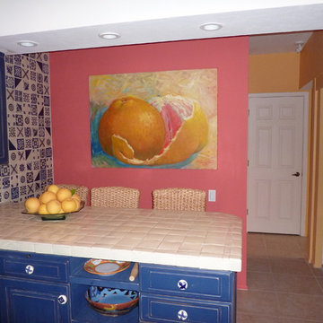
The Sonora Desert in Tucson, Arizona sets the stage for this festive retreat replicating the Mexican interiors so enjoyed by this couple seeking a colorful getaway. Bold colors and an extensive art collection punctuate the space, while tongue and groove wood boards fill between the existing beams for further texture. Read more and see before and after pictures at the above referenced website.
 hungryeye
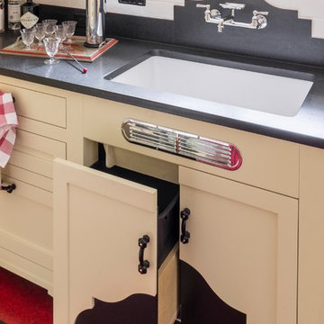
Kitchen in a 1926 bungalow, done to my client's brief that it should look 'original' to the house.
The three 'jewels' of the kitchen are the immaculately restored 1928 Wedgwood high-oven stove, the SubZero refrigerator/freezer designed to look like an old-fashioned ice box, and the island referencing a farmhouse table with pie-save cabinet underneath, done in ebonized oak and painted bead-board.
The red Marmoleum floor has double inlaid borders, the counters are honed black granite, and the walls, cabinets, and trim are all painted a soft ocher-based cream-colour taken from a 1926 DutchBoy paint deck. Virtually everything is custom, save the sink, faucets, and pulls, done to my original designs. The Bosch dishwasher, washer, and dryer are all hidden in the cabinetry.
All photographs courtesy David Duncan Livingston. (Kitchen featured in Fall 2018 AMERICAN BUNGALOW magazine)
 MATHISON | MATHISON ARCHITECTS
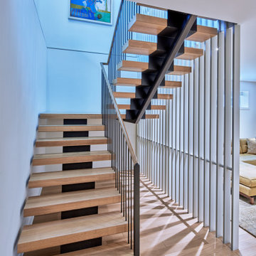
Watermark Residence was conceived as a “downsizing” project for Owners looking to transition from the home where they raised their family to a simpler lifestyle. The footprint and exterior massing of the single family condo was prescribed, but MMA wove new details into these constraints and was urged by the Owner to completely reinvent the interior experience.
From the exterior, the home sits subtly on a corner lot, referencing the neighborhood in its style, but with a warmth and crispness that speaks also to the interiors.
The primary goal of the project was to provide an open, inviting atmosphere of connected spaces that allowed natural light into all areas of the home. Upon entry, there is an immediate involvement in the daily activities with the living and dining rooms being the focal point, and a more intimate kitchen slightly out of view.
Throughout the home, the idea of privacy and transparency plays an important role in the organization of spaces and materials chosen. More private corridors lead to intimate bedroom spaces and functional laundry and mudrooms. A two-floor, semi-transparent slat wall shields direct visibility from the street, while also providing connection between the entertaining spaces of the home. Combined with the white oak, open staircase, the movement between levels feels intuitive and inviting.
A simple palette of materials, understated in their appearance but detailed in their execution, are threaded throughout the home. Gathering spaces are represented with open slats, grounding brick, white oak, and bright walls. Movement deeper into the house brings refined slat panels with integrated hardware at kitchen millwork, softly painted cabinetry, and warm tones of walnut in furniture elements. The most private spaces of the home further extrude the slat element into fluted panels, painted in deeper colors.
 Naikoon Contracting Ltd
Architect: M3 Architecture Inc.
Interior Design: Mocoro Studio
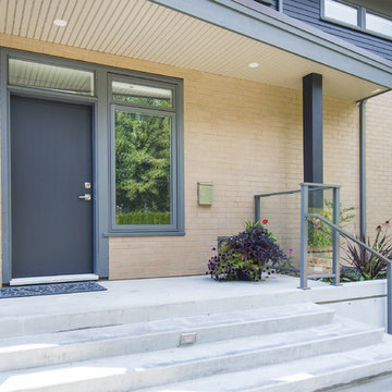
We recently completed a development project in the Pemberton Heights area of North Vancouver. These 2 houses were built to benefit the long-term durability through the selection of efficient materials and process which will give a longer lifespan with lower maintenance and energy costs. This project was a perfect fit for us to assist in the design and execute the construction while working with some outstanding clients and consultants. A win for all of us!
The original home was recycled hitting our target goals of 90%, leading way to a couple of stealth looking homes with performance levels right there with the best of them. Our mechanical engineer designed the mechanical systems to achieve maximum efficiency and hit our internal target goals that we have set for ourselves in accordance with our Vision here at Naikoon. These homes came in at EnerGuide score of 85% which can also be referenced in GJ with a score of 54GJ. To give you an idea of how this rating relates to an average home of this size, these 2 beauties on Mackay are about 80% more efficient. The main components in the design and equipment selection that leads to this are:
1) Space heating and Cooling
2) Water Heating
3) Lights and Appliances
4) Wall assemblies and insulation
Like all of our projects, we take pride in looking at the small details of the house. Things like, insulated water lines, domestic hot water heat recovery units, electric car plug-ins, solar power ready, extensive use of environmentally friendly materials, hot water heat pumps and stringent testing and inspection point along the way, led to a successful completion of 2 certified high-performance homes with Built Green Platinum and EnergyStar certifications.
Photo credits: vopenhouse.ca
 Mauk Cabinets by Design
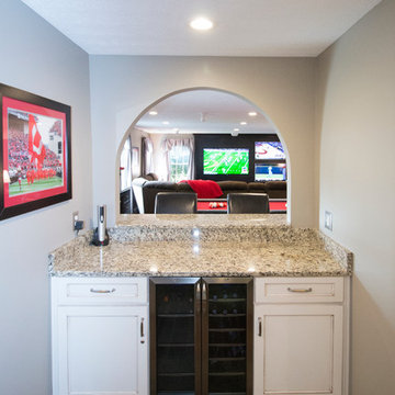
Design and installation by Mauk Cabinets by design in Tipp City, OH. Designer: Aaron Mauk.
Photographer: Shelley Schilperoot
Inspiration for a huge timeless enclosed ceramic tile family room remodel in Other with a bar, gray walls, no fireplace and a media wall
Inspiration for a huge timeless enclosed ceramic tile family room remodel in Other with a bar, gray walls, no fireplace and a media wall
 Dynia Architects
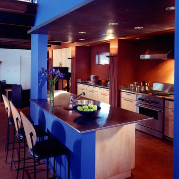
This 2,500 square foot “studio” is located in a neighborhood bisected by alleys and containing charming remnants of indigenous outbuildings common to the region. The desire was to create a clean, open, contemporary interior in a building that outwardly referenced its context. The primary form of the house took shape from the long, narrow lot. On the north end, which faces an alley, a patinated clad steel structure forms a canopy for the entry. This carefully scaled “cabin”, raised above the upper level to access a glimpse of the mountains, pays homage to the many sheds lining the alley.
The south end features a terrace above the garage that is an extension of the primary interior space. The masonry west wall of the building provides privacy from the adjacent lot. This functional “spine” contains program elements on both levels and is visible internally and externally. A gently curved wall provides continuity between the floors and shields a bathroom and dressing area. This wall stops short of the ceiling, allowing the uninterrupted plane of maple veneer plywood to form a canopy unifying the spaces.
A.I.A. Wyoming Chapter Design Award of Honor 2004
 Axis Mundi | Chicago
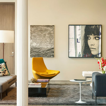
This NoHo apartment, in a landmarked circa 1870 building designed by Stephen Decatur Hatch and converted to lofts in 1987, had been interestingly renovated by a rock musician before being purchased by a young hedge fund manager and his gallery director girlfriend. Naturally, the couple brought to the project their collection of painting, photography and sculpture, mostly by young emerging artists. Axis Mundi accommodated these pieces within a neutral palette accented with occasional flashes of bright color that referenced the various artworks. Major furniture pieces – a sectional in the library, a 12-foot-long dining table–along with a rich blend of textures such as leather, linen, fur and warm woods, helped bring the sprawling dimensions of the loft down to human scale.
Size: 3,400 sf
Design Team: John Beckmann and Nick Messerlian
Architect: Nemaworkshop
Photography: Durston Saylor, and Mark Roskams
© Axis Mundi Design LLC.
 Cure Design Group
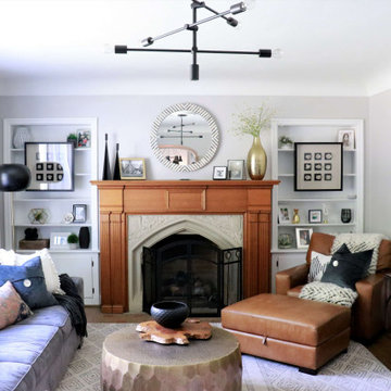
a classic city home, built in the 50’s. Her family moved in August of ’18, and in less than a year, she’s already completed a number of remodel projects including additions to the master bedroom and 2-bedroom + bath “kids’ wing.” She’s opened walls from the kitchen to the living and dining rooms creating a massive open floor plan and refinished all the original hardwood floors. After seeing her beautifully furnished space and hearing her listing everything she’s done to get her house the way it looks today, I had so many exciting ideas to help her add the finishing touches she was needing and to give her the look she was going for.
Referencing her inspiration pics saved to Houzz and Pinterest, the first item on the list was to add window treatments. These were presented in a soft, crisp white fabric which maintains the brightness for each room, diffusing the sunlight throughout, keeping each space light and airy. The simple functional panels give her the privacy she wanted from all the passersby walking the park, which are lined to help regulate the temperature differences she needed. The hardware for these panels is something to mention –simple, modern, matte black rods and brackets, highlighted with acrylic finials and gold rings. This combination is an exclamation point showcasing what custom window treatments can really do for a room. The main dining room window boasts a striking contrast of rich black wide leather tape, drawing your eye right to the beautiful picture window, which in and of itself is a perfect accent to this space.
From there, adding the right wall hangings and artwork, task lighting, accessories, and accents layered throughout, mixing lots of textures, metal finishes, and varying shades of color synchronizes one room to the next buttoning up the entire design concept she was striving to achieve.
 hungryeye
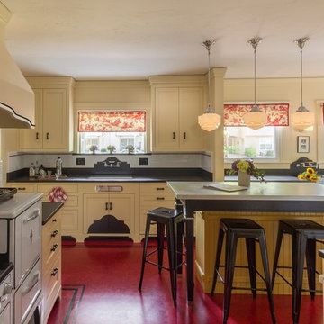
Kitchen in a 1926 bungalow, done to my client's brief that it should look 'original' to the house.
The three 'jewels' of the kitchen are the immaculately restored 1928 Wedgwood high-oven stove, the SubZero refrigerator/freezer designed to look like an old-fashioned ice box, and the island referencing a farmhouse table with pie-save cabinet underneath, done in ebonized oak and painted bead-board.
The red Marmoleum floor has double inlaid borders, the counters are honed black granite, and the walls, cabinets, and trim are all painted a soft ocher-based cream-colour taken from a 1926 DutchBoy paint deck. Virtually everything is custom, save the sink, faucets, and pulls, done to my original designs. The Bosch dishwasher, washer, and dryer are all hidden in the cabinetry.
All photographs courtesy David Duncan Livingston. (Kitchen featured in Fall 2018 AMERICAN BUNGALOW magazine)
 Axis Mundi
Bond Street Loft, New York
This NoHo apartment, in a landmarked circa 1870 building designed by Stephen Decatur Hatch and converted to lofts in 1987, had been interestingly renovated by a rock musician before being purchased by a young hedge fund manager and his gallery director girlfriend. Naturally, the couple brought to the project their collection of painting, photography and sculpture, mostly by young emerging artists (Eddie Martinez, Aaron Curry, Adam Pendelton and Sam Curry, Jung Lee). Axis Mundi accommodated these pieces within a neutral palette accented with occasional flashes of bright color that referenced the various artworks. Major furniture pieces – a sectional in the library, a 12-foot-long dining table–along with a rich blend of textures such as leather, linen, fur and warm woods, helped bring the sprawling dimensions of the loft down to human scale.
Design Team: John Beckmann, with Nick Messerlian
Architect: Nemaworkshop
Photography: Durston Saylor, and Mark Roskams
Size: 3500 sf
© Axis Mundi Design LLC.
32