
Search results for "Reflecting elevated" in Home Design Ideas

 ODS Architecture
Originally a nearly three-story tall 1920’s European-styled home was turned into a modern villa for work and home. A series of low concrete retaining wall planters and steps gradually takes you up to the second level entry, grounding or anchoring the house into the site, as does a new wrap around veranda and trellis. Large eave overhangs on the upper roof were designed to give the home presence and were accented with a Mid-century orange color. The new master bedroom addition white box creates a better sense of entry and opens to the wrap around veranda at the opposite side. Inside the owners live on the lower floor and work on the upper floor with the garage basement for storage, archives and a ceramics studio. New windows and open spaces were created for the graphic designer owners; displaying their mid-century modern furnishings collection.
A lot of effort went into attempting to lower the house visually by bringing the ground plane higher with the concrete retaining wall planters, steps, wrap around veranda and trellis, and the prominent roof with exaggerated overhangs. That the eaves were painted orange is a cool reflection of the owner’s Dutch heritage. Budget was a driver for the project and it was determined that the footprint of the home should have minimal extensions and that the new windows remain in the same relative locations as the old ones. Wall removal was utilized versus moving and building new walls where possible.
Photo Credit: John Sutton Photography.
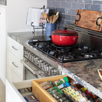
 Twelve Stones Designs, LLC
The owners of this kitchen had spent the money to upgrade the finishes in their kitchen upon building the home 12 years ago, but after living in the space for several years they realized how nonfunctional the layout really was. The (then) two preschool aged children had grown into busy, hungry teenagers with many friends who also liked to hang out at the house. So the family needed a more functional kitchen with better traffic flow, space for daily activities revolving around the kitchen at different times of day, and a kitchen that could accommodate cooking for and serving large groups. Furthermore, the dark, traditional finishes no longer reflected the homeowners’ style. They requested a brighter, more relaxed, coastal style that reflected their love of the seaside cities they like to visit.
Originally, the kitchen was U-shaped with a narrow island in the middle. The island created narrow aisles that bottle-necked at the dishwasher, refrigerator, and cooktop areas. There was a pass-through from the foyer into the kitchen, but the owners never liked that the pass-through was also located so close to the powder room. The awkward proximity was unappealing and made guests feel uncomfortable.
The kitchen’s storage was made up of lots of narrow cabinets, apothecary drawers, clipped corner units, and very few drawers. It lacked useful storage for the larger items the family used on a daily basis. And the kitchen’s only pantry was small closet that had only builder-grade, narrow shelving with no illumination to be able to see the contents inside.
Overall, the kitchen’s lighting plan was poorly executed. Only six recessed cans illuminated the entire kitchen and nook areas. The under cabinet lighting was not evenly distributed either. In fact, the builder had mis-placed the under cabinet lighting around the decorative pilasters which made for choppy, dark cubbies. Further, the builder didn’t include any lighting over the sink or the bar area, which meant whoever was doing the dishes was always in their own shadow. That, coupled with the steep overhang of the game room above made the bar area feel like a dim, cavernous space that wasn’t inviting or task oriented. The kitchen looked out into the main living space, but the raised bar and a narrow wall (which held the only large cabinet in the kitchen) created more of a barrier than a relationship to the living room or breakfast nook. In fact, one couldn’t even see the breakfast nook from the cooktop or sink areas due to its orientation. The raised bar top was too narrow to comfortably sit to either dine at or chat from due to the lack of knee space. The the homeowners confided that the kitchen felt more like a dark, dirty prison than place where the family, or their guests, wanted to gather and commune.
The clients' needs and desires were:
➢ to create a kitchen that would be a space the family loved to be in; to relate to the adjacent spaces all around, and to have better flow for entertaining large groups
➢ to remove the walls between the breakfast nook and living area and to be able to utilize the natural light from the windows in both those areas
➢ to incorporate a functional chopping block for prepping fresh food for home cooked meals, an island with a large sink and drain board, 2 pull out trash cans, and seating for at least the 2 teens to eat or do homework
➢ to design a kitchen and breakfast nook with an airy, coastal, relaxed vibe that blended with the rest of the house's coastal theme
➢ to integrate a layered lighting plan which would include ample general illumination, specific task lighting, decorative lighting, and lots of illuminated storage
➢ to design a kitchen with not only more storage for all the husband’s kitchen gadgets and collection of oils and spices, but smart storage, including a coffee/breakfast bar and a place to store and conceal the toaster oven and microwave
➢ to find a way to utilize the large open space between the kitchen, pantry area, and breakfast nook
Twelve Stones Designs achieved the owner's goals by:
➢ removing the walls between the kitchen and living room to allow the natural light to filter in from the adjacent rooms and to create a connection between the kitchen, nook, and living spaces for a sense of unity and communion
➢ removing the existing pantry and designing 3 large pantry style cabinets with LED tape lights and rollout drawers to house lots of kitchen appliances, gadgets, and tons of groceries. We also took the cabinets all the way up to the 9’ ceiling for additional storage for seasonal items and bulk storage.
➢ designing 2 islands - 1 with a gorgeous black walnut chopping block that houses a drawer for chopping and carving knives and a custom double pull out trash unit for point of use utilization - and 1 that houses the dishwasher, a large Blanco Gourmet sink with integrated drain board, woven baskets for fresh root vegetables and kitchen towels, plenty of drawer storage for kitchen items, and bar seating for up to 4 diners.
➢ closing off the space between the kitchen and the powder room to create a beautiful new private alcove for the powder room as well as adding some decorative storage. This also gave us space to include more tall storage near the new range for precision placement of the husband’s extensive oil and spice collection as well as a location for a combo-steam oven the wife wanted for baking and cooking healthy meals.
The project is enhanced functionally by:
➢ incorporated USB and standard receptacles for the kids’ laptops and phone charging in the large island
➢ designing the small island to include additional open shelving for items used on a daily basis such as a variety of bowls, plates, and colanders. This set up also works well for the husband who prefers to “plate” his dinners in restaurant-style fashion before presenting them to the table.
➢ the integration of specific storage units, such as double stacked cutlery drawers, a custom spice pull-out, a Kuerig coffee and tea pod drawer, and custom double stacked utensil drawers
➢ moving the refrigerator to the old oven location - this eliminated the bottle neck as well as created a better relationship to the eating table. It also utilizes the floor space between the pantry, nook, and kitchen
➢ creating a banquet style breakfast nook - this banquette seating not only doubles the amount of seating for large gatherings but it better utilizes the odd space between the kitchen and the previous nook area. It also helps to create a distinct pathway from the mudroom room through the pantry area, kitchen, nook, and living room.
➢ the coffee/breakfast bar area which includes the perfect location for the concealed microwave and toaster oven, convenient storage for the coffee pods and tea accoutrements. Roll-out drawers below also house the smoothie maker, hot water kettle, and a plethora of smoothie-making ingredients such as protein powders, smoothie additives, etc. Furthermore, the drawers below the Keurig house measuring utensil, cutlery, baking supplies and tupperware storage.
➢ incorporating lots of wide drawers and pullouts to accommodate large cookware.
➢ utilizing as much vertical space as possible by building storage to the ceiling which accommodates the family’s abundant amount of serving platters, baking sheets, bakeware, casserole dishes, and additional cutting boards.
The project is enhanced aesthetically by:
➢ new 5-piece Versailles pattern porcelain tile that now seamlessly joins the entire down stairs area together creating a bright, cohesiveness feeling instead of choppy separated spaces - it also adds a coastal feeling
➢ designing a cabinet to conceal the microwave and toaster oven
➢ the coastal influenced light fixtures over the nook table and island
➢ the sandy colors of the Langdon Cambria countertops. The swirling pattern and sparkling quartz pieces remind the homeowner of black-and-tan sandy beaches
➢ the striped banquet seating whose creamy white background and blue-green stripes were the inspiration for the cabinet and wall colors.
➢ All the interior doors were painted black to coordinate with the blacks and grays in the backsplash tile and countertop. This also adds a hint of tailored formality to an otherwise casual space.
➢ the use of WAC's Oculux small aperture LED units for the overhead lighting complimented with Diode LED strips for task lighting under the cabinets and inside the pantry and glass wall cabinets. All of the lighting applications are on separate dimmer switches.
Innovative uses of materials or construction methods by Realty Restoration LLC:
➢ Each 1-1/2” x 3” block of reclaimed end-grain black walnut that makes up the center island chopping block was hand milled and built in the shop. It was designed to look substantial and proportional to the surrounding elements, executed by creating the 4 inch tall top with a solid wood chamfered edge band.
➢ The metal doors on either side of the vent hood were also custom designed for this project and built in the Realty Restoration LLC shop. They are made 1x2, 11-gauge mild steel with ribbed glass. Weighing 60 lbs a piece, heavy duty cabinet hinges were added to support the weight of the door and keep them from sagging.
➢ Under-cabinet receptacles were added along the range wall in order to have a clean, uninterrupted backsplash.
Design obstacles to overcome:
➢ Because we were removing the demising walls between the kitchen and living room, we had to find a way to plumb and vent the new island. We did this by tunneling through the slab (the slab had post tension cables which prevented us from just trenching) to run a new wet vent through a nearby structural wall. We pulled the existing hot and cold lines between upper floor joists and ran them down the structural wall as well and up through a conduit in the tunnel.
➢ Since we were converting from wall overs to a gas range it allowed us to utilize the 220 feed for the wall ovens to provide a new sub panel for all the new kitchen circuits
➢ Due to framing deficiencies inherited from the original build there was a 1-1/2” differential in the floor-to-ceiling height over a 20 foot span; by utilizing the process of cutting and furring coupled with the crown moulding details on the cabinet elevations we were able to mask the problem and provide seamless transitions between the cabinet components.
Evidence of superior craftsmanship:
➢ uniquely designed, one-of-a-kind metal “X” end panels on the large island. The end panels were custom made in the Realty Restoration LLC shop and fitted to the exact dimensions of the island. The welding seams are completely indistinguishable - the posts look like they are cut from a single sheet of metal
➢ square metal posts on the small island were also custom made and designed to compliment and carry through the metal element s throughout the kitchen
➢ the beautiful, oversized end panels on the pantry cabinets which give the breakfast nook a tailored look
➢ integrating a large format 5 piece Versailles tile pattern to seamlessly flow from the existing spaces into the new kitchen space
➢ By constructing a custom cabinet that jogged around a corner we could not remodel (housing the entry way coat closet) we were able to camouflage the adjacent wall offset within the upper and lower cabinets. By designing around the existing jog in the structural walls we accomplished a few things: we were able to find the space to house, and hide, the microwave and toaster oven yet still have a clean cohesive appearance from the kitchen side. Additionally, the owners were able to keep their much needed coat closet and we didn’t have to increase the budget with unnecessary structural work.

 Astro Design Inc.
Design & Supply by Astro Design, Ottawa Canada
Timeless yet fresh in its aesthetic and efficient in its layout, this beautiful kitchen is sure to become a well used and thoroughly enjoyed heart and hub of this new home.
Doublespace Photography
Find the right local pro for your project

 GAYLA BECHTOL ARCHITECT
This view beautifully captures how Santa Fe Style Architecture rises naturally from the landscape. The clean adobe-inspired walls and modern timber pergola reflect the traditions of Adobe Architecture while embracing contemporary design. Stone terracing and pathways, crafted with care, are examples of thoughtful Site and Landscape Design Santa Fe, guiding visitors through a lush, layered garden toward the entry. Every detail reflects the hand of a skilled Santa Fe Architect, where structure and setting harmonize with timeless proportion and balance. The result is a work of Custom Residential Design Santa Fe—a retreat that honors heritage, celebrates place, and elevates daily living.
Wendy McEahern

 Insignia Homes
Jeff Tippett
Beach style bathroom photo in Grand Rapids with an undermount sink, shaker cabinets, gray cabinets and white walls
Beach style bathroom photo in Grand Rapids with an undermount sink, shaker cabinets, gray cabinets and white walls

 Vetter Architects
The owners requested that their home harmonize with the spirit of the surrounding Colorado mountain setting and enhance their outdoor recreational lifestyle - while reflecting their contemporary architectural tastes. The site was burdened with a myriad of strict design criteria enforced by the neighborhood covenants and architectural review board. Creating a distinct design challenge, the covenants included a narrow interpretation of a “mountain style” home which established predetermined roof pitches, glazing percentages and material palettes - at direct odds with the client‘s vision of a flat-roofed, glass, “contemporary” home.
Our solution finds inspiration and opportunities within the site covenant’s strict definitions. It promotes and celebrates the client’s outdoor lifestyle and resolves the definition of a contemporary “mountain style” home by reducing the architecture to its most basic vernacular forms and relying upon local materials.
The home utilizes a simple base, middle and top that echoes the surrounding mountains and vegetation. The massing takes its cues from the prevalent lodgepole pine trees that grow at the mountain’s high altitudes. These pine trees have a distinct growth pattern, highlighted by a single vertical trunk and a peaked, densely foliated growth zone above a sparse base. This growth pattern is referenced by placing the wood-clad body of the home at the second story above an open base composed of wood posts and glass. A simple peaked roof rests lightly atop the home - visually floating above a triangular glass transom. The home itself is neatly inserted amongst an existing grove of lodgepole pines and oriented to take advantage of panoramic views of the adjacent meadow and Continental Divide beyond.
The main functions of the house are arranged into public and private areas and this division is made apparent on the home’s exterior. Two large roof forms, clad in pre-patinated zinc, are separated by a sheltering central deck - which signals the main entry to the home. At this connection, the roof deck is opened to allow a cluster of aspen trees to grow – further reinforcing nature as an integral part of arrival.
Outdoor living spaces are provided on all levels of the house and are positioned to take advantage of sunrise and sunset moments. The distinction between interior and exterior space is blurred via the use of large expanses of glass. The dry stacked stone base and natural cedar cladding both reappear within the home’s interior spaces.
This home offers a unique solution to the client’s requests while satisfying the design requirements of the neighborhood covenants. The house provides a variety of indoor and outdoor living spaces that can be utilized in all seasons. Most importantly, the house takes its cues directly from its natural surroundings and local building traditions to become a prototype solution for the “modern mountain house”.
Overview
Ranch Creek Ranch
Winter Park, Colorado
Completion Date
October, 2007
Services
Architecture, Interior Design, Landscape Architecture

 Refined Renovations & Refined Home
A family moved from the city to this home just north of Boston. The house was built in the early 2000s and needed some updating - a new kitchen, mudroom, and a laundry room that had to be relocated to the second floor. In addition to the renovations, the couple needed to furnish their home. This included furniture, decor, accessories, wallpaper, window treatments, paint colors etc. Every room was transformed to meet the family's needs and was a reflection of their personality. The end result was a bright, fun and livable home for the couple and their three small children. Max Holiver Photography
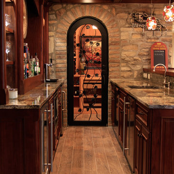
Sponsored
Delaware, OH

Buckeye Basements, Inc.
Central Ohio's Basement Finishing ExpertsBest Of Houzz '13-'21

 M. Designs Architects
The striking new remodel in the city of Saratoga, California. Modern, Practical, Stylish! Dark wooden frames with windows in various shapes and sizes, outlined with a white border. clean cut landscaping and refreshing to view


 Dunn Architecture Studio
Darren Eskandari
Example of a trendy entryway design in Los Angeles with a glass front door
Example of a trendy entryway design in Los Angeles with a glass front door

 Tina Michelle Interiors
Inspiration for a timeless l-shaped travertine floor and beige floor kitchen remodel in Miami with an undermount sink, recessed-panel cabinets, white cabinets, marble countertops, multicolored backsplash, glass tile backsplash, stainless steel appliances and an island
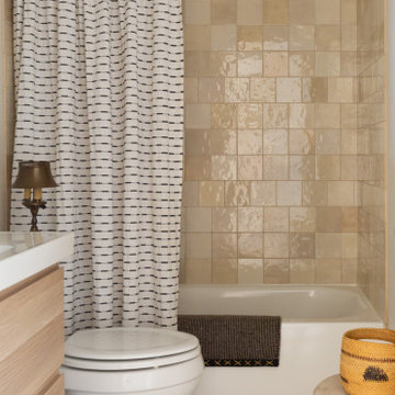
 Leah Impey Interior Design
Drop-in bathtub - scandinavian beige tile porcelain tile and single-sink drop-in bathtub idea in San Diego with flat-panel cabinets, light wood cabinets, white countertops and a floating vanity
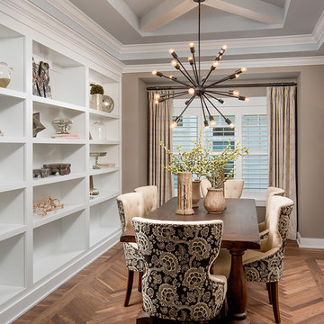


 Studio Snaidero DC Metro
LUX in Reflect White High Gloss Lacquer and Dark Ash Wood Veneer photographed by Gordon Beall Photography.
Inspiration for a contemporary single-wall light wood floor eat-in kitchen remodel in DC Metro with flat-panel cabinets, white cabinets, an island, gray backsplash, an undermount sink, glass sheet backsplash and paneled appliances
Inspiration for a contemporary single-wall light wood floor eat-in kitchen remodel in DC Metro with flat-panel cabinets, white cabinets, an island, gray backsplash, an undermount sink, glass sheet backsplash and paneled appliances

 Vision Interiors
As a conceptual urban infill project, the Wexley is designed for a narrow lot in the center of a city block. The 26’x48’ floor plan is divided into thirds from front to back and from left to right. In plan, the left third is reserved for circulation spaces and is reflected in elevation by a monolithic block wall in three shades of gray. Punching through this block wall, in three distinct parts, are the main levels windows for the stair tower, bathroom, and patio. The right two-thirds of the main level are reserved for the living room, kitchen, and dining room. At 16’ long, front to back, these three rooms align perfectly with the three-part block wall façade. It’s this interplay between plan and elevation that creates cohesion between each façade, no matter where it’s viewed. Given that this project would have neighbors on either side, great care was taken in crafting desirable vistas for the living, dining, and master bedroom. Upstairs, with a view to the street, the master bedroom has a pair of closets and a skillfully planned bathroom complete with soaker tub and separate tiled shower. Main level cabinetry and built-ins serve as dividing elements between rooms and framing elements for views outside.
Architect: Visbeen Architects
Builder: J. Peterson Homes
Photographer: Ashley Avila Photography

 Eric Reinholdt, Architect
The main ‘wharf’ cottage seen here extends over the tidal salt pond below with a structural steel frame anchored to the pond’s granite basin and contains communal living spaces: kitchen, dining, and living rooms.
Linking interior space to the views beyond is a cantilevered deck which appears to float above the water. The flanking cottages not seen here contain private sleeping quarters and frame views to the surrounding moss covered forest.
Eric Reinholdt - Project Architect/Lead Designer with Elliott + Elliott Architecture
Photo: Tom Crane Photography, Inc.
 Vision Interiors
As a conceptual urban infill project, the Wexley is designed for a narrow lot in the center of a city block. The 26’x48’ floor plan is divided into thirds from front to back and from left to right. In plan, the left third is reserved for circulation spaces and is reflected in elevation by a monolithic block wall in three shades of gray. Punching through this block wall, in three distinct parts, are the main levels windows for the stair tower, bathroom, and patio. The right two-thirds of the main level are reserved for the living room, kitchen, and dining room. At 16’ long, front to back, these three rooms align perfectly with the three-part block wall façade. It’s this interplay between plan and elevation that creates cohesion between each façade, no matter where it’s viewed. Given that this project would have neighbors on either side, great care was taken in crafting desirable vistas for the living, dining, and master bedroom. Upstairs, with a view to the street, the master bedroom has a pair of closets and a skillfully planned bathroom complete with soaker tub and separate tiled shower. Main level cabinetry and built-ins serve as dividing elements between rooms and framing elements for views outside.
Architect: Visbeen Architects
Builder: J. Peterson Homes
Photographer: Ashley Avila Photography


 ELEVATIONS | Design Solutions by Myers
Visit Our Showroom
8000 Locust Mill St.
Ellicott City, MD 21043
Masonite Interior Door - Logan’s classic Shaker design blends seamlessly with any space, allowing you to add visual interest that isn’t overpowering.
Elevations Design Solutions by Myers is the go-to inspirational, high-end showroom for the best in cabinetry, flooring, window and door design. Visit our showroom with your architect, contractor or designer to explore the brands and products that best reflects your personal style. We can assist in product selection, in-home measurements, estimating and design, as well as providing referrals to professional remodelers and designers.

 Endless Pools
Constructed for year-round swimming in a cold climate, this Endless Pool Swim Spa sunroom preserves a natural feel with a welcoming woodland view. The lakeside windows capture the light reflected off the water for added warmth. The Pool's compact size and insulated construction make it quick and economical to heat.
11