
Search results for "Reflecting elevated" in Home Design Ideas
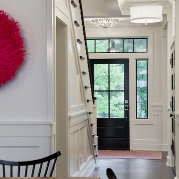
 ADŌR Homes
SpaceCrafting Real Estate Photography
Inspiration for a mid-sized transitional dark wood floor single front door remodel in Minneapolis with white walls and a black front door
Inspiration for a mid-sized transitional dark wood floor single front door remodel in Minneapolis with white walls and a black front door
 Vetter Architects
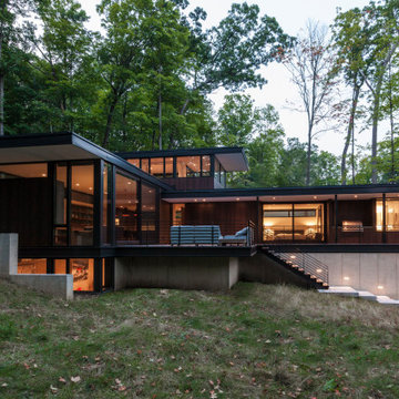
The client’s request was quite common - a typical 2800 sf builder home with 3 bedrooms, 2 baths, living space, and den. However, their desire was for this to be “anything but common.” The result is an innovative update on the production home for the modern era, and serves as a direct counterpoint to the neighborhood and its more conventional suburban housing stock, which focus views to the backyard and seeks to nullify the unique qualities and challenges of topography and the natural environment.
The Terraced House cautiously steps down the site’s steep topography, resulting in a more nuanced approach to site development than cutting and filling that is so common in the builder homes of the area. The compact house opens up in very focused views that capture the natural wooded setting, while masking the sounds and views of the directly adjacent roadway. The main living spaces face this major roadway, effectively flipping the typical orientation of a suburban home, and the main entrance pulls visitors up to the second floor and halfway through the site, providing a sense of procession and privacy absent in the typical suburban home.
Clad in a custom rain screen that reflects the wood of the surrounding landscape - while providing a glimpse into the interior tones that are used. The stepping “wood boxes” rest on a series of concrete walls that organize the site, retain the earth, and - in conjunction with the wood veneer panels - provide a subtle organic texture to the composition.
The interior spaces wrap around an interior knuckle that houses public zones and vertical circulation - allowing more private spaces to exist at the edges of the building. The windows get larger and more frequent as they ascend the building, culminating in the upstairs bedrooms that occupy the site like a tree house - giving views in all directions.
The Terraced House imports urban qualities to the suburban neighborhood and seeks to elevate the typical approach to production home construction, while being more in tune with modern family living patterns.
Overview:
Elm Grove
Size:
2,800 sf,
3 bedrooms, 2 bathrooms
Completion Date:
September 2014
Services:
Architecture, Landscape Architecture
Interior Consultants: Amy Carman Design
 MainStreet Design Build
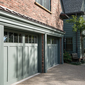
This early 20th century Poppleton Park home was originally 2548 sq ft. with a small kitchen, nook, powder room and dining room on the first floor. The second floor included a single full bath and 3 bedrooms. The client expressed a need for about 1500 additional square feet added to the basement, first floor and second floor. In order to create a fluid addition that seamlessly attached to this home, we tore down the original one car garage, nook and powder room. The addition was added off the northern portion of the home, which allowed for a side entry garage. Plus, a small addition on the Eastern portion of the home enlarged the kitchen, nook and added an exterior covered porch.
Special features of the interior first floor include a beautiful new custom kitchen with island seating, stone countertops, commercial appliances, large nook/gathering with French doors to the covered porch, mud and powder room off of the new four car garage. Most of the 2nd floor was allocated to the master suite. This beautiful new area has views of the park and includes a luxurious master bath with free standing tub and walk-in shower, along with a 2nd floor custom laundry room!
Attention to detail on the exterior was essential to keeping the charm and character of the home. The brick façade from the front view was mimicked along the garage elevation. A small copper cap above the garage doors and 6” half-round copper gutters finish the look.
KateBenjamin Photography
Find the right local pro for your project
 Vetter Architects
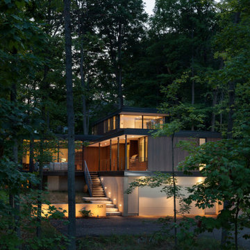
The client’s request was quite common - a typical 2800 sf builder home with 3 bedrooms, 2 baths, living space, and den. However, their desire was for this to be “anything but common.” The result is an innovative update on the production home for the modern era, and serves as a direct counterpoint to the neighborhood and its more conventional suburban housing stock, which focus views to the backyard and seeks to nullify the unique qualities and challenges of topography and the natural environment.
The Terraced House cautiously steps down the site’s steep topography, resulting in a more nuanced approach to site development than cutting and filling that is so common in the builder homes of the area. The compact house opens up in very focused views that capture the natural wooded setting, while masking the sounds and views of the directly adjacent roadway. The main living spaces face this major roadway, effectively flipping the typical orientation of a suburban home, and the main entrance pulls visitors up to the second floor and halfway through the site, providing a sense of procession and privacy absent in the typical suburban home.
Clad in a custom rain screen that reflects the wood of the surrounding landscape - while providing a glimpse into the interior tones that are used. The stepping “wood boxes” rest on a series of concrete walls that organize the site, retain the earth, and - in conjunction with the wood veneer panels - provide a subtle organic texture to the composition.
The interior spaces wrap around an interior knuckle that houses public zones and vertical circulation - allowing more private spaces to exist at the edges of the building. The windows get larger and more frequent as they ascend the building, culminating in the upstairs bedrooms that occupy the site like a tree house - giving views in all directions.
The Terraced House imports urban qualities to the suburban neighborhood and seeks to elevate the typical approach to production home construction, while being more in tune with modern family living patterns.
Overview:
Elm Grove
Size:
2,800 sf,
3 bedrooms, 2 bathrooms
Completion Date:
September 2014
Services:
Architecture, Landscape Architecture
Interior Consultants: Amy Carman Design
 AquaTerra Outdoors
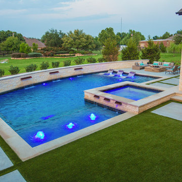
This late 70's ranch style home was recently renovated with a clean, modern twist on the ranch style architecture of the existing residence. We were hired to create the entire outdoor environemnt including the new pool and spa. Similar to the renovated home, this aquatic environment was designed to take a traditional pool and gives it a clean, modern twist. The site proved to be perfect for a long, sweeping curved water feature that can be seen from all of the outdoor gathering spaces as well as many rooms inside the residence. This design draws people outside and allows them to explore all of the features of the pool and outdoor spaces. Features of this resort like outdoor environment include play pool with two lounge areas with LED lit bubblers, Pebble Tec Pebble Sheen Luminous series pool finish, Lightstreams glass tile, spa with six custom copper Bobe water spillway scuppers, water feature wall with three custom copper Bobe water scuppers, Fully automated with Pentair Equipment, LED lighting throughout the pool and spa, gathering space with automated fire pit, lounge deck area, synthetic turf between step pads and deck and a fully loaded Gourmet outdoor kitchen to meet all the entertaining needs.
This outdoor environment cohesively brings the clean & modern finishes of the renovated home seamlessly to the outdoors to a pool and spa for play, exercise and relaxation.
Photography: Daniel Driensky
 Storie Collective
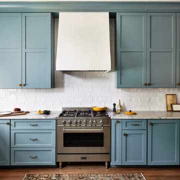
In this Victorian home on Capitol Hill, the interior had been gut renovated by a developer to match a modern farmhouse aesthetic which did not reflect our client. Our scope included a complete overhaul of the primary bathroom and powder room, a heavy kitchen refresh, along with new hardware, doors, paint, lighting, furnishings and window treatments throughout the home. Our goal was to also elevate the home’s architectural details, including a new stair rail, back to what could have been original millwork while creating a feminine, sophisticated space for a family of 5 (plus one adorable furry friend).
 Secret Gardens
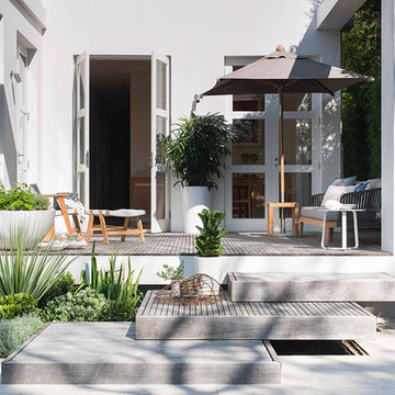
Our clients have a busy life so they wanted their inner city garden to be low fuss and look low fuss. They wanted outdoor spaces that looked relaxed, with a simple and soft palette of finishes that acknowledged their coastal location. The site conditions and their brief also called for plants that were hardy and that would tolerate the full sun and sandy soils. The structural finishes and the plant colours provide a harmonious blend and compliment the design choices of the interior.
Sponsored
Delaware, OH

Buckeye Basements, Inc.
Central Ohio's Basement Finishing ExpertsBest Of Houzz '13-'21
 JRP Design & Remodel
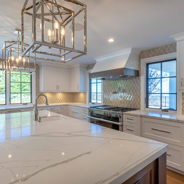
Our client's Tudor-style home felt outdated. She was anxious to be rid of the warm antiquated tones and to introduce new elements of interest while keeping resale value in mind. It was at a Boys & Girls Club luncheon that she met Justin and Lori through a four-time repeat client sitting at the same table. For her, reputation was a key factor in choosing a design-build firm. She needed someone she could trust to help design her vision. Together, JRP and our client solidified a plan for a sweeping home remodel that included a bright palette of neutrals and knocking down walls to create an open-concept first floor.
Now updated and expanded, the home has great circulation space for entertaining. The grand entryway, once partitioned by a wall, now bespeaks the spaciousness of the home. An eye catching chandelier floats above the spacious entryway. High ceilings and pale neutral colors make the home luminous. Medium oak hardwood floors throughout add a gentle warmth to the crisp palette. Originally U-shaped and closed, the kitchen is now as beautiful as it is functional. A grand island with luxurious Calacatta quartz spilling across the counter and twin candelabra pendants above the kitchen island bring the room to life. Frameless, two-tone cabinets set against ceramic rhomboid tiles convey effortless style. Just off the second-floor master bedroom is an elevated nook with soaring ceilings and a sunlit rotunda glowing in natural light. The redesigned master bath features a free-standing soaking tub offset by a striking statement wall. Marble-inspired quartz in the shower creates a sense of breezy movement and soften the space. Removing several walls, modern finishes, and the open concept creates a relaxing and timeless vibe. Each part of the house feels light as air. After a breathtaking renovation, this home reflects transitional design at its best.
PROJECT DETAILS:
•Style: Transitional
•Countertops: Vadara Quartz, Calacatta Blanco
•Cabinets: (Dewils) Frameless Recessed Panel Cabinets, Maple - Painted White / Kitchen Island: Stained Cacao
•Hardware/Plumbing Fixture Finish: Polished Nickel, Chrome
•Lighting Fixtures: Chandelier, Candelabra (in kitchen), Sconces
•Flooring:
oMedium Oak Hardwood Flooring with Oil Finish
oBath #1, Floors / Master WC: 12x24 “marble inspired” Porcelain Tiles (color: Venato Gold Matte)
oBath #2 & #3 Floors: Ceramic/Porcelain Woodgrain Tile
•Tile/Backsplash: Ceramic Rhomboid Tiles – Finish: Crackle
•Paint Colors: White/Light Grey neutrals
•Other Details: (1) Freestanding Soaking Tub (2) Elevated Nook off Master Bedroom
Photographer: J.R. Maddox
 JRP Design & Remodel
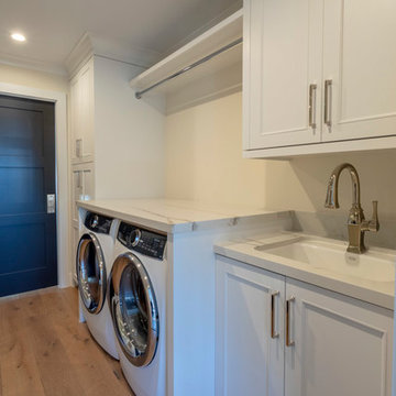
Our client's Tudor-style home felt outdated. She was anxious to be rid of the warm antiquated tones and to introduce new elements of interest while keeping resale value in mind. It was at a Boys & Girls Club luncheon that she met Justin and Lori through a four-time repeat client sitting at the same table. For her, reputation was a key factor in choosing a design-build firm. She needed someone she could trust to help design her vision. Together, JRP and our client solidified a plan for a sweeping home remodel that included a bright palette of neutrals and knocking down walls to create an open-concept first floor.
Now updated and expanded, the home has great circulation space for entertaining. The grand entryway, once partitioned by a wall, now bespeaks the spaciousness of the home. An eye catching chandelier floats above the spacious entryway. High ceilings and pale neutral colors make the home luminous. Medium oak hardwood floors throughout add a gentle warmth to the crisp palette. Originally U-shaped and closed, the kitchen is now as beautiful as it is functional. A grand island with luxurious Calacatta quartz spilling across the counter and twin candelabra pendants above the kitchen island bring the room to life. Frameless, two-tone cabinets set against ceramic rhomboid tiles convey effortless style. Just off the second-floor master bedroom is an elevated nook with soaring ceilings and a sunlit rotunda glowing in natural light. The redesigned master bath features a free-standing soaking tub offset by a striking statement wall. Marble-inspired quartz in the shower creates a sense of breezy movement and soften the space. Removing several walls, modern finishes, and the open concept creates a relaxing and timeless vibe. Each part of the house feels light as air. After a breathtaking renovation, this home reflects transitional design at its best.
PROJECT DETAILS:
•Style: Transitional
•Countertops: Vadara Quartz, Calacatta Blanco
•Cabinets: (Dewils) Frameless Recessed Panel Cabinets, Maple - Painted White / Kitchen Island: Stained Cacao
•Hardware/Plumbing Fixture Finish: Polished Nickel, Chrome
•Lighting Fixtures: Chandelier, Candelabra (in kitchen), Sconces
•Flooring:
oMedium Oak Hardwood Flooring with Oil Finish
oBath #1, Floors / Master WC: 12x24 “marble inspired” Porcelain Tiles (color: Venato Gold Matte)
oBath #2 & #3 Floors: Ceramic/Porcelain Woodgrain Tile
•Tile/Backsplash: Ceramic Rhomboid Tiles – Finish: Crackle
•Paint Colors: White/Light Grey neutrals
•Other Details: (1) Freestanding Soaking Tub (2) Elevated Nook off Master Bedroom
Photographer: J.R. Maddox
 place architecture:design
Tom Holdsworth Photography
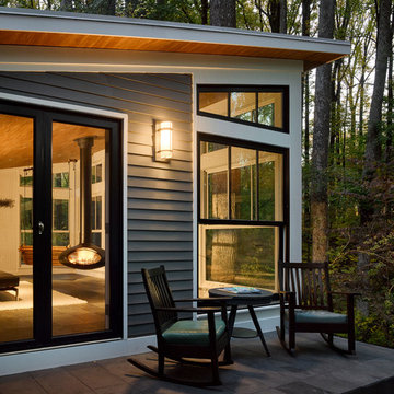
Our clients wanted to create a room that would bring them closer to the outdoors; a room filled with natural lighting; and a venue to spotlight a modern fireplace.
Early in the design process, our clients wanted to replace their existing, outdated, and rundown screen porch, but instead decided to build an all-season sun room. The space was intended as a quiet place to read, relax, and enjoy the view.
The sunroom addition extends from the existing house and is nestled into its heavily wooded surroundings. The roof of the new structure reaches toward the sky, enabling additional light and views.
The floor-to-ceiling magnum double-hung windows with transoms, occupy the rear and side-walls. The original brick, on the fourth wall remains exposed; and provides a perfect complement to the French doors that open to the dining room and create an optimum configuration for cross-ventilation.
To continue the design philosophy for this addition place seamlessly merged natural finishes from the interior to the exterior. The Brazilian black slate, on the sunroom floor, extends to the outdoor terrace; and the stained tongue and groove, installed on the ceiling, continues through to the exterior soffit.
The room's main attraction is the suspended metal fireplace; an authentic wood-burning heat source. Its shape is a modern orb with a commanding presence. Positioned at the center of the room, toward the rear, the orb adds to the majestic interior-exterior experience.
This is the client's third project with place architecture: design. Each endeavor has been a wonderful collaboration to successfully bring this 1960s ranch-house into twenty-first century living.


 ZeroEnergy Design
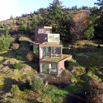
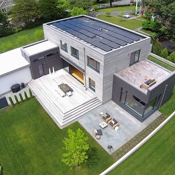
 (ZED) created this modern home for a progressive family in the desirable community of Lexington.
Thoughtful Land Connection. The residence is carefully sited on the infill lot so as to create privacy from the road and neighbors, while cultivating a side yard that captures the southern sun. The terraced grade rises to meet the house, allowing for it to maintain a structured connection with the ground while also sitting above the high water table. The elevated outdoor living space maintains a strong connection with the indoor living space, while the stepped edge ties it back to the true ground plane. Siting and outdoor connections were completed by ZED in collaboration with landscape designer Soren Deniord Design Studio.
Exterior Finishes and Solar. The exterior finish materials include a palette of shiplapped wood siding, through-colored fiber cement panels and stucco. A rooftop parapet hides the solar panels above, while a gutter and site drainage system directs rainwater into an irrigation cistern and dry wells that recharge the groundwater.
Cooking, Dining, Living. Inside, the kitchen, fabricated by Henrybuilt, is located between the indoor and outdoor dining areas. The expansive south-facing sliding door opens to seamlessly connect the spaces, using a retractable awning to provide shade during the summer while still admitting the warming winter sun. The indoor living space continues from the dining areas across to the sunken living area, with a view that returns again to the outside through the corner wall of glass.
Accessible Guest Suite. The design of the first level guest suite provides for both aging in place and guests who regularly visit for extended stays. The patio off the north side of the house affords guests their own private outdoor space, and privacy from the neighbor. Similarly, the second level master suite opens to an outdoor private roof deck.
Light and Access. The wide open interior stair with a glass panel rail leads from the top level down to the well insulated basement. The design of the basement, used as an away/play space, addresses the need for both natural light and easy access. In addition to the open stairwell, light is admitted to the north side of the area with a high performance, Passive House (PHI) certified skylight, covering a six by sixteen foot area. On the south side, a unique roof hatch set flush with the deck opens to reveal a glass door at the base of the stairwell which provides additional light and access from the deck above down to the play space.
Energy. Energy consumption is reduced by the high performance building envelope, high efficiency mechanical systems, and then offset with renewable energy. All windows and doors are made of high performance triple paned glass with thermally broken aluminum frames. The exterior wall assembly employs dense pack cellulose in the stud cavity, a continuous air barrier, and four inches exterior rigid foam insulation. The 10kW rooftop solar electric system provides clean energy production. The final air leakage testing yielded 0.6 ACH 50 - an extremely air tight house, a testament to the well-designed details, progress testing and quality construction. When compared to a new house built to code requirements, this home consumes only 19% of the energy.
Architecture & Energy Consulting: ZeroEnergy Design
Landscape Design: Soren Deniord Design
Paintings: Bernd Haussmann Studio
Photos: Eric Roth Photography
Sponsored
Columbus, OH
Free consultation for landscape design!

Peabody Landscape Group
Franklin County's Reliable Landscape Design & Contracting
 TKS Design Group
Download our free ebook, Creating the Ideal Kitchen. DOWNLOAD NOW
For many, extra time at home during COVID left them wanting more from their homes. Whether you realized the shortcomings of your space or simply wanted to combat boredom, a well-designed and functional home was no longer a want, it became a need. Tina found herself wanting more from her Old Irving Park home and reached out to The Kitchen Studio about adding function to her kitchen to make the most of the available real estate.
At the end of the day, there is nothing better than returning home to a bright and happy space you love. And this kitchen wasn’t that for Tina. Dark and dated, with a palette from the past and features that didn’t make the most of the available square footage, this remodel required vision and a fresh approach to the space. Lead designer, Stephanie Cole’s main design goal was better flow, while adding greater functionality with organized storage, accessible open shelving, and an overall sense of cohesion with the adjoining family room.
The original kitchen featured a large pizza oven, which was rarely used, yet its footprint limited storage space. The nearby pantry had become a catch-all, lacking the organization needed in the home. The initial plan was to keep the pizza oven, but eventually Tina realized she preferred the design possibilities that came from removing this cumbersome feature, with the goal of adding function throughout the upgraded and elevated space. Eliminating the pantry added square footage and length to the kitchen for greater function and more storage. This redesigned space reflects how she lives and uses her home, as well as her love for entertaining.
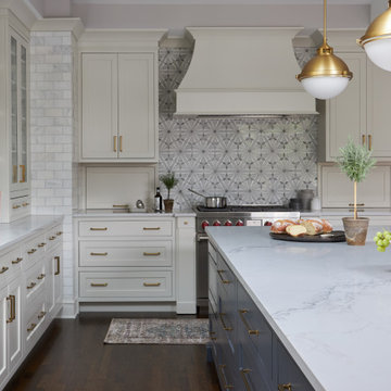
The kitchen features a classic, clean, and timeless palette. White cabinetry, with brass and bronze finishes, contrasts with rich wood flooring, and lets the large, deep blue island in Woodland’s custom color Harbor – a neutral, yet statement color – draw your eye.
The kitchen was the main priority. In addition to updating and elevating this space, Tina wanted to maximize what her home had to offer. From moving the location of the patio door and eliminating a window to removing an existing closet in the mudroom and the cluttered pantry, the kitchen footprint grew. Once the floorplan was set, it was time to bring cohesion to her home, creating connection between the kitchen and surrounding spaces.
The color palette carries into the mudroom, where we added beautiful new cabinetry, practical bench seating, and accessible hooks, perfect for guests and everyday living. The nearby bar continues the aesthetic, with stunning Carrara marble subway tile, hints of brass and bronze, and a design that further captures the vibe of the kitchen.
Every home has its unique design challenges. But with a fresh perspective and a bit of creativity, there is always a way to give the client exactly what they want [and need]. In this particular kitchen, the existing soffits and high slanted ceilings added a layer of complexity to the lighting layout and upper perimeter cabinets.
While a space needs to look good, it also needs to function well. This meant making the most of the height of the room and accounting for the varied ceiling features, while also giving Tina everything she wanted and more. Pendants and task lighting paired with an abundance of natural light amplify the bright aesthetic. The cabinetry layout and design compliments the soffits with subtle profile details that bring everything together. The tile selections add visual interest, drawing the eye to the focal area above the range. Glass-doored cabinets further customize the space and give the illusion of even more height within the room.
While her family may be grown and out of the house, Tina was focused on adding function without sacrificing a stunning aesthetic and dreamy finishes that make the kitchen the gathering place of any home. It was time to love her kitchen again, and if you’re wondering what she loves most, it’s the niche with glass door cabinetry and open shelving for display paired with the marble mosaic backsplash over the range and complimenting hood. Each of these features is a stunning point of interest within the kitchen – both brag-worthy additions to a perimeter layout that previously felt limited and lacking.
Whether your remodel is the result of special needs in your home or simply the excitement of focusing your energy on creating a fun new aesthetic, we are here for it. We love a good challenge because there is always a way to make a space better – adding function and beauty simultaneously.
 Vetter Architects
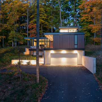
The client’s request was quite common - a typical 2800 sf builder home with 3 bedrooms, 2 baths, living space, and den. However, their desire was for this to be “anything but common.” The result is an innovative update on the production home for the modern era, and serves as a direct counterpoint to the neighborhood and its more conventional suburban housing stock, which focus views to the backyard and seeks to nullify the unique qualities and challenges of topography and the natural environment.
The Terraced House cautiously steps down the site’s steep topography, resulting in a more nuanced approach to site development than cutting and filling that is so common in the builder homes of the area. The compact house opens up in very focused views that capture the natural wooded setting, while masking the sounds and views of the directly adjacent roadway. The main living spaces face this major roadway, effectively flipping the typical orientation of a suburban home, and the main entrance pulls visitors up to the second floor and halfway through the site, providing a sense of procession and privacy absent in the typical suburban home.
Clad in a custom rain screen that reflects the wood of the surrounding landscape - while providing a glimpse into the interior tones that are used. The stepping “wood boxes” rest on a series of concrete walls that organize the site, retain the earth, and - in conjunction with the wood veneer panels - provide a subtle organic texture to the composition.
The interior spaces wrap around an interior knuckle that houses public zones and vertical circulation - allowing more private spaces to exist at the edges of the building. The windows get larger and more frequent as they ascend the building, culminating in the upstairs bedrooms that occupy the site like a tree house - giving views in all directions.
The Terraced House imports urban qualities to the suburban neighborhood and seeks to elevate the typical approach to production home construction, while being more in tune with modern family living patterns.
Overview:
Elm Grove
Size:
2,800 sf,
3 bedrooms, 2 bathrooms
Completion Date:
September 2014
Services:
Architecture, Landscape Architecture
Interior Consultants: Amy Carman Design
 Vetter Architects
The client’s request was quite common - a typical 2800 sf builder home with 3 bedrooms, 2 baths, living space, and den. However, their desire was for this to be “anything but common.” The result is an innovative update on the production home for the modern era, and serves as a direct counterpoint to the neighborhood and its more conventional suburban housing stock, which focus views to the backyard and seeks to nullify the unique qualities and challenges of topography and the natural environment.
The Terraced House cautiously steps down the site’s steep topography, resulting in a more nuanced approach to site development than cutting and filling that is so common in the builder homes of the area. The compact house opens up in very focused views that capture the natural wooded setting, while masking the sounds and views of the directly adjacent roadway. The main living spaces face this major roadway, effectively flipping the typical orientation of a suburban home, and the main entrance pulls visitors up to the second floor and halfway through the site, providing a sense of procession and privacy absent in the typical suburban home.
Clad in a custom rain screen that reflects the wood of the surrounding landscape - while providing a glimpse into the interior tones that are used. The stepping “wood boxes” rest on a series of concrete walls that organize the site, retain the earth, and - in conjunction with the wood veneer panels - provide a subtle organic texture to the composition.
The interior spaces wrap around an interior knuckle that houses public zones and vertical circulation - allowing more private spaces to exist at the edges of the building. The windows get larger and more frequent as they ascend the building, culminating in the upstairs bedrooms that occupy the site like a tree house - giving views in all directions.
The Terraced House imports urban qualities to the suburban neighborhood and seeks to elevate the typical approach to production home construction, while being more in tune with modern family living patterns.
Overview:
Elm Grove
Size:
2,800 sf,
3 bedrooms, 2 bathrooms
Completion Date:
September 2014
Services:
Architecture, Landscape Architecture
Interior Consultants: Amy Carman Design
 Moss Yaw Design studio
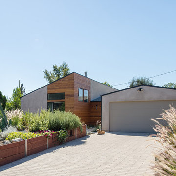
Example of a mid-sized minimalist gray one-story wood gable roof design in Los Angeles

 Erica Peale Design
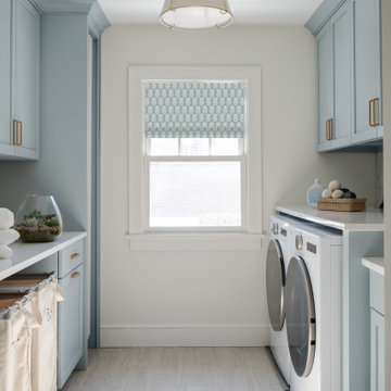
Once dark and weighed down by orange walls, this laundry room has been completely reimagined into a light-filled, uplifting space. New custom cabinetry delivers abundant hidden storage, keeping everyday essentials beautifully organized, while a dedicated laundry sink with a natural stone backsplash brings both function and a touch of luxury. Thoughtful details like pull-out drying racks make daily tasks effortless. The result is a room that feels fresh, bright, and genuinely happy—proof that even the most utilitarian spaces can be a joy to be in.
 Haus Interior Design
**Featured in Home & Design Magazine!
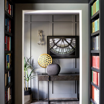
The inspiration for this unique project draws on the clients’ love of Paris and the city’s vibrant romanticism and mix of architectural styles. Our challenge was to elevate builder-grade finishes in a newly-constructed townhome to create an urban retreat with aged patina for this young couple. Soft industrial elements were layered over Old-World inspired details on nearly every surface for maximum impact. We added rustic wood ceilings and industrial beams to create drama, texture, and value throughout.
A Parisian-inspired glass/iron wall divider relieves the open concept floor plan, creating a more intimate seating space. Oversized pendants of steel, blown glass, horsehair and faux horn provide soft illumination while drawing the eye upward to architectural ceiling details. Custom midnight blue built-ins create a library that frames the entry and study. The deep and dramatic color palette of paint and wallpaper that adorns the walls is a vibrant mix of cobalt, citron, teal and smoky lavender. Light pours into the rooms from the large windows, reflects off the oversized acid-wash mirror, and forms dramatic shadows on the walls, setting the mood for this home.
 Grandeur Hills Group,Inc.
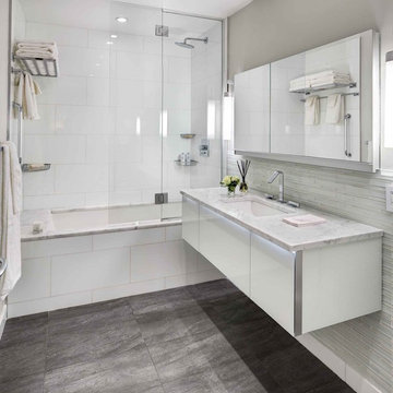
This bathroom looks very bright and spacious, doesn't it? The bathroom is lit by several miniature ceiling-mounted lamps. Pay attention to the large number of glass, polished and mirrored surfaces that not only add shine to the interior, but also visually expand the room. The dominant color here is white, which perfectly reflects the light emitted by the fixtures, also making the room bright and spacious.
Don’t miss the chance to elevate your bathroom interior design together with the best Grandeur Hills Group specialists
52