
Search results for "Rejecting" in Home Design Ideas
 KURV Architecture DPC (Alex Hughes Architects)
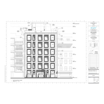
Located in the heart of Manhattan’s Lower East Side, the building was erected on a shallow commercial lot between two 120 year old masonry buildings and a new residential rental building. 330 Grand Street is a mix of 725 SF 1BRs and 1050 SF 2BR apartments. It also contains a 1100 SF two story duplex as well as private and public rooftop space, large private balconies for most units and two large private terraces for the ground floor units.
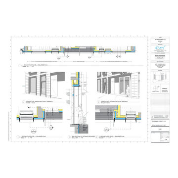
330 Grand Street was originally designed and approved at the NYC DOB as a prefabricated modular building. During the pandemic, as shipping costs skyrocketed putting the project at risk, we suggested redesigning the building as a reinforced cast-in-place concrete structure. Concrete was readily available and prices had not been affected by the demand increase that many other materials suffered in the pandemic. We took this opportunity to raise floor to ceiling heights, enlarge high performance windows and redistribute the buildings MEPFS and Structural Systems to create very open floor plans.
The challenge was to create a luxurious sensorial living experience with very limited means. In a city with very high construction costs, low cost residential buildings in the area are usually devoid of good quality, design and character. Our approach was to aim high for the end user, prioritizing natural light, open space with long visual perspectives, high ceilings and as always, rejecting the use of predefined building templates.
Our biggest challenge was to ensure that the small spaces feel as clean cut, large and bright as possible. Several unique design decisions were made to ensure low cost and high quality;
Floor plans were laid out so that spaces were wide open and free of clutter from mechanical or structural interruptions. Therefore all infrastructure was placed in lateral demising walls, which in turn act as the unit’s storage and kitchen. The apartments feel wide open, are super quiet and have more storage space than any other comparable apartment in the city.
To solve the problem of the site’s shallow commercial lot which is typically prone to dark interior spaces we focused our attention on the building’s envelope. Instead of the usual small punched window openings, oversized high performance windows were designed to ensure that light penetrated as far as possible into the units. In the smaller 1BR units, the full 50’ depth of the lot is perceived by partitioning spaces with sliding pocket doors that can be retracted to allow deep visual perspectives, making the sight lines in the space feel longer, larger, more ample than normal. In addition to the full height glazing, each unit above the 2nd floor receives a 7 foot covered balcony, adding 120 to 240 sf to each apartment, something unusual in New York City buildings. The space is large enough for a full size dining table, when the weather permits being outside.
We also worked hard to ensure modularity. For example, all kitchen units are all identical throughout the building. The idea of modularity and the economy of the repetitive unit is exercised to the maximum through the building.
Hardware, appliances, flooring, wall coverings and material finishes are all carefully selected to feel bespoke, high quality and unique.
It was important to KURV that the result of this work manifest into something that would deeply connect with the end user and sustain relationships with the consumers of this space.
All images by KURV Architecture ©
 KURV Architecture DPC (Alex Hughes Architects)
Located in the heart of Manhattan’s Lower East Side, the building was erected on a shallow commercial lot between two 120 year old masonry buildings and a new residential rental building. 330 Grand Street is a mix of 725 SF 1BRs and 1050 SF 2BR apartments. It also contains a 1100 SF two story duplex as well as private and public rooftop space, large private balconies for most units and two large private terraces for the ground floor units.
330 Grand Street was originally designed and approved at the NYC DOB as a prefabricated modular building. During the pandemic, as shipping costs skyrocketed putting the project at risk, we suggested redesigning the building as a reinforced cast-in-place concrete structure. Concrete was readily available and prices had not been affected by the demand increase that many other materials suffered in the pandemic. We took this opportunity to raise floor to ceiling heights, enlarge high performance windows and redistribute the buildings MEPFS and Structural Systems to create very open floor plans.
The challenge was to create a luxurious sensorial living experience with very limited means. In a city with very high construction costs, low cost residential buildings in the area are usually devoid of good quality, design and character. Our approach was to aim high for the end user, prioritizing natural light, open space with long visual perspectives, high ceilings and as always, rejecting the use of predefined building templates.
Our biggest challenge was to ensure that the small spaces feel as clean cut, large and bright as possible. Several unique design decisions were made to ensure low cost and high quality;
Floor plans were laid out so that spaces were wide open and free of clutter from mechanical or structural interruptions. Therefore all infrastructure was placed in lateral demising walls, which in turn act as the unit’s storage and kitchen. The apartments feel wide open, are super quiet and have more storage space than any other comparable apartment in the city.
To solve the problem of the site’s shallow commercial lot which is typically prone to dark interior spaces we focused our attention on the building’s envelope. Instead of the usual small punched window openings, oversized high performance windows were designed to ensure that light penetrated as far as possible into the units. In the smaller 1BR units, the full 50’ depth of the lot is perceived by partitioning spaces with sliding pocket doors that can be retracted to allow deep visual perspectives, making the sight lines in the space feel longer, larger, more ample than normal. In addition to the full height glazing, each unit above the 2nd floor receives a 7 foot covered balcony, adding 120 to 240 sf to each apartment, something unusual in New York City buildings. The space is large enough for a full size dining table, when the weather permits being outside.
We also worked hard to ensure modularity. For example, all kitchen units are all identical throughout the building. The idea of modularity and the economy of the repetitive unit is exercised to the maximum through the building.
Hardware, appliances, flooring, wall coverings and material finishes are all carefully selected to feel bespoke, high quality and unique.
It was important to KURV that the result of this work manifest into something that would deeply connect with the end user and sustain relationships with the consumers of this space.
All images by KURV Architecture ©
 KURV Architecture DPC (Alex Hughes Architects)
Located in the heart of Manhattan’s Lower East Side, the building was erected on a shallow commercial lot between two 120 year old masonry buildings and a new residential rental building. 330 Grand Street is a mix of 725 SF 1BRs and 1050 SF 2BR apartments. It also contains a 1100 SF two story duplex as well as private and public rooftop space, large private balconies for most units and two large private terraces for the ground floor units.
330 Grand Street was originally designed and approved at the NYC DOB as a prefabricated modular building. During the pandemic, as shipping costs skyrocketed putting the project at risk, we suggested redesigning the building as a reinforced cast-in-place concrete structure. Concrete was readily available and prices had not been affected by the demand increase that many other materials suffered in the pandemic. We took this opportunity to raise floor to ceiling heights, enlarge high performance windows and redistribute the buildings MEPFS and Structural Systems to create very open floor plans.
The challenge was to create a luxurious sensorial living experience with very limited means. In a city with very high construction costs, low cost residential buildings in the area are usually devoid of good quality, design and character. Our approach was to aim high for the end user, prioritizing natural light, open space with long visual perspectives, high ceilings and as always, rejecting the use of predefined building templates.
Our biggest challenge was to ensure that the small spaces feel as clean cut, large and bright as possible. Several unique design decisions were made to ensure low cost and high quality;
Floor plans were laid out so that spaces were wide open and free of clutter from mechanical or structural interruptions. Therefore all infrastructure was placed in lateral demising walls, which in turn act as the unit’s storage and kitchen. The apartments feel wide open, are super quiet and have more storage space than any other comparable apartment in the city.
To solve the problem of the site’s shallow commercial lot which is typically prone to dark interior spaces we focused our attention on the building’s envelope. Instead of the usual small punched window openings, oversized high performance windows were designed to ensure that light penetrated as far as possible into the units. In the smaller 1BR units, the full 50’ depth of the lot is perceived by partitioning spaces with sliding pocket doors that can be retracted to allow deep visual perspectives, making the sight lines in the space feel longer, larger, more ample than normal. In addition to the full height glazing, each unit above the 2nd floor receives a 7 foot covered balcony, adding 120 to 240 sf to each apartment, something unusual in New York City buildings. The space is large enough for a full size dining table, when the weather permits being outside.
We also worked hard to ensure modularity. For example, all kitchen units are all identical throughout the building. The idea of modularity and the economy of the repetitive unit is exercised to the maximum through the building.
Hardware, appliances, flooring, wall coverings and material finishes are all carefully selected to feel bespoke, high quality and unique.
It was important to KURV that the result of this work manifest into something that would deeply connect with the end user and sustain relationships with the consumers of this space.
All images by KURV Architecture ©
Find the right local pro for your project
 Glenview Haus – Custom Doors & Wine Cellars
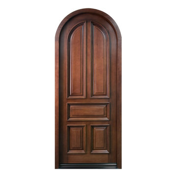
The Glenview Haus Classic Collection of front doors provides solid wood doors with elegant, archetypal designs. The custom-made styles range from two-panel doors with elaborate raised moldings to beautiful glass doors with leaded patterns, adding beauty and grace to the home’s entrance. The artisans at Glenview Haus focus on enhancing the natural elegance of the high-end wood grains by using furniture quality stains and techniques.

 Olde Wood Ltd.
J. Albert Studios
Huge traditional brown two-story wood exterior home idea in Cleveland
Huge traditional brown two-story wood exterior home idea in Cleveland

 First State Building & Design
We expanded an existing deck with new stairs, railing, decking, deck board design, lighting, complete with all post and beam wraps. All decking you see is Zuri decking with Timbertech Rail Systems. We installed riser lights up the stairs with post caps on top of all posts.

 Rustic Trades Furniture
An amazing customer contacted us about making sliding barn doors for their lake front cabin home. (We designed a custom Emerson Trestle Table and Bench to match the doors.) I am excited to share this space!



 Ellie Lillstrom Photography
Photo: A Darling Felicity Photography © 2015 Houzz
Bedroom - small eclectic guest bedroom idea in Seattle with white walls
Bedroom - small eclectic guest bedroom idea in Seattle with white walls

 Turner Tile & Stone
Wood look Tiles at Office, residential
Example of a minimalist bedroom design in Las Vegas
Example of a minimalist bedroom design in Las Vegas

 TKS Design Group
Corner shower - mid-sized traditional master white tile and subway tile marble floor corner shower idea in Chicago with shaker cabinets, dark wood cabinets, an undermount tub, beige walls, an undermount sink and marble countertops


 Gaile Guevara
| DETAILS | in concrete constructed condos it's very rare that we ever want to have to core new drain locations. For the Master Ensuite more and more when we do full renovations down to studs we are removing the terrible 5' tubs and tiny itty bitty 3x3' showers. For some reason the idea of luxury meant squeeze as much as you can so you have a long list of features when you go to market. More and more we are doing oversized his and hers showers. So when you have a drain that you are repurposing from previous plumbing fixtures and the drain isn't centred, it's pretty much magic to have the team surprise you after several site meetings and evaluations - we opted for the plumbers favourite to use Schluter linear tile over drains and have the oversized tile cut to fit and provide the necessary grout lines for a flush shower threshold. This might seem like nothing but is everything when we have the perfect tile layout be inline with the what we think is a centred drain. These are the kind of details that make my OCD sister inside so happy, we call it the centre flush drain happy dance. Kudos to @caisleydevelopments @4thdimensionconstruction with the help of @stonetilevancouver for finding a perfect subtle sand toned oversized porcelain. A large format tile in a shade and same tone value as our hardwood floor and one shade darker than our Baltic Birch flush panels for ease of cleaning and hiding dirt. When you want things clean I opt for showers with minimal detailing to be in shades darker than white. Cleaning becomes less treacherous. Also gone is this idea of ugly accent tile, we opt for uniform tile one material throughout a bathroom floor to ceiling and if possible all walls. Construction geekery 101 continues


 David Wilds Patton Lighting Design
Example of a mid-sized trendy wooden straight open and metal railing staircase design in San Francisco
 Moss Yaw Design studio
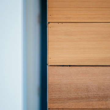
a narrow vertical gap at the entry cedar and adjacent drywall allows visitors a peek to the open kitchen and living via a unique interior detail
Example of a small 1960s wood wall entry hall design in Orange County
Example of a small 1960s wood wall entry hall design in Orange County


 cityhomeCOLLECTIVE
Jess Downer & Renata Stone, Big Bear Photo Co.
Example of an eclectic hallway design in Salt Lake City
Example of an eclectic hallway design in Salt Lake City

 Siding & Windows Group Ltd
Siding & Windows Group installed James Hardie Premium Artisan Siding in ColorPlus Technology Color Iron Gray and Hardie Artisan Accent Trim in ColorPlus Technology Color Arctic White. Replaced Windows with Marvin Ultimate Wood Windows. Siding and Windows was installed on the rear addition located in Chicago, IL.


16