
Search results for "Rejection digital">rejection" in Home Design Ideas

 Digital Marketing Agency USA
Rank You Up is a USA based digital marketing agency. Our Internet marketing team can help you in quick exposure for your business Website and able to drive instant visitor for your business. We are specialized in providing result oriented internet marketing services, Online Marketing and promotion solution, and Social media marketing.
 Paintzen, Inc.
For many, professional interior design is a luxury. Whether your home’s design project is large or small, having the ability to transform your house, apartment or condo into a beautiful, unique space is a wonderful opportunity for self-expression. Even if it is a just simple accent wall painted in a color that speaks to you, or a complete renovation of your cabinets to achieve the kitchen of your dreams, interior design allows you to create an environment that is both personal and comfortable.
That is exactly how interior designer and founder of Design Exchange Sean Carlson Perry feels about what he does for a living. “The reason that I love designing spaces, and value the impact of space design on people, is the way the spaces make us feel, the visceral appeal of good design. Good design should stimulate the senses and generate an emotionally engaging experience. As a designer, I get to massage and sculpt people’s experience of space!” Perry shared with us.
In late 2017, the Paintzen team connected with Perry regarding a very special design project he was working on. Design Exchange was renovating, redesigning and re-furnishing The Ali Forney Center. The Ali Forney Center, based in New York City, is the largest and most comprehensive organization dedicated to housing homeless LGBTQ youth. Nearly 40% of the homeless youth population is LGBTQ. Homeless LGBTQ youth are eight times more likely to experience violence, discrimination, and suicide. AFC houses 124 youths each night and provides services to over 1,400 homeless young people per year.
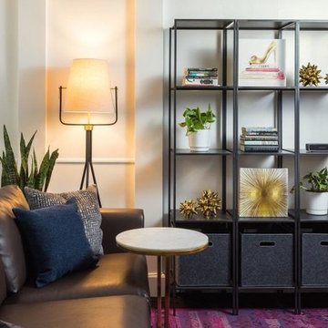
Although the organization does an incredible job to provide safety and shelter to homeless youth, Perry and his team felt the space itself could use some updating and could feel more welcoming. Rooms were dark, cold, and lacked proper storage. Furniture was in poor shape and didn’t work. The rooms were being under-utilized; overall, there was so much more that could be done within the walls of the AFC that could be improved using interior design & paint!
We at Paintzen were excited to partner with Design Exchange to do our part in this transformation. The dark, paneled walls were re-painted white. This entirely opened up the space, making it brighter, warmer and more welcoming. The white walls also served as a much better backdrop for smart lighting, as well as for the furniture, wall decor, and new flooring. Beyond painting, Perry and his team used FLOR carpet tiles for durability in a bright Fuchsia shade for a pop of color. They created a more functional layout to maximize the space and make better use of its architectural details and added new furniture including lamps, tables, throws, a sofa, a TV and a Roku to make the space beautiful, and even fun.
“Design increases connection and community,” Perry told us. “When we revamp a shelter space, history tells us that the residents spend more time in the space, more time with their peers, building connections and community; a greater sense of home.” Perry’s goal was to create an environment that set its residents up for success by improving their quality of life, outlook and self-esteem.
“This isn’t extreme home makeover (although I wish I had that budget!). It’s about improving the aesthetics of the space to create a better environment and experience for people who are going through challenging times. I’ve been lucky enough to have an amount of work that allows me to donate a portion of profits to Design Exchange Projects.”
Sean Carlson Perry founded Design Exchange as a way to use his talent, passion, and skills to help those who are struggling, or in a place of immediate need. He was searching to bring deeper meaning and a humanitarian component to his work. Perry has worked with clients in New York, San Francisco, and Los Angeles. “Good design—functionally, aesthetically and ergonomically—promotes a better quality of life.” This is a mantra that describes why Perry does what he does through Design Exchange, working to help the underserved of New York City and other cities across the country.
“I grew up gay in Nebraska, and have gone through some hard times when I was younger, but I can’t imagine going through what these kids go through – rejection from family, being kicked out of the house for being who they are, homeless and having nowhere else to turn,” said Perry. “Luckily, there is The Ali Forney Center. Doing these projects for AFC strikes close to home for me, so they are extra special and close to my heart.”
 Living Interiors
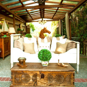
Let in the light - the conservatory / sunroom sprawls-out in a converted shed. Outdoor chandeliers provide a soft glow at night. Farmhouse style furniture adds a touch of country-living flair to this bright & sunny space. Overhead UV rejecting panels give sun-bleaching protection to the furnishings below. A vintage daybed and the outdoor curtains are UV resistant Sunbrella fabric in Sand Beige. The teak wood horse head sculpture is from Pottery Barn.
Find the right local pro for your project
 Living Interiors
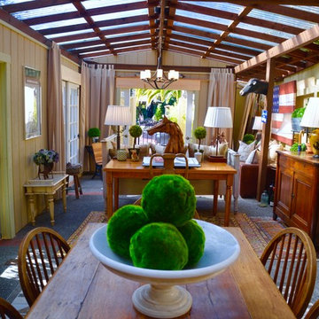
A converted shed is now a bright and sunny office/art studio. Outdoor chandeliers provide a soft glow at night. Farmhouse style furniture adds a touch of country-living flair to this creative and rustic space. Overhead UV rejecting panels give sun-bleaching protection to the furnishings below.
 Kohler
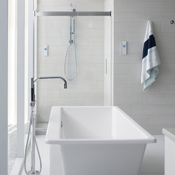
This spacious bath/ shower takes full advantage of the area’s abundance of light with a bank of windows that looks out on a private courtyard. The Levity® shower doors, a HydroRail® shower column supports a Shift™ Ellipse handshower and a Moxie® showerhead + wireless speaker, so you can switch between sprays and play your music in the shower. The DTV Prompt® digital system lets you customize your experience and control your showering components.
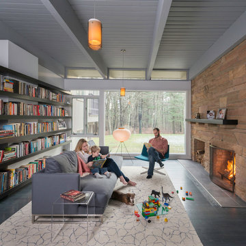
 Flavin Architects
This remodel of a mid century gem is located in the town of Lincoln, MA a hot bed of modernist homes inspired by Gropius’ own house built nearby in the 1940’s. By the time the house was built, modernism had evolved from the Gropius era, to incorporate the rural vibe of Lincoln with spectacular exposed wooden beams and deep overhangs.
The design rejects the traditional New England house with its enclosing wall and inward posture. The low pitched roofs, open floor plan, and large windows openings connect the house to nature to make the most of its rural setting.
Photo by: Nat Rea Photography
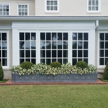
 Lone Star Window Tinting
Client was looking for UV, Glare, and Solar heat rejection to protect furnishings and improve comfort level.
Lone Star Window Tinting
Inspiration for a modern kitchen remodel in Dallas
Inspiration for a modern kitchen remodel in Dallas
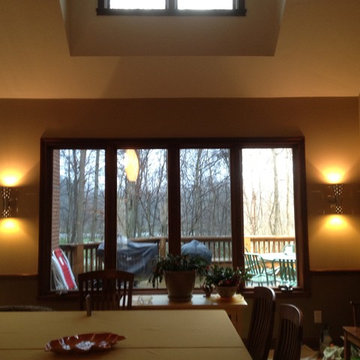
 SOLARIS
Vista V18 Glare reducing film on all of the windows except the right. 78% glare reduction, 71% Heat rejection, 99.9% UV rejection.
Trendy living room photo in Indianapolis
Trendy living room photo in Indianapolis
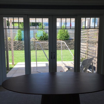
 Millard Enterprises
3M's Prestige window films are not only designed to be unnoticeable to the casual observer but are also designed to offer superior heat rejecting capabilities - most notably, the sun's infrared heat.
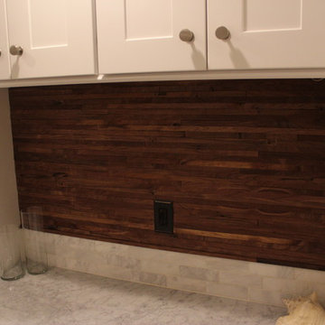
 Foley Cabinetry & Design LLC
Reclaimed Walnut Backsplash. I acquired this material from my hardwood lumber supplier. He has dozens of pallets of this reclaimed walnut, which is claimed to be rejected Smith and Wesson gun stock material from eons ago.
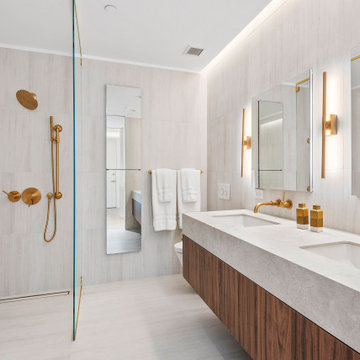
 KURV Architecture DPC (Alex Hughes Architects)
Located in the heart of Manhattan’s Lower East Side, the building was erected on a shallow commercial lot between two 120 year old masonry buildings and a new residential rental building. 330 Grand Street is a mix of 725 SF 1BRs and 1050 SF 2BR apartments. It also contains a 1100 SF two story duplex as well as private and public rooftop space, large private balconies for most units and two large private terraces for the ground floor units.
330 Grand Street was originally designed and approved at the NYC DOB as a prefabricated modular building. During the pandemic, as shipping costs skyrocketed putting the project at risk, we suggested redesigning the building as a reinforced cast-in-place concrete structure. Concrete was readily available and prices had not been affected by the demand increase that many other materials suffered in the pandemic. We took this opportunity to raise floor to ceiling heights, enlarge high performance windows and redistribute the buildings MEPFS and Structural Systems to create very open floor plans.
The challenge was to create a luxurious sensorial living experience with very limited means. In a city with very high construction costs, low cost residential buildings in the area are usually devoid of good quality, design and character. Our approach was to aim high for the end user, prioritizing natural light, open space with long visual perspectives, high ceilings and as always, rejecting the use of predefined building templates.
Our biggest challenge was to ensure that the small spaces feel as clean cut, large and bright as possible. Several unique design decisions were made to ensure low cost and high quality;
Floor plans were laid out so that spaces were wide open and free of clutter from mechanical or structural interruptions. Therefore all infrastructure was placed in lateral demising walls, which in turn act as the unit’s storage and kitchen. The apartments feel wide open, are super quiet and have more storage space than any other comparable apartment in the city.
To solve the problem of the site’s shallow commercial lot which is typically prone to dark interior spaces we focused our attention on the building’s envelope. Instead of the usual small punched window openings, oversized high performance windows were designed to ensure that light penetrated as far as possible into the units. In the smaller 1BR units, the full 50’ depth of the lot is perceived by partitioning spaces with sliding pocket doors that can be retracted to allow deep visual perspectives, making the sight lines in the space feel longer, larger, more ample than normal. In addition to the full height glazing, each unit above the 2nd floor receives a 7 foot covered balcony, adding 120 to 240 sf to each apartment, something unusual in New York City buildings. The space is large enough for a full size dining table, when the weather permits being outside.
We also worked hard to ensure modularity. For example, all kitchen units are all identical throughout the building. The idea of modularity and the economy of the repetitive unit is exercised to the maximum through the building.
Hardware, appliances, flooring, wall coverings and material finishes are all carefully selected to feel bespoke, high quality and unique.
It was important to KURV that the result of this work manifest into something that would deeply connect with the end user and sustain relationships with the consumers of this space.
All images by KURV Architecture ©
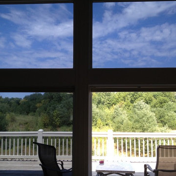 SOLARIS
Vista V14 Glare reducing film on all of the windows except the bottom right. 86% glare reduction, 78% Heat rejection, 99.9% UV rejection.
Inspiration for a contemporary entryway remodel in Indianapolis
Inspiration for a contemporary entryway remodel in Indianapolis

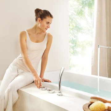
 Studio41 Home Design Showroom
Flexibility for your GROHE SPA® | Wireless technology. Push-button operation. Experience the convenience of digital technology with GROHE Veris F-digital. Buttons on the digital controller let you start or stop the water and adjust the temperature, while a dial around the outside is used to control the water pressure. Enhanced by an illuminated ring, the design gives you instant visual feedback of the water temperature. And for the bath and shower, the digital diverter lets you switch between water outlets with a single touch. | ShopStudio41.com
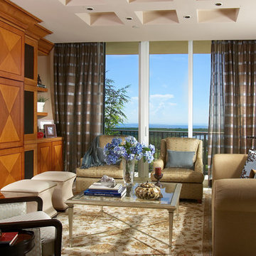
 Budget Blinds
Premium clear window film rejects 40% of the sun's heat and protects furnishings from harmful UV rays by filtering at 99%.
Living room - traditional living room idea in Orange County
Living room - traditional living room idea in Orange County
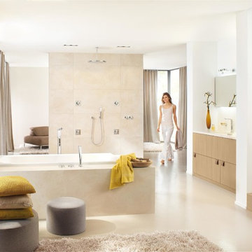 Studio41 Home Design Showroom
Flexibility for your GROHE SPA® | Wireless technology. Push-button operation. Experience the convenience of digital technology with GROHE Veris F-digital. Buttons on the digital controller let you start or stop the water and adjust the temperature, while a dial around the outside is used to control the water pressure. Enhanced by an illuminated ring, the design gives you instant visual feedback of the water temperature. And for the bath and shower, the digital diverter lets you switch between water outlets with a single touch. | ShopStudio41.com
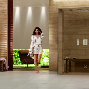 Studio41 Home Design Showroom
Flexibility for your GROHE SPA® | Wireless technology. Push-button operation. Experience the convenience of digital technology with GROHE Veris F-digital. Buttons on the digital controller let you start or stop the water and adjust the temperature, while a dial around the outside is used to control the water pressure. Enhanced by an illuminated ring, the design gives you instant visual feedback of the water temperature. And for the bath and shower, the digital diverter lets you switch between water outlets with a single touch. | ShopStudio41.com
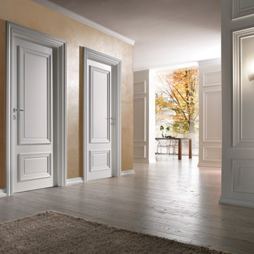
 Almes Doors
his entire family of interior door models was inspired by the brilliant works and innovative ideas of Andrea Palladio, a prolific Italian architect employed by a number of affluent Venetians in the 16th Century. Rejecting the Renaissance, Mannerism, and early Baroque methods ubiquitous in his time, Palladio looked to ancient Greek and Roman architects for inspiration. Bucolic villas were one of his specialties. More often than not he would incorporate the classical temple front into his design of the facade. The rest of the structure’s configuration often consisted of a centralized block raised on an elevated podium, which would be flanked by lower, and somewhat stockier, service wings. The celebrated master’s style has seen several revivals over the centuries. Thomas Jefferson’s Rotunda at the University of Virginia would be a well-known example.
The interior door series named after Palladio can blend into, define, or dominate pretty much any type of decor - depending on your preferences.
 Digital Marketing Agency USA
Digital Marketing Agency USA
Home design - victorian home design idea in Dallas
Home design - victorian home design idea in Dallas
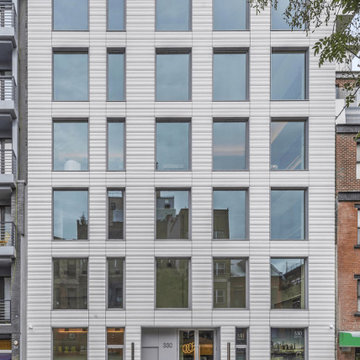 KURV Architecture DPC (Alex Hughes Architects)
Located in the heart of Manhattan’s Lower East Side, the building was erected on a shallow commercial lot between two 120 year old masonry buildings and a new residential rental building. 330 Grand Street is a mix of 725 SF 1BRs and 1050 SF 2BR apartments. It also contains a 1100 SF two story duplex as well as private and public rooftop space, large private balconies for most units and two large private terraces for the ground floor units.
330 Grand Street was originally designed and approved at the NYC DOB as a prefabricated modular building. During the pandemic, as shipping costs skyrocketed putting the project at risk, we suggested redesigning the building as a reinforced cast-in-place concrete structure. Concrete was readily available and prices had not been affected by the demand increase that many other materials suffered in the pandemic. We took this opportunity to raise floor to ceiling heights, enlarge high performance windows and redistribute the buildings MEPFS and Structural Systems to create very open floor plans.
The challenge was to create a luxurious sensorial living experience with very limited means. In a city with very high construction costs, low cost residential buildings in the area are usually devoid of good quality, design and character. Our approach was to aim high for the end user, prioritizing natural light, open space with long visual perspectives, high ceilings and as always, rejecting the use of predefined building templates.
Our biggest challenge was to ensure that the small spaces feel as clean cut, large and bright as possible. Several unique design decisions were made to ensure low cost and high quality;
Floor plans were laid out so that spaces were wide open and free of clutter from mechanical or structural interruptions. Therefore all infrastructure was placed in lateral demising walls, which in turn act as the unit’s storage and kitchen. The apartments feel wide open, are super quiet and have more storage space than any other comparable apartment in the city.
To solve the problem of the site’s shallow commercial lot which is typically prone to dark interior spaces we focused our attention on the building’s envelope. Instead of the usual small punched window openings, oversized high performance windows were designed to ensure that light penetrated as far as possible into the units. In the smaller 1BR units, the full 50’ depth of the lot is perceived by partitioning spaces with sliding pocket doors that can be retracted to allow deep visual perspectives, making the sight lines in the space feel longer, larger, more ample than normal. In addition to the full height glazing, each unit above the 2nd floor receives a 7 foot covered balcony, adding 120 to 240 sf to each apartment, something unusual in New York City buildings. The space is large enough for a full size dining table, when the weather permits being outside.
We also worked hard to ensure modularity. For example, all kitchen units are all identical throughout the building. The idea of modularity and the economy of the repetitive unit is exercised to the maximum through the building.
Hardware, appliances, flooring, wall coverings and material finishes are all carefully selected to feel bespoke, high quality and unique.
It was important to KURV that the result of this work manifest into something that would deeply connect with the end user and sustain relationships with the consumers of this space.
All images by KURV Architecture ©
4