
Search results for "Releases" in Home Design Ideas
 Tile Doctor Ltd
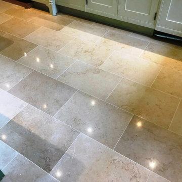
The owner of this recently purchased property in the Berkshire village of Twyford had inherited a Jerusalem limestone floor that had been installed throughout the ground floor including the Kitchen. The previous owner hadn’t maintained the stone floor very well and as a result it had become dull, patchy and the new owner was finding it impossible to keep clean. The floor was becoming a problem for them and they had been considering ripping it all up and getting it replaced. However due to the size of the floor and potential cost of replacing it they searched for other solutions and contacted Tile Doctor to see if it could be renovated.
I scheduled an appointment with the owners to survey the floor and it wasn’t long before I realised that we could achieve a great result by polishing the Limestone using a set of diamond burnishing pads. To prove how well I thought the floor would clean up I offered to complete a demo within the small utility room. This was arranged and completed a week later, as I expected once I had finished the demo the floor looked fantastic, more importantly the client was ecstatic with the results and couldn’t wait to book us in to complete the rest of the house.
It was a large floor so I estimated the process would take 4-5 days to complete and would need to work in sections starting with the kitchen then progressing into the study and cloakroom, dining room and finishing off with the entrance hall. Thankfully I had an empty house to work in which helped as I could start sealing the area I worked on the prior day.
The limestone had become quite pitted in the high traffic area, these pits had filled up with soil and become unsightly. My first task was to deep clean the dirt filled pits and grout, to do this I used a strong dilution of Tile Doctor Pro Clean and a stiff nylon brush making sure I could get into the pits releasing the dirt, then vacuuming up all the chemical slurry as I went along.
The next task was to fill these pits I used a two-part epoxy filler that matched the colour of the stone. Once the filler had dried, I worked through the hand burnishing blocks from 100 grit to 400 and I smoothed out the areas that had been filled.
Now the holes/pits had been filled I continued with the restoration of the floor by moving onto the burnishing process using diamond encrusted floor burnishing pads. This involves honing the Limestone with a set of burnishing pads starting at 400-grit. The pads are applied to the floor with a heavy floor buffing machine using water to lubricate the process. The pad is run over each tile around three times and the fine slurry this process generates is rinsed off afterwards with water and then extracted with a wet vacuum. You then move onto the 800-grit and then 1500-grit slowly building back the appearance of the stone.
As I had worked in sections/rooms at a time I was able to allow a full day drying time before sealing. Happy with the depth of colour from the pad system I opted to seal the floor with two coats of Tile Doctor Ultra-Seal. I had a range of sealers to choose from an in this case I felt Ultra-Seal would be most suited as it doesn’t change the natural appearance of the Limestone yet will provide years of protection and make it much easier to keep clean.
The owners were over the moon with how the limestone now looked and relieved that their problem floor had been restored. For aftercare cleaning I recommended Tile Doctor Stone Soap which is designed for maintaining the patina on polished stone floors.
Dennis Buckland
Berkshire Tile Doctor
 Neumann & Rudy Architecture
**Spatial Composition & Architectural Volume**
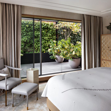
The room is organized around a single, decisive architectural gesture: a full-height sliding glazed wall that dissolves the boundary between the sleeping chamber and an enclosed garden court. The composition is fundamentally horizontal — a low-slung bed platform anchoring the right-hand foreground, a seating vignette calibrated to the left, and between them an uninterrupted sightline drawn through the aperture to the ivy-clad boundary wall beyond. This lateral emphasis is reinforced overhead by a recessed shadow-gap ceiling detail and a stepped perimeter cove that reads as a floating plane, subtly compressing the volume at its edges while lifting it at centre. The glazing itself is elegantly restrained: slim black-framed sliders set within a warm timber reveal, the sill deep enough to function as a threshold rather than a mere junction — an architectural pause between interior and exterior. Circulation is generous and diagonal, the ottoman and lounge chair angled to acknowledge both the bed and the view, establishing a soft triangulation of use. The tall marquetry armoire at the right terminates the composition vertically, providing the single strong axis of ascent in an otherwise recumbent plan, and its sculptural crown — a bronze group of standing figures — punctuates the ceiling zone with deliberate counterpoint.
**Materiality, Color & Texture**
The palette is an exercise in tonal modulation within a narrow chromatic band: greige, taupe, dove, mushroom, all carried on warm grey undertones with no true white and no true black save the slender window mullions. Textural variation, rather than colour contrast, performs the compositional work. The curtains — likely a slubbed silk or textured linen-viscose blend — hang in deep pinch-pleat falls whose vertical striation animates the flanking walls, while the grasscloth wallcovering behind the armoire introduces a fine, dry, horizontal weave. Against these soft-focus surfaces, the armoire delivers the room's most emphatic tactile statement: a hand-carved, faceted diamond-relief pattern in pale limed oak, bleached almost to bone, whose faceted geometry catches and fragments light. Upholstery in supple dove-grey leather on the chair and bench is offset by a crushed-velvet cushion and a finely pleated bolster at the bedhead, layering matte against lustre. Metallics are used sparingly and warmly — antiqued brass sabots on the furniture legs, a brushed bronze plinth-form side table — while the bed's pale coverlet, incised with a fine embroidered arabesque and studded buttoning, contributes a subtle graphic line. Underfoot, a hand-knotted rug in mottled silver-sage over honed stone completes a gradient from cool floor to warm wall.
**Lighting, Atmosphere & Style Profile**
Natural light is the primary luminous instrument here, admitted as a broad, diffuse northern wash through the glazed wall and rendered soft by the surrounding foliage, which filters and greens the light before it enters. The absence of visible decorative fixtures is intentional: illumination is concealed within the ceiling cove and shadow gaps, implying an evening register of low, indirect ambient light supplemented by discreet task sources. This restraint sustains an atmosphere of hushed, cloistered calm — a sanctuary sensibility in which the garden functions as a living tapestry, its verdant saturation supplying the room's only chromatic release. Stylistically, the scheme reads as Soft Minimalism inflected with Contemporary Continental luxury: a lineage traceable to mid-century French decorative tradition — Jean-Michel Frank's plinths, Royère's rounded silhouettes — reinterpreted through a modernist discipline of tonal reduction and planar clarity. The result is neither austere nor decorative but precisely balanced: a quiet, artisanal luxe in which craft (the carved oak, the cast bronze, the hand-finished textiles) supplies the ornament that colour deliberately withholds.
 Neumann & Rudy Architecture
**I. Spatial Composition & Architectural Volume**
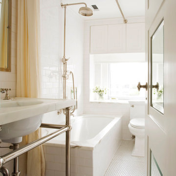
This is an exercise in the disciplined choreography of a constrained footprint — a narrow, rectilinear bathroom whose length is exploited rather than disguised. The composition unfolds along a single axis, the viewer's eye drawn from the foreground console lavatory, past the drop-in tub, to the terminal glazed aperture that anchors the far wall and releases the volume outward. The photograph's vantage, taken through a partially opened multi-paneled door with its cushioned rail-and-stile profile and beveled glazing, establishes a layered threshold condition: the room is framed, glimpsed, and entered simultaneously. Ceiling height is generous relative to plan dimension, and the architect has resisted the temptation to lower it; instead, a slender crown profile and a delicate picture-rail cornice terminate the field tile at a consistent datum, reinforcing the vertical proportion. Above the tub, a bank of recessed-panel cabinetry is set flush into the reveal of a soffit, borrowing the depth of the wall assembly to gain storage without protrusion — a deft piece of joinery logic. The window is treated as an architectural niche, its deep jambs and marble sill establishing a plinth that reads as inhabited rather than merely functional. Overhead, an exposed nickel-plated curtain rod traverses the ceiling plane in a single diagonal gesture, its cantilevered support rendering the drapery a movable spatial partition rather than a fixed enclosure.
**II. Materiality, Color & Texture**
The palette is a study in monochromatic gradation, calibrated almost entirely within the white spectrum yet richly differentiated by surface behavior. Hand-glazed subway tile in a running-bond pattern clads the wet walls, its subtle undulation and pooled glaze catching light unevenly to produce a soft, ceramic luminosity that no machine-pressed tile could replicate. Underfoot, a penny-round mosaic in matte porcelain introduces fine-grain granularity and a faintly warm grout line, its curvilinear tessellation providing tactile counterpoint to the orthogonal wall coursing. Marble — likely a Calacatta or lightly veined Carrara — appears strategically at the lavatory deck, the tub apron cap, and the window sill, its ochre-gold and cool grey veining supplying the room's only true figuration and its principal chromatic warmth. Polished nickel is the unifying metal, deployed with unusual generosity: the exposed console legs and cross-braced towel bar, the exposed riser and telephone-style handshower, the cross-handle fittings, and the rose-mounted door knob with its knurled backplate. Its cool, silvery reflectivity absorbs and redistributes ambient light, dissolving the hardware into the field. The single yielding material is the shower curtain — an unlined linen or cotton voile in pale butter-yellow — whose slubby weave, gravity-drawn folds, and warm undertone break the room's cool register and introduce the necessary note of domestic softness.
**III. Lighting, Atmosphere & Style Profile**
Illumination is overwhelmingly diurnal and unapologetically singular in source: the window at the terminus floods the space with diffuse, high-key daylight that blows toward pure white at the aperture and falls off gradually along the tile, modeling the wall's minute irregularities into a low-relief texture. The absence of visible decorative fixtures — save a discreet ceiling-recessed vent or downlight above the shower — is deliberate; artificial lighting is subordinated so that the material palette performs under natural light. The resulting atmosphere is serene, hygienic without sterility, and quietly luxurious: light behaves as a material in its own right, and the white-on-white scheme functions as a reflector rather than a void. Stylistically, the room synthesizes early-twentieth-century Anglo-American sanitary vernacular — the exposed-plumbing console lavatory, the exposed-riser shower, the metro tile and penny mosaic — with a contemporary editorial restraint that strips out ornament and pattern in favor of proportion and craft. It might be characterized as Refined Classicism, or more precisely, a Transitional Pre-War Revival: historically literate in its detailing, resolutely modern in its spatial economy and tonal discipline. The single pale-yellow textile is the design's signature move, a calibrated warm accent that prevents the achromatic scheme from tipping into clinical austerity and confirms the project's essential thesis — that restraint, correctly executed, reads as generosity.
Find the right local pro for your project
 Tile Doctor Ltd
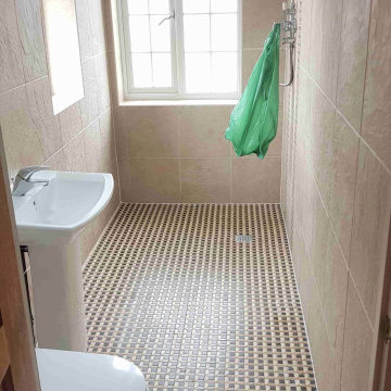
This wet room in Doncaster had become so mouldy and dirty the owners didn’t know what to do with it. The Limestone and Marble Mosaics on the floor and the Ceramic wall tile and Grout throughout the bathroom had become so badly affected with mould, nothing they could buy from could resolve it.
Following my site visit I was confident the room could be cleaned up (in-fact I have seen worse), I explained what we could do to restore and revamp the wet room and they were happy to go ahead with my quote.
First, I opened windows to maximise ventilation and then working top down I set about tackling the Ceramic wall tile and grout by spraying on a strong dilution of Tile Doctor Pro-Clean. Spraying on the solution mixes it with air making it lighter and easier to stick to the wall where it can soak in and get to work breaking down the mould.
After about fifteen minutes it was scrubbed into the tile and specifically the grout joints where it was needed most. This action releases grime and other contamination from the grout. The room needed a series of different treatments due to the different tiles and areas of mould, so I followed that up with Tile Doctor Duo Clean. This is a bleach-based cleaner which is brilliant at tackling mould and getting the grout back to its original colour.
The Ceramic tile in this bathroom has a textured surface which traps dirt so to get them clean I also used Tile Doctor Oxy-Gel. Being a Gel is easily sticks to the vertical surface allowing for longer dwell times which allows the product to dissolve the dirt and make it easier to remove.
With the walls looking much clear for my efforts I turned my attention to the Mosaic floor tiles. For these I went straight in with a cocktail combination of Tile Doctor Pro-Clean and Duo Clean cleaners which I knew from cleaning the wall tiles would have the right impact.
I was also able to use a buffing machine fitted with a poly brush attachment and running at medium speed to do most of the scrubbing. The grout lines were green with mould, and I was able to get this process to return the Mosaics and grout lines back to their original state.
The slurry was removed with a wet vacuum and rinsed thoroughly with water. It took many hours and repeated scrubbing to get the room looking like it should. I was then able to finally leave for the day and allow the wet room to dry out overnight.
I returned the following morning and started by removing all the old silicone from the corners of the room, much of it had become stained and difficult to get clean so replacement was the best option. The waste was removed and replaced with a new bead of mould resistant silicone colour matched to suit the tiles.
The Mosaics has fully dried by this point, so I was then able to apply a sealer to floor to seal in the Marble and Limestone floor Mosaics and grout. I used a couple of coats of Tile Doctor Colour Grow for this, it’s a breathable impregnating sealer that’s suitable for wet rooms. For the wall tile and grout, I used an aerosol sealer which will help protect the walls from getting mouldy and dirty again.
Once I had finished, I educated the owners on how to keep up the cleaning of the room supplying them with a complimentary bottle of Tile Doctor Aqua-Pro shower tile Cleaner. This is much better than any supermarket cleaner as it is pH neutral and will ensure that the newly applied sealant will not be prematurely affected. Hopefully, this will ensure it never gets quite so bad in the future however improved ventilation is the real key to solving that problem. They were very satisfied with the work we carried out and as you can see from the photographs on this page, the wet room has been transformed.
Matthew Lovett
South Yorkshire Tile Doctor

 Soake Pools
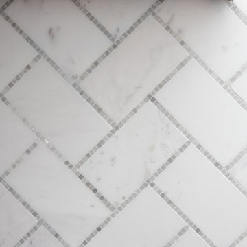
Details make the difference in our pools- this concrete plunge pool s interior is finished with a subtle grey Daltile for an earthy look that blends with its natural surroundings.
 TreHus Architects+Interior Designers+Builders
Example of a large classic u-shaped dark wood floor eat-in kitchen design in Minneapolis with a double-bowl sink, recessed-panel cabinets, white cabinets, white backsplash, stainless steel appliances, an island and black countertops
 Neumann & Rudy Architecture
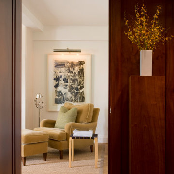
The photograph is constructed as a deliberate act of framing — an enfilade view captured through a threshold, in which the aperture of a doorway becomes both proscenium and compositional device. The image is organized around a strong vertical tripartite division: a dark stile of paneled millwork at the left edge, the luminous rectangle of the adjacent sitting room at center, and a substantial pier of figured hardwood joinery at right, terminating in a plinth-like pedestal. This asymmetrical clamping of the bright volume between two dark masses produces a pronounced sense of compression and release, a Wrightian sequencing in which the constricted, wood-lined passage funnels the eye toward the softer, higher-key room beyond. The architectural vocabulary within that inner volume is restrained and orthogonal: crisp painted plaster planes, a shallow soffit or dropped beam crossing the ceiling to modulate the overhead datum, and a simple flat-stock baseboard that reads as a quiet ground line rather than an ornamental flourish. The sightline is layered and telescopic — foreground jamb, mid-ground seating group, background artwork on the far wall — establishing depth through overlapping planes rather than perspectival theatrics. Underfoot, a herringbone-laid oak parquet in the passage gives way to a large-format sisal rug bound in linen tape, its rectilinear geometry reinforcing the axis while softening the transition between circulation and repose.
The material argument here is one of calibrated opposition: dense, saturated hardwood against pale, absorptive plaster and textile. The framing joinery — most plausibly a rich mahogany or stained cherry, its cathedral grain and ribbon figure fully legible under raking light — carries a deep oxblood-to-umber tonality and a satin, hand-rubbed sheen that lends the passage a library-like gravity. Against this, the interior room is rendered in a warm off-white with distinctly yellow-ochre undertones, avoiding the clinical chill of a true cool white and instead reading as parchment or unbleached linen. The upholstery — a rolled-arm wing chair and matching ottoman in a camel or buff-toned cotton velvet — supplies the tactile fulcrum of the composition: a napped, light-absorbing pile that contrasts against the coarse, tightly woven boucle of the sisal below and the smooth lacquer of the vertical joinery. Accent notes are sparing and precise: a pale celadon embroidered cushion introduces the only cool chromatic interruption; a rectilinear bench in blond ash with a woven black leather strap deck delivers a graphic, near-Nordic counterpoint; and a monolithic white ceramic vessel atop the pedestal provides a hard, matte punctuation. The abstract work on paper — a gestural monochrome in charcoal, ink and Payne's grey, generously matted behind glass — functions as the room's tonal anchor, its cool achromatics preventing the warm palette from tipping into sentimentality. Sprays of yellow oncidium orchid supply the single high-chroma gesture, echoing the ochre undertone of the walls.
The lighting strategy is layered, low-lumen and unapologetically warm, eschewing ambient wash in favor of discrete pools of illumination. A slim linear picture light, bronze-finished and cantilevered from the wall, grazes the artwork with a scalloped throw that reveals the tooth of the paper and establishes the far wall as the room's luminous terminus. A chrome-shaded articulating floor lamp — a modernist task fixture with a distinctly mid-century pedigree — provides a secondary, reflective glint and introduces the only cool metallic in the palette. Daylight enters obliquely and unseen from the left, softly modeling the plaster and the velvet nap without ever flattening the composition; the foreground joinery, meanwhile, sits in deep shadow, its grain caught only in a slow, specular gradient. The cumulative atmosphere is one of hushed, crepuscular intimacy — a room calibrated for reading and retreat rather than reception. Stylistically, the project resolves into a form of Transitional Warm Modernism: the classical proportioning, paneled millwork and rolled-arm seating are drawn from a traditional American vocabulary, yet they are stripped of applied ornament, edited to essentials, and disciplined by the graphic austerity of the abstract art and the blond-and-black bench. It is a sensibility best characterized as quiet luxury — tonal, textural, and materially honest, deriving its authority from the resonance of grain, nap and light rather than from any declarative gesture.
 Tile Doctor Ltd
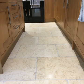
My client had recently moved into a bungalow in Godalming where they inherited the Limestone tiled kitchen floor pictured below. The previous owner had not looked after the floor very well and by the time they moved in it was pretty filthy. Limestone is a natural but porous stone where, unless sealed, attracts dirt into its tiny holes and as you would expect Cream Limestone shows the dirt easily. The protective seal had long since worn off this floor and was now ingrained with dirt it was now looking permanently dirty.
Before quoting I conducted a small test clean to work out the best method to renovate the stone and this also gives the client a good idea of how the floor will look after its finished. They were delighted with the initial result and happy with my quote gave me the go ahead.
On arrival first I helped the customer remove his tables and chairs and I then set about tapping up the plinths in the kitchen and the skirtings to protect them from cleaning solutions and equipment. The cleaning equipment I have invested in works more efficiently in open spaces, so it’s worth spending time at the beginning preparing the area first.
Next, I used a deck brush to apply a mixture of water and Tile Doctor Pro-Clean to the dirtiest tiles. Tile Doctor Pro-Clean works well when left to dwell for ten minutes or so. I also applied the same product to the grout over half the room so it could get a head start breaking down the dirt. Then using a stiff brush, I scrubbed the grout clean. Once it was worked loose, I extracted the now dirty solution with a wet vacuum.
With the grout clean I turned my attention back to the tiles with where the Pro-Clean had been left to soak in. Giving them a quick brush, I noted that what appeared to be permanently ingrained dirt had now come loose. To get the tiles really clean I used a 17″ rotary machine fitted with diamond encrusted buffer pads. This removes the tiny dots of dirt on the stone and with it comes any existing sealer and dirt.
A set of four burnishing pads were used, starting with a 400-grit, and finishing with a 3000-grit pad. The first 400-grit pad is coarse, and the grits become smoother as you work through the set. Water is used to lubricate the process and the released dirt is extracted in-between using the wet vacuum mentioned earlier. This process does take time but by the end of day one the floor was looking a lot better.
The next step is sealing however the floor needs to be bone dry for that, so I left a couple of industrial fans in place and left the Limestone to dry off overnight.
Returning the following day my first job was to ensure the floor was dry by taking multiple moisture readings with a damp meter. The readings were good, so I was able to make a start applying the sealer which for this floor was Tile Doctor Ultra Seal.
Ultra-Seal is an impregnating sealer that soaks into those small holes in the stone I mentioned earlier, I occupies the pores thus preventing dirt from becoming ingrained. The other feature of this sealer is it doesn’t change the appearance or colour of the stone leaving it with a very natural finish. Two coats of sealer were applied, leaving the seal to dry between each coat.
After the final coat was dried, I gave it a final polish with a soft nylon pad and the floor was finished. Before leaving we discussed after care which for this floor, I recommended Tile Doctor Stone Soap and I requested that the customer to stay out of the kitchen for a couple of hours while the sealer cured. They were over the moon with the new floor and could not believe the difference it had made to their kitchen.
Rupert Mcleod
West Surrey Tile Doctor

 All Surface Restoration
Exposed aggregate driveway after cleaning & sealing with Paver Gloss Sealer.
Photo of a mid-sized front yard driveway in Detroit.
Photo of a mid-sized front yard driveway in Detroit.



 Dura Supreme Cabinetry
This contemporary kitchen features the NEW Stainless Steel Drawers and Roll-Out Shelves from Dura Supreme Cabinetry. The Bria (frameless) cabinets in Dura Supreme's "White" and Wired-Foil cabinets in Dura Supreme's "Wired-Mercury" are a great combination of cabinetry for creating the clean sleek look of this modern two-tone kitchen design.
Dura Supreme Cabinetry is excited to introduce NEW Stainless Steel Drawers and Roll-Out Shelves for their Bria Cabinetry (Frameless / Full-Access product line). For a limited time, this new metal drawer system is available exclusively from Dura Supreme as they partnered with Blum to be the first American manufacturer to bring it to market.
Dura Supreme’s Stainless Steel Drawers and Roll-Out Shelves are an attractive option for any kitchen design. Sleek, double-wall, stainless steel sides are only ½” thick and work with many of Dura Supreme’s wood drawer accessories, as well as the coordinating gray metal accessories designed specifically for Stainless Steel drawers. Concealed, undermount glides are integrated into the sides and are self-closing with a soft-close feature.
Our new Stainless Steel drawer option provides a contemporary alternative to our classic Maple dovetailed drawer. For homeowners that favor Transitional or Contemporary styling, this sleek, high-performance drawer system will be ideal!
Request a FREE Dura Supreme Brochure:
http://www.durasupreme.com/request-brochure
Find a Dura Supreme Showroom in your area:
http://www.durasupreme.com/dealer-locator
Want to become a Dura Supreme Dealer? Go to:
http://www.durasupreme.com/new-dealer-inquiry
To view a video and more info about this product go to: http://www.durasupreme.com/storage-solutions/stainless-steel-drawers-roll-outs
 Tile Doctor Ltd
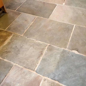
The owner of this period cottage in the old market town of Tadcaster near Leeds, had what was once a beautiful Yorkshire stone floor in the kitchen. It has been a long time since it had been given a proper clean so over the years and with the Kitchen being a high traffic area the whole floor including the grout had darkened and he now wanted it refurbished in time for Christmas.
I visited the property to assess what needed to be done and could see straight away that any protective sealer that was once on the floor had long since worn off. In fact, it was so consistently dirty with years of built-up grease and dirt I had to wonder if one had ever been applied.
I explained what the floor needed was a really deep intensive clean and then a sealer applied to make it easy to keep clean. The problem with most tile and stone is its porosity and if left unprotected dirt easily becomes lodged into its pores making cleaning a struggle.
To prove the difference that can be achieved and to allow me to work out a process on which I could base an accurate quote I ran a test clean on part of the kitchen floor. The test clean went very well, the difference was remarkable, and the cleaned section really stood out. Pleased with the potential of a clean floor they accepted my quote, and we pencilled a date in the diary.
I returned on the appointed date and began by removing the kickboards from under the kitchen units to protect them from splashing. Next, I set about spaying the floor with a strong dilution of Tile Doctor Pro-Clean, this is a purpose made tile and grout cleaner that eats into the grease and dirt so it can be removed. This product works best if you leave it for ten minutes before scrubbing in using a heavy-duty machine fitted with a heavy-duty brush. The soil released from the floor was then extracted using a wet vacuum.
The Pro-Clean did a good job on the grout however it was clear something stronger was required to really get the stone clean, so I stepped up a gear and applied Tile Doctor Remove and Go using the same process as before. This is a really good product for removing deeply ingrained grease and dirt.
The final step of the cleaning process was to give the stone and acid wash using Tile Doctor Grout Clean-Up to remove old grout haze and other mineral deposits; additionally, being an acidic product, it counters the alkaline cleaning products used earlier neutralising the pH level of the floor and leaving it ready for sealing.
Before sealing I like to discuss the different products available and the finishes they can provide. In this case my clients’ main concerns were that they wanted the stone to look natural and easy to maintain going forward.
With this in mind, Tile Doctor Seal & Go Extra was chosen, it’s a modern acrylic-based sealer that brings out the natural colours in the stone and gives a very slight smooth finish. The protection it provides will prevent dirt becoming ingrained int the pores of the stone and ensure the floor is easier to maintain. Several coats were applied, until we achieved the required finish.
The deep cleaning process and fresh sealer transformed the stone floor bringing out its original beauty and my customer couldn’t believe the difference in the floor and was highly delighted.
For aftercare I gave the client a bottle of Tile Doctor Neutral Cleaner, this product is pH neutral so it will clean the floor but won’t damage the sealer. Often people use household cleaners for cleaning tiled floors, but due to the strong chemicals they contain, they can do more harm than good by slowly stripping away the protective sealer and taking the floor back to square one. Tile Doctor Neutral Tile Cleaner is reasonably priced, and the concentrated formula means a small amount goes a long way so it’s well worth using.
This was a pleasurable job for me as it was good to see the floor transform from dull and lifeless to clean and showing the natural colour and beauty of the York stone, and always lovely to have another satisfied client.
Simon Testa
North East Yorkshire Tile Doctor

 Great Goats Landscaping, Inc.
Photo of a mid-sized rustic partial sun backyard stone pond in Minneapolis for summer.

 The Land Collaborative
TLC
Design ideas for a mid-sized modern full sun front yard gravel garden path in San Francisco.
Design ideas for a mid-sized modern full sun front yard gravel garden path in San Francisco.

 Catherine L Kauer, Kauerdesign.com
A waterfall streams into the cold plunge spa, integrating quartzite, mixed Sierra boulders. Low maintenance plantings providing color spill around the pool edge; Catherine L Kauer
 Neumann & Rudy Architecture
**I. Spatial Composition & Architectural Volume**
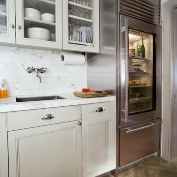
This is a galley-adjacent service zone — most likely a scullery or butler's pantry annexed to a primary kitchen — and its power derives from compression rather than expanse. The composition is organized along a single working wall that terminates abruptly in a full-height stainless volume, creating a deliberate collision of cabinetry rhythm and monolithic mass. The upper millwork establishes the governing geometry: a run of glazed-front wall cabinets with recessed shaker-profile stiles and rails, capped by a substantial crown assembly that reads as architectural cornice rather than applied trim. Within the second bay, the designer has inserted a period-correct plate rack with fluted vertical dividers and open glassware shelving, converting storage into ordered display and introducing a fine-grain vertical striation that counterpoints the broader panel field below. The base run answers with inset drawer fronts and applied-molding door panels, its cabinetry set on a shallow toe recess that lets the volume appear to float rather than plinth. The sightline is intentionally foreshortened: the eye travels the countertop plane eastward, is arrested by the refrigerator's tall stainless slab, then released through a sliver of hallway and door casing at the far right — a compressed reveal that implies circulation beyond and prevents the corridor from reading as a dead end. Ceiling height is inferred rather than shown, the cabinetry's soffit-scaled crown suggesting generous vertical proportion held in check by the room's narrow footprint.
**II. Materiality, Color & Texture**
The palette is a study in achromatic warmth, restrained to four principal materials and disciplined in its saturation. Cabinetry is finished in a soft greige-white — a putty-leaning off-white with faint green-grey undertone — applied in a low-sheen eggshell that absorbs rather than reflects, allowing the millwork profiles to be read through shadow rather than gloss. The backsplash is a honed marble subway field, laid in running bond with tight joints; its veining is delicate, feathered, and grey-toned, providing textural incident without pattern assertion. This continues seamlessly into the countertop, a thick marble slab with a squared eased edge and an integrated undermount trough sink, the material continuity from horizontal to vertical plane reinforcing the wall as a single stone-clad surface. Against this cool mineral field, the stainless steel refrigerator introduces an industrial register — brushed, directional, faintly grey-violet in its reflected light — while polished nickel hardware (bin pulls, cup pulls, knobs, and a wall-mounted bridge faucet with cross handles) supplies punctuating specular highlights at a consistent scale. The floor is the room's tonal anchor: white oak in a herringbone lay, fumed or grey-washed to a driftwood tone that reveals open grain and medullary ray figure. Small warm accents — a butcher-block cutting board with worn patina, amber glass bottles, a persimmon-toned bowl, the pale green of a champagne label — function as chromatic acupuncture within an otherwise desaturated field.
**III. Lighting, Atmosphere & Style Profile**
Illumination is layered and largely concealed. Ambient daylight enters obliquely from the left, raking across the marble backsplash at a low angle that mobilizes the honed surface's subtle relief and casts the cabinet door profiles into legible shadow. Undercabinet linear lighting washes the countertop and backsplash with a warm, low-kelvin pool, while the refrigerator's interior glazing performs as an unexpected internal lantern — a glowing vitrine that punctures the stainless slab and becomes the composition's focal luminance. This device is the image's most sophisticated gesture: it recasts a utilitarian appliance as an illuminated cabinet of curiosities, echoing the glass-front upper millwork on the opposite wall and completing a diagonal dialogue of lit transparency across the room. The resulting atmosphere is quiet, tempered, and quietly bourgeois — an interior of custodial calm rather than spectacle. Stylistically, the project synthesizes as a **contemporary Anglo-American scullery vernacular**: classical inset millwork and plate-rack joinery inherited from the pre-war service kitchen, reinterpreted through professional-grade stainless equipment, honed rather than polished stone, and a wire-brushed herringbone floor. Call it Refined Utilitarianism — a design position in which historical typology supplies the grammar, industrial hardware supplies the punctuation, and the near-monochrome palette allows craft, profile, and light to carry the entire expressive burden.
 Neumann & Rudy Architecture
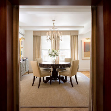
The photograph is composed as a deliberate enfilade study, framing the dining room through a deep, mahogany-cased cased opening that functions as both proscenium and threshold. This heavy portal — with its substantial reveal, plinth-like jambs and crisply mitered head casing — establishes a strong rectilinear armature that compresses the foreground and, by contrast, releases the eye into the luminous volume beyond. The plan reads as a classic pre-war apartment sequence: an axial sightline runs from the gallery floor, across the field of the dining room, and terminates at the window wall, where a curtained bay borrows daylight from the street. The ceiling is articulated by shallow beam drops or applied soffits — a coffer-adjacent treatment that registers the building's structural grid while lending the room a subtle sense of enclosure and datum. Geometry is orchestrated around opposing figures: the orthogonal rigor of casings, valance, beam lines and picture frames set against the centralized circular table, whose radial symmetry anchors the room's midpoint directly beneath the chandelier. Furnishings are held in a loose, non-touching arrangement, with generous circulation clearance at the perimeter, so that the room's volume — rather than its contents — remains the primary subject. Secondary sightlines to the left, toward a mirrored console and gilt-framed panel, and to the right, toward a picture-lit artwork, quietly widen the perceived footprint and imply adjacent rooms beyond the frame.
The material narrative is built on a controlled tonal ascent from dark to light. The foreground is dominated by richly figured, warm-red mahogany millwork and a chevron-laid oak parquet whose bleached, honeyed grain reads with a slight gray wash — a directional pattern that visually propels the viewer toward the interior. Within the dining room, the palette shifts to a low-saturation envelope of chalky off-white plaster walls and putty-toned textiles: floor-length linen or silk-blend drapery panels with a faint slubbed weave, gathered beneath a tailored, flat-front upholstered valance whose crisp horizontal band imparts an atelier precision. Underfoot, a natural sisal or seagrass rug with a linen tape border introduces a coarse, granular tactility that grounds the refined upholstery above; its woven, matte texture is deliberately calibrated against the smoother satin sheen of the dining chairs' subtly striped fabric. The room's tonal fulcrum is the antique carved pedestal table — a near-black, deeply modeled Anglo-Indian or Colonial Revival piece whose pierced apron, scrolled tripod base and paw feet supply the composition's only ornamental exuberance and its darkest value. Accents are chosen for restraint: silvered leaf on the console's fretwork facing, water-gilt on the framed panel, polished nickel or silver on the chandelier and the flower vessel, and the cool white of massed oriental lilies. Undertones remain uniformly warm — greige, ecru, taupe, oatmeal — with cool relief supplied only by the metals and the daylight itself.
Lighting is layered with quiet discipline. Natural light enters as a diffused, north-facing wash through a sheer-veiled window, its intensity softened by roller or Roman shading so that the glazing reads as a luminous plane rather than a view; this creates a gentle contre-jour that silhouettes the chandelier and the table's carved base. The multi-arm chandelier — a silvered, pagoda-crested fixture with slender candle sleeves and faceted drops — serves as sculptural punctuation more than as a working source, its warm 2700K glow registering as ambient sparkle. Accent illumination is deployed with curatorial intent: a picture light grazes the framed work at right, while the recessed downlights and the darkened foreground casings produce a chiaroscuro that heightens the sense of arrival. The cumulative atmosphere is one of hushed formality — composed, aerated, and almost monastic in its refusal of visual noise. Stylistically, the room synthesizes into what might be termed Transitional Classicism, or Warm Neutral Modern Traditional: the bones and millwork are unmistakably pre-war Beaux-Arts-derived, yet the flat-front valances, unadorned wall planes, natural-fiber flooring and simplified parson-back chairs reflect a contemporary editorial sensibility. The single antique table operates as a considered anachronism — a note of patinated gravitas within an otherwise pared-back, texturally driven interior — demonstrating a designer's confidence in restraint punctuated by one authoritative gesture.

 Altera Landscape
Living walls by Scott Hutcheon of Seasons Landscaping
This is an example of a contemporary courtyard landscaping in Orange County.
This is an example of a contemporary courtyard landscaping in Orange County.


74