
Search results for "Remove lines" in Home Design Ideas
 Revitalize Design by Val Valdez
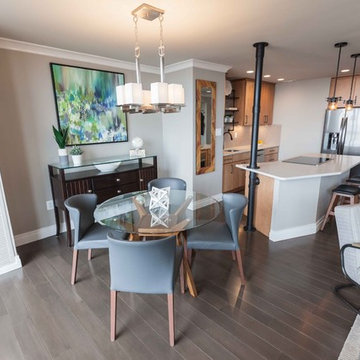
The outer kitchen walls and bulkheads were removed to create an open feel. The main challenge in opening up the space was the building restricting the removal of the existing telephone wires that were located in one of the walls. To maintain compliance with the building rules, I designed an "iron pipe" to house the phone wires which also serves as a conduit for the required wiring to the island. This pipe has an industrial influence which ties in perfectly with the custom-made shelving over the kitchen sink.
The property is a 700 square foot condo. The homeowner's goal was to have his 40+ year old unit transformed into a brand new space. To accomplish this, we gutted the entire unit; we replaced the popcorn ceiling with new drywall, replaced the old flooring with maple engineered wood flooring, removed the mirrored walls and painted the drywall a soothing neutral gray, and removed the kitchen walls and bulkheads to create an open concept. The bathroom and kitchen were totally renovated as well.
Additions include: Handsome crown moulding and custom baseboards, Sherwin Williams wall, ceiling and trim paint (the ceiling is NOT white), LED recessed light fixtures, custom island pendants, Quartz countertops, custom dining chandelier, custom shelving over the kitchen sink and custom "iron pipe" designed to house existing telephone wires (building restricted the removal of existing phone line).
Photography by Michael Anthony Harrison, www.MikeAntPhotography.com
 TVL Creative Ltd.
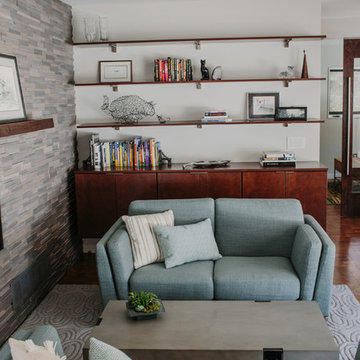
We took our Boulder clients through an amazing transformation! Almost every room in their home has been remodeled to better reflect their tastes and create spaces that functions better for their family. We utilized natural materials every step of the way and designed a balance of mid-century inspired touches and cool contemporary finishes. In the living room we removed the existing half-wall to open up the entry and dining room and create an easier transition between spaces. To make the fireplace the focal point of the living room we designed a beautiful wall of honed sandstone and sourced a reclaimed wood mantel. Increasing storage was a necessity for this home, so we added a much needed closet to the dining room, and designed semi custom floating cabinetry for the living room & dining room. We added a custom barn door to their family room to give them the option of closing the television off from the rest of their home. The clients really wanted to brighten up their dark kitchen, so we removed the black cabinets and red backsplash to make room for beautiful natural wood cabinets and a custom clay tile backsplash. Contemporary touches like a zero radius stainless steel sink, concrete light fixtures, and a double waterfall counter-top continue to echo the clean lines utilized through out the rest of the home. For the two first floor bathrooms we removed barrels full of mosaic tile and installed large scale white and grey tiles, making the rooms feel larger and reign in the visual texture. We continued to use the cool tones and clean lines in the bathrooms to tie them in with the rest of the home and give us a unified feel between spaces.
 ED Enterprises, Inc.
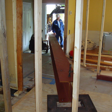
Designing and engineering this kitchen was a team effort between the owners and E D Enterprises, Inc. A twenty-four foot bearing wall was removed and replaced with a twenty-four foot steel beam to create a more open space. The existing soffits and electrical were removed, as well. The owners were then able to plan the kitchen of their dreams.
First, we shored up the second floor and roof, and rerouted the electrical and gas line.
Walls were then framed for the new kitchen footprint. The bearing wall was then removed. The new steel was delivered to the home. The steel was raised into position and the steel column was installed and bolted to the foundation.
We then framed and dry walled around the steel beam.
General Contractor / Remodel: E D Enterprises, Inc.
Find the right local pro for your project
 Drury Design
THE SETUP
Multiple ovens, multiple workspaces, multiple sinks – when you think about it, non-jewish kitchens have been adapting the criteria of kosher kitchens for years.
Gladys’ clients in West Rogers Park are Orthodox Jewish. The house they bought already had a kosher kitchen – it just wasn’t done that well. It needed some more things to be duplicated for the dairy side and the meat side. Plus, it was dark and the configuration wasn’t very conducive for a family of eight.
It was time for a remodel.
Design Objectives
Improve kosher kitchen
Add more storage in the island
Better lighting
More open, lighter feel
Change the wood floor in the kitchen to tile
THE REMODEL
Design Challenges
- We had originally planned on removing a wing wall by the breakfast area. During demolition, we learned it contained a support beam.
- The kitchen is a substantial size, but having two sinks, dishwashers, and ovens presented a challenge – how do we fit it all in and make it flow with the storage still accessible near the work areas?
Where do you stop the materials for the new space? - -- The right tile, paint, lighting, etc. would be needed to make the remodeled area cohesive with the rest of the main floor.
- An existing column limited cabinet options and thus, storage capacity. Could we conceal it without disrupting the cabinetry flow?
Design Solutions
- We had to keep the wing wall, but decided to continue the tile on the sides of the cabinets and maintain the height of the tile to line up with the rest of the backsplash. This actually presented a very nice and cohesive look, especially since the opposite side has a wing wall to the left of the refrigerator.
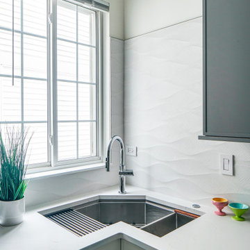
- We used “L-shaped” corner sinks instead of the rectangular ones set on an angle. This gave us more of the legs of the triangles versus the hypotenuse, which allowed for the two dishwashers, and the pullout utensil canisters and spice pullouts while still keeping the 3-drawer cabinets on either side of the range (by the sinks). The old island had the recess for stools which the family never used. By extending the width of the island 6” and utilizing this leg space, we were able to fit 18”-deep cabinets on this side – adding lots of accessible storage. The family can now work simultaneously on the dairy side (the side with the fridge) and the meat side (opposite) without getting in each other’s way. We separated the cooking by using the range oven for the meat and a built-in microwave in the base cabinet. The wall oven with built-in microwave on top is for dairy.
- Corner sinks opened up the middle area for a wider range – we went from a 30” to a 36”. Removing all the wall cabinets (on the range wall) made a big difference. That opened up the entire space while adding some visual impact. (Not pictured: We also made the cabinets directly opposite the range wall tall and removed the countertop, resulting in more room for rollouts and even more storage!) The kitchen now has more storage than it did before.
- We ended up painting the ceiling of the kitchen into the hallway that leads to the foyer. The living and dining rooms were separated by a soffit, so that became a natural boundary. We kept the tile in the kitchen by stopping it short of the hallway and lining it up with the pantry wall. This creates a border between the breakfast area and family room. The rest of the existing wood floors were refinished to refresh and make the hue darker. We also painted a dark accent wall and carried it into the breakfast area to make the rooms look deeper.
- The in-the-way column housed plumbing and couldn’t be moved. We still built cabinets in that spot – we just had to build a chase inside it to conceal the pipes. There was still plenty of room for new storage. We also took the cabinets all the way to the ceiling. The continuous tall cabinets added a functional elegance to the space.
THE RENEWED SPACE
The client’s long-awaited dream of a better kosher kitchen has finally been achieved, beautifully combining enhanced storage solutions with adherence to the family’s orthodox dietary laws. The kitchen’s standout feature, an expanded island, now offers a spacious and efficient workspace. This allows several family members to cook together comfortably, without the inconvenience of bumping into each other, ensuring a harmonious and productive cooking environment.
 Cindy Olstead Interiors
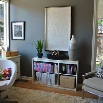
This project was a full-house remodel. The home was originally built in 1960's as an Eichler-style home with older wood paneling throughout the home.
We removed the wood paneling, replaced the flooring with new wood flooring, removed a few walls to create an open-kitchen concept, and fully remodeled two bathrooms. We selected all the materials with the clients as well as performed a few architectural upgrades.
 Xandriss Art
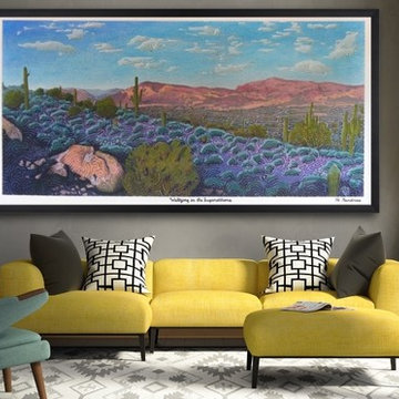
Waltzing in the Superstitions - large continuous line painting
This painting is made up from a single continuous line that never crossses, throughout the entire work.
4 feet x 8 feet wide
This artwork is available for purchase. If you are in the Phoenix metro area, I can deliver and install it for you as well.
 TVL Creative Ltd.
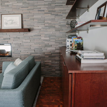
We took our Boulder clients through an amazing transformation! Almost every room in their home has been remodeled to better reflect their tastes and create spaces that functions better for their family. We utilized natural materials every step of the way and designed a balance of mid-century inspired touches and cool contemporary finishes. In the living room we removed the existing half-wall to open up the entry and dining room and create an easier transition between spaces. To make the fireplace the focal point of the living room we designed a beautiful wall of honed sandstone and sourced a reclaimed wood mantel. Increasing storage was a necessity for this home, so we added a much needed closet to the dining room, and designed semi custom floating cabinetry for the living room & dining room. We added a custom barn door to their family room to give them the option of closing the television off from the rest of their home. The clients really wanted to brighten up their dark kitchen, so we removed the black cabinets and red backsplash to make room for beautiful natural wood cabinets and a custom clay tile backsplash. Contemporary touches like a zero radius stainless steel sink, concrete light fixtures, and a double waterfall counter-top continue to echo the clean lines utilized through out the rest of the home. For the two first floor bathrooms we removed barrels full of mosaic tile and installed large scale white and grey tiles, making the rooms feel larger and reign in the visual texture. We continued to use the cool tones and clean lines in the bathrooms to tie them in with the rest of the home and give us a unified feel between spaces.
Sponsored
Sunbury, OH

J.Holderby - Renovations
Franklin County's Leading General Contractors - 2X Best of Houzz!
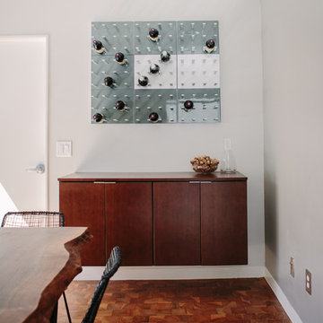 TVL Creative Ltd.
We took our Boulder clients through an amazing transformation! Almost every room in their home has been remodeled to better reflect their tastes and create spaces that functions better for their family. We utilized natural materials every step of the way and designed a balance of mid-century inspired touches and cool contemporary finishes. In the living room we removed the existing half-wall to open up the entry and dining room and create an easier transition between spaces. To make the fireplace the focal point of the living room we designed a beautiful wall of honed sandstone and sourced a reclaimed wood mantel. Increasing storage was a necessity for this home, so we added a much needed closet to the dining room, and designed semi custom floating cabinetry for the living room & dining room. We added a custom barn door to their family room to give them the option of closing the television off from the rest of their home. The clients really wanted to brighten up their dark kitchen, so we removed the black cabinets and red backsplash to make room for beautiful natural wood cabinets and a custom clay tile backsplash. Contemporary touches like a zero radius stainless steel sink, concrete light fixtures, and a double waterfall counter-top continue to echo the clean lines utilized through out the rest of the home. For the two first floor bathrooms we removed barrels full of mosaic tile and installed large scale white and grey tiles, making the rooms feel larger and reign in the visual texture. We continued to use the cool tones and clean lines in the bathrooms to tie them in with the rest of the home and give us a unified feel between spaces.
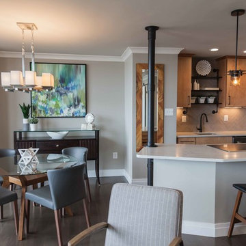 Revitalize Design by Val Valdez
The property is a 700 square foot condo. The homeowner's goal was to have his 40+ year old unit transformed into a brand new space. To accomplish this, we gutted the entire unit; we replaced the popcorn ceiling with new drywall, replaced the old flooring with maple engineered wood flooring, removed the mirrored walls and painted the drywall a soothing neutral gray, and removed the kitchen walls and bulkheads to create an open concept. The bathroom and kitchen were totally renovated as well.
The outer kitchen walls and bulkheads were removed to create an open feel. The main challenge in opening up the space was the building restricting the removal of the existing telephone wires that were located in one of the walls. To maintain compliance with the building rules, I designed an "iron pipe" to house the phone wires which also serves as a conduit for the required wiring to the island. This pipe has an industrial influence which ties in perfectly with the custom-made shelving over the kitchen sink.
Additions include: Handsome crown moulding and custom baseboards, Sherwin Williams wall, ceiling and trim paint (the ceiling is NOT white), LED recessed light fixtures, custom island pendants, Quartz countertops, custom dining chandelier, custom shelving over the kitchen sink and custom "iron pipe" designed to house existing telephone wires (the building restricted the removal of existing phone line).
Photography by Michael Anthony Harrison, www.MikeAntPhotography.com
 Alair Homes Plano
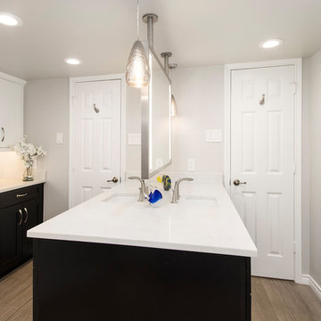
The client's master suite was dark with outdated wallpaper. They wanted the vanity with the floating mirrors to remain the focal point of the bathroom, so for the most part, the layout stayed the same. We went in, removed all finishes and started over; keeping with the style of the house. Grand Mirrors with integrated lighting were installed over the center vanities. The only change in the layout was that the bath tub was removed and replaced shower. The shower was lined with solid white marble tiles and accented with a cool Valentino parquet marble. The old shower became a linen storage closet and cabinets for additional storage. The lower cabinets are a deep espresso finish with contrasting linen finished cabinets up top. The door to the water closet was replaced with a pocket door, creating more space.
The guest bathroom felt claustrophobic with the wall between the vanity and toilet/shower area. We removed the wall and used a pony wall at the end of the vanity instead to hide the toilet. Being a guest bath there was no need double sinks, so one was removed, increasing the cabinet space. The crown molding stayed but the popcorn ceiling texture was removed in both bathrooms. The clients love their new sleek, brighter bathrooms.
Design/Remodel by Hatfield Builders & Remodelers | Photography by Versatile Imaging
 Alair Homes Plano
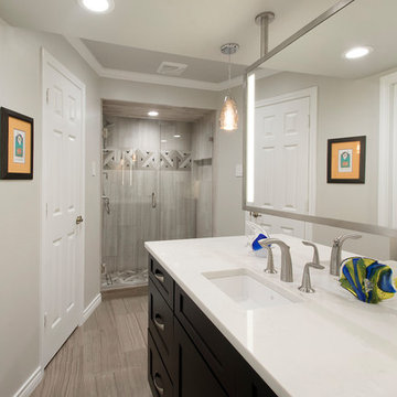
The client's master suite was dark with outdated wallpaper. They wanted the vanity with the floating mirrors to remain the focal point of the bathroom, so for the most part, the layout stayed the same. We went in, removed all finishes and started over; keeping with the style of the house. Grand Mirrors with integrated lighting were installed over the center vanities. The only change in the layout was that the bath tub was removed and replaced shower. The shower was lined with solid white marble tiles and accented with a cool Valentino parquet marble. The old shower became a linen storage closet and cabinets for additional storage. The lower cabinets are a deep espresso finish with contrasting linen finished cabinets up top. The door to the water closet was replaced with a pocket door, creating more space.
The guest bathroom felt claustrophobic with the wall between the vanity and toilet/shower area. We removed the wall and used a pony wall at the end of the vanity instead to hide the toilet. Being a guest bath there was no need double sinks, so one was removed, increasing the cabinet space. The crown molding stayed but the popcorn ceiling texture was removed in both bathrooms. The clients love their new sleek, brighter bathrooms.
Design/Remodel by Hatfield Builders & Remodelers | Photography by Versatile Imaging
 TVL Creative Ltd.
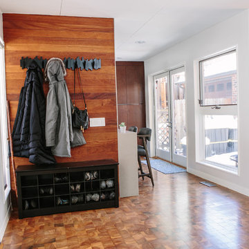
We took our Boulder clients through an amazing transformation! Almost every room in their home has been remodeled to better reflect their tastes and create spaces that functions better for their family. We utilized natural materials every step of the way and designed a balance of mid-century inspired touches and cool contemporary finishes. In the living room we removed the existing half-wall to open up the entry and dining room and create an easier transition between spaces. To make the fireplace the focal point of the living room we designed a beautiful wall of honed sandstone and sourced a reclaimed wood mantel. Increasing storage was a necessity for this home, so we added a much needed closet to the dining room, and designed semi custom floating cabinetry for the living room & dining room. We added a custom barn door to their family room to give them the option of closing the television off from the rest of their home. The clients really wanted to brighten up their dark kitchen, so we removed the black cabinets and red backsplash to make room for beautiful natural wood cabinets and a custom clay tile backsplash. Contemporary touches like a zero radius stainless steel sink, concrete light fixtures, and a double waterfall counter-top continue to echo the clean lines utilized through out the rest of the home. For the two first floor bathrooms we removed barrels full of mosaic tile and installed large scale white and grey tiles, making the rooms feel larger and reign in the visual texture. We continued to use the cool tones and clean lines in the bathrooms to tie them in with the rest of the home and give us a unified feel between spaces.
 TVL Creative Ltd.
We took our Boulder clients through an amazing transformation! Almost every room in their home has been remodeled to better reflect their tastes and create spaces that functions better for their family. We utilized natural materials every step of the way and designed a balance of mid-century inspired touches and cool contemporary finishes. In the living room we removed the existing half-wall to open up the entry and dining room and create an easier transition between spaces. To make the fireplace the focal point of the living room we designed a beautiful wall of honed sandstone and sourced a reclaimed wood mantel. Increasing storage was a necessity for this home, so we added a much needed closet to the dining room, and designed semi custom floating cabinetry for the living room & dining room. We added a custom barn door to their family room to give them the option of closing the television off from the rest of their home. The clients really wanted to brighten up their dark kitchen, so we removed the black cabinets and red backsplash to make room for beautiful natural wood cabinets and a custom clay tile backsplash. Contemporary touches like a zero radius stainless steel sink, concrete light fixtures, and a double waterfall counter-top continue to echo the clean lines utilized through out the rest of the home. For the two first floor bathrooms we removed barrels full of mosaic tile and installed large scale white and grey tiles, making the rooms feel larger and reign in the visual texture. We continued to use the cool tones and clean lines in the bathrooms to tie them in with the rest of the home and give us a unified feel between spaces.

 House of a Different Color
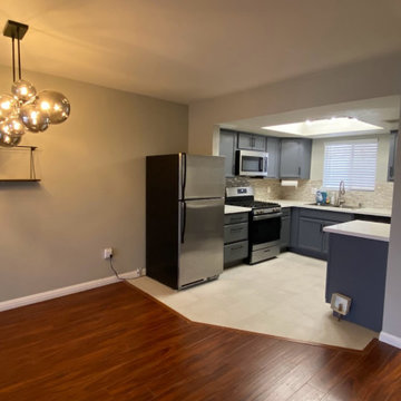
Design consultation and advising for DIY/Budget Renovation.
Owner purchased this condo with a very cramped and dated kitchen and light fixtures, and early 2000s-era café paint colors.
Owner did a lot of the work himself or with friends to keep the budget down.
HDC advised on design details and paint colors, chose light fixtures (ceiling lights for kitchen and dining and arch floor lamp in living room). HDC also assisted with creating a new kitchen floor plan, which involved removing one wall, replacing existing tile and modifying flooring transition location, replacing all cabinetry except for the tall pantry cabinet, choosing cabinet paint, installing modern cabinet hardware, replacing laminate counters with a budget white quartz prefab counter, replacing appliances, sink, and faucet, and installing a low-cost peel & stick backsplash.
Due to budget constraints, we could not remove the entire wall between the kitchen and dining space to make the wall completely flush from the kitchen to dining area transition, but decided to relocate the refrigerator to that wall nonetheless, in order to improve sightlines and improve traffic flow and function for refrigerator access. We created a coffee/drinks bar where the original fridge was located. The owner decided to keep the existing water line that had serviced the ice maker in the fridge where it was previously located (and cap it temporarily). He plans to plumb it in the future to support a filtered drinking water line and auto-filling coffee maker to finish out the drink center.
Ultimately, we couldn't stretch the budget for a perfect layout, but we were still able to improve the function and open up the flow of this hub of the condo for better entertaining and more convenient homeowner use of the space.
 TVL Creative Ltd.
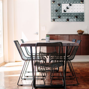
We took our Boulder clients through an amazing transformation! Almost every room in their home has been remodeled to better reflect their tastes and create spaces that functions better for their family. We utilized natural materials every step of the way and designed a balance of mid-century inspired touches and cool contemporary finishes. In the living room we removed the existing half-wall to open up the entry and dining room and create an easier transition between spaces. To make the fireplace the focal point of the living room we designed a beautiful wall of honed sandstone and sourced a reclaimed wood mantel. Increasing storage was a necessity for this home, so we added a much needed closet to the dining room, and designed semi custom floating cabinetry for the living room & dining room. We added a custom barn door to their family room to give them the option of closing the television off from the rest of their home. The clients really wanted to brighten up their dark kitchen, so we removed the black cabinets and red backsplash to make room for beautiful natural wood cabinets and a custom clay tile backsplash. Contemporary touches like a zero radius stainless steel sink, concrete light fixtures, and a double waterfall counter-top continue to echo the clean lines utilized through out the rest of the home. For the two first floor bathrooms we removed barrels full of mosaic tile and installed large scale white and grey tiles, making the rooms feel larger and reign in the visual texture. We continued to use the cool tones and clean lines in the bathrooms to tie them in with the rest of the home and give us a unified feel between spaces.
 Drury Design
THE SETUP
Multiple ovens, multiple workspaces, multiple sinks – when you think about it, non-jewish kitchens have been adapting the criteria of kosher kitchens for years.
Gladys’ clients in West Rogers Park are Orthodox Jewish. The house they bought already had a kosher kitchen – it just wasn’t done that well. It needed some more things to be duplicated for the dairy side and the meat side. Plus, it was dark and the configuration wasn’t very conducive for a family of eight.
It was time for a remodel.
Design Objectives
Improve kosher kitchen
Add more storage in the island
Better lighting
More open, lighter feel
Change the wood floor in the kitchen to tile
THE REMODEL
Design Challenges
- We had originally planned on removing a wing wall by the breakfast area. During demolition, we learned it contained a support beam.
- The kitchen is a substantial size, but having two sinks, dishwashers, and ovens presented a challenge – how do we fit it all in and make it flow with the storage still accessible near the work areas?
Where do you stop the materials for the new space? - -- The right tile, paint, lighting, etc. would be needed to make the remodeled area cohesive with the rest of the main floor.
- An existing column limited cabinet options and thus, storage capacity. Could we conceal it without disrupting the cabinetry flow?
Design Solutions
- We had to keep the wing wall, but decided to continue the tile on the sides of the cabinets and maintain the height of the tile to line up with the rest of the backsplash. This actually presented a very nice and cohesive look, especially since the opposite side has a wing wall to the left of the refrigerator.
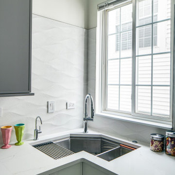
- We used “L-shaped” corner sinks instead of the rectangular ones set on an angle. This gave us more of the legs of the triangles versus the hypotenuse, which allowed for the two dishwashers, and the pullout utensil canisters and spice pullouts while still keeping the 3-drawer cabinets on either side of the range (by the sinks). The old island had the recess for stools which the family never used. By extending the width of the island 6” and utilizing this leg space, we were able to fit 18”-deep cabinets on this side – adding lots of accessible storage. The family can now work simultaneously on the dairy side (the side with the fridge) and the meat side (opposite) without getting in each other’s way. We separated the cooking by using the range oven for the meat and a built-in microwave in the base cabinet. The wall oven with built-in microwave on top is for dairy.
- Corner sinks opened up the middle area for a wider range – we went from a 30” to a 36”. Removing all the wall cabinets (on the range wall) made a big difference. That opened up the entire space while adding some visual impact. (Not pictured: We also made the cabinets directly opposite the range wall tall and removed the countertop, resulting in more room for rollouts and even more storage!) The kitchen now has more storage than it did before.
- We ended up painting the ceiling of the kitchen into the hallway that leads to the foyer. The living and dining rooms were separated by a soffit, so that became a natural boundary. We kept the tile in the kitchen by stopping it short of the hallway and lining it up with the pantry wall. This creates a border between the breakfast area and family room. The rest of the existing wood floors were refinished to refresh and make the hue darker. We also painted a dark accent wall and carried it into the breakfast area to make the rooms look deeper.
- The in-the-way column housed plumbing and couldn’t be moved. We still built cabinets in that spot – we just had to build a chase inside it to conceal the pipes. There was still plenty of room for new storage. We also took the cabinets all the way to the ceiling. The continuous tall cabinets added a functional elegance to the space.
THE RENEWED SPACE
The client’s long-awaited dream of a better kosher kitchen has finally been achieved, beautifully combining enhanced storage solutions with adherence to the family’s orthodox dietary laws. The kitchen’s standout feature, an expanded island, now offers a spacious and efficient workspace. This allows several family members to cook together comfortably, without the inconvenience of bumping into each other, ensuring a harmonious and productive cooking environment.
 TVL Creative Ltd.
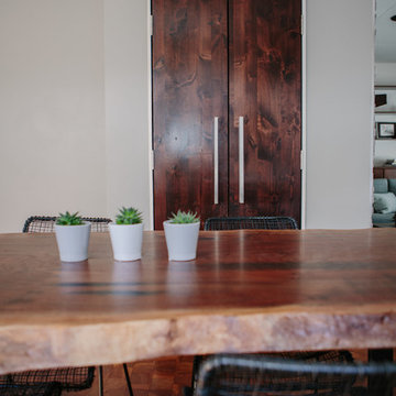
We took our Boulder clients through an amazing transformation! Almost every room in their home has been remodeled to better reflect their tastes and create spaces that functions better for their family. We utilized natural materials every step of the way and designed a balance of mid-century inspired touches and cool contemporary finishes. In the living room we removed the existing half-wall to open up the entry and dining room and create an easier transition between spaces. To make the fireplace the focal point of the living room we designed a beautiful wall of honed sandstone and sourced a reclaimed wood mantel. Increasing storage was a necessity for this home, so we added a much needed closet to the dining room, and designed semi custom floating cabinetry for the living room & dining room. We added a custom barn door to their family room to give them the option of closing the television off from the rest of their home. The clients really wanted to brighten up their dark kitchen, so we removed the black cabinets and red backsplash to make room for beautiful natural wood cabinets and a custom clay tile backsplash. Contemporary touches like a zero radius stainless steel sink, concrete light fixtures, and a double waterfall counter-top continue to echo the clean lines utilized through out the rest of the home. For the two first floor bathrooms we removed barrels full of mosaic tile and installed large scale white and grey tiles, making the rooms feel larger and reign in the visual texture. We continued to use the cool tones and clean lines in the bathrooms to tie them in with the rest of the home and give us a unified feel between spaces.
Sponsored
Fredericksburg, OH

High Point Cabinets
Columbus' Experienced Custom Cabinet Builder | 4x Best of Houzz Winner
 TVL Creative Ltd.
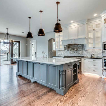
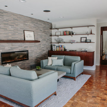
We took our Boulder clients through an amazing transformation! Almost every room in their home has been remodeled to better reflect their tastes and create spaces that functions better for their family. We utilized natural materials every step of the way and designed a balance of mid-century inspired touches and cool contemporary finishes. In the living room we removed the existing half-wall to open up the entry and dining room and create an easier transition between spaces. To make the fireplace the focal point of the living room we designed a beautiful wall of honed sandstone and sourced a reclaimed wood mantel. Increasing storage was a necessity for this home, so we added a much needed closet to the dining room, and designed semi custom floating cabinetry for the living room & dining room. We added a custom barn door to their family room to give them the option of closing the television off from the rest of their home. The clients really wanted to brighten up their dark kitchen, so we removed the black cabinets and red backsplash to make room for beautiful natural wood cabinets and a custom clay tile backsplash. Contemporary touches like a zero radius stainless steel sink, concrete light fixtures, and a double waterfall counter-top continue to echo the clean lines utilized through out the rest of the home. For the two first floor bathrooms we removed barrels full of mosaic tile and installed large scale white and grey tiles, making the rooms feel larger and reign in the visual texture. We continued to use the cool tones and clean lines in the bathrooms to tie them in with the rest of the home and give us a unified feel between spaces.
 TVL Creative Ltd.
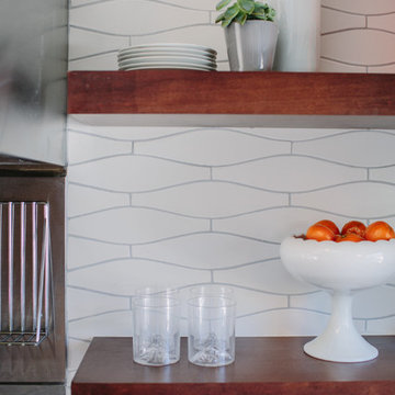
We took our Boulder clients through an amazing transformation! Almost every room in their home has been remodeled to better reflect their tastes and create spaces that functions better for their family. We utilized natural materials every step of the way and designed a balance of mid-century inspired touches and cool contemporary finishes. In the living room we removed the existing half-wall to open up the entry and dining room and create an easier transition between spaces. To make the fireplace the focal point of the living room we designed a beautiful wall of honed sandstone and sourced a reclaimed wood mantel. Increasing storage was a necessity for this home, so we added a much needed closet to the dining room, and designed semi custom floating cabinetry for the living room & dining room. We added a custom barn door to their family room to give them the option of closing the television off from the rest of their home. The clients really wanted to brighten up their dark kitchen, so we removed the black cabinets and red backsplash to make room for beautiful natural wood cabinets and a custom clay tile backsplash. Contemporary touches like a zero radius stainless steel sink, concrete light fixtures, and a double waterfall counter-top continue to echo the clean lines utilized through out the rest of the home. For the two first floor bathrooms we removed barrels full of mosaic tile and installed large scale white and grey tiles, making the rooms feel larger and reign in the visual texture. We continued to use the cool tones and clean lines in the bathrooms to tie them in with the rest of the home and give us a unified feel between spaces.
 Drury Design
THE SETUP
Multiple ovens, multiple workspaces, multiple sinks – when you think about it, non-jewish kitchens have been adapting the criteria of kosher kitchens for years.
Gladys’ clients in West Rogers Park are Orthodox Jewish. The house they bought already had a kosher kitchen – it just wasn’t done that well. It needed some more things to be duplicated for the dairy side and the meat side. Plus, it was dark and the configuration wasn’t very conducive for a family of eight.
It was time for a remodel.
Design Objectives
Improve kosher kitchen
Add more storage in the island
Better lighting
More open, lighter feel
Change the wood floor in the kitchen to tile
THE REMODEL
Design Challenges
- We had originally planned on removing a wing wall by the breakfast area. During demolition, we learned it contained a support beam.
- The kitchen is a substantial size, but having two sinks, dishwashers, and ovens presented a challenge – how do we fit it all in and make it flow with the storage still accessible near the work areas?
Where do you stop the materials for the new space? - -- The right tile, paint, lighting, etc. would be needed to make the remodeled area cohesive with the rest of the main floor.
- An existing column limited cabinet options and thus, storage capacity. Could we conceal it without disrupting the cabinetry flow?
Design Solutions
- We had to keep the wing wall, but decided to continue the tile on the sides of the cabinets and maintain the height of the tile to line up with the rest of the backsplash. This actually presented a very nice and cohesive look, especially since the opposite side has a wing wall to the left of the refrigerator.
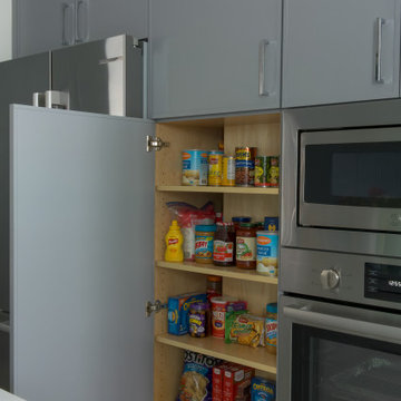
- We used “L-shaped” corner sinks instead of the rectangular ones set on an angle. This gave us more of the legs of the triangles versus the hypotenuse, which allowed for the two dishwashers, and the pullout utensil canisters and spice pullouts while still keeping the 3-drawer cabinets on either side of the range (by the sinks). The old island had the recess for stools which the family never used. By extending the width of the island 6” and utilizing this leg space, we were able to fit 18”-deep cabinets on this side – adding lots of accessible storage. The family can now work simultaneously on the dairy side (the side with the fridge) and the meat side (opposite) without getting in each other’s way. We separated the cooking by using the range oven for the meat and a built-in microwave in the base cabinet. The wall oven with built-in microwave on top is for dairy.
- Corner sinks opened up the middle area for a wider range – we went from a 30” to a 36”. Removing all the wall cabinets (on the range wall) made a big difference. That opened up the entire space while adding some visual impact. (Not pictured: We also made the cabinets directly opposite the range wall tall and removed the countertop, resulting in more room for rollouts and even more storage!) The kitchen now has more storage than it did before.
- We ended up painting the ceiling of the kitchen into the hallway that leads to the foyer. The living and dining rooms were separated by a soffit, so that became a natural boundary. We kept the tile in the kitchen by stopping it short of the hallway and lining it up with the pantry wall. This creates a border between the breakfast area and family room. The rest of the existing wood floors were refinished to refresh and make the hue darker. We also painted a dark accent wall and carried it into the breakfast area to make the rooms look deeper.
- The in-the-way column housed plumbing and couldn’t be moved. We still built cabinets in that spot – we just had to build a chase inside it to conceal the pipes. There was still plenty of room for new storage. We also took the cabinets all the way to the ceiling. The continuous tall cabinets added a functional elegance to the space.
THE RENEWED SPACE
The client’s long-awaited dream of a better kosher kitchen has finally been achieved, beautifully combining enhanced storage solutions with adherence to the family’s orthodox dietary laws. The kitchen’s standout feature, an expanded island, now offers a spacious and efficient workspace. This allows several family members to cook together comfortably, without the inconvenience of bumping into each other, ensuring a harmonious and productive cooking environment.
44