
Search results for "Remove lines" in Home Design Ideas
 Amy Troute Inspired Interior Design
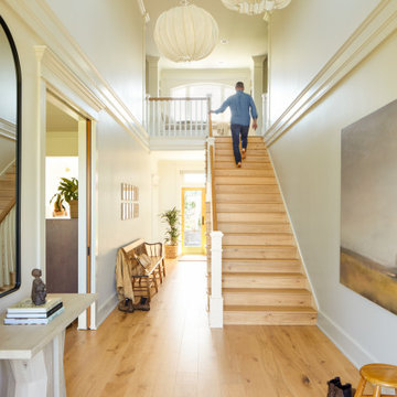
This designer’s ideal is homeowners with a clear vision, set priorities, and values that align seamlessly with ours. These clients, an accomplished artist and the owner of a generational hops growing farm, were collaborative and trusting from the start. They conscientiously selected a team of Architect (Green Hammer), General Contractor (Cellar Ridge) and ATIID for furnishings and finishing touches. Each firm was able to meticulously manage their leg of the project, while collaborating wholistically with each other and the homeowners.
The family farmhouse, lovingly named “Westwood,” was showing the wear one expects after serving a growing family for decades. The owner’s dream was to revive, open up, and breathe modern life into each space, while respecting the home’s heritage.
One of our first collaborations was the light fixture that would grace the main two-story entry hall. HiiH Lights in Astoria, Oregon, was commissioned to bring “the function of light, the craft of paper, and the art of sculpture” to the home. Visiting the maker’s space – a massive barn on his coastal property – was such an inspiring adventure! Original work by the resident artist sets an ethereal tone in the space, and an antique bench handsomely blends the old with the new.
A wall that divided the home’s living room and kitchen was removed, and the breezy and bright gathering room was born. Light walls, warm wood tones, cozy upholstery, clean lines and heritage elements create a welcoming atmosphere and invite lounging and conversation. The sun-drenched nook is the home’s main indoor dining area, with an extension table and sculpted chairs that are just right for family gatherings or morning rituals with the Sunday paper. The kitchen is a chef’s dream with every modern amenity, but its casual attitude is “let’s make a mess and eat!”
The owner’s artwork graces the mantel over the new fireplace that was carved from a tree felled on the property, illustrating the thoughtful consideration of each element. The muted wool area rugs in the entryways and great room are hard-wearing for farm life, and the furniture’s classic lines, bold contrasting colors, deep seating and soft textures encourage cozy conversations or large group gatherings.
The library is undoubtedly our favorite space in this home. Tucked in “speakeasy style” behind a hidden (wallpapered!) door in the moody wet bar, and drenched in deep green, the room offers a quiet retreat that hugs you in an embrace of books and family photos. The cozy settee nestled between the bookcases sits opposite a custom pair of modern cognac leather wing chairs. The area rug continues the storied look without the antique price tag with a piece from Loloi’s “Heritage Collection.”
A little va-va-voom was requested for the powder bath and boy did we deliver! Custom wallpaper plays over original wainscotting and ceilings wrapped in more glorious green. The space evokes joy every time you open the door!
A primary suite that would “transport us to another world” and be “classic yet modern, peaceful, collected and uncluttered” was a tall order. Our new furniture layout takes full advantage of the view of wine country hills and the Willamette River, welcomes fireside lounging, and serves as a calm respite for the lovely owners.
Westwood Farmhouse truly was inspired by family, genuine love for home and graciousness for all who enter. Finishing the job was emotional for all involved because we were truly made to feel like part of the family.
Photography by George Barberis
 Edmond Kitchen & Bath LLC
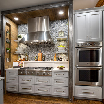
This creative transitional space was transformed from a very dated layout that did not function well for our homeowners - who enjoy cooking for both their family and friends. They found themselves cooking on a 30" by 36" tiny island in an area that had much more potential. A completely new floor plan was in order. An unnecessary hallway was removed to create additional space and a new traffic pattern. New doorways were created for access from the garage and to the laundry. Just a couple of highlights in this all Thermador appliance professional kitchen are the 10 ft island with two dishwashers (also note the heated tile area on the functional side of the island), double floor to ceiling pull-out pantries flanking the refrigerator, stylish soffited area at the range complete with burnished steel, niches and shelving for storage. Contemporary organic pendants add another unique texture to this beautiful, welcoming, one of a kind kitchen! Photos by David Cobb Photography.
 Linc Thelen Design
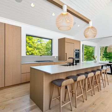
This couple purchased a second home as a respite from city living. Living primarily in downtown Chicago the couple desired a place to connect with nature. The home is located on 80 acres and is situated far back on a wooded lot with a pond, pool and a detached rec room. The home includes four bedrooms and one bunkroom along with five full baths.
The home was stripped down to the studs, a total gut. Linc modified the exterior and created a modern look by removing the balconies on the exterior, removing the roof overhang, adding vertical siding and painting the structure black. The garage was converted into a detached rec room and a new pool was added complete with outdoor shower, concrete pavers, ipe wood wall and a limestone surround.
Kitchen Details:
-Cabinetry, custom rift cut white oak
-Light fixtures, Lightology
-Barstools, Article and refinished by Home Things
-Appliances, Thermadore, stovetop has a downdraft hood
-Island, Ceasarstone, raw concrete
-Sink and faucet, Delta faucet, sink is Franke
-White shiplap ceiling with white oak beams
-Flooring is rough wide plank white oak and distressed
Find the right local pro for your project
 Rellion Homes
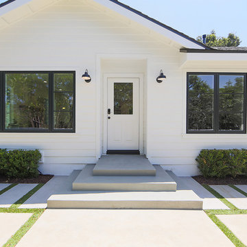
This is a remodel of small home in Pacific Palisades, Los Angeles, just off Sunset Blvd. The goals of this project are to reconfigure the floor plan and to meet current homeowner's needs and update its aesthetics to current tastes suitable in that area. To achieve these goals, the interior of the house was completely gutted and reconfigured and the exterior was removed and wrapped with new siding. Since the house is close to ocean and surrounded by celebrities' mansions, the interior design is slightly eclectic with a mix of coastal casual with a hint of modern Hollywood glam.
 Gusto Design Studio
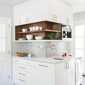
Walnut accents peek through at the coffee bar.
Photo Credit: Haris Kenjar
Example of a 1950s home design design in Portland
Example of a 1950s home design design in Portland

 Metropolis Drafting and Construction Inc
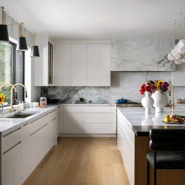
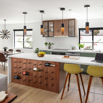
Who said that a Burbank bungalow home needs to be doll and old fashioned.
In this Burbank remodeling project we took this 1200sq. bungalow home and turned it to a wonderful mixture of European modern kitchen space and calm transitional modern farmhouse furniture and flooring.
The kitchen was a true challenge since space was a rare commodity, but with the right layout storage and work space became abundant.
A floating 5' long sitting area was constructed and even the back face of the cabinets was used for wine racks.
Exterior was updated as well with new black windows, new stucco over layer and new light fixtures all around.
both bedrooms were fitted with huge 10' sliding doors overlooking the green backyard.


 By Design Interiors Inc
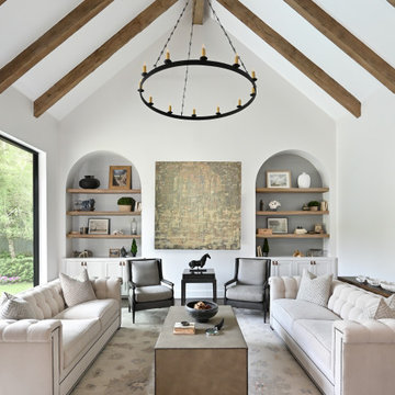
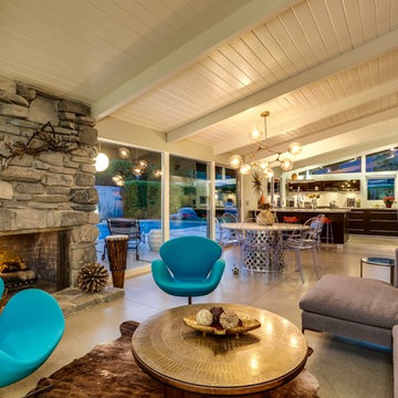
A great room design with exposed wooden beams along ceiling with natural tones throughout. Complete with a pair of reclaimed wood book shelves, each lined with wallcovering on the back walls. Neutrals and collected antiques and artifacts accent the cozy space.

 Craig O'Connell Architecture
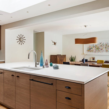
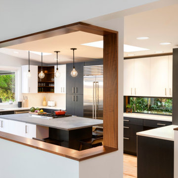
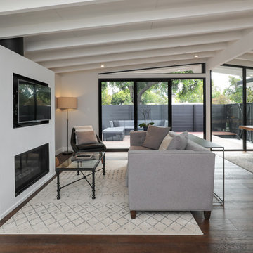
This 1950s Fairfax home underwent a dramatic transformation with updated midcentury modern touches. The floor plan was opened up to create an open plan kitchen and dining room that flows to the back patio.

 Room Resolutions
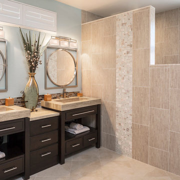
Jane removed the existing tub to make way for a large walk-in shower, complete with an eye-catching contemporary shower panel, contrasting natural bamboo and sleek stainless steel. The rectangular porcelain tile with a bamboo effect was installed vertically to add visual height, while paired with a stone and glass mosaic tile in a wrapped stripe for interest. The glass block window streams natural light through the door-less shower entrance, and can be seen from the bedroom.
To continue the functional clean lines, a large vanity with a travertine countertop and integrated double stone sinks was installed.
Photography - Grey Crawford
 Albert, Righter & Tittmann Architects, Inc.
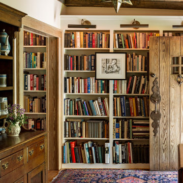
Our client, with whom we had worked on a number of projects over the years, enlisted our help in transforming her family’s beloved but deteriorating rustic summer retreat, built by her grandparents in the mid-1920’s, into a house that would be livable year-‘round. It had served the family well but needed to be renewed for the decades to come without losing the flavor and patina they were attached to.
The house was designed by Ruth Adams, a rare female architect of the day, who also designed in a similar vein a nearby summer colony of Vassar faculty and alumnae.
To make Treetop habitable throughout the year, the whole house had to be gutted and insulated. The raw homosote interior wall finishes were replaced with plaster, but all the wood trim was retained and reused, as were all old doors and hardware. The old single-glazed casement windows were restored, and removable storm panels fitted into the existing in-swinging screen frames. New windows were made to match the old ones where new windows were added. This approach was inherently sustainable, making the house energy-efficient while preserving most of the original fabric.
Changes to the original design were as seamless as possible, compatible with and enhancing the old character. Some plan modifications were made, and some windows moved around. The existing cave-like recessed entry porch was enclosed as a new book-lined entry hall and a new entry porch added, using posts made from an oak tree on the site.
The kitchen and bathrooms are entirely new but in the spirit of the place. All the bookshelves are new.
A thoroughly ramshackle garage couldn’t be saved, and we replaced it with a new one built in a compatible style, with a studio above for our client, who is a writer.

 Tipton Spires Design|Build
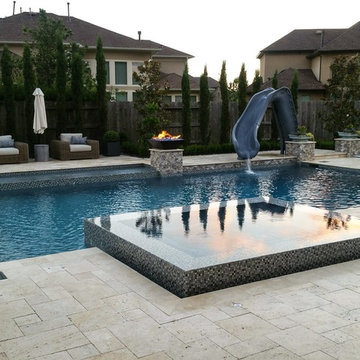
Gorgeous luxury straight line swimming pool featuring travertine decking, glass tiles, perimeter overflow spa, CSW creations fire woks and slide
Example of a large classic pool design in Houston
Example of a large classic pool design in Houston

 Alisberg Parker
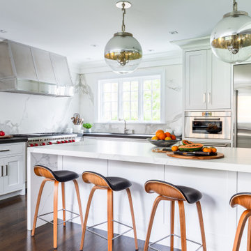
Eat-in kitchen - transitional l-shaped dark wood floor eat-in kitchen idea in New York with a single-bowl sink, shaker cabinets, white cabinets, granite countertops, white backsplash, marble backsplash, stainless steel appliances, an island and black countertops
 Greenberg Construction
Greenberg Construction
Location: Mountain View, CA, United States
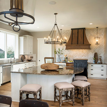
Our clients wanted to create a beautiful and open concept living space for entertaining while maximized the natural lighting throughout their midcentury modern Mackay home. Light silvery gray and bright white tones create a contemporary and sophisticated space; combined with elegant rich, dark woods throughout.
Removing the center wall and brick fireplace between the kitchen and dining areas allowed for a large seven by four foot island and abundance of light coming through the floor to ceiling windows and addition of skylights. The custom low sheen white and navy blue kitchen cabinets were designed by Segale Bros, with the goal of adding as much organization and access as possible with the island storage, drawers, and roll-outs.
Black finishings are used throughout with custom black aluminum windows and 3 panel sliding door by CBW Windows and Doors. The clients designed their custom vertical white oak front door with CBW Windows and Doors as well.

 Housetrends Magazine
Since moving into her Dublin home two and a half years ago, Nancy Sanford has been peeling off the decades—quite literally. Built in the 1980s, the home was “very well-maintained, but very little had been done to it” in terms of updating the finishes or style, Sanford says. Plush white carpet ran from wall-to-wall-to-wall, almond-colored laminate coated the kitchen cabinets and wallpaper ran rampant—even covering some ceilings.
Despite her efforts, Sanford knew it was going to take more than cosmetic editing to shake the ‘80s and make the home her own. Although she lives in the traditional-leaning Muirfield community, Sanford adores a minimalist, contemporary style—and admits to devouring design magazines “ad nauseam.”
To implement her thoroughly modern vision, Sanford turned to Brigid Norton, an interior designer and family friend, and Kristi Youles, a kitchen designer with The JAE Company. Working together, the trio created a carefully considered contemporary design that’s easy on the eyes, and the body.
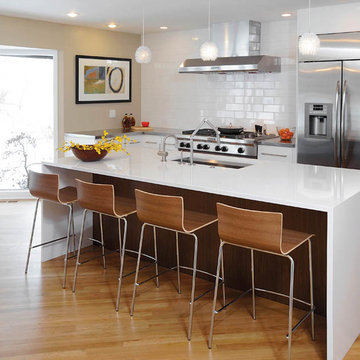
In addition to improving the flow of the kitchen—by removing a V-shaped peninsula that angled out into the room—and adding appliances like a stainless steel refrigerator, Sanford’s short list of must-haves included clean, uncluttered lines and no wall cabinets over the countertops. “I’ve found as I’ve aged, I’ve gotten shorter and just don’t use the upper cabinets,” Sanford explains.
Easy-access, smooth-slide drawers with clean slab fronts were the answer—resulting in strong visual lines, an open, airy feel and enhanced ergonomics. Starting with a “needs assessment,” Youles and Norton designed the space quite literally around Nancy. By looking at factors such as her height and which items she uses most frequently, they were able to determine the optimum placement for everything from canned goods in the pantry to cutlery, pans and plates in the customized drawers, all of which helped to achieve the ultimate kitchen organization.
But there’s more to the kitchen cabinets smooth façade than clean-lined storage. Walnut drawer fronts—found on the oven and the base of the island—are book-matched, allowing the grain to continue from drawer to drawer. And even in spaces where drawers weren’t feasible, beneath the sink and in a desk area, the designers continued the look with cabinet doors crafted to resemble drawers.
The visual continuity of these lines might not be as impactful if it weren’t for the careful selection of contrasting finishes. The designers filled the space with pure, glossy white—using a specific type of quartz, White Cliff by Cambria, to accent the bold rectangular design of the island. Then, to break up the expanse of accompanying white painted drawers, walnut was selected to bring the contrasting warmth and grain of wood without red undertones. It is commonly found in modern furniture design, as well as current productions of mid-century designs like the iconic Eames Lounge Chair from Herman Miller, Youles says.
 Crystal Kitchen + Bath
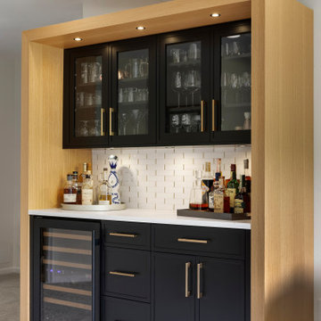
Located in Minnetonka, MN, this remodel was designed for a couple who wanted to transform their lower level into an upscale, entertaining retreat. The husband envisioned a sleek, fully stocked bar with room for barware, a beverage fridge, and his whiskey collection. We delivered with a custom quarter sawn oak and black cabinetry design, topped with durable Cambria quartz, and accented with warm brass hardware.
The adjacent movie room was given dramatic depth with the blackest paint we could source, creating a true cinematic atmosphere. A nearby powder bath received a complete refresh with quality, low-maintenance materials, including a stylish wood vanity, coordinating mirror, modern fixtures, and new flooring.
Though the original plan called for removing a wall in the movie room, structural limitations led to a design pivot, focusing instead on maximizing style and function within the existing layout. Materials were repeated throughout the home for a cohesive, high-end feel. Now, the homeowners can comfortably host friends and family in a space that blends modern sophistication with easy, everyday living.
 House of a Different Color
Design consultation and advising for DIY/Budget Renovation.
Owner purchased this condo with a very cramped and dated kitchen and light fixtures, and early 2000s-era café paint colors.
Owner did a lot of the work himself or with friends to keep the budget down.
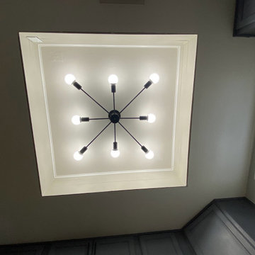
HDC advised on design details and paint colors, chose light fixtures (ceiling lights for kitchen and dining and arch floor lamp in living room). HDC also assisted with creating a new kitchen floor plan, which involved removing one wall, replacing existing tile and modifying flooring transition location, replacing all cabinetry except for the tall pantry cabinet, choosing cabinet paint, installing modern cabinet hardware, replacing laminate counters with a budget white quartz prefab counter, replacing appliances, sink, and faucet, and installing a low-cost peel & stick backsplash.
Due to budget constraints, we could not remove the entire wall between the kitchen and dining space to make the wall completely flush from the kitchen to dining area transition, but decided to relocate the refrigerator to that wall nonetheless, in order to improve sightlines and improve traffic flow and function for refrigerator access. We created a coffee/drinks bar where the original fridge was located. The owner decided to keep the existing water line that had serviced the ice maker in the fridge where it was previously located (and cap it temporarily). He plans to plumb it in the future to support a filtered drinking water line and auto-filling coffee maker to finish out the drink center.
Ultimately, we couldn't stretch the budget for a perfect layout, but we were still able to improve the function and open up the flow of this hub of the condo for better entertaining and more convenient homeowner use of the space.
42