
Search results for "Remove lines" in Home Design Ideas
 AFFD Design Firm
GAO Zhiqiang: Exploring the infinite possibilities beyond boundaries - Space Emotion Design Series - Vniau Office
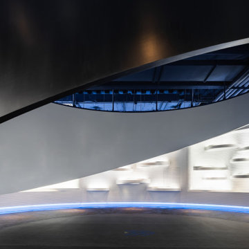
The essence of space design is to pay attention to people’s emotional needs, especially in office designs.
Vniau office is designed by GAO Zhiqiang, a space emotion designer. He created an extremely comfortable and inclusive office space by modern design tech-niques, combined with technology, history and humanities.
/ Explore /
Infinite possibilities beyond boundaries
A humanistic caring, warm and emotional design work, under the continuous changes of social forms, evolves into a space in accordance with the develop-ment of the current era, which is the most solid response from the designer to the space.
This open space makes you feel like entering into a movie scene. Large areas of black and white contrast, and smooth lines create a powerful aura. However, soft lights bring back a romantic atmosphere. The space is highlighted by vir-tuality and reality.
The development of modern technology diversified people’s cognition and iden-tification of space dimension. The designer tries to break the inherent bound-ary consciousness among technology, humanities and nature by comfortable and efficient spatial perception.
Wandering between virtual and real, light and shadow, the space presents a fu-ture sense through symbols. It shows a bold, free, open, lush, and new office format.
"Compared with technology, we pay more attention to people's emotions and feelings. We have always been advocating using the most common materials to create different spaces, and the key is depended on design." Said designer GAO Zhiqiang.
Therefore, when it came to the selection of materials, pureness presents in-finity, simplicity creates richness. Bright green brings cheerfulness, and the exposed ceiling and cloud-like chandeliers create a natural and agile visual perception. The combination of dynamic and stillness embodies the concentra-tion of the designer.
As the previous office was in Chinese style with redwood furniture, in order to have good effect of the overall space, the designer discussed with the own-er repeatedly, strive to change into a modern style, which matches more with their products, clients, competitors, brand culture and temperament of the of-fice, younger staff, etc., in the end, this design shows up.
This is a ring-shaped office space with same walls and same core tubes, which make people easily disoriented. By the principle of 5 elements - metal, wood, water, fire and earth, the designer placed the reception and exhibition room in the middle, and painted in yellow, corresponding to central earth.
According to this principle, the R & D department on the east side is decorat-ed in green, corresponding to wood, also, the market and finance department on the south side is orange, corresponding to fire. Service department on the west is white color representing metal, CEO and QC office on the north side is given black color, representing water. 5 directions are painted in 5 colors, which make people clearly distinguish departments and directions.
The building wall of the void area has a huge sloped beam, which causes poor visual experience. To solve this problem, the designer creates a magnificent X-shaped style by making use of the original beam structure. Its perforated sides and the luminous aluminum plates are very sci-fi, showing a similar vision of X-Men headquarters.
The interaction, communication and intersection among people are the key points of designing moving lines. Their optimization brings closer collaboration among departments,shorten the distance that people have to walk in the space, such as in conference rooms, negotiation rooms, recreation area, water bar, reception area.
Reasonable moving lines make discussion and communication between people, de-partments, and customers more efficient. At the same time, different spaces create different atmospheres and emotions, relax, or serious, or leisurable, etc., so as to meet needs of different moments.
In addition, the designer GAO Zhiqiang said, "We want to create a feeling of flowing clouds. Lights and curves create moving lines, and give a sense of freedom."
To remove the shackles of traditional office designs, and give a space infi-nite vitality is not just a change in form, it is more about 'people' them-selves. Here, everyone has a very large degree of freedom, and they can feel the infinite possibilities of future. Initiative and creativity are stimulated at the same time. Once people create the environment, areas interact with each other, and the power of design emerges.
Soft curve is a visual expression of tolerance and infinite possibilities. The spatial layout breaks isolation and shortens the distance of human hearts. High efficiency while no boundaries, and everywhere has space for independent thinking and solitude. The space respects each individual and can also unit as a whole.
Gaudi, the most famous Spanish architect, once said that straight lines belong to human, and curves belong to the God. It is probably that the curves give birth to too many wonderful changes. In this space, the curves are formed smoothly, either on the ground or ceiling, or a room, a partition.
"Spatial emotion design" advocates bringing human attributes to spatial func-tions. By designing and shaping the space, people are able to work in the best state of physiological and psychological emotions. Therefore, AFFD is trying their best to create comfortable working environments for employees, to ensure efficient work, as well as physical and mental health of staff.
 Tile Doctor Ltd
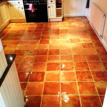
Terracotta may be one of the most aesthetically pleasing types of tiled floor, but as many of our customers will tell you can be particularly difficult to keep clean. This is due to the naturally high porosity of clay, which allows dirt to become very easily trapped. Quite commonly this situation is made worse by a lack of an adequate sealer to block the intrusion of muck. Of course, poor quality cleaning products also make it difficult for property owners to keep their Terracotta tiles clean, and a combination of the two problems can leave these floors looking a lot like this one, located in the kitchen of a house in the beautiful Forest of Dean.
The property owner was keen to have me restore some character to her dull Terracotta tiles. It was proving increasingly difficult for her to keep them clean due to the reasons described before, and the grout had also become very dirty. So, the customer turned to me for some professional assistance.
While these Terracotta tiles had been sealed previously it had, over time, lost its ability to protect the stone against ingrained dirt. To remove the old excess sealer my product of choice was the heavy duty soil remover and stripper, Tile Doctor Remove & Go, which I applied liberally across the surface and scrubbed in to the tile used a rotary machine fitted with a scrubbing pad. This also helped to remove the trapped dirt and left the stone looking fresher.
Once the old sealer was removed – to be replaced with a fresh sealer once cleaning was complete – I was free to focus on the troublesome grout lines with Tile Doctor Pro Clean, an alkaline cleaner that reliably breaks down dirt. When cleaning the grout, I opted to use a handheld grout brush that allowed for more precise, careful application of the product.
As per usual, the floor was given a good rinse and left to dry for 24 hours.
Upon returning to the property I checked the floor was completely dry, ready for sealing. My process for sealing actually involved the application of two different kinds of sealer; initially I applied a single coat of Tile Doctor Colour Grow which has soaks into the pores of the tile and has the added bonus of enhancing its natural colours.
Once this had dried I then applied ix coats of Tile Doctor Seal and Go, a product which forms a durable layer of protection of the surface of the tiles and at the same time provides a lovely sheen finish.
The combination of the two sealers will certainly offer a long-term solution to the ingrained dirt problem, and the appearance-enhancing properties in the products really helped to transform the tiles from dull and dirty to lively and eye-catching. Nonetheless, before departing the property, I also left my very pleased customer with some cleaning advice for the future.
Paul Wales
Monmouthshire Tile Doctor
 Revitalize Design by Val Valdez
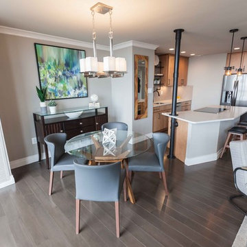
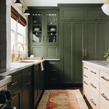
The outer kitchen walls and bulkheads were removed to create an open feel. The main challenge in opening up the space was the building restricting the removal of the existing telephone wires that were located in one of the walls. To maintain compliance with the building rules, I designed an "iron pipe" to house the phone wires which also serves as a conduit for the required wiring to the island. This pipe has an industrial influence which ties in perfectly with the custom-made shelving over the kitchen sink.
The property is a 700 square foot condo. The homeowner's goal was to have his 40+ year old unit transformed into a brand new space. To accomplish this, we gutted the entire unit; we replaced the popcorn ceiling with new drywall, replaced the old flooring with maple engineered wood flooring, removed the mirrored walls and painted the drywall a soothing neutral gray, and removed the kitchen walls and bulkheads to create an open concept. The bathroom and kitchen were totally renovated as well.
Additions include: Handsome crown moulding and custom baseboards, Sherwin Williams wall, ceiling and trim paint (the ceiling is NOT white), LED recessed light fixtures, custom island pendants, Quartz countertops, custom dining chandelier, custom shelving over the kitchen sink and custom "iron pipe" designed to house existing telephone wires (building restricted the removal of existing phone line).
Photography by Michael Anthony Harrison, www.MikeAntPhotography.com
Find the right local pro for your project
 TVL Creative Ltd.
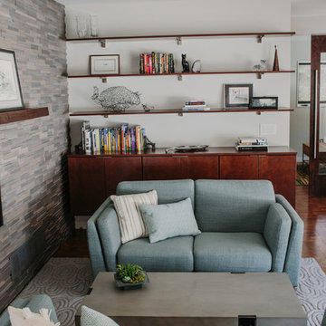
We took our Boulder clients through an amazing transformation! Almost every room in their home has been remodeled to better reflect their tastes and create spaces that functions better for their family. We utilized natural materials every step of the way and designed a balance of mid-century inspired touches and cool contemporary finishes. In the living room we removed the existing half-wall to open up the entry and dining room and create an easier transition between spaces. To make the fireplace the focal point of the living room we designed a beautiful wall of honed sandstone and sourced a reclaimed wood mantel. Increasing storage was a necessity for this home, so we added a much needed closet to the dining room, and designed semi custom floating cabinetry for the living room & dining room. We added a custom barn door to their family room to give them the option of closing the television off from the rest of their home. The clients really wanted to brighten up their dark kitchen, so we removed the black cabinets and red backsplash to make room for beautiful natural wood cabinets and a custom clay tile backsplash. Contemporary touches like a zero radius stainless steel sink, concrete light fixtures, and a double waterfall counter-top continue to echo the clean lines utilized through out the rest of the home. For the two first floor bathrooms we removed barrels full of mosaic tile and installed large scale white and grey tiles, making the rooms feel larger and reign in the visual texture. We continued to use the cool tones and clean lines in the bathrooms to tie them in with the rest of the home and give us a unified feel between spaces.
 ED Enterprises, Inc.
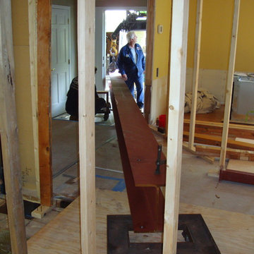
Designing and engineering this kitchen was a team effort between the owners and E D Enterprises, Inc. A twenty-four foot bearing wall was removed and replaced with a twenty-four foot steel beam to create a more open space. The existing soffits and electrical were removed, as well. The owners were then able to plan the kitchen of their dreams.
First, we shored up the second floor and roof, and rerouted the electrical and gas line.
Walls were then framed for the new kitchen footprint. The bearing wall was then removed. The new steel was delivered to the home. The steel was raised into position and the steel column was installed and bolted to the foundation.
We then framed and dry walled around the steel beam.
General Contractor / Remodel: E D Enterprises, Inc.
 Drury Design
THE SETUP
Multiple ovens, multiple workspaces, multiple sinks – when you think about it, non-jewish kitchens have been adapting the criteria of kosher kitchens for years.
Gladys’ clients in West Rogers Park are Orthodox Jewish. The house they bought already had a kosher kitchen – it just wasn’t done that well. It needed some more things to be duplicated for the dairy side and the meat side. Plus, it was dark and the configuration wasn’t very conducive for a family of eight.
It was time for a remodel.
Design Objectives
Improve kosher kitchen
Add more storage in the island
Better lighting
More open, lighter feel
Change the wood floor in the kitchen to tile
THE REMODEL
Design Challenges
- We had originally planned on removing a wing wall by the breakfast area. During demolition, we learned it contained a support beam.
- The kitchen is a substantial size, but having two sinks, dishwashers, and ovens presented a challenge – how do we fit it all in and make it flow with the storage still accessible near the work areas?
Where do you stop the materials for the new space? - -- The right tile, paint, lighting, etc. would be needed to make the remodeled area cohesive with the rest of the main floor.
- An existing column limited cabinet options and thus, storage capacity. Could we conceal it without disrupting the cabinetry flow?
Design Solutions
- We had to keep the wing wall, but decided to continue the tile on the sides of the cabinets and maintain the height of the tile to line up with the rest of the backsplash. This actually presented a very nice and cohesive look, especially since the opposite side has a wing wall to the left of the refrigerator.
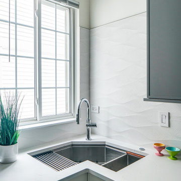
- We used “L-shaped” corner sinks instead of the rectangular ones set on an angle. This gave us more of the legs of the triangles versus the hypotenuse, which allowed for the two dishwashers, and the pullout utensil canisters and spice pullouts while still keeping the 3-drawer cabinets on either side of the range (by the sinks). The old island had the recess for stools which the family never used. By extending the width of the island 6” and utilizing this leg space, we were able to fit 18”-deep cabinets on this side – adding lots of accessible storage. The family can now work simultaneously on the dairy side (the side with the fridge) and the meat side (opposite) without getting in each other’s way. We separated the cooking by using the range oven for the meat and a built-in microwave in the base cabinet. The wall oven with built-in microwave on top is for dairy.
- Corner sinks opened up the middle area for a wider range – we went from a 30” to a 36”. Removing all the wall cabinets (on the range wall) made a big difference. That opened up the entire space while adding some visual impact. (Not pictured: We also made the cabinets directly opposite the range wall tall and removed the countertop, resulting in more room for rollouts and even more storage!) The kitchen now has more storage than it did before.
- We ended up painting the ceiling of the kitchen into the hallway that leads to the foyer. The living and dining rooms were separated by a soffit, so that became a natural boundary. We kept the tile in the kitchen by stopping it short of the hallway and lining it up with the pantry wall. This creates a border between the breakfast area and family room. The rest of the existing wood floors were refinished to refresh and make the hue darker. We also painted a dark accent wall and carried it into the breakfast area to make the rooms look deeper.
- The in-the-way column housed plumbing and couldn’t be moved. We still built cabinets in that spot – we just had to build a chase inside it to conceal the pipes. There was still plenty of room for new storage. We also took the cabinets all the way to the ceiling. The continuous tall cabinets added a functional elegance to the space.
THE RENEWED SPACE
The client’s long-awaited dream of a better kosher kitchen has finally been achieved, beautifully combining enhanced storage solutions with adherence to the family’s orthodox dietary laws. The kitchen’s standout feature, an expanded island, now offers a spacious and efficient workspace. This allows several family members to cook together comfortably, without the inconvenience of bumping into each other, ensuring a harmonious and productive cooking environment.
 Cindy Olstead Interiors
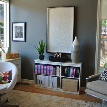
This project was a full-house remodel. The home was originally built in 1960's as an Eichler-style home with older wood paneling throughout the home.
We removed the wood paneling, replaced the flooring with new wood flooring, removed a few walls to create an open-kitchen concept, and fully remodeled two bathrooms. We selected all the materials with the clients as well as performed a few architectural upgrades.

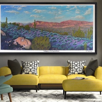
 Xandriss Art
Waltzing in the Superstitions - large continuous line painting
This painting is made up from a single continuous line that never crossses, throughout the entire work.
4 feet x 8 feet wide
This artwork is available for purchase. If you are in the Phoenix metro area, I can deliver and install it for you as well.
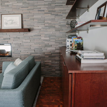 TVL Creative Ltd.
We took our Boulder clients through an amazing transformation! Almost every room in their home has been remodeled to better reflect their tastes and create spaces that functions better for their family. We utilized natural materials every step of the way and designed a balance of mid-century inspired touches and cool contemporary finishes. In the living room we removed the existing half-wall to open up the entry and dining room and create an easier transition between spaces. To make the fireplace the focal point of the living room we designed a beautiful wall of honed sandstone and sourced a reclaimed wood mantel. Increasing storage was a necessity for this home, so we added a much needed closet to the dining room, and designed semi custom floating cabinetry for the living room & dining room. We added a custom barn door to their family room to give them the option of closing the television off from the rest of their home. The clients really wanted to brighten up their dark kitchen, so we removed the black cabinets and red backsplash to make room for beautiful natural wood cabinets and a custom clay tile backsplash. Contemporary touches like a zero radius stainless steel sink, concrete light fixtures, and a double waterfall counter-top continue to echo the clean lines utilized through out the rest of the home. For the two first floor bathrooms we removed barrels full of mosaic tile and installed large scale white and grey tiles, making the rooms feel larger and reign in the visual texture. We continued to use the cool tones and clean lines in the bathrooms to tie them in with the rest of the home and give us a unified feel between spaces.
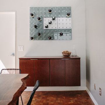 TVL Creative Ltd.
We took our Boulder clients through an amazing transformation! Almost every room in their home has been remodeled to better reflect their tastes and create spaces that functions better for their family. We utilized natural materials every step of the way and designed a balance of mid-century inspired touches and cool contemporary finishes. In the living room we removed the existing half-wall to open up the entry and dining room and create an easier transition between spaces. To make the fireplace the focal point of the living room we designed a beautiful wall of honed sandstone and sourced a reclaimed wood mantel. Increasing storage was a necessity for this home, so we added a much needed closet to the dining room, and designed semi custom floating cabinetry for the living room & dining room. We added a custom barn door to their family room to give them the option of closing the television off from the rest of their home. The clients really wanted to brighten up their dark kitchen, so we removed the black cabinets and red backsplash to make room for beautiful natural wood cabinets and a custom clay tile backsplash. Contemporary touches like a zero radius stainless steel sink, concrete light fixtures, and a double waterfall counter-top continue to echo the clean lines utilized through out the rest of the home. For the two first floor bathrooms we removed barrels full of mosaic tile and installed large scale white and grey tiles, making the rooms feel larger and reign in the visual texture. We continued to use the cool tones and clean lines in the bathrooms to tie them in with the rest of the home and give us a unified feel between spaces.
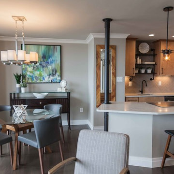 Revitalize Design by Val Valdez
The property is a 700 square foot condo. The homeowner's goal was to have his 40+ year old unit transformed into a brand new space. To accomplish this, we gutted the entire unit; we replaced the popcorn ceiling with new drywall, replaced the old flooring with maple engineered wood flooring, removed the mirrored walls and painted the drywall a soothing neutral gray, and removed the kitchen walls and bulkheads to create an open concept. The bathroom and kitchen were totally renovated as well.
The outer kitchen walls and bulkheads were removed to create an open feel. The main challenge in opening up the space was the building restricting the removal of the existing telephone wires that were located in one of the walls. To maintain compliance with the building rules, I designed an "iron pipe" to house the phone wires which also serves as a conduit for the required wiring to the island. This pipe has an industrial influence which ties in perfectly with the custom-made shelving over the kitchen sink.
Additions include: Handsome crown moulding and custom baseboards, Sherwin Williams wall, ceiling and trim paint (the ceiling is NOT white), LED recessed light fixtures, custom island pendants, Quartz countertops, custom dining chandelier, custom shelving over the kitchen sink and custom "iron pipe" designed to house existing telephone wires (the building restricted the removal of existing phone line).
Photography by Michael Anthony Harrison, www.MikeAntPhotography.com
 Alair Homes Plano
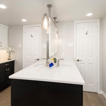
The client's master suite was dark with outdated wallpaper. They wanted the vanity with the floating mirrors to remain the focal point of the bathroom, so for the most part, the layout stayed the same. We went in, removed all finishes and started over; keeping with the style of the house. Grand Mirrors with integrated lighting were installed over the center vanities. The only change in the layout was that the bath tub was removed and replaced shower. The shower was lined with solid white marble tiles and accented with a cool Valentino parquet marble. The old shower became a linen storage closet and cabinets for additional storage. The lower cabinets are a deep espresso finish with contrasting linen finished cabinets up top. The door to the water closet was replaced with a pocket door, creating more space.
The guest bathroom felt claustrophobic with the wall between the vanity and toilet/shower area. We removed the wall and used a pony wall at the end of the vanity instead to hide the toilet. Being a guest bath there was no need double sinks, so one was removed, increasing the cabinet space. The crown molding stayed but the popcorn ceiling texture was removed in both bathrooms. The clients love their new sleek, brighter bathrooms.
Design/Remodel by Hatfield Builders & Remodelers | Photography by Versatile Imaging
 Alair Homes Plano
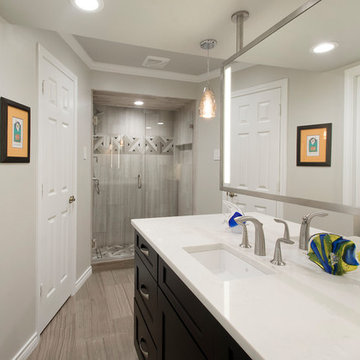
The client's master suite was dark with outdated wallpaper. They wanted the vanity with the floating mirrors to remain the focal point of the bathroom, so for the most part, the layout stayed the same. We went in, removed all finishes and started over; keeping with the style of the house. Grand Mirrors with integrated lighting were installed over the center vanities. The only change in the layout was that the bath tub was removed and replaced shower. The shower was lined with solid white marble tiles and accented with a cool Valentino parquet marble. The old shower became a linen storage closet and cabinets for additional storage. The lower cabinets are a deep espresso finish with contrasting linen finished cabinets up top. The door to the water closet was replaced with a pocket door, creating more space.
The guest bathroom felt claustrophobic with the wall between the vanity and toilet/shower area. We removed the wall and used a pony wall at the end of the vanity instead to hide the toilet. Being a guest bath there was no need double sinks, so one was removed, increasing the cabinet space. The crown molding stayed but the popcorn ceiling texture was removed in both bathrooms. The clients love their new sleek, brighter bathrooms.
Design/Remodel by Hatfield Builders & Remodelers | Photography by Versatile Imaging

 TVL Creative Ltd.
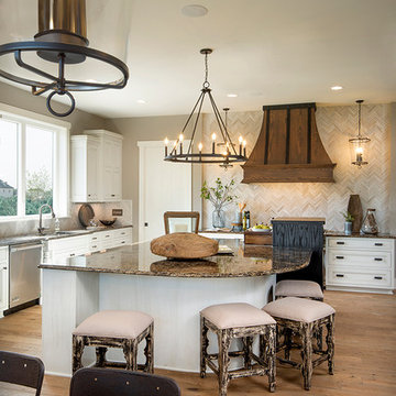
We took our Boulder clients through an amazing transformation! Almost every room in their home has been remodeled to better reflect their tastes and create spaces that functions better for their family. We utilized natural materials every step of the way and designed a balance of mid-century inspired touches and cool contemporary finishes. In the living room we removed the existing half-wall to open up the entry and dining room and create an easier transition between spaces. To make the fireplace the focal point of the living room we designed a beautiful wall of honed sandstone and sourced a reclaimed wood mantel. Increasing storage was a necessity for this home, so we added a much needed closet to the dining room, and designed semi custom floating cabinetry for the living room & dining room. We added a custom barn door to their family room to give them the option of closing the television off from the rest of their home. The clients really wanted to brighten up their dark kitchen, so we removed the black cabinets and red backsplash to make room for beautiful natural wood cabinets and a custom clay tile backsplash. Contemporary touches like a zero radius stainless steel sink, concrete light fixtures, and a double waterfall counter-top continue to echo the clean lines utilized through out the rest of the home. For the two first floor bathrooms we removed barrels full of mosaic tile and installed large scale white and grey tiles, making the rooms feel larger and reign in the visual texture. We continued to use the cool tones and clean lines in the bathrooms to tie them in with the rest of the home and give us a unified feel between spaces.
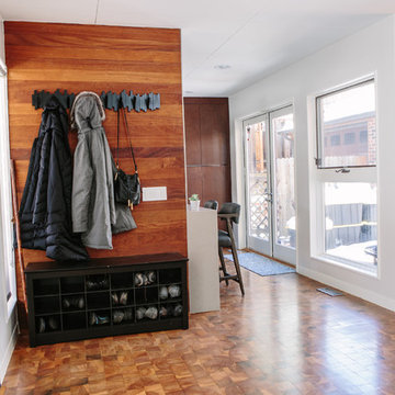 TVL Creative Ltd.
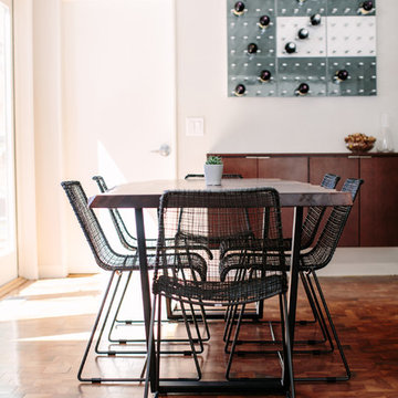
We took our Boulder clients through an amazing transformation! Almost every room in their home has been remodeled to better reflect their tastes and create spaces that functions better for their family. We utilized natural materials every step of the way and designed a balance of mid-century inspired touches and cool contemporary finishes. In the living room we removed the existing half-wall to open up the entry and dining room and create an easier transition between spaces. To make the fireplace the focal point of the living room we designed a beautiful wall of honed sandstone and sourced a reclaimed wood mantel. Increasing storage was a necessity for this home, so we added a much needed closet to the dining room, and designed semi custom floating cabinetry for the living room & dining room. We added a custom barn door to their family room to give them the option of closing the television off from the rest of their home. The clients really wanted to brighten up their dark kitchen, so we removed the black cabinets and red backsplash to make room for beautiful natural wood cabinets and a custom clay tile backsplash. Contemporary touches like a zero radius stainless steel sink, concrete light fixtures, and a double waterfall counter-top continue to echo the clean lines utilized through out the rest of the home. For the two first floor bathrooms we removed barrels full of mosaic tile and installed large scale white and grey tiles, making the rooms feel larger and reign in the visual texture. We continued to use the cool tones and clean lines in the bathrooms to tie them in with the rest of the home and give us a unified feel between spaces.
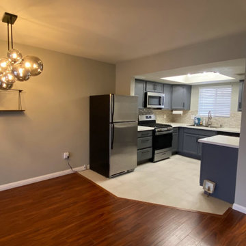
 House of a Different Color
Design consultation and advising for DIY/Budget Renovation.
Owner purchased this condo with a very cramped and dated kitchen and light fixtures, and early 2000s-era café paint colors.
Owner did a lot of the work himself or with friends to keep the budget down.
HDC advised on design details and paint colors, chose light fixtures (ceiling lights for kitchen and dining and arch floor lamp in living room). HDC also assisted with creating a new kitchen floor plan, which involved removing one wall, replacing existing tile and modifying flooring transition location, replacing all cabinetry except for the tall pantry cabinet, choosing cabinet paint, installing modern cabinet hardware, replacing laminate counters with a budget white quartz prefab counter, replacing appliances, sink, and faucet, and installing a low-cost peel & stick backsplash.
Due to budget constraints, we could not remove the entire wall between the kitchen and dining space to make the wall completely flush from the kitchen to dining area transition, but decided to relocate the refrigerator to that wall nonetheless, in order to improve sightlines and improve traffic flow and function for refrigerator access. We created a coffee/drinks bar where the original fridge was located. The owner decided to keep the existing water line that had serviced the ice maker in the fridge where it was previously located (and cap it temporarily). He plans to plumb it in the future to support a filtered drinking water line and auto-filling coffee maker to finish out the drink center.
Ultimately, we couldn't stretch the budget for a perfect layout, but we were still able to improve the function and open up the flow of this hub of the condo for better entertaining and more convenient homeowner use of the space.
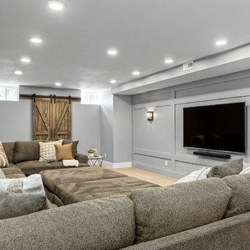
 TVL Creative Ltd.
We took our Boulder clients through an amazing transformation! Almost every room in their home has been remodeled to better reflect their tastes and create spaces that functions better for their family. We utilized natural materials every step of the way and designed a balance of mid-century inspired touches and cool contemporary finishes. In the living room we removed the existing half-wall to open up the entry and dining room and create an easier transition between spaces. To make the fireplace the focal point of the living room we designed a beautiful wall of honed sandstone and sourced a reclaimed wood mantel. Increasing storage was a necessity for this home, so we added a much needed closet to the dining room, and designed semi custom floating cabinetry for the living room & dining room. We added a custom barn door to their family room to give them the option of closing the television off from the rest of their home. The clients really wanted to brighten up their dark kitchen, so we removed the black cabinets and red backsplash to make room for beautiful natural wood cabinets and a custom clay tile backsplash. Contemporary touches like a zero radius stainless steel sink, concrete light fixtures, and a double waterfall counter-top continue to echo the clean lines utilized through out the rest of the home. For the two first floor bathrooms we removed barrels full of mosaic tile and installed large scale white and grey tiles, making the rooms feel larger and reign in the visual texture. We continued to use the cool tones and clean lines in the bathrooms to tie them in with the rest of the home and give us a unified feel between spaces.
Sponsored
Sunbury, OH

J.Holderby - Renovations
Franklin County's Leading General Contractors - 2X Best of Houzz!
 Drury Design
THE SETUP
Multiple ovens, multiple workspaces, multiple sinks – when you think about it, non-jewish kitchens have been adapting the criteria of kosher kitchens for years.
Gladys’ clients in West Rogers Park are Orthodox Jewish. The house they bought already had a kosher kitchen – it just wasn’t done that well. It needed some more things to be duplicated for the dairy side and the meat side. Plus, it was dark and the configuration wasn’t very conducive for a family of eight.
It was time for a remodel.
Design Objectives
Improve kosher kitchen
Add more storage in the island
Better lighting
More open, lighter feel
Change the wood floor in the kitchen to tile
THE REMODEL
Design Challenges
- We had originally planned on removing a wing wall by the breakfast area. During demolition, we learned it contained a support beam.
- The kitchen is a substantial size, but having two sinks, dishwashers, and ovens presented a challenge – how do we fit it all in and make it flow with the storage still accessible near the work areas?
Where do you stop the materials for the new space? - -- The right tile, paint, lighting, etc. would be needed to make the remodeled area cohesive with the rest of the main floor.
- An existing column limited cabinet options and thus, storage capacity. Could we conceal it without disrupting the cabinetry flow?
Design Solutions
- We had to keep the wing wall, but decided to continue the tile on the sides of the cabinets and maintain the height of the tile to line up with the rest of the backsplash. This actually presented a very nice and cohesive look, especially since the opposite side has a wing wall to the left of the refrigerator.
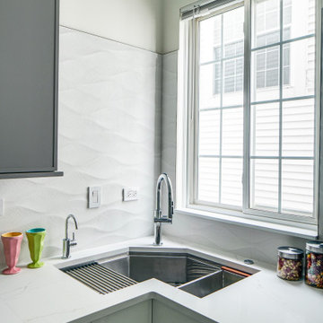
- We used “L-shaped” corner sinks instead of the rectangular ones set on an angle. This gave us more of the legs of the triangles versus the hypotenuse, which allowed for the two dishwashers, and the pullout utensil canisters and spice pullouts while still keeping the 3-drawer cabinets on either side of the range (by the sinks). The old island had the recess for stools which the family never used. By extending the width of the island 6” and utilizing this leg space, we were able to fit 18”-deep cabinets on this side – adding lots of accessible storage. The family can now work simultaneously on the dairy side (the side with the fridge) and the meat side (opposite) without getting in each other’s way. We separated the cooking by using the range oven for the meat and a built-in microwave in the base cabinet. The wall oven with built-in microwave on top is for dairy.
- Corner sinks opened up the middle area for a wider range – we went from a 30” to a 36”. Removing all the wall cabinets (on the range wall) made a big difference. That opened up the entire space while adding some visual impact. (Not pictured: We also made the cabinets directly opposite the range wall tall and removed the countertop, resulting in more room for rollouts and even more storage!) The kitchen now has more storage than it did before.
- We ended up painting the ceiling of the kitchen into the hallway that leads to the foyer. The living and dining rooms were separated by a soffit, so that became a natural boundary. We kept the tile in the kitchen by stopping it short of the hallway and lining it up with the pantry wall. This creates a border between the breakfast area and family room. The rest of the existing wood floors were refinished to refresh and make the hue darker. We also painted a dark accent wall and carried it into the breakfast area to make the rooms look deeper.
- The in-the-way column housed plumbing and couldn’t be moved. We still built cabinets in that spot – we just had to build a chase inside it to conceal the pipes. There was still plenty of room for new storage. We also took the cabinets all the way to the ceiling. The continuous tall cabinets added a functional elegance to the space.
THE RENEWED SPACE
The client’s long-awaited dream of a better kosher kitchen has finally been achieved, beautifully combining enhanced storage solutions with adherence to the family’s orthodox dietary laws. The kitchen’s standout feature, an expanded island, now offers a spacious and efficient workspace. This allows several family members to cook together comfortably, without the inconvenience of bumping into each other, ensuring a harmonious and productive cooking environment.
 TVL Creative Ltd.
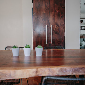
We took our Boulder clients through an amazing transformation! Almost every room in their home has been remodeled to better reflect their tastes and create spaces that functions better for their family. We utilized natural materials every step of the way and designed a balance of mid-century inspired touches and cool contemporary finishes. In the living room we removed the existing half-wall to open up the entry and dining room and create an easier transition between spaces. To make the fireplace the focal point of the living room we designed a beautiful wall of honed sandstone and sourced a reclaimed wood mantel. Increasing storage was a necessity for this home, so we added a much needed closet to the dining room, and designed semi custom floating cabinetry for the living room & dining room. We added a custom barn door to their family room to give them the option of closing the television off from the rest of their home. The clients really wanted to brighten up their dark kitchen, so we removed the black cabinets and red backsplash to make room for beautiful natural wood cabinets and a custom clay tile backsplash. Contemporary touches like a zero radius stainless steel sink, concrete light fixtures, and a double waterfall counter-top continue to echo the clean lines utilized through out the rest of the home. For the two first floor bathrooms we removed barrels full of mosaic tile and installed large scale white and grey tiles, making the rooms feel larger and reign in the visual texture. We continued to use the cool tones and clean lines in the bathrooms to tie them in with the rest of the home and give us a unified feel between spaces.
 House of a Different Color
Design consultation and advising for DIY/Budget Renovation.
Owner purchased this condo with a very cramped and dated kitchen and light fixtures, and early 2000s-era café paint colors.
Owner did a lot of the work himself or with friends to keep the budget down.
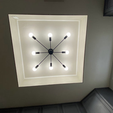
HDC advised on design details and paint colors, chose light fixtures (ceiling lights for kitchen and dining and arch floor lamp in living room). HDC also assisted with creating a new kitchen floor plan, which involved removing one wall, replacing existing tile and modifying flooring transition location, replacing all cabinetry except for the tall pantry cabinet, choosing cabinet paint, installing modern cabinet hardware, replacing laminate counters with a budget white quartz prefab counter, replacing appliances, sink, and faucet, and installing a low-cost peel & stick backsplash.
Due to budget constraints, we could not remove the entire wall between the kitchen and dining space to make the wall completely flush from the kitchen to dining area transition, but decided to relocate the refrigerator to that wall nonetheless, in order to improve sightlines and improve traffic flow and function for refrigerator access. We created a coffee/drinks bar where the original fridge was located. The owner decided to keep the existing water line that had serviced the ice maker in the fridge where it was previously located (and cap it temporarily). He plans to plumb it in the future to support a filtered drinking water line and auto-filling coffee maker to finish out the drink center.
Ultimately, we couldn't stretch the budget for a perfect layout, but we were still able to improve the function and open up the flow of this hub of the condo for better entertaining and more convenient homeowner use of the space.
46