
Search results for "Remove lines" in Home Design Ideas
 Greenberg Construction
Greenberg Construction
Location: Mountain View, CA, United States
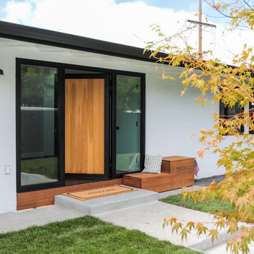
Our clients wanted to create a beautiful and open concept living space for entertaining while maximized the natural lighting throughout their midcentury modern Mackay home. Light silvery gray and bright white tones create a contemporary and sophisticated space; combined with elegant rich, dark woods throughout.
Removing the center wall and brick fireplace between the kitchen and dining areas allowed for a large seven by four foot island and abundance of light coming through the floor to ceiling windows and addition of skylights. The custom low sheen white and navy blue kitchen cabinets were designed by Segale Bros, with the goal of adding as much organization and access as possible with the island storage, drawers, and roll-outs.
Black finishings are used throughout with custom black aluminum windows and 3 panel sliding door by CBW Windows and Doors. The clients designed their custom vertical white oak front door with CBW Windows and Doors as well.
 Rachel Loewen Photography
Photo: Rachel Loewen © 2019 Houzz
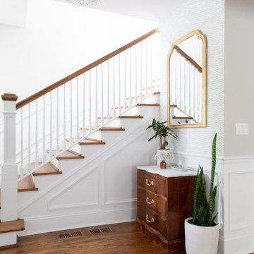
Example of a transitional staircase design in Chicago
Example of a transitional staircase design in Chicago
 Clearcut & Co
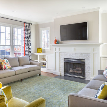
This project consisted of stripping everything to the studs and removing walls on half of the first floor and replacing with custom finishes creating an open concept with zoned living areas.
Find the right local pro for your project
 Athyrium Design
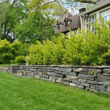
This exquisite home on Philadelphia's Main Line underwent a total landscape transformation. Overgrown plantings and invasive species were removed to make room for a transitional landscape that functions for this family's low-maintenance lifestyle. Here, boxwoods are interplanted with native species and formal lines are combined with a rain garden. This updated landscape now supports the client's lifestyle as well as the surrounding environment!

 Straight Line Design and Remodeling
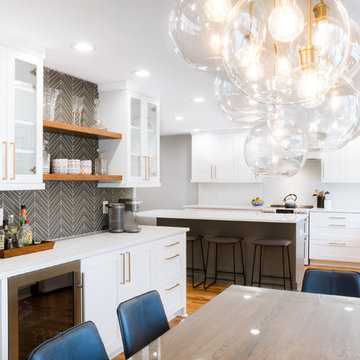
Our clients' existing kitchen was too small and claustrophobic for the busy household. We decided to swap the locations of the kitchen and dining room and removed the wall that divided them, allowing for much better flow from one room to the other.
We also added more lighting and brighter finishes to give the space a clean and modern appearance. The tile backsplash adds texture and geometric patterns to draw in the eye.
The quartz surfaces, hardwood floors, and painted cabinets were installed with durability and resilience in mind.
The final product was a much better fit for the needs of the household. It also provided a significant investment into the overall value of their home.
 Cornerstone Interiors
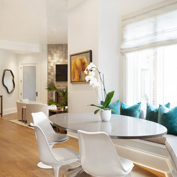
Example of a transitional medium tone wood floor and brown floor breakfast nook design in Indianapolis with white walls


 TimeLine Renovations Inc.
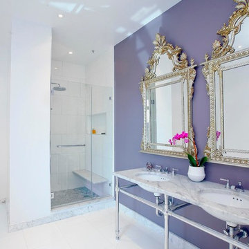
 Our client just purchased 2 apartments and the renovation consisted of creating their dream home by combining them into one. Now, with a dream home comes the "dream" master bathroom. A lot of time was spent deciding the new floor plan for the apartment, to make sure everything was accounted for. To achieve the new master bathroom and full custom walk in closet: 2 existing bathrooms, a laundry room and a kitchen needed to be removed. On paper it all looked good, but the issue is how do we make the plumbing work in the new layout. Relocating plumbing fixtures in a residential building is not the easiest due to the fact that you cannot chop the concrete slab to run new drain lines. We decided to use a wall hung toilet with an in wall carrier that way the drain lines were running inside the wall. All other existing fixtures needed to be capped off and all venting needed to be relocated to connect to the main vent stack.
Once we confirmed that all plumbing would work to our new layout, the design began. We were looking for elegance in simplicity... The overall bathroom color is white. White ceilings, white walls, white tiles and then just a "High Gloss Finish" plum color vanity accent wall. The double vanity is perfect for the mornings getting ready.
The shower has a multifunction shower body. The 15" rain head, a hand held and 2 body sprays. Each can be used individually or simultaneously for the ultimate shower experience. The shower seat is made from 1 1/4 white carrara marble with no visible leg supports to make a floating seat. The niche was carved into the wall for shampoo and soap.
We improved the lighting be using Low Voltage Recessed Lights throughout and added one in the shower as well. The lights are on 3 separate zones with dimmers. For the cold winter days, we added an electric heated floor to keep the feet warm.
Speakers were installed in the ceiling which are connected with the Audio/ Visual throughout the apartment.
 Terravista Interior Design Group
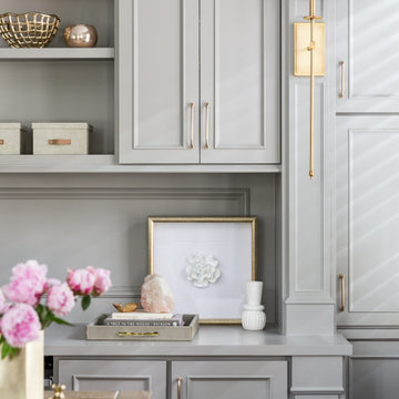
The client wanted to create a traditional rustic design with clean lines and a feminine edge. She works from her home office, so she needed it to be functional and organized with elegant and timeless lines. In the kitchen, we removed the peninsula that separated it for the breakfast room and kitchen, to create better flow and unity throughout the space.
 Milgard Windows & Doors
The Kiguchi family moved into their Austin, Texas home in 1994. Built in the 1980’s as part of a neighborhood development, they happily raised their family here but longed for something more contemporary. Once they became empty nesters, they decided it was time for a major remodel. After spending many years visiting Austin AIA Home Tours that highlight contemporary residential architecture, they had a lot of ideas and in 2013 were ready to interview architects and get their renovation underway.
The project turned into a major remodel due to an unstable foundation. Architects Ben Arbib and Ed Hughey, of Arbib Hughey Design were hired to solve the structural issue and look for inspiration in the bones of the house, which sat on top of a hillside and was surrounded by great views.
Unfortunately, with the old floor plan, the beautiful views were hidden by small windows that were poorly placed. In order to bring more natural light into the house the window sizes and configurations had to be addressed, all while keeping in mind the homeowners desire for a modern look and feel.
To achieve a more contemporary and sophisticated front of house, a new entry was designed that included removing a two-story bay window and porch. The entrance of the home also became more integrated with the landscape creating a template for new foliage to be planted. Older exterior materials were updated to incorporate a more muted palette of colors with a metal roof, dark grey siding in the back and white stucco in the front. Deep eaves were added over many of the new large windows for clean lines and sun protection.
“Inside it was about opening up the floor plan, expanding the views throughout the house, and updating the material palette to get a modern look that was also warm and inviting,” said Ben from Arbib Hughey Design. “Prior to the remodel, the house had the typical separation of rooms. We removed the walls between them and changed all of the windows to Milgard Thermally Improved Aluminum to connect the inside with the outside. No matter where you are you get nice views and natural light.”
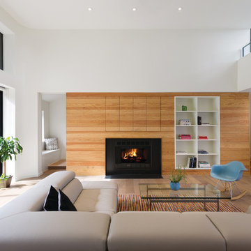
The architects wanted to create some drama, which they accomplished with the window placement and opening up the interior floor plan to an open concept approach. Cabinetry was used to help delineate intimate spaces. To add warmth to an all-white living room, white-washed oak wood floors were installed and pine planks were used around the fireplace. The large windows served as artwork bringing the color of nature into the space.
An octagon shaped, elevated dining room, (named “the turret”), had a big impact on the design of the house. They architects rounded the corners and added larger window openings overlooking a new sunken garden. The great room was also softened by rounding out the corners and that circular theme continued throughout the house, being picked up in skylight wells and kitchen cabinetry. A staircase leading to a catwalk was added and the result was a two-story window wall that flooded the home with natural light.
When asked why Milgard® Thermally Improved Aluminum windows were selected, the architectural team listed many reasons:
1) Aesthetics: “We liked the slim profiles and narrow sightlines. The window frames never get in the way of the view and that was important to us. They also have a very contemporary look that went well with our design.”
2) Options: “We liked that we could get large sliding doors that matched the windows, giving us a very cohesive look and feel throughout the project.”
3) Cost Effective: “Milgard windows are affordable. You get a good product at a good price.”
4) Custom Sizes: “Milgard windows are customizable, which allowed us to get the right window for each location.”
Ready to take on your own traditional to modern home remodeling project? Arbib Hughey Design advises, “Work with a good architect. That means picking a team that is creative, communicative, listens well and is responsive. We think it’s important for an architect to listen to their clients and give them something they want, not something the architect thinks they should have. At the same time you want an architect who is willing and able to think outside the box and offer up design options that you may not have considered. Design is about a lot of back and forth, trying out ideas, getting feedback and trying again.”
The home was completely transformed into a unique, contemporary house perfectly integrated with its site. Internally the home has a natural flow for the occupants and externally it is integrated with the surroundings taking advantage of great natural light. As a side note, it was highly praised as part of the Austin AIA homes tour.
 Mariano & Co., LLC
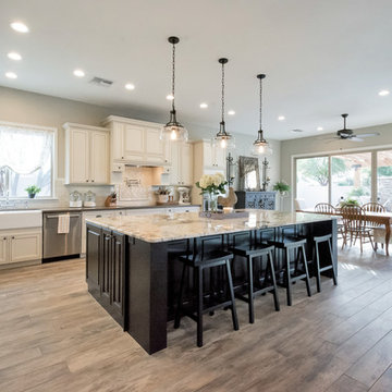
We removed a wall that separated the Kitchen and living room to open up the space. Created a Large Island that is topped with Granite with a Smokehouse stain cabinet, the surround is Grey Quartz with Cream Cabinets.
 Terravista Interior Design Group
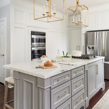
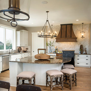
The client wanted to create a traditional rustic design with clean lines and a feminine edge. She works from her home office, so she needed it to be functional and organized with elegant and timeless lines. In the kitchen, we removed the peninsula that separated it for the breakfast room and kitchen, to create better flow and unity throughout the space.
 MHM LIVING
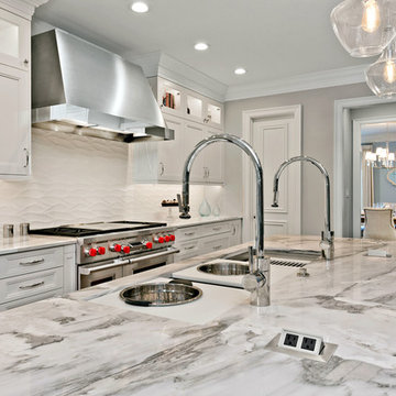
Our client came as a referral. They had seen a kitchen project we had completed where we opened up the kitchen to the living room. They were inspired to do the same in their kitchen. While they initially came to us looking to simply remove a wall to open up the space, in conversation it was clear we could help them really make the space function better for their family and entertaining. Ultimately they wanted to have an open bright space that was family friendly, great for entertaining and satisfied their love of cooking.
By far, the greatest challenge we faced with this project was removing the load bearing wall that started the conversation to begin with. This wall was supporting 2 stories and housed the majority of electricity and plumbing for the kitchen and bathrooms above.
Some of the key features are:
An island enlarged to the maximum size that the beautiful Calacatta Retro slab allowed. The island houses a Galley 5-foot prep station sink with two faucets, dishwasher, two beverage coolers, drawer microwave, trash disposal, and a charging station for all of the family’s digital devices, are all conveniently located in the island.
A vibrant tile from Porcelanosa is installed as the backsplash.
The butler pantry was transformed into a coffee and wine bar.
Installed Mocket pop-up outlets on the island that close flush to the island when not in use, but are easily accessible.
Sonos speakers discreetly concealed in the ceiling for music throughout the space.
The kitchen with dark colors and heavy gothic like style trim is gone, and a light, bright, kitchen with clean lines and an abundance of features has taken its place. The client is beyond delighted with the transformation of their kitchen and now combined living room space.

 Katie Hutchison Studio
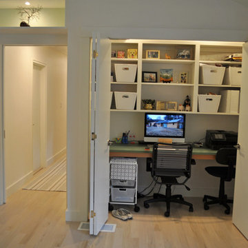
Constructed in two phases, this renovation, with a few small additions, touched nearly every room in this late ‘50’s ranch house. The owners raised their family within the original walls and love the house’s location, which is not far from town and also borders conservation land. But they didn’t love how chopped up the house was and the lack of exposure to natural daylight and views of the lush rear woods. Plus, they were ready to de-clutter for a more stream-lined look. As a result, KHS collaborated with them to create a quiet, clean design to support the lifestyle they aspire to in retirement.
To transform the original ranch house, KHS proposed several significant changes that would make way for a number of related improvements. Proposed changes included the removal of the attached enclosed breezeway (which had included a stair to the basement living space) and the two-car garage it partially wrapped, which had blocked vital eastern daylight from accessing the interior. Together the breezeway and garage had also contributed to a long, flush front façade. In its stead, KHS proposed a new two-car carport, attached storage shed, and exterior basement stair in a new location. The carport is bumped closer to the street to relieve the flush front facade and to allow access behind it to eastern daylight in a relocated rear kitchen. KHS also proposed a new, single, more prominent front entry, closer to the driveway to replace the former secondary entrance into the dark breezeway and a more formal main entrance that had been located much farther down the facade and curiously bordered the bedroom wing.
Inside, low ceilings and soffits in the primary family common areas were removed to create a cathedral ceiling (with rod ties) over a reconfigured semi-open living, dining, and kitchen space. A new gas fireplace serving the relocated dining area -- defined by a new built-in banquette in a new bay window -- was designed to back up on the existing wood-burning fireplace that continues to serve the living area. A shared full bath, serving two guest bedrooms on the main level, was reconfigured, and additional square footage was captured for a reconfigured master bathroom off the existing master bedroom. A new whole-house color palette, including new finishes and new cabinetry, complete the transformation. Today, the owners enjoy a fresh and airy re-imagining of their familiar ranch house.
Photos by Katie Hutchison
 Kowalske Kitchen & Bath
This exciting ‘whole house’ project began when a couple contacted us while house shopping. They found a 1980s contemporary colonial in Delafield with a great wooded lot on Nagawicka Lake. The kitchen and bathrooms were outdated but it had plenty of space and potential.
We toured the home, learned about their design style and dream for the new space. The goal of this project was to create a contemporary space that was interesting and unique. Above all, they wanted a home where they could entertain and make a future.
At first, the couple thought they wanted to remodel only the kitchen and master suite. But after seeing Kowalske Kitchen & Bath’s design for transforming the entire house, they wanted to remodel it all. The couple purchased the home and hired us as the design-build-remodel contractor.
First Floor Remodel
The biggest transformation of this home is the first floor. The original entry was dark and closed off. By removing the dining room walls, we opened up the space for a grand entry into the kitchen and dining room. The open-concept kitchen features a large navy island, blue subway tile backsplash, bamboo wood shelves and fun lighting.
On the first floor, we also turned a bathroom/sauna into a full bathroom and powder room. We were excited to give them a ‘wow’ powder room with a yellow penny tile wall, floating bamboo vanity and chic geometric cement tile floor.
Second Floor Remodel
The second floor remodel included a fireplace landing area, master suite, and turning an open loft area into a bedroom and bathroom.
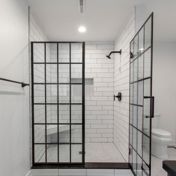
In the master suite, we removed a large whirlpool tub and reconfigured the bathroom/closet space. For a clean and classic look, the couple chose a black and white color pallet. We used subway tile on the walls in the large walk-in shower, a glass door with matte black finish, hexagon tile on the floor, a black vanity and quartz counters.
Flooring, trim and doors were updated throughout the home for a cohesive look.
 User
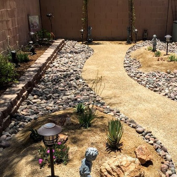
UserSmall yard concersion from grass to a more meditative theme for client. We incorporated succulents, aloe, elephant food, desert lavender . we also removed the dirst from the back wall planter in order to tarback wall to protect the wall from water staining. Deana M. Chiavola
 Mariano & Co., LLC
DEMO - We removed the tub shower combo, flooring, vanities, commode room walls, and removed the mirrored doors to the master closet.
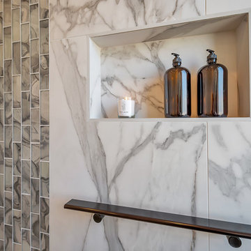
THE REMODEL - We created a large zero threshold walk-in shower that is complete with 24x48 Charme series Calcatta Gold LARGE format tiles and a a 12” deco column down the middle with a 2x6 Abaco Mosaic. For the vanity, we added a beautiful floating cabinet topped with Monte Cristo Granite in a Satin finish. The under cabinet lighting and light up Mirror were supplied by our client. The wood look tile flooring was also installed throughout the bathroom, bedroom, and a few other rooms throughout the home. Finally, After removing those walls for the commode room, we were able to open up more room for the overall bathroom and then we reframed the Master Closet opening to add double doors & framed a new entry door.
Sponsored
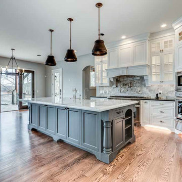
Fredericksburg, OH

High Point Cabinets
Columbus' Experienced Custom Cabinet Builder | 4x Best of Houzz Winner
 Forward Design Build Remodel
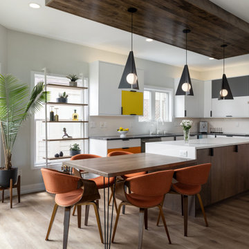
Our clients were ready to take their 20+ year old home and give the design a refresh, and make their space a lot more functional for their needs. The areas in their first floor they wanted to improve were the kitchen, mudroom and pantry, dining room, living room, stairway and powder room. They wanted their space to match their fun mid-century modern style.
Our design team and our clients dreamed up a plan that not only solves all of the functional issues they were dealing with, it’s also a stunning and unique space. We removed the wall in between the kitchen and dining room. We created a center island that extends and lowers to include an eat-in area. The cabinetry plan in the kitchen changed to suit their needs. We re-did the flooring throughout the first floor and installed a new fireplace. The existing laundry room got moved to the basement, making way for a mudroom and pantry space. We installed a new railing on the staircase and an art niche in the living room. The powder room got a refresh with statement wallpaper and vanity.
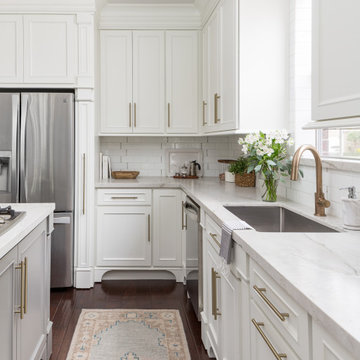 Terravista Interior Design Group
The client wanted to create a traditional rustic design with clean lines and a feminine edge. She works from her home office, so she needed it to be functional and organized with elegant and timeless lines. In the kitchen, we removed the peninsula that separated it for the breakfast room and kitchen, to create better flow and unity throughout the space.
 Revival House
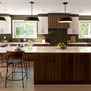
This kitchen remodel of a 70’s home reflects the character of the existing home and some design features of that era while giving it a fresh, modern look. The client wanted the remodeled space to blend in with the rest of the home, retaining some of the 1970’s character while including all the best features of today’s kitchens.
Removing the wall separating the informal eating area from the family room provided a nice open space allowing for a larger kitchen footprint and plenty of light throughout.
A combination of Decor's Dove Wing painted and Natural stained Walnut cabinetry was chosen. The dark walnut, slab lower cabinets unite the kitchen with the darker wood theme found throughout the home, while the white, slim-shaker upper cabinets give the space a light and airy feeling. The beautiful vertical grain of the walnut is the foundation of a theme that is echoed throughout the space: tall & thin vertical lines without bulk or needless ornamentation. The unique design detail gives the kitchen a great balance of depth and character while still brightening the space. Walnut crown molding throughout defines the space and ties everything together.
The vertical-set green Japanese tile from Virginia Tile, also characteristic of the 1970’s, serves as the backsplash and fills the range wall. The tall & slim theme is underscored by several design elements from the vertical tile and tall cabinet pulls in matte black from Top Knobs, to the thin quartz countertops, skinny shaker cabinet door style, and tall, slim refrigerator doors, all meant to eliminate excess bulk and lighten up the space.
An impressive focal point in this kitchen is the custom walnut reeded hood, designed to reflect a popular 1970’s feature. Narrow walnut shelves below the white upper cabinets near the refrigerator provide a nice surprise to the eye. An extra long island, decked in polished 2cm Corian Quartz countertop in Novello, provides ample seating, storage, and task space, making it an ideal surface for serving, eating, meal prep, gathering, and entertaining. The client desired a long island with comfortable counter seating at one end for a family of five, including space for a baby’s high chair.
High-end Bosch appliances and functional storage were also priorities. The dry bar on the opposite wall features additional storage and an Elica beverage refrigerator, framed by tall walnut larder cabinets on each end. The white larder cabinet doors pocket into the sides, revealing beautiful finished walnut interiors.
Wall cabinets feature Decor’s integrated under-cabinet lighting, while puck lights illuminate the beverage center counter. This kitchen is bursting with integrated storage. Many deep drawers feature interior double drawers making smaller items more accessible. Decor’s spice drawer to the right of the range keeps spices organized, while divided tray storage on the left of the range keeps these taller items handy.
While the design is inspired by the 1970’s, it exemplifies the best of the 2020’s, and the new space is open, bright, and functional for this family with young children.
54