
Search results for "Replacing items" in Home Design Ideas

 Jami Abbadessa
This young family was ready for a new, fresh and updated look to their house. They wanted a totally different color scheme and vibe and needed it finished within 6 weeks to be ready for a party of 100+ people they were hosting. I was happy to help! Even though many items that were selected were on back order and needed to be replaced, they kept their spirits high after countless returns and exchanges. Although art was being framed a day before the party and decor was being installed at the last minute, we pulled it together and accomplished our goal of finishing on time!
The easiest (and most cost effective!) way to change the feeling of a space is with color, so that’s what I did. I swapped out the tired burgundy/browns for a clean palette of blues and greys. In the family room, a new custom sectional in a neutral grey took place of the brown leatherette sofa. A blue accent chair was placed in the room to brighten that corner. Patterned drapes were hung for privacy and added texture. Colorful artwork and a Moroccan print area rug livened up the space. Many of the accessories and decor throughout the home were sourced at Home Goods, Target and Ikea.
The only piece of furniture that was kept in the entire home was the dining table, chairs and bar stools. The head chairs were swapped out for swanky upholstered navy ones with a nail head trim. A custom cornice to match the chairs was installed in the kitchen to hide the existing roller shades. The bar stools were reupholstered in the same fabric and some throw pillows for the sofa were made in the navy velvet as well. A Z Gallerie chandelier and blue pendants were installed for a little added drama. The fireplace got a makeover with a fresh coat of white paint and tile mosaic.
Their daughter wanted a beach theme bedroom, so that’s what she got! New blue walls, drapes and accessories brought the ocean to this room. Their son has taken a liking to super heroes and Legos. A red, blue and yellow color palette with bold stripes helped to create a fun, playful space for him to enjoy his Legos and super heroes. The master bedroom got a new look with updated furnishings and colorful, yet soothing, bedding. New drapes, an area rug and accessories help pull together this peaceful sanctuary. The bathroom got a makeover with a new vanity, tile mosaic back splash, new lighting and tile on the floor and shower.

 Renovisions
These South Shore of Boston homeowners are no different than many recent clients who show an interest in upgrading their dated and aged bathrooms. They are looking to modernize, reflecting today’s bath trends but also desire increased re-sale value with new fixtures, tile and ventilation system. Given the time we spend in our baths, it is not surprising. (A recent Houzz, survey found that 60% of people occupy their bathrooms for at least one hour per day plus 58% of people surveyed said they use their smart phone or tablet to handle a multitude of activities.)
This stunning full bath Renovision involved replacing the existing builder-grade vanity, sink and faucet with striking dark blue cabinetry featuring a bank of three deep drawers on each side of a two-door sink base. This client likes the new standard vanity height, no 34.5” which allows more storage space for cosmetic and cleaning supply items.
Silestone’s Blanco Zeus countertop clearly modernizes the look and feel of this bath and doesn’t take away from the grey wood-look planked porcelain tiled floor which is on trend. The tub/shower walls with niche for shampoos and 3”x6” white subway tiles reflect a classic, clean and fresh look. The curved shower rod provides additional room while showering and its chrome finish ties in with the new shiny fixtures.
Adding a few architectural elements definitely enhanced this bath. Renovisions re-worked the existing closet space with a custom built piece which included open shelving to store bath towels and door(s) on the bottom to accommodate laundry hamper.
This furniture-look closet along with the window, trims and plantation shutters were color matched in the same white painted finish; stylish and sensible indeed!

 Chapman Design Group, Inc.
Mark Hoyle
Originally, this 3700 SF two level eclectic farmhouse from the mid 1980’s underwent design changes to reflect a more colonial style. Now, after being completely renovated with additional 2800 SF living space, it’s combined total of 6500 SF boasts an Energy Star certification of 5 stars.
Approaching this completed home, you will meander along a new driveway through the dense buffer of trees until you reach the clearing, and then circle a tiered fountain on axis with the front entry accentuating the symmetrical main structure. Many of the exterior changes included enclosing the front porch and rear screened porch, replacing windows, replacing all the vinyl siding with and fiber cement siding, creating a new front stoop with winding brick stairs and wrought iron railings as will as other additions to the left and rear of the home.
The existing interior was completely fro the studs and included modifying uses of many of the existing rooms such as converting the original dining room into an oval shaped theater with reclining theater seats, fiber-optic starlight ceiling and an 80” television with built-in surround sound. The laundry room increased in size by taking in the porch and received all new cabinets and finishes. The screened porch across the back of the house was enclosed to create a new dining room, enlarged the kitchen, all of which allows for a commanding view of the beautifully landscaped pool. The upper master suite begins by entering a private office then leads to a newly vaulted bedroom, a new master bathroom with natural light and an enlarged closet.
The major portion of the addition space was added to the left side as a part time home for the owner’s brother. This new addition boasts an open plan living, dining and kitchen, a master suite with a luxurious bathroom and walk–in closet, a guest suite, a garage and its own private gated brick courtyard entry and direct access to the well appointed pool patio.
And finally the last part of the project is the sunroom and new lagoon style pool. Tucked tightly against the rear of the home. This room was created to feel like a gazebo including a metal roof and stained wood ceiling, the foundation of this room was constructed with the pool to insure the look as if it is floating on the water. The pool’s negative edge opposite side allows open views of the trees beyond. There is a natural stone waterfall on one side of the pool and a shallow area on the opposite side for lounge chairs to be placed in it along with a hot tub that spills into the pool. The coping completes the pool’s natural shape and continues to the patio utilizing the same stone but separated by Zoysia grass keeping the natural theme. The finishing touches to this backyard oasis is completed utilizing large boulders, Tempest Torches, architectural lighting and abundant variety of landscaping complete the oasis for all to enjoy.
Find the right local pro for your project
 Sosna Inc
Our clients approached us to renovate their home, as it was lacking function for their family’s changing needs. They were facing issues with insufficient storage, and underutilised areas.
The entry was cramped, which was especially noticeable when several people were coming in, or when carrying in groceries. The Shared Bathroom was too small, and lacked enough room for their teenage children to store their individual belongings. Additionally, since both clients work from home, a dedicated office space was essential.
On the Main Floor, we relocated the closet at the entry, making the entrance more spacious, and the Powder Room was given an update and new fixtures.
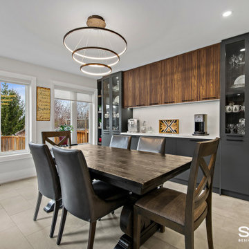
The wall between the Kitchen and Dining Room was removed, which opened up the Main Floor. Half of the space this created was used to create a much larger Kitchen with ample gathering space for our client’s large family. The new custom Kitchen boasts plenty of dark cabinetry with wood accents, and is complimented by a beautiful quartz countertop and matching black fixtures.
The other half of the newly created space was transformed into a quiet, functional home office. In the new office, a wall of built-in cabinetry offers useful storage for both work and hobby items, creating the perfect space for both work and crafting.
On the Second Floor, we expanded the Shared Bathroom by using space from the Guest Bedroom closet and the Second Floor Office. We replaced the bathtub shower combo with a spacious grand shower and added a large vanity and makeup area, giving each teenager their own dedicated personal storage space.
In the Master Ensuite, we altered the entryway location, allowing for a redesigned layout that includes a large vanity and double sink, enhancing both functionality and storage.
Our clients expressed their happiness with the renovation process with Sosna, specifically how clean the construction area was kept, and how respectful the Sosna team was of their home and neighbours. They were pleased that all deadlines were met, and the project was completed on time, and looked even better than they had dreamed.
Sosna Inc
416-888-7366 ext 1
email: contact@sosna.ca
website: sosna.ca

 K Squared Builders - Dale Kramer
Challenges of a Small Kitchen.
"How can we add a dishwasher and increase storage to our already small kitchen?"
A good question for sure. We tucked the refrigerator into what had been a hall closet, encorporated a neat rolling cabinet/cutting board 'under' the new (handmade by owner) oak table, replaced a window into a new place, removed an space wasting unused brick chimney, strategically added many storage cabinets and removed bearing walls.
The countertops are a combination of soapstone and Quartzite. We even squeezed in the "small but pretty" farm sink!
"Lance Kramer (project manager) kept us informed every step, kept the job clean, did great work" ...and with a twinkle in his eye
... " I'd recommend you do not fire him". Richard L." No danger there! Great job K Team.

 Innovative Design Build
Five stars isn’t enough! Our project was to reconfigure and update the main floor of a house we recently purchased that was built in 1961. We wanted to maintain some of the unique feeling it originally had but bring it up-to-date and eliminate the closed-in rooms and downright weird layout that was the result of multiple, partial remodeling projects. We began with a long wishlist of changes which also required replacement of very antiquated plumbing, electrical wiring and HVAC. We even found a fireplace that had been walled in and needed major re-construction. Many other aspects and details on this incredible list we made included an all new kitchen layout, converting a bedroom into a master closet, adding new half-bath, completely rebuilding the master bath, and adding stone, tile and custom built cabinetry. Our design plans included many fixtures and details that we specified and required professional installation and careful handling. Innovative helped us make reasonable decisions. Their skilled staff took us through a design process that made sense. There were many questions and all were answered with sincere conversation and positive – innovation – on how we could achieve our goals. Innovative provided us with professional consultants, who listened and were courteous and creative, with solid knowledge and informative judgement. When they didn’t have an answer, they did the research. They developed a comprehensive project plan that exceeded our expectations. Every item on our long list was checked-off. All agreed on work was fulfilled and they completed all this in just under four months. Innovative took care of putting together a team of skilled professional specialists who were all dedicated to make everything right. Engineering, construction, supervision, and I cannot even begin to describe how much thanks we have for the demolition crew! Our multiple, detailed project designs from Raul and professional design advice from Mindy and the connections she recommended are all of the best quality. Diego Jr., Trevor and his team kept everything on track and neat and tidy every single day and Diego Sr., Mark, Ismael, Albert, Santiago and team are true craftsmen who follow-up and make the most minuscule woodworking details perfect. The cabinets by Tim and electrical work and installation of fixtures by Kemchan Harrilal-BB and Navindra Doolratram, and Augustine and his crew on tile and stone work – all perfection. Aisling and the office crew were always responsive to our calls and requests. And of course Clark and Eric who oversaw everything and gave us the best of the best! Apologies if we didn’t get everyone on this list – you’re all great! Thank you for your hard work and dedication. We can’t thank you enough Innovative Construction – we kind of want to do it again!
Dave Hallman & Matt DeGraffenreid
 Jami Abbadessa
This young family was ready for a new, fresh and updated look to their house. They wanted a totally different color scheme and vibe and needed it finished within 6 weeks to be ready for a party of 100+ people they were hosting. I was happy to help! Even though many items that were selected were on back order and needed to be replaced, they kept their spirits high after countless returns and exchanges. Although art was being framed a day before the party and decor was being installed at the last minute, we pulled it together and accomplished our goal of finishing on time!
The easiest (and most cost effective!) way to change the feeling of a space is with color, so that’s what I did. I swapped out the tired burgundy/browns for a clean palette of blues and greys. In the family room, a new custom sectional in a neutral grey took place of the brown leatherette sofa. A blue accent chair was placed in the room to brighten that corner. Patterned drapes were hung for privacy and added texture. Colorful artwork and a Moroccan print area rug livened up the space. Many of the accessories and decor throughout the home were sourced at Home Goods, Target and Ikea.
The only piece of furniture that was kept in the entire home was the dining table, chairs and bar stools. The head chairs were swapped out for swanky upholstered navy ones with a nail head trim. A custom cornice to match the chairs was installed in the kitchen to hide the existing roller shades. The bar stools were reupholstered in the same fabric and some throw pillows for the sofa were made in the navy velvet as well. A Z Gallerie chandelier and blue pendants were installed for a little added drama. The fireplace got a makeover with a fresh coat of white paint and tile mosaic.
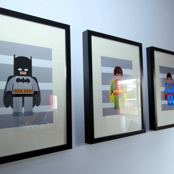
Their daughter wanted a beach theme bedroom, so that’s what she got! New blue walls, drapes and accessories brought the ocean to this room. Their son has taken a liking to super heroes and Legos. A red, blue and yellow color palette with bold stripes helped to create a fun, playful space for him to enjoy his Legos and super heroes. The master bedroom got a new look with updated furnishings and colorful, yet soothing, bedding. New drapes, an area rug and accessories help pull together this peaceful sanctuary. The bathroom got a makeover with a new vanity, tile mosaic back splash, new lighting and tile on the floor and shower.
Sponsored
Columbus, OH

Hope Restoration & General Contracting
Columbus Design-Build, Kitchen & Bath Remodeling, Historic Renovations
 Jordan Design Build Group
Our clients wanted their renovation to blend classic design features with modern elements to reflect their elegant, yet comfortable style. The space that needed the most attention was the kitchen which felt dark, cold, and unwelcoming with its traditional espresso-colored cabinets and stainless steel countertops. A two-level peninsula interrupted flow and connectivity with the adjacent spaces. To have the biggest impact and accommodate the kitchen’s expansion and redesign, we relocated a hallway to an exterior wall allowing natural light to flood in.
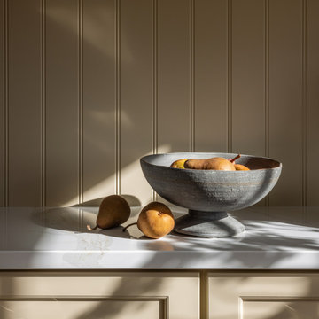
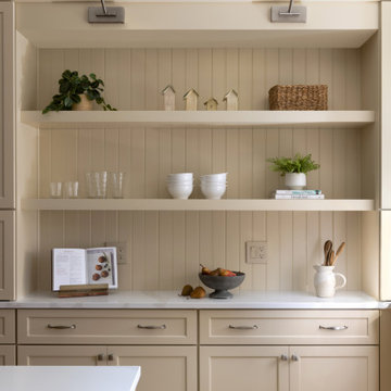
With Craftsman details throughout the rest of the home, our Our clients wanted a double-sided island (with seating) in their redesigned kitchen, something their old one lacked. To maintain good circulation, we designed a shallow ‘hutch’ and recessed the paneled refrigerator/freezer, so they are perfectly aligned. The creamy tone of the painted cabinets complements the champagne-stained maple, adding softness and warmth to the space. We incorporated traditional details such as a beadboard backsplash, library sconces, and a Venetian plaster hood, but balanced these with more modern features such as a continuous quartz backsplash, updated hardware, fixtures and lighting. Blending old and new creates a space with a sense of history and character – it feels fresh, modern, and comfortable.
The kitchen is a chef’s dream with a suite of professional appliances including a 48” double gas range and separate 24” refrigerator and freezer columns, paneled to integrate seamlessly. Two sinks allow for separate prep and cleaning zones. Open shelves and glass-front cabinets are the perfect way to showcase treasured items and favorite dishware, while hidden accessories keep the cook and kitchen well-organized. Replacing the old peninsula with an island created better flow and connectivity with the adjacent rooms. The kitchen is now brighter, cozier, and more inviting.
An informal dining area connects the new kitchen to the living room and a nearby butler’s pantry got a top-to-bottom makeover. We paired moody blue-green cabinets with a stunning Nero Marquina marble countertop and black sink. Brushed brass was used throughout, from the bar faucet to the hardware and mosaic tile accent. A distinctive drink rail gives a nod to the past while the saturated color on the walls, ceiling and trim feels simultaneously contemporary and timeless.
 Jordan Design Build Group
Our clients wanted their renovation to blend classic design features with modern elements to reflect their elegant, yet comfortable style. The space that needed the most attention was the kitchen which felt dark, cold, and unwelcoming with its traditional espresso-colored cabinets and stainless steel countertops. A two-level peninsula interrupted flow and connectivity with the adjacent spaces. To have the biggest impact and accommodate the kitchen’s expansion and redesign, we relocated a hallway to an exterior wall allowing natural light to flood in.
With Craftsman details throughout the rest of the home, our Our clients wanted a double-sided island (with seating) in their redesigned kitchen, something their old one lacked. To maintain good circulation, we designed a shallow ‘hutch’ and recessed the paneled refrigerator/freezer, so they are perfectly aligned. The creamy tone of the painted cabinets complements the champagne-stained maple, adding softness and warmth to the space. We incorporated traditional details such as a beadboard backsplash, library sconces, and a Venetian plaster hood, but balanced these with more modern features such as a continuous quartz backsplash, updated hardware, fixtures and lighting. Blending old and new creates a space with a sense of history and character – it feels fresh, modern, and comfortable.
The kitchen is a chef’s dream with a suite of professional appliances including a 48” double gas range and separate 24” refrigerator and freezer columns, paneled to integrate seamlessly. Two sinks allow for separate prep and cleaning zones. Open shelves and glass-front cabinets are the perfect way to showcase treasured items and favorite dishware, while hidden accessories keep the cook and kitchen well-organized. Replacing the old peninsula with an island created better flow and connectivity with the adjacent rooms. The kitchen is now brighter, cozier, and more inviting.
An informal dining area connects the new kitchen to the living room and a nearby butler’s pantry got a top-to-bottom makeover. We paired moody blue-green cabinets with a stunning Nero Marquina marble countertop and black sink. Brushed brass was used throughout, from the bar faucet to the hardware and mosaic tile accent. A distinctive drink rail gives a nod to the past while the saturated color on the walls, ceiling and trim feels simultaneously contemporary and timeless.
 Integrated Home Improvement
Both the design and construction teams put their heart into making sure we worked with the client to achieve this gorgeous vision. The client was sensitive to both aesthetic and functionality goals, so we set out to improve their old, dated cramped kitchen, with an open concept that facilitates cooking workflow, and dazzles the eye with its mid century modern design. One of their biggest items was their need for increased storage space. We certainly achieved that with ample cabinet space and doubling their pantry space.
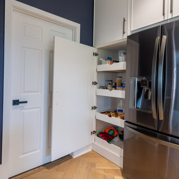
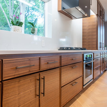
The 13 foot waterfall island is the centerpiece, which is heavily utilized for cooking, eating, playing board games and hanging out. The pantry behind the walnut doors used to be the fridge space, and there's an extra pantry now to the left of the current fridge. We moved the sink from the counter to the island, which really helped workflow (we created triangle between cooktop, sink and fridge/pantry 2). To make the cabinets flow linearly at the top we moved and replaced the window. The beige paint is called alpaca from Sherwin Williams and the blue is charcoal blue from sw.
Everything was carefully selected, from the horizontal grain on the walnut cabinets, to the subtly veined white quartz from Arizona tile, to the black glass paneled luxury hood from Futuro Futuro. The pendants and chandelier are from West Elm. The flooring is from karastan; a gorgeous engineered, white oak in herringbone pattern. The recessed lights are decorative from Lumens. The pulls are antique brass from plank hardware (in London). We sourced the door handles and cooktop (Empava) from Houzz. The faucet is Rohl and the sink is Bianco.
 Integrated Home Improvement
Both the design and construction teams put their heart into making sure we worked with the client to achieve this gorgeous vision. The client was sensitive to both aesthetic and functionality goals, so we set out to improve their old, dated cramped kitchen, with an open concept that facilitates cooking workflow, and dazzles the eye with its mid century modern design. One of their biggest items was their need for increased storage space. We certainly achieved that with ample cabinet space and doubling their pantry space.
The 13 foot waterfall island is the centerpiece, which is heavily utilized for cooking, eating, playing board games and hanging out. The pantry behind the walnut doors used to be the fridge space, and there's an extra pantry now to the left of the current fridge. We moved the sink from the counter to the island, which really helped workflow (we created triangle between cooktop, sink and fridge/pantry 2). To make the cabinets flow linearly at the top we moved and replaced the window. The beige paint is called alpaca from Sherwin Williams and the blue is charcoal blue from sw.
Everything was carefully selected, from the horizontal grain on the walnut cabinets, to the subtly veined white quartz from Arizona tile, to the black glass paneled luxury hood from Futuro Futuro. The pendants and chandelier are from West Elm. The flooring is from karastan; a gorgeous engineered, white oak in herringbone pattern. The recessed lights are decorative from Lumens. The pulls are antique brass from plank hardware (in London). We sourced the door handles and cooktop (Empava) from Houzz. The faucet is Rohl and the sink is Bianco.
 Sosna Inc
Our clients approached us to renovate their home, as it was lacking function for their family’s changing needs. They were facing issues with insufficient storage, and underutilised areas.
The entry was cramped, which was especially noticeable when several people were coming in, or when carrying in groceries. The Shared Bathroom was too small, and lacked enough room for their teenage children to store their individual belongings. Additionally, since both clients work from home, a dedicated office space was essential.
On the Main Floor, we relocated the closet at the entry, making the entrance more spacious, and the Powder Room was given an update and new fixtures.
The wall between the Kitchen and Dining Room was removed, which opened up the Main Floor. Half of the space this created was used to create a much larger Kitchen with ample gathering space for our client’s large family. The new custom Kitchen boasts plenty of dark cabinetry with wood accents, and is complimented by a beautiful quartz countertop and matching black fixtures.
The other half of the newly created space was transformed into a quiet, functional home office. In the new office, a wall of built-in cabinetry offers useful storage for both work and hobby items, creating the perfect space for both work and crafting.
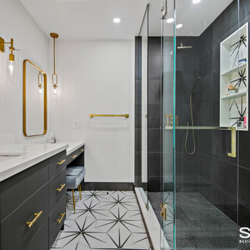
On the Second Floor, we expanded the Shared Bathroom by using space from the Guest Bedroom closet and the Second Floor Office. We replaced the bathtub shower combo with a spacious grand shower and added a large vanity and makeup area, giving each teenager their own dedicated personal storage space.
In the Master Ensuite, we altered the entryway location, allowing for a redesigned layout that includes a large vanity and double sink, enhancing both functionality and storage.
Our clients expressed their happiness with the renovation process with Sosna, specifically how clean the construction area was kept, and how respectful the Sosna team was of their home and neighbours. They were pleased that all deadlines were met, and the project was completed on time, and looked even better than they had dreamed.
Sosna Inc
416-888-7366 ext 1
email: contact@sosna.ca
website: sosna.ca
 Integrated Home Improvement
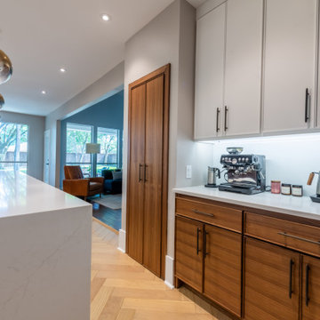
Both the design and construction teams put their heart into making sure we worked with the client to achieve this gorgeous vision. The client was sensitive to both aesthetic and functionality goals, so we set out to improve their old, dated cramped kitchen, with an open concept that facilitates cooking workflow, and dazzles the eye with its mid century modern design. One of their biggest items was their need for increased storage space. We certainly achieved that with ample cabinet space and doubling their pantry space.
The 13 foot waterfall island is the centerpiece, which is heavily utilized for cooking, eating, playing board games and hanging out. The pantry behind the walnut doors used to be the fridge space, and there's an extra pantry now to the left of the current fridge. We moved the sink from the counter to the island, which really helped workflow (we created triangle between cooktop, sink and fridge/pantry 2). To make the cabinets flow linearly at the top we moved and replaced the window. The beige paint is called alpaca from Sherwin Williams and the blue is charcoal blue from sw.
Everything was carefully selected, from the horizontal grain on the walnut cabinets, to the subtly veined white quartz from Arizona tile, to the black glass paneled luxury hood from Futuro Futuro. The pendants and chandelier are from West Elm. The flooring is from karastan; a gorgeous engineered, white oak in herringbone pattern. The recessed lights are decorative from Lumens. The pulls are antique brass from plank hardware (in London). We sourced the door handles and cooktop (Empava) from Houzz. The faucet is Rohl and the sink is Bianco.
Sponsored
Columbus, OH
Hope Restoration & General Contracting
Columbus Design-Build, Kitchen & Bath Remodeling, Historic Renovations
 Integrated Home Improvement
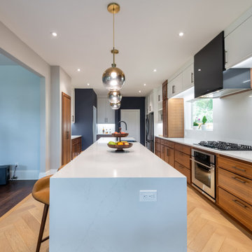
Both the design and construction teams put their heart into making sure we worked with the client to achieve this gorgeous vision. The client was sensitive to both aesthetic and functionality goals, so we set out to improve their old, dated cramped kitchen, with an open concept that facilitates cooking workflow, and dazzles the eye with its mid century modern design. One of their biggest items was their need for increased storage space. We certainly achieved that with ample cabinet space and doubling their pantry space.
The 13 foot waterfall island is the centerpiece, which is heavily utilized for cooking, eating, playing board games and hanging out. The pantry behind the walnut doors used to be the fridge space, and there's an extra pantry now to the left of the current fridge. We moved the sink from the counter to the island, which really helped workflow (we created triangle between cooktop, sink and fridge/pantry 2). To make the cabinets flow linearly at the top we moved and replaced the window. The beige paint is called alpaca from Sherwin Williams and the blue is charcoal blue from sw.
Everything was carefully selected, from the horizontal grain on the walnut cabinets, to the subtly veined white quartz from Arizona tile, to the black glass paneled luxury hood from Futuro Futuro. The pendants and chandelier are from West Elm. The flooring is from karastan; a gorgeous engineered, white oak in herringbone pattern. The recessed lights are decorative from Lumens. The pulls are antique brass from plank hardware (in London). We sourced the door handles and cooktop (Empava) from Houzz. The faucet is Rohl and the sink is Bianco.
 Integrated Home Improvement
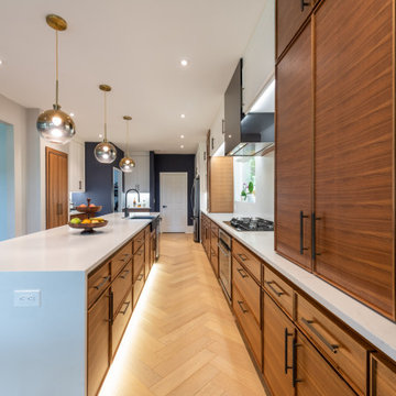
Both the design and construction teams put their heart into making sure we worked with the client to achieve this gorgeous vision. The client was sensitive to both aesthetic and functionality goals, so we set out to improve their old, dated cramped kitchen, with an open concept that facilitates cooking workflow, and dazzles the eye with its mid century modern design. One of their biggest items was their need for increased storage space. We certainly achieved that with ample cabinet space and doubling their pantry space.
The 13 foot waterfall island is the centerpiece, which is heavily utilized for cooking, eating, playing board games and hanging out. The pantry behind the walnut doors used to be the fridge space, and there's an extra pantry now to the left of the current fridge. We moved the sink from the counter to the island, which really helped workflow (we created triangle between cooktop, sink and fridge/pantry 2). To make the cabinets flow linearly at the top we moved and replaced the window. The beige paint is called alpaca from Sherwin Williams and the blue is charcoal blue from sw.
Everything was carefully selected, from the horizontal grain on the walnut cabinets, to the subtly veined white quartz from Arizona tile, to the black glass paneled luxury hood from Futuro Futuro. The pendants and chandelier are from West Elm. The flooring is from karastan; a gorgeous engineered, white oak in herringbone pattern. The recessed lights are decorative from Lumens. The pulls are antique brass from plank hardware (in London). We sourced the door handles and cooktop (Empava) from Houzz. The faucet is Rohl and the sink is Bianco.
 Integrated Home Improvement
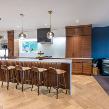
Both the design and construction teams put their heart into making sure we worked with the client to achieve this gorgeous vision. The client was sensitive to both aesthetic and functionality goals, so we set out to improve their old, dated cramped kitchen, with an open concept that facilitates cooking workflow, and dazzles the eye with its mid century modern design. One of their biggest items was their need for increased storage space. We certainly achieved that with ample cabinet space and doubling their pantry space.
The 13 foot waterfall island is the centerpiece, which is heavily utilized for cooking, eating, playing board games and hanging out. The pantry behind the walnut doors used to be the fridge space, and there's an extra pantry now to the left of the current fridge. We moved the sink from the counter to the island, which really helped workflow (we created triangle between cooktop, sink and fridge/pantry 2). To make the cabinets flow linearly at the top we moved and replaced the window. The beige paint is called alpaca from Sherwin Williams and the blue is charcoal blue from sw.
Everything was carefully selected, from the horizontal grain on the walnut cabinets, to the subtly veined white quartz from Arizona tile, to the black glass paneled luxury hood from Futuro Futuro. The pendants and chandelier are from West Elm. The flooring is from karastan; a gorgeous engineered, white oak in herringbone pattern. The recessed lights are decorative from Lumens. The pulls are antique brass from plank hardware (in London). We sourced the door handles and cooktop (Empava) from Houzz. The faucet is Rohl and the sink is Bianco.
 Klopf Architecture
From Mid-Century Classic to the Present
An iconic design updated with comfort, function, and flow for today.
A Remodel That Balances Past and Present
What started as a desire to update a classic Eichler soon became an exploration of how Mid-Century Modern design can successfully evolve for today. The client, a tech professional with a passion for scuba diving and underwater photography, wanted a home that would both honor its original character and feel tailored to his daily life. A lifelong technology enthusiast, he still owns the very first Mac desktop he saved up for as a teenager working at Radio Shack, a detail that underscores his appreciation for design that melds function and form.
Honoring Separation While Expanding Possibility
Unlike many contemporary remodels where walls are opened up to create expansive living spaces, this project took a more restrained approach. The client valued the defined rooms of the original plan and wanted to preserve as much wall space as possible for displaying his large-format underwater photography. The emphasis was not on dramatic spatial reinvention, but on thoughtful refinements. Klopf Architecture shaped a gallery-like backdrop while also expanding the primary suite, modernizing materials and fixtures throughout the home, and improving the functionality and layout of the kitchen. The finished home feels at once timeless and renewed, an Eichler that continues to inspire while fully supporting the lifestyle of its present-day owner.
A major turning point came mid-design. The original project brief had not included an addition, but as the reconfiguration of the primary bedroom and bath unfolded, it became clear that an expansion was the best approach to achieve the client’s vision of a more spacious suite. Fortunately, the adjustment came at a stage when revisions were still manageable and was integrated seamlessly, showing how thoughtful course corrections can strengthen a project rather than hinder it.
Navigating Challenges With Precision
The design development included multiple conceptual rounds, balancing preservation with subtle expansion. During construction, an existing post previously thought to be load-bearing turned out not to be. The structural engineer was able to pivot quickly, and both the post and the cross beam that had been intended to replace it could be omitted, allowing the original rhythm of the Eichler beam bays to be preserved.
Sustainability was not just a checklist item, but a way to align the home with the client’s values of simplicity, efficiency, and long-term functionality. R-38 roof insulation reduced energy usage, solar panels with battery storage provided independence and resilience, and passive comfort strategies eliminated the need forenergy-intensive air conditioning. An electric vehicle charger and an on-demand hot water recirculation system (with call buttons as opposed to having constant circulation) add to the home’s long-term efficiency factors. Together, these moves created a home that is quieter, more comfortable, and better equipped for the future, qualities that supported the client’s pragmatic approach to design and living lightly.
Details That Respect the Eichler DNA
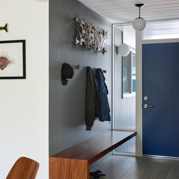
The remodel carries forward the Eichler’s original spirit while introducing new layers of modern livability. Originally, the house was approached along a deep, narrow walk, with the garage on one side and the house on the other, leaving the front door tucked far back within this chasm-like space. By pulling the entry forward, the design reshaped the arrival experience, creating a clearer threshold and a natural drop-off zone for bags, shoes, and keys. This shift also made room for a custom bench at the entry that extends seamlessly through the glass sidelight. The bench and drop-off zone now work together as a single, integrated sequence that supports everyday living while offering a tactile reminder of Eichler’s philosophy of connectedness.
At the client’s request, Klopf reintroduced a classic Eichler gesture by extending the exterior siding into the entry and living room. The detail reinforces a sense of indoor/outdoor continuity while providing a subtle architectural surface that allows the client’s photography to take visual precedence.
The signature concrete masonry wall at the front was reconstructed using blocks sourced to match the originals, now strengthened with rebar for seismic resilience while maintaining a private outdoor courtyard, visually extending the kitchen outward. A decorative trellis element, a detail borrowed from a neighboring Eichler, restores a familiar mid-century modern architectural motif. At the courtyard entry door, a custom etched glass sidelight with an ocean-themed design featuring kelp and jellyfish serves as a subtle homage to the client’s passion for deep-sea diving.
Landscaping became an integral part of the overall transformation. The homeowner engaged landscape architect Randi Johnsen of Third Nature Studio to shape a series of calm, inviting outdoor rooms that read as a natural extension of the interiors. While technically outside of the core construction scope, the landscape design proved central to achieving a sense of completeness and connectedness across the property. Such whole-property considerations often emerge as design ideas take shape, underscoring the importance of flexibility in planning and budgeting, as well as close collaboration among the design team starting early in the process.
The Value of Evolving Scope
As with many custom residential projects, the scope evolved during the design process. What began as a targeted remodel grew to include a new/expanded primary suite, a rebuilt CMU patio wall for strength and longevity, and a solar panel array and battery storage for energy resilience and carbon-reduction. Each thoughtful decision represented a conscious investment in the home’s performance and character, rather than a cost overrun.
The result was a project delivered on schedule, tailored precisely to the client’s lifestyle, and positioned to add long-term value both functionally and aesthetically. By embracing scope evolution as an opportunity rather than a challenge, and relying on good design paired with transparent communication, this remodel demonstrates how Eichler homes can be adapted for contemporary living without erasing their DNA.
Klopf Architecture project team: John Klopf, AIA, and Klara Kevane, Elise Webb and Nicholas LaNasa.
Contractor: Golden Cove Construction
Landscape Design: Third Nature Studio
Structural Engineer: Daniel Bastiao Design
Photography: ©2025 Mariko Reed
Year Completed: 2024
Location: Sunnyvale, CA

 Jordan Design Build Group
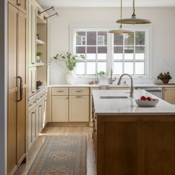
Our clients wanted their renovation to blend classic design features with modern elements to reflect their elegant, yet comfortable style. The space that needed the most attention was the kitchen which felt dark, cold, and unwelcoming with its traditional espresso-colored cabinets and stainless steel countertops. A two-level peninsula interrupted flow and connectivity with the adjacent spaces. To have the biggest impact and accommodate the kitchen’s expansion and redesign, we relocated a hallway to an exterior wall allowing natural light to flood in.
With Craftsman details throughout the rest of the home, our Our clients wanted a double-sided island (with seating) in their redesigned kitchen, something their old one lacked. To maintain good circulation, we designed a shallow ‘hutch’ and recessed the paneled refrigerator/freezer, so they are perfectly aligned. The creamy tone of the painted cabinets complements the champagne-stained maple, adding softness and warmth to the space. We incorporated traditional details such as a beadboard backsplash, library sconces, and a Venetian plaster hood, but balanced these with more modern features such as a continuous quartz backsplash, updated hardware, fixtures and lighting. Blending old and new creates a space with a sense of history and character – it feels fresh, modern, and comfortable.
The kitchen is a chef’s dream with a suite of professional appliances including a 48” double gas range and separate 24” refrigerator and freezer columns, paneled to integrate seamlessly. Two sinks allow for separate prep and cleaning zones. Open shelves and glass-front cabinets are the perfect way to showcase treasured items and favorite dishware, while hidden accessories keep the cook and kitchen well-organized. Replacing the old peninsula with an island created better flow and connectivity with the adjacent rooms. The kitchen is now brighter, cozier, and more inviting.
An informal dining area connects the new kitchen to the living room and a nearby butler’s pantry got a top-to-bottom makeover. We paired moody blue-green cabinets with a stunning Nero Marquina marble countertop and black sink. Brushed brass was used throughout, from the bar faucet to the hardware and mosaic tile accent. A distinctive drink rail gives a nod to the past while the saturated color on the walls, ceiling and trim feels simultaneously contemporary and timeless.
 Integrated Home Improvement
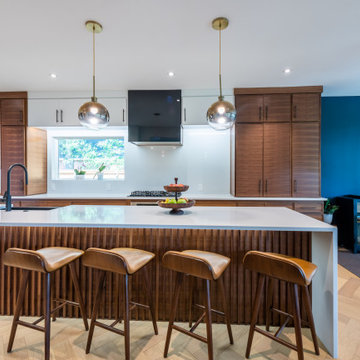
Both the design and construction teams put their heart into making sure we worked with the client to achieve this gorgeous vision. The client was sensitive to both aesthetic and functionality goals, so we set out to improve their old, dated cramped kitchen, with an open concept that facilitates cooking workflow, and dazzles the eye with its mid century modern design. One of their biggest items was their need for increased storage space. We certainly achieved that with ample cabinet space and doubling their pantry space.
The 13 foot waterfall island is the centerpiece, which is heavily utilized for cooking, eating, playing board games and hanging out. The pantry behind the walnut doors used to be the fridge space, and there's an extra pantry now to the left of the current fridge. We moved the sink from the counter to the island, which really helped workflow (we created triangle between cooktop, sink and fridge/pantry 2). To make the cabinets flow linearly at the top we moved and replaced the window. The beige paint is called alpaca from Sherwin Williams and the blue is charcoal blue from sw.
Everything was carefully selected, from the horizontal grain on the walnut cabinets, to the subtly veined white quartz from Arizona tile, to the black glass paneled luxury hood from Futuro Futuro. The pendants and chandelier are from West Elm. The flooring is from karastan; a gorgeous engineered, white oak in herringbone pattern. The recessed lights are decorative from Lumens. The pulls are antique brass from plank hardware (in London). We sourced the door handles and cooktop (Empava) from Houzz. The faucet is Rohl and the sink is Bianco.
 Integrated Home Improvement
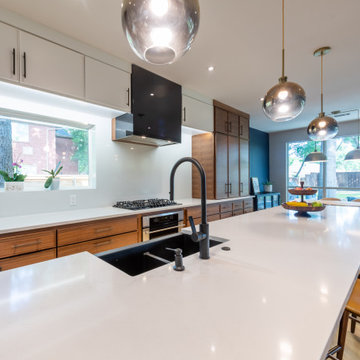
Both the design and construction teams put their heart into making sure we worked with the client to achieve this gorgeous vision. The client was sensitive to both aesthetic and functionality goals, so we set out to improve their old, dated cramped kitchen, with an open concept that facilitates cooking workflow, and dazzles the eye with its mid century modern design. One of their biggest items was their need for increased storage space. We certainly achieved that with ample cabinet space and doubling their pantry space.
The 13 foot waterfall island is the centerpiece, which is heavily utilized for cooking, eating, playing board games and hanging out. The pantry behind the walnut doors used to be the fridge space, and there's an extra pantry now to the left of the current fridge. We moved the sink from the counter to the island, which really helped workflow (we created triangle between cooktop, sink and fridge/pantry 2). To make the cabinets flow linearly at the top we moved and replaced the window. The beige paint is called alpaca from Sherwin Williams and the blue is charcoal blue from sw.
Everything was carefully selected, from the horizontal grain on the walnut cabinets, to the subtly veined white quartz from Arizona tile, to the black glass paneled luxury hood from Futuro Futuro. The pendants and chandelier are from West Elm. The flooring is from karastan; a gorgeous engineered, white oak in herringbone pattern. The recessed lights are decorative from Lumens. The pulls are antique brass from plank hardware (in London). We sourced the door handles and cooktop (Empava) from Houzz. The faucet is Rohl and the sink is Bianco.
85