
Search results for "Replacing items" in Home Design Ideas
 TKS Design Group
Download our free ebook, Creating the Ideal Kitchen. DOWNLOAD NOW
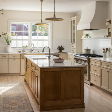
This family from Wheaton was ready to remodel their kitchen, dining room and powder room. The project didn’t call for any structural or space planning changes but the makeover still had a massive impact on their home. The homeowners wanted to change their dated 1990’s brown speckled granite and light maple kitchen. They liked the welcoming feeling they got from the wood and warm tones in their current kitchen, but this style clashed with their vision of a deVOL type kitchen, a London-based furniture company. Their inspiration came from the country homes of the UK that mix the warmth of traditional detail with clean lines and modern updates.
To create their vision, we started with all new framed cabinets with a modified overlay painted in beautiful, understated colors. Our clients were adamant about “no white cabinets.” Instead we used an oyster color for the perimeter and a custom color match to a specific shade of green chosen by the homeowner. The use of a simple color pallet reduces the visual noise and allows the space to feel open and welcoming. We also painted the trim above the cabinets the same color to make the cabinets look taller. The room trim was painted a bright clean white to match the ceiling.
In true English fashion our clients are not coffee drinkers, but they LOVE tea. We created a tea station for them where they can prepare and serve tea. We added plenty of glass to showcase their tea mugs and adapted the cabinetry below to accommodate storage for their tea items. Function is also key for the English kitchen and the homeowners. They requested a deep farmhouse sink and a cabinet devoted to their heavy mixer because they bake a lot. We then got rid of the stovetop on the island and wall oven and replaced both of them with a range located against the far wall. This gives them plenty of space on the island to roll out dough and prepare any number of baked goods. We then removed the bifold pantry doors and created custom built-ins with plenty of usable storage for all their cooking and baking needs.
The client wanted a big change to the dining room but still wanted to use their own furniture and rug. We installed a toile-like wallpaper on the top half of the room and supported it with white wainscot paneling. We also changed out the light fixture, showing us once again that small changes can have a big impact.
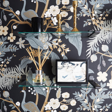
As the final touch, we also re-did the powder room to be in line with the rest of the first floor. We had the new vanity painted in the same oyster color as the kitchen cabinets and then covered the walls in a whimsical patterned wallpaper. Although the homeowners like subtle neutral colors they were willing to go a bit bold in the powder room for something unexpected. For more design inspiration go to: www.kitchenstudio-ge.com
 TKS Design Group
Download our free ebook, Creating the Ideal Kitchen. DOWNLOAD NOW
This family from Wheaton was ready to remodel their kitchen, dining room and powder room. The project didn’t call for any structural or space planning changes but the makeover still had a massive impact on their home. The homeowners wanted to change their dated 1990’s brown speckled granite and light maple kitchen. They liked the welcoming feeling they got from the wood and warm tones in their current kitchen, but this style clashed with their vision of a deVOL type kitchen, a London-based furniture company. Their inspiration came from the country homes of the UK that mix the warmth of traditional detail with clean lines and modern updates.
To create their vision, we started with all new framed cabinets with a modified overlay painted in beautiful, understated colors. Our clients were adamant about “no white cabinets.” Instead we used an oyster color for the perimeter and a custom color match to a specific shade of green chosen by the homeowner. The use of a simple color pallet reduces the visual noise and allows the space to feel open and welcoming. We also painted the trim above the cabinets the same color to make the cabinets look taller. The room trim was painted a bright clean white to match the ceiling.
In true English fashion our clients are not coffee drinkers, but they LOVE tea. We created a tea station for them where they can prepare and serve tea. We added plenty of glass to showcase their tea mugs and adapted the cabinetry below to accommodate storage for their tea items. Function is also key for the English kitchen and the homeowners. They requested a deep farmhouse sink and a cabinet devoted to their heavy mixer because they bake a lot. We then got rid of the stovetop on the island and wall oven and replaced both of them with a range located against the far wall. This gives them plenty of space on the island to roll out dough and prepare any number of baked goods. We then removed the bifold pantry doors and created custom built-ins with plenty of usable storage for all their cooking and baking needs.
The client wanted a big change to the dining room but still wanted to use their own furniture and rug. We installed a toile-like wallpaper on the top half of the room and supported it with white wainscot paneling. We also changed out the light fixture, showing us once again that small changes can have a big impact.
As the final touch, we also re-did the powder room to be in line with the rest of the first floor. We had the new vanity painted in the same oyster color as the kitchen cabinets and then covered the walls in a whimsical patterned wallpaper. Although the homeowners like subtle neutral colors they were willing to go a bit bold in the powder room for something unexpected. For more design inspiration go to: www.kitchenstudio-ge.com

Find the right local pro for your project

 Renovisions
This master bath ‘Renovision’ came with three main requests from the homeowner: more storage, a larger shower and a luxurious look that feels like being at an upscale hotel. The Renovisions team accomplished these wishes and exceeded the clients expectations.
Request number 1: more storage. The existing closet was reconfigured to accommodate better storage for towels and bath supplies making it both functional and attractive. The custom built pull-out hamper was perfect. The long vanity and center tower offers much more cabinet space and drawer storage compared to what they had, especially with the increased vanity height.
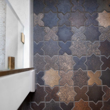
Request number 2: A larger shower. Working within the existing footprint we were able to build a shower that is nearly a foot deeper as space was available. Creating a large rectangular cubby provides plenty of space for shampoos and soaps. The frameless sliding glass shower enclosure keeps the space open and airy while allowing the beautiful Carrera-look porcelain wall tiles to be the focus of this master bath.
Request number 3: a luxurious look. Turning their once boring, builder grade bathroom into an upscale hotel-like space was challenging, however, not a problem for the Renovisions team and their creative ways of resolving design snags along the way. Re-locating the doorway to the bathroom was one way to create a more spacious flow in and out of the space. Having the right design to start was half the battle – installing the beautiful products right the first time to ensure a proper fit and finish worthy of the upscale feel is the other half. The delicate tile detail in the shower cubby is the ‘jewelry’ in the room – the soft curves of this 2-tone wave design tile adds a dramatic feel and enlightened mood this client loves.
Overall, the homeowner was happy with every solution-based approach to all requests – their once dated builders bath is now bright, open and airy with a soft grey wall color adding to the soothing feel of this master bath.

 User
Inspiration for a large timeless carpeted curved staircase remodel in Chicago with carpeted risers
 Sosna Inc
Our clients, a family of professionals with 2 young kids, approached us to renovate their early 2000’s Toronto home to make it better suit the needs of their family. Although they were happy with the Kitchen layout, they requested that we update the existing cabinetry, and add additional cabinetry for increased storage. In the Laundry Room, they needed a storage solution for cleaning materials, and an updated laundry sink. They wanted the Basement to be a comfortable family space to spend time together, and for the kids to have a space to play.
The Kitchen cabinets were dated and starting to fall apart, and the Master En-Suite was dated and awkwardly shaped, with a tight walk-in shower.
In the Basement, the HVAC bulkhead was awkward and unsightly, and the space was not ideal for the kids to play, due to outdated carpeting, and a lack of storage space for their toys.
We spent time getting to know our clients to design a space that optimized functionality and comfort for their family.
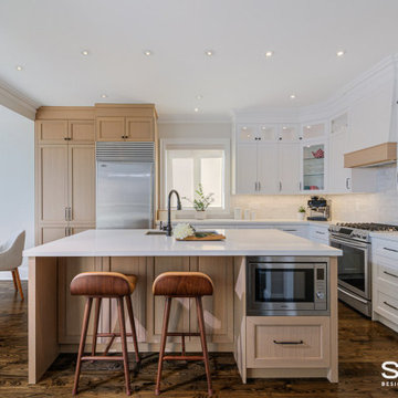
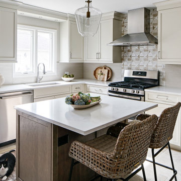
In the Kitchen, we kept the existing layout, but added a tall cabinet for pantry and broom storage. A new island was built with a space to accommodate a built-in microwave, to keep it from cluttering the countertop. The new white oak tall cabinets and island cabinets were complimented by light coloured marble-looking quartz countertops and the handmade subway tile backsplash for a fresh, updated look.
In the Master Ensuite, we replaced the large, dated deck-mounted tub with a semi-freestanding tub, tucked nicely into the corner. The extra space this created allowed us to add a walk-in shower without the awkward angle that had existed prior to the renovation. The new walk-in shower featured a ceiling mounted showerhead, and a useful ledge for toiletries. We even had enough space to add a bonus make-up table to match the new double vanity. Both were custom built to be floating for a modern look, and easier maintenance.
In the Laundry Room, we installed the washer and dryer side by side, instead of stacked. This allowed for a long working countertop and upper storage cabinets that were custom built. Additionally, a hanging rack installed above the sink is perfect for drying small items, and the adjustable shelves and dividers in the custom built cabinetry will provide plenty of convenient space to store cleaning materials.
In the Basement, we widened the bulkhead to allow us to center the wall-mounted TV, and added custom media cabinets with floating shelves to accommodate electronics.
The space was made more comfortable for the kids to play with new vinyl heated flooring, and tall cabinets with adjustable shelves, dividers, and deep drawers to keep all of their toys organized.
All of these updates provided our clients with a home that fits their family’s needs and lifestyle.
If your home isn’t functional for your family, contact us to learn more. We’re the Renovator You Can Count On!

 Advance Design Studio, Ltd.
Bud Kane has remodeled nearly every room in his own home over many years. Now reaching his 70’s, he contemplated heading up a major kitchen and laundry room renovation himself, planning on doing the carpentry work with his own hands. “I was not convinced I would ever meet anyone who could do it as well as I could do it myself”, said Bud. Ruth and Bud spent 5 years visiting kitchen firms and interviewing designers. They couldn’t however bring themselves to pull the trigger on the project, until they met Advance Design Studio in 2015.
“No one understood what I wanted”, said Ruth. She was continually frustrated by experiences with designers who weren’t hearing what was important to her. “Everyone kept designing my kitchen with what they thought it should look like; I couldn’t find anyone who would listen to me”!
When they met designer Scott Christensen from Advance Design Studio, they liked him right away. He listened to Ruth and designed a kitchen that she loved, all the while interjecting years of wisdom and design expertise that Ruth appreciated. “The finished product is better than I expected”, says Ruth. “I respected Scott’s opinions and together we created the perfect place for me to bake with my grandkids and truly enjoy the kitchen and laundry room I’ve been dreaming of for many years!”
The kitchen transformation began with removing the home’s soffits, and extending new painted maple cabinetry to the ceiling with the addition of an elegant crown molding. Ruth’s new Vita Mix holds a coveted place on her counter, and adjustments were planned to size the cabinets in conjunction with the under cabinet decorative light molding to fit this appliance just right. “This one small detail was really important to me”, says Ruth smiling. An elegant new island replaced the original island, complete with room for 3 stools where her grandchildren will sit to make home-made pasta every Thanksgiving, and cookies at Christmas time. “Traditions are very important in my family, and making my kitchen work to suit cherished activities with my family was the number one reason this renovation was so desired”, replied Ruth when asked about the island.
A picture perfect new tea station replaced a cluttered unused desk area, creating a wonderful place to prepare hot drinks for sipping any season of the year while overlooking the couple’s wonderfully manicured gardens from the lovely 3 season’s room just off the kitchen. The soft sage island bead panel detail was repeated on the backsplash, replicating the feel of a fine old piece of furniture.
The biggest problem with the laundry room was 3 doors, one from the garage, one from the closet, and one to the hallway. “Scott designed a pocket door, and oh what a dream it is now to bring groceries in from the garage!” exclaims Bud who grew to disdain this task! Doing laundry is now a breeze in this attractive new space that doubles as a wonderful pantry for the kitchen with room to store food items that didn’t have a home in the poorly designed original space.
New Hickory distressed wood flooring was laid both in the kitchen and leading to the hall foyer. Soft gray wood-replicating porcelain was placed in the laundry area, making for an easily cleanable surface for what doubles as a mud room from the garage. Creamy tumbled marble graces an unobtrusive backsplash spilling onto shiny granite counter tops in a rich earthy pattern of fall colors that mimic colors throughout the home. Advance is known details that included custom crafted furniture toe kicks, luxurious crown moldings, and beaded under cabinet moldings. The kitchen is complete with a glass display cabinet showing Ruth’s treasured china tea collection.
Early on, it was initially only their intention of purchasing cabinets for the new design. They were so impressed however with Advance Design’s complete program for budgeting, design, installation and management that it became clear to them both that they wanted Advance to handle the entire project from start to finish. “After seeing the quality work they did, coupled with the in-house team completely dedicated to our satisfaction, it became apparent there was no other choice but to hire them to handle everything. And we’re so glad we did, we have not one regret”, says Bud.
“The attention to detail by the carpentry crew more than satisfied my perfectionist expectations of the finished carpentry,” exclaimed Bud. “Every one of Advance Design’s people we encountered from design through construction was wonderful. We’ve never met a group of people so dedicated to making sure we were happy with every single detail, and every single part of this experience”, said Ruth and Bud.
Joe Nowak
Sponsored
Columbus, OH

Hope Restoration & General Contracting
Columbus Design-Build, Kitchen & Bath Remodeling, Historic Renovations
 Jordan Design Build Group
Our clients wanted their renovation to blend classic design features with modern elements to reflect their elegant, yet comfortable style. The space that needed the most attention was the kitchen which felt dark, cold, and unwelcoming with its traditional espresso-colored cabinets and stainless steel countertops. A two-level peninsula interrupted flow and connectivity with the adjacent spaces. To have the biggest impact and accommodate the kitchen’s expansion and redesign, we relocated a hallway to an exterior wall allowing natural light to flood in.
With Craftsman details throughout the rest of the home, our Our clients wanted a double-sided island (with seating) in their redesigned kitchen, something their old one lacked. To maintain good circulation, we designed a shallow ‘hutch’ and recessed the paneled refrigerator/freezer, so they are perfectly aligned. The creamy tone of the painted cabinets complements the champagne-stained maple, adding softness and warmth to the space. We incorporated traditional details such as a beadboard backsplash, library sconces, and a Venetian plaster hood, but balanced these with more modern features such as a continuous quartz backsplash, updated hardware, fixtures and lighting. Blending old and new creates a space with a sense of history and character – it feels fresh, modern, and comfortable.
The kitchen is a chef’s dream with a suite of professional appliances including a 48” double gas range and separate 24” refrigerator and freezer columns, paneled to integrate seamlessly. Two sinks allow for separate prep and cleaning zones. Open shelves and glass-front cabinets are the perfect way to showcase treasured items and favorite dishware, while hidden accessories keep the cook and kitchen well-organized. Replacing the old peninsula with an island created better flow and connectivity with the adjacent rooms. The kitchen is now brighter, cozier, and more inviting.
An informal dining area connects the new kitchen to the living room and a nearby butler’s pantry got a top-to-bottom makeover. We paired moody blue-green cabinets with a stunning Nero Marquina marble countertop and black sink. Brushed brass was used throughout, from the bar faucet to the hardware and mosaic tile accent. A distinctive drink rail gives a nod to the past while the saturated color on the walls, ceiling and trim feels simultaneously contemporary and timeless.

 San Luis Kitchen Co.
Surrounded by vineyards, horse ranches, and open land, the home is in a great location that is reasonably close to town while retaining a secluded air.
Our homeowners have enjoyed their country retreat for many years. They are blessed with a large extended family and love to host gatherings and entertain weekend guests. The only drawback to their gracious home was the drab and malfunctioning kitchen. First off, the cabinets were an out-dated whitewashed oak. Uggh! High ceilings were a plus feature that was negated by bizarrely stacked wall cabinets – making you think that maybe the original “designer” forgot about the 9 foot ceiling height. More likely, the original cabinets were stock items that didn’t come in the right size for the house. You can also see the lovely fluorescent light box tacked to the middle of the ceiling over the island. Why? Was there no thought to the style shown in the rest of the house?
Secondly, the homeowners were fighting with a poor kitchen layout. The large built-in refrigerator and separate freezer were placed right in the main traffic flow from the hall, there was not enough counter space to the right of the sink, the dishwasher was crammed right next to the fridge, and a broom closet took up prime real estate next to the cook-top. Now, remember, guests are frequent in this home and often several people were trying to use the kitchen at one time. Cross traffic and outright pile-ups were inevitable as some folks gathered veggies from the fridge to sauté at the cook-top while others were rinsing used dishes for the dishwasher and still others were taking frozen items to the prep sink and then the microwave. Don’t get me started about the trash and recycling receptacles – complete inconvenience to all!
So, our homeowners – the poor, benighted souls – were desperate for a remodel when they found San Luis Kitchen. On their first visit to our showroom, the couple fell in love with our French Country display. The display features soft white cabinets in a distressed cottage finish with a contrasting dark island and armoire; our homeowners were smitten. We knew everyone was up to the challenge and so we got right down to work.
We visited their home and measured their kitchen. While we were there, we took stock of the house’s overall style and the homeowner’s décor. We asked what they liked best about their home, what worked well and what didn’t. We found that they loved their arched passageways, the trim details on their mantle and the soft curves of the posts at their stair rail. They also showed us many photos of kitchens that they liked – both from magazines and on-line. Using this information, we went back to the office and pulled together a design.
We suggested swinging the refrigerator and freezer 90 degrees and setting them in place of the existing oven and hutch area. This brings them out of the traffic flow and into a comfortable relationship to the island counter. The fridge and freezer the homeowners chose were mismatched in width – we disguised the difference using custom detailing on the decorative panels. Deep storage cabinets above fill out the space.
Moving the fridge/freezer gained lots of luxurious counter space to the right of the new farmhouse sink. We placed the broom closet near the hall and tucked the microwave behind closed cabinet doors (which tuck away when open) to the left of it. The beautiful existing wood floor insisted that the island remain in the same location, however we replaced it with luscious cherry cabinets in an antique burnished finish. The island retained its prep sink and gained a wine refrigerator and both a trash compactor and double bin recycling cabinet. A decorative pot rack now hangs in place of the ugly old fluorescent lights.
The highlight of the new kitchen is the La Cornue range in a bright and bold blue! The homeowners traveled to a Bay area appliance showroom to see the ranges in person before purchasing to make sure that the ovens were of suitable size and that blue was truly the right color. The range was perfect, so it was purchased. The matching blue hood was created on site using a standard stainless hood as the base and painting a tapered drywall cover. To either side of the range we placed pullout base cabinets for oils and spices and such, each fronted with a turned post chosen to echo their stairway balusters. We also chose cabinet trim (crown, light rail and toe base) to harmonize with the homes existing details.
We knew for sure that the completed kitchen was a success when the happy homeowners reported to us that over Thanksgiving they had five cooks working in the space with no conflict whatsoever. That’s a true complement to our design – Thank You!
 J. Stephens Interiors
Modern form is married with elegant function in this open-floor-plan apartment in the heart of Chelsea, NYC. Award-winning interior designer, Jo Ann Alston, transformed the outdated elements of this upscale unit to create a timeless, yet modern aesthetic, with clean, natural lines that bespeak both luxury and ease. This charmingly functional kitchen now serves as the focal point for cooking, convening, and entertaining, for the whole family and their numerous guests.
Careful planning and selection were required to effectively work within the parameters of the open floor plan to create a seamless flow from the kitchen to the living room. Modern cabinetry, strategically hidden appliances, and ingeniously concealed lighting and elevations all coalesce to create uninterrupted sight lines that engender a sense of harmony and aesthetic intrigue.
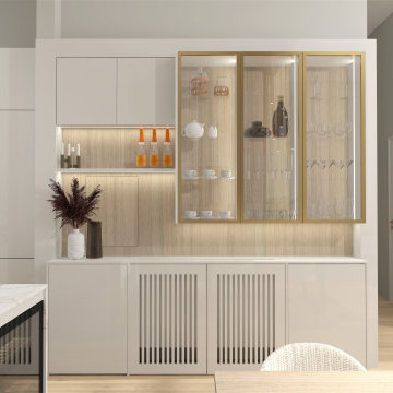
The existing cabinets, countertops, and appliances were all replaced, the wood flooring was refinished, and an elegant bar area was incorporated into the dining room, doubling as a bar for entertaining and a buffet for serving meals. In the kitchen, European, high-gloss lacquer was selected for the minimalist-modern cabinetry and coordinated with flooring and Dekton countertops, whose practicality and functionality are especially well-suited for NYC apartment homeowners with a penchant for entertaining.
For the sight lines from the living room to the kitchen to be seamless and uninterrupted, the refrigerator is concealed within the cabinetry and the range is hidden from sight behind the island. A dramatic light fixture above the dining room island and tasteful uplighting and downlighting offer especially compelling views of the kitchen when viewed from the living room, while glass cabinets with brass trim and accent lighting visually expand the width of the space.
Touches of luxury such as the brass faucet and brass-framed glass cabinets visually harmonize with the colors in the waterfall designed Dekton countertop, the game-stopper feature of the large kitchen island. A clean, light-wood back splash at the bar corresponds effortlessly with the newly refinished wood flooring, further enhancing the soft and natural vibe of the entire apartment.
This elegant stroke of design genius is proof positive that you need not compromise timeless elegance for practical, modern features in an uncluttered, even minimalist environment. The brilliance of this design is not limited to its balanced and graceful aesthetic appeal. It also includes the great many benefits coordinated between designer and client to ensure there would also be plenty of room for storage of kitchen items, abundant countertop space, and designated areas for enjoying company together comfortably throughout the space.
Anyone who walks through this space in the heart of Chelsea is bound to feel both inspired and at ease. This is the result of careful planning and attention to the smallest details that culminate in comfort, style, and design excellence.
 VAULT®
In the Tuscany region of central Italy, a region made famous around the world for its history, landscapes, traditions, artistic legacy and fine wine, perhaps nothing is more universally recognized than the old world villa’s that are nestled into the rolling countryside. Standing at approximately 10,500 square feet, this custom residence has all of the elegance, style and craftsmanship of those old world homes, but with all of the modern amenities of a new modern luxury home. This stunning residence was recognized by the National Association of Home Builders (NAHB) as the best custom built home in the country in 2010, a testament to the skillful designers and craftsmen who brought the homeowners vision into reality.
When Chad Haas, Founder of VAULT (www.vaultgarage.com), a company that prides itself in furnishing some of the most beautiful garages in the world, was brought into the project, the home and garage had already been built. The accolades of the gorgeous villa already awarded. But the homeowner felt that the exterior and interior of the garage lacked architectural harmony with the rest of the home and so he flew Mr. Haas out to visit the space directly so that he could assist hands-on with re-designing a new look and to add furnishings to accessories the space.
“When I first approached the villa from the street, I knew that I’d have my work cut out for me. Everything looked so perfect exactly the way it was designed and built. I questioned myself ‘how was I going to improve upon perfection?’, since remarkable attention was paid to even the smallest of details in the home” asked Haas.
The client’s goal was to engage Haas to design and furnish a garage where he could relax, separate from the home, enjoy his growing car collection and entertain family and friends.
After spending a short weekend together with the home owner to gather his ideas, Haas returned back to his Beaverton, Oregon-based company with a clearer vision: create the ultimate gentlemen’s retreat through the look of a turn-of-a-century Tuscan ‘car barn’.
Absolutely nothing in the garage was overlooked – and it shows. Every design element in the garage for color, texture and material was meticulously thought out to elicit just the right feeling and emotion in everyone that enters what may be one of the most beautifully elegant garages in America, a space commonly overlooked in the construction of homes today.
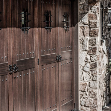
A main focal point of the exterior of garage is the beautiful view from the courtyard, where all three carriage doors can be seen. While the existing wood doors looked acceptable, it was agreed that something more befitting of the quality and beauty of the home were appropriate. Haas designed luxurious castle-style doors handcrafted from solid Mahogany and bathed in a rich dark brown stain that was complemented by hand-wrought iron grills, clavos and door pull hardware. The double-wide door, in particular, is truly remarkable in both its elegance, as well as its one-of-a-kind operation. “The client was concerned in this area of having mounting hardware and a motor on the ceiling. Because the cars in this area do not get brought out on a regular (daily) basis, the doors open manually by hand and operate accordion style on a track”. The homes main overhead garage doors feature jack-shaft operation which removes the clutter of a motor on the garage ceiling, but offers the convenience of powered operation. These extraordinary, custom-made castle doors look just as beautiful on the inside as the out and their unparalleled design and craftsmanship take the exterior of the home to even greater heights than before.
On to the interior, a black and white epoxy coating was stripped and replaced with porcelain tiles that resembled Italian travertine stone. To give the car barn a rustic feeling and a presence that it was older, not modern, Haas worked on the development and concept directly with the home owner to collaborate with a local millwork company that designed and hand-finished substantial wood beams from distressed Doug Fir. All of the walls were hand-plastered by a local artist using straw that was harvested from the immediate area surrounding the home and incorporated into the plaster to give it a rustic antique quality.
Haas conceived and designed a bar area and cabinetry for a work area that pulled inspiration from old ice boxes of the 1920’s that utilized heavy nickel-plated hardware, again to give storage spaces a rustic appearance.
The warm glow from several custom porcelain neon signs, each one meticulously built entirely by hand by VAULT, are dispersed throughout the space and transform the entire room and bring it to life. The client had never previously owned a neon sign before and along with the carriage doors felt that these items have transformed the space more than any other feature. Several antique gas pumps, restored in the client’s favorite petro bran, and a few additional porcelain signs will eventually furnish the rest of the space to complement the clients amazing car collection.
In addition to the countless details that set this showcase garage apart, its ability to seamlessly blend with the rest of the home and the natural, rustic setting of the Colorado Rockies, yet house modern automobiles in a manner in which they feel well placed and belong, is also noteworthy.
GARAGE DESIGN & FURNISHINGS
To learn more about VAULT visit them at: http://www.vaultgarage.com/
And on Facebook: http://www.facebook.com/VaultGarage
PHOTOGRAPHY
All photographs were used with the permission of photographer John Vanderpool (john.vanderpool5@gmail.com)
You can visit John Vanderpool on Facebook at: https://www.facebook.com/JVanderpoolPhotography
ARCHITECTURE
Jerry Gloss, Principal, KGA Architects: http://www.kgarch.com/
HOMEBUILDER
Thomas Sattler Home: http://thomassattlerhomes.com/
VEHICLES
Here is an overview of the cars that were photographed in this article:
1. 2014 Ferrari 458 Italia
2. 2013 Maserati GranTurismo Sport
3. 2007 Porsche 911 GT3 RS (997)
4. 2008 Porsche Cayenne GTS
5. 2008 Porsche GT3 RS
6. 2013 Porsche 911 Turbo S (997)
7. 2014 Porsche Panamera GTS
8. 2013 Ford SVT Raptor (6.2L CrewCab)’
Overview of project reprinted with permission of DuPont Registry.

 Design Vision Studio
Erik Grammer Photography -
I recently came across a post on Facebook with a photo of an elderly couple with a quote saying "We were born in a time when if something was broken we would fix it, not throw it away..." This quote resonated with me. I found myself thinking of it while working on the same house - for the fourth time. I affectionately call this beautiful Southern California beach house the Humpty Dumpty home.
I started a wonderful business relationship with one of my favorite clients back in 2003. Initially, I was called in to "fix" and finish what another designer started. Once completed and with everything just so, the couple unfortunately divorced and amicably divided the art, rugs and furnishings. I was hired for a second time to recreate each room as close as possible to replace all items that were missing.
The house was happily restored back to the original design and all was well for a few years. My client relocated to the East Coast for a temporary job assignment and the house was rented to a person (whose name I can't say) from a famous all-girl band. During this time there was a problem with the upstairs laundry room and water damage occurred. I was hired for the third time to help repair and update (ever so slightly) some areas in the house. My client requested to keep the design and feeling of the house intact because he loved it so much.
A few years passed before a pipe broke in the master bathroom while the new renter was out of town on vacation. Unfortunately, things like this do happen - and if not attended to quickly, major damage can occur. In this case, nearly the entire house was flooded requiring it to be completely gutted and stripped down to the floorboards and studs. In January of this year, I was hired to help the client, the insurance company, and the contractor put the house back together again. But unlike the Humpty Dumpty story, this house has actually been put back together again - several times over.
Although, this house and client have experienced some challenges, I say this is a perfect example of design success. My client has had many opportunities to change and create something new in his environment with every mis-adventure. Instead, he realizes his home is exactly the way he likes it. It has been such an honor to work with this man who is definitive, trusting, and confident enough to create (or re-create) the perfect home that "fits" his personality and lifestyle.
Although this Humpty Dumpty home has been good for my business, I hope the next project with this client is to decorate another property - perhaps a New York City Apartment!
 Drury Design
THE SETUP
“You have to figure out how to rebuild a life worth living,” Basia Kozub’s client says. Her husband passed away suddenly three years ago. Holidays with family became more important, and she found herself struggling with a 37-year old kitchen that was falling apart. “I made a decision to move forward,” she says. “I went, ‘You know what? I’m redoing the kitchen.'”
The big task of getting started was as easy as having a conversation – literally. Basia was on the job, helping the client sort through priorities, wishes and ideas. Basia’s client is 5′ 4″, likes keeping an eye on the kiddoes in the backyard and wanted certain things to have their own place.
THE REMODEL
The objectives were:
Enlarge and open the space
Find a classic look that incorporates blues
Upgrade to easy-to-use appliances
Hide an office space within the space
Ample storage for dishes
Design challenges:
Uneven window alignment on the back wall
Original kitchen smaller than desired, stuctural concerns if walls to be moved
Keep folks close – figure out seating for entertaining
Main sink in corner is ideal, but windows are hard to reach
Lots of storage needed for dishes, glass collection, pantry items, bar bottles and office supplies
Specific storage needs for oft-used spices and utensils
THE RENEWED SPACE
Design solutions:
Replace back wall windows, establish window size continuity
Take out two walls to open up the space, tall shallow cabinet and a tall filler added to conceal a new header
Large island that seats six easily
Custom corner sink cabinet with recessed edge allows vertically challenged homeowner to reach the windows
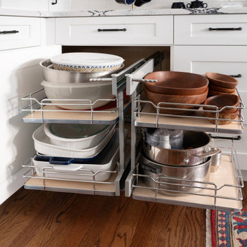
Mindful storage planning features: plenty of cabinets, pull-out bar bottle storage, file drawers & cubbies with pocket doors for office appliances, magic corner pullouts, and appliance garages with pocket doors
Shelf behind range for easy access to daily-use spices and oils. Also: spice and utensil pullouts on either side of range
The clients says every priority and wish box got checked. The highly functional design absorbed everything that used to be in that area of the house, but now those things are out of the way.
“In the past, we were all spread out when we gathered for the holidays, because we had to spread out. Now, we’re all in here together, including my 92-year old mother. We’re visiting, cooking, laughing… everyone is here. And I’m really learning how to use these appliances. This kitchen has given me a whole new life.”
Sponsored
Plain City, OH

Kuhns Contracting, Inc.
Central Ohio's Trusted Home Remodeler Specializing in Kitchens & Baths
 Drury Design
THE SETUP
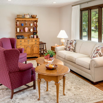
Client Background: Our clients, a couple who have transitioned into the empty nest phase, have cherished their home for over three decades without undergoing any significant renovations. With a newfound desire to adapt their living space to better suit their current lifestyle, they’ve embarked on a journey to reimagine their kitchen — the heart of their home. Their aspiration is to cultivate a serene, neutral-toned sanctuary on the first floor that seamlessly merges with their family room, ensuring a harmonious and inviting environment.
Design Inspiration: The renovation is inspired by the couple’s penchant for soft, calming neutrals, using their cherished family room and the kitchen’s existing tile flooring as the cornerstone for the color scheme. This approach aims to foster a sense of warmth and tranquility throughout.
Design Objectives:
Harmonize the kitchen with the family room by adopting a soothing, neutral color scheme, ensuring a seamless flow across the first floor.
Enhance kitchen functionality with thoughtfully designed cabinetry, providing a designated place for every item and maximizing storage efficiency.
Cultivate an inviting and comfortable atmosphere that reflects the homeowners’ desire for a calm and relaxing space.
Design Challenges:
The homeowners wish to retain the existing kitchen tile flooring and integrate it into a refreshed, modern design.
Accommodating a dining area spacious enough for family visits without compromising the kitchen’s open feel or functional layout.
Despite liking the current placement of plumbing and appliances, the homeowners aspire for a more open floor plan to facilitate better movement and interaction.
The need to amplify natural light in the kitchen, especially around the sink area, where existing lighting is insufficient.
Preserving the half-wall between the kitchen and family room, a feature the homeowners want to keep, while ensuring it complements the new design.
THE RENEWED SPACE
Design Solutions:
By choosing a neutral color palette that complements the existing tile, the design unifies the kitchen with the adjacent spaces. The tile’s grout was cleaned and restored, enhancing the floor’s appearance and integrating it seamlessly with the new kitchen aesthetic.
The inclusion of a larger island with seating for two, alongside maintaining a substantial dining table, was achieved by optimizing the spatial layout. This allowed for a sociable yet functional kitchen, accommodating large family gatherings without feeling crowded.
Minor adjustments to the kitchen’s layout maintained the preferred locations for plumbing and appliances while introducing an ‘open’ design concept. Strategic modifications, such as angling the pantry wall, improved the flow and accessibility within the space.
Replacing the garden window with a broader, standard window significantly increased natural light, transforming the sink area into a bright, welcoming space with enhanced views of the outdoors.
The decision to keep the half-wall was ingeniously leveraged to define the dining area while maintaining an open connection to the family room. This feature not only serves as a visual separator but also ties the two spaces together through the shared color scheme and design elements.
The homeowners are thrilled with their newly remodeled kitchen, which has become a hub of warmth and hospitality. Hosting a wedding shower and a birthday party, they have shared their renewed space with friends and family, who have been equally enamored. This remodel has not only met their functional and aesthetic desires but has also enriched their home with a fresh sense of serenity and joy.
The upstairs part of the home is shaping up nicely. Here’s their newly remodeled primary bathroom.
 TKS Design Group
Download our free ebook, Creating the Ideal Kitchen. DOWNLOAD NOW
This family from Wheaton was ready to remodel their kitchen, dining room and powder room. The project didn’t call for any structural or space planning changes but the makeover still had a massive impact on their home. The homeowners wanted to change their dated 1990’s brown speckled granite and light maple kitchen. They liked the welcoming feeling they got from the wood and warm tones in their current kitchen, but this style clashed with their vision of a deVOL type kitchen, a London-based furniture company. Their inspiration came from the country homes of the UK that mix the warmth of traditional detail with clean lines and modern updates.
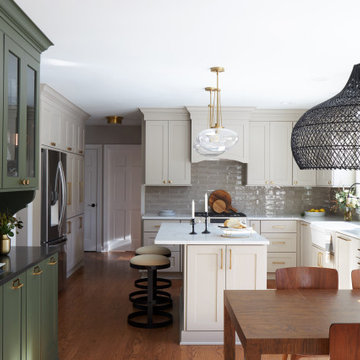
To create their vision, we started with all new framed cabinets with a modified overlay painted in beautiful, understated colors. Our clients were adamant about “no white cabinets.” Instead we used an oyster color for the perimeter and a custom color match to a specific shade of green chosen by the homeowner. The use of a simple color pallet reduces the visual noise and allows the space to feel open and welcoming. We also painted the trim above the cabinets the same color to make the cabinets look taller. The room trim was painted a bright clean white to match the ceiling.
In true English fashion our clients are not coffee drinkers, but they LOVE tea. We created a tea station for them where they can prepare and serve tea. We added plenty of glass to showcase their tea mugs and adapted the cabinetry below to accommodate storage for their tea items. Function is also key for the English kitchen and the homeowners. They requested a deep farmhouse sink and a cabinet devoted to their heavy mixer because they bake a lot. We then got rid of the stovetop on the island and wall oven and replaced both of them with a range located against the far wall. This gives them plenty of space on the island to roll out dough and prepare any number of baked goods. We then removed the bifold pantry doors and created custom built-ins with plenty of usable storage for all their cooking and baking needs.
The client wanted a big change to the dining room but still wanted to use their own furniture and rug. We installed a toile-like wallpaper on the top half of the room and supported it with white wainscot paneling. We also changed out the light fixture, showing us once again that small changes can have a big impact.
As the final touch, we also re-did the powder room to be in line with the rest of the first floor. We had the new vanity painted in the same oyster color as the kitchen cabinets and then covered the walls in a whimsical patterned wallpaper. Although the homeowners like subtle neutral colors they were willing to go a bit bold in the powder room for something unexpected. For more design inspiration go to: www.kitchenstudio-ge.com
 VAULT®
In the Tuscany region of central Italy, a region made famous around the world for its history, landscapes, traditions, artistic legacy and fine wine, perhaps nothing is more universally recognized than the old world villa’s that are nestled into the rolling countryside. Standing at approximately 10,500 square feet, this custom residence has all of the elegance, style and craftsmanship of those old world homes, but with all of the modern amenities of a new modern luxury home. This stunning residence was recognized by the National Association of Home Builders (NAHB) as the best custom built home in the country in 2010, a testament to the skillful designers and craftsmen who brought the homeowners vision into reality.
When Chad Haas, Founder of VAULT (www.vaultgarage.com), a company that prides itself in furnishing some of the most beautiful garages in the world, was brought into the project, the home and garage had already been built. The accolades of the gorgeous villa already awarded. But the homeowner felt that the exterior and interior of the garage lacked architectural harmony with the rest of the home and so he flew Mr. Haas out to visit the space directly so that he could assist hands-on with re-designing a new look and to add furnishings to accessories the space.
“When I first approached the villa from the street, I knew that I’d have my work cut out for me. Everything looked so perfect exactly the way it was designed and built. I questioned myself ‘how was I going to improve upon perfection?’, since remarkable attention was paid to even the smallest of details in the home” asked Haas.
The client’s goal was to engage Haas to design and furnish a garage where he could relax, separate from the home, enjoy his growing car collection and entertain family and friends.
After spending a short weekend together with the home owner to gather his ideas, Haas returned back to his Beaverton, Oregon-based company with a clearer vision: create the ultimate gentlemen’s retreat through the look of a turn-of-a-century Tuscan ‘car barn’.
Absolutely nothing in the garage was overlooked – and it shows. Every design element in the garage for color, texture and material was meticulously thought out to elicit just the right feeling and emotion in everyone that enters what may be one of the most beautifully elegant garages in America, a space commonly overlooked in the construction of homes today.
A main focal point of the exterior of garage is the beautiful view from the courtyard, where all three carriage doors can be seen. While the existing wood doors looked acceptable, it was agreed that something more befitting of the quality and beauty of the home were appropriate. Haas designed luxurious castle-style doors handcrafted from solid Mahogany and bathed in a rich dark brown stain that was complemented by hand-wrought iron grills, clavos and door pull hardware. The double-wide door, in particular, is truly remarkable in both its elegance, as well as its one-of-a-kind operation. “The client was concerned in this area of having mounting hardware and a motor on the ceiling. Because the cars in this area do not get brought out on a regular (daily) basis, the doors open manually by hand and operate accordion style on a track”. The homes main overhead garage doors feature jack-shaft operation which removes the clutter of a motor on the garage ceiling, but offers the convenience of powered operation. These extraordinary, custom-made castle doors look just as beautiful on the inside as the out and their unparalleled design and craftsmanship take the exterior of the home to even greater heights than before.
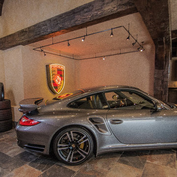
On to the interior, a black and white epoxy coating was stripped and replaced with porcelain tiles that resembled Italian travertine stone. To give the car barn a rustic feeling and a presence that it was older, not modern, Haas worked on the development and concept directly with the home owner to collaborate with a local millwork company that designed and hand-finished substantial wood beams from distressed Doug Fir. All of the walls were hand-plastered by a local artist using straw that was harvested from the immediate area surrounding the home and incorporated into the plaster to give it a rustic antique quality.
Haas conceived and designed a bar area and cabinetry for a work area that pulled inspiration from old ice boxes of the 1920’s that utilized heavy nickel-plated hardware, again to give storage spaces a rustic appearance.
The warm glow from several custom porcelain neon signs, each one meticulously built entirely by hand by VAULT, are dispersed throughout the space and transform the entire room and bring it to life. The client had never previously owned a neon sign before and along with the carriage doors felt that these items have transformed the space more than any other feature. Several antique gas pumps, restored in the client’s favorite petro bran, and a few additional porcelain signs will eventually furnish the rest of the space to complement the clients amazing car collection.
In addition to the countless details that set this showcase garage apart, its ability to seamlessly blend with the rest of the home and the natural, rustic setting of the Colorado Rockies, yet house modern automobiles in a manner in which they feel well placed and belong, is also noteworthy.
GARAGE DESIGN & FURNISHINGS
To learn more about VAULT visit them at: http://www.vaultgarage.com/
And on Facebook: http://www.facebook.com/VaultGarage
PHOTOGRAPHY
All photographs were used with the permission of photographer John Vanderpool (john.vanderpool5@gmail.com)
You can visit John Vanderpool on Facebook at: https://www.facebook.com/JVanderpoolPhotography
ARCHITECTURE
Jerry Gloss, Principal, KGA Architects: http://www.kgarch.com/
HOMEBUILDER
Thomas Sattler Home: http://thomassattlerhomes.com/
VEHICLES
Here is an overview of the cars that were photographed in this article:
1. 2014 Ferrari 458 Italia
2. 2013 Maserati GranTurismo Sport
3. 2007 Porsche 911 GT3 RS (997)
4. 2008 Porsche Cayenne GTS
5. 2008 Porsche GT3 RS
6. 2013 Porsche 911 Turbo S (997)
7. 2014 Porsche Panamera GTS
8. 2013 Ford SVT Raptor (6.2L CrewCab)’
Overview of project reprinted with permission of DuPont Registry.
 Drury Design
THE SETUP
“You have to figure out how to rebuild a life worth living,” Basia Kozub’s client says. Her husband passed away suddenly three years ago. Holidays with family became more important, and she found herself struggling with a 37-year old kitchen that was falling apart. “I made a decision to move forward,” she says. “I went, ‘You know what? I’m redoing the kitchen.'”
The big task of getting started was as easy as having a conversation – literally. Basia was on the job, helping the client sort through priorities, wishes and ideas. Basia’s client is 5′ 4″, likes keeping an eye on the kiddoes in the backyard and wanted certain things to have their own place.
THE REMODEL
The objectives were:
Enlarge and open the space
Find a classic look that incorporates blues
Upgrade to easy-to-use appliances
Hide an office space within the space
Ample storage for dishes
Design challenges:
Uneven window alignment on the back wall
Original kitchen smaller than desired, stuctural concerns if walls to be moved
Keep folks close – figure out seating for entertaining
Main sink in corner is ideal, but windows are hard to reach
Lots of storage needed for dishes, glass collection, pantry items, bar bottles and office supplies
Specific storage needs for oft-used spices and utensils
THE RENEWED SPACE
Design solutions:
Replace back wall windows, establish window size continuity
Take out two walls to open up the space, tall shallow cabinet and a tall filler added to conceal a new header
Large island that seats six easily
Custom corner sink cabinet with recessed edge allows vertically challenged homeowner to reach the windows
Mindful storage planning features: plenty of cabinets, pull-out bar bottle storage, file drawers & cubbies with pocket doors for office appliances, magic corner pullouts, and appliance garages with pocket doors
Shelf behind range for easy access to daily-use spices and oils. Also: spice and utensil pullouts on either side of range
The clients says every priority and wish box got checked. The highly functional design absorbed everything that used to be in that area of the house, but now those things are out of the way.
“In the past, we were all spread out when we gathered for the holidays, because we had to spread out. Now, we’re all in here together, including my 92-year old mother. We’re visiting, cooking, laughing… everyone is here. And I’m really learning how to use these appliances. This kitchen has given me a whole new life.”
Sponsored
Columbus, OH
Hope Restoration & General Contracting
Columbus Design-Build, Kitchen & Bath Remodeling, Historic Renovations
 Sosna Inc
Our clients, a family of professionals with 2 young kids, approached us to renovate their early 2000’s Toronto home to make it better suit the needs of their family. Although they were happy with the Kitchen layout, they requested that we update the existing cabinetry, and add additional cabinetry for increased storage. In the Laundry Room, they needed a storage solution for cleaning materials, and an updated laundry sink. They wanted the Basement to be a comfortable family space to spend time together, and for the kids to have a space to play.
The Kitchen cabinets were dated and starting to fall apart, and the Master En-Suite was dated and awkwardly shaped, with a tight walk-in shower.
In the Basement, the HVAC bulkhead was awkward and unsightly, and the space was not ideal for the kids to play, due to outdated carpeting, and a lack of storage space for their toys.
We spent time getting to know our clients to design a space that optimized functionality and comfort for their family.
In the Kitchen, we kept the existing layout, but added a tall cabinet for pantry and broom storage. A new island was built with a space to accommodate a built-in microwave, to keep it from cluttering the countertop. The new white oak tall cabinets and island cabinets were complimented by light coloured marble-looking quartz countertops and the handmade subway tile backsplash for a fresh, updated look.
In the Master Ensuite, we replaced the large, dated deck-mounted tub with a semi-freestanding tub, tucked nicely into the corner. The extra space this created allowed us to add a walk-in shower without the awkward angle that had existed prior to the renovation. The new walk-in shower featured a ceiling mounted showerhead, and a useful ledge for toiletries. We even had enough space to add a bonus make-up table to match the new double vanity. Both were custom built to be floating for a modern look, and easier maintenance.
In the Laundry Room, we installed the washer and dryer side by side, instead of stacked. This allowed for a long working countertop and upper storage cabinets that were custom built. Additionally, a hanging rack installed above the sink is perfect for drying small items, and the adjustable shelves and dividers in the custom built cabinetry will provide plenty of convenient space to store cleaning materials.
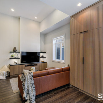
In the Basement, we widened the bulkhead to allow us to center the wall-mounted TV, and added custom media cabinets with floating shelves to accommodate electronics.
The space was made more comfortable for the kids to play with new vinyl heated flooring, and tall cabinets with adjustable shelves, dividers, and deep drawers to keep all of their toys organized.
All of these updates provided our clients with a home that fits their family’s needs and lifestyle.
If your home isn’t functional for your family, contact us to learn more. We’re the Renovator You Can Count On!
 Sosna Inc
Our clients, a family of professionals with 2 young kids, approached us to renovate their early 2000’s Toronto home to make it better suit the needs of their family. Although they were happy with the Kitchen layout, they requested that we update the existing cabinetry, and add additional cabinetry for increased storage. In the Laundry Room, they needed a storage solution for cleaning materials, and an updated laundry sink. They wanted the Basement to be a comfortable family space to spend time together, and for the kids to have a space to play.
The Kitchen cabinets were dated and starting to fall apart, and the Master En-Suite was dated and awkwardly shaped, with a tight walk-in shower.
In the Basement, the HVAC bulkhead was awkward and unsightly, and the space was not ideal for the kids to play, due to outdated carpeting, and a lack of storage space for their toys.
We spent time getting to know our clients to design a space that optimized functionality and comfort for their family.
In the Kitchen, we kept the existing layout, but added a tall cabinet for pantry and broom storage. A new island was built with a space to accommodate a built-in microwave, to keep it from cluttering the countertop. The new white oak tall cabinets and island cabinets were complimented by light coloured marble-looking quartz countertops and the handmade subway tile backsplash for a fresh, updated look.
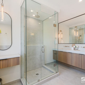
In the Master Ensuite, we replaced the large, dated deck-mounted tub with a semi-freestanding tub, tucked nicely into the corner. The extra space this created allowed us to add a walk-in shower without the awkward angle that had existed prior to the renovation. The new walk-in shower featured a ceiling mounted showerhead, and a useful ledge for toiletries. We even had enough space to add a bonus make-up table to match the new double vanity. Both were custom built to be floating for a modern look, and easier maintenance.
In the Laundry Room, we installed the washer and dryer side by side, instead of stacked. This allowed for a long working countertop and upper storage cabinets that were custom built. Additionally, a hanging rack installed above the sink is perfect for drying small items, and the adjustable shelves and dividers in the custom built cabinetry will provide plenty of convenient space to store cleaning materials.
In the Basement, we widened the bulkhead to allow us to center the wall-mounted TV, and added custom media cabinets with floating shelves to accommodate electronics.
The space was made more comfortable for the kids to play with new vinyl heated flooring, and tall cabinets with adjustable shelves, dividers, and deep drawers to keep all of their toys organized.
All of these updates provided our clients with a home that fits their family’s needs and lifestyle.
If your home isn’t functional for your family, contact us to learn more. We’re the Renovator You Can Count On!
 Drury Design
THE SETUP
“You have to figure out how to rebuild a life worth living,” Basia Kozub’s client says. Her husband passed away suddenly three years ago. Holidays with family became more important, and she found herself struggling with a 37-year old kitchen that was falling apart. “I made a decision to move forward,” she says. “I went, ‘You know what? I’m redoing the kitchen.'”
The big task of getting started was as easy as having a conversation – literally. Basia was on the job, helping the client sort through priorities, wishes and ideas. Basia’s client is 5′ 4″, likes keeping an eye on the kiddoes in the backyard and wanted certain things to have their own place.
THE REMODEL
The objectives were:
Enlarge and open the space
Find a classic look that incorporates blues
Upgrade to easy-to-use appliances
Hide an office space within the space
Ample storage for dishes
Design challenges:
Uneven window alignment on the back wall
Original kitchen smaller than desired, stuctural concerns if walls to be moved
Keep folks close – figure out seating for entertaining
Main sink in corner is ideal, but windows are hard to reach
Lots of storage needed for dishes, glass collection, pantry items, bar bottles and office supplies
Specific storage needs for oft-used spices and utensils
THE RENEWED SPACE
Design solutions:
Replace back wall windows, establish window size continuity
Take out two walls to open up the space, tall shallow cabinet and a tall filler added to conceal a new header
Large island that seats six easily
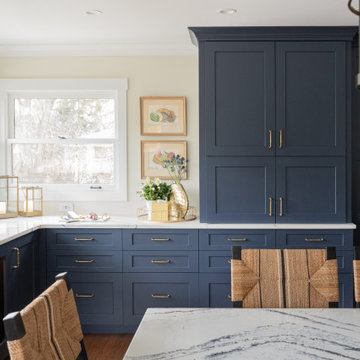
Custom corner sink cabinet with recessed edge allows vertically challenged homeowner to reach the windows
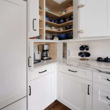
Mindful storage planning features: plenty of cabinets, pull-out bar bottle storage, file drawers & cubbies with pocket doors for office appliances, magic corner pullouts, and appliance garages with pocket doors
Shelf behind range for easy access to daily-use spices and oils. Also: spice and utensil pullouts on either side of range
The clients says every priority and wish box got checked. The highly functional design absorbed everything that used to be in that area of the house, but now those things are out of the way.
“In the past, we were all spread out when we gathered for the holidays, because we had to spread out. Now, we’re all in here together, including my 92-year old mother. We’re visiting, cooking, laughing… everyone is here. And I’m really learning how to use these appliances. This kitchen has given me a whole new life.”
92