
Search results for "Reports" in Home Design Ideas
 Custom Design & Construction
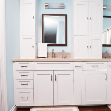
Our homeowners came to us in need of a bathroom remodel. Unique to this design is that the toilet and shower are in a separate room from the vanity. The space is separated by a pocket door. The vanity area has no door to the master bedroom; it is an open concept. This makes the vanity area almost serve as a dressing area due to the proximity of the walk in closet (and open concept). The shower offers an oversized bench and niche. The homeowners enjoy the rain shower head which is ceiling mounted. They also have a hand held body sprayer. We partnered with DeWils Cabinetry and Cambria Quartz for the vanity area. Double vanities, with full height tower cabinets, complete with glass doors in the top shelf, are not only decorative but offer tons of organized storage for toiletries. One of the other features we love about this cabinetry is the use of a spice rack style cabinet pull out. Our clients report that it is the perfect size for their toiletries
https://www.houzz.com/pro/cambriaquartz/cambria
https://www.houzz.com/pro/dewils/dewils-custom-cabinetry
 Advance Design Studio, Ltd.
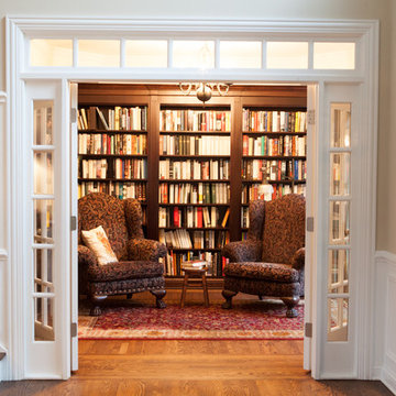
Home owners Ken & Bonnie never used their dining room. What they really wanted was a traditional library room to house their large collection of prized books! During their first floor facelift and kitchen renovation, Advance Design also created an elegant library room filled with beautiful architectural details that flowed effortlessly with the rest of the home’s stately design and thoughtful details.
“Advance Design’s master carpenter was a very patient perfectionist, cutting each and every little piece of trim until it came together with these intricate wood architectural details that we absolutely love!” reports Bonnie. “Our dining room was just a wasted room that we never used. We needed a place to store and display our extensive book collection, and now we have this amazing room that is an unexpected “wow” factor when guests walk in our front door”.
Advance Design placed hidden lighting inconspicuously to break to monotony of the books in a decorative shelf area where the family posts photos of children and family at special life events. The room looks out over the beautifully manicured front garden near the home’s entry, and is a most peaceful place to pull up a chair, drink some tea, and enjoy a good read.
Photographer: Joe Nowak
 FOUR POINT DESIGN BUILD INC
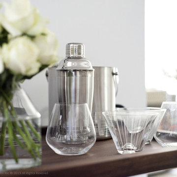
DESIGN BUILD REMODEL | DINING ROOM Transformation | FOUR POINT DESIGN BUILD INC | Part Five
This completely transformed 3,500+ sf family dream home sits atop the gorgeous hills of Calabasas, CA and celebrates the strategic and eclectic merging of contemporary and mid-century modern styles with the earthy touches of a world traveler!
AS SEEN IN Better Homes and Gardens | BEFORE & AFTER | 10 page feature and COVER | Spring 2016
To see more of this fantastic transformation, watch for the launch of our NEW website and blog THE FOUR POINT REPORT, where we celebrate this and other incredible design build journey! Launching September 2016.
Photography by Riley Jamison
#DiningRoom #remodel #LAinteriordesigner #builder #dreamproject #oneinamillion
Find the right local pro for your project
 Custom Design & Construction
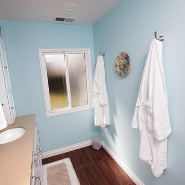
Our homeowners came to us in need of a bathroom remodel. Unique to this design is that the toilet and shower are in a separate room from the vanity. The space is separated by a pocket door. The vanity area has no door to the master bedroom; it is an open concept. This makes the vanity area almost serve as a dressing area due to the proximity of the walk in closet (and open concept). The shower offers an oversized bench and niche. The homeowners enjoy the rain shower head which is ceiling mounted. They also have a hand held body sprayer. We partnered with DeWils Cabinetry and Cambria Quartz for the vanity area. Double vanities, with full height tower cabinets, complete with glass doors in the top shelf, are not only decorative but offer tons of organized storage for toiletries. One of the other features we love about this cabinetry is the use of a spice rack style cabinet pull out. Our clients report that it is the perfect size for their toiletries
https://www.houzz.com/pro/cambriaquartz/cambria
https://www.houzz.com/pro/dewils/dewils-custom-cabinetry
 FOUR POINT DESIGN BUILD INC
DESIGN BUILD REMODEL | DINING ROOM Transformation | FOUR POINT DESIGN BUILD INC | Part Five
This completely transformed 3,500+ sf family dream home sits atop the gorgeous hills of Calabasas, CA and celebrates the strategic and eclectic merging of contemporary and mid-century modern styles with the earthy touches of a world traveler!
AS SEEN IN Better Homes and Gardens | BEFORE & AFTER | 10 page feature and COVER | Spring 2016
To see more of this fantastic transformation, watch for the launch of our NEW website and blog THE FOUR POINT REPORT, where we celebrate this and other incredible design build journey! Launching September 2016.
Photography by Riley Jamison
#DiningRoom #remodel #LAinteriordesigner #builder #dreamproject #oneinamillion
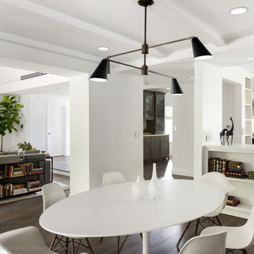 FOUR POINT DESIGN BUILD INC
DESIGN BUILD REMODEL | DINING ROOM Transformation | FOUR POINT DESIGN BUILD INC | Part Five
This completely transformed 3,500+ sf family dream home sits atop the gorgeous hills of Calabasas, CA and celebrates the strategic and eclectic merging of contemporary and mid-century modern styles with the earthy touches of a world traveler!
AS SEEN IN Better Homes and Gardens | BEFORE & AFTER | 10 page feature and COVER | Spring 2016
To see more of this fantastic transformation, watch for the launch of our NEW website and blog THE FOUR POINT REPORT, where we celebrate this and other incredible design build journey! Launching September 2016.
Photography by Riley Jamison
#DiningRoom #remodel #LAinteriordesigner #builder #dreamproject #oneinamillion
 Advance Design Studio, Ltd.
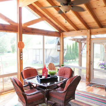
When Bill and Jackie Fox decided it was time for a 3 Season room, they worked with Todd Jurs at Advance Design Studio to make their back yard dream come true. Situated on an acre lot in Gilberts, the Fox’s wanted to enjoy their yard year round, get away from the mosquitoes, and enhance their home’s living space with an indoor/outdoor space the whole family could enjoy.
“Todd and his team at Advance Design Studio did an outstanding job meeting my needs. Todd did an excellent job helping us determine what we needed and how to design the space”, says Bill.
The 15’ x 18’ 3 Season’s Room was designed with an open end gable roof, exposing structural open beam cedar rafters and a beautiful tongue and groove Knotty Pine ceiling. The floor is a tongue and groove Douglas Fir, and amenities include a ceiling fan, a wall mounted TV and an outdoor pergola. Adjustable plexi-glass windows can be opened and closed for ease of keeping the space clean, and use in the cooler months. “With this year’s mild seasons, we have actually used our 3 season’s room year round and have really enjoyed it”, reports Bill.
“They built us a beautiful 3-season room. Everyone involved was great. Our main builder DJ, was quite a craftsman. Josh our Project Manager was excellent. The final look of the project was outstanding. We could not be happier with the overall look and finished result. I have already recommended Advance Design Studio to my friends”, says Bill Fox.
Photographer: Joe Nowak
 Olamar Interiors
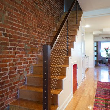
This client came to us with a unique challenge: create a modern design that matches her fun and funky personality but to make it as "green" and chemical free as possible. We rose to the challenge, researching the best options for sustainable, green and chemical free furnishings. The upholstery pieces are made from sustainable and chemical free materials, the dining table is made of sustainable wood with a chemical free finish. The rugs are from a fair-trade company that supports education for women in India. The client had hired a Feng Shui expert to provide her with a report which we used to design the space. The wallpaper behind the living room sofa is custom designed and custom-made. It is a map made up of hundred of small photos that the homeowner provided to us. It represents the area in her home that will bring travel and connect her to the people she loves. The large, colorful art piece in the dining area is hung in the area of the home that will bring joy around family and children. The hearts and pink/red colored wallpaper in the den will evoke love and relationships.
The client has a colorful, fun personality and we wanted to infuse the design with it. A white backdrop allows all of the pinks, reds, navy blues and turquoises to pop, creating a lively, modern feeling. The textures in the floor and wall coverings and in the fabrics create a lived in, collected feeling and add a touch of bohemian chic style. The new modern cable and walnut stair banister is in keeping with the original modern feel of the row house and keeps the narrow staircase from feeling tight and closed in.
This was a fun, creative and unique project for us. This particular client was one of Olamar's first clients eight years ago when we first opened our doors. At that time the house was nothing but a condemned shell that the client renovated, with our assistance. At that time we designed the kitchen, which is still in excellent condition and still looks amazing!
Photographer: Greg Tinius
 Custom Design & Construction
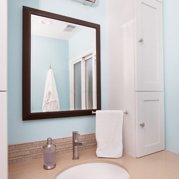
Our homeowners came to us in need of a bathroom remodel. Unique to this design is that the toilet and shower are in a separate room from the vanity. The space is separated by a pocket door. The vanity area has no door to the master bedroom; it is an open concept. This makes the vanity area almost serve as a dressing area due to the proximity of the walk in closet (and open concept). The shower offers an oversized bench and niche. The homeowners enjoy the rain shower head which is ceiling mounted. They also have a hand held body sprayer. We partnered with DeWils Cabinetry and Cambria Quartz for the vanity area. Double vanities, with full height tower cabinets, complete with glass doors in the top shelf, are not only decorative but offer tons of organized storage for toiletries. One of the other features we love about this cabinetry is the use of a spice rack style cabinet pull out. Our clients report that it is the perfect size for their toiletries
https://www.houzz.com/pro/cambriaquartz/cambria
https://www.houzz.com/pro/dewils/dewils-custom-cabinetry
 Pound Ridge Painting Co.
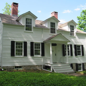
Front of house by Patrick Reddy
Mid-sized traditional white two-story wood exterior home idea in New York
Mid-sized traditional white two-story wood exterior home idea in New York
 Village Home Stores
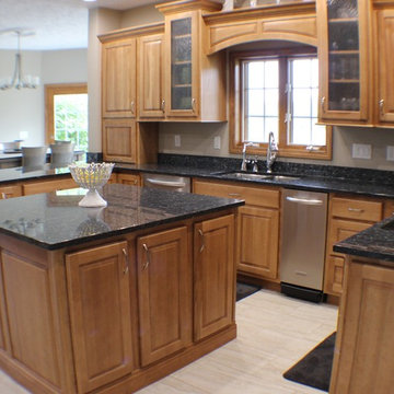
A large square island and a peninsula offer multiple spaces for prep and a raised-panel valance adds interest above the sink
Open concept kitchen - mid-sized traditional u-shaped ceramic tile open concept kitchen idea in Chicago with an undermount sink, raised-panel cabinets, light wood cabinets, granite countertops, stainless steel appliances and an island
Open concept kitchen - mid-sized traditional u-shaped ceramic tile open concept kitchen idea in Chicago with an undermount sink, raised-panel cabinets, light wood cabinets, granite countertops, stainless steel appliances and an island
 FOUR POINT DESIGN BUILD INC
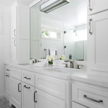
DESIGN BUILD REMODEL | Bathroom Remodel | FOUR POINT DESIGN BUILD INC | Part Four
This completely transformed 3500+ sf family dream home sits atop the gorgeous hills of Calabasas CA and celebrates the strategic and eclectic merging of contemporary and classic forms, with mid-century modern accents earthy touches of a world traveler.
Home to a very active family, when considering the needs our client's beautiful young daughter, our focus was on function, longevity, openness, daylight, privacy, and the future; As we planned ahead to a time when this bathroom might serve as another master suite!
AS SEEN IN Better Homes and Gardens | BEFORE & AFTER | 10 page feature and COVER | Spring 2016
To see more of this fantastic transformation, watch for the launch of our NEW website and blog THE FOUR POINT REPORT, where we celebrate this and other incredible design build journey! Launching September 2016.
Photography by Riley Jamison
#bathroom #remodel #LAinteriordesigner #builder #dreamproject #oneinamillion
 Olamar Interiors
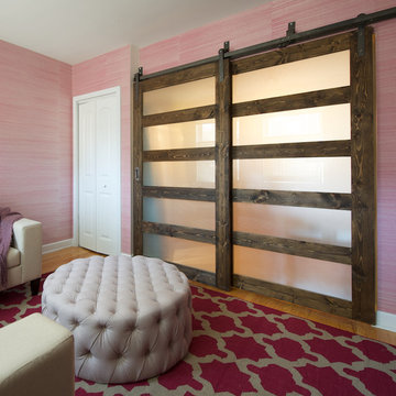
This client came to us with a unique challenge: create a modern design that matches her fun and funky personality but to make it as "green" and chemical free as possible. We rose to the challenge, researching the best options for sustainable, green and chemical free furnishings. The upholstery pieces are made from sustainable and chemical free materials, the dining table is made of sustainable wood with a chemical free finish. The rugs are from a fair-trade company that supports education for women in India. The client had hired a Feng Shui expert to provide her with a report which we used to design the space. The wallpaper behind the living room sofa is custom designed and custom-made. It is a map made up of hundred of small photos that the homeowner provided to us. It represents the area in her home that will bring travel and connect her to the people she loves. The large, colorful art piece in the dining area is hung in the area of the home that will bring joy around family and children. The hearts and pink/red colored wallpaper in the den will evoke love and relationships.
The client has a colorful, fun personality and we wanted to infuse the design with it. A white backdrop allows all of the pinks, reds, navy blues and turquoises to pop, creating a lively, modern feeling. The textures in the floor and wall coverings and in the fabrics create a lived in, collected feeling and add a touch of bohemian chic style. The new modern cable and walnut stair banister is in keeping with the original modern feel of the row house and keeps the narrow staircase from feeling tight and closed in.
This was a fun, creative and unique project for us. This particular client was one of Olamar's first clients eight years ago when we first opened our doors. At that time the house was nothing but a condemned shell that the client renovated, with our assistance. At that time we designed the kitchen, which is still in excellent condition and still looks amazing!
Photographer: Greg Tinius
 Longjin Craft
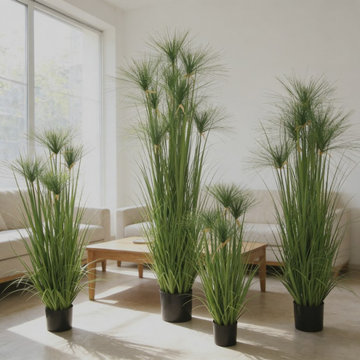
The Art of Wholesale Artificial Grass Potted Plants The demand is skyrocketing. A recent report shows a staggering 35% increase in the wholesale market for artificial potted plants in the last two years. How did we get here? DIY enthusiasts and retail designers alike are gravitating toward artificial options like never before. For instance, a pop-up shop in Austin showcased Longjin Craft’s artificial pampas grass, achieving record sales within the first week. Just imagine the impact such products can have on urban spaces where natural greenery struggles to thrive. Quality varies significantly. Some manufacturers cut corners, using inferior materials that fade or crumble within months. In stark contrast, premium brands such as Longjin Craft utilize advanced UV-resistant technology, ensuring durability and vibrant colors. The weight of high-quality polymer can feel surprising when comparing. Light as a feather? Not exactly. Some high-end options weigh substantially more, signifying their robust build. Trends and Innovations in the Market What’s trending? Sustainability, of course! Buyers are more eco-conscious. Reports indicate over 50% of consumers prefer brands that highlight their sustainability practices. Enter the world of recyclable artificial plants. Brands are innovating, shifting materials from merely synthetic to environmentally friendly composites. How can you not be impressed by this shift? The future looks greener—ironically speaking. Retailers are embracing unique selling propositions to set their brands apart. Take, for example, customizable potted plant arrangements. Imagine a landscape designer creating a bespoke setup featuring various plant species, with artificial variants like those from Longjin Craft fitting seamlessly into the surroundings. It’s a game-changer, keeping costs down while making spaces visually stunning. Practical Applications in Design Interior design is evolving. From coffee shops to luxury hotels, artificial potted grass is popping up everywhere. One case study revealed that a Southern California cafe increased customer dwell time by 25% after introducing strategically placed artificial plants. Imagine sipping your latte surrounded by lush greenery—all without the maintenance headaches. Commercial settings also benefit massively. Large office complexes are opting for artificial potted plants to create inviting environments. The rationale? Reduces maintenance costs and boosts employee morale. Can you believe a single office could save thousands annually by replacing natural greenery with artificial options? Longjin Craft has increasingly become a go-to choice for these installations, thanks to their reputation for striking aesthetics and quality.
 Advance Design Studio, Ltd.
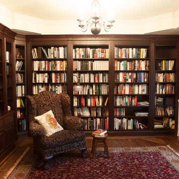
Home owners Ken & Bonnie never used their dining room. What they really wanted was a traditional library room to house their large collection of prized books! During their first floor facelift and kitchen renovation, Advance Design also created an elegant library room filled with beautiful architectural details that flowed effortlessly with the rest of the home’s stately design and thoughtful details.
“Advance Design’s master carpenter was a very patient perfectionist, cutting each and every little piece of trim until it came together with these intricate wood architectural details that we absolutely love!” reports Bonnie. “Our dining room was just a wasted room that we never used. We needed a place to store and display our extensive book collection, and now we have this amazing room that is an unexpected “wow” factor when guests walk in our front door”.
Advance Design placed hidden lighting inconspicuously to break to monotony of the books in a decorative shelf area where the family posts photos of children and family at special life events. The room looks out over the beautifully manicured front garden near the home’s entry, and is a most peaceful place to pull up a chair, drink some tea, and enjoy a good read.
Photographer: Joe Nowak
 Pro-Tection Seattle
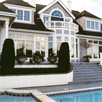
Mid-sized traditional gray two-story wood gable roof idea in Seattle with a shingle roof
 Advance Design Studio, Ltd.
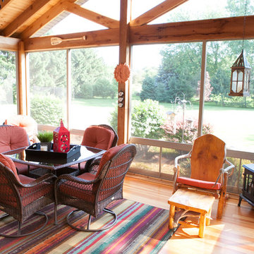
When Bill and Jackie Fox decided it was time for a 3 Season room, they worked with Todd Jurs at Advance Design Studio to make their back yard dream come true. Situated on an acre lot in Gilberts, the Fox’s wanted to enjoy their yard year round, get away from the mosquitoes, and enhance their home’s living space with an indoor/outdoor space the whole family could enjoy.
“Todd and his team at Advance Design Studio did an outstanding job meeting my needs. Todd did an excellent job helping us determine what we needed and how to design the space”, says Bill.
The 15’ x 18’ 3 Season’s Room was designed with an open end gable roof, exposing structural open beam cedar rafters and a beautiful tongue and groove Knotty Pine ceiling. The floor is a tongue and groove Douglas Fir, and amenities include a ceiling fan, a wall mounted TV and an outdoor pergola. Adjustable plexi-glass windows can be opened and closed for ease of keeping the space clean, and use in the cooler months. “With this year’s mild seasons, we have actually used our 3 season’s room year round and have really enjoyed it”, reports Bill.
“They built us a beautiful 3-season room. Everyone involved was great. Our main builder DJ, was quite a craftsman. Josh our Project Manager was excellent. The final look of the project was outstanding. We could not be happier with the overall look and finished result. I have already recommended Advance Design Studio to my friends”, says Bill Fox.
Photographer: Joe Nowak
 The Gall Group: Design | Build | Remodel
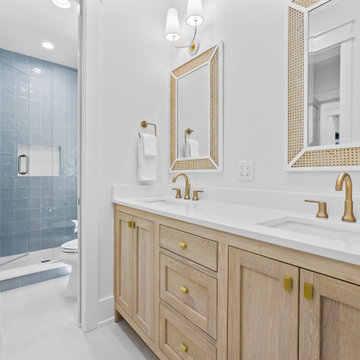
This first floor guest bathroom also functions as the pool bathroom. The blue zellige shower tile coordinates with the Anna French modern coastal wave wallpaper in the guest bedroom.
 ZeroEnergy Design
Lincoln Farmhouse
LEED-H Platinum, Net-Positive Energy
OVERVIEW. This LEED Platinum certified modern farmhouse ties into the cultural landscape of Lincoln, Massachusetts - a town known for its rich history, farming traditions, conservation efforts, and visionary architecture. The goal was to design and build a new single family home on 1.8 acres that respects the neighborhood’s agrarian roots, produces more energy than it consumes, and provides the family with flexible spaces to live-play-work-entertain. The resulting 2,800 SF home is proof that families do not need to compromise on style, space or comfort in a highly energy-efficient and healthy home.
CONNECTION TO NATURE. The attached garage is ubiquitous in new construction in New England’s cold climate. This home’s barn-inspired garage is intentionally detached from the main dwelling. A covered walkway connects the two structures, creating an intentional connection with the outdoors between auto and home.
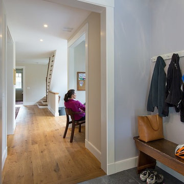
FUNCTIONAL FLEXIBILITY. With a modest footprint, each space must serve a specific use, but also be flexible for atypical scenarios. The Mudroom serves everyday use for the couple and their children, but is also easy to tidy up to receive guests, eliminating the need for two entries found in most homes. A workspace is conveniently located off the mudroom; it looks out on to the back yard to supervise the children and can be closed off with a sliding door when not in use. The Away Room opens up to the Living Room for everyday use; it can be closed off with its oversized pocket door for secondary use as a guest bedroom with en suite bath.
NET POSITIVE ENERGY. The all-electric home consumes 70% less energy than a code-built house, and with measured energy data produces 48% more energy annually than it consumes, making it a 'net positive' home. Thick walls and roofs lack thermal bridging, windows are high performance, triple-glazed, and a continuous air barrier yields minimal leakage (0.27ACH50) making the home among the tightest in the US. Systems include an air source heat pump, an energy recovery ventilator, and a 13.1kW photovoltaic system to offset consumption and support future electric cars.
ACTUAL PERFORMANCE. -6.3 kBtu/sf/yr Energy Use Intensity (Actual monitored project data reported for the firm’s 2016 AIA 2030 Commitment. Average single family home is 52.0 kBtu/sf/yr.)
o 10,900 kwh total consumption (8.5 kbtu/ft2 EUI)
o 16,200 kwh total production
o 5,300 kwh net surplus, equivalent to 15,000-25,000 electric car miles per year. 48% net positive.
WATER EFFICIENCY. Plumbing fixtures and water closets consume a mere 60% of the federal standard, while high efficiency appliances such as the dishwasher and clothes washer also reduce consumption rates.
FOOD PRODUCTION. After clearing all invasive species, apple, pear, peach and cherry trees were planted. Future plans include blueberry, raspberry and strawberry bushes, along with raised beds for vegetable gardening. The house also offers a below ground root cellar, built outside the home's thermal envelope, to gain the passive benefit of long term energy-free food storage.
RESILIENCY. The home's ability to weather unforeseen challenges is predictable - it will fare well. The super-insulated envelope means during a winter storm with power outage, heat loss will be slow - taking days to drop to 60 degrees even with no heat source. During normal conditions, reduced energy consumption plus energy production means shelter from the burden of utility costs. Surplus production can power electric cars & appliances. The home exceeds snow & wind structural requirements, plus far surpasses standard construction for long term durability planning.
ARCHITECT: ZeroEnergy Design http://zeroenergy.com/lincoln-farmhouse
CONTRACTOR: Thoughtforms http://thoughtforms-corp.com/
PHOTOGRAPHER: Chuck Choi http://www.chuckchoi.com/
 FOUR POINT DESIGN BUILD INC
DESIGN BUILD REMODEL | Bathroom Remodel | FOUR POINT DESIGN BUILD INC | Part Four
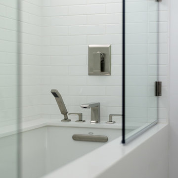
This completely transformed 3500+ sf family dream home sits atop the gorgeous hills of Calabasas CA and celebrates the strategic and eclectic merging of contemporary and classic forms, with mid-century modern accents earthy touches of a world traveler.
Home to a very active family, when considering the needs our client's beautiful young daughter, our focus was on function, longevity, openness, daylight, privacy, and the future; As we planned ahead to a time when this bathroom might serve as another master suite!
AS SEEN IN Better Homes and Gardens | BEFORE & AFTER | 10 page feature and COVER | Spring 2016
To see more of this fantastic transformation, watch for the launch of our NEW website and blog THE FOUR POINT REPORT, where we celebrate this and other incredible design build journey! Launching September 2016.
Photography by Riley Jamison
#bathroom #remodel #LAinteriordesigner #builder #dreamproject #oneinamillion
40