
Search results for "Reposition" in Home Design Ideas
 RAJ Kitchen and Bath, LLC
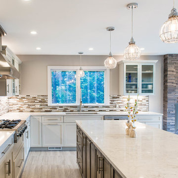
There were a few difficulties in making this kitchen any better than how it was. There was a separate staircase that had access to the second floor which was located in the kitchen. This left just enough room to push the dining room to one side. Then, there was the porch. A really nice panoramic view of the back, but was somehow under-used by the family during the summer months. Then, it was the size of the kitchen. It simply was way too small for a growing family, and while it had a peninsular in place, the flow just didn’t work. I remember watching them one day demonstrating how awkward it was using the kitchen. We got it! We had our marching orders to go and figure out how to make this kitchen work for this family.
Everything in the room was fair play. The design was done to make the kitchen very open. For a few ideas, we incorporated the porch in the kitchen by using the nana wall idea but it ended up being too cost prohibitive to do so. We then decided to do a permanent fix by using a commercial glass wall application. Once we figured that out, we moved back inside and removed the staircase. This gave us two added benefits. One allowed us to really reconfigure the kitchen and the other opened up the second floor for a huge built in closet system.
We relocated the windows, added a fire place with a built In TV above. From there, it was onto the kitchen itself which contained a huge Island with seating, large kitchen sink and built in appliances which was set up in a way to take advantage of the new layout. We re-positioned the kitchen facing the beautiful views outside rather than looking towards a wall. Now, when you enter the house up the entry stairs, the kitchen now draws you into the magnificent new open space. This is now setup for entertaining, relaxation, hanging out and most of all, preparing meals in a room where you only have to leave if you want to.
This one was all about the design. Design was what made this space. Setting this space up for success was crucial, and this kitchen is a great example of how design can cover a multitude of sins in Kitchen designs.
… Just close your eyes for a second and imagine waking up one winter morning and having a cup of coffee and watching the snow fall through those huge windows, leaning up against those 3D feature walls while watching the kids sitting around the table enjoying those warm radiant heated floors in this spacious kitchen…..
 DIGSdesign
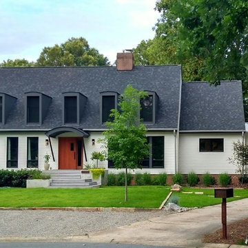
the house today. lower level windows repositioned. redesigned dormers painted to recede into the shingles. new rain canopy at entry. new wood steps with concrete planters at entry. new cement board siding. new side entry on right. red brick chimney a nod to the existing structure.
 DRAPES & DECOR
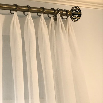
This was a renovation project for a 12 year old girl who outgrown her nursery style bedroom and desired new more grown up look with some blue colors and gold accents. We started with selecting a gorgeous chandelier to add some charm and character to the room. We've decided to keep the pale blue walls and add some striking accent colors in bedding and other accessory. We've placed a custom made monogram in navy/teal color and repeated this color in a new shaggy area rug and velvet euro shams. We have added brand new sheer curtains with a gold/grass hardware and repeated these finishes in wall art on the adjacent wall and also placed a desk lamp in gold/brass on the desk. We have repositioned the desk from a different wall and placed by the bed to serve as a nightstand and as a better homework space by the window. The bedding added lots of interest in patterns, color and texture.
Find the right local pro for your project

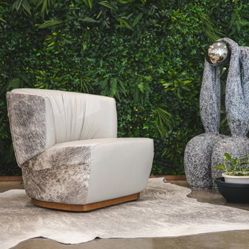
 Luxury Cowhides
A leather swivel barrel chair with cowhide accents offers a unique fusion of sophistication and rustic flair. The swivel feature enhances versatility, allowing for effortless repositioning to suit various seating arrangements. The barrel design provides enveloping comfort, while the cowhide accents add a touch of natural charm and individuality. Perfect for adding a statement piece to any room, this chair blends luxury and ruggedness seamlessly, making it a stylish and functional addition to your home.

 Gayler Design Build
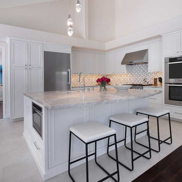
To maximize countertop space, we repositioned a doorway that separated the dining room and kitchen, streamlining traffic flow and enhancing the connection between these vital spaces.
 Mosscreek Designs Canada Inc.
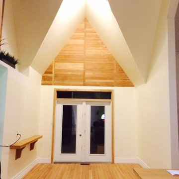
Former baptismal room opened to new kitchen space situated on former altar. Flooring pulled up, re-planed, re-positioned, re-sanded and re-finished.
 Home Staging 4 Success
Photo Credit: John Griffis of Griffis Media
Styled by Cheryl Trudell of HS4S
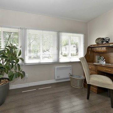
This desk was re-positioned from the Living Room into this room, originally decorated with a small leather love seat. With a stunning view of a large pond, the function was transformed into a inviting office area.
 Drury Design
THE SETUP
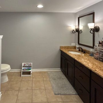
The original primary bathroom was characterized by a disjointed and segmented layout. The shower featured a bulky glass-block enclosure that overwhelmed the space visually. There was a considerable amount of open, unused space, and despite having a his and hers vanity, the arrangement lacked personal space for each user, as they shared the conjoined space between the sinks. The toilet was inconveniently located right by the door, with a half-wall partition meant to provide privacy but instead contributing to a cramped and unbalanced feel. Overall, the bathroom’s layout and design were fragmented, failing to make the most of the available space and lacking adequate storage solutions.
Design objectives:
- Reconfigure the layout to enhance functionality and flow.
- Create an elegant, upscale aesthetic that is light and bright.
- Incorporate specialized storage solutions for female hair care needs.
- Increase overall storage capacity.
- Develop a spa-like shower experience.
- Provide a significant wow factor to the space.
THE REMODEL
Design challenges to be solved:
- Repositioning the toilet to a more suitable location.
- Designing hair care storage solutions without cluttering the elegant space.
- Balancing an upscale, elegant design with a feminine touch in the color palette.
- Increasing the brightness of the room without adding windows.
- Completely replacing the existing shower to create a spa-like experience.
- Planning new storage solutions without adding bulkiness or clutter to the cabinetry.
THE RENEWED SPACE
Design solutions:
Toilet Relocation: Moved the toilet by the window, creating a better overall layout that also opened up two full walls for cabinetry and storage solutions.
Specialized Vanity Storage: The left side of the left vanity is the wife’s. Open shelves facing across the vanity can be used for decorative or daily needs items. Pull-out docking drawers with power outlets and metal basins handle hot hair appliances.
Bright and Elegant Color Scheme: White cabinets, countertops, floors, and shower walls keep the space bright. The just-off-white wall color with a hint of pink adds a feminine touch. Thin wainscoting with white trim offers traditional-leaning elegance.
Layered Lighting Strategy: Ceiling can lights, sconces, lighted mirrors, and toe-kick lighting were installed. Natural light-rated bulbs keep the space bright and natural-feeling.
Spa-Like Shower: An extra-large shower was created using the same floor tile materials for continuity. Equipped with a Kohler Anthem system with a shower head, hand-held, and four body sprays. His and Hers niches for separate body care product storage.
Enhanced Storage Solutions: Added a linen cabinet within the vanity area for efficient storage of towels and bathroom essentials.
This elegant bathroom feels incredibly spacious now. The color palette and lights keep the room bright and cheery. Gold fixtures, the herringbone pattern on the floor, and exquisite trim work add an elegant touch. With the husband and wife having their own vanity wall sections joined at the corner, each user truly has their own space within the space. The clients are very happy with the final result.
 Albers Design LLC
A previous client (Big Wood Lane) reached out to us to help design a remodel of a recently purchased on the south shore of Lake Minnetonka. The home had grown organically since its original construction in 1945. It had evolved over time to accommodate the needs of its numerous owners. Our client brought a new set of needs to the home that included a desire to make the lake home a comfortable destination for family and friends.
The project consisted of reconfiguring an outdated, inefficient kitchen, expansion of the bedroom wing to include individual bathrooms for bedrooms and redesign of the central stair guard rail.
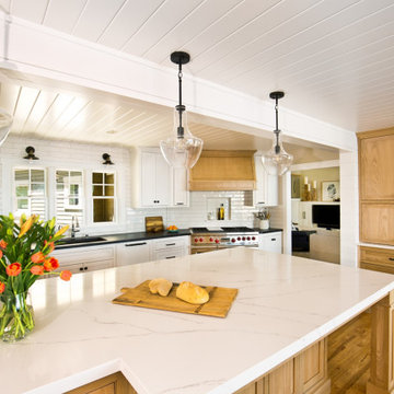
The redesign of the kitchen included repositioning major appliances for greater efficiency, more seating at an enlarged island, a new pantry, and expanded views to the lake. The expansion of the bedroom wing included eliminating a three-season porch on top of the garage on the inland side of the home. The space above the garage roof was enclosed and turned into dedicated bathrooms for each bedroom. These bathrooms are accessible only from the bathrooms which provide privacy and convenience to visitors.
 M-Squared Contracting Inc.
Believe it or not, this beautiful Roncesvalles home was once carved into three separate apartments. As a result, central to this renovation was the need to create a floor plan with a staircase to access all floors, space for a master bedroom and spacious ensuite on the second floor.
The kitchen was also repositioned from the back of the house to the front. It features a curved leather banquette nestled in the bay window, floor to ceiling millwork with a full pantry, integrated appliances, panel ready Sub Zero and expansive storage.
Custom fir windows and an oversized lift and slide glass door were used across the back of the house to bring in the light, call attention to the lush surroundings and provide access to the massive deck clad in thermally modified ash.
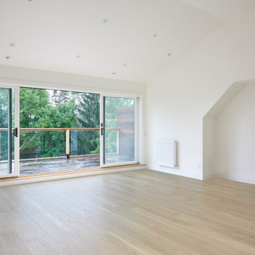
Now reclaimed as a single family home, the dwelling includes 4 bedrooms, 3 baths, a main floor mud room and an open, airy yoga retreat on the third floor with walkout deck and sweeping views of the backyard.
 RAJ Kitchen and Bath, LLC
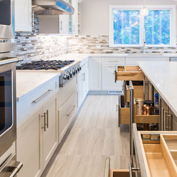
There were a few difficulties in making this kitchen any better than how it was. There was a separate staircase that had access to the second floor which was located in the kitchen. This left just enough room to push the dining room to one side. Then, there was the porch. A really nice panoramic view of the back, but was somehow under-used by the family during the summer months. Then, it was the size of the kitchen. It simply was way too small for a growing family, and while it had a peninsular in place, the flow just didn’t work. I remember watching them one day demonstrating how awkward it was using the kitchen. We got it! We had our marching orders to go and figure out how to make this kitchen work for this family.
Everything in the room was fair play. The design was done to make the kitchen very open. For a few ideas, we incorporated the porch in the kitchen by using the nana wall idea but it ended up being too cost prohibitive to do so. We then decided to do a permanent fix by using a commercial glass wall application. Once we figured that out, we moved back inside and removed the staircase. This gave us two added benefits. One allowed us to really reconfigure the kitchen and the other opened up the second floor for a huge built in closet system.
We relocated the windows, added a fire place with a built In TV above. From there, it was onto the kitchen itself which contained a huge Island with seating, large kitchen sink and built in appliances which was set up in a way to take advantage of the new layout. We re-positioned the kitchen facing the beautiful views outside rather than looking towards a wall. Now, when you enter the house up the entry stairs, the kitchen now draws you into the magnificent new open space. This is now setup for entertaining, relaxation, hanging out and most of all, preparing meals in a room where you only have to leave if you want to.
This one was all about the design. Design was what made this space. Setting this space up for success was crucial, and this kitchen is a great example of how design can cover a multitude of sins in Kitchen designs.
… Just close your eyes for a second and imagine waking up one winter morning and having a cup of coffee and watching the snow fall through those huge windows, leaning up against those 3D feature walls while watching the kids sitting around the table enjoying those warm radiant heated floors in this spacious kitchen…..
 RAJ Kitchen and Bath, LLC
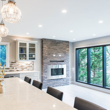
There were a few difficulties in making this kitchen any better than how it was. There was a separate staircase that had access to the second floor which was located in the kitchen. This left just enough room to push the dining room to one side. Then, there was the porch. A really nice panoramic view of the back, but was somehow under-used by the family during the summer months. Then, it was the size of the kitchen. It simply was way too small for a growing family, and while it had a peninsular in place, the flow just didn’t work. I remember watching them one day demonstrating how awkward it was using the kitchen. We got it! We had our marching orders to go and figure out how to make this kitchen work for this family.
Everything in the room was fair play. The design was done to make the kitchen very open. For a few ideas, we incorporated the porch in the kitchen by using the nana wall idea but it ended up being too cost prohibitive to do so. We then decided to do a permanent fix by using a commercial glass wall application. Once we figured that out, we moved back inside and removed the staircase. This gave us two added benefits. One allowed us to really reconfigure the kitchen and the other opened up the second floor for a huge built in closet system.
We relocated the windows, added a fire place with a built In TV above. From there, it was onto the kitchen itself which contained a huge Island with seating, large kitchen sink and built in appliances which was set up in a way to take advantage of the new layout. We re-positioned the kitchen facing the beautiful views outside rather than looking towards a wall. Now, when you enter the house up the entry stairs, the kitchen now draws you into the magnificent new open space. This is now setup for entertaining, relaxation, hanging out and most of all, preparing meals in a room where you only have to leave if you want to.
This one was all about the design. Design was what made this space. Setting this space up for success was crucial, and this kitchen is a great example of how design can cover a multitude of sins in Kitchen designs.
… Just close your eyes for a second and imagine waking up one winter morning and having a cup of coffee and watching the snow fall through those huge windows, leaning up against those 3D feature walls while watching the kids sitting around the table enjoying those warm radiant heated floors in this spacious kitchen…..
 Afka Designs Ltd.
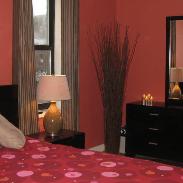
A huge transformation of a space just by de cluttering and repositioning the furniture and adding few decorative accessories. Nice and easy on the budget yet get the biggest bang!
 Michael Nash Design, Build & Homes
2011 NATIONAL NARI COTY SOUTHEAST REGIONAL AWARD
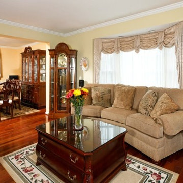
This family of four living in a 1987 brick colonial had to make dramatic changes now that their 85 years old grandmother was about to move in. They needed a mother-in-law suite complete with bathroom facilities to meet her needs. Because they were remodeling anyway, they decided to overhaul the rest of the home to create the house they have always dreamed about, including a grand two-story entry.
Starting in the basement, the homeowner added a home theatre room, added storage and a larger bathroom. Hard wood floors and a new stairway were also added.
The main level boasts the new two-story entry foyer. To its left is the mother-in-law suite with a large front bay window and its own walk-in closet and private bath. The bath is furnished with a walk-in jetted tub and aging-in-place accessories. Other first floor highlights include a music room and gourmet kitchen.
Kitchen amenities the client always wanted were added, including a large center island, extended cabinets, double layered crown molding, exotic granite top and wide board mahogany floors throughout entire first floor.
The entire second floor and stairs going up were reconfigured too. The master bedroom is larger with a new tray ceiling and recess lights. The new walk- in closet is now adjacent to the master bath instead of being across the room. The master bathroom was totally gutted and re-positioned. It includes an enlarged shower with bench and frameless shower door, toilet hidden behind a closet and new whirlpool surround with beautiful travertine tile and long double vanity space.
This new renovation is truly a testament to the possibilities of aging-in-place remodeling strategies. Three generations are now living comfortably in this home.
 Leslie Williams Interior Design
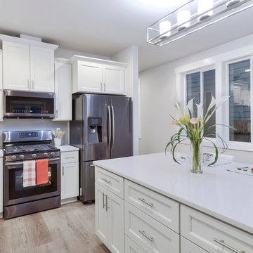
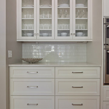
This kitchen was dramatically transformed with new white cabinets that stretch to the ceiling, custom hood, sink re-positioned under the window, new longer drawer banks, glass cabinet doors and a gorgeous new barn door pantry door! Quartz counter tops with simple subway tile back splash completes the look of this serene kitchen.
 DRAPES & DECOR
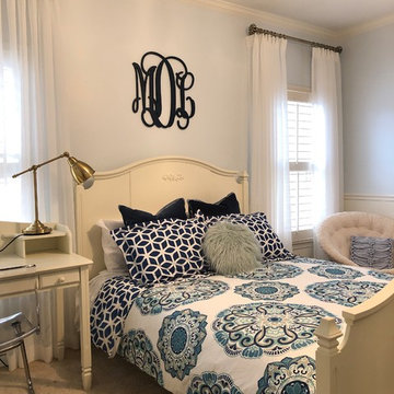
This was a renovation project for a 12 year old girl who outgrown her nursery style bedroom and desired new more grown up look with some blue colors and gold accents. We started with selecting a gorgeous chandelier to add some charm and character to the room. We've decided to keep the pale blue walls and add some striking accent colors in bedding and other accessory. We've placed a custom made monogram in navy/teal color and repeated this color in a new shaggy area rug and velvet euro shams. We have added brand new sheer curtains with a gold/grass hardware and repeated these finishes in wall art on the adjacent wall and also placed a desk lamp in gold/brass on the desk. We have repositioned the desk from a different wall and placed by the bed to serve as a nightstand and as a better homework space by the window. The bedding added lots of interest in patterns, color and texture.
 Native Edge Landscape
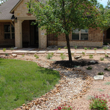
The existing excavated limestone boulders were strategically repositioned to not only serve as functional components but also as visually striking features to the modified design of the dry creek pathways and planted areas.
The trees are viewed as an opportunity to utilize dark Whittlesey mulch to provide contrast, water retention, and tie in to other defined beds and oak clusters on the property.
The front walk is comprised of sawn limestone pavers surrounded by crushed limestone rock mulch and accented by river rock dry creek bed that follows through to the backyard. The pavers lead down to a poured-in-place concrete path that grants access to outdoor utilities and matches the driveway seamlessly.
 HAUS | Architecture For Modern Lifestyles
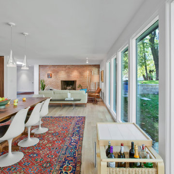
Dining Room features live edge Walnut table, vintage Eames fiberglass shell chairs, and Saarinen wine cart - Architecture: HAUS | Architecture For Modern Lifestyles - Interior Architecture: HAUS with Design Studio Vriesman, General Contractor: Wrightworks, Landscape Architecture: A2 Design, Photography: HAUS
32