
Search results for "Reshaping" in Home Design Ideas

 Heather Garrett Design
Photo by John Bessler
Entryway - traditional light wood floor entryway idea in Raleigh with green walls
Entryway - traditional light wood floor entryway idea in Raleigh with green walls


 Shenton Architects LLP
Located on the south side of Dune Road, facing the beach and the Atlantic Ocean, this existing house required a complete exterior re-design in addition to partial interior renovation work.
The original structure was a somewhat complex composition of volumes that stepped in and out, vertically and horizontally, combined with sloped glass roofs in several locations. All exterior walls were clad in white composite paneling, which gave the house a massive appearance divorced from its context.
It was clear that mere cosmetic improvements would not suffice, so the new design stripped the entire exterior down to the structure.
The house was then reshaped and reformed to simplify the overall geometry, while expressing the key volumes in the parti. Within the newly articulated massing, windows are either cut or chiseled into the elevations to create relief.
From the street the house is three stories high, including the basement, whereas from the beach it has only two stories. Sapele hardwood siding was selected for it’s durability and weathering characteristics. All the cladding is vertically oriented, with an open slat format for the upper two levels and a closed joint board format for the lower level. The open wood slats allow light to filter through the façade, especially at the large sloped skylight over the double height entry where a slatted screen provides privacy at night and solar control during the day.
Find the right local pro for your project
 Shenton Architects LLP
Located on the south side of Dune Road, facing the beach and the Atlantic Ocean, this existing house required a complete exterior re-design in addition to partial interior renovation work.
The original structure was a somewhat complex composition of volumes that stepped in and out, vertically and horizontally, combined with sloped glass roofs in several locations. All exterior walls were clad in white composite paneling, which gave the house a massive appearance divorced from its context.
It was clear that mere cosmetic improvements would not suffice, so the new design stripped the entire exterior down to the structure.
The house was then reshaped and reformed to simplify the overall geometry, while expressing the key volumes in the parti. Within the newly articulated massing, windows are either cut or chiseled into the elevations to create relief.
From the street the house is three stories high, including the basement, whereas from the beach it has only two stories. Sapele hardwood siding was selected for it’s durability and weathering characteristics. All the cladding is vertically oriented, with an open slat format for the upper two levels and a closed joint board format for the lower level. The open wood slats allow light to filter through the façade, especially at the large sloped skylight over the double height entry where a slatted screen provides privacy at night and solar control during the day.
 Above And Beyond Builders
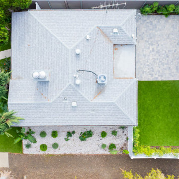
Complete Front & Backyard Landscape Remodel | Los Angeles
This project was a full front and backyard landscape transformation designed to deliver a clean, modern, and low-maintenance outdoor environment while maximizing curb appeal and usable space.
In the front yard, we reshaped the landscape with smooth concrete walkways, fresh planting, and premium artificial turf to create a soft, welcoming approach to the home. The layout was carefully planned to complement the home’s architecture while maintaining a natural flow from the sidewalk to the entry.
The backyard was fully reimagined as a functional outdoor living area. We installed new interlocking pavers for durability and visual balance, paired with artificial turf to keep the space green year-round with minimal upkeep. New fencing and privacy plantings were added to define the space and enhance privacy, creating a calm and cohesive outdoor setting.
Throughout the project, our focus was on:
Clean lines and modern finishes
Low-maintenance materials suitable for Los Angeles living
Proper grading and layout for long-term performance
A seamless transition between hardscape and landscape elements
The result is a timeless outdoor space that feels open, organized, and easy to enjoy, adding both lifestyle value and long-term property value.
 Shenton Architects LLP
Located on the south side of Dune Road, facing the beach and the Atlantic Ocean, this existing house required a complete exterior re-design in addition to partial interior renovation work.
The original structure was a somewhat complex composition of volumes that stepped in and out, vertically and horizontally, combined with sloped glass roofs in several locations. All exterior walls were clad in white composite paneling, which gave the house a massive appearance divorced from its context.
It was clear that mere cosmetic improvements would not suffice, so the new design stripped the entire exterior down to the structure.
The house was then reshaped and reformed to simplify the overall geometry, while expressing the key volumes in the parti. Within the newly articulated massing, windows are either cut or chiseled into the elevations to create relief.
From the street the house is three stories high, including the basement, whereas from the beach it has only two stories. Sapele hardwood siding was selected for it’s durability and weathering characteristics. All the cladding is vertically oriented, with an open slat format for the upper two levels and a closed joint board format for the lower level. The open wood slats allow light to filter through the façade, especially at the large sloped skylight over the double height entry where a slatted screen provides privacy at night and solar control during the day.

 McCullough's Flooring
Gorgeous master bath finished with Dal-Tile's Fabrique porcelain tile in the color Noir Linen polished. Tile size is 12"x24" installed in a brick joint pattern. The floor boasts underfloor heating on a timed thermostat.
 Bobby Berk
Millennials—the 77 million-strong generation born between 1981 and 1997--this past year surpassed the Baby Boom as the United States’ largest population cohort. This burgeoning generation currently represents one of every three homebuyers and we expect that this new and emerging demographic will reshape economic, business, and geographic marketplaces for decades to come.
Bobby-Berk
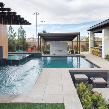
The Responsive Home project, a collaboration between TRI Pointe Group’s Pardee Homes and Hanley Wood’s BUILDER magazine, is a discovery lab for research, design and building practices to understand and activate the Millennial home buyer, now and over the next several years as they become of home-buying age.
As a result of this collaboration, two concept homes, located within the Inspirada master-planned community in Henderson, Nevada were unveiled at the IBS show in Las Vegas in January 2016. These innovative homes are fun, quirky, and positively ooze personality, thanks in no small part to architects Bassenian Lagoni, landscape architects Anderson Baron and celebrity creative director Bobby Berk, who infused the designs with youthful energy.
By design, the Responsive Home answers present and longer-term ownership living needs, providing a new home that young buyers can attain, personalize, adapt to their needs, and live in a connected, accessible way. Available in two floor plans, the Contemporary Farmhouse and the Contemporary Transitional blend livability with modern function catering to the most important request according to younger buyers – more space, specifically outdoors.
Both home choices offer evolution-over-time floor plans with powerful indoor-outdoor workflow, technology-enabled automation, energy performance and bold design finishes. Homeowners can personalize their space in multiple ways including options for additional bedrooms, office or fitness room, casita and studio living spaces inclusive of separate home entrances, among others.
Photo Credits: Brett Beyer

 H2D Architecture + Design
The Owners discovered original photographs of the house in the Washington State Archives, inspiring the restoration of its original front porch, which had been concealed beneath layers of framing and siding over the years. During construction, the original porch structure was found to be largely intact, requiring careful refurbishment rather than reconstruction. The interior renovation included a down-to-the-studs remodel of the main and upper floors, with walls relocated to create a more functional plan and the upper-floor ceilings vaulted to bring greater volume and light to the spaces. A redesigned stair creates a stronger connection between the two levels, while a new kitchen, updated dining room, and nursery support the needs of a growing family. Throughout the Wallingford Craftsman renovation, the design balances restoration with thoughtful contemporary interventions. Traditional finishes and details were selected to complement the original character of the home, allowing the renewed spaces to feel rooted in the history of the house while functioning naturally for modern living. The result is a Wallingford home renovation that celebrates what was already there—restoring lost character while carefully reshaping the home for the future.
+ Architecture: H2D Architecture + Design
+ Interior Design: H2D Architecture + Design
www.h2darchitects.com
+ Builder: Crescent Builds
+ Photography: Rafael Soldi Photography

 Lang's Home Remodeling
This kitchen combines a farmhouse style with state of the art appliances and unique features to create a beautiful, one-of-a-kind design. The paneled appliances, bench seat, and hood, together with the kitchen cabinets are stunning in two-toned cabinetry with a distressed finish. A recessed cutting board in the countertop is both practical and a unique, eye-catching feature.
 Interior Pros - Design Studio
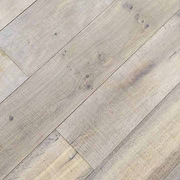
The grey trend has evolved in the last twelve months. Nowadays browns, beige and a touch of grey are in demand. Greige is the new buzzword.
Heavier hand scraped or contoured products, the rage that started around 2005 has taken a back seat in most areas, while a softer wire brushed "ceruse effect" seen mostly on White Oak has been remarkably strong showing no effects of becoming “dated” like the others mentioned.
Ceruse Color Possibilities
There are numerous color combinations to the "cerused" process with the most popular being white or off white. This design trend in hardwood flooring can have darker gray white oak with a mild ceruse off white effect.
There are limitless possibilities in either a prefinished hardwood floor or with what we can create for you in a custom on-site finished hardwood floor.
If something suits your fancy, contact us and we can work on creating just the look and sense of style you are looking for.
 NanaWall
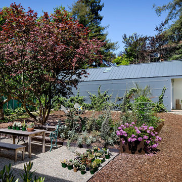
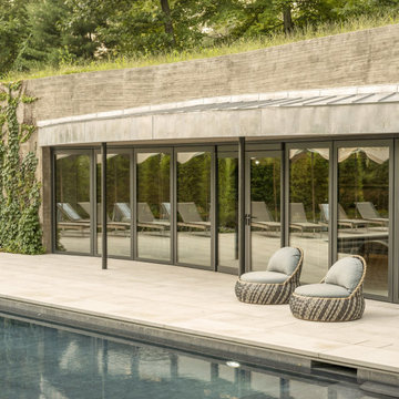
The cabana naturally rises from the hillside, a quiet gesture of respect for the land. Instead of flattening or reshaping the terrain, the team studied it, honored it, and translated it into architecture that responds to its environment. A focus on sustainability and minimal environmental impact guided every decision in the pool house design. The stucco façade supports the ivy’s climb. Porcelain pavers by Cancos form the patio and interior floor, creating a seamless indoor-outdoor plane. Inside, the floor is heated with radiant systems underneath, and above, a slatted white oak ceiling conceals integrated linear LED lighting and built-in heaters, making the space a true four-season retreat. Landscape lighting is woven throughout the property, ensuring the architectural experience continues long after sunset. Materials were locally sourced, and the finishes were kept natural, allowing the building to blend into the surroundings without imposing.
A Living Roof, A Living Legacy
Topped with a thriving, green roof and wrapped in lush Boston ivy, the structure feels more discovered than built. The living roof, engineered for structural support and walkability, is planted with a mix of native, low-maintenance seedlings that require mowing just twice a year. It provides thermal insulation, encourages biodiversity, and visually softens the entire structure. Pollinators and birds now share the roof, proof of how architecture can coexist with ecology.
 WORLD CUSTOM TABLE
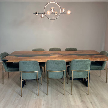
Every custom piece we create begins with a conversation, and this table is a perfect example of how thoughtful design can balance beauty and everyday practicality.
Our client was immediately drawn to the natural character of a live edge black walnut table. The organic lines, rich grain, and unique silhouette bring a sense of warmth and artistry that simply cannot be replicated. However, with young children at home, safety quickly became an important consideration. The client shared their concern that the original live edge, while beautiful, might be too sharp for a family setting.
After carefully discussing their needs, our team proposed a refined solution. We preserved the essence of the live edge, maintaining its natural flow and character, while softening the overall form. The corners were gently rounded, and the edges were skillfully smoothed and reshaped to eliminate sharpness without losing the authentic, organic look.
From material selection to final finishing, every step was handled with precision. We selected premium black walnut slabs with deep, consistent grain and carefully paired them to create a harmonious surface. The resin was poured seamlessly to enhance the wood’s natural beauty, resulting in a clean, elegant river that complements rather than overpowers the walnut.
The final result is a 98” x 40” dining table that feels both sophisticated and welcoming. It retains the charm of a live edge design while offering a safer, more comfortable experience for everyday family use. This project reflects our commitment to not only craftsmanship and quality, but also to truly understanding how our clients live and use their furniture.
A table should do more than look beautiful, it should fit seamlessly into life.
 MANDARINA STUDIO interior design
LOCATION: MILTON, MASSACHUSETTS
The renovation of this midcentury home centers on a complete transformation of the kitchen, which reshaped how the house functions and connects to its surroundings. The original layout relied on low cabinetry that failed to take advantage of the room’s generous volume. Mandarina Studio reworked the plan to improve circulation and take full advantage of the home’s soaring height and natural light.
The redesigned kitchen replaces a dated peninsula with a generously scaled island that supports both everyday use and entertaining. Cabinetry was reimagined vertically as well as horizontally, allowing storage and display to extend upward and reinforce the room’s proportions. A custom china cabinet with tall glass doors framed in blackened iron and finished in white oak adds presence and refinement.
At one end of the kitchen, a dedicated bar introduces a more intimate moment. Art, layered lighting, and wall-mounted sconces give this area its own identity, offering contrast to the openness of the main kitchen while supporting entertaining. Clerestory windows introduce shifting daylight throughout the day, bringing depth and movement to the quartzite focal wall at the range. Pendant lights reference midcentury forms in a refined, contemporary way. The completed kitchen was featured on the cover of Modern Luxury Interiors.
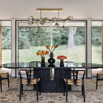
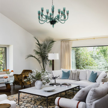
The renovation extended beyond the kitchen to include a new primary bath, a refreshed guest bath, and updated furnishings throughout the living and dining rooms. In the primary bath, marble with expressive veining is paired with a custom floating white oak vanity, balancing warmth and restraint. In the living room, a new picture window frames wooded views, while the furniture plan grounds the space. A turquoise Murano glass chandelier introduces color and artistry, adding a distinctive, personal note to the interior.
 MANDARINA STUDIO interior design
LOCATION: MILTON, MASSACHUSETTS
The renovation of this midcentury home centers on a complete transformation of the kitchen, which reshaped how the house functions and connects to its surroundings. The original layout relied on low cabinetry that failed to take advantage of the room’s generous volume. Mandarina Studio reworked the plan to improve circulation and take full advantage of the home’s soaring height and natural light.
The redesigned kitchen replaces a dated peninsula with a generously scaled island that supports both everyday use and entertaining. Cabinetry was reimagined vertically as well as horizontally, allowing storage and display to extend upward and reinforce the room’s proportions. A custom china cabinet with tall glass doors framed in blackened iron and finished in white oak adds presence and refinement.
At one end of the kitchen, a dedicated bar introduces a more intimate moment. Art, layered lighting, and wall-mounted sconces give this area its own identity, offering contrast to the openness of the main kitchen while supporting entertaining. Clerestory windows introduce shifting daylight throughout the day, bringing depth and movement to the quartzite focal wall at the range. Pendant lights reference midcentury forms in a refined, contemporary way. The completed kitchen was featured on the cover of Modern Luxury Interiors.
The renovation extended beyond the kitchen to include a new primary bath, a refreshed guest bath, and updated furnishings throughout the living and dining rooms. In the primary bath, marble with expressive veining is paired with a custom floating white oak vanity, balancing warmth and restraint. In the living room, a new picture window frames wooded views, while the furniture plan grounds the space. A turquoise Murano glass chandelier introduces color and artistry, adding a distinctive, personal note to the interior.

 Parkes & Lamb Interiors
Mary Craven Photography
Inspiration for a transitional bathroom remodel in Nashville
Inspiration for a transitional bathroom remodel in Nashville

 Maughan Design & Remodel
Whitney Lyons
Wine cellar - mid-sized rustic concrete floor and gray floor wine cellar idea in Portland with storage racks
Wine cellar - mid-sized rustic concrete floor and gray floor wine cellar idea in Portland with storage racks
 MANDARINA STUDIO interior design
LOCATION: MILTON, MASSACHUSETTS
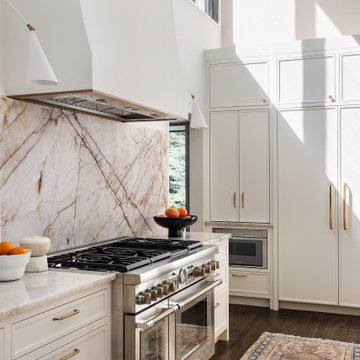
The renovation of this midcentury home centers on a complete transformation of the kitchen, which reshaped how the house functions and connects to its surroundings. The original layout relied on low cabinetry that failed to take advantage of the room’s generous volume. Mandarina Studio reworked the plan to improve circulation and take full advantage of the home’s soaring height and natural light.
The redesigned kitchen replaces a dated peninsula with a generously scaled island that supports both everyday use and entertaining. Cabinetry was reimagined vertically as well as horizontally, allowing storage and display to extend upward and reinforce the room’s proportions. A custom china cabinet with tall glass doors framed in blackened iron and finished in white oak adds presence and refinement.
At one end of the kitchen, a dedicated bar introduces a more intimate moment. Art, layered lighting, and wall-mounted sconces give this area its own identity, offering contrast to the openness of the main kitchen while supporting entertaining. Clerestory windows introduce shifting daylight throughout the day, bringing depth and movement to the quartzite focal wall at the range. Pendant lights reference midcentury forms in a refined, contemporary way. The completed kitchen was featured on the cover of Modern Luxury Interiors.
The renovation extended beyond the kitchen to include a new primary bath, a refreshed guest bath, and updated furnishings throughout the living and dining rooms. In the primary bath, marble with expressive veining is paired with a custom floating white oak vanity, balancing warmth and restraint. In the living room, a new picture window frames wooded views, while the furniture plan grounds the space. A turquoise Murano glass chandelier introduces color and artistry, adding a distinctive, personal note to the interior.
 MANDARINA STUDIO interior design
LOCATION: MILTON, MASSACHUSETTS
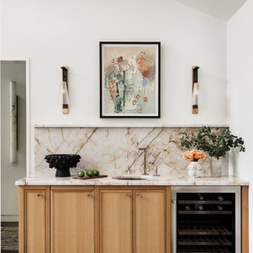
The renovation of this midcentury home centers on a complete transformation of the kitchen, which reshaped how the house functions and connects to its surroundings. The original layout relied on low cabinetry that failed to take advantage of the room’s generous volume. Mandarina Studio reworked the plan to improve circulation and take full advantage of the home’s soaring height and natural light.
The redesigned kitchen replaces a dated peninsula with a generously scaled island that supports both everyday use and entertaining. Cabinetry was reimagined vertically as well as horizontally, allowing storage and display to extend upward and reinforce the room’s proportions. A custom china cabinet with tall glass doors framed in blackened iron and finished in white oak adds presence and refinement.
At one end of the kitchen, a dedicated bar introduces a more intimate moment. Art, layered lighting, and wall-mounted sconces give this area its own identity, offering contrast to the openness of the main kitchen while supporting entertaining. Clerestory windows introduce shifting daylight throughout the day, bringing depth and movement to the quartzite focal wall at the range. Pendant lights reference midcentury forms in a refined, contemporary way. The completed kitchen was featured on the cover of Modern Luxury Interiors.
The renovation extended beyond the kitchen to include a new primary bath, a refreshed guest bath, and updated furnishings throughout the living and dining rooms. In the primary bath, marble with expressive veining is paired with a custom floating white oak vanity, balancing warmth and restraint. In the living room, a new picture window frames wooded views, while the furniture plan grounds the space. A turquoise Murano glass chandelier introduces color and artistry, adding a distinctive, personal note to the interior.

 Two Street Studio
Inspiration for a small mid-century modern brown two-story wood house exterior remodel in New York with a shingle roof and a black roof
34